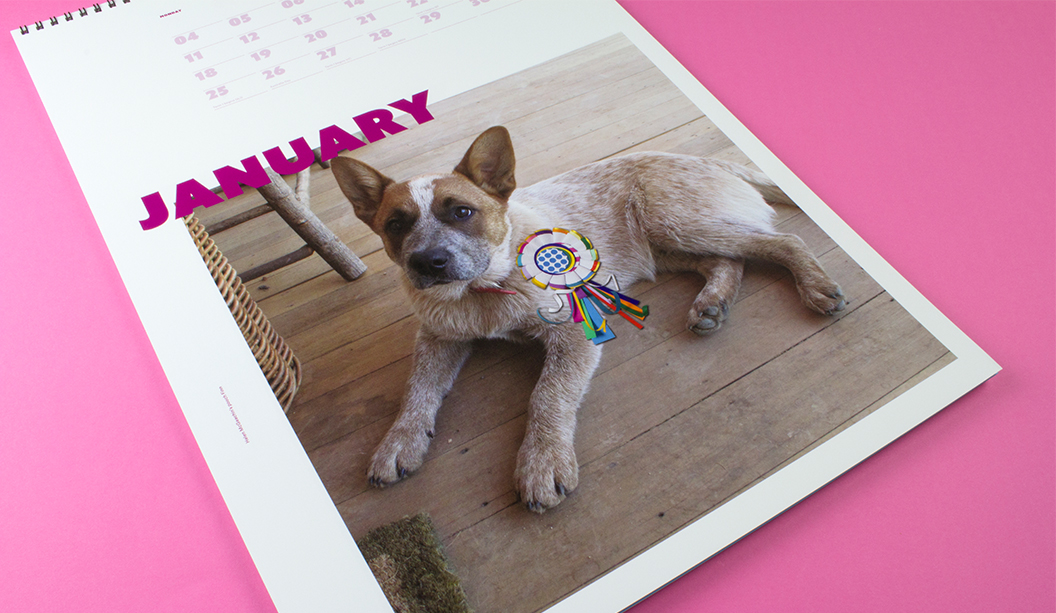
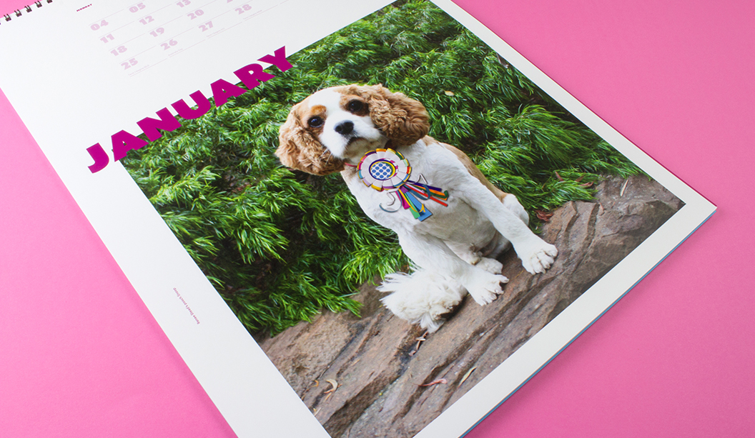
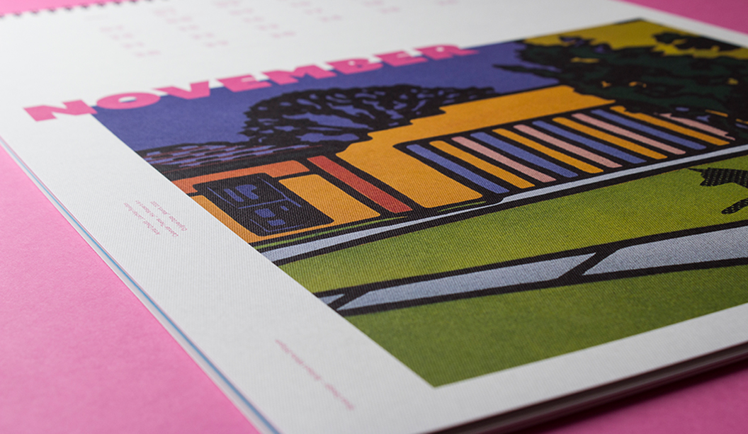
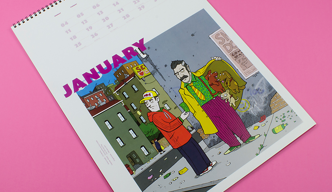
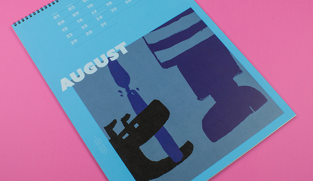
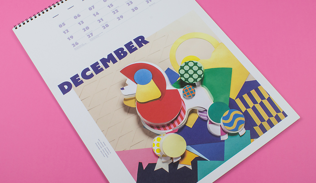
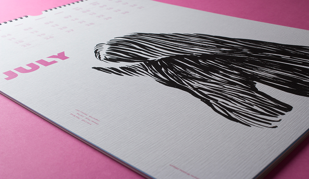
Footy Tips
Agency: Tiliqua Press with students from Billy Blue.
Publisher: Felix Oppen.
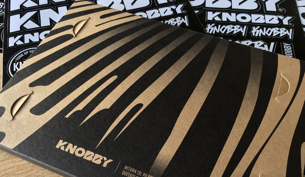
Stocks: Grange Offset 300gsm/110gsm.
Printed by: Seed Print Group in NSW.
Printing specs: CMYK Offset printed.
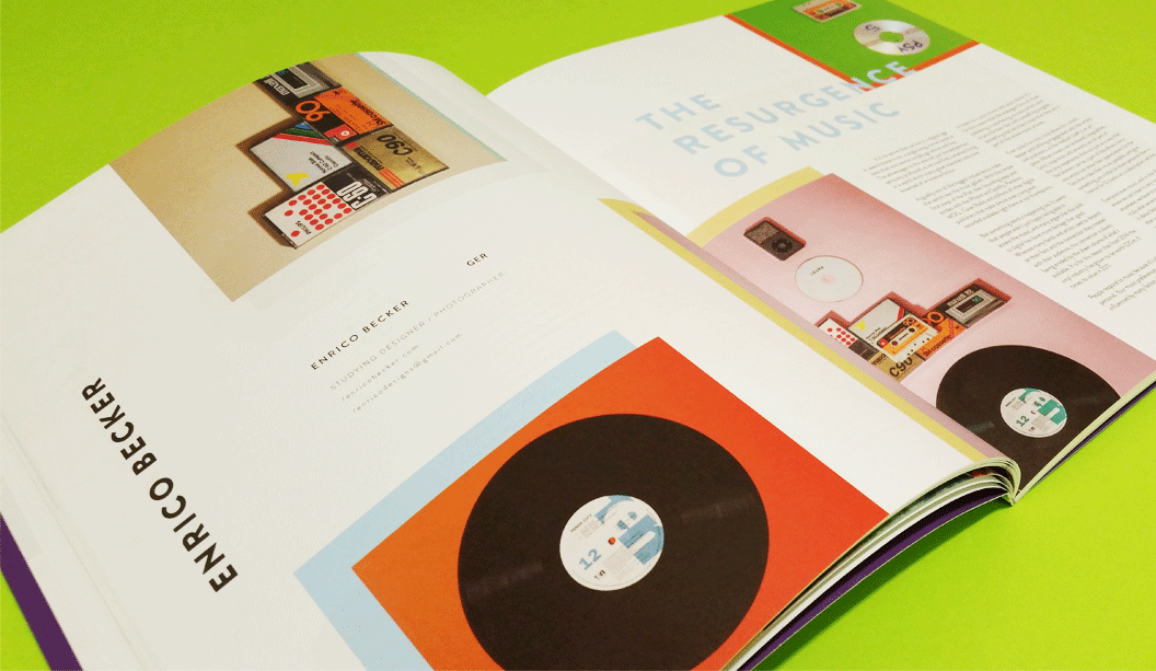
Every once in a while, someone dreams a little dream, yanks it out of the matrix, thrusts it into reality and watches it take shape. It’s a beautiful thing. This is the case with Felix Oppen, who recently launched the inaugural Ligature Journal, a publication made in collaboration with a bunch of hard working and enthusiastic students at Billy Blue College of Design.
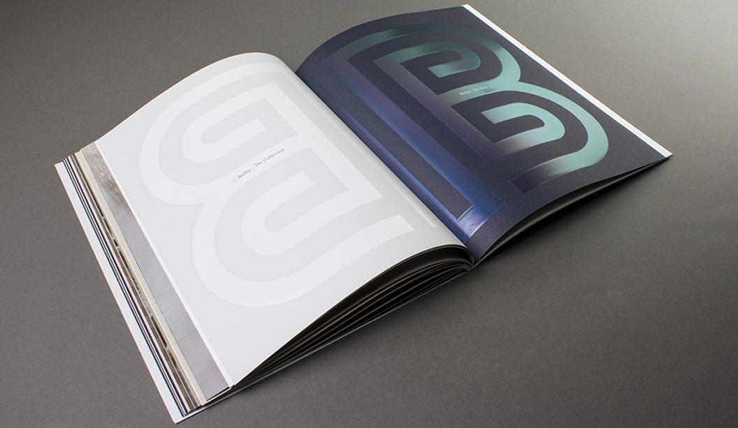
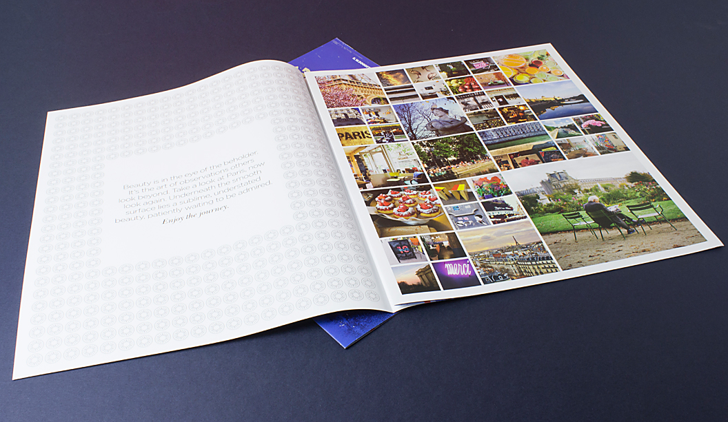
If you’re looking for a fresh compilation of ripper content featuring local artists and student work that spans graphic design, illustration and photography, call off the search party. One of the many cool things about Ligature Journal is that every aspect is student managed from content to press checks to building the digital version. While some may be dismissive of a student magazine, it totally stands up on its own as a top shelf, relevant publication. This is exactly the vision Felix had for Ligature Journal – that it would add to the design and creativity discourse in Australia, New Zealand and beyond.
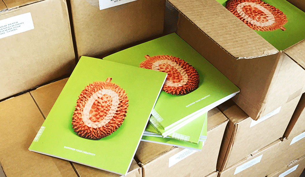
The team chose to release print and digital versions of Ligature Journal. Felix believes the future of publishing is to let each medium play to its strengths but work together. Smart. It is intended to be a tri-annual publication and you can already buy Issue Zero here.
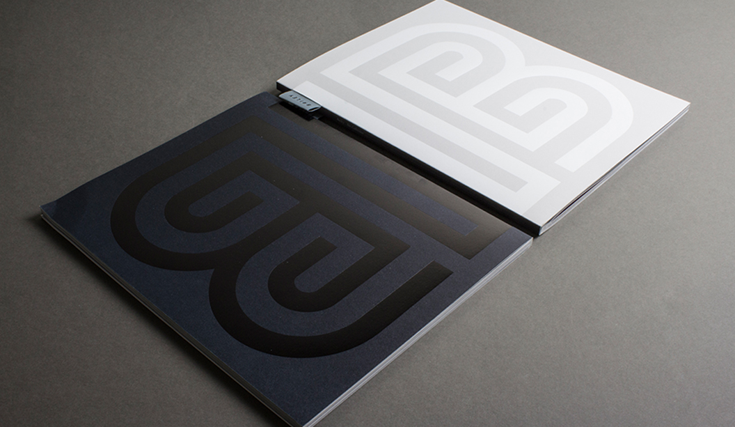
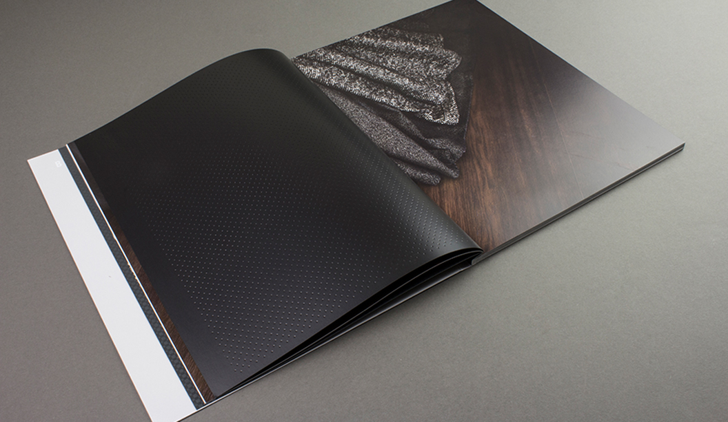
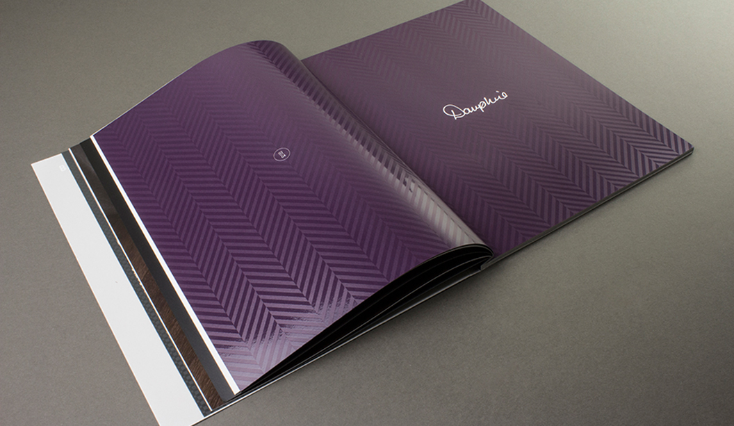
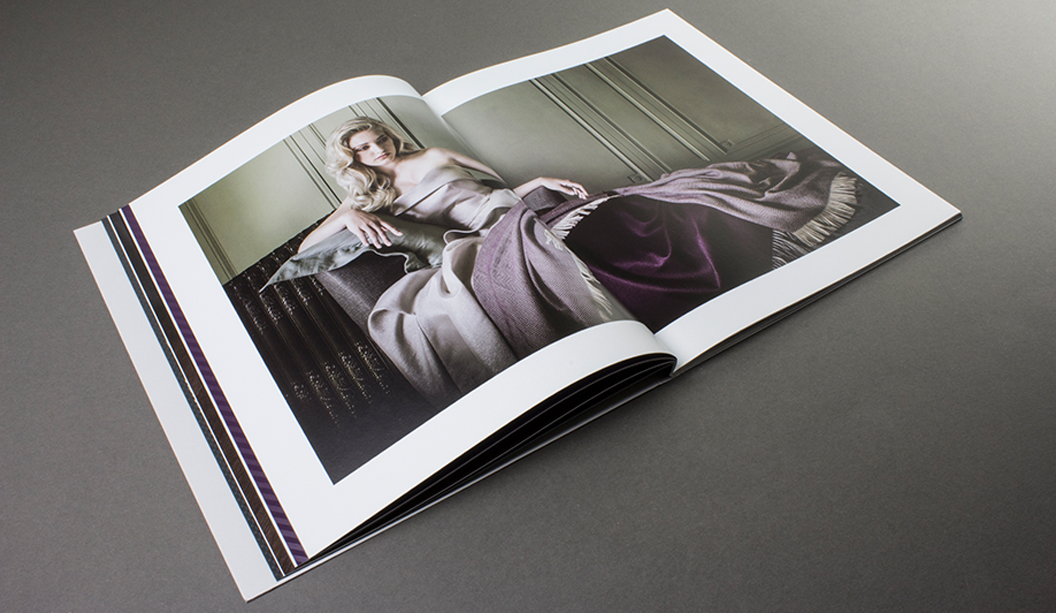
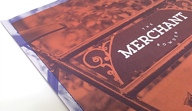
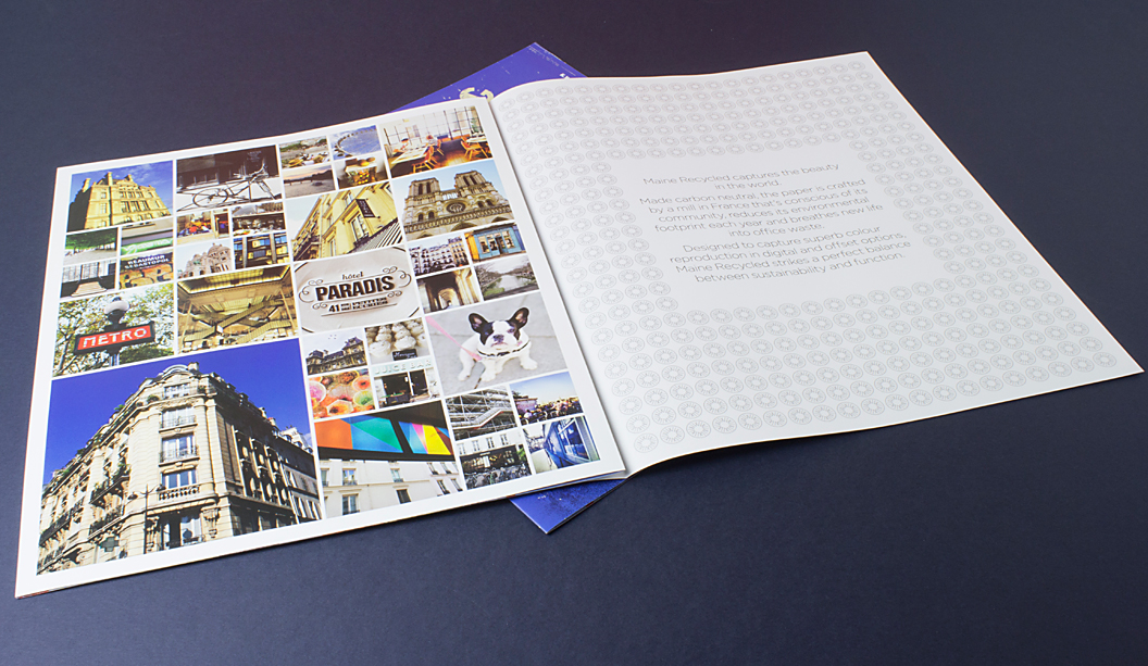
The stock chosen for this work is Grange Offset 300gsm/110gsm, an economical, bright white uncoated paper which Felix says punches way above its weight and is regularly mistaken for a specialty paper. We agree that the print job looks bang-on, and we look forward to watching the development of the concept across future issues.
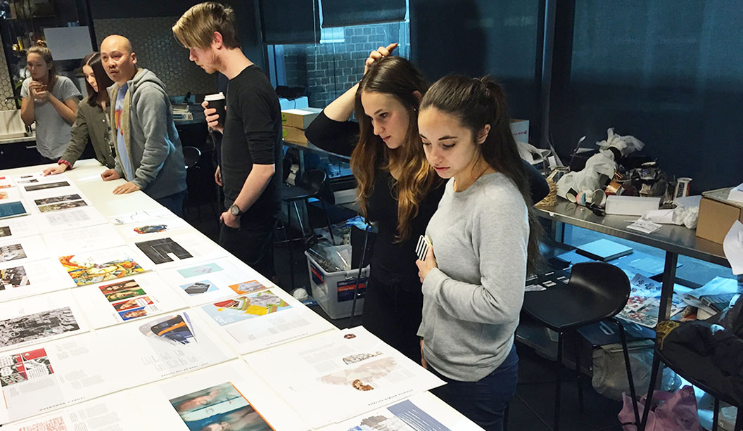
Pictured: Students reviewing layouts and the running order of articles, with Kuen Kam – the Billy Blue lecturer/mentor.
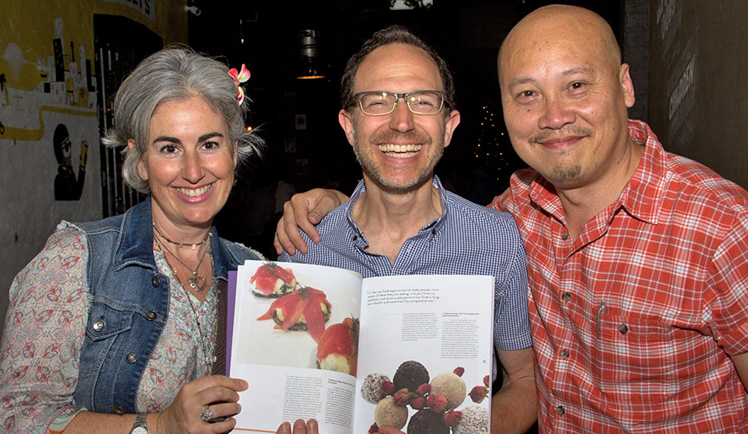
Pictured: At the launch, a very happy contributor, Neil Barnett (centre) and is partner, Vicki (left), with Neil’s article on raw food. Kuen Kam (right) is the Billy Blue lecturer/mentor for the students.