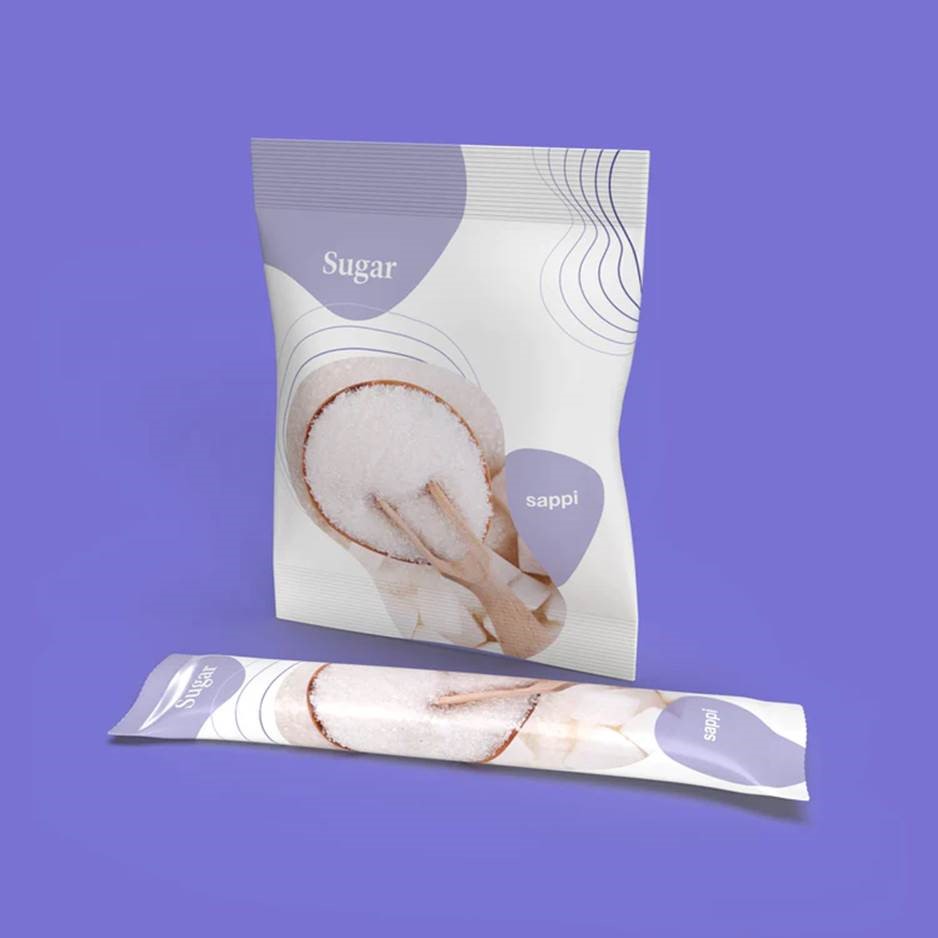
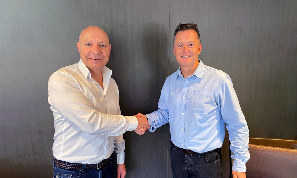
Ball & Doggett partners with global leader, Sappi, to distribute their innovative and sustainable barrier papers.

As Australia's leading distributor of printable materials and consumables, this partnership bolsters Ball & Doggett’s ever-expanding product offering—their first in the flexibles space—and solidifies their ongoing commitment in bringing innovative and sustainable solutions to the local market.

Sappi is a market and innovation producer of functional papers with integrated barrier functionality and excellent heat-sealing properties. These papers for flexible packaging come with integrated barriers against oxygen, water vapour, grease, aroma and mineral oil.

“Thanks to the integrated barriers, there is no need to apply special coatings or laminations. This innovative paper responds to market demand for alternatives to foils and plastic,” the company said.  

“This fantastic partnership between Ball & Doggett and Sappi signals our further expansion into the flexibles market as we continue to diversify our product offering and present sustainable alternatives where fit for purpose,” says Lou Tsoukalas, National Manger – Flexible Packaging, Ball & Doggett. “This is an exciting space in the Labels & Packaging division of our business, and is experiencing sustained growth stemming from continuous product innovation.”


”The partnership will be a huge benefit for customers needing a quick turnaround as new business opportunities are created for Barrier Papers.  Having stock available from Ball & Doggett’s warehouses in Australia, will bring a more efficient and timely process to what is a long lead-time out of our European manufacturing base” says Craig Brown, Managing Director, Sappi Australasia. We have found that new business can be a long and expensive process from concept, to trials to orders and having stock on the floor will help smooth that out.

This partnership grants Ball & Doggett distribution of three of Sappi’s paper-based packaging grades – produced from largely renewable sources. Offering a paper-based packaging solution with integrated heat-sealing function, and two high-barrier paper-based packaging solutions to replace multi-layer barrier films, providing greater value and sustainable options to support our customers and brand owners.

Ball & Doggett is the destination for sustainable packaging.


For further information on this announcement or product specifics, please contact:
Lou Tsoukalas
National Manager – Flexible Packaging
0447 892 340
lou.tsoukalas@ballanddoggett.com.au
Ball & Doggett


Formakote™ – The complete package

As Australian businesses continue to recover from the global pandemic, the challenges of supply chain remain a significant issue for SMEs with more than one in four citing supply of stock as an issue for their operations, according to new research from NAB.

Consumers are now all too aware just how fragile supply chains can be in the face of a health crisis, natural disaster or international incident. Ball & Doggett is certainly not immune from the pressures of global supply chain disruptions when sourcing materials from offshore locations.

Strong relationships with local suppliers can help ease the effects of global pressures and minimises supply chain disruptions. Our enduring partnership with Whakatane Mill Limited – the region’s only carton board manufacturer – has allowed us to do just that, to the benefit of our customer base.

BrettInterview

We caught up with Brett Keen, Sales Manager ANZ, Whakatane Mill Limited, at PacPrint, during his recent visit to Melbourne, to chat all things Formakote™ – the iconic carton board range – and present him with our newly created swatch book.

Formakote™ is our safe, flexible and sustainable carton board product, manufactured with unparalleled expertise by the FSC certified mill, located on the east coast of New Zealand’s north island.

“We recently reintroduced our folding box board range under the Formakote™ banner, offering four board types, Natura, White, Spectra and Sherpa,” explains Brett Keen.

“Formakote™ is produced to the highest quality, for optimal performance and the greatest product safety. It is made with a 3-layer structure that combines locally produced virgin kraft pulps and mechanical fibres. They are clay coated to meet the requirements of end users such as FMCG, beverage carrier boards and food services.” Brett added.

Formakote White, Natura and Spectra all comply with stringent food contact requirements.

FormakoteFamily-620x538

The Formakote™ family covers four distinct carton board grades:

Formakote™ White – Whiteback GC1 Whether it is packaging for Quick Service Restaurants or Supermarket shelves, Formakote™ White is the ideal choice.

Formakote™ Natura – Manillaback GC2 For your everyday packaging needs, Formakote™ Natura provides great value and performance and is available as hard sized for chilled food.

Formakote™ Spectra – Kraftback GC4 When strength and stiffness are critical, Formakote™ Spectra covers all the options.

Formakote™ Sherpa – Carrierboard As the name implies, Formakote™ Sherpa is tough and durable for any carrier-board application. Sherpa has high wet strength attributes, important for wet or chilled environments.

Ball & Doggett are continuing to see a very high increase in demand for our fibre-based products as more brand owners seek substitution solutions for plastic packaging, where fibre-based alternatives are fit for purpose.

Brett echoed this trend by adding, “It’s something we’ve seen from the outset at Whakatane Mill, after we moved away from producing liquid packaging board back to carton board, we’ve experienced an immediate and significant increase in demand for our products.”

The Formakote™ Swatch Book is available now through your local Ball & Doggett representative.

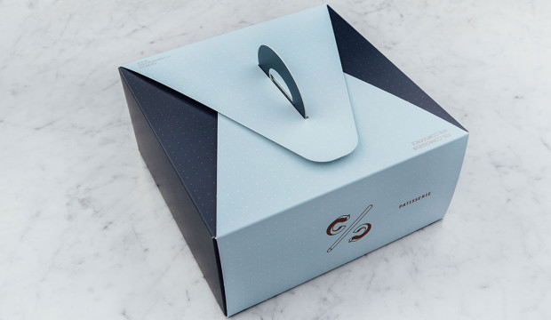
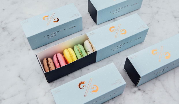
The Crux & Co. brand identity by Hue Studio

We tell our reps time and time again if you’re going to bring in samples of food packaging, INCLUDE the food. Sheesh.

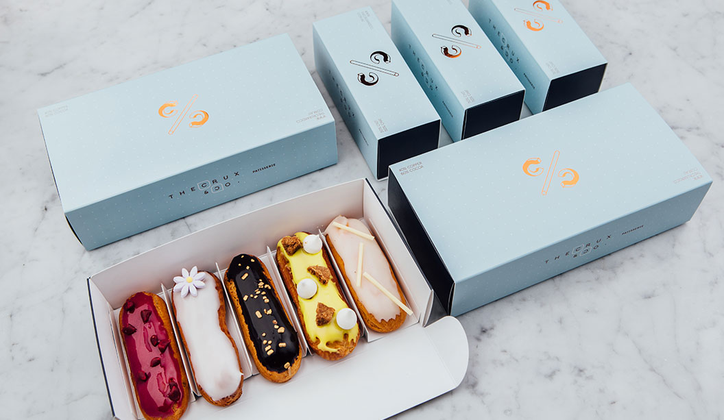
We love this branding job by Hue Studio for The Crux & Co. in Melbourne. We liked it so much we featured it as a case study in Spot, a recently released print publication that includes lots of rad design projects from local and international studios. Ask your paper specialist for a copy and in the meantime, check out more of Hue Studio’s work on their Instagram page @huestudio.

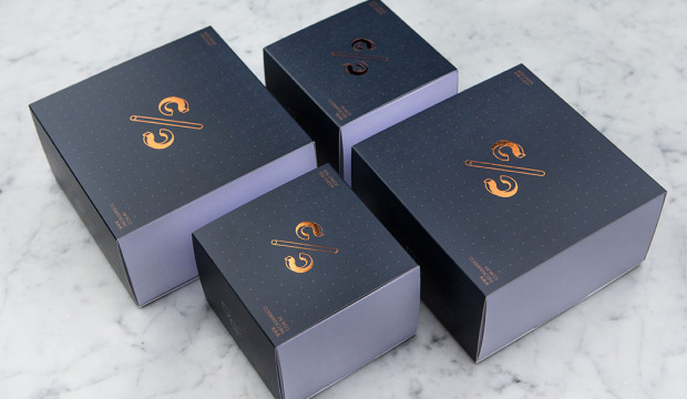
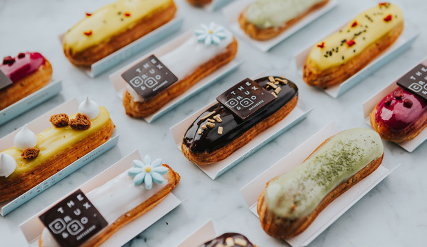
The Crux & Co. is a 110-seat café and patisserie in South Melbourne. The interior colour palette is baby blue and navy and the tables and cabinets have beautiful rounded edges that reference 1960s styling. The ethos behind The Crux & Co.’s menu is what we all strive for in life – balance. It boasts a delicious selection of macarons, eclairs, pastries and buttery house-made croissants, along with Korean influenced savoury dishes. Perfecto.

We interviewed Vian about his experience working on this rad project.

How did you articulate the brand identity of balance in a visual sense?
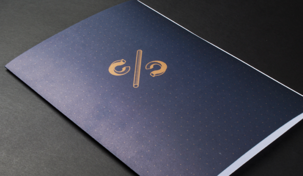
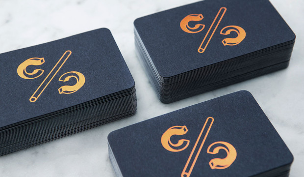
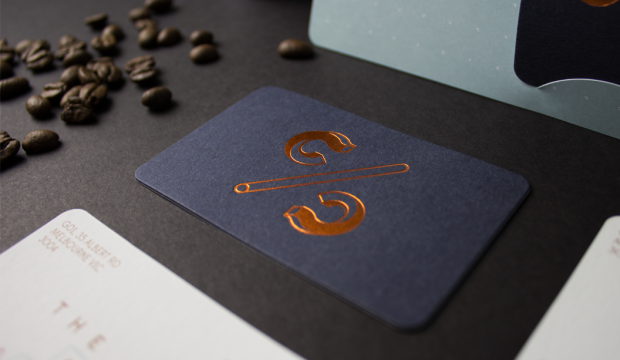
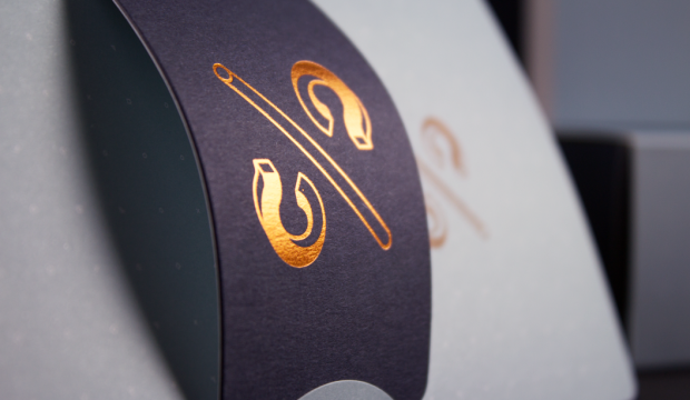
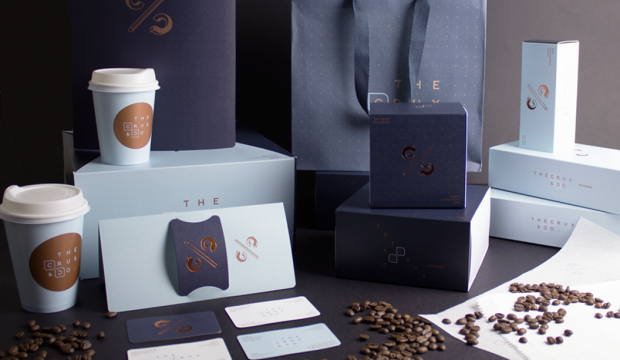
To bring the concept of balance to life we created all elements of The Crux & Co.’s branding with this concept in mind – everything from the monogram logo, which resembles a percentage symbol, to a series of cheeky C/C taglines like (50% Chit 50% Chat and 30% Cheese 70% Cheers). The taglines appear along with the custom pattern and typeface.

Did you work closely with the client to create the branding?
Yes, very close, but not intimately, because the
 one thing we know about the food industry is that sometimes people can’t respond to our queries until after business hours! And we totally understand that. The clients input and involvement is always paramount for the project’s success. It’s their business and their passion we’re bringing to life and at the same time, we want to create a space where we can be creative too. Approaching the project in this way creates a healthy designer-client relationship. It’s also good for us because the project doesn’t stop, even after the shop opens.

The marketing collateral, packaging and interior design complement each other perfectly. Did you also work closely with the architects?
We did work closely with Architects EAT (in particular Eid Goh), before and during the design process. We’ve collaborated on other projects together so the process was very smooth. It’s satisfying when you establish a good relationship with collaborators because, more often than not, they’ll give their honest opinion and this allows us to push ourselves even harder. I also don’t want to undermine the importance of the architect’s perspective on branding, which I think is crucial.

What’s involved in your process when designing a packaging job?
Firstly, we always do a lot of research. We ask the client a lot of questions and most importantly, determine who the competitors are and what’s already out there. For this project, we came up with a lot of concepts, made a lot of Barry Bleach Board mock-ups and used heaps of scalpels and cutting boards! With The Crux & Co. packaging we had to make size and design adjustments to the pastry boxes to make them more versatile. Working closely with the printers is really important too – for example for one box, we worked out how to get two-up on the printing press. This resulted in the box being smaller and now it takes up less space in the shop.

How crucial do you think packaging and branding is to eateries like The Crux & Co.?
I think the packaging design is just as important as the product itself because it allows the customer to revel in its beauty. They can appreciate the time and effort put into the design of the packaging as much as they can appreciate what’s inside. Also, good packaging can make you smile, even before you open it. The fact there are similar establishments opening up in practically every corner of Melbourne, means cafes like The Crux & Co. face stiff competition. So we have to be creative and come up with fresh ideas.

Why did you use the uncoated side of Barry Bleach Board for the pastry boxes?
To match the stationery set finish. The collateral 
is printed on uncoated Keaykolour Original, so we decided early on that the packaging needed to be uncoated too. Because it’s flipped, which means the coated side is in contact with the cakes and macarons. Barry Bleach Board is food safe and FDA approved – the biggest selling point for us – and is designed for high quality packaging materials. Along with the copper foil logo on each box, the overall design is ‘Chic and Classy’.

How important is branding to the overall customer experience?
Very. It’s about the whole experience, which starts before the customer walks in the front door and ends when they leave the shop with a beautifully designed cake or macaron box in a nice paper bag. Creating a brand identity is more than just abut a logo – it’s about the colour, typography, all the printed materials and how everything relates to the interior and in this case the food, which has to be amazing otherwise the customer won’t come back! Good branding and a complementary interior helps you get noticed and recognised faster and really completes the whole experience.

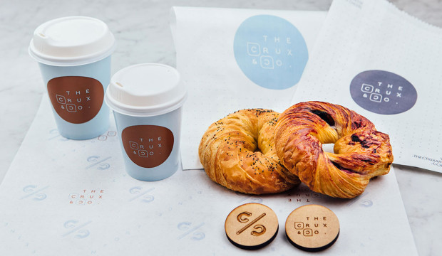
Now you be the judge…is the crogle balance or madness? A croissant pastry baked in the shape of a bagel with traditional bagel flavours like poppy seed and blueberry. Is it enough to get you down to The Crux & Co.? We think YES!

Boxes: Barry Bleach Board
Crux_10

Crux_7

Crux_8

Business cards:
– Print: Front: copper foil logo (35 mm x 35 mm) on Keaykolour Original Navy Blue 250gsm, (back) + 250gsm Keaykolour Pure White
– Back: 2 spot colours on Keaykolour Original Pure White
– Finishing: Mount back-to-back, Formecut round corners
– Size: 55 mm x 90 mm
Crux_4

crux-and-co-blog-1

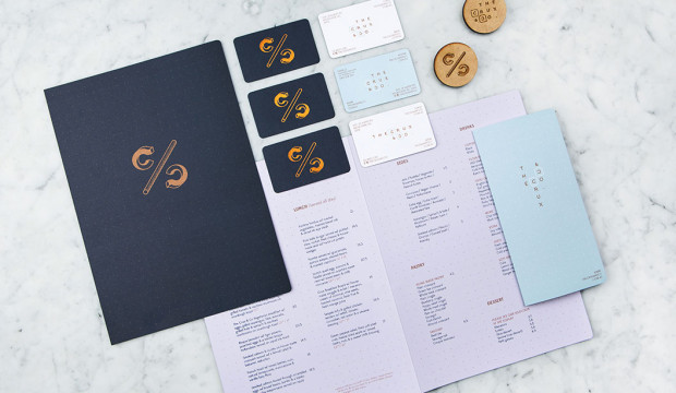
Menu:
– Print: 2 spot colours one side only.
– Size: 414 mm x 297 mm.
– Stock: 225 gsm Kaskad Skylark Violet
Crux_5

Crux_1

crux-and-co-blog-13

Gift card holder:
– Print: 2 spot colours one side only.
– Size: 198 mm x 207 mm.
– Stock: 250 gsm Grange Offset
– Quantity: 500
crux-and-co-blog-3

Sticker:
– Print: 2 spot colours one side.
– Size: 60 mm diameter
– Stock: Cast Gloss White Permanent
crux-and-co-blog-10

Crux_3


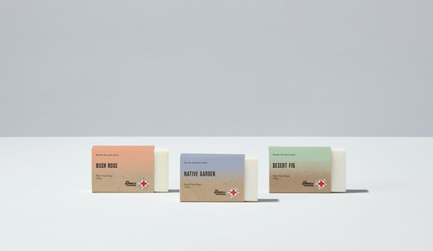
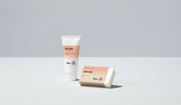
A unique scented product range by Grosz Co.Lab

We are suckers for scented products, especially ones that are beautiful and best of all for a good cause!

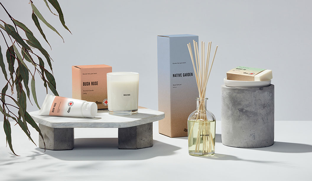
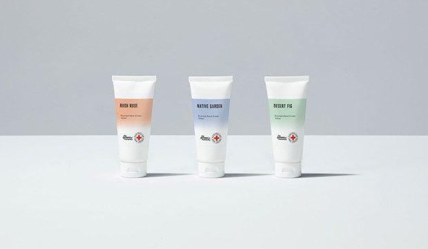
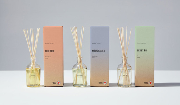
The makers are Grosz Co.Lab, an inter-disciplinary creative studio in Melbourne run by Ben and Laura. Working closely with long-time client Red Cross, they have developed a bespoke range of packaging for diffusers, candles, soaps and creams. The first project of this kind that Red Cross have embarked upon.

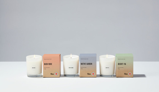
Printed on Buffalo Board 332gsm and 225gsm, each product is inspired by the Australian Landscape. “It was actually established very early on from the Red Cross team that they’d like to explore the use of a natural brown stock for the range as a reference to their heritage,” says Ben. And who can resist delish scents like Bush Rose, Native Garden and Desert Fig?

The super cool print effect (designed to mimic the scent materialising and dissipating) is a bitmap gradient allowing the colour of the stock to come through each of the three PMS colours. Working with Scott Henry at Colna Print & Pak, white ink was then mixed in with each colour and the level of opacity was adjusted on press to get just the right effect. Nice!

Available at Red Cross shops (they just sold out online but will be back soon), the funds raised helps to support the vital work of the organisation locally and abroad. “We feel fortunate they entrusted it to us – especially as it was not only the packaging design that we created, but also establishing the vision for the product range, naming and also consulting on the curation of the scents. We’re thrilled it’s been a success for them,” says Ben. See more of the project on www.groszcolab.com.au.

When asked what they’re dreams were for the future, Ben shares “…something that combines design across a range of disciplines, along with music, dance, fashion and/or scent would be a dream. Or perhaps a design museum! We have many ideas – we just need the funds.”  No doubt we’ll be seeing more from Grosz Co.Lab very soon.


Groz-Co_4

Groz-Co_6

Groz-Co_5

Groz-Co_3

Groz-Co_2

Beautiful product packaging by Lepaar

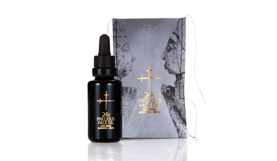
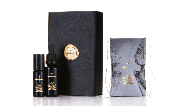
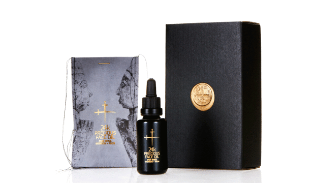
Title: 24k Precious Face Oil For Wise Women + Men.
Agency:
 Lepaar (NSW) – Johanna + Christo Everingham. 
Stocks: 
Knight Textures – Linen 2-sided 280gsm
Printing specs: Offset, CMYK + PMS + Pantone Blue 072U and Pantone 7579U.
Printed by: Lindwall + Ward, Marrickvile NSW (1c black offset + sealing varnish). Gold detailing + embossing: Goldcraft, Marrickville NSW.
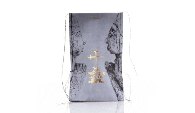
Embellishments: Stitching: Christo Everingham. The 14k gold plated staple from: OOOMS design studio, Netherlands.

Talented much are the first two words that spring to mind when speaking to Johanna, one half of Lepaar (the other half is…her other half Christo!). Drawing inspiration from the Knight promotion we released many years ago, the Lepaar design duo set about creating the packaging for their 24k Precious Face Oil.

24K-Image-3

Good design comes from lots of places but without a doubt, a brand’s philosophy will shape how good the outcome is. Lepaar are out to design exquisite products and objects of quality, beauty and function. They work with the best manufacturers, craftsmen and materials. They’re also staunch supporters of Australian companies and goods, plus they’re opposed to today’s throwaway kinda culture. The ingredients for the face oil are organic, biodynamic and from ethical growers and producers. We picking up what you’re putting down Lepaar.

Time for us to hand it over to Johanna, who has shared some great insights into the process…

“Because of our focus on local business, Doggett’s has been our first point of call throughout our years as brand designers. It’s a family run paper house, based in Australia and I’ve had brilliant personal service all the way through from Nathan Doggett. Living in the same suburb and bumping into each other over coffee or at house parties helps!

The Knight range has always been my personal favourite. The stock is one of the nicest to print deep blacks on without actually using rich blacks. For this particular job, we picked Knight Linen  because it’s got a fabric-like stretchy quality to it which we needed to squeeze the bottle into the sleeve after stitching. The texture allows for stretch and handling without crinkling.

24K-Image-2

We know the stock, so did expect it to look and feel expensive and luxurious. Yet we were amazed by the richness of the black, given that we only printed 1c black, without extra screens. We did print offset rather than digital, which I believe made a difference.

We wanted the sleeves to be very avant-garde, expensive and luxurious looking, showing off the hand-made character of the stitching without making it look ‘crafty’. Our objective was beautiful, luxurious packaging that is not wasteful, has a collectors-item quality to it, is different and communicates the precious nature of the product.

We spend a long time sourcing packaging and found it tough trying to find someone who would produce small quantities in luxury materials and finishes in Australia, without much luck. Because we stitch all our products into paper packaging we ended up trying different versions of sleeves on the sewing machine one day, reluctantly cutting up my well-loved Knight promo which I consider a collectors item. It worked and looked stunning. Different and modern and rock ’n roll all at once.

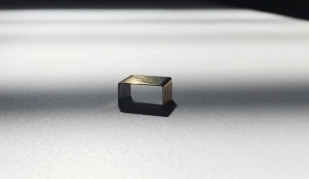
The closure was a headache, until lateral thinking kicked in. We had stapled it just to see what it looks like closed, got the gold ink marker out and painted the staple. Bit of night time googling produced OOOMS, a dutch design co who had released 14k gold plated staples a few years back and Guido the owner was only too happy to send some our way. We love them and suggest to customers to reuse them as lapel pins or make earnings out of them.

We believe we have created packaging that conveys language – one interacting string of things that mix and match and talk to each other. In this case all the ingredients, inside and out, sing.”

knight2


Thanks Lepaar, our fellow paper obsessed customers. You’ve created truly beautiful and unique home grown packaging that we love, love, love.

24K-Image-6

Our top five packaging picks of 2015

We love a good package here. Yes siree. Paper, label, texture, colour, it’s all part of our love.

We recently read-up on Landor’s predicted trends for 2016. There’s more on consumers craving authentic interaction, but we feel that one’s been thrown around for a while. One of the big and interesting trends however is the return of bricks and mortar stores, experiencing brands though multichannel/multi sensory experiences, a heightened focus on storytelling and incorporating products into peoples lives more than ever before. Product packaging could be even more important now than it ever has before.

Our top packaging job picks for 2015 are here for your eyes to feast on.

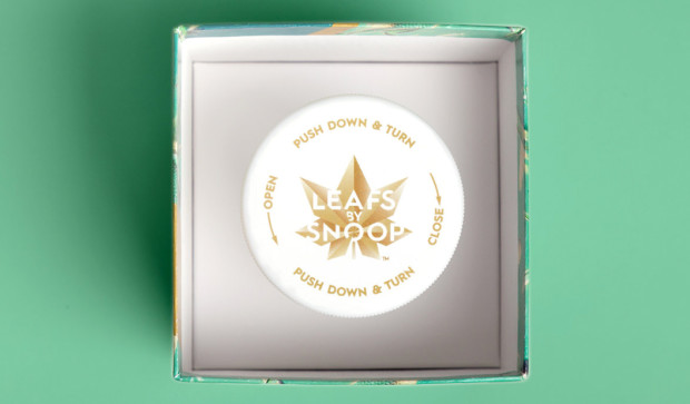
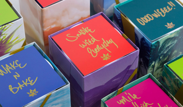
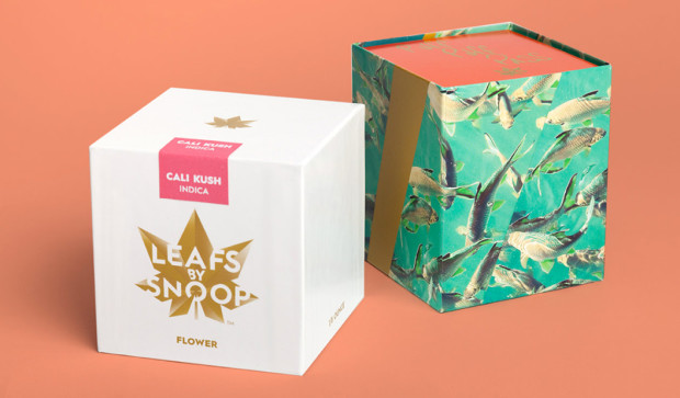
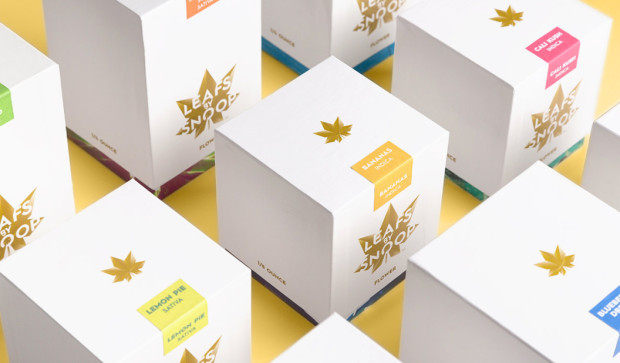
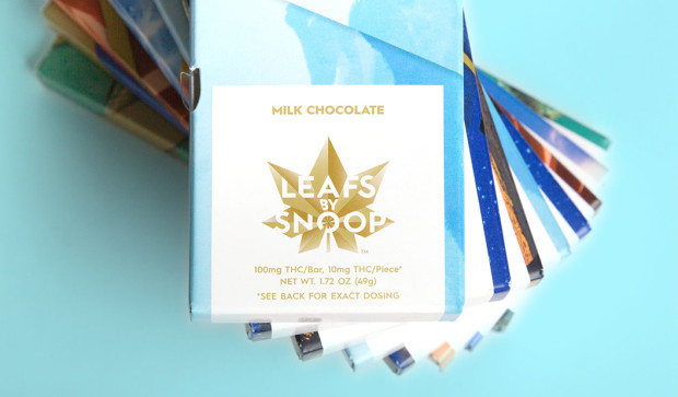
1. Snoop Dogg’s ‘Leafs by Snoop’, designed by Pentagram. We love this colourful and somehow sophisticated, California cool (to reflect Snoops roots) packaging that is promoting his cannabis range. Who are we to judge? It’s legal in Colorado! Everything from the beautifully designed logo to the colourways and use of interesting dies for the paper packaging makes the range a winner. We like the quotes below, written in Snoop’s own handwriting.

Top-4

Top-6

Top-7

Top-8

Top-9


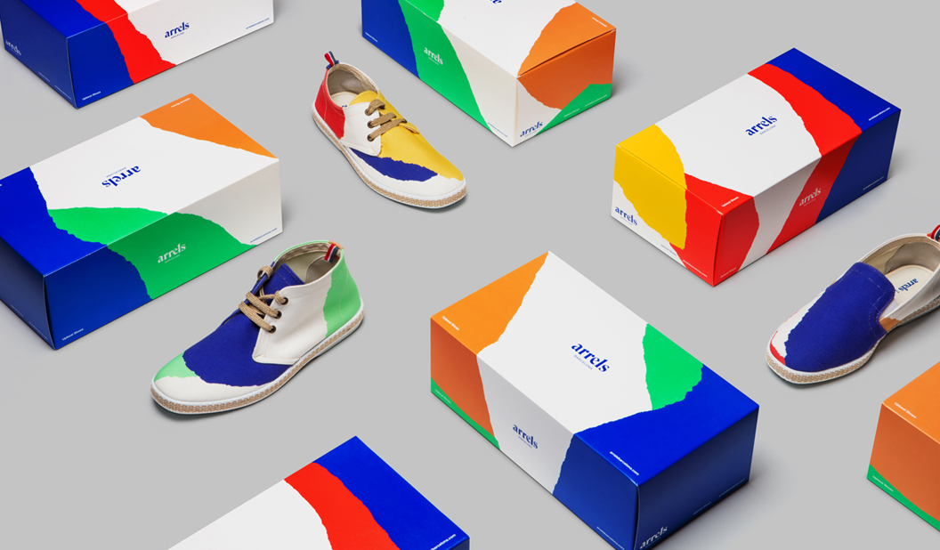
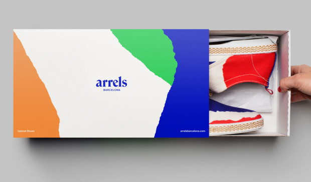
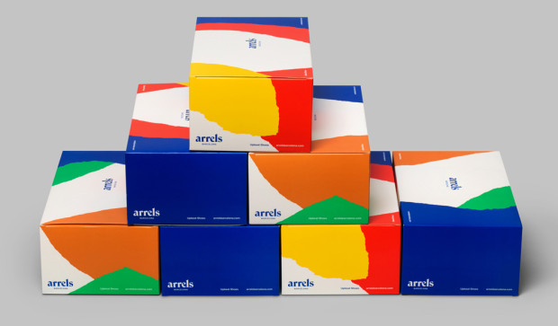
2. Hey Studio’s packaging for Arrels, Barcelona. 
Buy, buy, buy me now! If only the packaging could talk for sure this is what it would be saying. Colourful, bright graphics that perfectly complement the goods, mmmm m. The pattern created for the boxes extends into the printed brochure and is meant to represent the natural surface of the earth. Read the whole story here.

Top-10

Top-11

Top-12


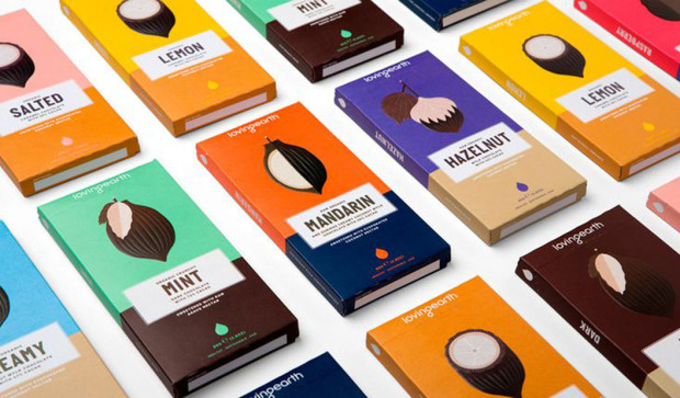
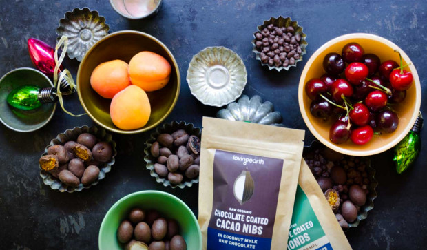
3. Loving Earth rebrand by Studio Round. 
We’ve got a bit of a soft spot for Loving Earth. The range speaks our language: Australian, chocolate, organic. This latest re-brand is beautiful. With the colourful identity system, illustrations and bold type, it’s a stand-out on the shelves. Read more about the project here.

Top-16

Top-15


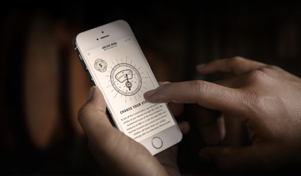
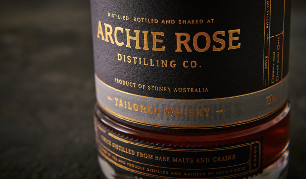
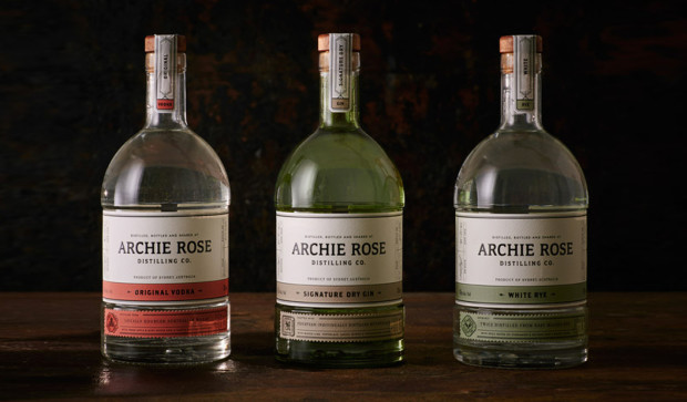
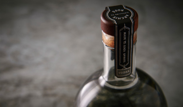
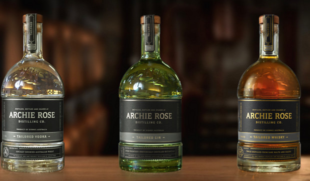
4. Archie Rose Distilling Co. branding by Squadink.
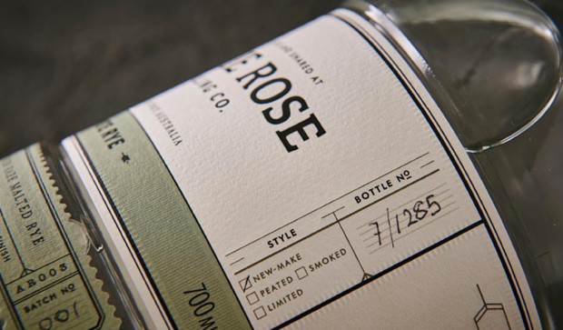
This is one of our overall fave projects from 2015 which includes the packaging design, bar and venue branding. There are now two rounds of packaging. The first round saw Original Vodka, Signature Dry Gin and White Rye designed with a creamy white textured label. The second round of spirits are the tailored Vodka, Gin and Whisky. This time on a black label with silver, gun mental and gold foils. And when we say tailored, we mean tailored. You can customise your own bottle from your phone and even get your name on it.

Top-17

Top-18

Top-20

Top-21

Top-22

Top-23


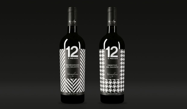
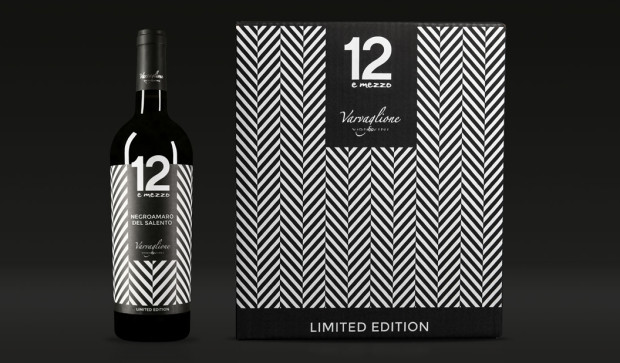
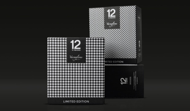
5. Limited edition collection of Varvaglione wines by Idem Design.
Inspired by the fashion world, these unique wine labels are dressed to impress. Created by Idem Design in Italy, the three textured patterns represent iconic brands in the fashion world, designed to be collected and admired. And of course to be enjoyed with a delicious Italian meal, preferably in Italy (let’s say Positano for the sake of it).

Top-1

Top-2

Top-3

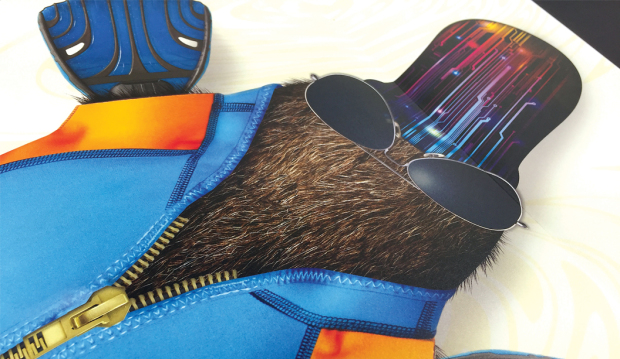
A surprise package for your ah-hum, package.

Agency: Knobby Men’s Underwear
Designer: Rob Rand
Stocks:
Buffalo Board 332gsm/610UMS
Printed by: Platypus Graphics Brisbane and Limehouse Press. All in QLD.
Printing specs: Offset printed.

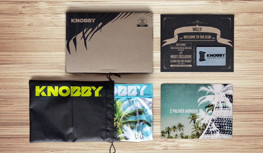
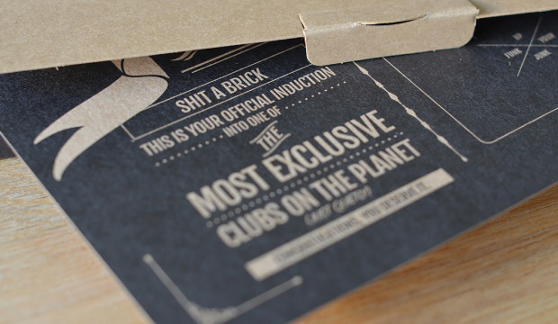
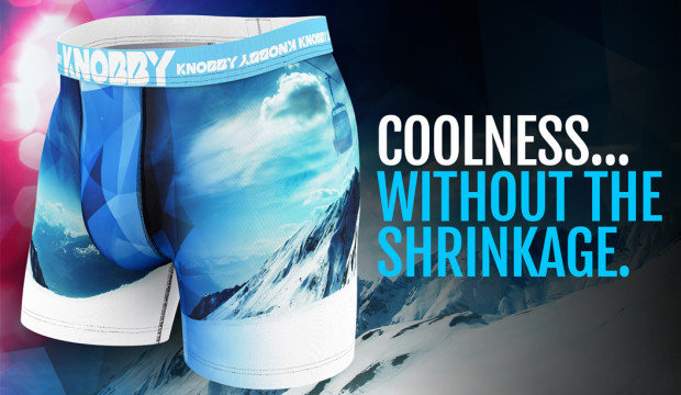
Knobby Men’s underwear you can only get by subscription. What a concept! Started by Rob Rand, a man who harboured a quiet hatred for poorly made, over priced undies that lacked imagination (plus he really didn’t like going to the shops). If you don’t like something, change it right? Fast forward to present day and the Knobby brand is growing in leaps and bounds with thousands of members worldwide.

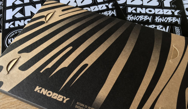
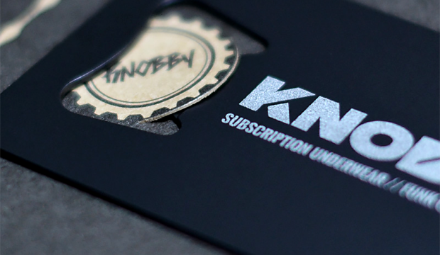
So what’s makes these undies so great? Well, the swanky packaging for one! Printed offset on Buffalo Board 332gsm/610UMS by Platypus Graphics (QLD), Buffalo Board is an ideal choice for packaging plus it’s extra strong, durable and made from natural kraft fibres that are fully recyclable. The new subscribers welcome card is printed on Buffalo Board too, by Limehouse Press. And most importantly, each pair of briefs is made to breathe, quick dry and stay put (no wedgies or riding up to see here). And they look pretty damn nice too.

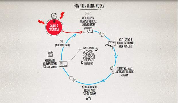
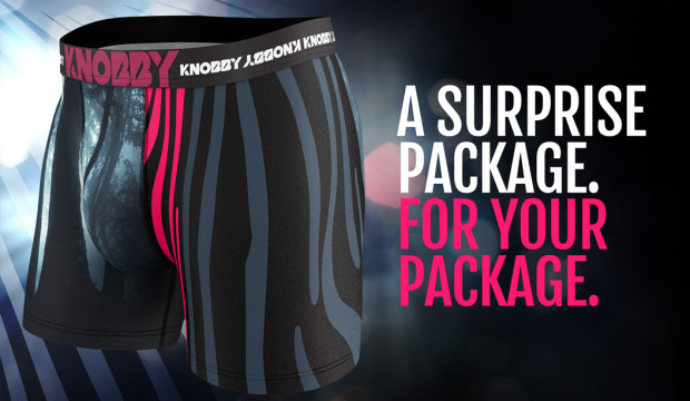
Keen to wear a Knobby? Firstly, become a member and each month for a small fee of $20 you’ll receive a new pair of limited edition undies direct to your door, no delivery fees, no hassle. You’ll never get the same print twice, so every time you open the box you get: ‘A surprise package. For your package’. Is that not the best tag line ever?!

Based in Queensland and shipping worldwide every day, Knobby men can be rest assured there’s no more shopping or running out of undies. Oh, and there’s a female line launching next year for the ladies. Bonus.

Knobby-2

Knobby-1

Knobby-7

Knobby-6

Knobby-4

Knobby-5

The Merchant Apartments brochure by Them Advertising

Title: The Merchant Apartments.
Agency: 
Them Advertising (SA). 
Stocks: 
Buffalo Board 283gsm (slip case), Sovereign Offset 250gsm cover and 160gsm text (brochure).
Printing specs: Offset, CMYK + PMS + Pantone Blue 072 U and Pantone 7579 U.
Printed by: Graphic Print Group (SA), binding by Chasdor (SA).

We’re featuring this brochure as part of #kwdpropertyweek this week. We were keen to find out a bit more about Them Advertising’s approach to the project so we spoke to Robert McHale from the agency.
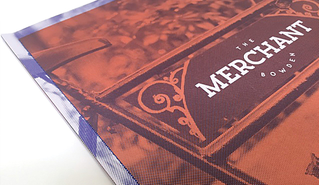
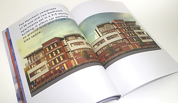
The project involved creating the brand identity for Emmett Property’s latest development in Bowden. The agency’s strong reputation in the field of property development marketing has gotten even stronger with the release of this piece. We dig it.

tmb11

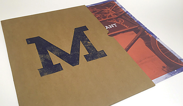
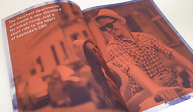
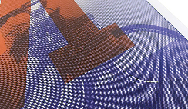
Short and sharp, the brochure is a real showstopper. After undertaking extensive background research, the print piece was designed to reflect the lives of the large number of merchants living in Bowden during the 1800s. Distinctive elements such as the unique, seamless sewn spine were incorporated to pay homage to Bowden’s rich culture. The paper was chosen to complement the history too. Robert explained: “Buffalo Board (the reverse side) was used for the sleeve as it gives a raw and earthy texture which ties in perfectly with Bowden’s history. Sovereign Offset was chosen for the text and cover as it’s an economical, top-of-the-range uncoated stock that provides rich colour and a smooth feel.”

tmb2

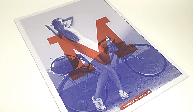
We also wondered, why add a print piece into the mix? In this digital age, does a printed piece really matter that much? Robert said: “Having a printed piece to complement the website added to the entire experience of buying a Merchant Apartment. The unique Buffalo Board sleeve allows prospective buyers to have a practical place to store floor plans and other information. It gives an indication of the quality, look and feel of The Merchant Apartments, helping to sell the overall lifestyle.” Seriously, what a killer idea. Giving the slip case a dual purpose is really clever. Every element of this piece is great: the hand stamped ‘M’ on the front, the use of a packaging grade and design/layout.

tmb9

We also hear that the printers, being as good as they are, helped the team a lot. It meant there were no challenges when it came to printing the piece. Happy client, happy designer, happy printer (should that be a t-shirt slogan?). And, the development almost entirely sold out within just six months of its release. Nice.

tmb7

tmb3

Doggett x Justus Magazine

Title: Justus Magazine issue 4: ‘Wrapped in you’
Designer: Lindsay Smith from Eleven Eleven Design
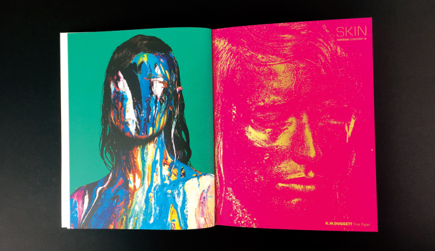
Stocks: Strathmore Premium Wove, Super Smooth and Cambric, Skin Curious Collection,Rives Design,Buffalo Kraft, HannoArt Satin, Curious Metallics,Impact,Wild,Buffalo Board
Printing specs: Predominantly offset printed with foil, UV, spot colours, die cuts, reflectakote plus digital section printed on a HP Indigo
Printed by: Platypus Graphics (QLD)

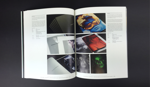
Justus issue 4 is about to hit the streets and we’re super excited to say it features a knockout selection of our finest fine papers. It’s like our paper dreams have come true.

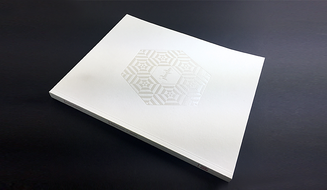
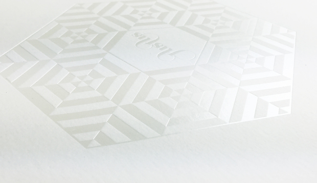
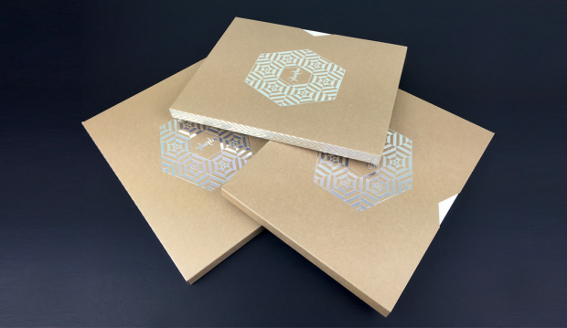
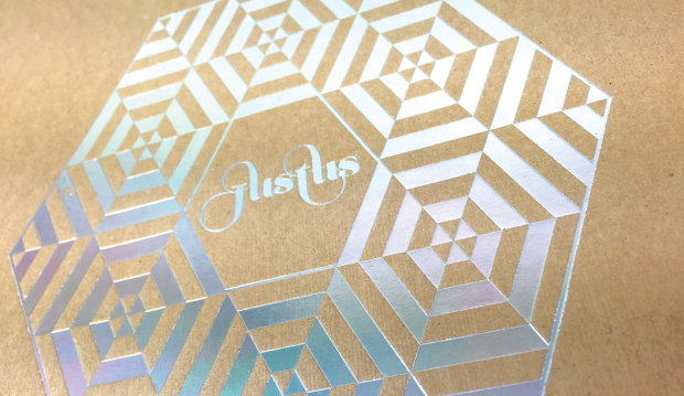
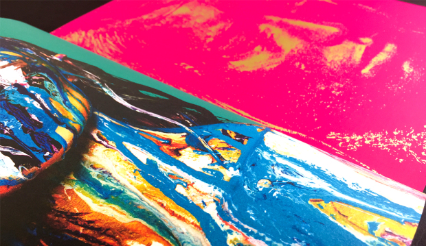
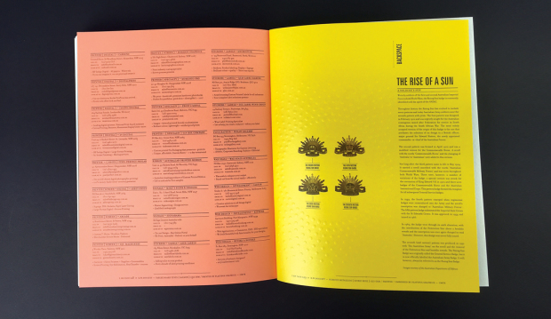
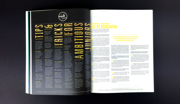
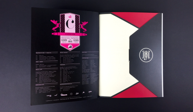
With unlimited access to print and embellishment techniques, the Justus story starts with a Tafeda embossed Buffalo Board slip case, followed by a pearl ‘snowflake’ like foil on Wild paper. Opening the first pages, it shows UV printing on Strathmore Super Smooth and then it rolls on from there. Spot colours, copper foils, a silver reflectakote, French folds, die cuts and more. There is definitely nothing minimalist about Justus issue 4. More is more.

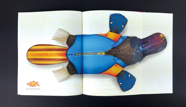
Designed and edited by Lindsay Smith of Eleven Eleven design, Justus Magazine is created to celebrate (and show off), the talent within the Australian print, paper and design industry. It is made by us, for us. Just us. Issue 4 ‘Wrapped in you’ has a central theme of packaging and is printed by Platypus Graphics. Based in Brisbane these guys run a slick operation and their skill as printers, foilers and finishers is clear to see. I addition, there’s also a special HP Indigo section which highlights what these new machines can do and how our paper responds to the new digital techniques.

Your K.W.Doggett Fine Paper specialist has a copy to show you in their next studio visit but if you can’t wait til then, log on to Justus and subscribe for yourself. We look forward to bringing this beauty to market soon.


Justus-1

Justus-3

Justus-4

Justus-13

Justus-12

Justus-5

Justus-10

Justus-14

Justus-6

Justus-9

Justus-7

Justus-8

Justus-11

Justus-15

Buffalo Board recipe cards promotion

Title: Buffalo Board recipe cards promotion
Agency: Recipe cards – Seesaw (VIC). Notepads – K.W.Doggett Fine Paper.
Stocks: Recipe cards – Buffalo BoardKaskad Kingfisher Blue and Kaskad Fantail Orange. Notepads – Buffalo Kraft, Buffalo BoardGrange Tints Old Gold and Tablex Tints Salmon.
Printing specs: Recipe cards – Offset and digitally printed. Notepads – Debossed.
Printed by: Recipe cards – Bambra (VIC). Notepads – E.H. Stationers (VIC).

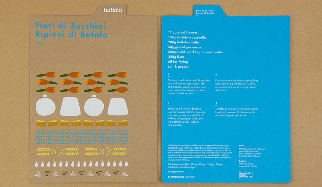
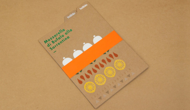
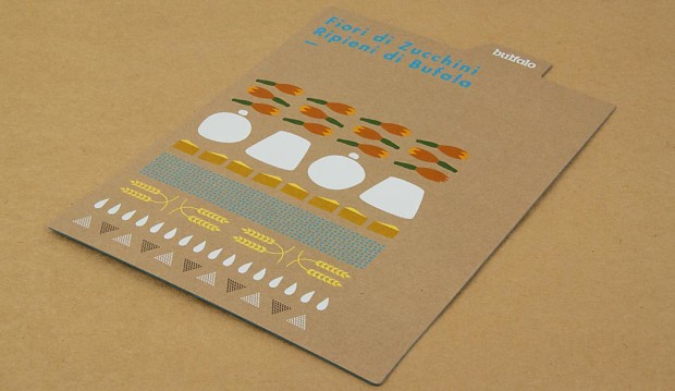
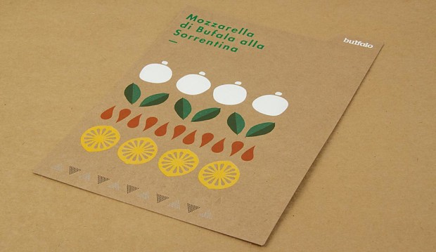
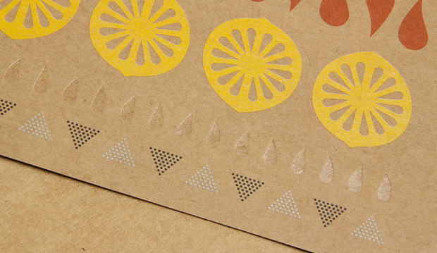
We have a fun, new and exciting Buffalo Board recipe cards promotion for you to feast your eyes on. The cards are a follow up to our previous promo in 2011. You may remember five recipe cards featuring mouth watering buffalo mozzarella dishes? Visit the post here. This latest set of colourful cards were designed by Seesaw and feature simple illustrative graphics that highlight the recipe’s ingredients. To showcase just how versatile Buffalo can be, Seesaw went to town with embellishments and we printed one card offset and the other digital. The recipes were kindly supplied by chef Maurizio Terzini, owner of popular Italian Restaurant Da’Orazio and the famous Icebergs Restaurant in Bondi.

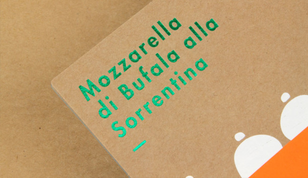
The offset card is printed CMYK on Buffalo Board 283gsm with three foils ie Clear, White and Milford Astor GFE123 Dark Green for some extra bling. The digital card was printed HP Indigo CMYK on Buffalo Board 283gsm plus Opaque White Ink and duplexed to Kaskad Kingfisher Blue 270gsm with Opaque White Ink (two hits) phew! To wrap them all up nice and neat we added a belly band in Kaskad Fantail Orange 100gsm.

BUFF3

Buffalo Board is a low density, high yield product. It’s an uncoated, moisture-resistant folding carton board that is cost effective, has a verifiably low bacteria content compared to many other paperboard products and outstanding strength and durability. Buffalo Board is also available in 386gsm/711ums and is also used for health, beauty, fashion and beverage applications. It’s made from natural kraft fibres that are responsibly sourced and fully recyclable and is carbon neutral (measured exit mill gate).

Printing tips
Buffalo Board is suitable for all kinds of jobs. Think offset, digital and letterpress printing as well as embellishments like foil and screen printing. The natural kraft paper looks great with some white ink (consider two-three hits for offset and two hits for digital). If you want your CMYK colours to really pop, apply a white ink base first then a layer of CMYK over the top. This provides a surface for which the colour can sit up on, resulting in a brighter finish. You might like to do a combination of both like we did for the recipe cards (colours with and without a white base) to achieve a variety of printed effects. It comes up a treat!
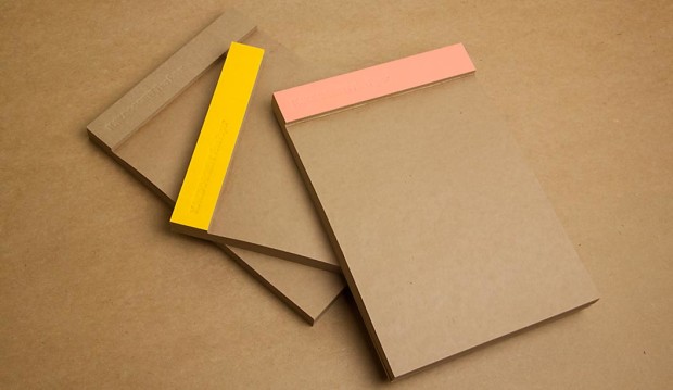
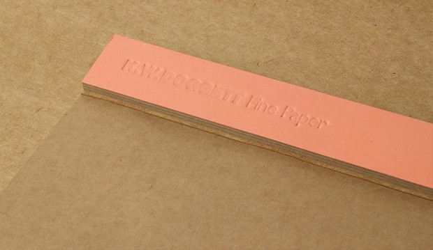
It’s no secret we have a thing for bling, but kraft could be a close second. So we’ve also produced a set of A5 notepads as a gift for our customers. They come with three different spine colours – natural ie Buffalo Board, as well as Grange Tints Old Gold 80gsm and Tablex Tints Salmon 150gsm. All have a subtle K.W.Doggett Fine Paper debossed logo on them. It’s also perforated along the spine for writing down quick and easy tear-away ideas.

BUFF1

If you have any specific packaging related questions, please call our John Alipan, Packaging Business Development Manager  (National) on 0434 692 446 or jalipan@kwdoggett.com.au and for all the Syndey-siders, contact Chris Churchward on 0488 440 131 or cchurchward@kwdoggett.com.au

Our paper specialists and account managers are coming around to see you soon with your own copy. Enjoy!

BUFF4

BUFF5

BUFF7

BUFF8


BUFF2