2016 Doggett Christmas Card

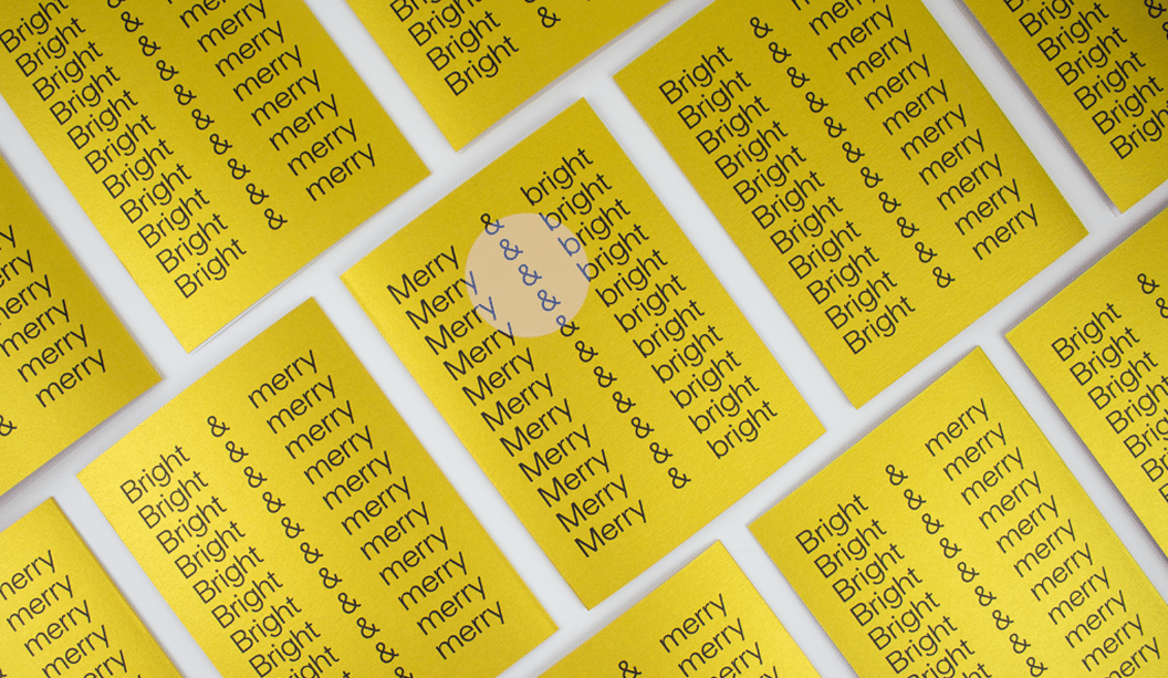
Designer: Studio Constantine (VIC).
Card Stock: Duplexed Curious Collection Metallics – Super Gold 250gsm and Virtual Pearl 120gsm.
Envelope Stock: Curious Collection Matter – Desiree Red 135gsm*.
Printed by:Blue Print (VIC).
Duplexed by: Cartonlux (VIC).
Envelopes by: Direct Envelopes (VIC).
Finished by:Blue Print (VIC). Scored, trimmed and folded.

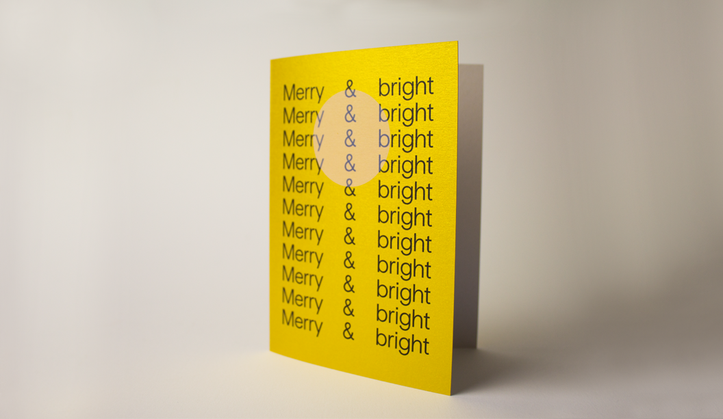
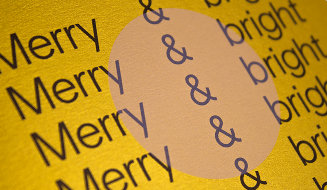
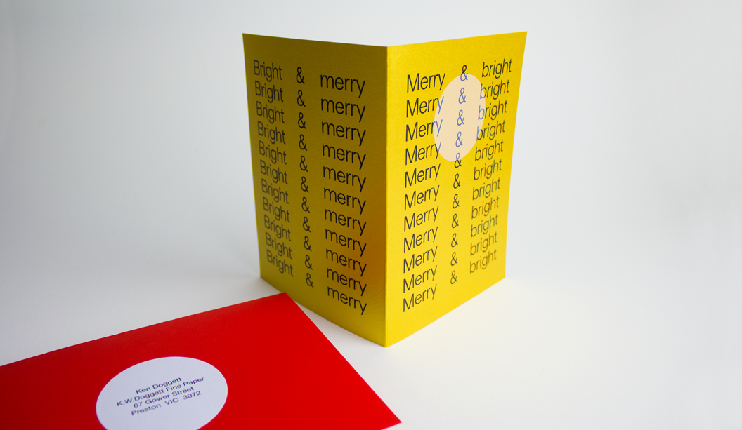
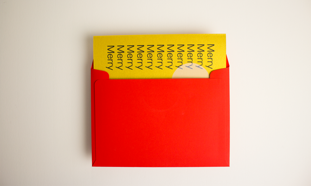
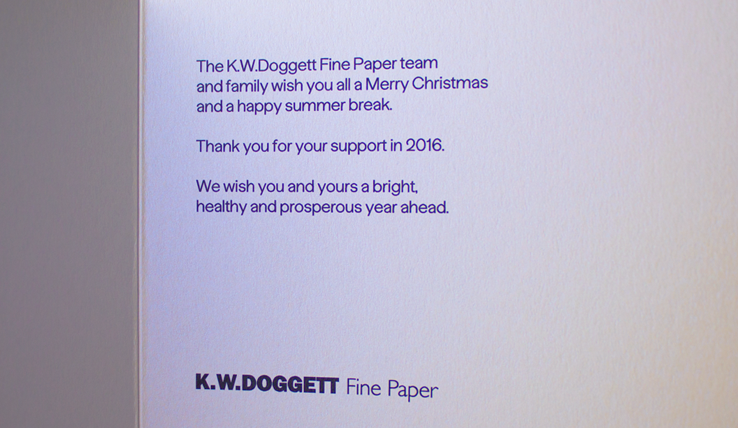
Our 2016 Christmas card is so bright that we reckon it could probably give you a sunnies tan line. Which is why we love it.

We asked David of Studio Constantine to get creative so the card would bring merriment to our rather broad client base (graphic designers to corporates). When looking for inspiration, we like to imagine that after a few eggnogs staring up at the overcast summer sky, David had a lightbulb moment. He would create a card featuring the bright Aussie sun we’ve all been waiting for.

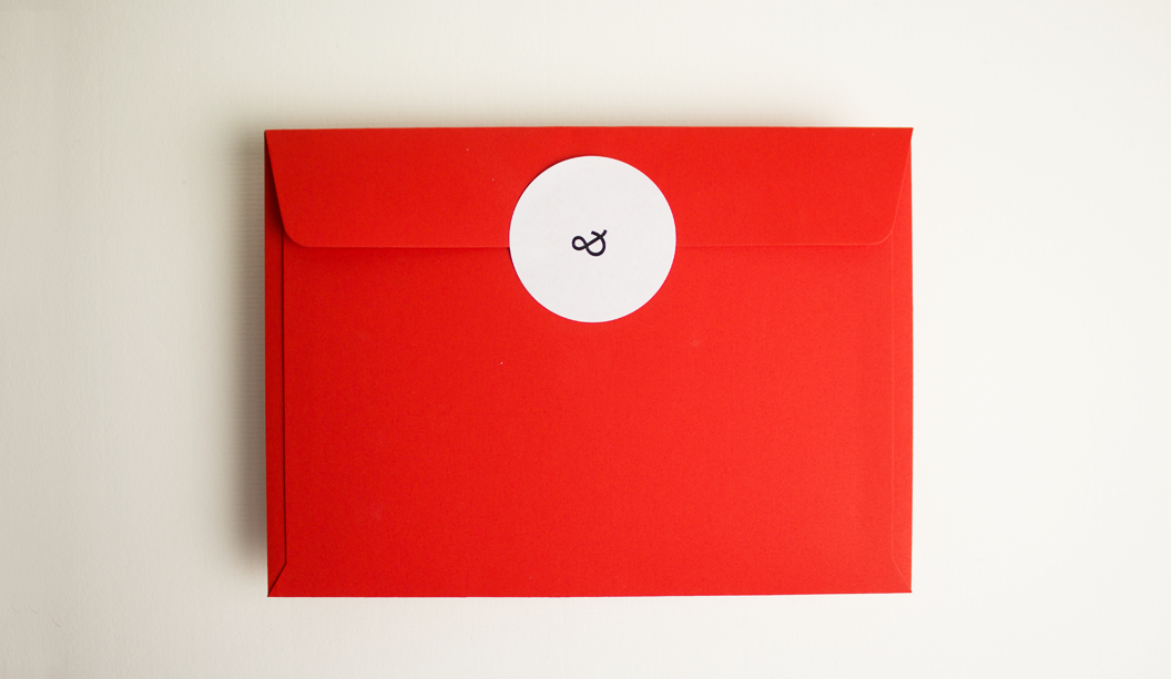
What we have is a duplexed card on Curious Collection Metallics – Super Gold 250gsm and Virtual Pearl 120gsm. It was printed HP Indigo black with white ink overprint (2 hits @ 50%) on the front ala the setting sun. We also had envelopes custom made in Curious Collection Matter – Desiree Red 135gsm* and printed Doggett Labels circular (C45 & C60) stickers in-house for postage and closure labels.

The combo of the red and the gold is very Christmas and a little bit Chinese New Year too. All in all – party time.

*Grammage not stocked by KWD – available on request from Arjowiggins.


2016-christmas-card-standing

2016-christmas-card-closeup

2016-christmas-card-and-envelope

2016-christmas-card-envelope-shadow

2016-christmas-card-envelope-back

2016-christmas-card-inside-envelope

2016-christmas-card-inside


Doggett’s has some new dog tags

Our new look business cards have arrived and look smashing, bringing us from the 90’s to the noughties, oh yeah!! There has been a suite of four cards designed by David Lancashire Design (VIC), the same peeps that designed the Doggett branding many years ago. We used a variety of stocks and printing processes as part of the overall rebrand. B'card_2 Here is a description of the four cards: 1. Purple geometric dog – printed 1 PMS 266 (Doggett purple) and black on Strathmore Premium Super Smooth Ultimate White 432gsm. 2. Origami dog – printed matt white pigment foil stamp on Hercules Greyback 450gsm. 3. Silhouette dog – printed gun metal grey foil + matt black foil stamp on Conqueror Laid Concrete 300gsm duplexed to Conqueror CX22 Diamond White 320gsm. 4. Tangram dog – printed 4 colour process (high gamut*) plus 1 PMS on Knight Smooth White 200gsm and triplexed to Kaskad Fantail Orange 270gsm. Print specs: • All the shells were printed at Southern Colour (VIC). • Foiling was done at Lorimier (VIC). • All overprints done at Taylor’d Press (VIC). • Cards designed by David Lancashire Design (VIC). *Southern Colour have an offset process called high gamut that makes certain colours like blue, orange, green really pop. It’s a special process where two or three inks are added in addition to CMYK, to extend the colour gamut and enable the press to print a wider range of colours. This in turn makes images look more vibrant, or ‘pop’ with colour. Ask your local paper specialist or account manager to show you the cards if you’re keen to have a look at the re-design. Enjoy! Stocks: Conqueror CX22 / Conqueror Laid / Hercules Greyback / Kaskad / Knight – Smooth / Strathmore Premium Super Smooth. B'card_3 B'card_4 B'card_5

Owen & Peach stationery

Title: Owen & Peach stationery suite
Agency: Bird Design (Melbourne)
Client: Owen & Peach
Stocks: Knight – Smooth
Printed by: Taylor’d Press (Melbourne)

Newly formed graphic design studio – Bird Design in Melbourne, created a bold, confident new look for Owen & Peach (chartered accountants) and TVA Partners after they merged in late 2011. Corporate stationery is often pretty uniform – you’ve got your corporate colours and a brandmark. And then, when a company throws in a blind emboss or two, you get a corporate stationery suite with a dash of something special. We love a little embellishment – of the print variety that is!

Peach-4

And who can overlook a strong brandmark? Something that is as memorable as it is simple. Bird Design created an upward blue tick/arrow for the Owen & Peach branding to emphasise growth and positive movement. Combined with the use of bright blue and black, it gives the stationery a much more contemporary feel. Knight Smooth White was chosen as the stock for the entire suite to complement this direction. The suite includes notepads (105gsm), letterhead (105gsm), with comps (105gsm) and business cards (350gsm) printed 2 colour with an embossed brandmark on the business cards, letterhead and with comps.

Bird Design shared some of their thoughts about the print finish on the Knight Smooth White: “The stock held the ink/colour beautifully. A nice flat coverage with the natural fibre of the paper was still visible. An initial concern was how the fine blue lines on the business card would look on the press but the colour held very well and the contrast of the black, blue and the whiteness of the stock is very punchy. The stock held the emboss well too.” We think the business card is particularly impressive with the discreet yet stylish pattern. Who said blue and black should never be seen. We love it!

The Bird Design recipe for success included a thorough understanding of the brief and also the history of both companies which they started to unravel out in the initial meeting. This helped drive and direct choices later in the process including the selection of paper which needed to be bold and contemporary and include suitable stock weights throughout the range. What can be better than a happy client at the end of the day? Bird Design delivered a suite that was on brief and successfully delivered the intention to create a confident and bold stationery suite.

Photographs provided by Albert Comper.

Peach-1

Peach-3

Peach-5