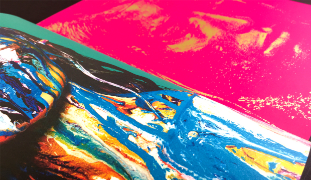
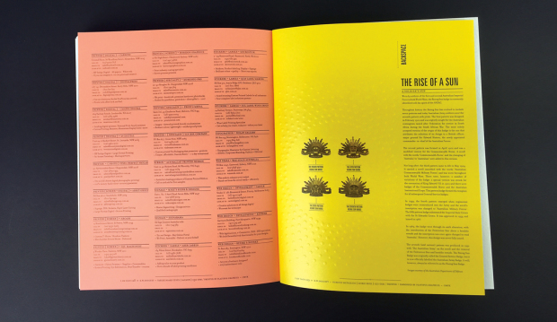
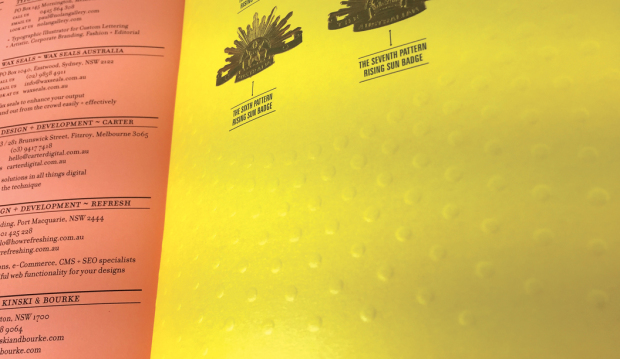
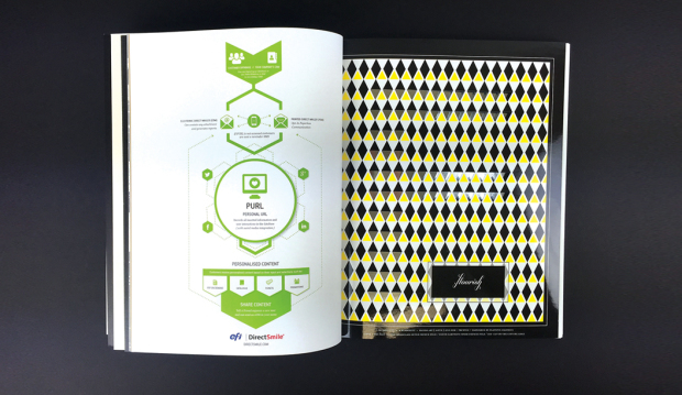
Every paper stock has different inherent qualities based on the composition of the fibres in the pulp and how the paper is manufactured. Some papers are better suited to certain types of embellishment than others. We strongly recommend discussing what you want to achieve, along with your choice of paper, with your commercial print supplier before making a decision. Choosing the wrong stock for embellishment can be a disaster!
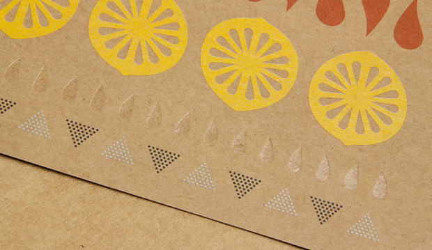
Diecut
The Sub Divide, a collective of beautiful print
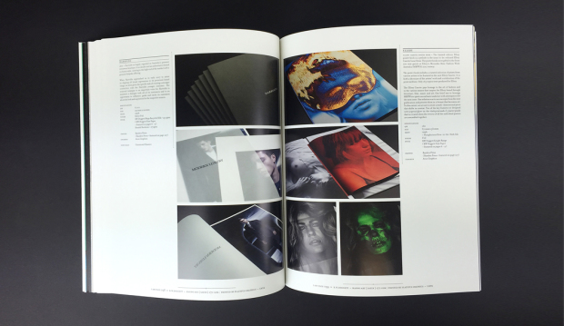
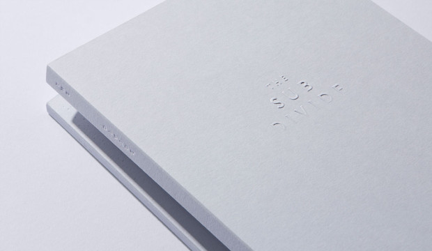
In 2016, we got to be a part of something pretty spesh when it comes to the world of paper and print. The culmination was the limited edition book The Sub Divide. It’s part print, part art and a whole lot of beauty. A curated resource celebrating a selection of 30 highly regarded photographers – recommended by and for, the creative industry. The publication has been developed by a collective of specialists dedicated to their craft.
(Most of the content from this blog post first appeared in Issue 11 of GSM Magazine).
The Sub Divide is an exquisite printed resource developed through the pillars of inspiration, experimentation, collaboration and celebration. It also celebrates craftsmanship. With a unique collaborative approach to production, this resource came to life through the dedication and expertise of some very committed individuals. The project started with a simple conversation between John Wanless Director at Bambra Press and one of staff after they saw printed test sheets of photographic material lying on Bambra’s press room floor. Grosz Co. Lab’s Creative Directors, Ben Grosz and Laura Camilleri then became involved by developing the concept and curating the collection of photographic works which the book showcases. Their efforts were none other than extraordinary!
The collective behind this project comprised includes:
> Bambra Press for Initial concept and delivering exceptional print.
> Grosz Co. Lab for the development and curation of the publication through intelligent, articulated design.
> Huber Inks for the supply of the Pacifica Inks and also specialist guidance on technical advice during the process, supplied by Ball & Doggett.
> The Bindery for the development and production of the unique featured binding techniques.
> Avon Graphics for the production and expertise in embellishments and foiling.
> Foldercorp for the production of the sleeve.
> Cartonlux for laminating the stock for the sleeve.
> Nordale Graphics/Wibelin for the binding techniques.
And yours truly for the supply of paper (visit our existing websites until the Ball & Doggett one is live).
The technical challenges
Such a complex print project presents many technical challenges. A key driver to the success of the publication was the extensive research and development phase. This included a series of mock-ups created by our Designline team in VIC that enabled dialogue with everyone involved. Creating a mock-up although it doesn’t have any print is a key step in any major print project and can save a lot of time and ensure the end product is exactly what you want.
One of the specific technical challenges presented, was the unique bind which creates both an interesting aesthetic experience and is also unusual in placing the index containing the details of the featured photographers in the middle of the book. The bind solution was developed by Ian Leckie, operations manager at The Bindery.
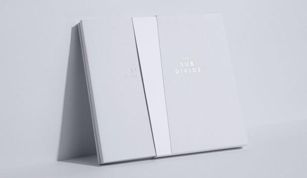
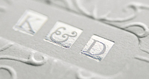
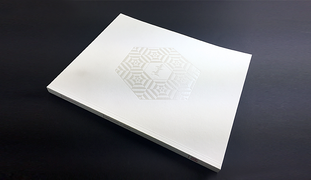
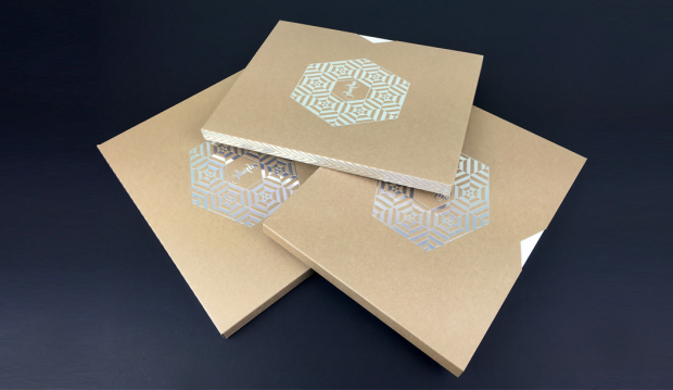
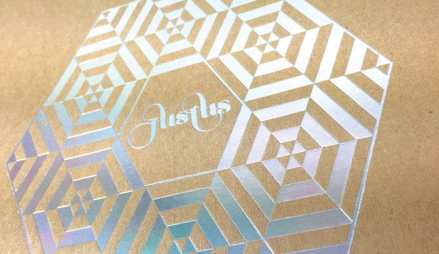
The slipcase (1) uses Colorplan Cool Grey 270gsm stock which has been custom diecut, folded and hand-glued, then duplex laminated to Colorplan Pristine White 270gsm. The embellishment across the slipcase features foiling by Avon Graphics with an API Foil (2004 / CL Clear Rainbow).
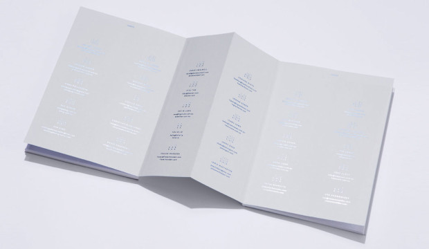
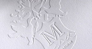
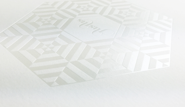
The bind design (2 + 3) uses a unique concertina fold to connect the two sections of the book together. The cover uses 350gsm Colorplan Cool Grey stock, on which a range of tactile embellishments have been employed including a multi-level emboss using a hand-carved sculpted die on the front cover (3), and on the back cover (4) a blind press using a foil stamping die without the counter die.
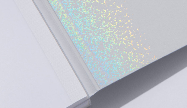
The inside front and back cover (5 & 6) use an API Foil (2004 / CL Clear Rainbow), and the spines and concertina fold (7) employ a blind deboss and foil. The index (8) is cleverly positioned at the centre of the book to make maximum use of the extra real-estate allowed by the open concertina fold, and was foiled using a blue metallic foil.
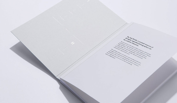
> The internal text pages of The Sub Divide were printed by the team at Bambra Press in CMYK, using Pacifica Inks throughout, on a Heidelberg XL75 12P
+ Aqueous Coater using Fuji Film CTP Processless Plates. Various screen rulings (specifically developed by Bambra Press) were selected to ensure the best possible result across each section of the book.
After 15 months of development from concept to production, The Sub Divide was officially launched in October 2016. A testament to the quality of the finished product, Grosz Co. Lab were recipients of a gold medal in the Print/Design Category at the recent 34th Annual National Print Awards.
For a more information on the production methods used in the project visit www.thesubdivide.bjball.com.au
Please direct any queries about The Sub Divide to Zaidee Jackson, Business Development Manager via zaidee.jackson@ballanddoggett.com.au
The Sub Divide featured photographers
The Sub Divide features the work of 30 highly regarded Australian photographers. Published together for the first time, the photographers responded to catergorisations divided into two groupings. The first, a commercial response to ‘people’, ‘place’ and ‘pieces’. And the second category was a response to ‘passion’, exploring the photographer’s personal connection, depicted through their lens.
> Amanda Austin //amandaaustin.net
> Andrew Curtis //andrewcurtis.com.au
> Anna Pogossova //annapogossova.com
> Ben Glezer //beng.com.au
> Ben King //benkingphotographer.com
> Bonnie Savage //bonniesavage.com
> Brooke Holm //brookeholm.com.au
> Cecille David //cecilledavid.com
> Christian Blanchard //christianblanchard.com
> David Rosendale //davidrosendale.com
> Derek Swalwell //derekswalwell.com
> Dieu Tan //dieutan.com
> Eve Wilson //vevewilson.com.au
> Foliolio //foliol.io
> Fraser Marsden //frasermarsden.com
> Heather Dinas //heatherdinas.com
> Ingvar Kenne //ingvarkenne.com
> Isamu Sawa //isamusawa.com.au
> James Geer //jamesgeer.com
> Jamie Macfadyen //jamiemacfadyen.com
> Jeremy Blincoe //jeremyblincoe.com
> Justin Ridler //justinridler.net
> Lynton Crabb //crabb.com.au
> Mark Lobo //marklobo.com.au
> Peter Bennetts //peterbennetts.com
> Peter Greig //petergreig.com
> Shannon Mcgrath //shannonmcgrath.com
> Tim Jones //timjones.co
> Toby Scott //tobyscott.com.au
> Zoe Economides //zoeeconomides.com
This article was originally published in GSM Magazine, created by BJ Ball New Zealand.
Latest Rives promo ‘snail mail’, by Ortolan
Title: Sail mail
Agency: Ortolan (VIC)
Stocks: Rives Design Bright White 120gsm, Rives Tradition Bright White 120gsm, Rives Tradition Digital Bright White 250gsm, Rives Design Bright White 350gsm, Rives Tradition Pale Cream 320gsm, Rives Design Natural White 350gsm, Curious Translucents 92gsm and JAC Brilliant Gloss White.
Printing specs: Offset and Digitally printed.
Printed by: Mercedes Waratah (offset), Press Print (digital) and JBS Printers (stickers). All in VIC.
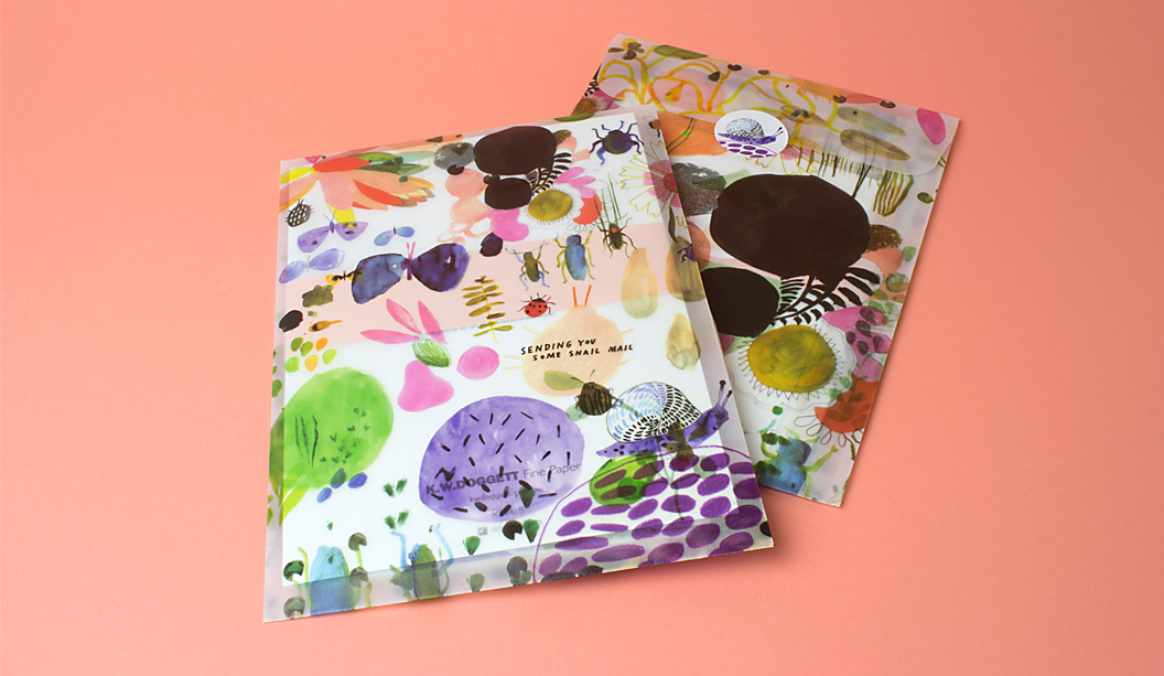
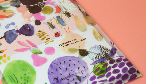
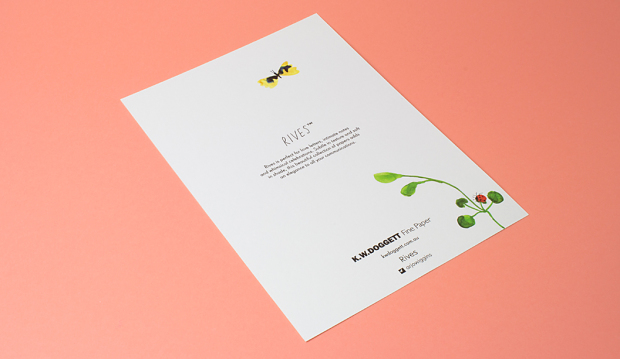
‘Snail Mail’, celebrates the idea of love letters, intimate notes and whimsical celebrations. It’s no surprise we are lovers of paper in all varieties so it’s been a real treat to work on this promo that showcases the Rives range. It’s sure to inspire the inner romantic in you all, it certainly has with us!
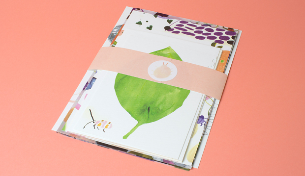
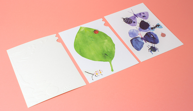
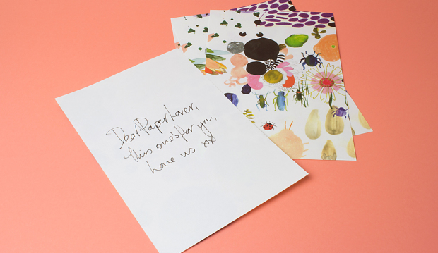
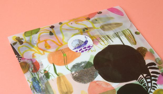
Created by the super talented team at Ortolan, in particular Kat Macleod and Holly Canham, the Rives stationery set showcases the versatility of the range. There’s a mix of Design and Tradition, printed both offset and digital, with wrapping paper and A5 envelope printed on Curious Translucents for something a little different. We couldn’t go past adding some stickers to the set, printed on JAC Brilliant Gloss White.
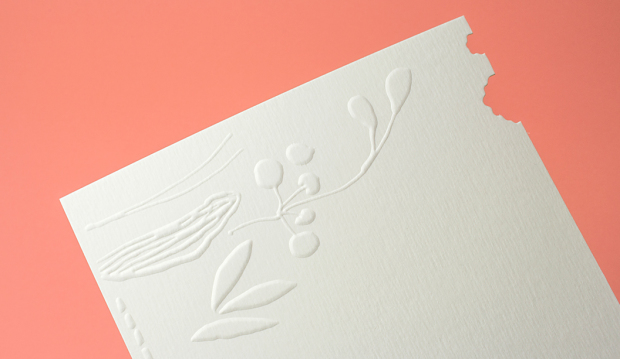
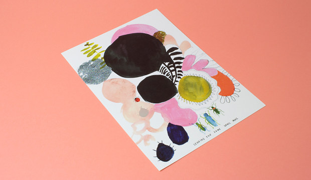
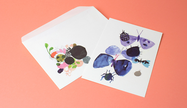
This beautiful piece features delicate hand painted scenes of flora and fauna dotted with silver foils, a blind emboss and little die cut bite marks that ties each of the applications together in a delightful combination. We can even imagine seeing this illustration printed as bespoke wallpaper or as a textile pattern for Gorman’s new spring range.
Rives’ premium surface is engineered for beautiful colour reproduction and because we were working with watercolour and illustration, without the complexities of skin colours and hi-end photography, the print experience was a dream. Rives is ideal for all kinds of contemporary communications including stationery, annual reports, cards, direct mail, envelopes, menus, packaging, swing tags plus much more.
Printing specs:
-
Transparent envelope: Curious Translucents 92gsm, printed CMYK offset by Mercedes Waratah.
-
Belly band: Rives Design Bright White 120gsm, printed offset PMS489 (peach) by Mercedes Waratah.
-
Wrapping paper: Curious Translucents 92gsm, printed CMYK offset by Mercedes Waratah.
-
Writing paper: Rives Tradition Bright White 120gsm, printed CMYK offset by Mercedes Waratah.
-
A5 tech spec card: Rives Tradition Digital Bright White 250gsm, printed CMYK plus silver foil on a HP Indigo by Press Print.
-
Stickers: JAC Brilliant Gloss White, printed offset by JBS Printers.
-
A6 cards:
– Card 1 (leaf): Rives Design Bright White 350gsm, printed CMYK offset plus diecut by Mercedes Waratah.
– Card 2 (blind emboss): Rives Tradition Pale Cream 320gsm, blind emboss plus diecut by Mercedes Waratah.
– Card 3 (butterfly): Rives Design Natural White 350gsm, printed CMYK offset plus silver foil by Mercedes Waratah. -
C6 envelopes:
– Envelope 1: Rives Design Natural White 350gsm, printed CMYK offset by Mercedes Waratah.
– Envelope 2: Rives Design Bright White 350gsm, printed CMYK offset by Mercedes Waratah.
– Envelope 3: Rives Tradition Pale Cream 320gsm, printed CMYK offset by Mercedes Waratah.
A bit about Rives:
The Rives range made by Arjowiggins is all about the tactile experience of paper with textures inspired by the craftsman’s hand. The Tradition surface has a subtle and modern, refined felt-like finish. The Design features a fine mesh texture. This timeless and elegant range is also available in Design Digital and Tradition Digital – both Indigo compatible sheets in 120gsm. Rives Design and Tradition are available in 120-350gsm.
We suspect you’ll be itching to get your hands on these beauties but rest assured your friendly paper specialist will be by soon with a copy especially for you. Remember, you can always visit this part of our website for more information about this range or explore our new ‘Colour wall‘ to see the real deal. Enjoy!
Doggett x Justus Magazine
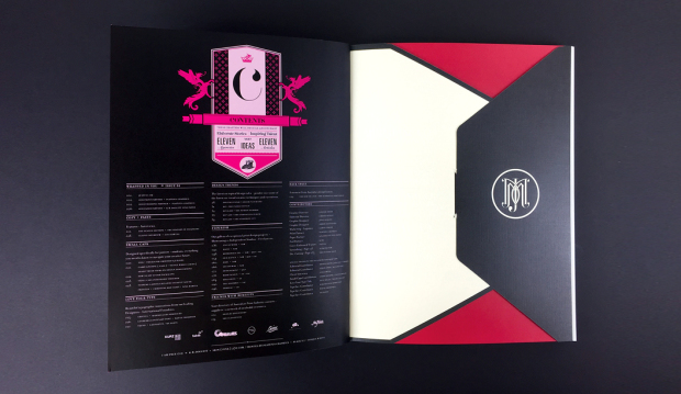
Title: Justus Magazine issue 4: ‘Wrapped in you’
Designer: Lindsay Smith from Eleven Eleven Design
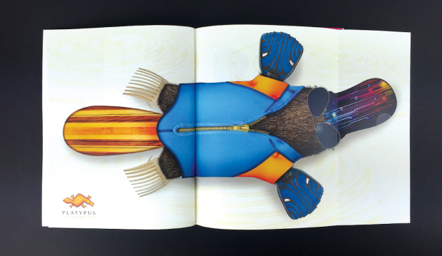
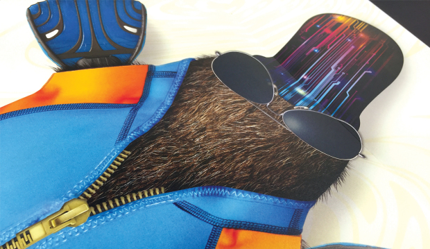
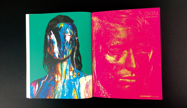
Stocks: Strathmore Premium Wove, Super Smooth and Cambric, Skin Curious Collection,Rives Design,Buffalo Kraft, HannoArt Satin, Curious Metallics,Impact,Wild,Buffalo Board
Printing specs: Predominantly offset printed with foil, UV, spot colours, die cuts, reflectakote plus digital section printed on a HP Indigo
Printed by: Platypus Graphics (QLD)
Justus issue 4 is about to hit the streets and we’re super excited to say it features a knockout selection of our finest fine papers. It’s like our paper dreams have come true.
With unlimited access to print and embellishment techniques, the Justus story starts with a Tafeda embossed Buffalo Board slip case, followed by a pearl ‘snowflake’ like foil on Wild paper. Opening the first pages, it shows UV printing on Strathmore Super Smooth and then it rolls on from there. Spot colours, copper foils, a silver reflectakote, French folds, die cuts and more. There is definitely nothing minimalist about Justus issue 4. More is more.
Designed and edited by Lindsay Smith of Eleven Eleven design, Justus Magazine is created to celebrate (and show off), the talent within the Australian print, paper and design industry. It is made by us, for us. Just us. Issue 4 ‘Wrapped in you’ has a central theme of packaging and is printed by Platypus Graphics. Based in Brisbane these guys run a slick operation and their skill as printers, foilers and finishers is clear to see. I addition, there’s also a special HP Indigo section which highlights what these new machines can do and how our paper responds to the new digital techniques.
Your K.W.Doggett Fine Paper specialist has a copy to show you in their next studio visit but if you can’t wait til then, log on to Justus and subscribe for yourself. We look forward to bringing this beauty to market soon.
Christmas matters
Title: K.W.Doggett Fine Paper 2015 Christmas cards
Agency: Hofstede Design (VIC)
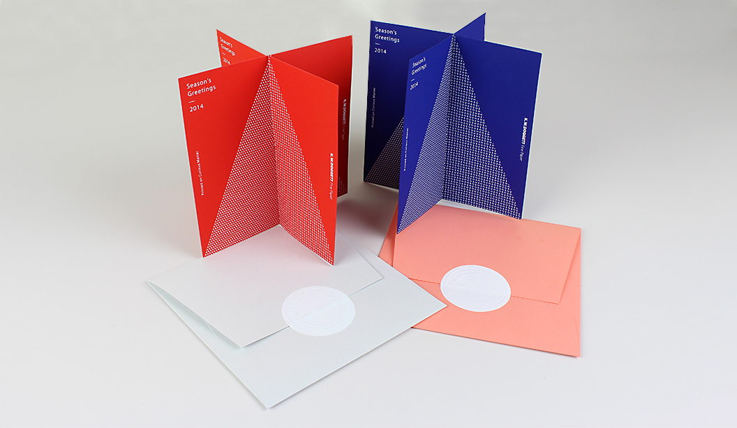
Stocks: Curious Matter Desiree Red 380gsm and Adiron Blue 270gsm (cards). Tablex Salmon and Kaskad Sparrow Grey (envelopes).
Printed by: Apex Gold Stamping (cards and address labels), Northern Tag Stringers (envelopes). Both in VIC.
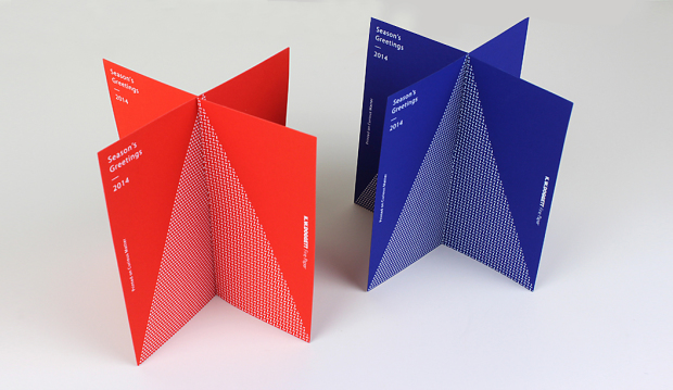
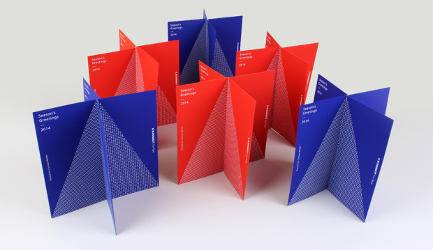
Our super cheery Christmas cards are printed on new specialty range Curious Matter. Hofstede Design have done a great job of creating a striking yet intentionally simple graphic, making the paper the star of the show. Each card is made-up of two pieces that interlock to make a four sided tree design. All we need now are teeny tiny presents to sit under the tree!
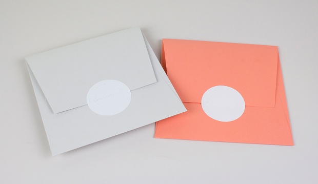
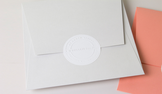
For something extra special, we created envelopes printed on Tablex Salmon and Kaskad Sparrow Grey plus some embossed return address labels to seal the deal.
Curious Matter
The Curious Matter range made by Arjowiggins Creative Papers, is all about the tactile experience of the paper. It’s sand-like yet silky feel (because of the potato starch it’s coated with) is sure to have you addicted. Did we mention it has a colour palette that really pops?! Available in 125, 135, 270 and 380gsm, it will fill your dreams with ideas about your next paper creation.
Printing specs:
- Card 1 – printed white foil stamp on Curious Matter Desiree Red 380gsm.
- Card 2 – printed white foil stamp on Curious Matter Adiron Blue 270gsm.
- Envelope 1 – custom made, on Kaskad Sparrow Grey 160gsm.
- Envelope 2 – custom made, on Tablex Salmon 150gsm.
- Address labels – custom made on Doggett label white gloss.
Phew! Merry Christmas everyone and stay tuned for more updates on the official launch of Curious Matter in the New Year. Enjoy!
Buffalo Board recipe cards promotion
Title: Buffalo Board recipe cards promotion
Agency: Recipe cards – Seesaw (VIC). Notepads – K.W.Doggett Fine Paper.
Stocks: Recipe cards – Buffalo Board, Kaskad Kingfisher Blue and Kaskad Fantail Orange. Notepads – Buffalo Kraft, Buffalo Board, Grange Tints Old Gold and Tablex Tints Salmon.
Printing specs: Recipe cards – Offset and digitally printed. Notepads – Debossed.
Printed by: Recipe cards – Bambra (VIC). Notepads – E.H. Stationers (VIC).
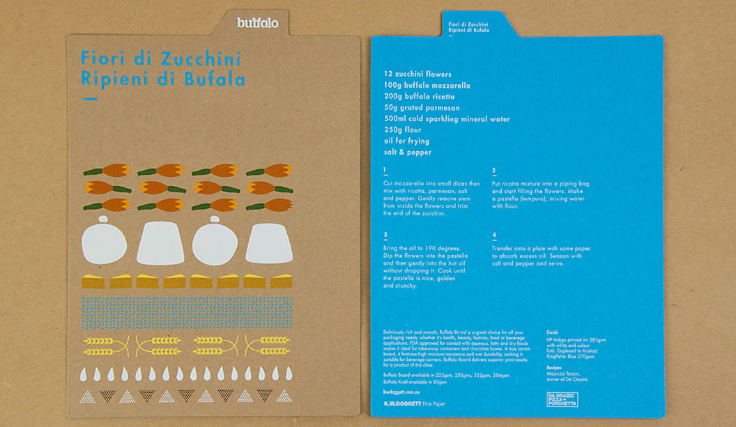
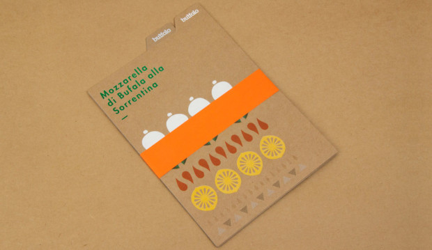
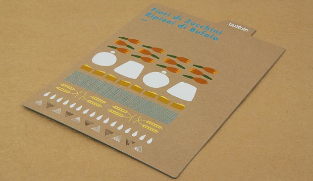
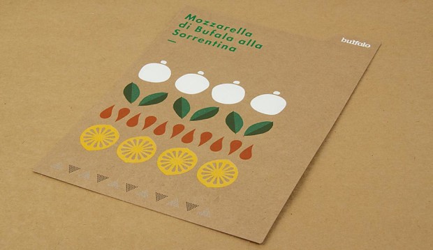
We have a fun, new and exciting Buffalo Board recipe cards promotion for you to feast your eyes on. The cards are a follow up to our previous promo in 2011. You may remember five recipe cards featuring mouth watering buffalo mozzarella dishes? Visit the post here. This latest set of colourful cards were designed by Seesaw and feature simple illustrative graphics that highlight the recipe’s ingredients. To showcase just how versatile Buffalo can be, Seesaw went to town with embellishments and we printed one card offset and the other digital. The recipes were kindly supplied by chef Maurizio Terzini, owner of popular Italian Restaurant Da’Orazio and the famous Icebergs Restaurant in Bondi.
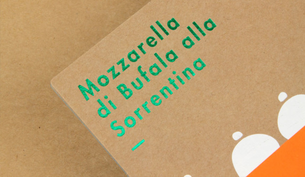
The offset card is printed CMYK on Buffalo Board 283gsm with three foils ie Clear, White and Milford Astor GFE123 Dark Green for some extra bling. The digital card was printed HP Indigo CMYK on Buffalo Board 283gsm plus Opaque White Ink and duplexed to Kaskad Kingfisher Blue 270gsm with Opaque White Ink (two hits) phew! To wrap them all up nice and neat we added a belly band in Kaskad Fantail Orange 100gsm.
Buffalo Board is a low density, high yield product. It’s an uncoated, moisture-resistant folding carton board that is cost effective, has a verifiably low bacteria content compared to many other paperboard products and outstanding strength and durability. Buffalo Board is also available in 386gsm/711ums and is also used for health, beauty, fashion and beverage applications. It’s made from natural kraft fibres that are responsibly sourced and fully recyclable and is carbon neutral (measured exit mill gate).
Printing tips
Buffalo Board is suitable for all kinds of jobs. Think offset, digital and letterpress printing as well as embellishments like foil and screen printing. The natural kraft paper looks great with some white ink (consider two-three hits for offset and two hits for digital). If you want your CMYK colours to really pop, apply a white ink base first then a layer of CMYK over the top. This provides a surface for which the colour can sit up on, resulting in a brighter finish. You might like to do a combination of both like we did for the recipe cards (colours with and without a white base) to achieve a variety of printed effects. It comes up a treat!
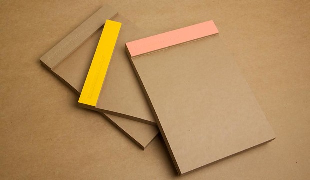
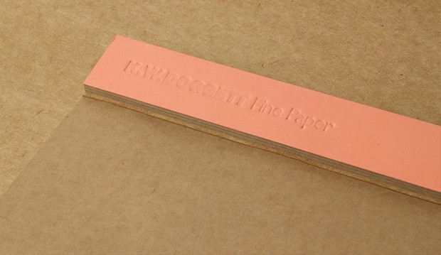
It’s no secret we have a thing for bling, but kraft could be a close second. So we’ve also produced a set of A5 notepads as a gift for our customers. They come with three different spine colours – natural ie Buffalo Board, as well as Grange Tints Old Gold 80gsm and Tablex Tints Salmon 150gsm. All have a subtle K.W.Doggett Fine Paper debossed logo on them. It’s also perforated along the spine for writing down quick and easy tear-away ideas.
If you have any specific packaging related questions, please call our John Alipan, Packaging Business Development Manager (National) on 0434 692 446 or jalipan@kwdoggett.com.au and for all the Syndey-siders, contact Chris Churchward on 0488 440 131 or cchurchward@kwdoggett.com.au
Our paper specialists and account managers are coming around to see you soon with your own copy. Enjoy!
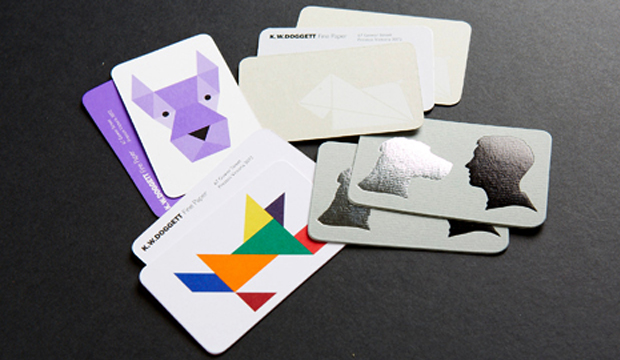
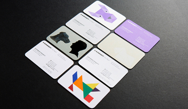
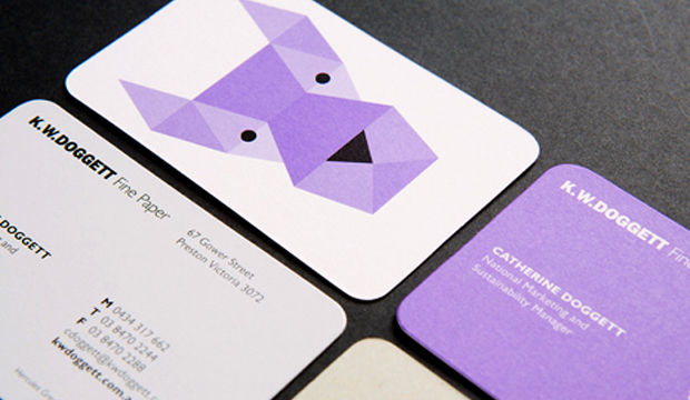
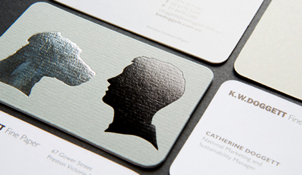
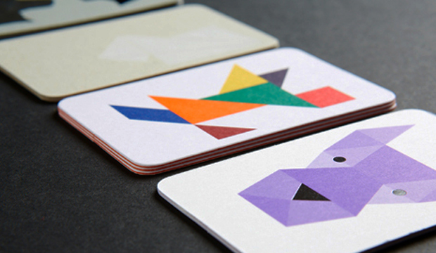
Doggett’s has some new dog tags
Eat, drink and be merry this Christmas!
Title: K.W.Doggett Fine Paper 2014 Christmas cards
Stocks: Kaskad / Strathmore Premium Cambric / Sun Offset
Printed by: Southern Colour. Embellishments (Avon). Express (Envelopes). Northern Tags (gift tags). All in VIC.
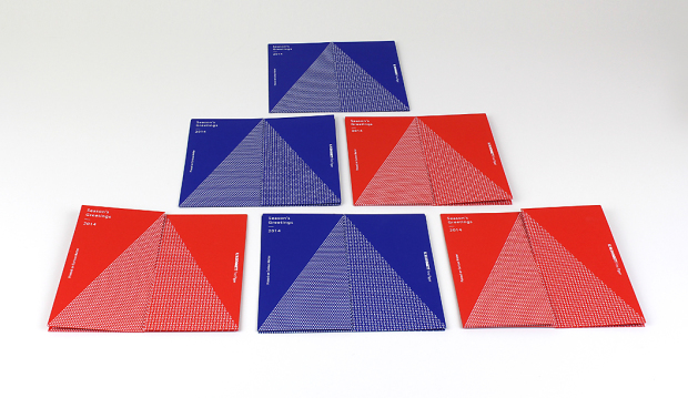
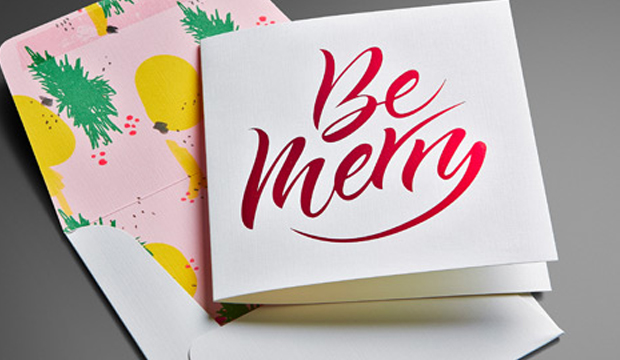
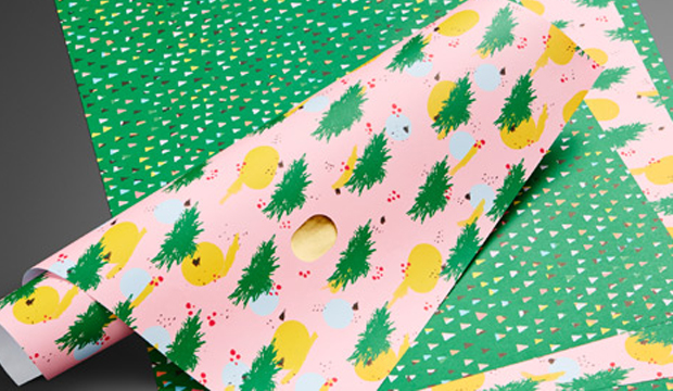
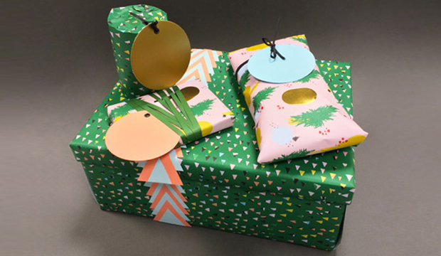
We had a very merry time creating our Christmas cards this year. For something extra special, we also created matching wrapping paper and some gift tags. It was an international affair this time around. The ‘Be Merry’ was crafted by the very talented calligrapher Henric Sjösten (Sweden). It was an LA based artist, Ashley Goldberg, who created the cheerful pattern on the inside of the envelope and two kinds of wrapping paper (a pink pattern and a green triangle pattern).
In keeping with the festive spirit, we wanted to have a bit of fun and showcase a variety of stocks and finishes:
- Card – printed 1 colour black + red foil stamp on Strathmore Premium Cambric – Ultimate White 270gsm.
- Envelope – custom made, printed 4 colour process +1PMS348 U (dark green) on Strathmore Premium Cambric – Ultimate White 216gsm.
- Wrapping paper pattern 1 – printed 4 colour process +1PMS348 U (dark green) with gold foil highlights on Sun Offset 120gsm.
- Wrapping paper pattern 2 – printed 4 colour process +1PMS348 U (dark green) on Sun Offset 120gsm.
- Three coloured circle gift tags diecut – Kaskad Salmon 270gsm, Kaskad Puffin Blue 270gsm and Lustralux Metallic Gold 250gsm.
Phew! We love spreading Christmas cheer, did we mention we also moonlight as carollers?! Just kidding. Enjoy!
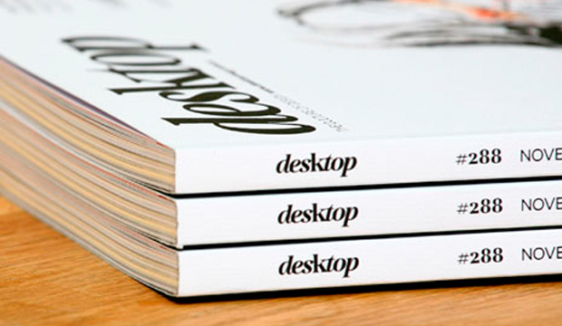
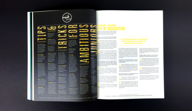
desktop’s love affair with print and paper – the November issue
desktop has long been the main go-to magazine for Australian graphic designrs. Rejuvenated early last year with a new look, it’s gone from strength-to-strength with even better visuals and content. And the best has got to be the November issue – a love affair with all things print and paper. Could the day get any better?
It starts with Matt Huynh’s beautiful illustration on the front cover (see above) and carries through to the gorgeous designs showcased across varying print techniques. It’s great to see print and paper celebrated in such style. Everyone that took part in making this edition happen approached it with pride and comittment and of course, a love of print.
All the paper merchants have come to the paper party too. We’re there flashing our wares in the ‘Special Inks’ section with Strathmore Premium Super Smooth Ultimate White 176gsm (formerly Expression) and the ‘Embossed’ section with Rives Design Natural White 120gsm. We’re kind of partial to our sections but they’re all pretty snazzy, so do pick up a copy and take a good look for yourself. It is definitely a keeper and worth every penny of the $9.25. Well done desktop!
Here’s the hit list of techniques and design studios included:
Special Inks: Toben, Deuce Design
Foiling: Babekuhl, Luke Brown
Special Papers: Alter, Work Art Life
Die Cutting: Parallax Design, Leuver Design
Embossing: A Friend of Mine, Pidgeon
Digital Printing: Photo Essay, Retrospect
Stocks: Expression Super Smooth / Rives Design
You say goodbye, I say hello
Title: You say goodbye, I say hello
Agency: Ortolan
Client: K.W.Doggett Fine Paper
Stocks: Keaykolour Original / Rives Design / Rives Tradition
Printed by: Bambra Press
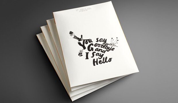
I am covetable, colourful and exciting. You want to use me, but I often get forgotten. What am I? Introducing our latest promotion for Rives – a modern day stationery set, complete with communication etiquette tips! The Rives promotion reminds us that in this day and age, we often forget the art of old fashioned communication. What? There is no hash tag involved? Impossible!
‘You say goodbye, I say hello’, is a promotion that showcases the versatility of Rives, a stock often used for letterheads, business cards and invitations. This provided the foundation for the creative development. We were fortunate enough to collaborate with two self-confessed Rives lovers – Kat Macleod and Narelle Brewer from Ortolan.
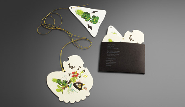
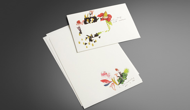
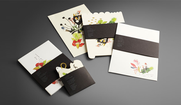
Kat and Narelle played further with the idea of tradition, took inspiration from the classic art form of botanical illustration, and included a twist. The result is a contemporary illustrative approach, featuring water colours of classic botanic specimens combined with made-up mutant flora. The word mutant conjures up a frightening image, but these illustrations are anything but that – they’re beautiful.
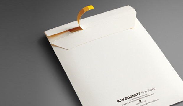
The stocks used for the 2011 Rives promotion include Rives Design and Tradition. It consists of post cards (die cut with the most gorgeous illustration and embellished with a hint of gold foil – see pics above), note paper, envelopes and gift cards (that even come with their own yellow string ready to attach to a gift!) and a paper chart.
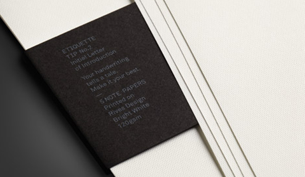
The promo is printed four colour process, the belly bands with two spot colours (one hit of silver and one hit of white), and everything is perfectly packed into a main envelope (printed outside one colour (black) and inside one colour (yellow PMS 109). Printed on the belly bands are cheeky etiquette tips like: ‘If you want to be invited back, think ink! An email is not a thank you note’; and, ‘Your hand writing tells a tale, make it your best’.
Fusing the strength of tradition with the energy of the present, Rives is a naturally elegant collection ideal for even the most contemporary communications. Available in Design – a discreet, fine mesh texture; Tradition – a refined felt-like finish; and, Design Digital – an indigo compatible sheet. Rives is exclusive to K.W.Doggett Fine Paper and proudly made FSC certified by Arjowiggins Creative Papers (France).