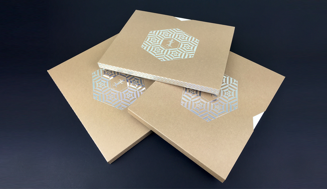
Justus issue 4 is about to hit the streets and we’re super excited to say it features a knockout selection of our finest fine papers. It’s like our paper dreams have come true.
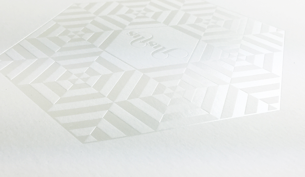
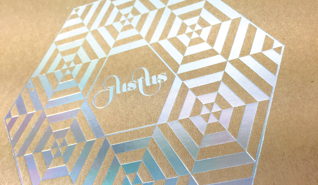
With unlimited access to print and embellishment techniques, the Justus story starts with a Tafeda embossed Buffalo Board slip case, followed by a pearl ‘snowflake’ like foil on Wild paper. Opening the first pages, it shows UV printing on Strathmore Super Smooth and then it rolls on from there. Spot colours, copper foils, a silver reflectakote, French folds, die cuts and more. There is definitely nothing minimalist about Justus issue 4. More is more.
Designed and edited by Lindsay Smith of Eleven Eleven design, Justus Magazine is created to celebrate (and show off), the talent within the Australian print, paper and design industry. It is made by us, for us. Just us. Issue 4 ‘Wrapped in you’ has a central theme of packaging and is printed by Platypus Graphics. Based in Brisbane these guys run a slick operation and their skill as printers, foilers and finishers is clear to see. I addition, there’s also a special HP Indigo section which highlights what these new machines can do and how our paper responds to the new digital techniques.
Your K.W.Doggett Fine Paper specialist has a copy to show you in their next studio visit but if you can’t wait til then, log on to Justus and subscribe for yourself. We look forward to bringing this beauty to market soon.
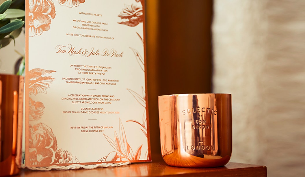
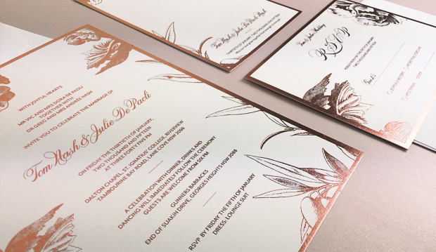
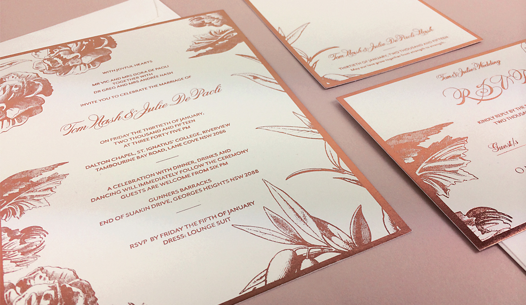
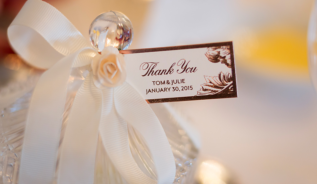
Title: A rose gold wedding Designer: Julie de Paoli Stocks: Strathmore Premium Wove – Soft 352gsm and 270gsm Printing specs: Offset printed Printed by:Watermarx Graphics (NSW)
These invitations were a personal project for graphic designer and bride-to-be Julie De Paoli. She wanted to create a design reflecting the unique bond she shares with her husband and the sentiment of their special day. So romantic!
So the theme of the wedding suite was centred around the concept of growth. Intricate botanical drawings are featured throughout, including an olive branch and a rose which represent Julie’s Mediterranean roots and her husband’s English background. Ripper idea and great choice to use the rose gold foil. Elegant bling.
The suite of items was printed on Strathmore Premium Wove – Soft White 352gsm and 270gsm. The typography retains a modern edge with the use of both script and san serif typefaces. Julie explains: “The stock, with its subtle texture complemented the smooth metallic finish of the rose gold foil. It was a difficult illustration to print, however the printers, Alan and Ange from Watermarx, did a fantastic job. The beautiful detail of the imagery and powerful bold foil was everything I had envisioned it to be.”
To see more of Julie’s work follow @juliedepaoli on Instagram and Twitter and keep your eyes peeled for her new website coming soon!
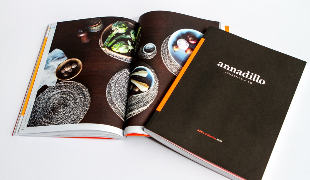
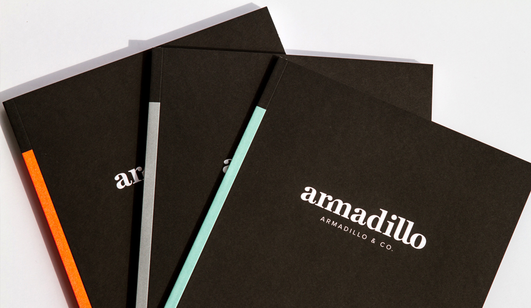
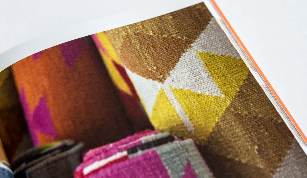
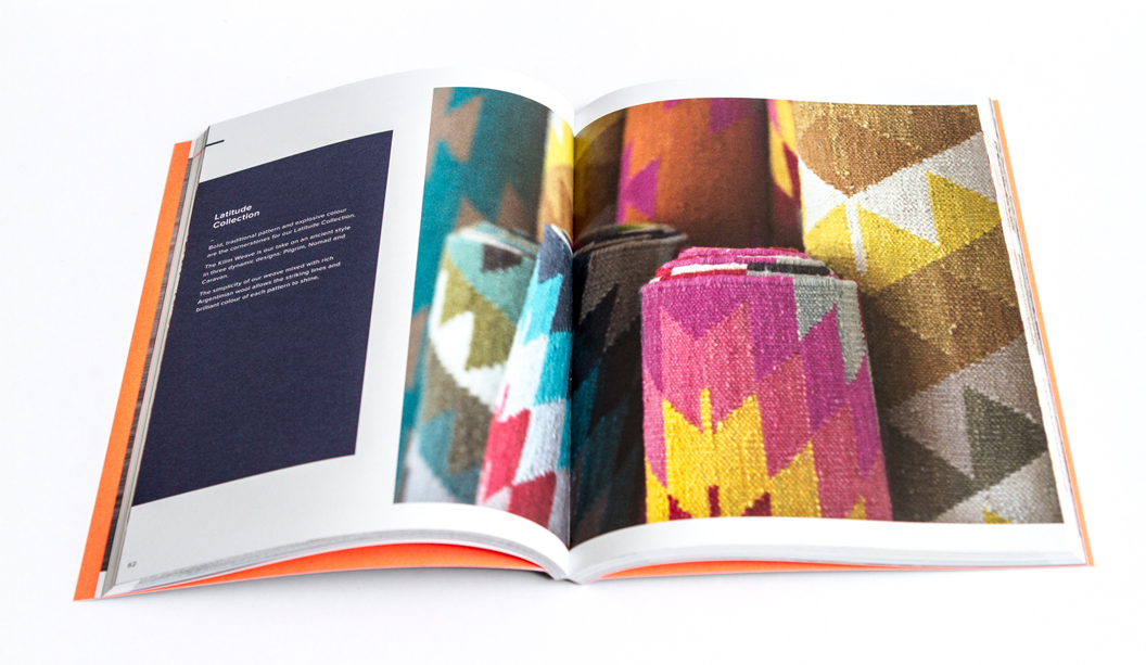
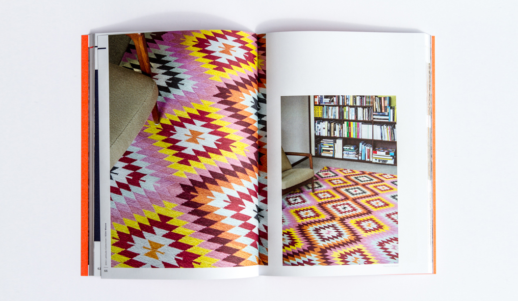
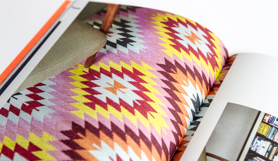
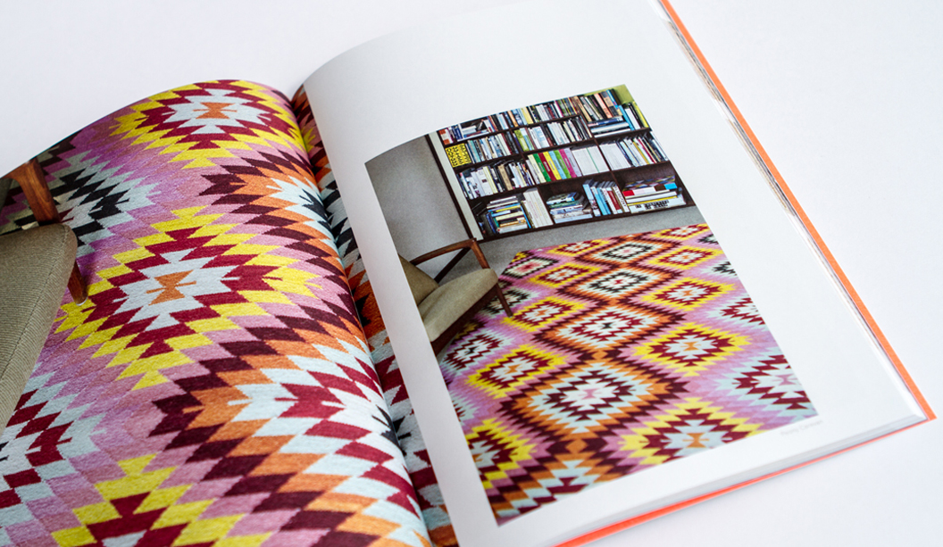
Armadillo&Co is dynamic duo Jodie Fried and Sally Pottharst, who share a love of honest and earthy rugs. This year, it was time to showcase their beautifully crafted pieces in a series of print catalogues.
Founded over five years ago, every piece embraces fair trade practices, is crafted from sustainable natural fibres including pure wool, hemp and PET recycled fibres, and all purchases benefit local schools in their weavers’ villages in India. We can’t help but gush at what a truly remarkable business this is, not to mention their beautiful rug collection. Armadillo&Co explains: “For us, it’s about combining aesthetics with ethics. Our artisans are our extended family – we treat them with love and respect that their weaving traditions have been generously passed down through generations.”
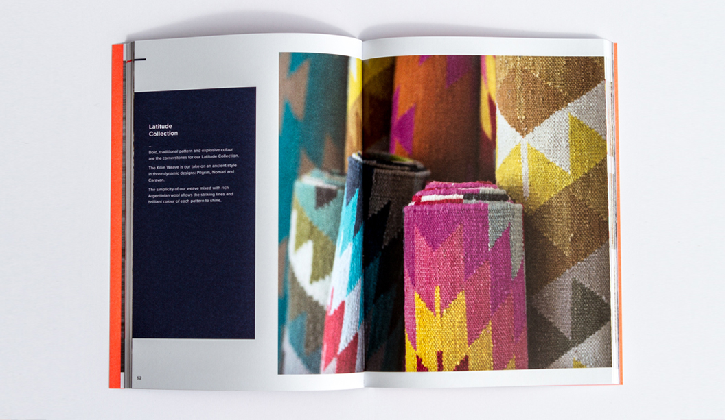
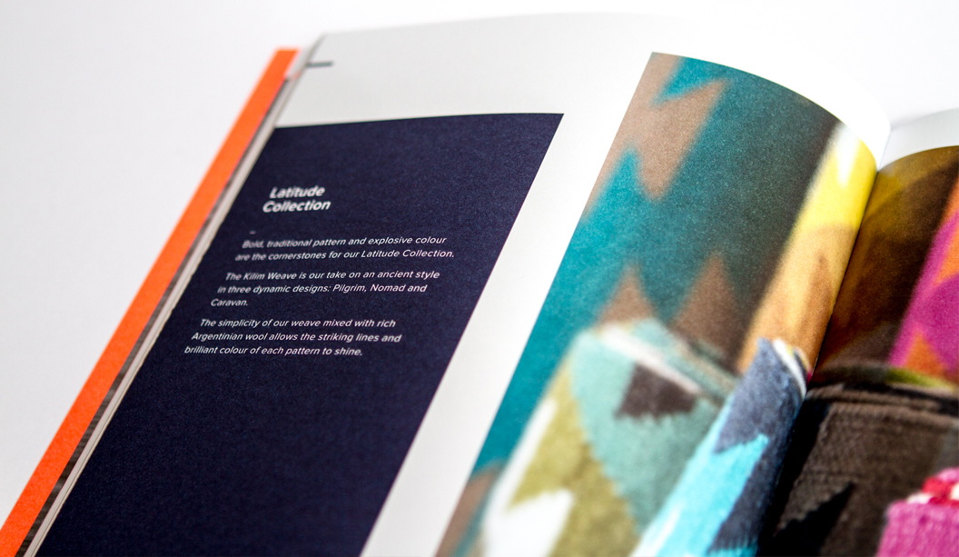
Armadillo&Co collaborated with designer Mike McMullen from Arms Studio in LA, to create the three gorgeous catalogues: ‘Collection’, ‘Bespoke’ and ‘Indoor Outdoor’ showcasing their 2015 range. Each piece is printed CMYK with a different PMS on Knight Vellum 280gsm for the cover and Sun Offset 120gsm for the text. The soft, uncoated surface of the paper pairs nicely with the stunning photography and earthy textures of the rugs.
There are just too many fabulous designs to choose from and we could spend hours pouring over their catalogues. Alas, it’s your turn! Visit http://armadillo-co.com/ we know you’ll love them as much as we do.
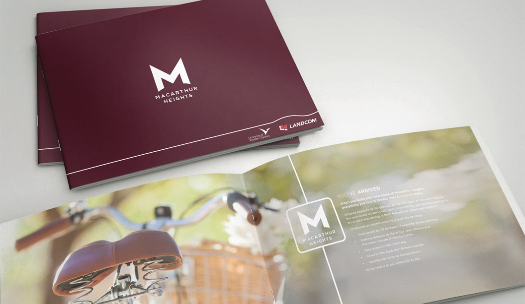
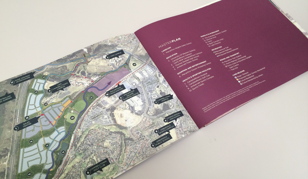
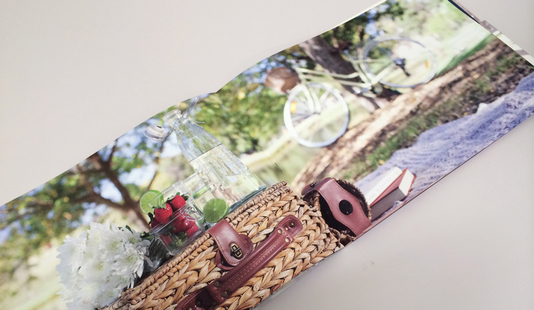
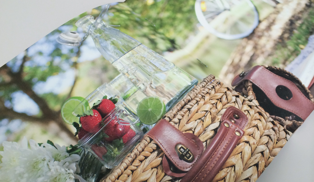
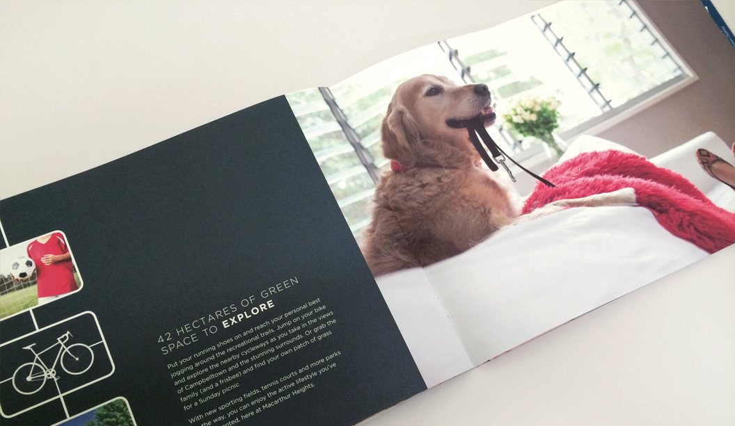
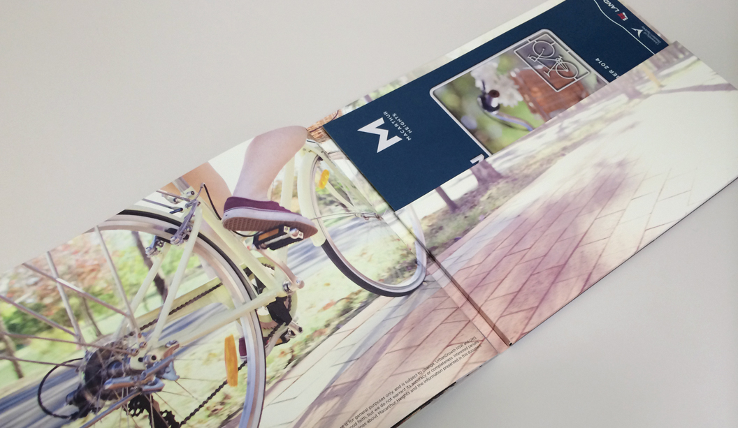
Macarthur Heights is a premium house and land release by developer Landcom in Campbelltown, NSW. Designed by the team at Enigma in Newcastle, the brief was to create a high-end brochure that captured the lifestyle offered by Macarthur Heights.
The property brochure comprises of a 4pp folder printed on Strathmore Premium Super Smooth Ultimate White 352gsm featuring an embossed “M” on the front. When it came to selecting the paper Enigma explains: “it was very important for the embossing to be sharp and tactile so we were looking for an uncoated stock that would be able to deliver the look and feel we were after.”
The 12pp brochure is printed on Strathmore Premium Super Smooth Ultimate White 148gsm with saddle stitched binding. The smooth, uncoated finish of the stock lends itself beautifully to lifestyle photography. “We were delighted with the finished product. The printed reproduction of the images is extremely sharp and the rich, solid colour throughout adds life and vitality to the piece. The client was extremely happy with the end result.”
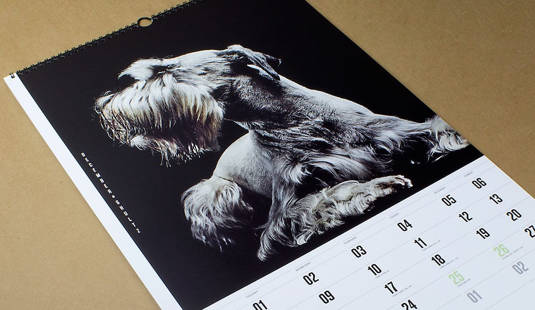
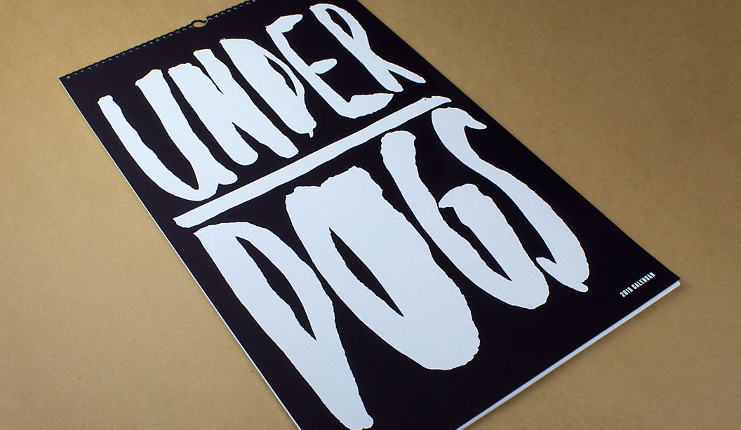
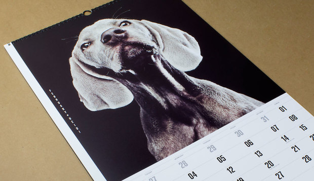
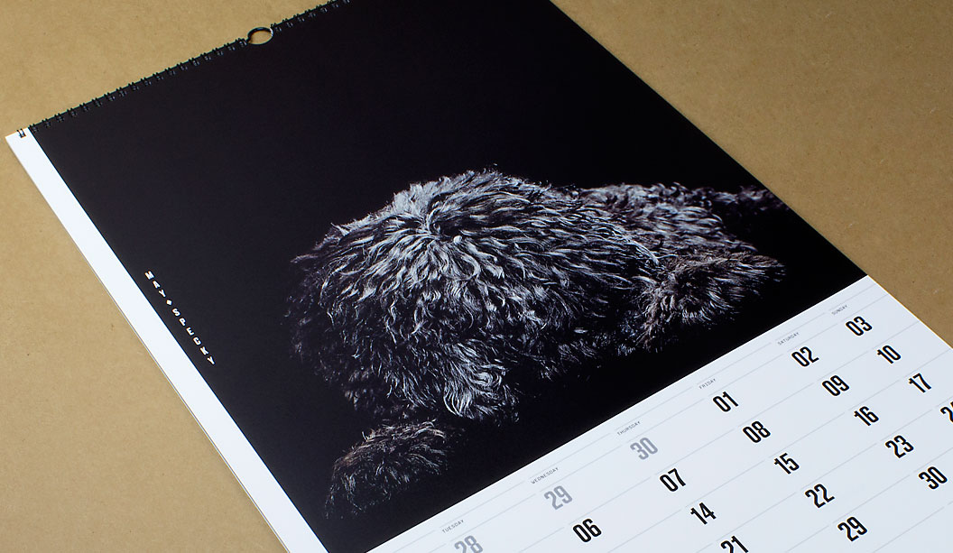
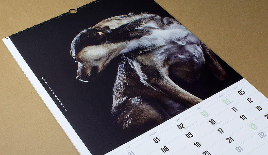
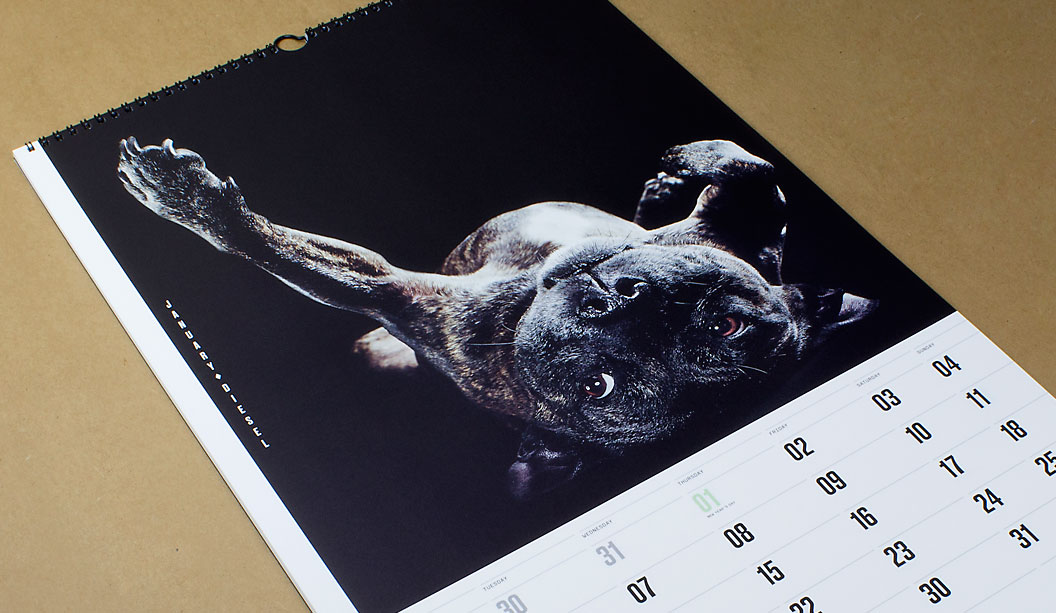
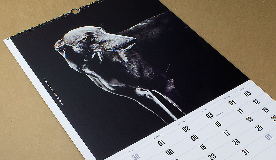
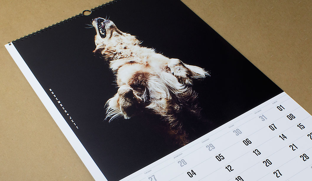
Next year marks our 40th year in the paper biz, so we called in the big guns to create our 2015 calendar which is given to key customers as a gift and a thank you. We assembled a team of poochie lovers that set-out on a collaboration that took nine months to complete. The result is a set of doggie portraits, fashion inspired images of 12 underdogs. The misfits and true Aussie battlers from the wrong side of the tracks.
The team of poochie aficondos was made-up of Marta Roca, Creative Director from online and print magazine Four&Sons along with some students which we found via a shout-out on desktop. The wonderful Caroline Beard and Anthony Stephens, two recently graduated RMIT students from VIC made the cut. They recently wrote to us saying how much they loved the experience, had loads of fun. That the project intensified their love of print and beautiful paper even more and they thanked us for the friendship and guidance provided. We think you guys rock! Ok, enough gushing.
When Catherine Doggett contacted Four&Sons to be a part of the calendar project, Marta says she: “Felt a sense of serendipity. From the KWD team, to the graduates Anthony and Caroline and James Geer, everyone got in sync with the underdog concept straight away. We all wanted to pay tribute to the unsung heroes and to give something back for all of those years of constant inspiration.”
To find the poochie models, we ran a doggy talent search among our VIC clients and customers. The criteria specifically asked for dogs that have been adopted or rescued. Each person submitted a photo and a bio of their dog. We received over 200 entries. A great response and so many great dogs! Marta, Anthony and Caroline chose the final 12 to appear in the calendar.
One camera shoot, one day and a lot of pooches coming and going from the studio in Melbourne’s leafy suburb of Elsternwick. We took the dogs for walks, helped them make friends and let them roam around in the hope we’d capture their true spirit which James did so brilliantly. We gave them lots of attention. It was a big love-in of our furry friends. “Maybe it was the treats, maybe we were just plain lucky. Or all of the above. Whatever the reason, magic just happened! We couldn’t have asked for better models,” said Marta to us recently. And internationally renowned photographer James Geer captured that magic.To say thanks for their hard work, we donated money to Pet Rescue Australia.
That’s it friends, we’re done for another year. We often joke that maybe, just maybe, one day, we will make the calendar about cats instead. Possibly even change our name to Cattett Paper. But we’re pretty keen on the dogs for now, so not just yet. Enjoy the 12 months of canine inspiration! Until next time…
Printing tips… Using the UV offset press (on an uncoated paper profile) means instant drying times and a slight sheen to the ink is created. The darker images were printed using a 225 line screen which gave us a richer black and even ink lay down. The lighter images were printed with a 175 line screen as there was more contrast between the lighter and darker areas. The cover is screen printed with two hits of white to give a bold ink lift.
The paper for the text pages is Strathmore Premium Super Smooth. Being a premium paper, it is ideal for high end photography with even ink lay down. Nice solids and sharp reproduction. It makes the images look great. The Ultimate White is slightly ivory in colour and does add a small amount of yellow to an image (you can compensate for this on press or when setting up artwork).
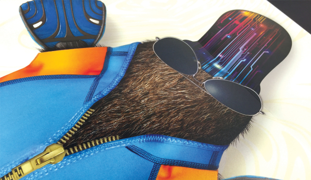
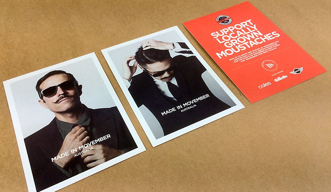
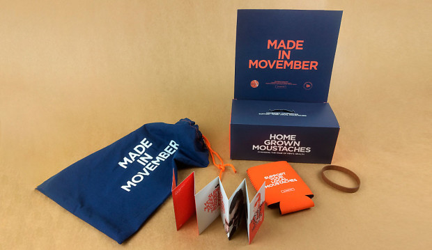
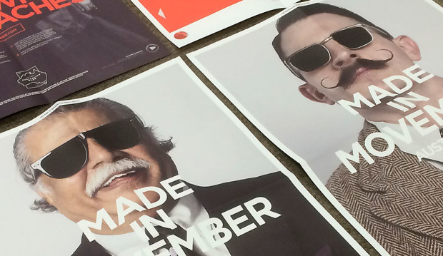
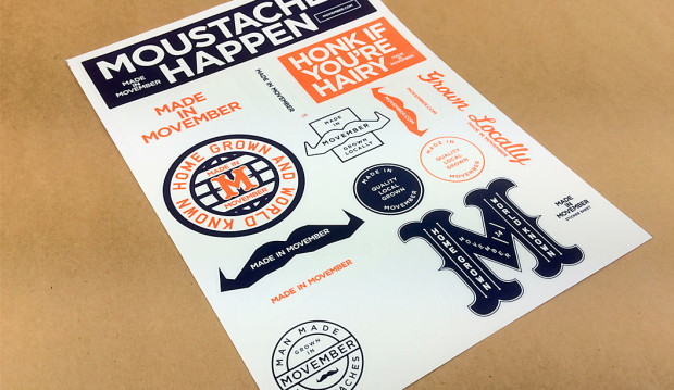
Title: Made in Movember 2014 campaign collateral Agency: Urchin (VIC) Stocks:Impact 135gsm, 190gsm, 300gsm, Printing specs: Offset printed (mainly), gig poster printed digitally on a HP Indigo Printed by:Madman Printing (VIC)
Ah Movember, the month where men start to morph into Boonie look-a-likes, creepy looking pool cleaners or in very unique cases, suave gentleman reminiscent of a 50s movie star (but it’s mainly the: ‘If I saw you in an alleyway I would scream’ kind of mo’s!). Our in-house team Hair of the Dog are growing facial patches like real troopers. We have the barely see them mo’s, the handle bars, the French chic versions and everything in between. Donate here if you wish.
Urchin, the studio behind the ‘Made in Movember’ design actually create a new campaign each year. As Tim Meyer from Urchin explains: “Re-designing the campaign direction each year is a core component of what makes Movember tick. We are raising very serious men’s health issues, so a new campaign each year also allows us to have fun and approach these causes in different ways without focusing on the negatives.”
We think it must be challenging but a whole lotta fun re-freshing the campaign year-to-year. Challenging because the team have to find a balance between theme, fun, message and health and this has to be done across 21 countries via print, web, video, advertising and products. Fun because it just is!
Collateral breakdown:
Postcards: Impact 300gsm
Campaign posters: Impact 135gsm
A2 health posters: Impact 135gsm
Party gig poster: Impact 135gsm
Health pocket guide: Impact 190gsm
(The campaign also included stubby holders, stickers, arm bands and a cloth bag to house everything).
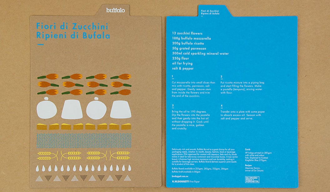
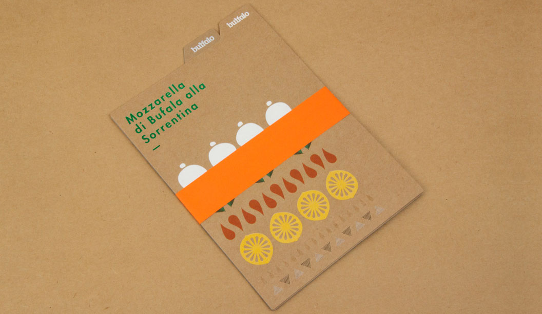
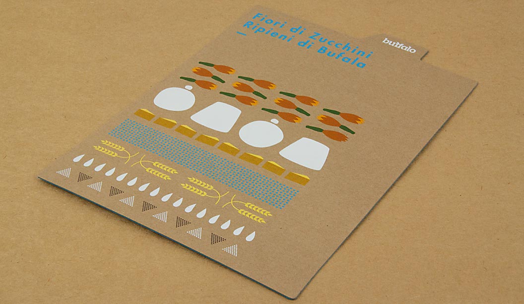
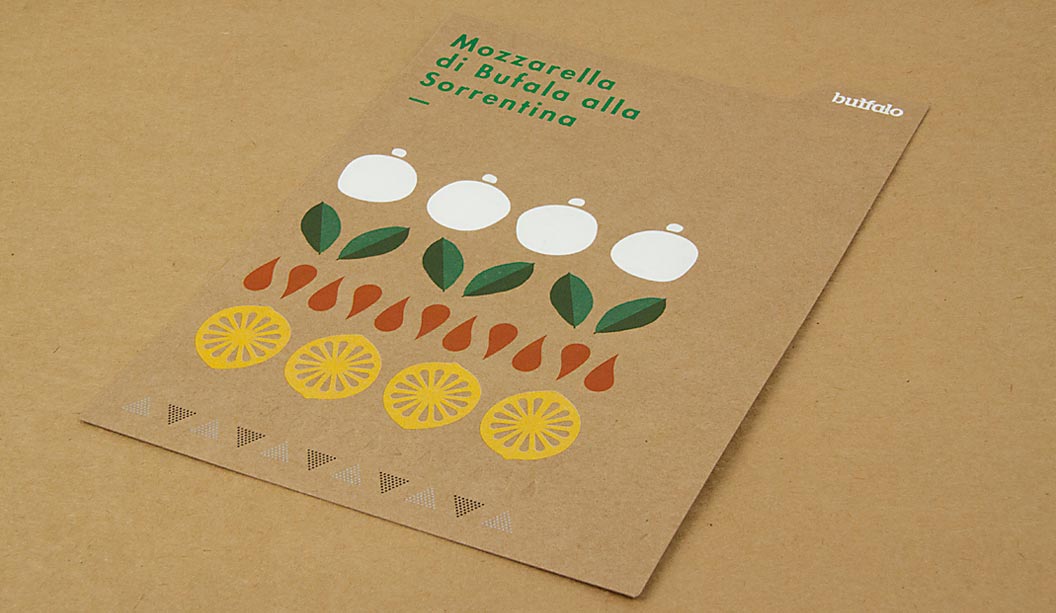
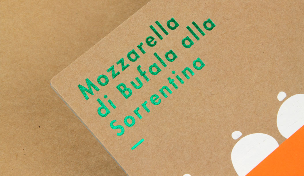
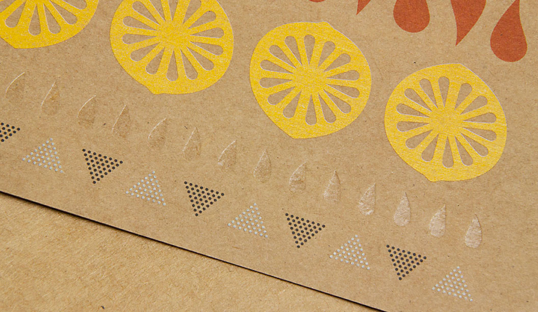
We have a fun, new and exciting Buffalo Board recipe cards promotion for you to feast your eyes on. The cards are a follow up to our previous promo in 2011. You may remember five recipe cards featuring mouth watering buffalo mozzarella dishes? Visit the post here. This latest set of colourful cards were designed by Seesaw and feature simple illustrative graphics that highlight the recipe’s ingredients. To showcase just how versatile Buffalo can be, Seesaw went to town with embellishments and we printed one card offset and the other digital. The recipes were kindly supplied by chef Maurizio Terzini, owner of popular Italian Restaurant Da’Orazio and the famous Icebergs Restaurant in Bondi.
The offset card is printed CMYK on Buffalo Board 283gsm with three foils ie Clear, White and Milford Astor GFE123 Dark Green for some extra bling. The digital card was printed HP Indigo CMYK on Buffalo Board 283gsm plus Opaque White Ink and duplexed to Kaskad Kingfisher Blue 270gsm with Opaque White Ink (two hits) phew! To wrap them all up nice and neat we added a belly band in Kaskad Fantail Orange 100gsm.
Buffalo Board is a low density, high yield product. It’s an uncoated, moisture-resistant folding carton board that is cost effective, has a verifiably low bacteria content compared to many other paperboard products and outstanding strength and durability. Buffalo Board is also available in 386gsm/711ums and is also used for health, beauty, fashion and beverage applications. It’s made from natural kraft fibres that are responsibly sourced and fully recyclable and is carbon neutral (measured exit mill gate).
Printing tips Buffalo Board is suitable for all kinds of jobs. Think offset, digital and letterpress printing as well as embellishments like foil and screen printing. The natural kraft paper looks great with some white ink (consider two-three hits for offset and two hits for digital). If you want your CMYK colours to really pop, apply a white ink base first then a layer of CMYK over the top. This provides a surface for which the colour can sit up on, resulting in a brighter finish. You might like to do a combination of both like we did for the recipe cards (colours with and without a white base) to achieve a variety of printed effects. It comes up a treat!
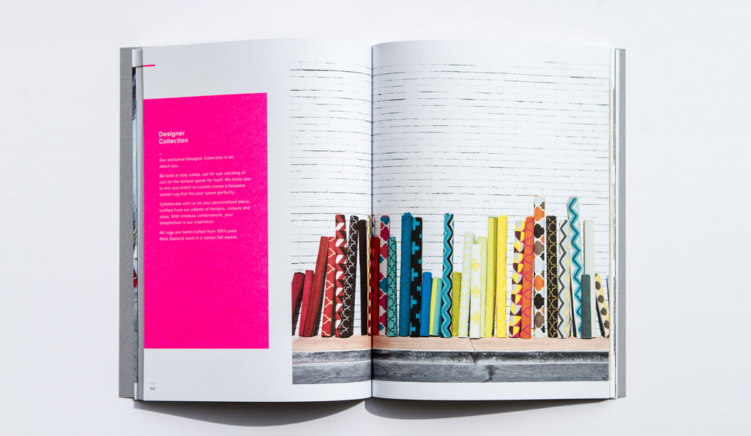
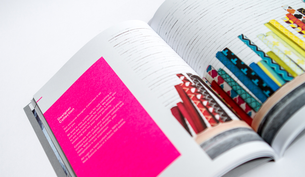
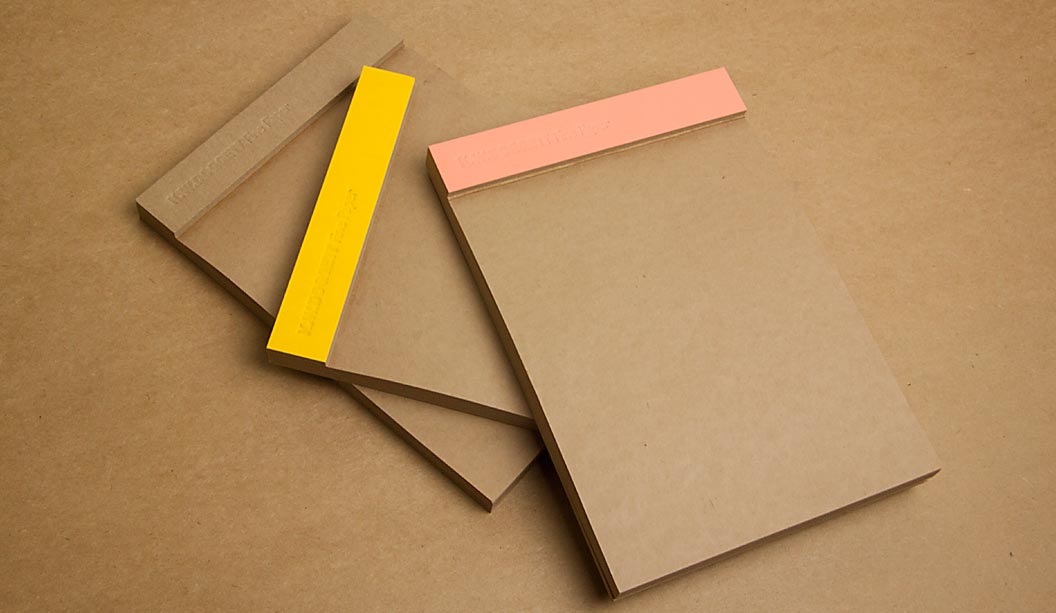
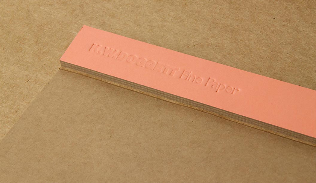
It’s no secret we have a thing for bling, but kraft could be a close second. So we’ve also produced a set of A5 notepads as a gift for our customers. They come with three different spine colours – natural ie Buffalo Board, as well as Grange Tints Old Gold 80gsm and Tablex Tints Salmon 150gsm. All have a subtle K.W.Doggett Fine Paper debossed logo on them. It’s also perforated along the spine for writing down quick and easy tear-away ideas.
If you have any specific packaging related questions, please call our John Alipan, Packaging Business Development Manager (National) on 0434 692 446 or jalipan@kwdoggett.com.auand for all the Syndey-siders, contact Chris Churchward on 0488 440 131 or cchurchward@kwdoggett.com.au
Our paper specialists and account managers are coming around to see you soon with your own copy. Enjoy!
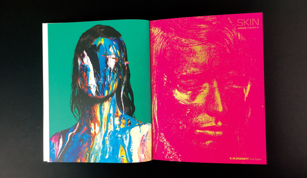
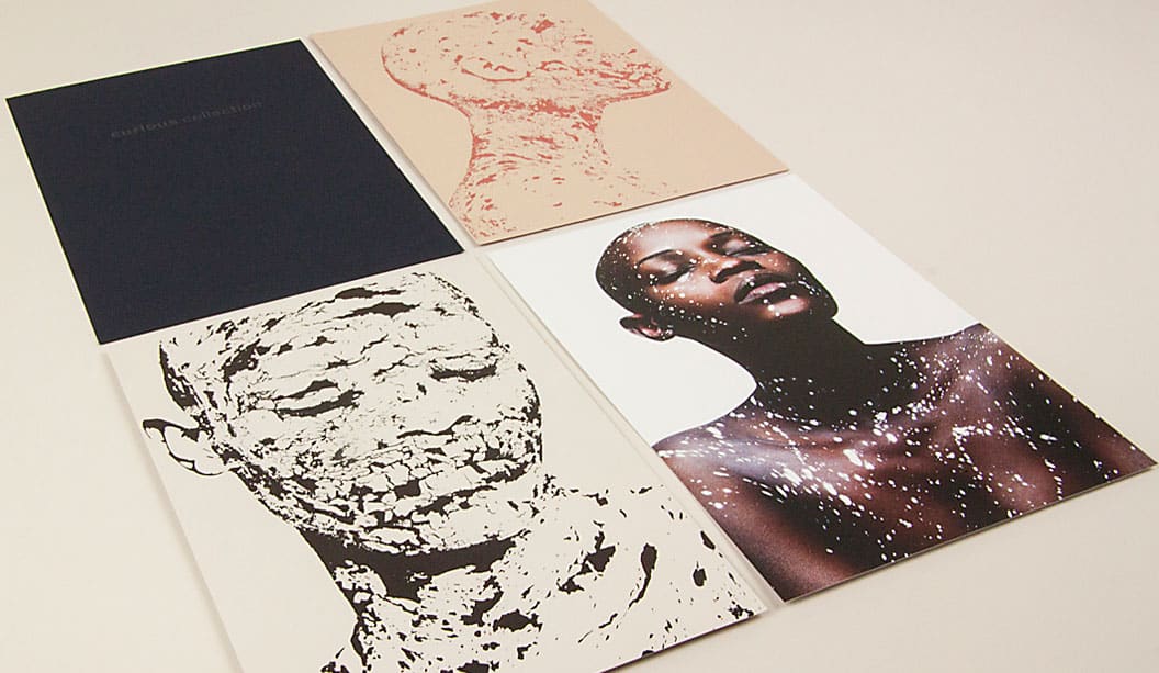
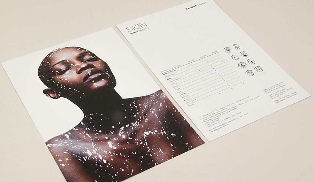
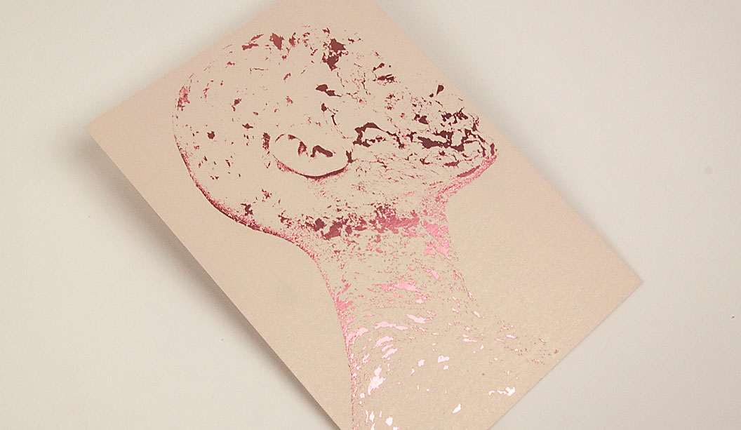
Our new promo showcases a stunning set of images on Skin Curious Collection and Curious Metallics. The images complement the Skin campaign from 2013. You may remember the original promotion with the haunting images of a man covered in a kaleidoscope of coloured paint. If not, visit the story here.
The shots are the hero, then there’s the paper and the awesome art direction from Three60 which means we got to collaborate on another exciting campaign. As Dellano shared with us: “Our concept explored the notion of regeneration. Our idea was to find a way to express shedding the old to make way for the new [imagery]. Like a snake putting on its new suit, we treated the image to look like the paper surface was the outer layer, slowly peeling and cracking away to reveal a shiny new surface that lies beneath.”
To give this year’s images just as much love, we used a mix of papers. After playing around with the stocks we discovered the suite of complementary colours in the Metallics and Skin ranges. We wanted something paired back, sophisticated and shades that worked well with the designs. Often, people use Curious Metallics for wedding invites but we had hoped that mixing up some of the stocks would show the kind of results you can get. So a bit more of a sophisticated colour palette with a dash of sparkle.
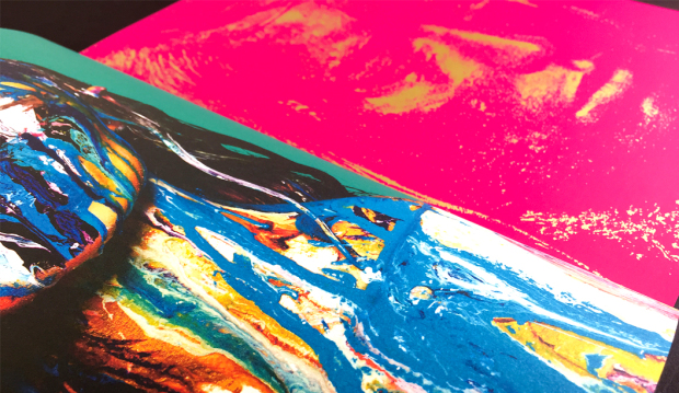
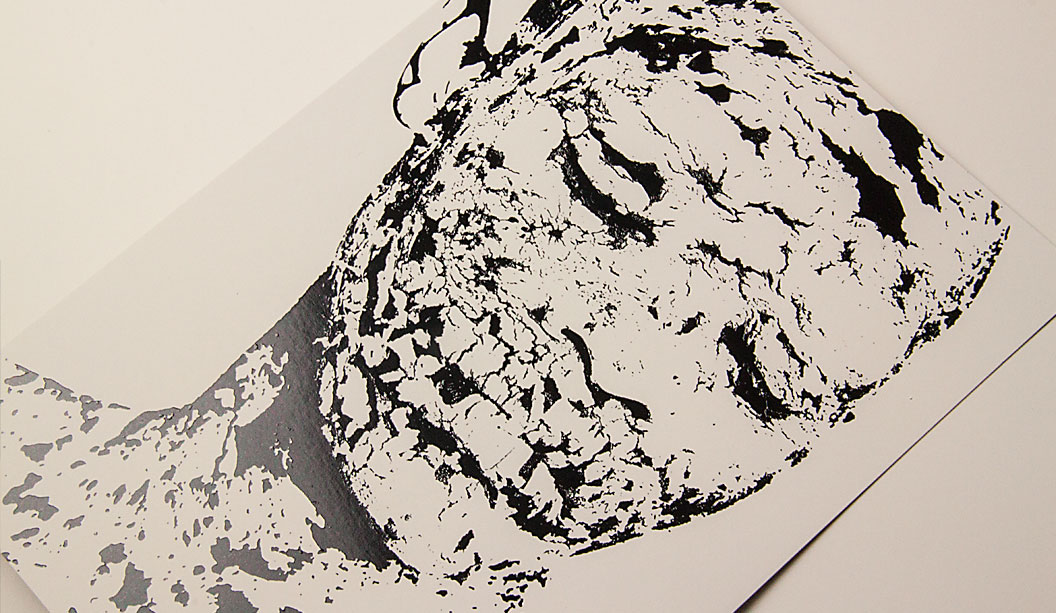
Check out the detail in those foiled images. Crazy. Critical to being able to achieve this result was the capacity to transform a full tonal range into a bitmap image which could be foiled. As Dellano further explains: “This was largely a process of knowing exactly what we wanted the end result to look like. We worked closely with our photographer to ensure our model would be lit appropriately to allow the tonal shift we needed in post production, without compromising the quality of light rendered once the image was converted to a bitmap format. However, no matter how much planning goes into creating these images, there is always a healthy amount of trial and error when it comes down to the final stages of tweaking in Photoshop.”
The Skin Stone and Curious Metallics Nude cards are a great example of having the embellishment really complement the stock while showcasing the design. We ran the cards through twice, same image, which resulted in a more solid look and a shinier finish. It was ok with one hit as well but we decided to go with two. The pressure was the same second run. The detail in the artwork also made a difference, as did the person making the plate. True craftsmen/women.
The dark blue card features a rad print technique called NexPress Gold. We recently wrote an article about it. If and when a silver version gets released we’re sure it will be just as popular. It only takes one hit of the Gold Dry Ink to get this effect. We did have to consider the FSC logo but and the very small font size but it all turned out aok.
Curious Collection papers are suitable for all kinds of jobs. Think offset, digital and letterpress printing as well as embellishments like foil and screen printing. The darker Skin colours look great with some white ink and the lighter colours in both ranges come up really well with CMYK printing. Applications include menus, luxury packaging, invitations, fashion labels, presentation folders, covers for publications and business cards. Both ranges are exclusive to us, the fine paper people and can be enjoyed by you, anytime you want some tactility in your life.
Stocks/specs: Card one: Skin Dark Blue 270gsm, UV spot gloss varnish (front), Dry Toner NexPress Gold Dry Ink (back). Card two: Skin Stone 270gsm, Milford Astor Gloss Black Foil. Card three: Skin Digital Extra White 270gsm, HP Indigo CMYK. Card four: Curious Metallics Nude 300gsm, Milford Astor Pink/Copper foil. Belly band: Curious Metallics Cognac 120gsm, Dry Toner CMYK.
Our paper specialists and account managers are coming around to see you soon with your own copy. Enjoy!
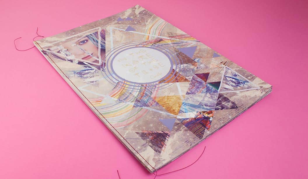
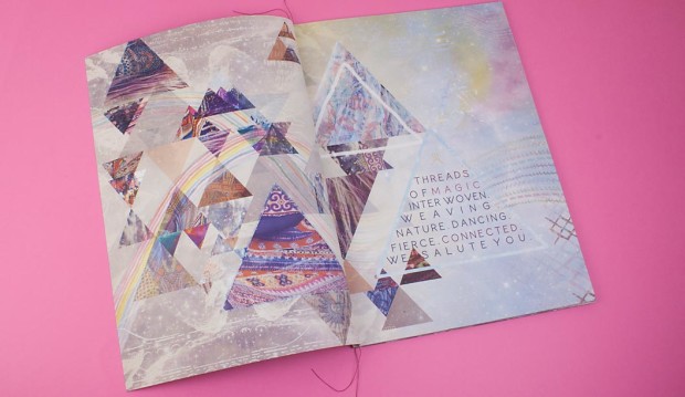
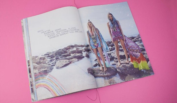
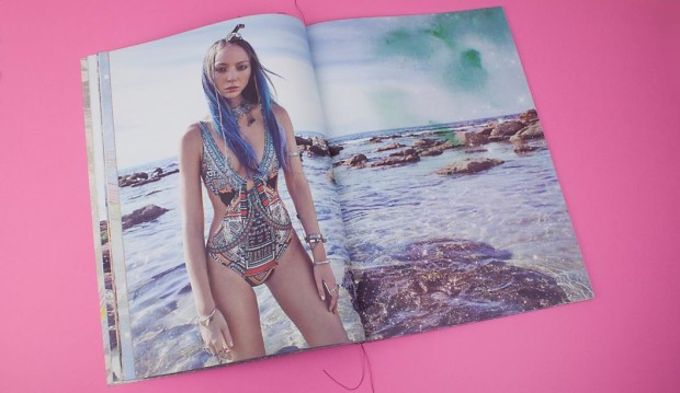
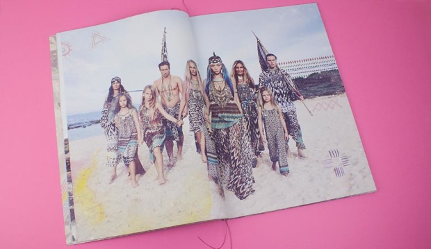
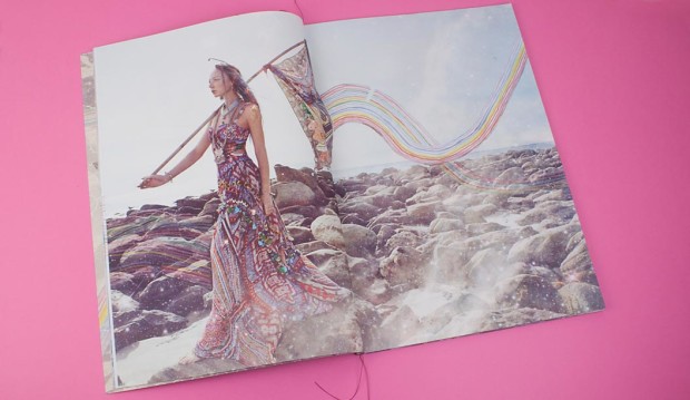
Heather Hawk is a very lucky designer in our eyes. She gets the fun job of branding each season for Camilla and translating the creative direction and styling of the shoot into a printed piece.
The latest look book reflects a 10 year celebration and Camilla wanted to make it super special. A lover of travel, Camilla’s latest adventures were spending some time with the tribes in the hills of Vietnam. Heather gets her inspiration for design elements and patterns from immersing herself in details like this. She then presents logo and design direction options to Camilla and the team and they choose their favourite.
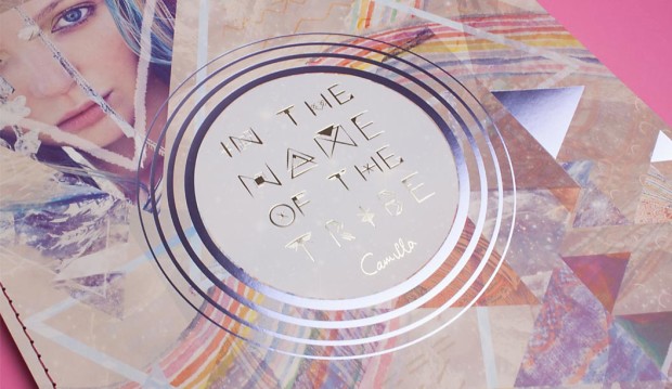
Part of what really makes this look book is the large format, singer sewn binding, not to forget the silver foil on the cover and illustrations throughout. Those rad hand painted rainbows and tribal symbols Heather draws with her own hand. Her own hand!! Amazing.
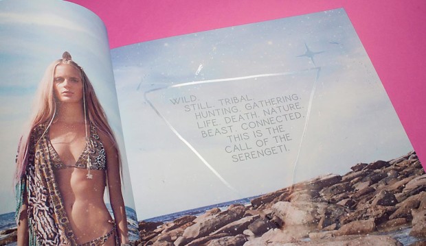
“There’s also something important I should mention about the whole experience of a Camilla look book,” says Heather. “It’s not only visual but textural. Camilla’s brand is all about the customer experience. So on the inside pages there are spot UV tribal symbols that are not necessarily clear to the eye but they pick up the light, and when you run your hand over them you feel the raised texture.”
This spot UV process is something Platypus Graphics do really well. What it does is makes a particular area of the page come to life (like in the above picture), adding a special touch to the piece. Heather wanted to use Skin as she finds it holds the colour really well. “I wanted the colour to pop and it also feels amazing. Grange – the uncoated text stock, is amazing too.”
As we say, it’s not just about our paper, it’s what you do with it! And you, Heather Hawk (and Platypus Graphics of course), have made it look totally rad.
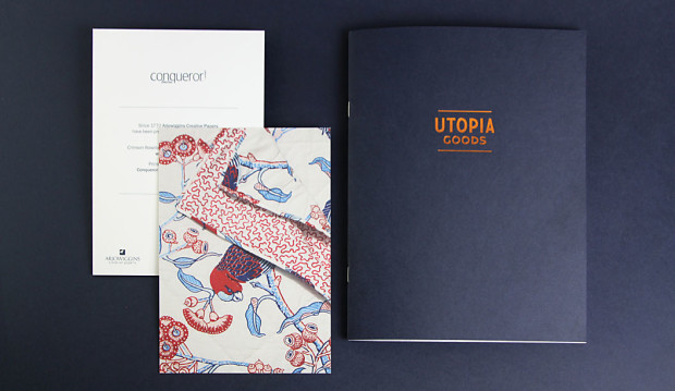
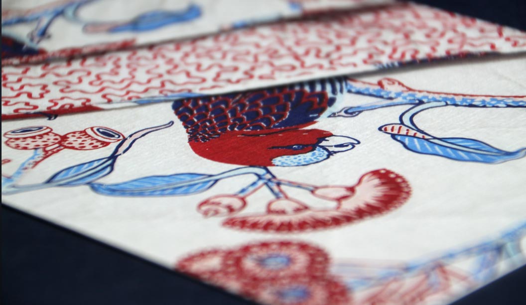
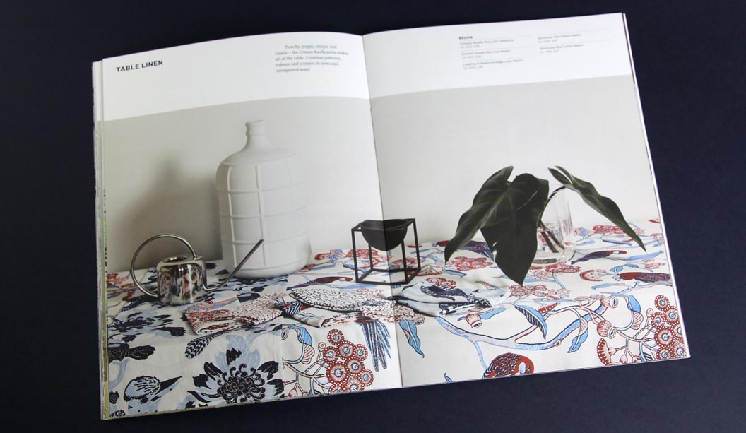
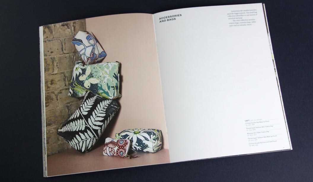
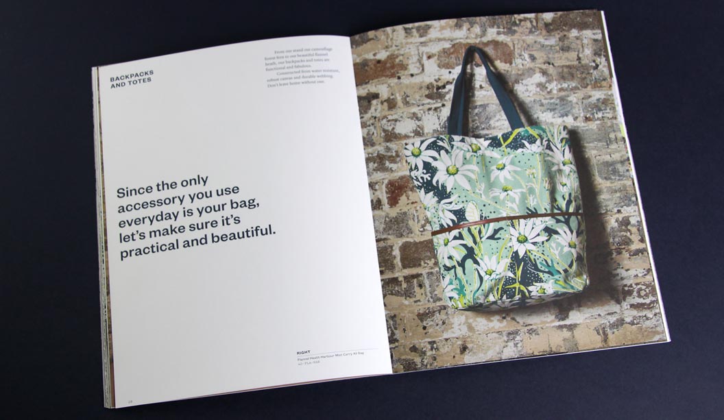
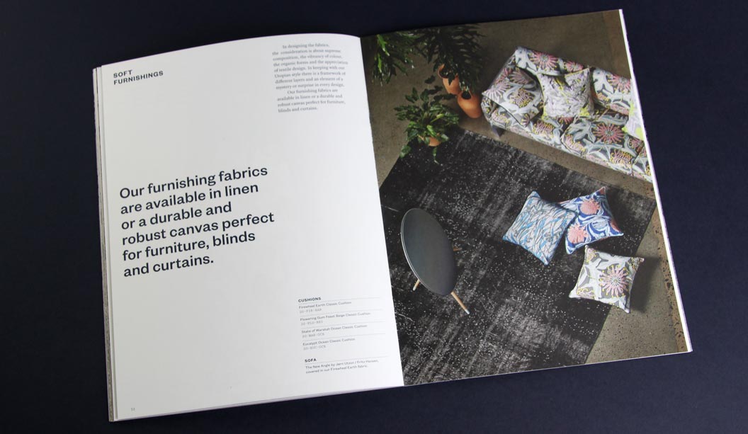
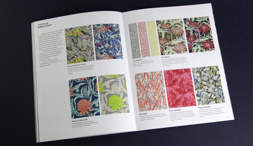
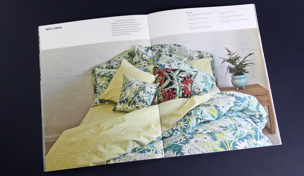
By day Bruce Slorach and Sophie Tatlow run the highly regarded Deuce Design. By night these two crafty cats dream up beautiful modern Australian homewares. Utopia Goods is a range of soft furnishings that centre around Bruce’s illustrative work. It features hand drawn native flora and fauna and is, in their words: “Part maximalist and part sumptuous fabric feast.” We love the colour, the chaos and the maximalist nature of it all. The perfect contrast to all that Danish minimalism of recent times.
For their printed catalogue, Duece were looking for a paper that would reproduce the beautiful bold colours of the collection and still offer the handler a natural finish. We chose Conqueror Wove Diamond White 120gsm, paired back with a Keaykolour Original Navy Blue cover in 250gsm. The Wove paper is soft to touch, not smooth but certainly not rough. The perfect softer style sheet for a brand such as Utopia Goods. Kudos to Special T Print in Sydney, a superb print job.
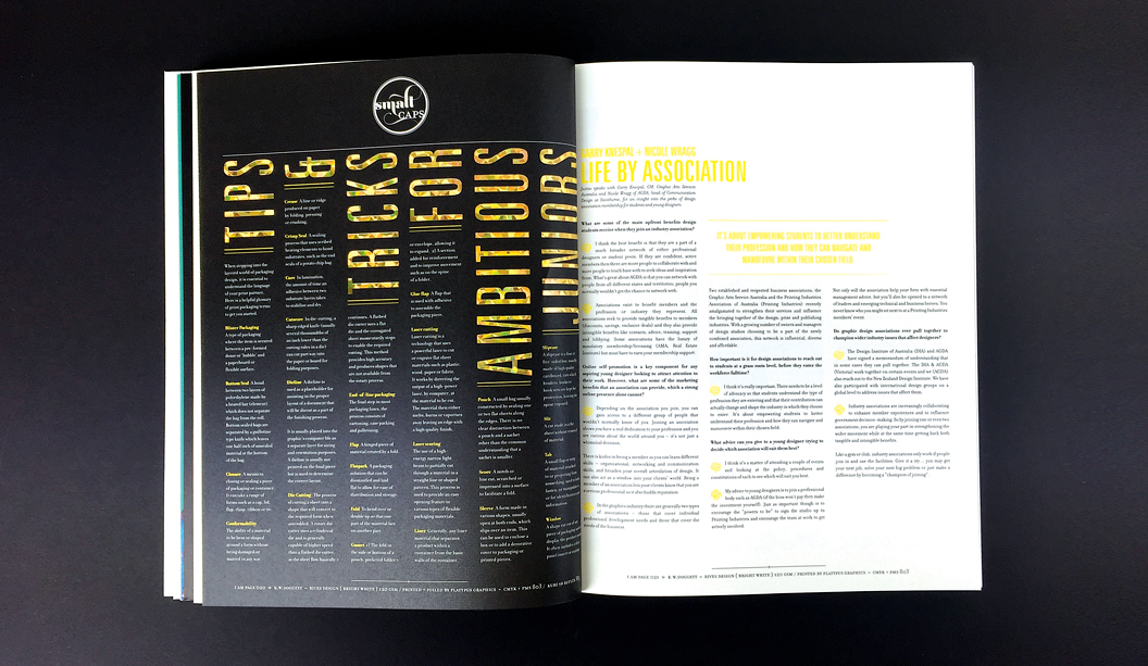
 Footy Tips