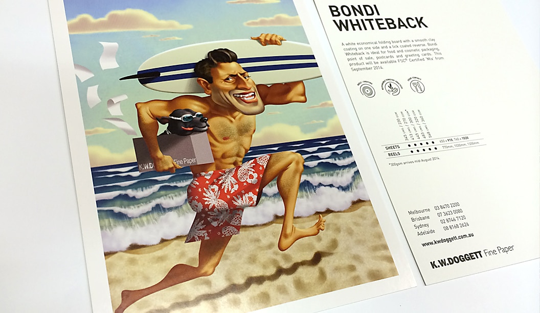
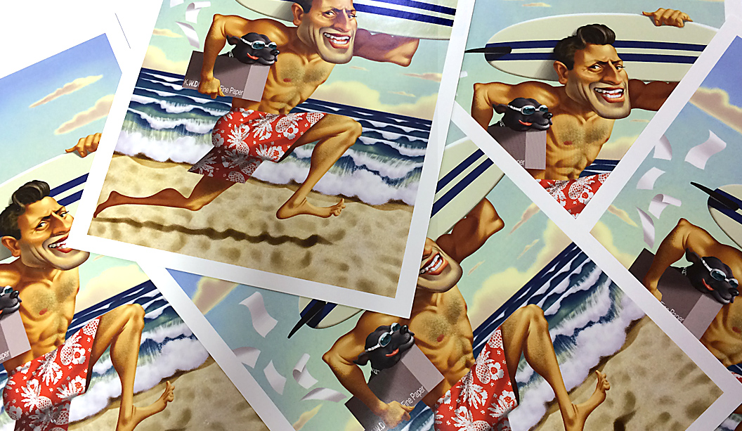
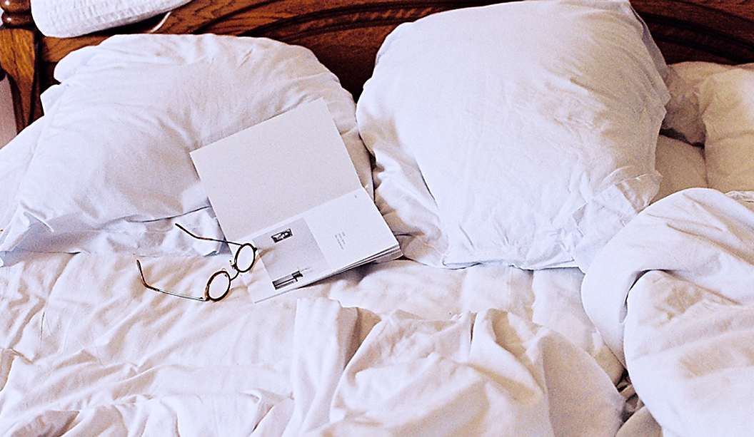
To announce the release of Bondi Whiteback, our newest packaging grade, we released two A5 postcards. One was printed offset and the other digital on a HP Indigo 7500. The image is a cracker and happens to be a custom illustration of a Doggett’s NSW staff member!
Bondi is an economical alternative and sits between our Simcote and Barry Bleach boards regarding price. A high white folding bleach board, it’s FSC certified, has a clay coating on one side and a lick coating on the other (this means the coating is not not as heavy on the back). It’s also food contact approved to ISEGA standards (the European version of FDA), which is excellent to know if you’re going wrap it around some chocolate. If you are, best send some to us.
Bondi Whiteback is ideal for cosmetic packaging, point of sale, postcards/greeting cards. Since releasing it, we’ve also seen it used for confectionery packets and pharmaceutical products.
Call John Alipan (National) 0434 692 446 or Chris Churchward (NSW) 0488 440 131 if you want to know more about any of our packaging stocks.
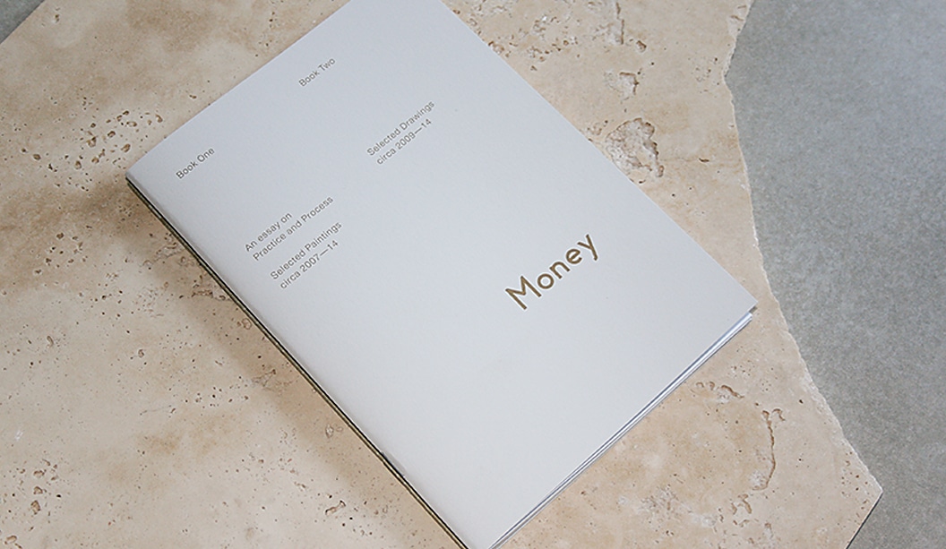
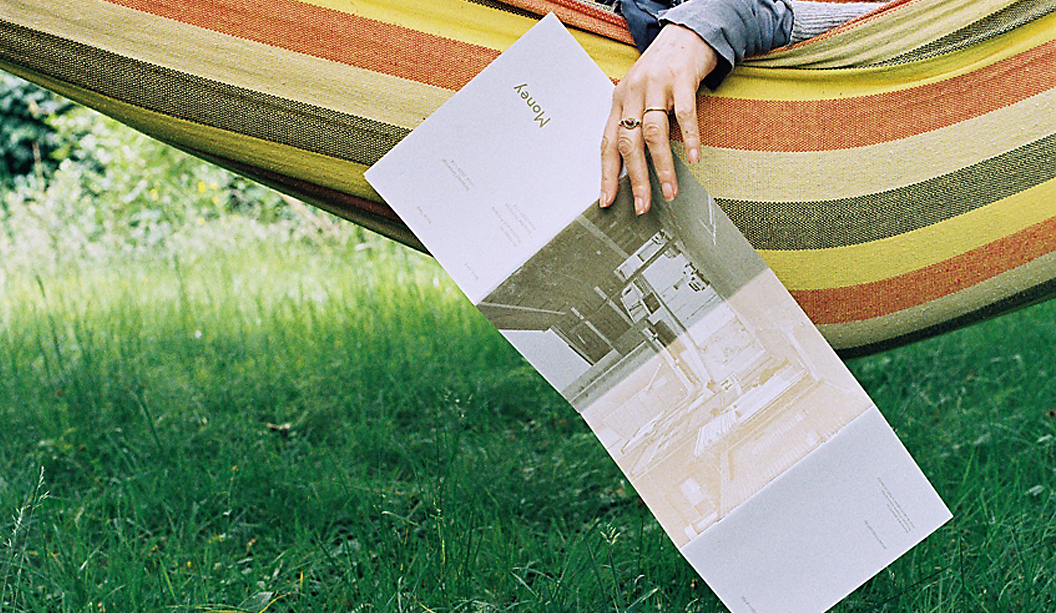
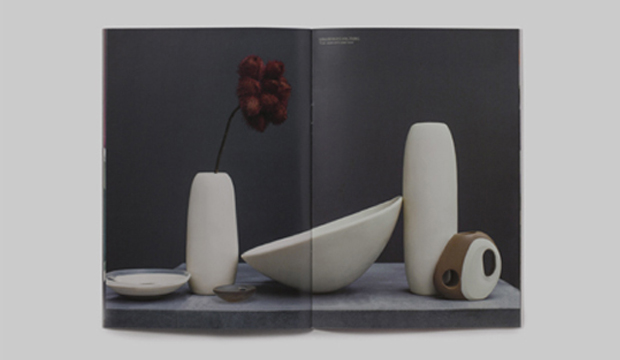
Title:James Money Monograph
Agency:Studio Constantine (VIC)Client:James Money, Artist
Stocks: Kaskad Sparrow Grey,Grange Offset, HannoArt Satin
Printing specs: Offset printed, Pantone 871 and duotonePrinted by:Adams Print (VIC)
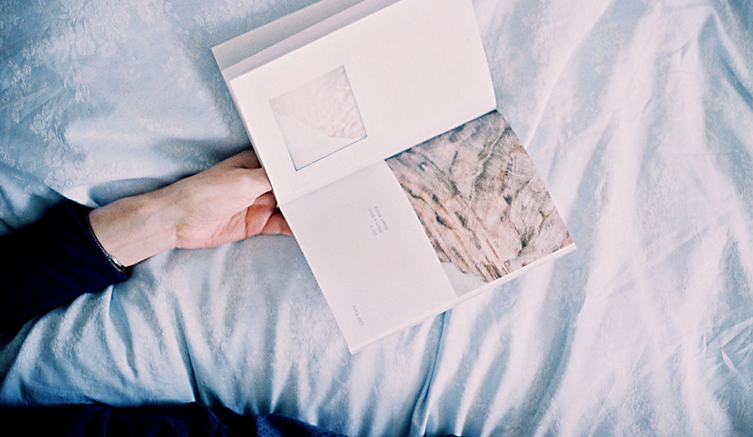
So many songs and puns we’d like to share about ‘money’ right now but alas, it’s not the point of this post. We refer here to James Money, an accomplished Australian artist and Archibald finalist. To launch into the Hong Kong art market during Art Basel/HK 2014, he collaborated with Studio Constantine to create a limited edition monograph of his work. The outcome is this simple and elegant A5 piece printed on Kaskad Sparrow Grey, Grange Offset and HannoArt Satin.Money (we just have to keep using his surname, it’s so great!) is an award winning artist. He works in both portraiture and landscape, exploring themes of isolation. His work appears in private collections around Australia and New York. Studio Constantine worked on all the stages – planning, documenting, editing and production. As David Constantine explains, they were keen to: “Use a format that led readers through the work and articulated the different genres. The layout and typography was deliberately restrained, although quietly assertive in scale.”
So we now have this little A5 beauty to feast our eyes on. A double-spined, concertina fold cover printed with Pantone 871 on the Kaskad with two different text paper stocks – a coated sheet for the painted work (HannoArt Satin) and an uncoated sheet (Grange Offset) with a custom duotone for James’ pen and ink drawings. Dee-lightful.
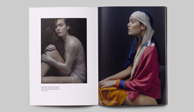
Documentary images by SC & Flore Diamant.
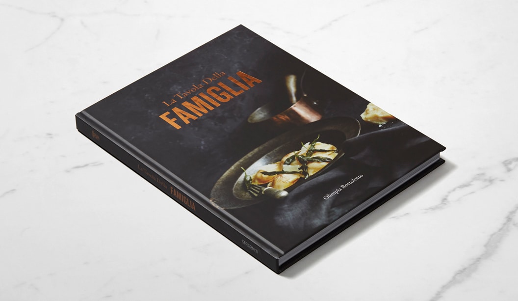
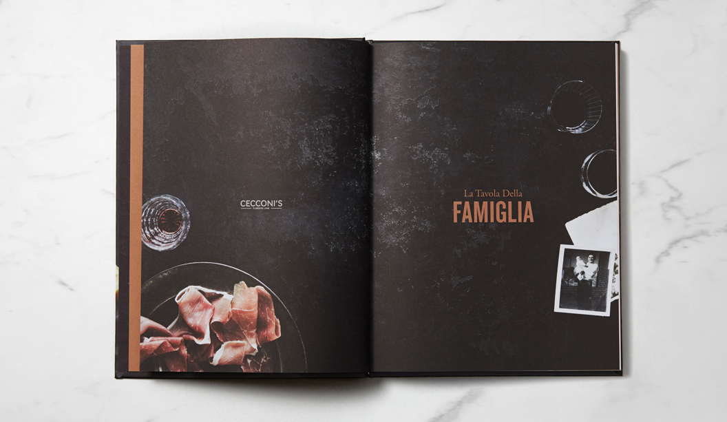
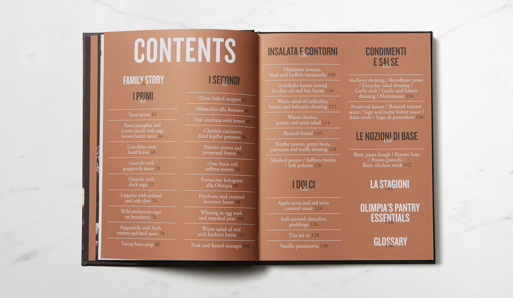
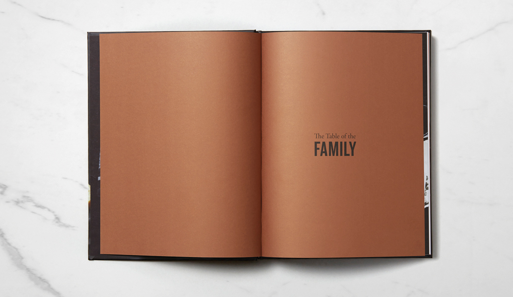
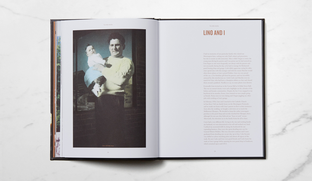
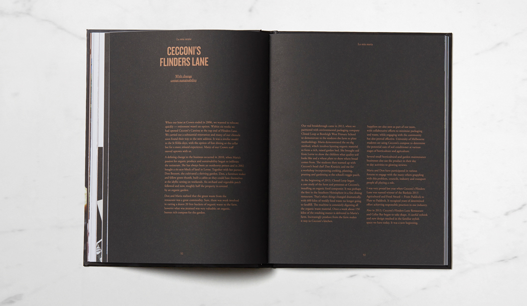
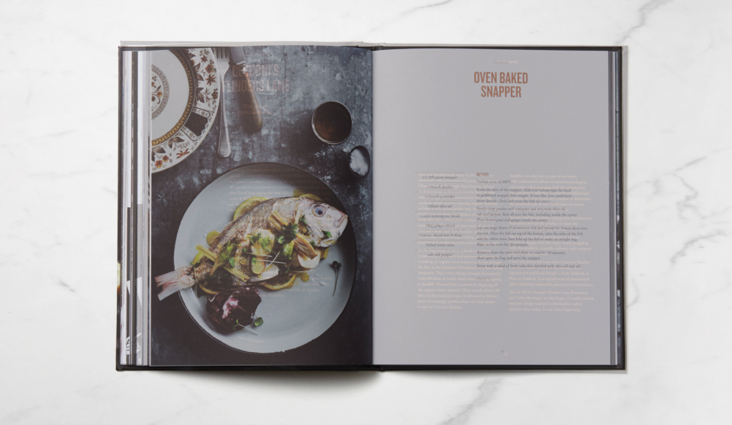
‘La Travola Della Famiglia’ (The Table of the Family), is not just a recipe book, it’s also a memoir and historical account of life in Australia for the Bortolotto family – owners of iconic Melbourne eatery – Cecconi’s on Flinders Lane, that has a rich 30 year history to be proud of. Maria, daughter and business partner of Olimpia Bortolotto (the author), approached Studio Brave in Melbourne to produce the book. In true Italian style, the studio were invited to dine with the Bortolotto family at their restaurant, where they experienced first-hand the family’s passion for food and life in Australia.
Working closely with photographer Sharyn Cairns, the design stemmed from their story – the notion that the restaurant was ever evolving and always at the forefront of Italian cuisine in Melbourne. Printed on Sovereign Silk 170gsm with copper foil for the cover and Sovereign Offset 135gsm for the text, the pages are filled with mouth-watering modern and traditional Italian recipes and carefully chosen typography to complement the old family photographs.
Studio Brave shared many interesting insights with us, like this one: “We felt it was integral to the Cecconi’s brand that we represent the beautiful copper highlights found throughout the Flinders Lane basement restaurant. Using a copper foiling on the cover, we were able to balance this with a copper metallic print throughout, which really brings the book to life and adds a sharpness that you cannot match using CMYK.”
This wonderfully tasty book is sure to inspire your inner Italian chef. Remember to invite us around if you ever unleash your culinary beast!
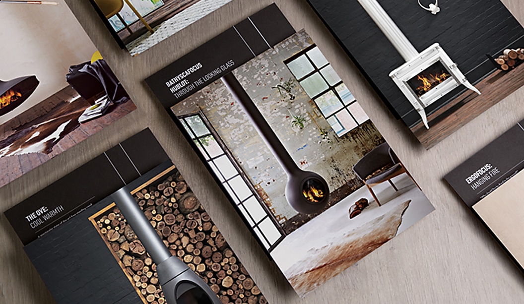
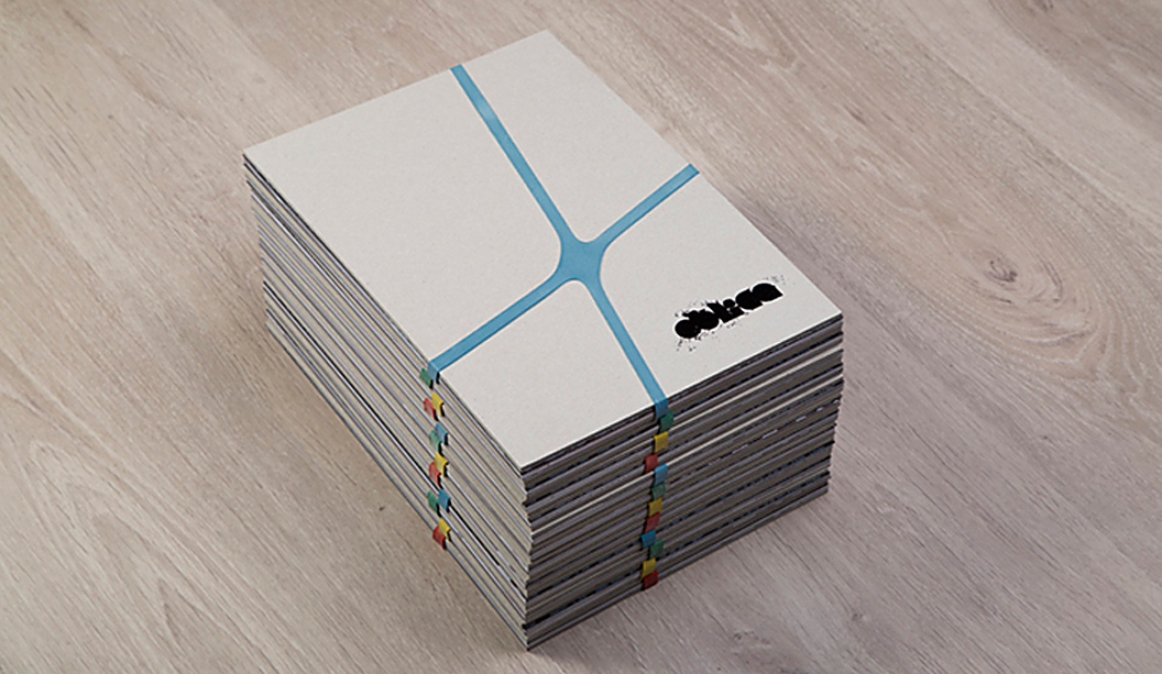
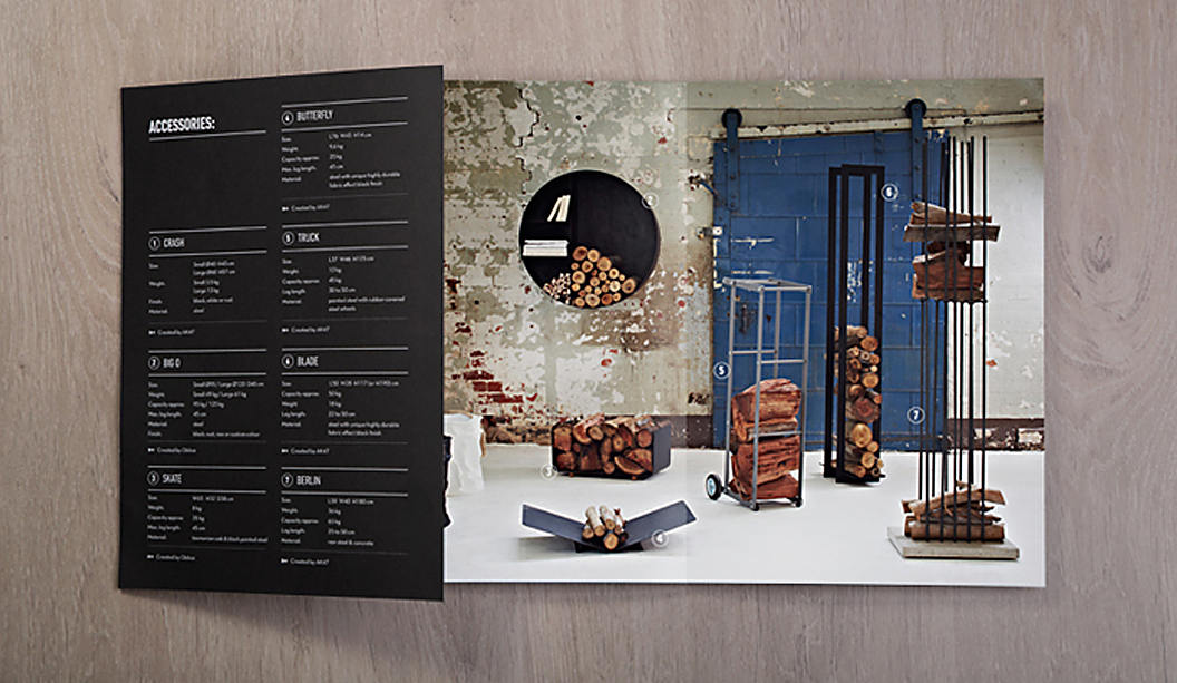
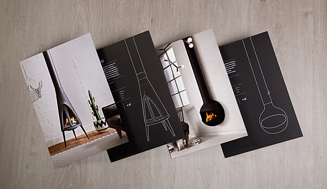
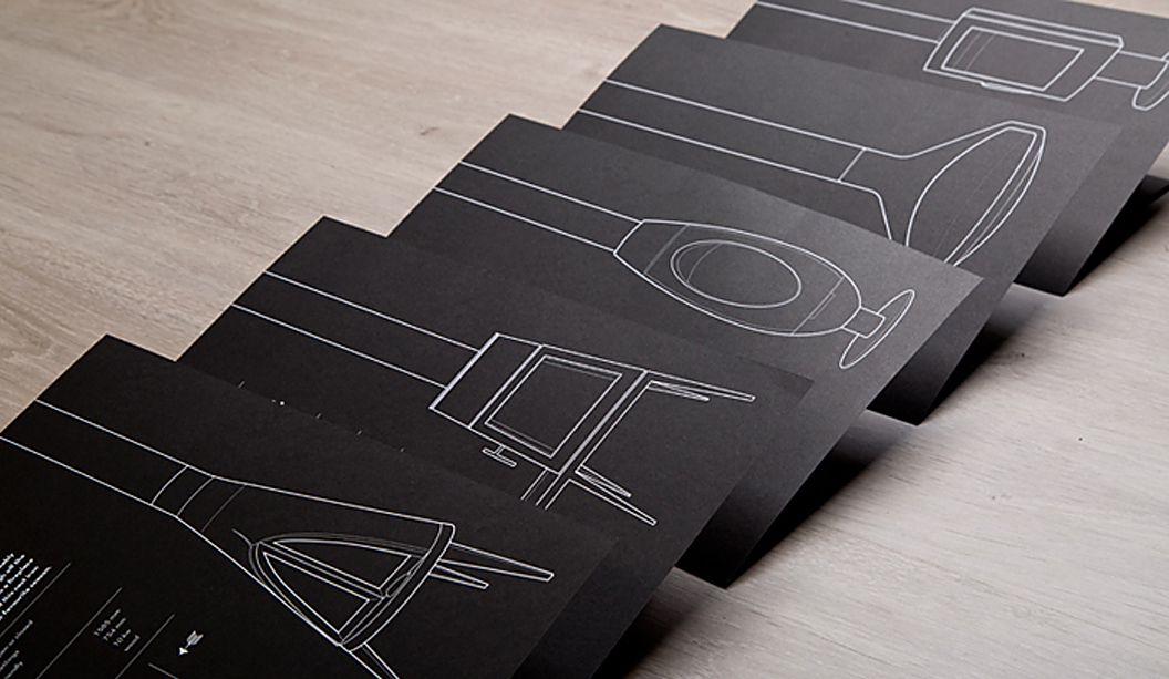
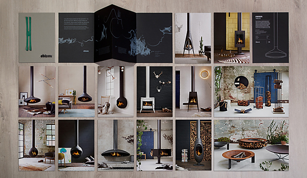
Oblica’s first catalogue is out and it’s a beauty. Designed by the team at Sense in Melbourne, in collaboration with photographer Arnelle Habib and stylists Jacqui Moore and Julia Greenthe, the piece showcases Oblica’s unique product range of contemporary European fireplaces, stoves and accessories that truly are a work of art.
The clever loose-leaf design means the catalogue can be customised for each person and easily updated as new products arrive. The cover is Boxboard 2100gsm with black gloss foil and the inserts and brochure are printed CMYK on Knight Vellum 200gsm, all bound together with a brightly coloured rubber x-band for extra wow factor. The catalogue design is really well considered and complements the quality evident in the range. In other words, the printed piece does the range justice.
If you have an Oblica fireplace, all there’s left to do is grab a hot chocolate and toast a marshmallow or two. If, like us, you don’t have one, then it’s a hot chocolate and heater type scenario.
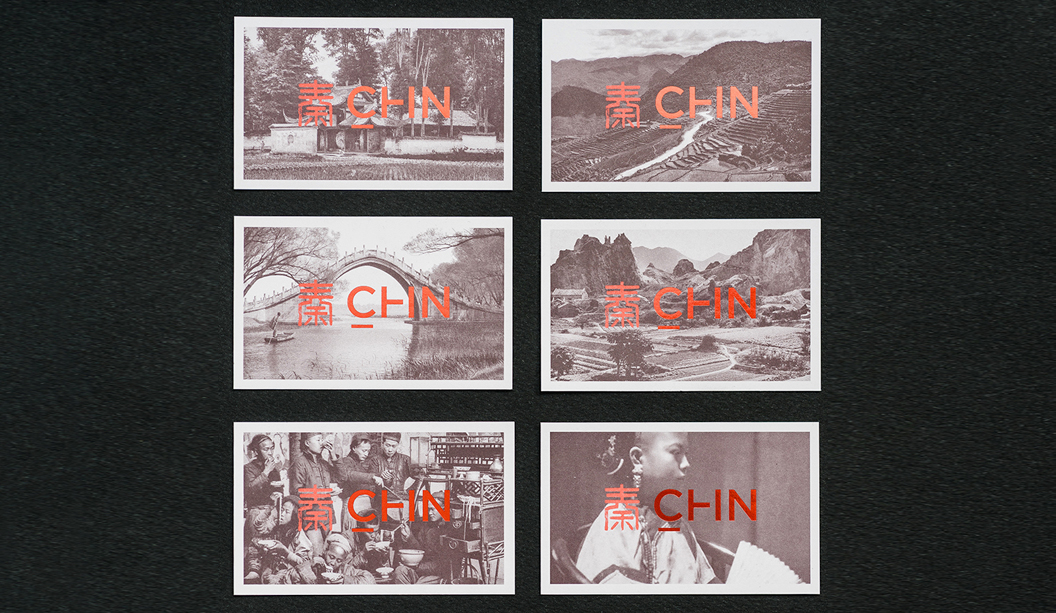
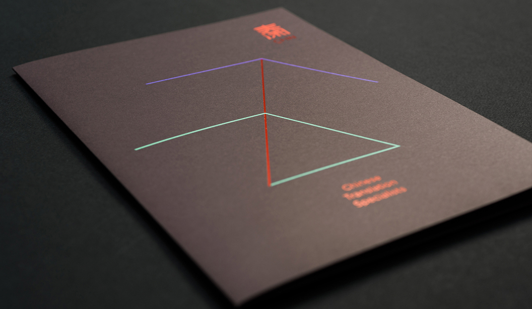
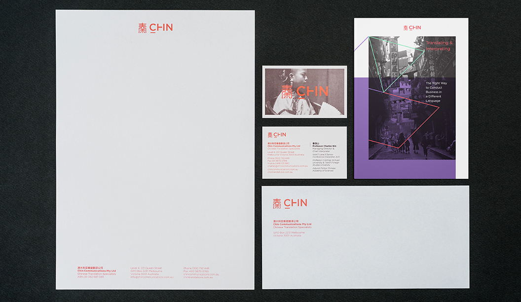
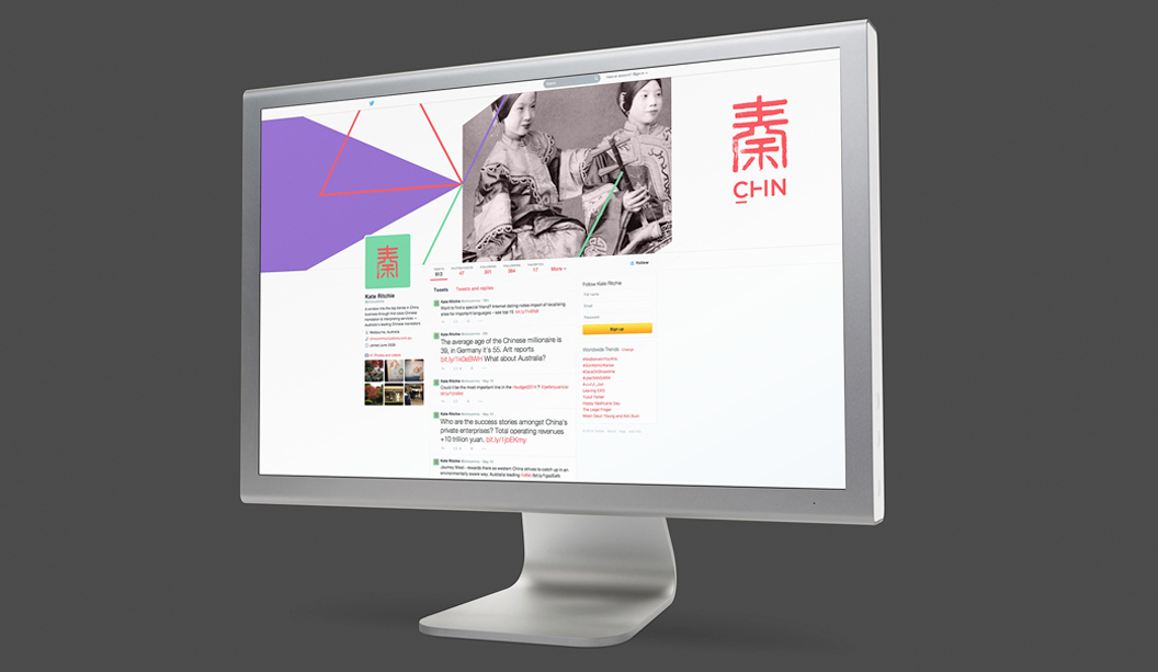
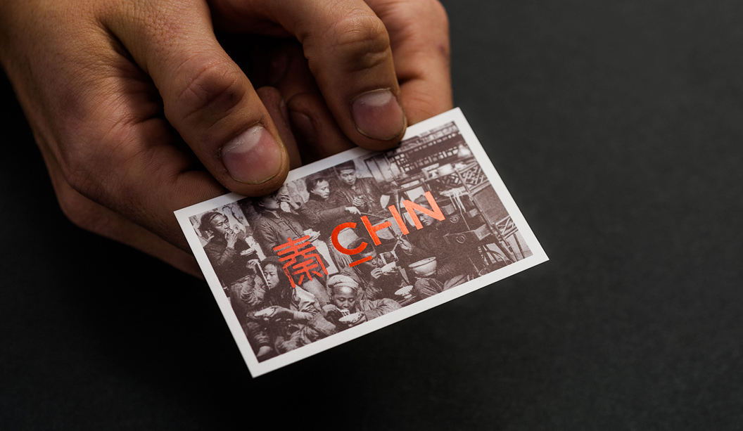
Chin Communications is a well-known Chinese translation service, operating for nearly 20 years. They provide translation services to people and businesses across Australia. A recent re-brand carried out by Melbourne-based studio Design By Bird, is really special. They considered the historical, multicultural, language and modern angles to create the right branding for Chin.
Steeped in tradition, the Chin logomark (秦) pays homage to both the company’s founder Qin (pronounced ‘Chin’) Lushan as well as Qin Shihuangdi – China’s first emperor. All great work comes from sound research. The studio looked into China’s rich history, discovering elements from the past they could take into Chin’s future. They found out that when Emperor Qin standardised currency, each coin was inscribed with seal script – an ancient Chinese technique. With this in mind, they re-worked the logo, included a bright colour palette and modern typography.
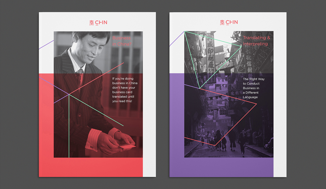
The studio shared many interesting insights like this one: “There are certain considerations that need to be taken into account when designing for a multicultural audience. For example, names should not be in red because in ancient China, red titles were reserved for the dead and particular white papers don’t sell in China because of their tones. Not only did we get to work with a great client on an exciting project, but we learnt a lot.”
The business cards and folders were printed on Strathmore Premium Super Smooth Ultimate White – 352gsm. The letterheads, with compliments slips and C4 envelopes were printed on the 118gsm. “The paper has a great texture, which the ink took to really well. We were particularly impressed with the clarity of the colours on the Ultimate White background,” reports the studio. Using a variety of processes and techniques including foils, block colour and photographic elements, everything was printed offset except for the with compliments slips, which were printed digitally.
The new suite of collateral is a lovely blend of the old and new, giving an ultra-modern lift to a well-recognised brand. What’s not to love?
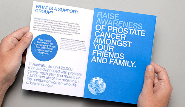
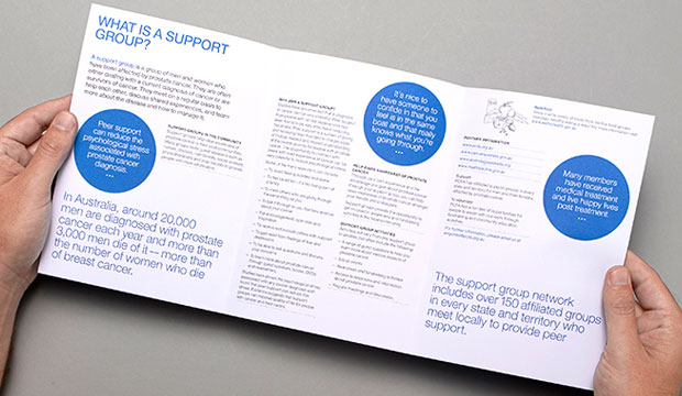
Thursday Design have a knack for teaming up with great illustrators. This time it was Lew Keilar who did a super job of illustrating real people from the prostate cancer community for a series of three A5 brochures. Using PMS colours like the foundation’s blue, PMS 3005 and PMS 144, PMS 305, PMS 583 plus a black, Thursday Design have done a great job of making this collateral a real stand-out. The campaign launches nationally this month so keep a look out for it.
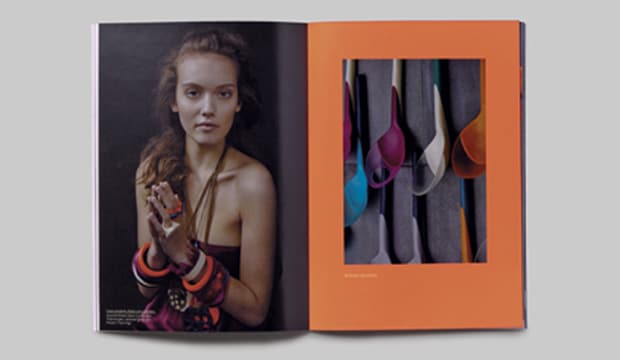
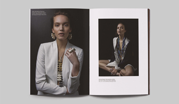
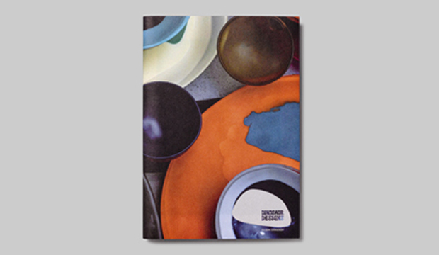
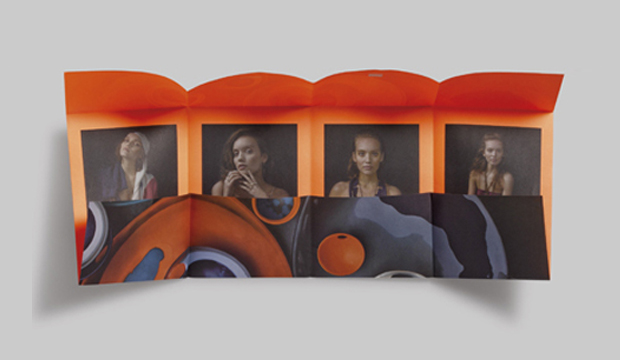
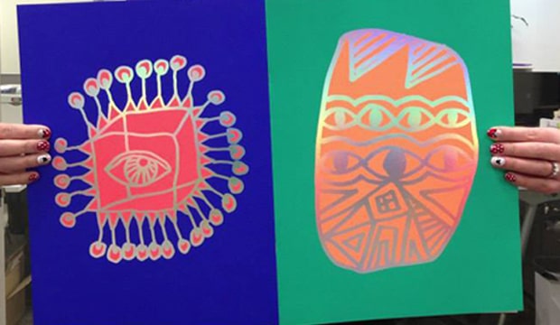
Dinosaur Designs is one of the Australia’s most celebrated brands in jewellery, homewares and objet d’art. To showcase their stunning new range, Dinosaur Designs aka Louise Olsen and Stephen Ormandy, partnered with Hoyne Design and photographer Nicholas Samartis to produce a highly collectible annual publication. Its graphic and textural imagery had us at page one. The theme is modern tribal, as Louise Olsen said: “With this collection, we played with the rhythmic sensibility of colour and pattern. Strong earthy tones are balanced with earthy neutral tones.
The 32pp A5 booklet is printed offset CMYK with fluoro orange ink on HannoArt Satin 170gsm and cover Impact 100% recycled 300gsm. The dust jacket is designed as a treatment which unfolds to reveal a double sided poster, printed offset CMYK with fluoro orange on Impact 100% recycled 100gsm. The publication is a work of art in itself – a real little beauty that does the brand justice. To view Dinosaur Design’s beautiful new range see www.dinosaurdesigns.com.au/collections
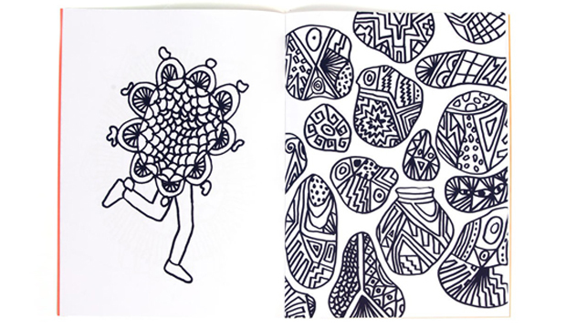
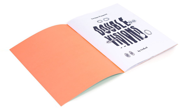
Tin&Ed from downtown Fitzroy have created a colouring book (for big kids just like us), especially for the release of Lisa Gorman’s new home wares range – Gorman Home Time. The ‘Double Visions’ colouring book features hand drawn illustrations by the talented duo and at a neat $39.95, could be just the gift for your favourite person this Christmas.
The limited edition 16pp book is printed 5 colours including an orange and red fluoro ink on Sovereign Offset 135gsm and cover Sovereign Offset 300gsm with a colossal holographic foil on the front and back for some extra bling!
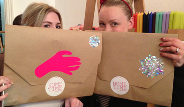
For all of you chomping at the bit to feast your eyes on Gorman Home Time, the range is available in two special pop-up shop locations in Melbourne – Shop g08 at the GPO, and 336 Brunswick Street, Fitzroy AND of course it’s all available online too!
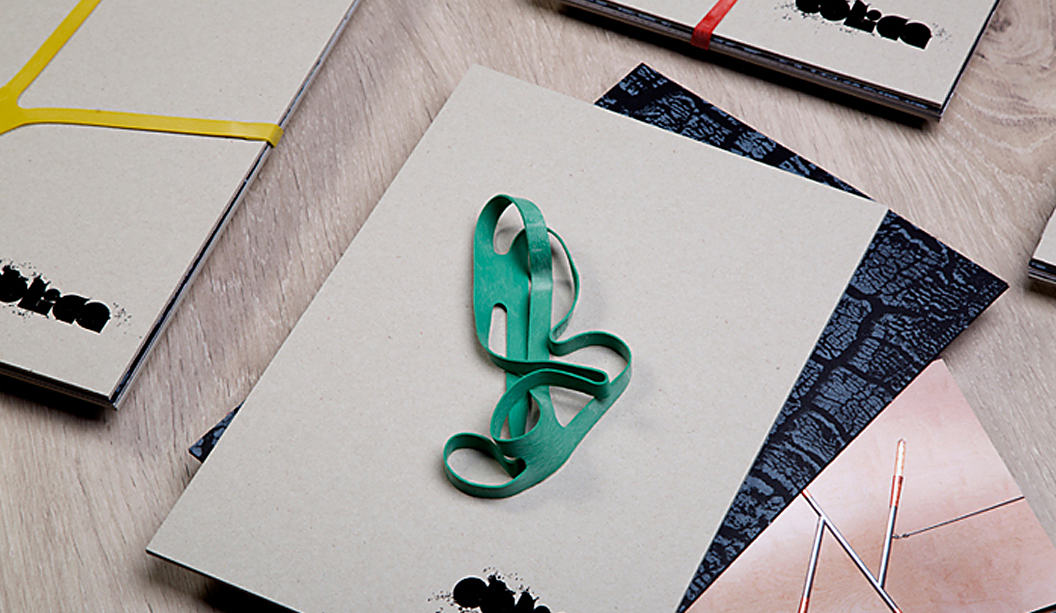
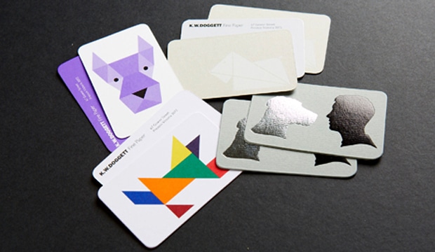
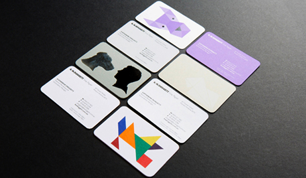
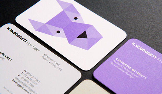
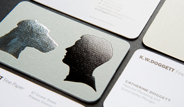
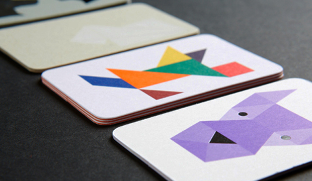
Our new look business cards have arrived and look smashing, bringing us from the 90’s to the noughties, oh yeah!! There has been a suite of four cards designed by David Lancashire Design (VIC), the same peeps that designed the Doggett branding many years ago. We used a variety of stocks and printing processes as part of the overall rebrand.
Here is a description of the four cards:
1. Purple geometric dog – printed 1 PMS 266 (Doggett purple) and black on Strathmore Premium Super Smooth Ultimate White 432gsm.
2. Origami dog – printed matt white pigment foil stamp on Hercules Greyback 450gsm.
3. Silhouette dog – printed gun metal grey foil + matt black foil stamp on Conqueror Laid Concrete 300gsm duplexed to Conqueror CX22 Diamond White 320gsm.
4. Tangram dog – printed 4 colour process (high gamut*) plus 1 PMS on Knight Smooth White 200gsm and triplexed to Kaskad Fantail Orange 270gsm.
Print specs:
• All the shells were printed at Southern Colour (VIC).
• Foiling was done at Lorimier (VIC).
• All overprints done at Taylor’d Press (VIC).
• Cards designed by David Lancashire Design (VIC).
*Southern Colour have an offset process called high gamut that makes certain colours like blue, orange, green really pop. It’s a special process where two or three inks are added in addition to CMYK, to extend the colour gamut and enable the press to print a wider range of colours. This in turn makes images look more vibrant, or ‘pop’ with colour.
Ask your local paper specialist or account manager to show you the cards if you’re keen to have a look at the re-design. Enjoy!
Stocks: Conqueror CX22 / Conqueror Laid / Hercules Greyback / Kaskad / Knight – Smooth / Strathmore Premium Super Smooth.
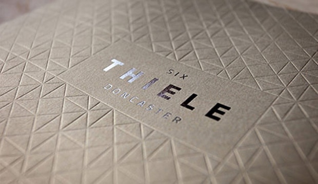
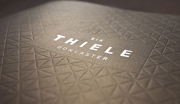
Six Thiele Doncaster is the latest residential apartment project by Accord Property Group. The masterminds behind this impressive brochure design is Scharp, a multi-disciplinary creative studio specialising in property and development. Scharp came up with a full marketing campaign to promote the new development which included an animated movie, website, lifestyle photography, print and online advertising collateral, and much, much more. A very talented bunch indeed!
The cover is printed offset on Curious Metallics in Gold Leaf 300gsm. No ink was used on the cover. Instead, a full blanket blind deboss of the brand’s geometric motif (inspired by the architecture designed by award-winning architect Clarke Hopkins Clarke), has been impressed across the entire surface to create a stunning tactile experience. As a final touch of opulence, Six Thiele Doncaster’s bold logotype was centrally embellished using Milford Astor silver foil for a striking and eye-catching contrast.
 Footy Tips