Kloke’s autum/winter Collection 2013

Agency: Three60
Client: Kloke
Stocks: Strathmore Premium Super Smooth
Printed by: Bambra Press (VIC)

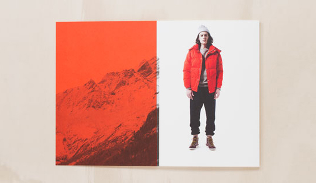
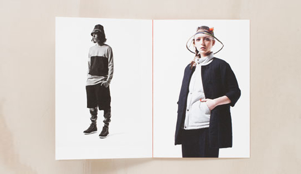
Adam and Amy Coombes share a common passion – they both love fashion and each other! In 2011, this driven and creative couple started Kloke, a Melbourne based clothing label that produces technical garments and tailored detail. Recently, Three60 produced printed piece showcasing Kloke’s Autumn/Winter collection, calling it ‘Dissimulate’.

The A5, 32pp book references the spirit of the brand as a functional and detailed piece. Printed on Strathmore Super Smooth, 352gsm the book is pad bound (also known as cheesecloth). This is where the glue is dyed and the colour is visible on the spine. It also means it can be opened flat for spreads or taken apart and used as individual cards. Printed CMYK plus PMS 172U, we think the PMS has come up a treat, really punchy and rich. Makes buying something even more enticing. Not that we need an excuse.

Kloke-autumn_2

Kloke-autumn_3


Sow ‘n Sow cards – design that grows

Title: Gifts of Seeds and Australian Native cards
Agency: Sow ‘n Sow
Stocks: Enviro Board
Printed by: MJ Printing (VIC) and Moule Print (VIC)

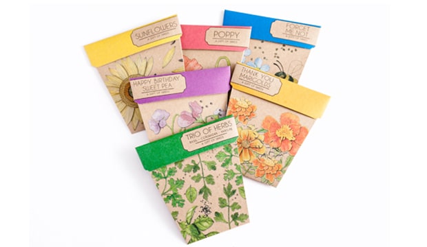
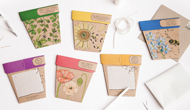
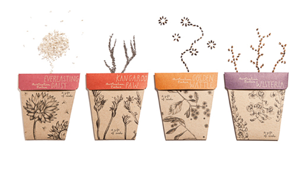
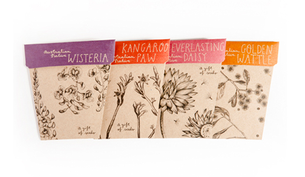
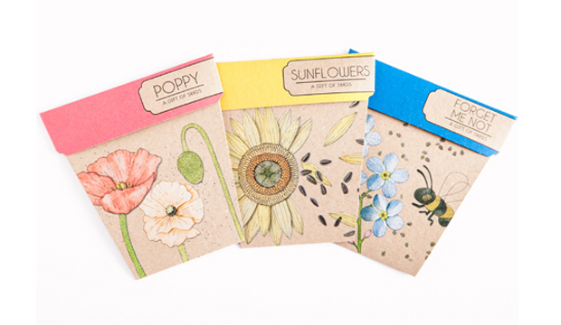
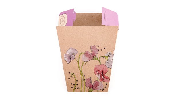
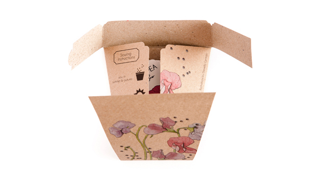
We love hearing inspiring stories and Michelle Brady is a woman with one such story to tell. Her dream to combine her penchant for gardening, be a business owner and pursue her creative passions became an everyday reality. She created Sow ‘n Sow, a Melbourne company that produces the ‘Gifts of Seeds’ card collection. The packets of seeds are beautiful enough to be given as a gift yet they’re a card too! She recently released an Australian Natives collection as well.

Sow_5

This innovative idea stemmed (pardon the pun) from both her new found interest in gardening and the birthday presents she would give away to friends and family that were packets of seeds. Her idea simply blossomed (ahem) from there. Michelle can tailor the seed packets to any particular project or corporate promotion. She once created mint seed packets at an event for Bacardi, to encourage people to make their own Mojito cocktail. Now, why didn’t we think of that?!

Created in collaboration with designer and illustrator Daniella Germain, the ranges feature really lovely illustrations. The ‘Gift of Seeds’ illustrations are collages which give the packets a 3D effect and for the Australian Natives collection, the inspiration came from botanical illustrations so the intention was for an earthier, more understated feel.

Michelle mentioned to us: “The focus was very much on the item being a gift, so we kept a minimal layout and let the illustrations speak for themselves. Enviro Board 230gsm was an easy choice for the packets, because of its eco-friendly credentials, 100% recycled factor as well as its earthy look and feel.” The ‘Gifts of Seeds’ cards were printed offset with a double hit of opaque white, then CMYK. The Australian Native packets were printed offset plus CMYK.

We’ve spotted these little beauties around town recently and they look even more special in person!

Sow_1 Sow_2 Sow_3 Sow_6 Sow_7

Woolwich Pier Hotel direct mail campaign

TitleWoolwich Pier Hotel direct mail piece
AgencyMatter Design (QLD)
Client: Woolwich Pier Hotel
Stocks: Knight – Vellum

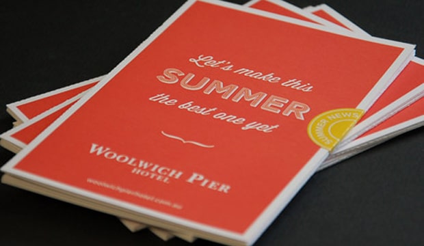
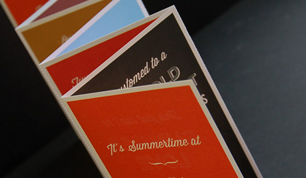
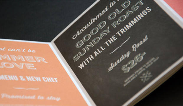
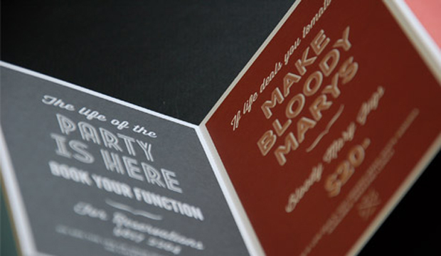
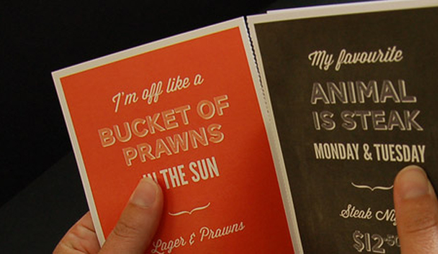
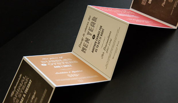
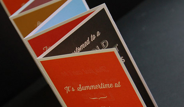
Here’s a direct mail piece that must have had thousands of people in the Lower North Shore and Ryde areas wanting a beer and hearty pub meal! Printed on Knight – Vellum 200gsm, the piece is a 7pp concertina fold with perf, created for one of Sydney’s most iconic pubs, the Woolwich Pier Hotel. The studio behind it is Matter Design (who also designed the hotel’s website and promotional posters).

Woolwich_5

Matter Design was asked to develop a new style to attract an audience over the Christmas and New Year period. The brief was to take a typographical approach and still have that traditional English feel but with a modern twist. Mission accomplished! You may recognise some of the free Conqueror typefaces that were used – Carved and Inline. Other fonts include Wisdom Script and League Gothic.

The Knight range is known for its tactility and elegant nature, factors that Matter Design took into account. They wanted people to pick up the piece and interact with it so Knight – Vellum was a good choice for them. The client provided creative freedom in all respects which made for a very happy design studio. It’s clear in the outcome – such a fun colour palette and lovely typography, quite different to regular pub branding.

Given the large print run (14,000), the job was offset printed by Lindsay Yates Group. Alyce Biggs from Matter Design explains: “The colours were practically spot on with the Pantone breakdowns on the 7 spot Heidelberg Speedmaster. The printer has great attention to detail and a great technical system so our CMYK was as close to the Pantone as it could be.”

We hope Matter Design keep producing such beautiful printed pieces. We like them a lot.

Woolwich_1

Woolwich_2

Woolwich_3

Woolwich_4

Woolwich_5

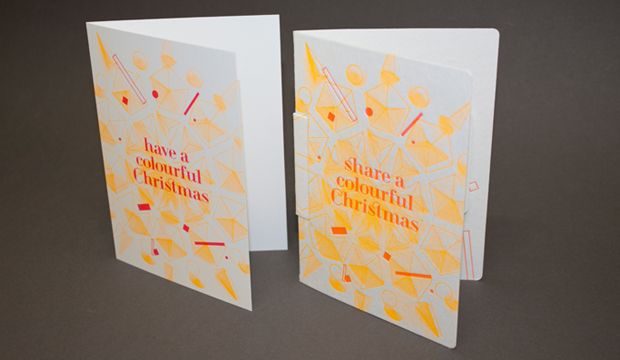
A colourful Christmas at Doggett’s

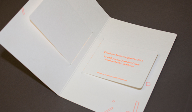
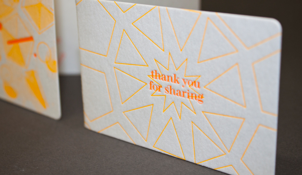
Our 2012 Christmas cards are printed on our new WILD and Strathmore Enhance papers. Why two papers? Well, we couldn’t choose between the soft cotton finish of WILD and the geometric fine texture of Enhance. So why choose when you can have both. There have to be some perks to having warehouses full of paper! We threw in some seriously bright fluoro to bring our ‘colourful Christmas’ message to life. Here’s the specification low down:

Card 1:
WILD cotton paper 300gsm. Arriving mid January (weights 150, 300, 450, 850gsm)
Designed and letterpress printed by The Hungry Workshop.

Card 2:
Strathmore Premium Enhance 271gsm. Sound familiar? This is not a new paper but a new name. Previously know as Beckett Enhance. This Mohawk made paper is now branded as Strathmore. In fact, all our Mohawk grades: Expression, Concept, Cambric and Enhance are all now branded as part of the Strathmore family. Swatch out in early 2013. Card designed by The Hungry Workshop. Printed offset on a Heidelberg Speedmaster press.

xmas-2012_2

xmas-2012_3

xmas-2012_1


ABC Television press kits

Title: ABC Television press kits
Agency: ABC TV graphic design department (NSW)
Stocks: Buffalo Board / Keaykolour Original / Maine Recycled – Silk / Newsprint / Sovereign Offset
Printed by: Advanced Press (NSW) and foiling

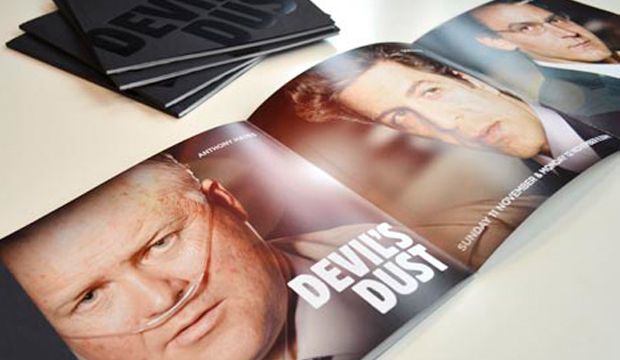
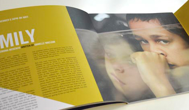
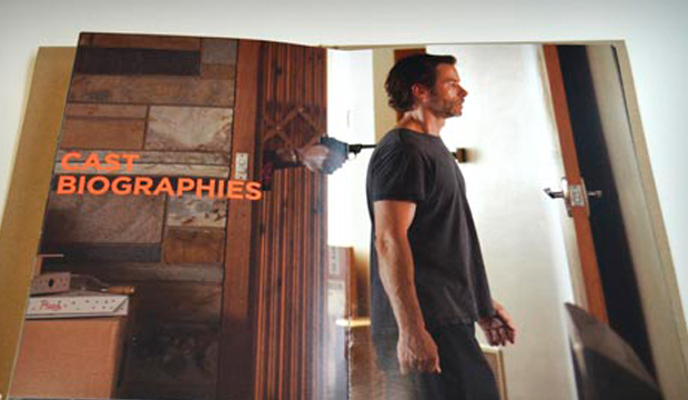
Media releases and press kits are mostly standard issue – words plus supporting imagery tends to be the status quo. Not the case for ABC Television’s graphic design department! We have to say, when we first saw these tasty morsels of paper goodness, ‘press kit’ did not cross our minds. Some hot new shows deserved kits that made the journalists sit upright in their uncomfortable office chairs. Clare Goodall, Print Designer from ABC Television, shared some insights into each of these offset printed pieces:

Redfern Now: The inspiration came from the keyart which saw the mustard yellow carried throught out the campaign including online, print and outdoor. Cover: 6pp wrap around on Sovereign Offset 300gsm with die cut text. Text: Sovereign Offset 170gsm.

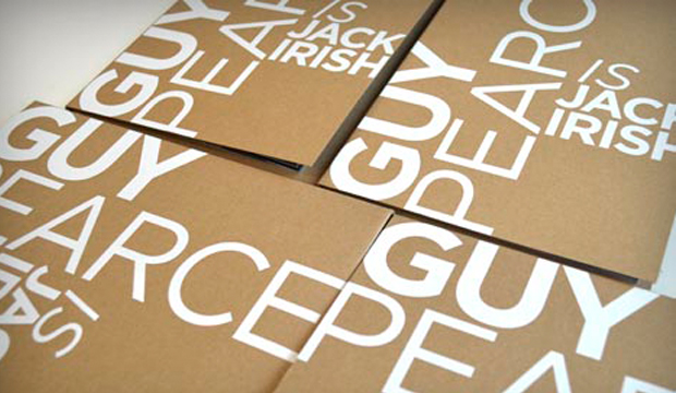
Jack Irish: The key message of this campaign was ‘Guy Pearce is back on Australian television’. This was boldly stated using a gloss white foil on a contrasting Buffalo Board. Cover: Buffalo Board 332gsm. Text: Maine Recycled Silk 170gsm with spot fluoro orange 804c.

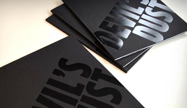
Devil’s Dust: The conflicting nature of this story was represented with the stock. The use of Newsprint 45gsm represented the story which unfolded in newspapers nationally. Maine Recycled Silk 170gsm illustrated the cinematic elements of the production. Cover: Keaykolour Jet Black 300gsm. Text: Newsprint 45gsm (printed black only) and Maine Recycled Silk 170gsm.

We rate the use of print to make an impact and a point of difference. We love the colours and carefully chosen stock selection which tells a unique story for each of these quality shows. ABC has definitely set a standard here!

Redfern_6

Redfern_1

Redfern_5

Redfern_2 Redfern_3

Redfern_4

The 2013 calendar ‘Salon de Doggett’ is unveiled!

Title: 2013 calendar – Salon de Doggett
Agency: University of Technology Sydney (UTS), Bachelor of Design (Visual Communication) students
Client: K.W.Doggett Fine Paper
Stocks: Envirocare 100% Recycled / HannoArt – Satin / Knight – Textures / Knight – Vellum
Printed by: Offset Alpine Printing (NSW). Embellishments: Gold Craft Embossing (NSW)

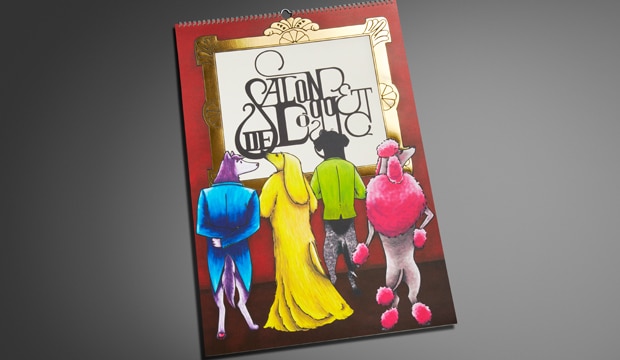
The calendar pays homage to art movements and famous artists with canine adaptations. Imagine the Mona Lisa from the Renaissance period looking much furrier than usual! Or Picasso’s abstract Weeping Woman as a pouting pooch. These classics sit alongside dogified originals from the Graffiti Art, Bahaus and Art Deco movements, just to name a few. We’ve been producing the calendar for 26 years, as a gift for our customers. We are still, after all this time, blown away by the creativity and professionalism the students show.

Printed stochastically with 4 colour process and UV inks, the cover is printed on Knight Vellum  200gsm and features a striking gold foil. HannoArt Satin 200gsm, Envirocare 100% Recycled, Knight Linen 280gsm and Knight Vellum 200gsm are all mixed within the 12 months, with a few surprise embellishments too.

A special thank you to Amy Commons, Creative Director of Sai Designs and Tutor at UTS, as well all the students for their hard work and effort in producing an amazing calendar. The students we had the pleasure of working with (in no particular order) are: Carina Lee, Eleanor Cliffe, Jamie Lo, Nikki Lo, Ash Myburgh, Susanne Peng, Lucy Turnbull, Vanson Han, Thiwanka Somaratna, Lucinda Dryden and Yewon Chung.

Your fine paper specialist will be around shortly to drop in your 2013 calendar – where you can see these 12 beautiful (slightly familiar) loveable pooches for yourself.

Cover – Nikki Lo.
January (Futurism) – Jamie Lo.
February (Renaissance) – Susanne Peng.
March (German Expressionism) – Lucy Turnbull.
April (Graffiti Art) – Vanson Han.
May (Bahaus) – Thiwanka Somaratna.
June (Cubism) – Jamie Lo.
July (Art Deco) – Lucinda Dryden.
August (Post Impressionism) – Vanson Han.
September (Ukiyo-E) – Vanson Han.
October (Day of the Dead) – Carina Lee.
November (Surrealism) – Yewon Chung.
December (Pop Art) – Ash Myburgh.
Typography and layout – Eleanor Cliffe
Project management team – Carina Lee, Eleanor Cliffe, Jamie Lo.

desktop’s love affair with print and paper – the November issue
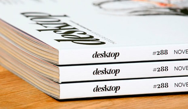
desktop has long been the main go-to magazine for Australian graphic designrs. Rejuvenated early last year with a new look, it’s gone from strength-to-strength with even better visuals and content. And the best has got to be the November issue – a love affair with all things print and paper. Could the day get any better?

It starts with Matt Huynh’s beautiful illustration on the front cover (see above) and carries through to the gorgeous designs showcased across varying print techniques. It’s great to see print and paper celebrated in such style. Everyone that took part in making this edition happen approached it with pride and comittment and of course, a love of print.

All the paper merchants have come to the paper party too. We’re there flashing our wares in the ‘Special Inks’ section with Strathmore Premium Super Smooth Ultimate White 176gsm (formerly Expression) and the ‘Embossed’ section with Rives Design Natural White 120gsm. We’re kind of partial to our sections but they’re all pretty snazzy, so do pick up a copy and take a good look for yourself. It is definitely a keeper and worth every penny of the $9.25. Well done desktop!

Here’s the hit list of techniques and design studios included:
Special Inks: Toben, Deuce Design
Foiling: Babekuhl, Luke Brown
Special Papers: Alter, Work Art Life
Die Cutting: Parallax Design, Leuver Design
Embossing: A Friend of Mine, Pidgeon
Digital Printing: Photo Essay, Retrospect
Stocks: Expression Super Smooth / Rives Design

7 days in Hong Kong by James Braund

Cover: Conqueror Laid Diamond White, 100gsm.
Text: Conqueror CX22 Diamond White, 100gsm / Conqueror Contour Brilliant White, 120gsm/Conqueror CX22 Cream 100gsm.
Title: 7 Days in Hong Kong- James Braund
Agency: Clear Design (VIC)
Client: James Braund (VIC)
Stocks: Conqueror Contour / Conqueror CX22 / Conqueror Laid
Printed by: Bambra Press (VIC)

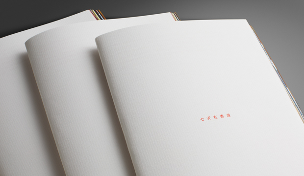
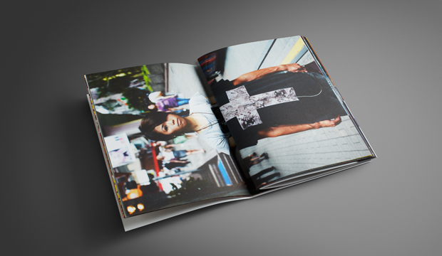
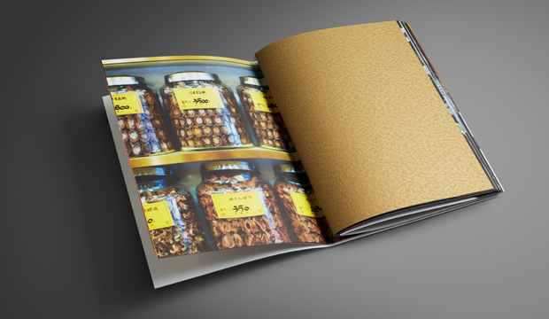
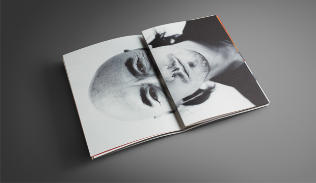
For seven days, James Braund explored the streets of Hong Kong, looking down the lane ways, discovering characters on the street and finding vantage points to absorb the metropolis. These are his observations from the trip, capturing the energy of Hong Kong and the ideas of Ted X.

His collection of images have been beautifully reproduced on Conqueror CX22, a super smooth specialty paper made by Arjowiggins Creative Papers. Presented as a collection of loose A4 sheets means there is no binding to interrupt your view and favourite images can be easily pulled out for display. The A5 booklet features pages of solid colour, including a solid flood of gold ink on the Conqueror Contour – giving you the unusual effect of beaten metal.

7-Days-in-HK_5

A collaboration between the photographer, the designers and us has resulted in what we think is a beautiful little show piece. Something we’re really excited to be taking to market. CX22 is a paper often forgotten in the Conqueror paper suite but we think this book shows just how good the paper really is. It knocks the full colour off the page and the solids look dense and even. Definitely a paper to consider when looking for a premium print result.

Thank you to James for allowing us to print his beautiful images and a big thank you to Russell and Matthew from Clear. You guys always deliver the goods!

7-Days-in-HK_4

7-Days-in-HK_2

7-Days-in-HK_1

3sidedsquare business cards

Title: 3sidedsquare business cards
Agency: 3sidedsquare
Stocks: Knight – Smooth
Printed by: Moule Print (VIC) on an Heidelberg SM52 Speedmaster.

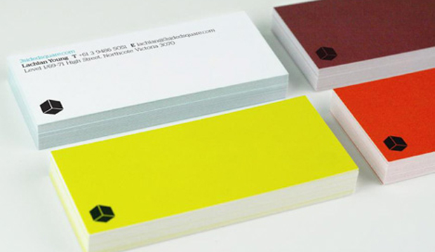
We’re definitely keen on visually appealing business cards. They say so much in a small amount of space. And we always remember the stand out ones. That’s the point right? In this case, take a handful of bright sparks from 3sidedsquare, a design and web studio in Melbourne, add a personalised colour palette and you have a pocketful of business card goodness right there.

So how does one achieve a pared-back design combined with eye popping bursts of colour? Hmmm? You go through various rounds of restraint and indulgence, do the loop a few times and then choose a lovely, uncoated stock to ensure the end result is crisp and clear. Knight Smooth White 400gsm made for a great outcome with its bright white and smooth surface. Another great example that shows the importance of choosing the right paper for your design.

Each member of the team selected their own striking hue to make up the set of vibrantly coloured cards. So, not only does the team have an important business tool, they have a neat little ice breaker that is a talking point with clients. As Lachlan Young from 3sidedsquare tell us: “The colours injects personality into the most personal of stationery items.” Besides the cards we love the opening graphic on their website – check out that pattern!

square_1

100% Melbourne book

Title: 100% Melbourne book
Agency: Famous Visual Services (VIC)
Client: City of Melbourne
Stocks: Impact / Tablex – Textures
Printed by: Bambra Press (VIC)

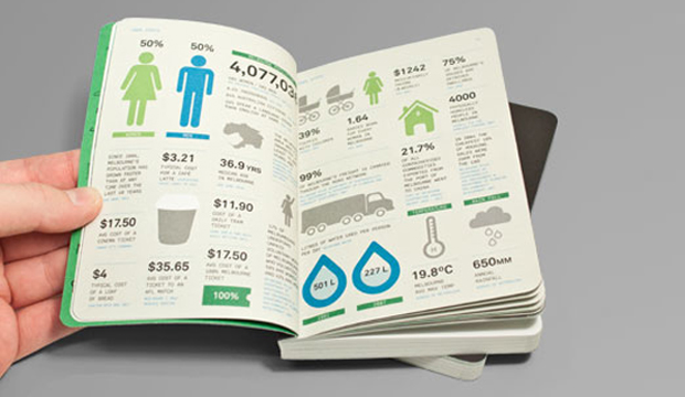
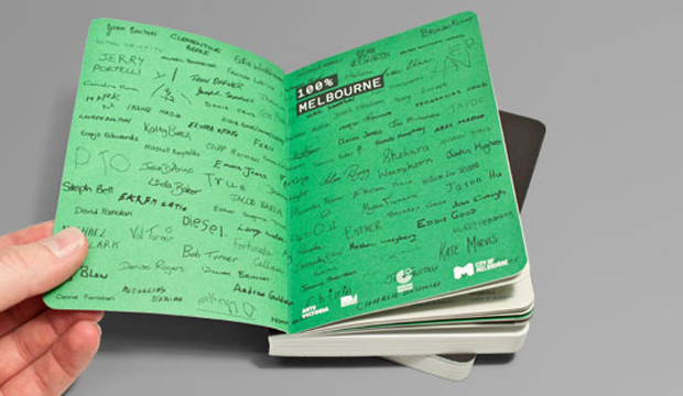
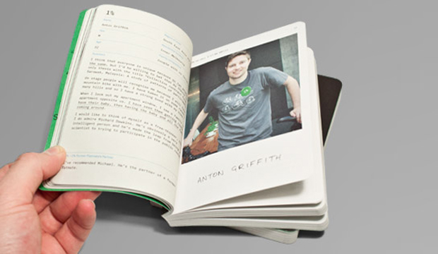
This little pearler is called the ‘100% Melbourne’ book. It’s beautifully designed (all 272 pages of it), with an enchanting story to match. A collaboration with Berlin theatre makers Rimini Protokol, the City of Melbourne and Famous Visual Services, the book reflects statistics from Melbourne city’s research department, contrasted with the story of each Melburnian. The 100 participants were also gathered together on stage to create a living breathing portrait of Melbourne. It was part theatre, part reality and of course ‘100% Melbourne’. Sounds like fun!

Melbs_2

The cover is printed on Tablex Freckles 280gsm and the text is on Impact 80gsm. We’re really impressed with the use of Tablex Freckles. It has to be one of the best examples we have seen in ages. Impact 80gsm was chosen for its flickability, minimum show through and great environmental credentials. The A6 format ensured the book could be easily carried home after the show. Just the right size to stash in your hand/man bag isn’t it? On the flip side, Famous Visual Services needed the outcome to be robust so they used Tablex Freckles 280gsm for its bookish texture and durability.

This book shows the importance of great digestable design. The aesthetic Famous Visual Services developed for the book highlights the contrast between the formal language of data and passports as well as the informal visual style of hand writing and casual portrait photography.

Dom Forde from Famous Visual Services shared some production insights with us: “A consistent colour treatment was added to every image to soften the hard edge of the digital shots. The colour palette was an important part of the identity and the stock chosen added the same tactile quality we were after. We used a rich black on the Tablex cover which handled that well and held the detail of our illustration really well.” This lovely little Melbourne treasure was finished off with some section sewing and bevelled edges.

Now that the team has had a taste of book binding, they’re considering some more lengthy publication projects.

Melbs_4

Melbs_3