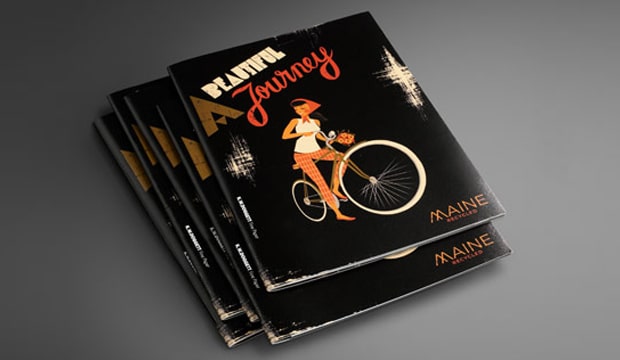
Maine Recycled promotion ‘A beautiful journey’

Title: Maine Recycled promotion
Agency: Thursday Design
Client: K.W.Doggett Fine Paper
Stocks: Maine Recycled – Gloss / Maine Recycled – Silk / Maine Recycled Digital – Gloss / Maine Recycled Digital – Silk
Printed by: Southern Colour (NSW). Carbon8 (NSW) – digitally printed postcards.

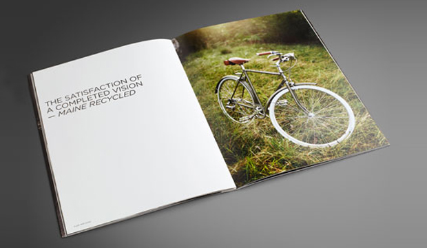
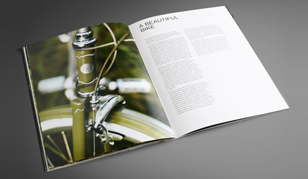
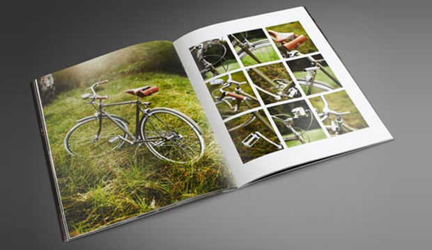
Albert Einstein once said: “Life is like riding a bicycle, in order to keep your balance, you must keep moving.” Wise words from a very wise soul but why on Earth are we talking about bicycles when we’ve just launched a paper promotion?! The quote is reflective of the unexpected and surprising element to our printed promotion – our beautiful Maine Recycled bike. Yep, we restored an old Speedwell frame into a modern classic. It’s a real beauty. What’s old is new again.
Maine Recycled_2

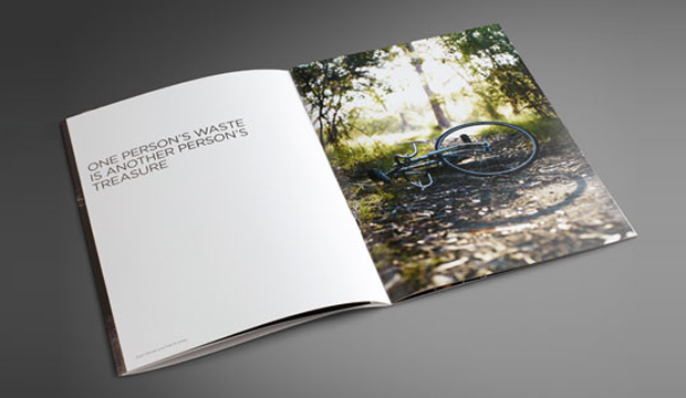
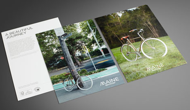
Thursday Design in Sydney are the creatives behind this project which they built based on the single minded proposition ‘Maine Recycled highlights the beauty of the world’. The photographic essay/brochure is called ‘A beautiful journey’. It’s printed CMYK on a Heidelberg Speedmaster CD102-6 with dry gloss varnishes (dust jacket Silk 130gsm, cover Silk 300gsm, text Silk 150gsm). The other parts include an offset postcard (Gloss 350gsm), two digital postcards (Gloss 350gsm and Silk 350gsm) and an A1 poster (Silk 200gsm). We chose to print the postcards in offset and digital form because we often get asked how an image looks in comparison so we reproduced the shot of the bike on the grass using an offset press and an HP Indigo 5500 press (we’ve included the printing specs on the back for handy reference).

Craig Johns, Creative Director at Thursday Design sums it up perfectly: “A decision to restore (or recycle) a once beautiful bicycle, seemed to be the perfect metaphor for the brand. Commissioning a beautifully shot photographic essay of a once great bike being restored reinforces the key brand message.” And we think it cleverly conveys a neat little environmental story too!

Maine Recycled is an A2+ coated paper available in gloss and silk and suitable for offset and digital printing. It’s made with an amazing 60% FSC® certified post consumer waste fibre and 40% FSC® certified virgin fibre, and is even certified carbon neutral from cradle to printer. The pulp is produced at Greenfield Mill in France, Europe’s number one producer of recycled pulp. In comes the waste (mainly sorted office waste), and out comes a shiny new generation, bright white sheet. There’s literally so much pulp you could fill thousands of velodromes!  We’re pretty proud of this sheet and the fact that it has one of the highest recycled contents going around among the coated papers.

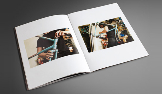
It took hours to find the right frame. The Speedwell road racer was discovered in unrideable condition, unloved and uncared for. Many more hours were spent finding the right person to rebuild the bike. Saran Langdon from Stallion Bikes in Redfern was chosen and she lovingly restored the frame via an incredibly detailed process. Her brief was to keep as much of the original bike as possible. Some gorgeous new bits like the classic seat and saddlebag from English company Brooks, brake callipers from Tektro and Soma vintage style light set, made our bike a true beauty. Speedwell frames were made in the late 1950s and early 1970s by a bike manufacturer in the same suburb as Stallion Bikes! There was also an  unexpected challenge of completing the bike build before Sarah went on maternity leave (her partner was due to give birth the same week of the bike restoration). Pressure much?

The gorgeous cover illustration is designed by Christoper Nielsen who you may have seen on The Design Files and who is well known around the traps for producing some colourful and exciting vintage inspired illustrations. He recently unveiled the creative process he undertook to produce the ‘Maine girl’ and it’s definitely worth a read.

So there you have it friends. Maine Recycled is a great on press performer and has a sweet environmental story which we hope you like as much as we do. Please speak to your paper specialist or account manager for more information. A copy of the promotion should be coming your way as we speak.
Maine Recycled_1

Maine Recycled_3

Maine Recycled_4

Maine Recycled_5

Maine Recycled_6


Bird Design business cards

Title: Bird Design business cards
Agency: Bird Design (VIC
Stocks: Conqueror Laid
Printed by: Taylor’d Press (VIC), Edging – OrtBindery (VIC).

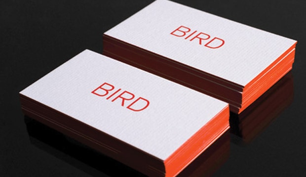
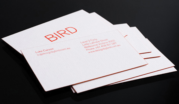
In the previous story, we talked about Bird Design’s stationery suite project for Owen & Peach, and now we’re going to talk about the designers themselves. Meet Bird, a Melbourne based graphic design studio that develops engaging design experiences across architectural and environmental signage/graphics, branding and print mediums. Their studio business cards are an expression of the studio’s character – a less is more approach which is greatly influenced by Director Luke Carson’s design philosophy.

Bird-2

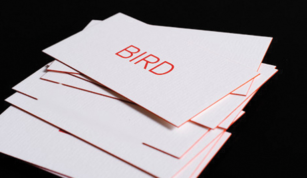
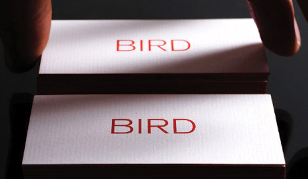
There is an underlying grid system which supports the constructive design so Bird wanted to choose a stock that complemented this approach. They decided on a natural, exposed paper that has texture, something you can feel. Conqueror Laid Brilliant White ticked all the boxes for them. Bird ended up choosing the beefiest option, going with the bulky 400gsm which they say made the painted edges slightly more visible. This, combined with the textured feel of the paper, added a softness to the constructive design.

The cards are printed 1 colour both sides with edge colouring to match the PMS 1788. A tip if you ever chose to do something similar – paint small stacks to avoid any colour bleeding. So, there you have it, a pretty sweet and simple business card that screams ‘less is more’.

Photographs provided by Albert Comper.

Bird-3

Bird-4

Meet the Sovereigns

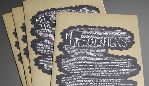
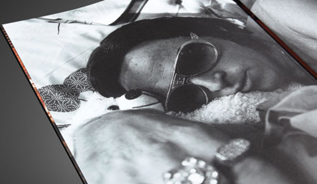
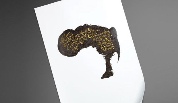
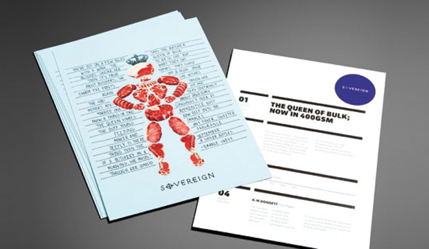
Title: Meet the Sovereigns Agency: Three60 Client: K.W.Doggett Fine Paper Stocks: Sovereign A2 – Gloss / Sovereign A2 – Silk / Sovereign Hi-Bulk Art Board / Sovereign Offset Printed by: Southern Colour A day in the life of a unique Aussie family… Jack is an early riser and he wastes no time getting stuck into the day’s work. The Queen’s day begins with a trip to the local butcher. The King’s daily ritual is grooming himself until it’s show time. He wakes up, has a shower and works on his tan for a few hours. The Queen returns, Jack cooks up a BBQ and the royal family sit down to lunch. Meet-the-Sovereigns_6 This humorous new promotion plays up the characters of the Sovereign family, with each member corresponding to one of our best loved papers: Sovereign Offset is shown as the Jack of all trades, no job is too big or too small, he gets the job done every time. Sovereign A2 is The King, the real performer. He’s been selling strong for 32 years and is well loved by printers and designers alike. And the Queen represents the heavy weight strength and durability of our Sovereign Hi-Bulk Art Board… guaranteed to outmuscle any competitor. The Sovereign Family represents our best brands for performance, price and reliability. To see the Sovereigns in action for yourself, simply contact our sample department for your copy of the book. Meet-the-Sovereigns_1 Meet-the-Sovereigns_2 Meet-the-Sovereigns_3 Meet-the-Sovereigns_4 Meet-the-Sovereigns_5

Making an Impact!

Title: Making an Impact!
Agency: Thursday Design
Client: K.W. Doggett Fine Paper
Stocks: Impact
Printed by: Southern Colour – NSW

A bold promotional campaign showcasing our new environmental champion, Impact 100% recycled.

The creative team of Thursday Design in Sydney were chosen to bring this bold paper to life. The brief was to create a robust personality and not become another clichéd environmental paper promotion. The ‘Impact’ promotion needed to stand alone but still be taken as a serious contender, in the growing environmental paper market.

Making-an-Impact_5

The solution
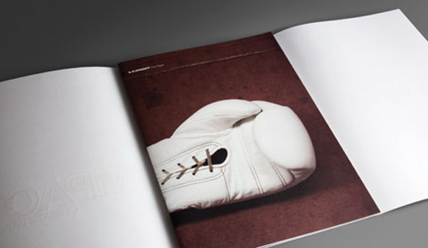
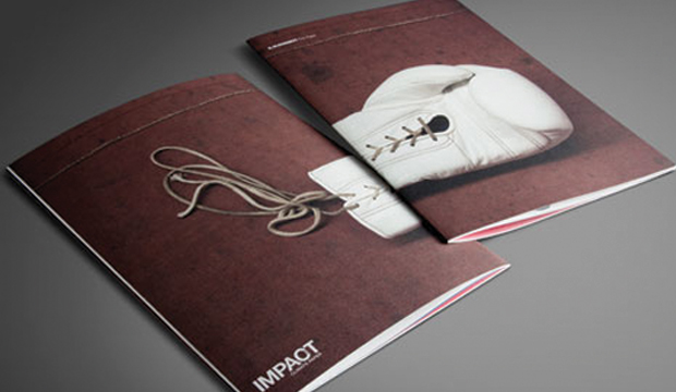
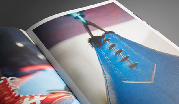
The concept for the campaign was conceived after exploring words and phases which linked ‘Impact’ (and the papers environmental attributes) to the sport of boxing, for example, fighting for what you believe in / challenges faced / raw / standing for something / guard / light-weight through to heavy-weight / protect / undisputed champion.

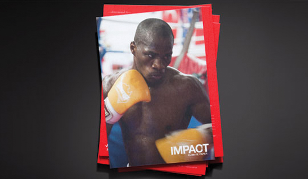
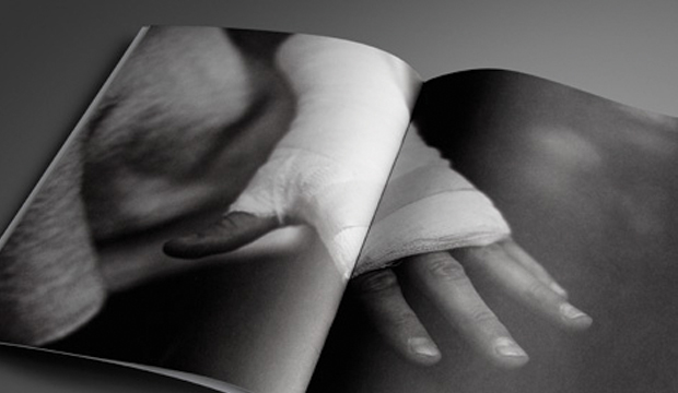
A photographer, Lee Valentine – was commissioned to document a dedicated young boxer preparing for his next professional fight. Hundreds of images were captured from the torturous training program in Western Sydney. Stunning images were taken of the boxers sparring in temperatures regularly climbing over 40°c in the gym.

The shoot climaxed after five weeks of training, when the young fighter in his sixth professional fight -successfully knocked out his opponent in under three rounds. The result provided the campaign with a visually striking conclusion.

The result
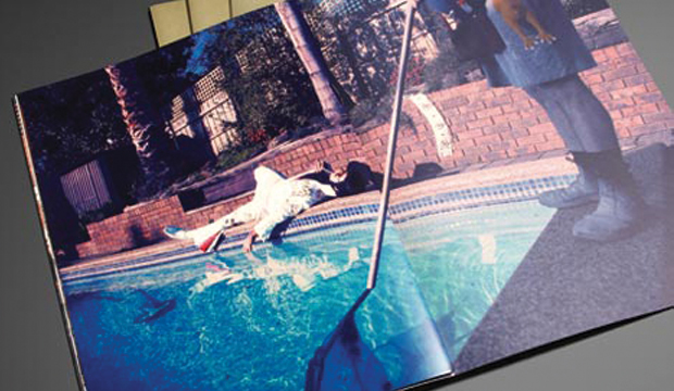
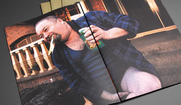
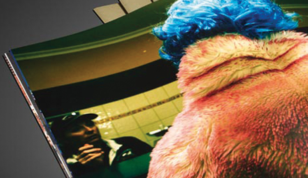
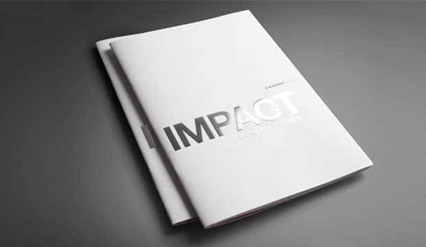
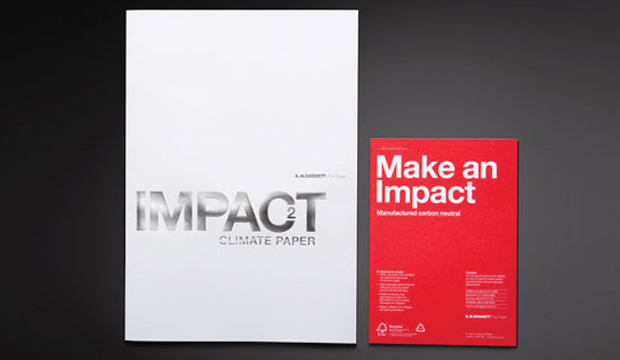
A 32 page photographic essay was offset printed, using five colours on four weights of Impact, including a large silver foiled 120gsm dust-jacket. The oversized proportion (240mm x 340mm) of the brochure enables the images to have maximum visual impact on the page, demonstrating the stocks superb ink holding qualities.

The over-riding aim of the project was to promote the use of sustainable paper options and to show that recycled and carbon neutral papers can still deliver exceptional print results.

Impact is made from 100% post consumer waste and is a carbon neutral product to K.W.Doggett Fine Paper warehouses nationally.

To receive your copy of the Impact paper sampler, please contact your nearest Sample Department.

Making-an-Impact_1

Making-an-Impact_2

Making-an-Impact_3

Making-an-Impact_4

Making-an-Impact_7