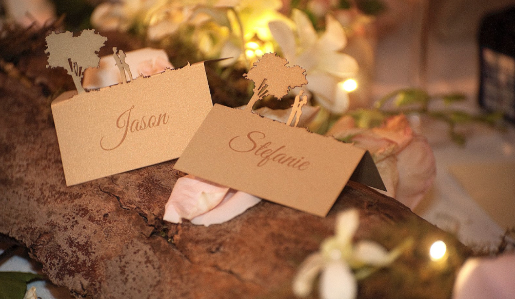
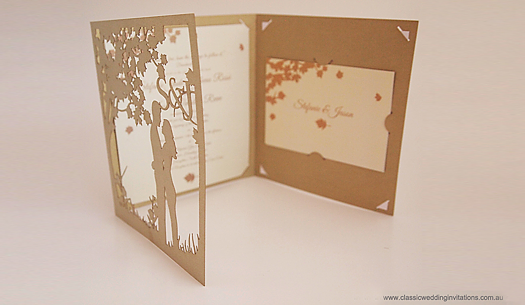
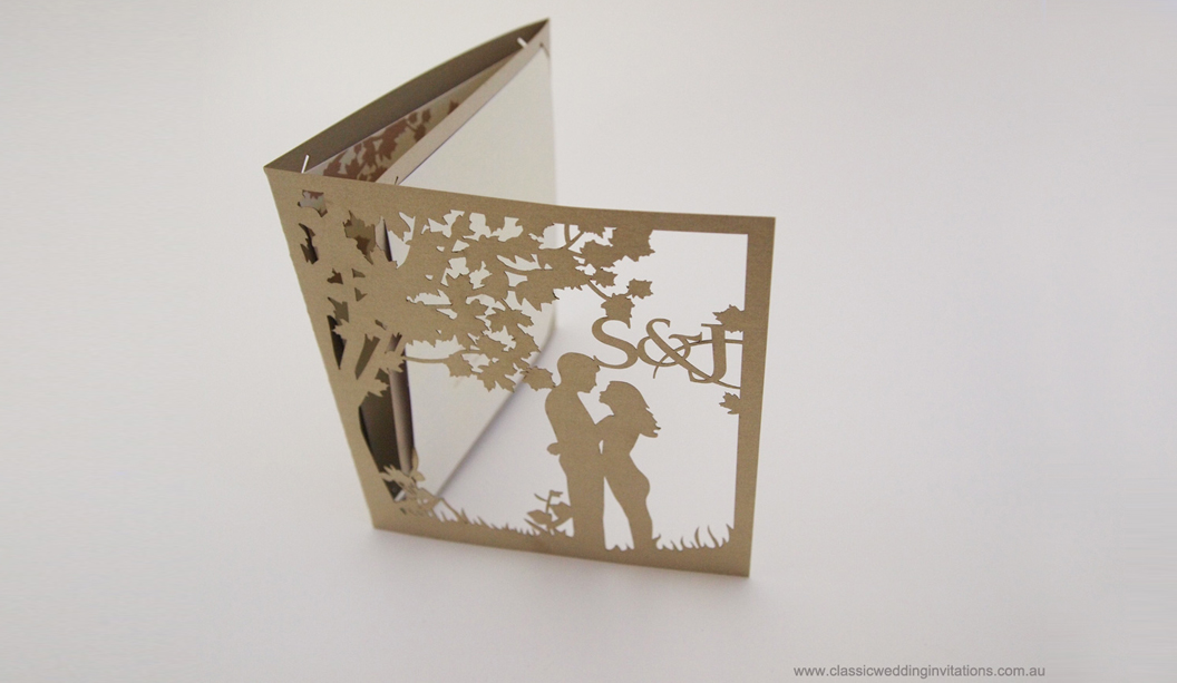
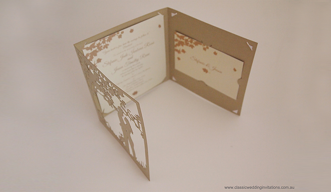
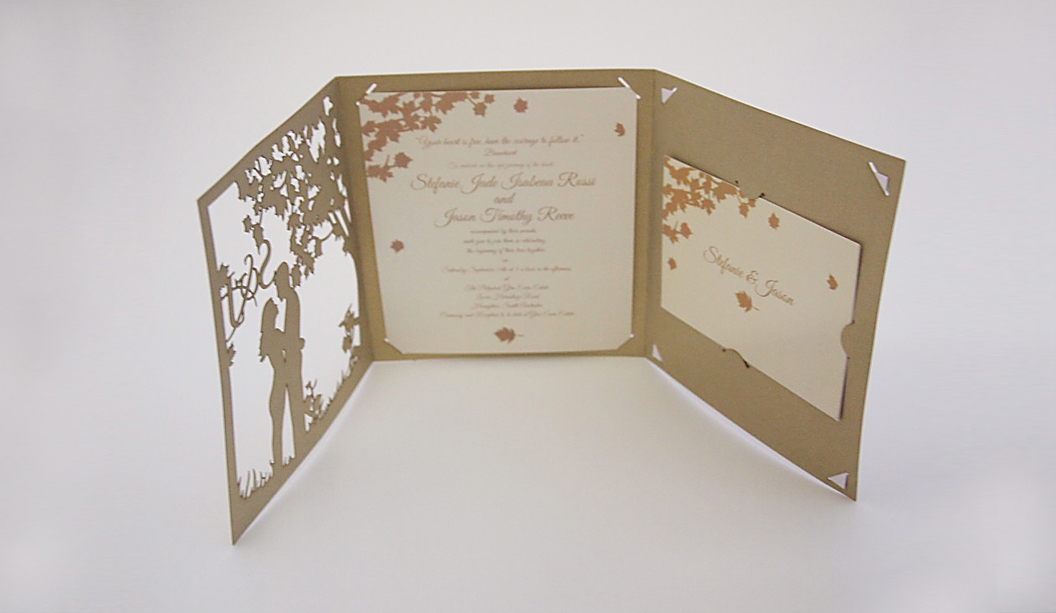
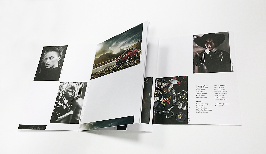
Classic Wedding Invitations are the makers of unique wedding stationery. Working as part of a collective under the Lydra Group, they design, laser-cut and print everything in-house and also offer digital fabric printing, laser cutting for businesses and custom projects. In other words they’re very busy creatives! There’s lots of unique stationery to choose from and you can even have your invitation custom made which is what Stefanie Rossi and her partner Jason did.
To complement their fairytale themed wedding, they chose a traditional tri-fold design using Curious Metallics Gold Leaf 280gsm. Linda Vydra from Lydra Group says: “It’s our most popular stock for weddings and we use a lot of pearl papers for laser cutting as the result is really effective.” To add a personal touch, the couple’s silhouette standing beneath a tree was laser cut out of the paper. So lovely! The main invitation, inserts, place cards, menus, table numbers and wedding sign were printed on Knight Smooth Cream 280gsm to tie the theme together.
With wedding season fast approaching, Classic Wedding Invitations is sure to inspire and delight all the soon-to-be brides out there. To view their range of laser cut invitations and bold modern invites made from wood, go to www.classicweddinginvitations.com.au
The world of printing is a wondrous but complex beast with all the proofs, colour correction, press checks, papers to choose from etc. Yet it’s very rewarding too. Seeing that printed piece come off press is a damn good feeling. But, it can also be tricky to know which print method to choose, particularly between offset v digital, so we’ve put together a list of important facts you should know when designing and printing digital jobs.
1. What is digital printing? It is the term used to describe printing technology that links printing processes to computers. There are various technologies available but the two main types of machines fall under the HP Indigo or Dry Toner banners. Dry toner (powder toner) printers are the Kodak Nexpress, Fuji Xerox, Ricoh, Canon, Lanier, Konica Minolta. The HP Indigo (liquid electrostatic ink) presses include the 3550, 5600, 7600 and 10000 models.
2. Paper. You need to use digitally certified papers, particularly important for the HP Indigo. Some printers will use non certified stocks and that’s ok, but it’s up to them. It’s also handy to advise them of the gsm and ums. Check our ‘Doggett Digital’ section for our range.
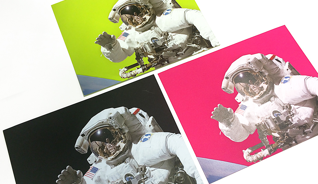
3. Print quality. Improvements in digital printing means machines like the HP Indigo presses can produce similar print results to offset printing. Check out the astronauts below printed on Pop’Set Lime Tonic, Cosmo Pink and Black 320gsm with four hits of white ink and CMYK over the top.
(Project above printed by Intelligent Media).
4. Speed. Digital printing is a simpler process compared to offset. Without the need for plates, mixing inks etc the final print can be delivered faster.
5. Cost effective. No set-up costs, no minimum print quantities and no plate costs. Some digital machines are also capable of doing inline finishing like binding eg saddle stitch, perfect bound or wire binding, so costs and turnaround times are reduced.
6. Short runs. It’s ideal for printing small to medium quantities ie 1-1000 units.
7. Personalisation. Also known as variable data. This allows you to tailor your message to your audience so you can personalise invites with the recipient’s names ie wedding invitations. We’ve heard of a national retail store using this method for posters given each store had different details, they printed the job digitally in one go.
8. Effects. Some digital machines such as HP Indigo have the ability to print special effects like white ink, special Pantone PMS colours, UV red invisible ink that fluoresces under ultraviolet light, clear varnish and gloss effects and raised ink, like an emboss effect. Here are some examples of Buffalo Board 283gsm printed using CMYK and white ink.
9. Green. There are lots of positive environmental factors like no pre-press stages so no films, plates or photo chemicals which means less waste. Printing can use a lot of water but digital presses are now waterless saving thousands of litres of water per year.
10. Last minute jobs. Lucky for you, digital printing can be done on demand and you have the ability to make last minute changes at the time of printing via the computer.
There are also many reasons why you would use offset printing too like the fact you can tweak the colours on press, do long runs etc. So just make sure you go for the right print method depending on your desired outcome. Stay tuned for more printing tips and production information in the next issue of Fetch. This final piece is printed CMYK on Knight Digital Indigo 270gsm.
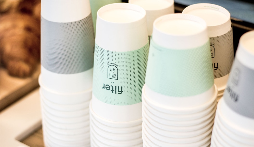
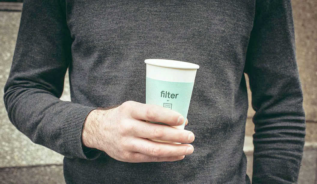
Title: Coffee cup paper sleeves from Filter café Stocks:Wild, Tablex and Kaskad Printing specs: Letterpress printed Printed by:The Hungry Workshop
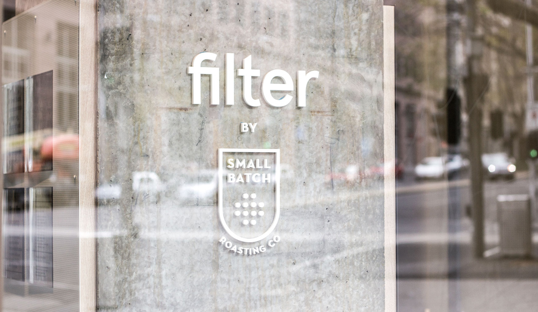
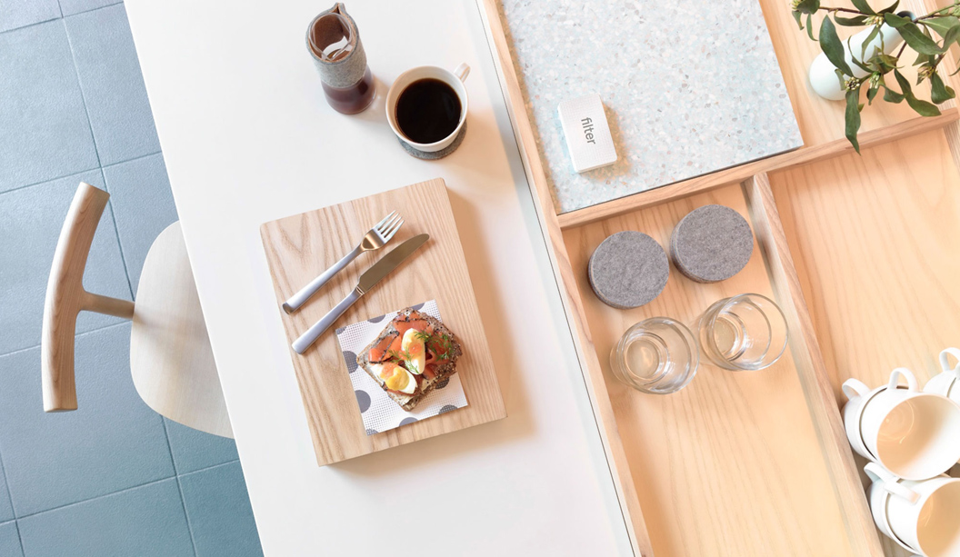
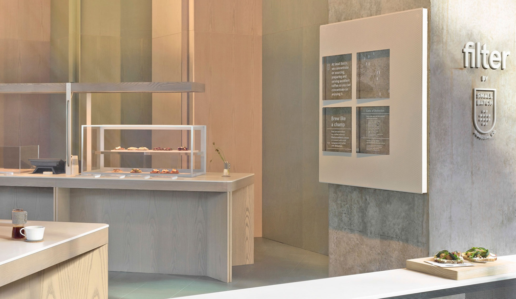
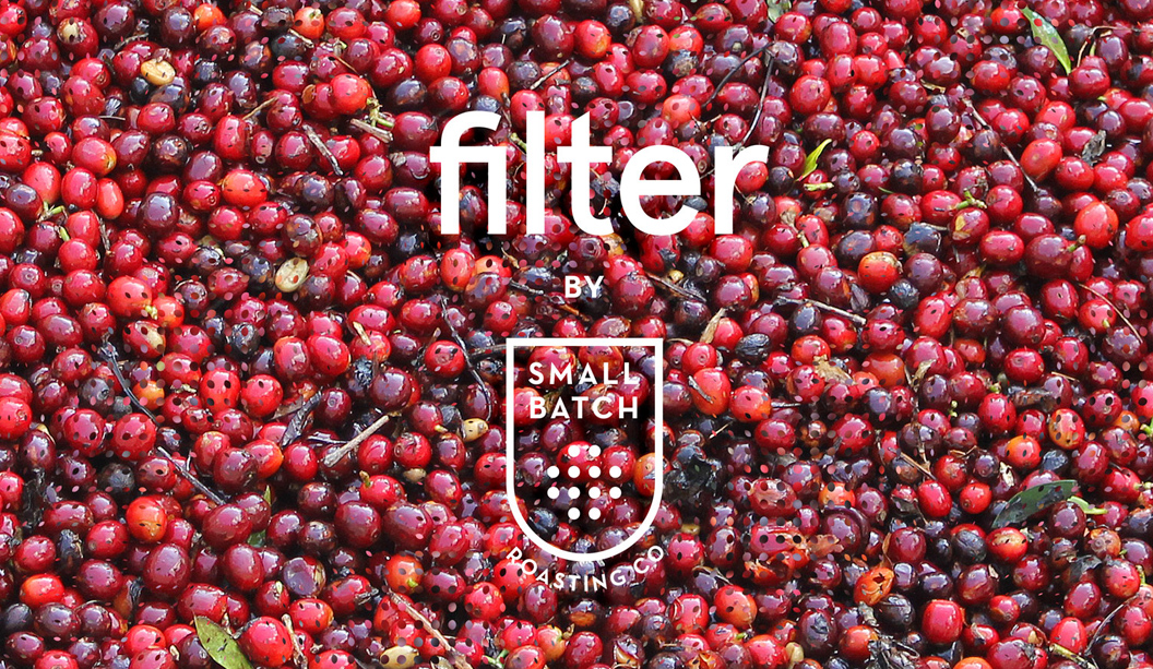
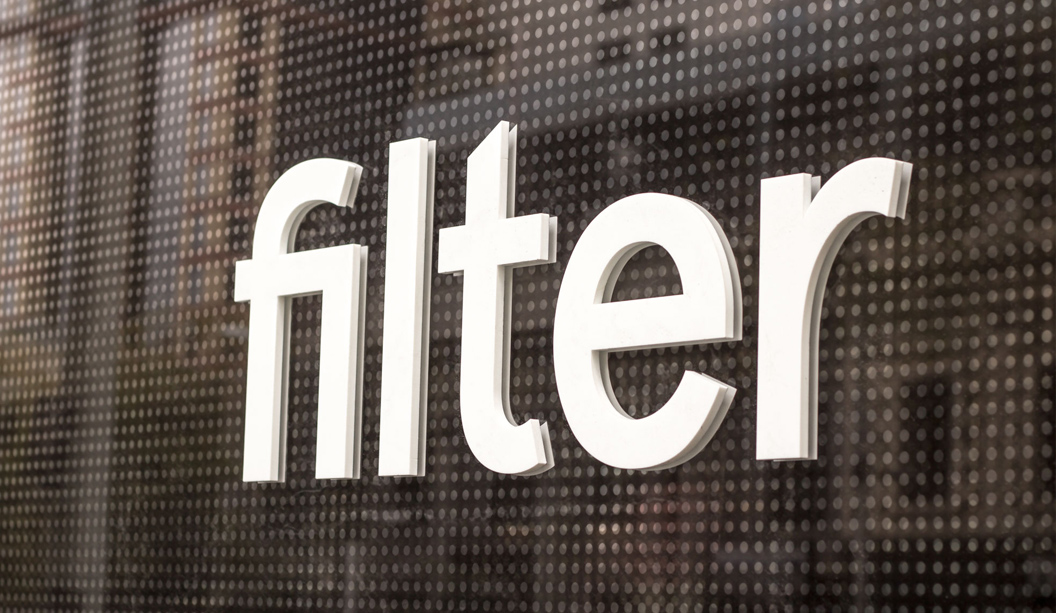
We’re very excited to feature new café ‘Filter’, the latest venture from Andrew Kelly and the team at Auction Rooms and Small Batch Roasting Co in Melbourne. The uber stylish branding was designed by The Hungry Workshop and we’re particularly loving the letterpress coffee cup sleeves. Such a great way to brand the coffee cups and because they’re printed on paper, the café has the option to use different colours and stocks later on.
Filter is all about celebrating the simplest method of preparing coffee, not too fussy and not too niche. A Scandinavian style typeface paired with a fine filtered moiré pattern, forms the core of the graphic for Filter. Jenna from The Hungry Workshop says: “The brand we crafted reflects this directness. A straightforward, clean and simple identity inspired by the effortlessness and layered subtlety of the offering. Simple coffee paired with the smørrebrød.”
The business cards are printed on Wild 450gsm and the coffee cup sleeves on Tablex Grey 200gsm and Kaskad Leafbird Green 160gsm. Both items were letterpress printed on The Hungry Workshop’s antique Heidelberg Windmill. The finished product is definitely a showstopper. Now we can enjoy the delicious coffee from Filter and collect the paper sleeves. We’re just spoilt for choice with two of our biggest loves – coffee and paper. A winning combo.
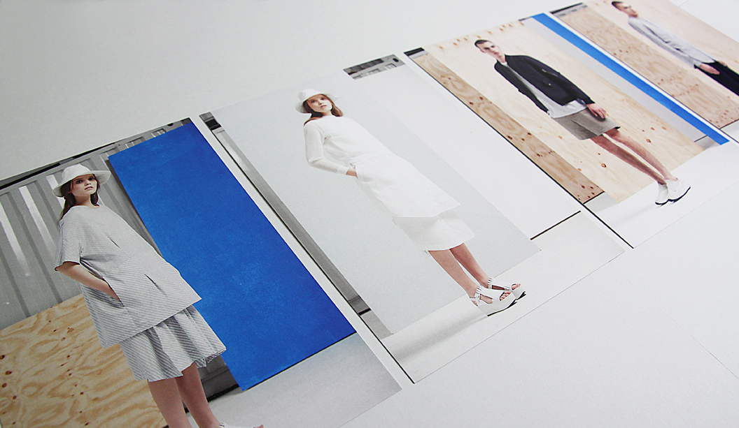
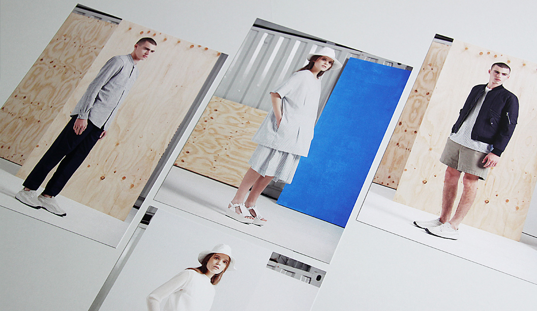
With spring only a few short weeks away, Melbourne fashion label Kloke have released a set of four A5 promotional cards to celebrate the launch of their 2014 spring/summer range. We are loving their latest creations and true to form, Kloke continue to create fresh and simple designs that leave us wanting more, more more. If you do want more of their previous ranges, check out the other Fetch stories: Kloke’s autum/winter Collection 2013 and Kloke spring/summer catalogue 2013.
The cards are digitally printed on a HP Indigo on Conqueror Wove Brilliant White 300gsm and packaged together with a Kaskad Sparrow Grey 160gsm belly band. Conqueror Wove is a great match for fashion photography, the images look sharp and the colours are really striking. Conqueror Wove isn’t digitally certified though. It was sapphire coated by the printer to make sure it would run through the digital machine. There are a small batch of printers that will treat the stock with this kind of coating (at a cost). Like the old adage states, where there’s a will, there is a way!
Be sure to check out Kloke’s beautiful new range online https://kloke.com.au/ or in store at 270 Brunswick Street, Fitzroy.
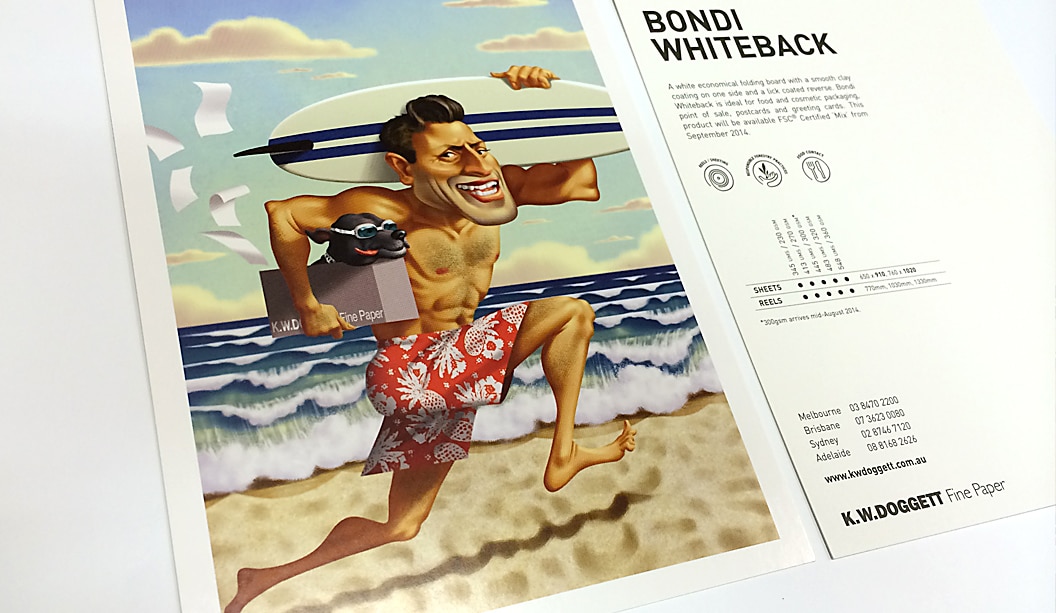
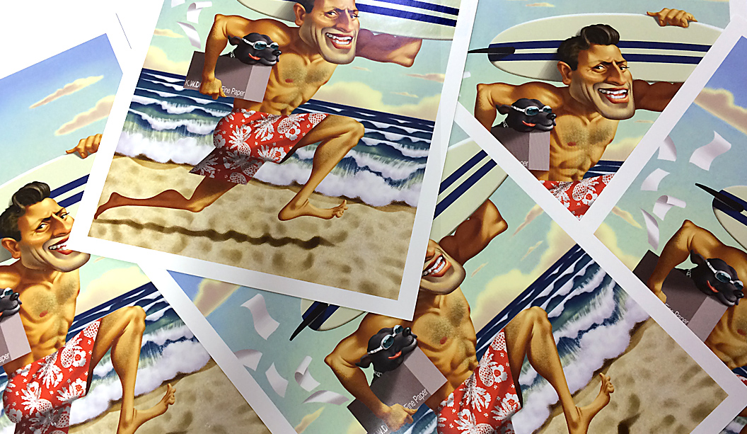
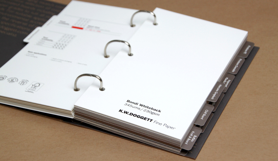
To announce the release of Bondi Whiteback, our newest packaging grade, we released two A5 postcards. One was printed offset and the other digital on a HP Indigo 7500. The image is a cracker and happens to be a custom illustration of a Doggett’s NSW staff member!
Bondi is an economical alternative and sits between our Simcote and Barry Bleach boards regarding price. A high white folding bleach board, it’s FSC certified, has a clay coating on one side and a lick coating on the other (this means the coating is not not as heavy on the back). It’s also food contact approved to ISEGA standards (the European version of FDA), which is excellent to know if you’re going wrap it around some chocolate. If you are, best send some to us.
Bondi Whiteback is ideal for cosmetic packaging, point of sale, postcards/greeting cards. Since releasing it, we’ve also seen it used for confectionery packets and pharmaceutical products.
Call John Alipan (National) 0434 692 446 or Chris Churchward (NSW) 0488 440 131 if you want to know more about any of our packaging stocks.
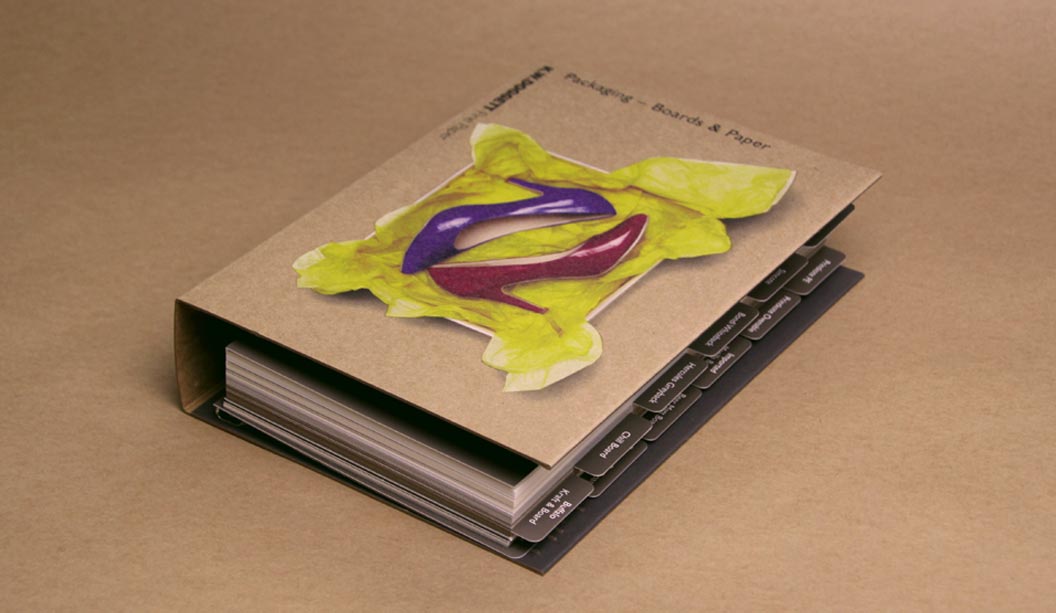
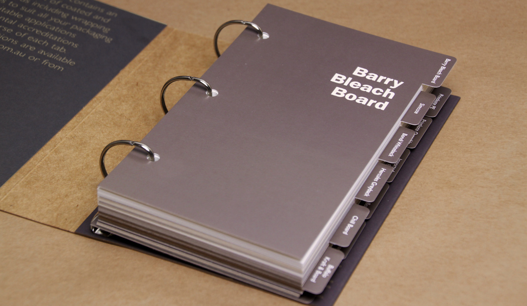
We don’t normally talk-up our swatches but the packaging swatch warrants some air time. In a few years we have grown our portfolio of packaging products from only a handful to now 13. We’ve added new products and weights that provides our customers with a lot more choices and flexibility to ensure they can find what they need.
The revamped swatch, developed for customers that work in the packaging arena or do board work, now includes tabbed sections for each product including stock availability, applications and logos. A good variety of our different grammages are featured too, with the all important measurement (ums) also listed.
We have all of the faves in there like Barry and Buffalo Board, alongside packaging products that didn’t appear in the original swatch like Beer Matt Board (great for letterpress jobs) and Enviro Board. Plus some newbies like Bondi Whiteback (economical, high white economical folding bleach board) and Printkote Ovenable Board (good for freezer-to-oven applications). All the stocks included in the new swatch are:
With our packaging products appearing on supermarket and chemist shelves, to famous chocolate store wrappers, fashion label swing tags, covers of real estate brochures, eco product catalogues and greeting cards, there’s an endless stream of things to get excited about. Paper, we love it.
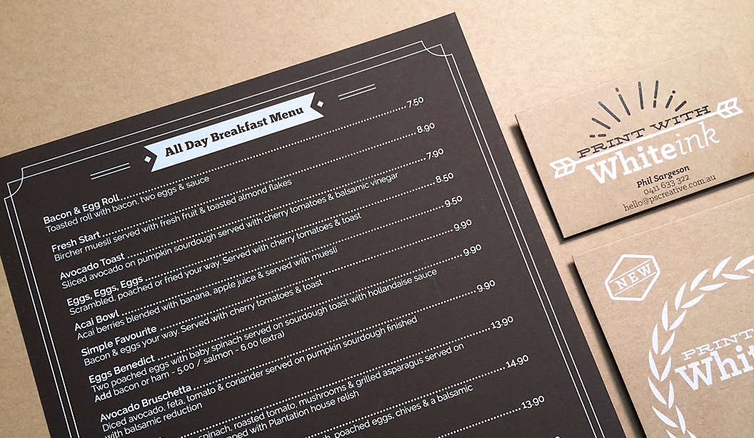
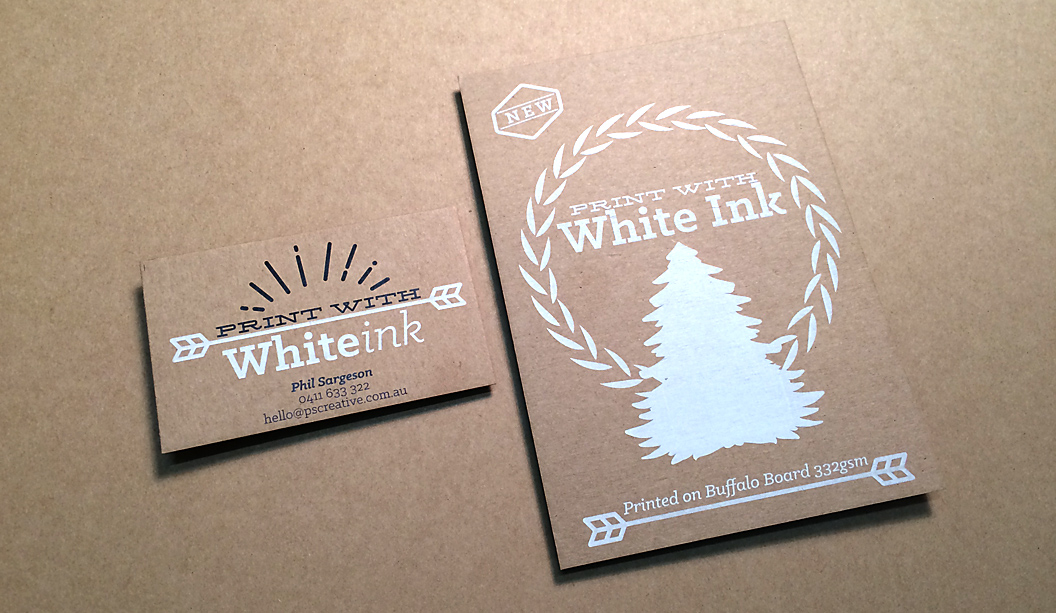
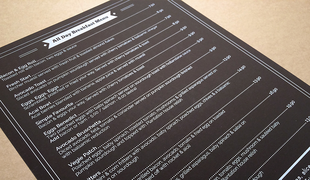
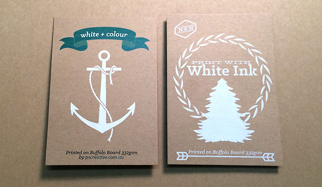
PS Creative specialises in white ink digital printing. Located in lovely Wynnum in Queensland, the boutique creative agency does lots of business cards, menus and wedding/event stationery. Their latest two jobs – a café menu and self-promotional card showcases their craft.
The menu, printed on Skin Curious Collection Mocha 270gsm was a job they got to work on after PS Creative approached the café to redesign their menu, showing them examples of what white ink can do. Daily wear and tear, some maple syrup and a car tyre (yup, one literally blew onto the road and a car ran over it)! later, these menus are still holding up. As Phil Sargeson from PS Creative explains: “The owners of the cafe wanted something completely different and long lasting, that’s when I contacted Corinne (our paper rep) to see if the Skin range would suit. The café have had really great comments on them.”
This set of images relates to their A6 self-promotional card. It’s printed full CYMK with white ink on Buffalo Board 332gsm, chosen for its natural/recycled look. Phil said to us: “I love the way the ink fuses with the board which gives the print a rustic vintage look – great for wedding invitation sets, but not just limited to that. We are now printing our own business cards on this stock and also a small handful of others to our clients.” Bring on the white ink we say! Have a read of an article we wrote on the process a couple of years ago for some hints and tips.
And if you happen to be a graphic designer, letterpress studio, agency or invitation designer, then PS Creative can offer you trade pricing. Get in contact with them by calling 0411 6333 22 or hello@pscreative.com.au
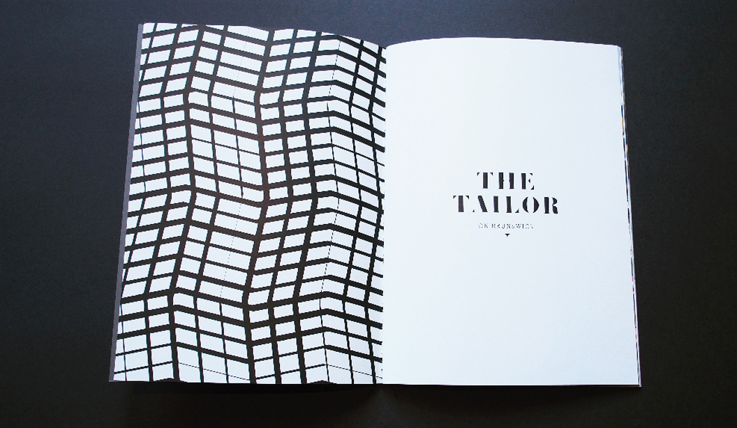
Title: The Tailor on Brunswick property brochure Agency:ERD Stocks: Keaykolour and Knight Smooth Printing specs: Digitally printed Printed by:Bambra Press VIC
This story is about a property developer, textiles factory and astute design studio. ERD recently designed the property publication ‘The Tailor on Brunswick’, for a boutique development located in funky East Brunswick in Melbourne. To make it happen, they had to convince developer Gutch & Co to do it after their real estate agent said it wasn’t necessary. Boo!! ERD knew: “The printed piece would reflect the style and attention to detail that defined the development.” We concur.
The brochure features singer sewn (black thread) binding that cleverly ties in with the building’s historical roots (in its original life it was a textile factory). The publication is 28pp with a 4pp cover, printed on Keaykolour Sombre Grey 300gsm for the cover and Knight Smooth 160gsm for the text. The beautiful stock choices were made all the more special with photography by Joe Vittorio and Mattia Scarfo and digital rendering by Andrew Clarkson.
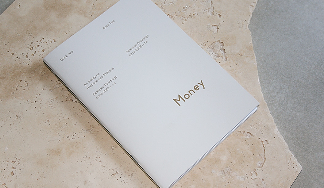
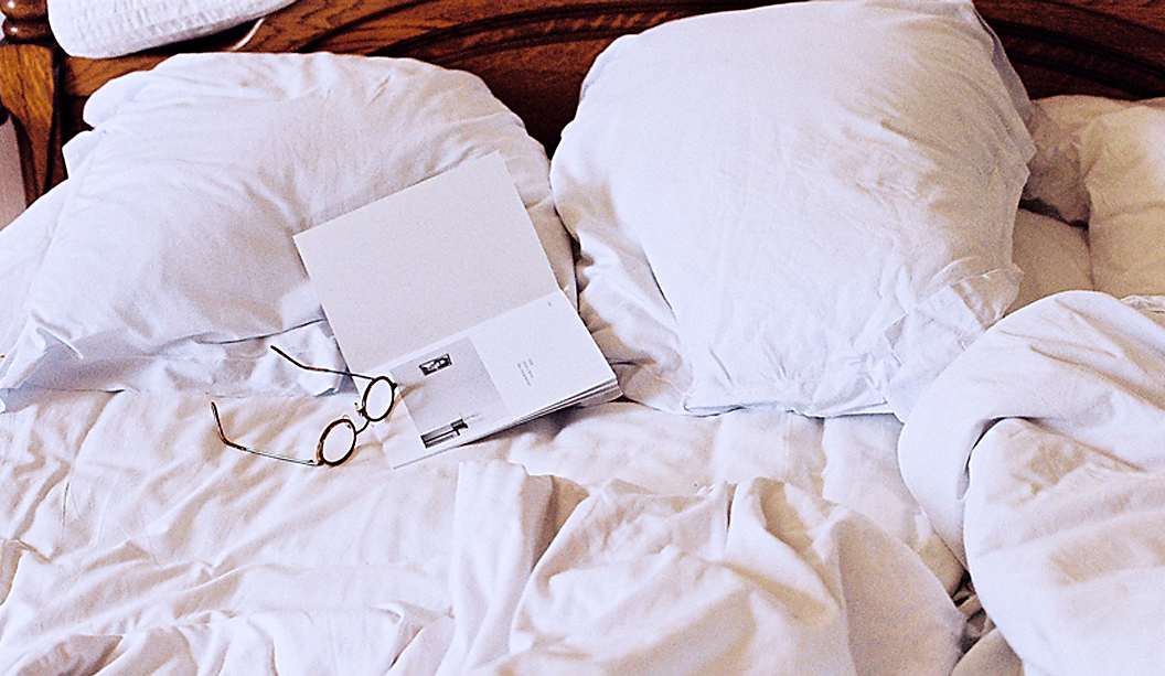
Title:James Money Monograph
Agency:Studio Constantine (VIC)Client:James Money, Artist
Stocks: Kaskad Sparrow Grey,Grange Offset, HannoArt Satin
Printing specs: Offset printed, Pantone 871 and duotonePrinted by:Adams Print (VIC)
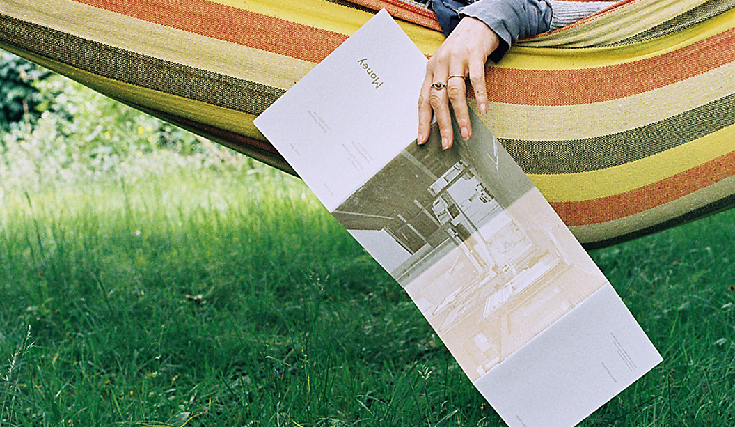
So many songs and puns we’d like to share about ‘money’ right now but alas, it’s not the point of this post. We refer here to James Money, an accomplished Australian artist and Archibald finalist. To launch into the Hong Kong art market during Art Basel/HK 2014, he collaborated with Studio Constantine to create a limited edition monograph of his work. The outcome is this simple and elegant A5 piece printed on Kaskad Sparrow Grey, Grange Offset and HannoArt Satin.Money (we just have to keep using his surname, it’s so great!) is an award winning artist. He works in both portraiture and landscape, exploring themes of isolation. His work appears in private collections around Australia and New York. Studio Constantine worked on all the stages – planning, documenting, editing and production. As David Constantine explains, they were keen to: “Use a format that led readers through the work and articulated the different genres. The layout and typography was deliberately restrained, although quietly assertive in scale.”
So we now have this little A5 beauty to feast our eyes on. A double-spined, concertina fold cover printed with Pantone 871 on the Kaskad with two different text paper stocks – a coated sheet for the painted work (HannoArt Satin) and an uncoated sheet (Grange Offset) with a custom duotone for James’ pen and ink drawings. Dee-lightful.
Documentary images by SC & Flore Diamant.
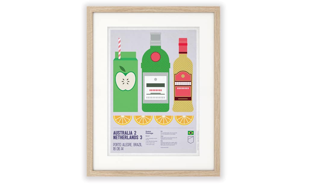
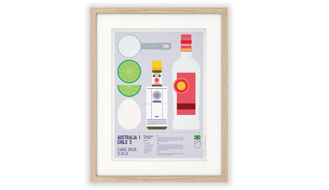
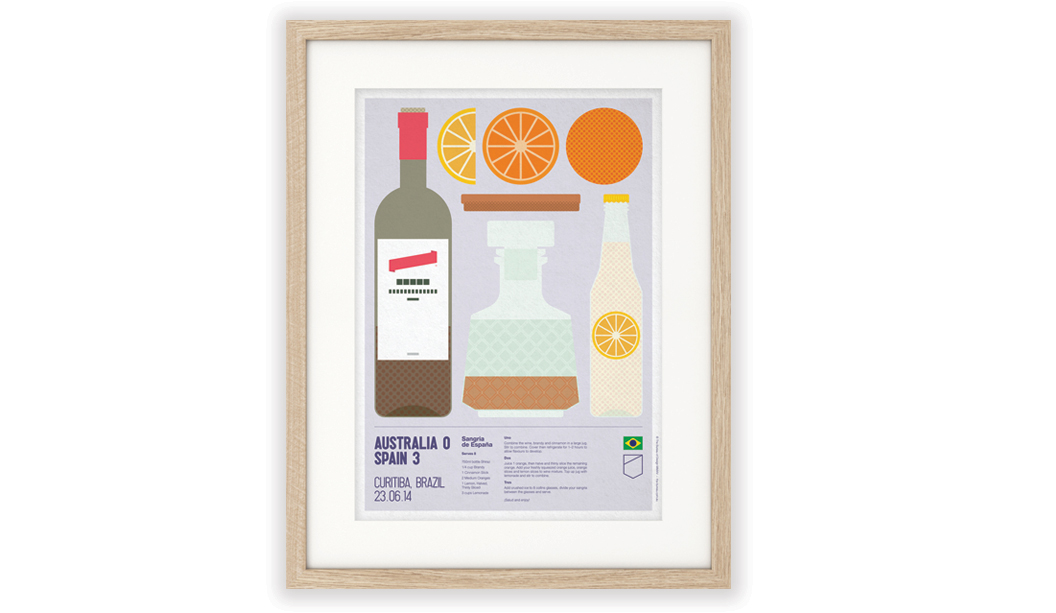
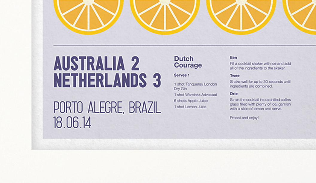
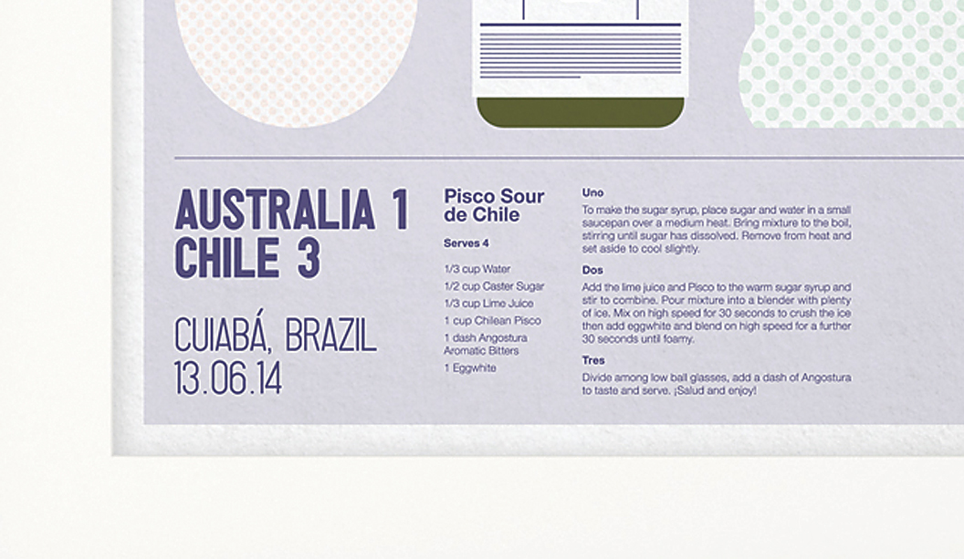
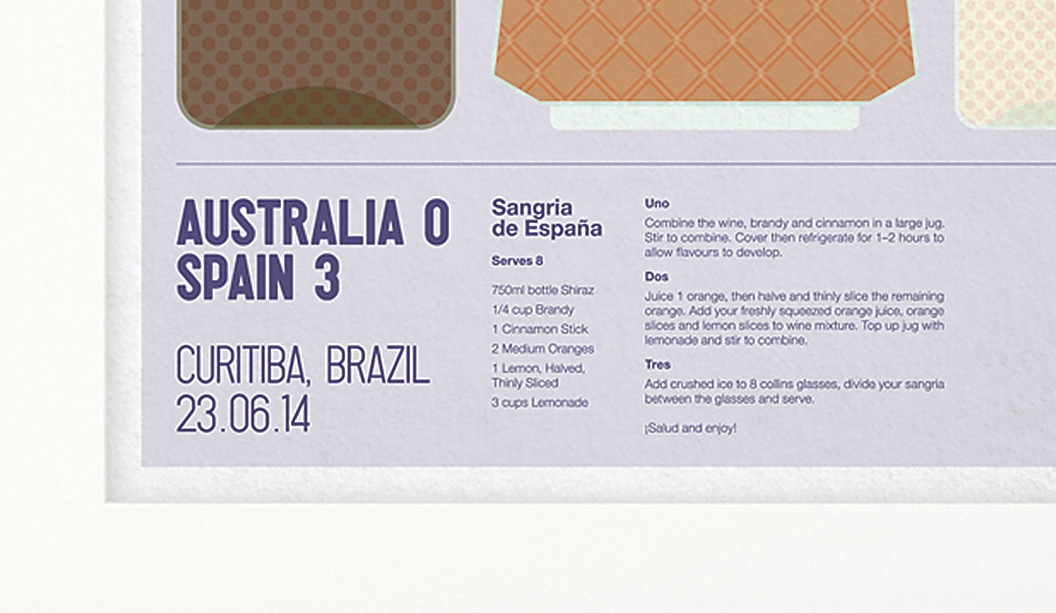
To celebrate the 2014 FIFA World Cup™, The Bureau in Melbourne created a series of illustrated posters complete with match details and recipe instructions so you can kick off your own ‘cocktail cup’ at home. Genius! It’s a special time of year, as the studio puts it: “We all suddenly become experts on match tactics and whether Tim Cahill is better in the air or with his feet!”
Inspired by host city, Brazil (the home of Samba, sandy beaches and sunshine), these one-of-a-kind designs are printed CMYK on an HP Indigo using Sovereign Offset 160gsm. The Bureau’s Creative Director, Jarrod Bransden, explains: “If you’re looking for a little consistency after an up and down Spanish campaign, you can’t go past the humble Sangria. Match the ingredients to the illustrations, follow the recipe and hold your glasses high to celebrate a brave Australian performance at the 2014 World Cup. If we can’t beat them, at least drink like them.” Ha!
So if you feel like a little opponent-inspired tipple from Chile, The Netherlands or Spain, go tohenryandson.com and purchase your very own poster. A perfect wall adornment whether you’re drowning your sorrows or just feel like some general merriment.
 Footy Tips