A range of digital papers that are best in show

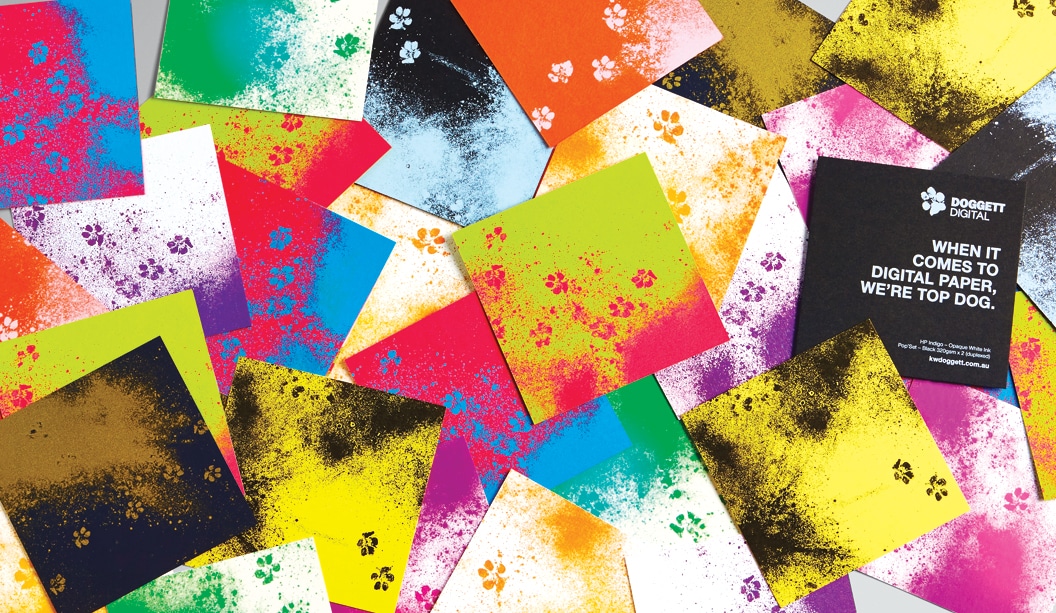
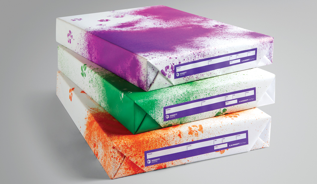
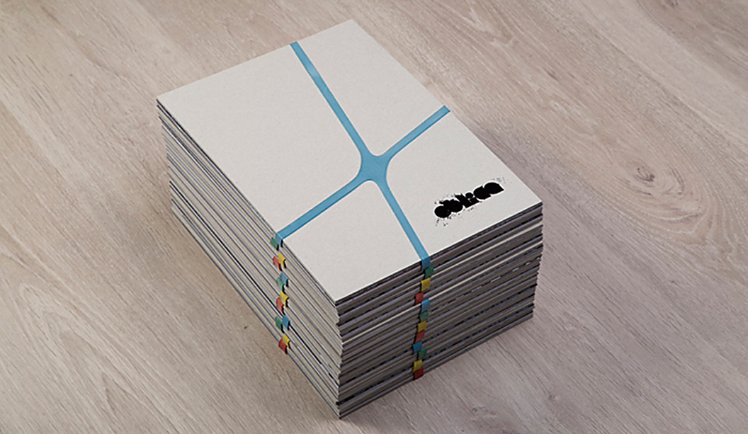
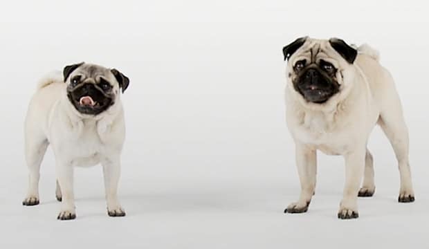
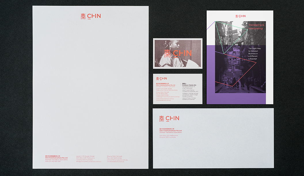
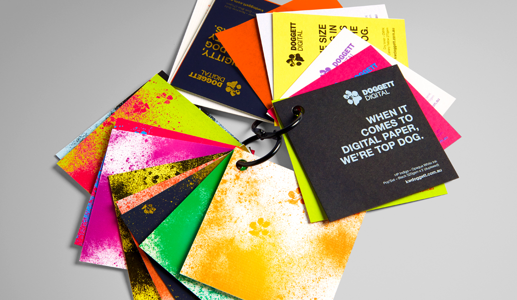
Roll out the toner splattered carpet, Doggett Digital has arrived! Thanks to the wonderful Seesaw in Victoria and their delightful dogs Klaus and Louie, we have this unique visual (that’s the pooches paw prints you can see) for our new sub-brand, Doggett Digital. It was about time we unified our digital product offering under one recognisable banner. We have a steadily growing range of products we stock suitable for the HP Indigo and Dry Toner machines including paper, boards, labels, vinyls and synthetics.

DD_2

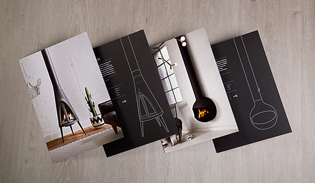
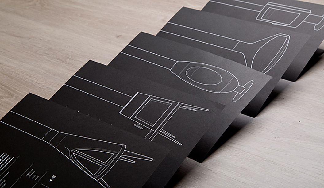
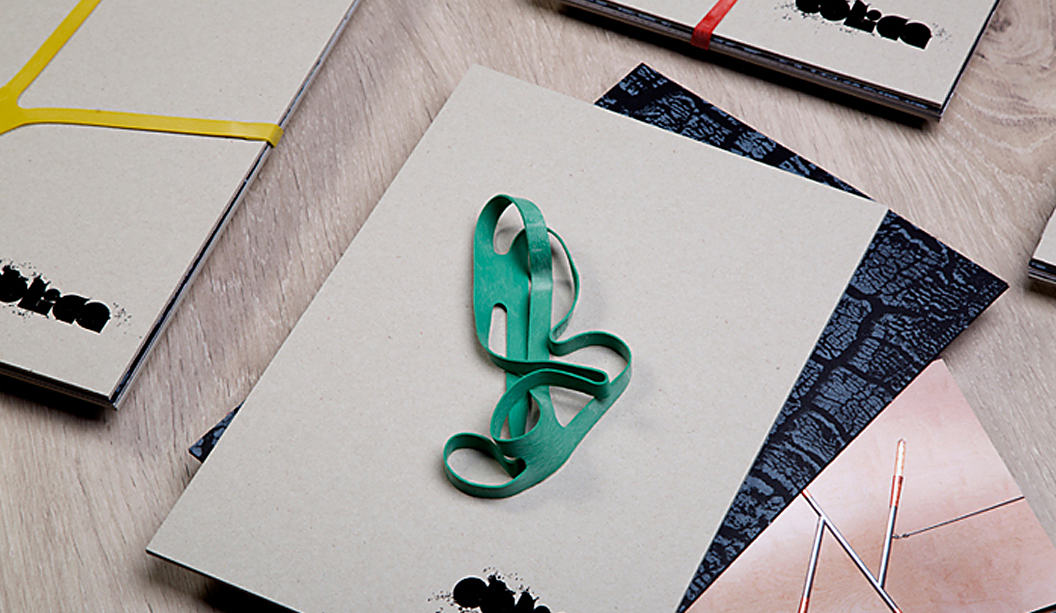
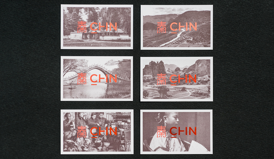
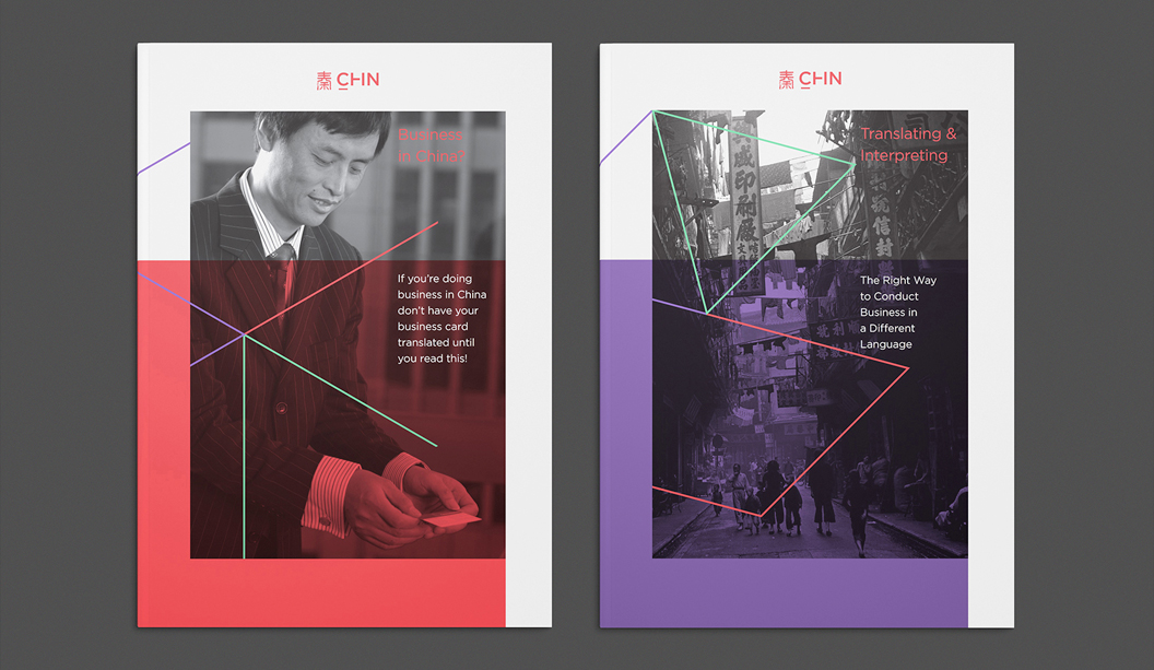
Here’s what we’ve rolled out with the new branding:

  • Swatch kit (for digital printers).
  • Price book (for digital printers).
  • Printing guides ie one for our Dry Toner products and one for our HP Indigo certified ones.
  • Wrapping paper
  • Eye candy samples (a range of colours and awesome print techniques

We have some exciting new colours and ranges like the Pop’Set from Arjowiggins Creative Papers (UK) in Lime Tonic, Black and Cosmo Pink in 320gsm and the new Mohawk Loop Digital i-Tone Antique Vellum in Straw and Urban Gray. These new products add colour to what is normally a predominantly white range of papers. Coming soon is Tacky for Dry Toner, following on from the Tacky for Indigo range released at the beginning of the year. And look out for our Doggett Digital branded trucks, on a street near you soon.

The pattern Seesaw created is meant to replicate a toner splatter on paper and the footprints of a dog (two in this case) that have walked right through the centre of the mess. We love it.

Need a digital expert?  Call or email Jon Roberts, Business Development Manager – Digital and he’d be happy to assist. Phone: 0409 411 546 or jroberts@kwdoggett.com.au

DD_3

DD_4

DD_5

DD_6

DD_7

Studio Brave design a cook book for Cecconi’s

Title: The table of the family
Agency: Studio Brave
Client: Cecconi’s Restaurant
Stocks: Sovereign Silk and Sovereign Offset
Printing specs: Offset printed
Printed by: Bambra VIC

‘La Travola Della Famiglia’ (The Table of the Family), is not just a recipe book, it’s also a memoir and historical account of life in Australia for the Bortolotto family –  owners of iconic Melbourne eatery – Cecconi’s on Flinders Lane, that has a rich 30 year history to be proud of. Maria, daughter and business partner of Olimpia Bortolotto (the author), approached Studio Brave in Melbourne to produce the book. In true Italian style, the studio were invited to dine with the Bortolotto family at their restaurant, where they experienced first-hand the family’s passion for food and life in Australia.

Famiglia_2

Working closely with photographer Sharyn Cairns, the design stemmed from their story – the notion that the restaurant was ever evolving and always at the forefront of Italian cuisine in Melbourne. Printed on Sovereign Silk 170gsm with copper foil for the cover and Sovereign Offset 135gsm for the text, the pages are filled with mouth-watering modern and traditional Italian recipes and carefully chosen typography to complement the old family photographs.

Studio Brave shared many interesting insights with us, like this one: “We felt it was integral to the Cecconi’s brand that we represent the beautiful copper highlights found throughout the Flinders Lane basement restaurant. Using a copper foiling on the cover, we were able to balance this with a copper metallic print throughout, which really brings the book to life and adds a sharpness that you cannot match using CMYK.”

This wonderfully tasty book is sure to inspire your inner Italian chef. Remember to invite us around if you ever unleash your culinary beast!

Famiglia_3

Famiglia_4

Famiglia_5

Famiglia_6

Famiglia_7

Famiglia_8

Oblica catalogue by Sense

Title: Oblica catalogue
Agency: Sense
Client: Oblica
Stocks: Knight Vellum
Printing specs: Offset printed
Printed by: Mckellar Renown Press VIC

Oblica’s first catalogue is out and it’s a beauty. Designed by the team at Sense in Melbourne, in collaboration with photographer Arnelle Habib and stylists Jacqui Moore and Julia Greenthe, the piece showcases Oblica’s unique product range of contemporary European fireplaces, stoves and accessories that truly are a work of art.

Obliqua-1

The clever loose-leaf design means the catalogue can be customised for each person and easily updated as new products arrive. The cover is Boxboard 2100gsm with black gloss foil and the inserts and brochure are printed CMYK on Knight Vellum 200gsm, all bound together with a brightly coloured rubber x-band for extra wow factor. The catalogue design is really well considered and complements the quality evident in the range. In other words, the printed piece does the range justice.

If you have an Oblica fireplace, all there’s left to do is grab a hot chocolate and toast a marshmallow or two. If, like us, you don’t have one, then it’s a hot chocolate and heater type scenario.

Obliqa-7

Obliqa-2

Obliqa-3

Obliqa-4

Obliqa-5

Obliqa-8

A blend of old and new at Chin Communications

Title: Chin Communications rebrand
Agency: Design By Bird
Client: Chin Communications
Stocks: Strathmore Premium Super Smooth – Ultimate White
Printing specs: Offset and digitally printed
Printed by: Inkifingus

Chin Communications is a well-known Chinese translation service, operating for nearly 20 years. They provide translation services to people and businesses across Australia. A recent re-brand carried out by Melbourne-based studio Design By Bird, is really special. They considered the historical, multicultural, language and modern angles to create the right branding for Chin.

Chin-1

Steeped in tradition, the Chin logomark (秦) pays homage to both the company’s founder Qin (pronounced ‘Chin’) Lushan as well as Qin Shihuangdi – China’s first emperor.  All great work comes from sound research. The studio looked into China’s rich history, discovering elements from the past they could take into Chin’s future. They found out that when Emperor Qin standardised currency, each coin was inscribed with seal script – an ancient Chinese technique. With this in mind, they re-worked the logo, included a bright colour palette and modern typography.

Chin-3

The studio shared many interesting insights like this one: “There are certain considerations that need to be taken into account when designing for a multicultural audience. For example, names should not be in red because in ancient China, red titles were reserved for the dead and particular white papers don’t sell in China because of their tones. Not only did we get to work with a great client on an exciting project, but we learnt a lot.”

Chin-6

The business cards and folders were printed on Strathmore Premium Super Smooth Ultimate White – 352gsm. The letterheads, with compliments slips and C4 envelopes were printed on the 118gsm. “The paper has a great texture, which the ink took to really well. We were particularly impressed with the clarity of the colours on the Ultimate White background,” reports the studio. Using a variety of processes and techniques including foils, block colour and photographic elements, everything was printed offset except for the with compliments slips, which were printed digitally.

The new suite of collateral is a lovely blend of the old and new, giving an ultra-modern lift to a well-recognised brand. What’s not to love?

Chin-7

Chin-4

Chin-5


The John Laurie folio by duo_d_uo pops with blue

Title: John Laurie folio
Agency: Duo d uo (VIC)
Client: John Laurie, Photographer
Stocks: Skin Curious Collection – Indigo
Printing specs: Offset printed plus gold foil
Printed by: Moule Print (VIC)

We can barely contain our excitement looking at all this blue. It was an ‘oooooo’ moment. Duo d uo is the brainchild of Cam Diamond and Nic Hawker who believe to get the best design, you need to look at things from every angle. A recent project of theirs features Skin Curious Collection – Indigo, creating as they call it ‘a perfect complement to John’s bold photographs’. Who is John Laurie you ask? He’s an esteemed food, travel and portrait photographer that goes that extra mile to get the perfect shot. When Cam and Nick took on the project, they “knew it needed to be as enduring as the imagery it would hold.”

Duo d uo - John Laurie folio pic 2

The hard cover book had to be robust with all the paws that would be touching it. Duo d uo considered how scuffed and damaged it would get so they choose to use Skin, an anti-scuff stock. The outcome is a modern yet timeless book.

Duo d uo - John Laurie folio pic 3

As Cam explains: “The folio cases and covers were custom made by a book binder so we could line the inside in Skin Curious Collection to match the rest of the collateral. We were very lucky that we could find a cloth in the same shade of indigo to create such a seamless look. We chose this coloured stock to not have to overprint all the collateral, which was an added cost we wanted to avoid. We decided to foil the business cards in gold to create both a visual and touch contrast to the super smooth satin finish of the stock.”

Duo d uo - John Laurie folio pic 4

This project looks so damn appealing, we can’t work out if we want to touch it or eat it. It’s always about food with us. And paper. And dogs.

Duo d uo - John Laurie folio pic 5

Jasper Margaritis’ illustrations are mind blowing

Jasper Margaritis was born on 10 December 2001. His drawing skills are so impressive that we’re rather jealous. His series is called ‘Internals’, a set of intricate illustrations that are an imaginative and playful exploration of the inner life of objects, animals and creatures. We’re talking a cloud, turtle, castle bug, snake, jet plane, octopus, a muscle man and more. He has also turned some of his creations into greeting cards, printed on our very own specialty stock Wild.

Jasper6

Jasper3

Can you guess what he uses to create these inspiring images? It’s a humble Sharpie. A simple, black, Sharpie which he applies to the canvas with the skill of someone far beyond his years. Did we mention we’re jealous? Visit Jasper’s blog here.

Jasper’s dad is a dear customer of ours, George Margaritis from Peel Design. Thanks for the pics George!

Jasper2

Jasper1

Eiko Ojala is a master at light and shade

E is for Eiko Ojala from Estonia (that’s him with the hand sticking out of this head). He’s an illustrator/designer with a ridiculously good eye for colours, light and shadow. His simple illustrations play with negative space and simple shapes that turn into intricate and interesting images. He keeps the images minimal. He’s a craftsmen, no doubt about that.

Ekio_3

We collaborated with Three60 and Eiko to create a unique set of images. We were intrigued to see how he responded to the brief, bringing to life the sketches Three60 produced for him to work off. Needless to say and as naff as it sounds, our paper dreams were exceeded. You can see a couple of examples of our new dogs on the home page.

Eiko was nominated for the ‘Young IIlustrators Award 2013’ as well as the ‘YCN professional Award 2013’ and ‘ADC Young Gun 2013’. His work has appeared in Wired, New York Times, New Yorker, New York Observer, Sunday Times, Harvard Business Review, V&A Museum, Dwell magazine, Le Monde and Intel. Eiko has also been featured on multiple platforms and forums, including Trendland, It’s Nice That and Etapes. You can check out Eiko’s work on the Behance network or via his own website

Ekio_1

Images we’ve used are mainly from the blog Design&Paper This David Bowie one above
is one of our favourites.