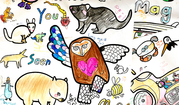
 Footy Tips
By Zaidee Jackson
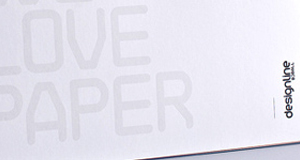
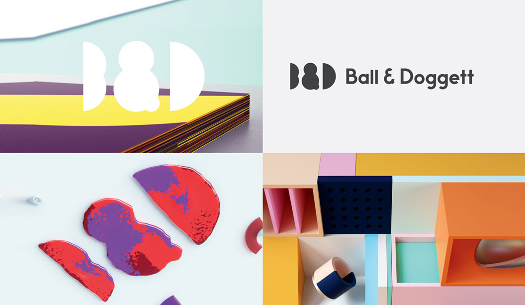
Connect, Inspire, Elevate – the measure of materiality Resilience, fortitude, the spirit of industry and partnership has been a cornerstone for Ball & Doggett Australia. We created opportunity through adversity and rose to challenges, making them part of our story. At the height of the pandemic, we were faced with challenges communicating with our customers. We took a stance of ‘controlling what we could’ and worked through the ebbs and flow. We created a platform with the sole purpose to connect, inspire and celebrate our industry. Through this lens, we developed a Youtube twelve-week interview series with customers to tell us their story. “R E S E T with Ball & Doggett, A conversation connecting our industry” was launched, July 17th, 2020. Click here for Episode 1
We wanted to share insight and understand what they were going through. Showing our community that they were not alone. We truly were all in this together.
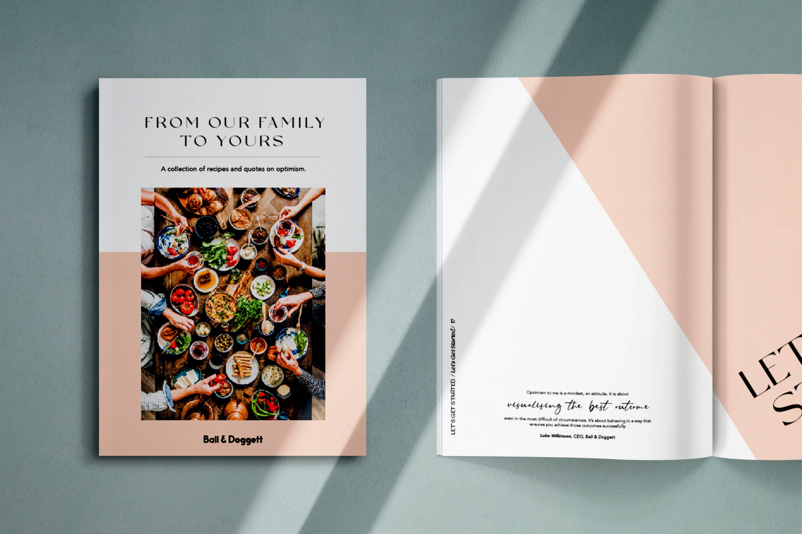
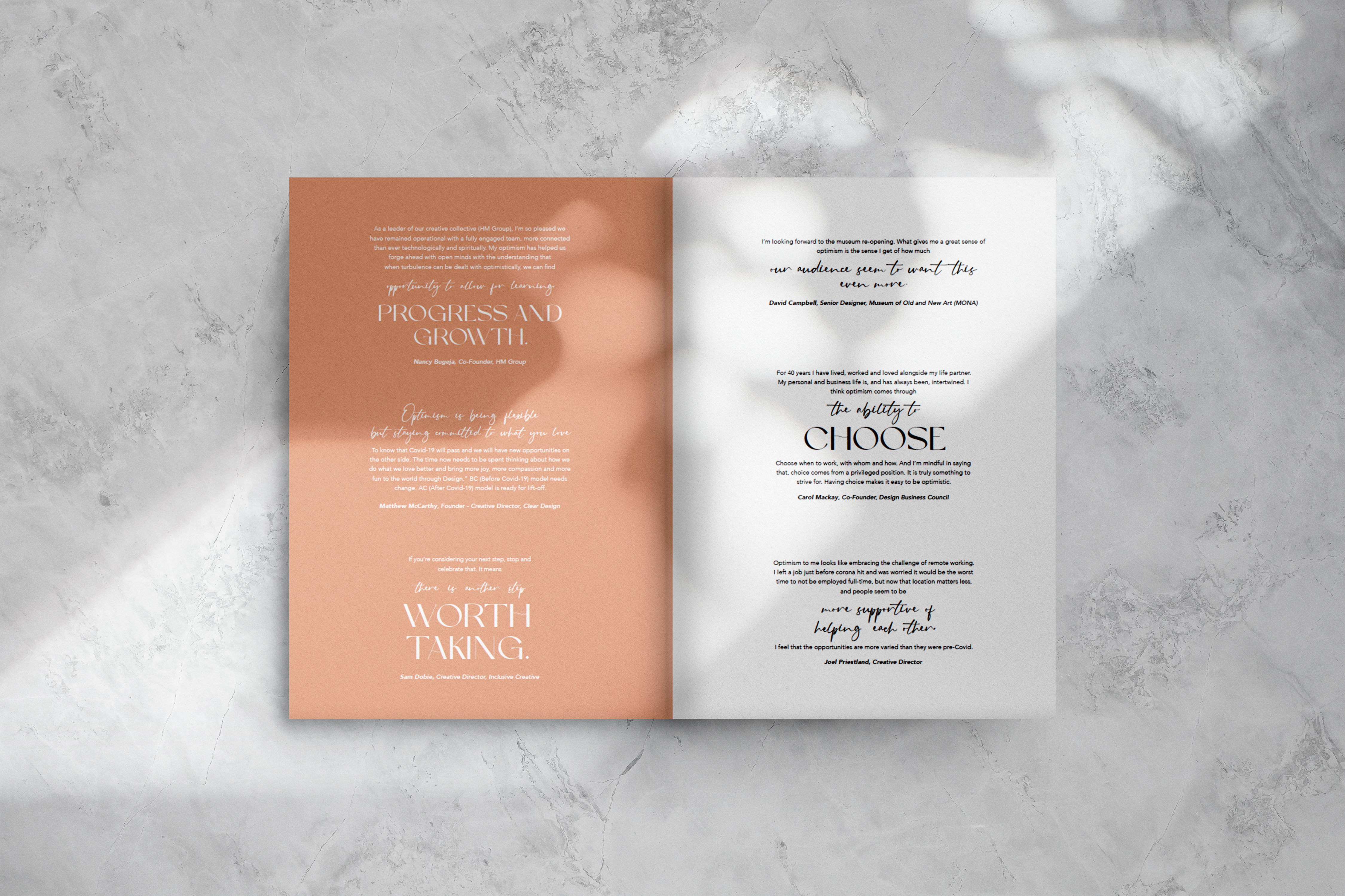
All our guests were asked to respond to one question; “What does optimism mean to you?”
Those quotes were a beacon of hope, celebrating the unity within our industry.
In late 2020 we were talking about creating something special for our team and customers as we ventured into 2021. The mood was still filled with uncertainty. An unknown in some instances and knew we had to bring those quotes back to life!
We wanted to create a project that connected with the soul. What better way than through food.
Food is the centre of our world, culture, experiences and connectivity.
These quotes on optimism were the catalyst in creating a cookbook that are peppered throughout the pages along with recipes. We wanted to create a project that connected the spirit of our team with a common goal. We reached out to our B & D national team creating a campaign to answer the question; “What recipes did you and your family enjoy during 2020 that brought you comfort?”
We were thrilled with over 30 contributors. Sharing their stories, recipes and photographs.
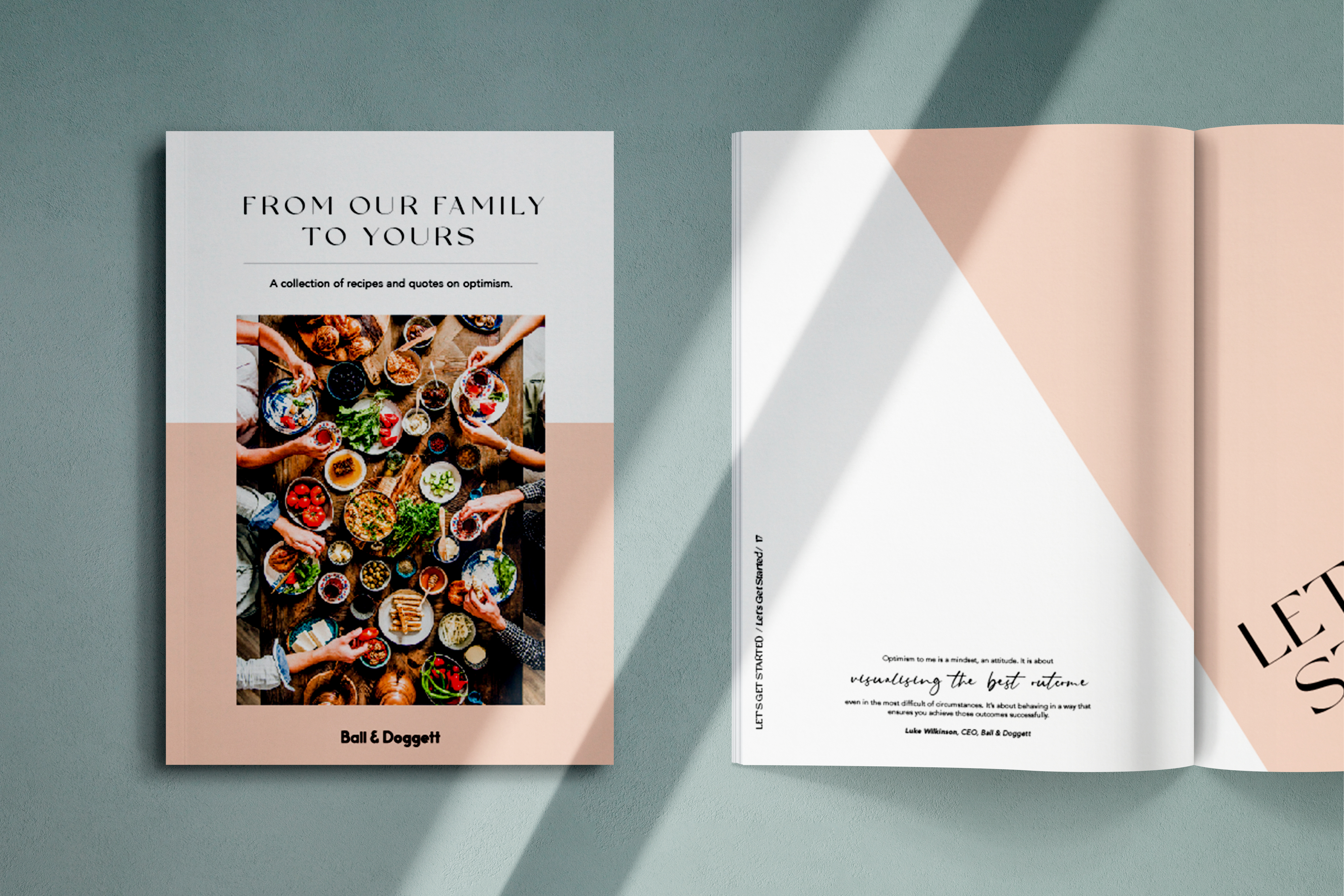
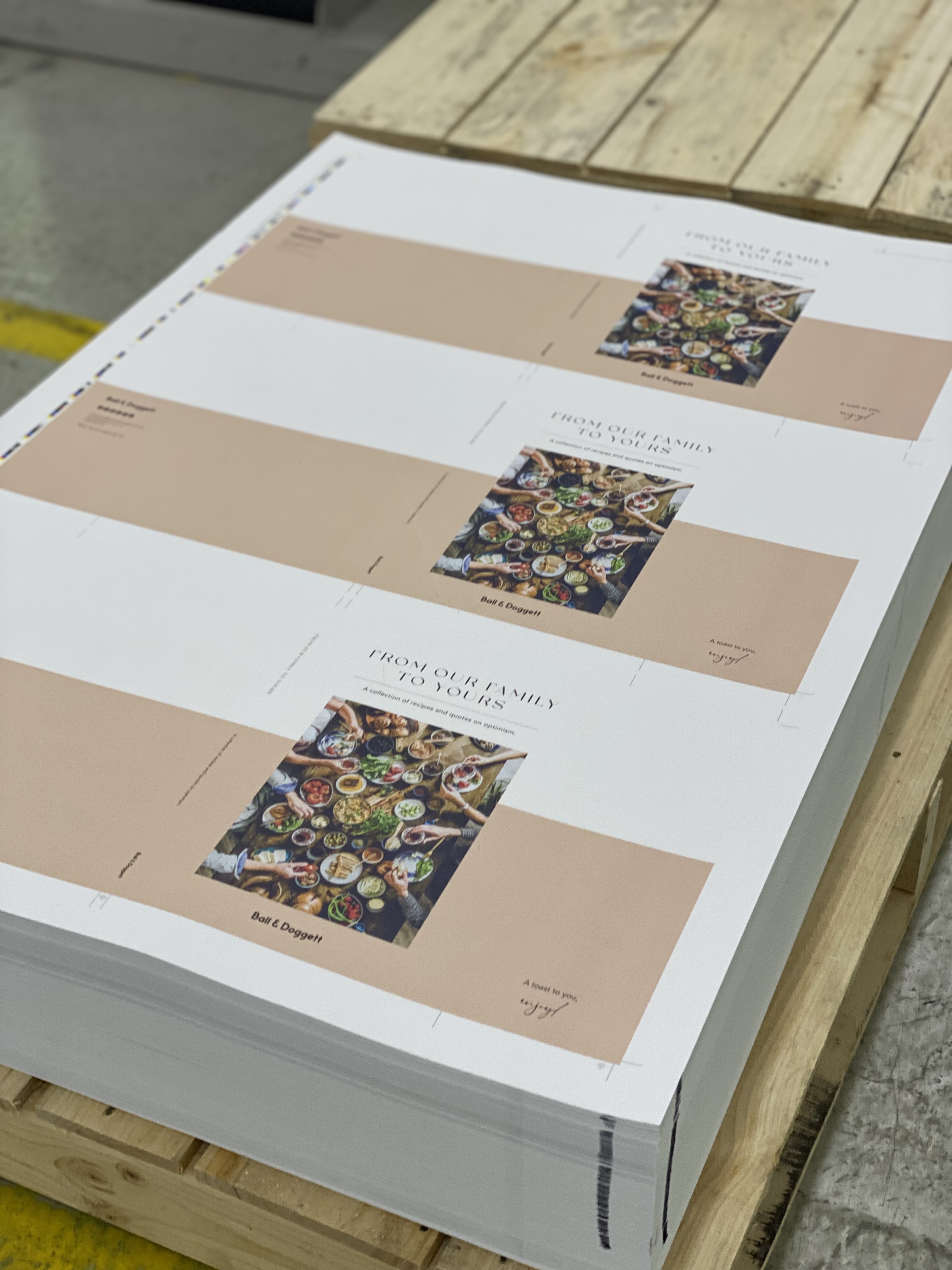
The Ball & Doggett Cookbook was born, ‘From our Family to Yours’, “A collection of Recipes and quotes on Optimism.”
Click here for Episode 1
We wanted to share insight and understand what they were going through. Showing our community that they were not alone. We truly were all in this together.
All our guests were asked to respond to one question; “What does optimism mean to you?”
Those quotes were a beacon of hope, celebrating the unity within our industry.
In late 2020 we were talking about creating something special for our team and customers as we ventured into 2021. The mood was still filled with uncertainty. An unknown in some instances and knew we had to bring those quotes back to life!
We wanted to create a project that connected with the soul. What better way than through food.
Food is the centre of our world, culture, experiences and connectivity.
These quotes on optimism were the catalyst in creating a cookbook that are peppered throughout the pages along with recipes. We wanted to create a project that connected the spirit of our team with a common goal. We reached out to our B & D national team creating a campaign to answer the question; “What recipes did you and your family enjoy during 2020 that brought you comfort?”
We were thrilled with over 30 contributors. Sharing their stories, recipes and photographs.
The Ball & Doggett Cookbook was born, ‘From our Family to Yours’, “A collection of Recipes and quotes on Optimism.”
 These recipes represents the shared experiences of our team members and their families.
Our project team created a publication with heart. It was presented as a gift to both customers and our national team. A token of thanks at Christmas for their resilience, commitment and passion to our business.
Permanency, Supply Partners, Materiality and Food!
This project was more than a printed experience on our glorious papers.
What started off as an online experience with a Youtube series, sharing the interviews of our 12 week eDM campaign, led to creating a tactile, beautifully crafted and considered printed publication.
A physical connection between our community, celebrating our industry’s craft of design, paper and print.
The depth and honesty shared throughout those interviews, coupled with the quotes on optimism we felt creating a permanent expression of our experiences and offering a beautiful physical memory to celebrate our resilience as a unified industry was apt.
Our gratitude is immense for all our contributors of optimism. It has provided an elevated expression, a sense of hope and brought smiles to faces that needed them during this time. Thank-you for allowing us to ribbon those quotes through our pages with this cookbook.
Our project journey took fourteen months from the time of concept until we received our first
thank-you from our first recipient.
These recipes represents the shared experiences of our team members and their families.
Our project team created a publication with heart. It was presented as a gift to both customers and our national team. A token of thanks at Christmas for their resilience, commitment and passion to our business.
Permanency, Supply Partners, Materiality and Food!
This project was more than a printed experience on our glorious papers.
What started off as an online experience with a Youtube series, sharing the interviews of our 12 week eDM campaign, led to creating a tactile, beautifully crafted and considered printed publication.
A physical connection between our community, celebrating our industry’s craft of design, paper and print.
The depth and honesty shared throughout those interviews, coupled with the quotes on optimism we felt creating a permanent expression of our experiences and offering a beautiful physical memory to celebrate our resilience as a unified industry was apt.
Our gratitude is immense for all our contributors of optimism. It has provided an elevated expression, a sense of hope and brought smiles to faces that needed them during this time. Thank-you for allowing us to ribbon those quotes through our pages with this cookbook.
Our project journey took fourteen months from the time of concept until we received our first
thank-you from our first recipient.
 Suppliers, Partners…who needs them? Every single one of us!
We were thrilled embarking on this project with our production partners. Gary Bowles from Arjowiggins Fine Papers came on board the moment we pitched the idea as our sponsor along with our print partner Southern Impact, Rod Dawson and Heath Nankervis.
We would like to acknowledge Kellie Northwood, CEO of The Real Media Collective for celebrating with us on this project and providing the forward in our publication.
It is an unapologetic celebration of print and what it offers us. The great experience of print and using various substrates expressed emotion and messaging. It’s the idea that you lean out with the communication piece at your own pace, absorb, process, enjoy and create a memory with the experience of print in your hand.
According to Twosides (twosides.org,au) Toluna Survey 2017, 66% agreed that it’s important to “switch off” and enjoy printed books and magazines.
Further findings indicate more Australians gain a deeper understanding when reading from print media (61%) over digital media (44%).
Print is enjoyed as the most trusted communication medium by consumers. It’s a source of truth that they engage with in their own time. Positive impact on return of investments has been the reward for business that use print in conjunction with online platforms.
So our message to you, print is your leading lady with online communication playing a fantastic supporting role, depending on the campaign of course – your options are limitless!
Production: Camera, lights, action!
Understanding the magnitude of this project presented itself in the first month. Given our workload we needed to ensure our project ran to our set project production schedules that were already stretched. I make this point as it pertains to the collaboration of all parties and ensuring we connected with Southern Impact from the word go. They are the experts in their craft, whilst we had a vision that we wanted to bring to fruition. We relied on the team from the onset for technical advice and direction.
Suppliers, Partners…who needs them? Every single one of us!
We were thrilled embarking on this project with our production partners. Gary Bowles from Arjowiggins Fine Papers came on board the moment we pitched the idea as our sponsor along with our print partner Southern Impact, Rod Dawson and Heath Nankervis.
We would like to acknowledge Kellie Northwood, CEO of The Real Media Collective for celebrating with us on this project and providing the forward in our publication.
It is an unapologetic celebration of print and what it offers us. The great experience of print and using various substrates expressed emotion and messaging. It’s the idea that you lean out with the communication piece at your own pace, absorb, process, enjoy and create a memory with the experience of print in your hand.
According to Twosides (twosides.org,au) Toluna Survey 2017, 66% agreed that it’s important to “switch off” and enjoy printed books and magazines.
Further findings indicate more Australians gain a deeper understanding when reading from print media (61%) over digital media (44%).
Print is enjoyed as the most trusted communication medium by consumers. It’s a source of truth that they engage with in their own time. Positive impact on return of investments has been the reward for business that use print in conjunction with online platforms.
So our message to you, print is your leading lady with online communication playing a fantastic supporting role, depending on the campaign of course – your options are limitless!
Production: Camera, lights, action!
Understanding the magnitude of this project presented itself in the first month. Given our workload we needed to ensure our project ran to our set project production schedules that were already stretched. I make this point as it pertains to the collaboration of all parties and ensuring we connected with Southern Impact from the word go. They are the experts in their craft, whilst we had a vision that we wanted to bring to fruition. We relied on the team from the onset for technical advice and direction.
 You have to start somewhere, where?
Mock-ups, glorious mock-ups! Working with our incredible Designline team, Jane Jackson and Sofia Cerros, we created a series of configurations that would allow us to understand how far we could push all elements; stock selection and colour (remember it’s always the fifth colour!), design, and naturally print.
We settled on a specification that certainly pushed our boundaries and knew a press check was always going to be part of the journey:
You have to start somewhere, where?
Mock-ups, glorious mock-ups! Working with our incredible Designline team, Jane Jackson and Sofia Cerros, we created a series of configurations that would allow us to understand how far we could push all elements; stock selection and colour (remember it’s always the fifth colour!), design, and naturally print.
We settled on a specification that certainly pushed our boundaries and knew a press check was always going to be part of the journey:
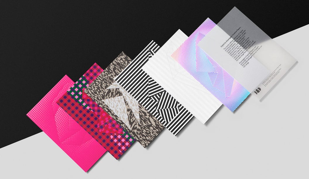
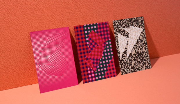
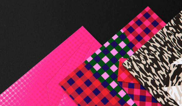
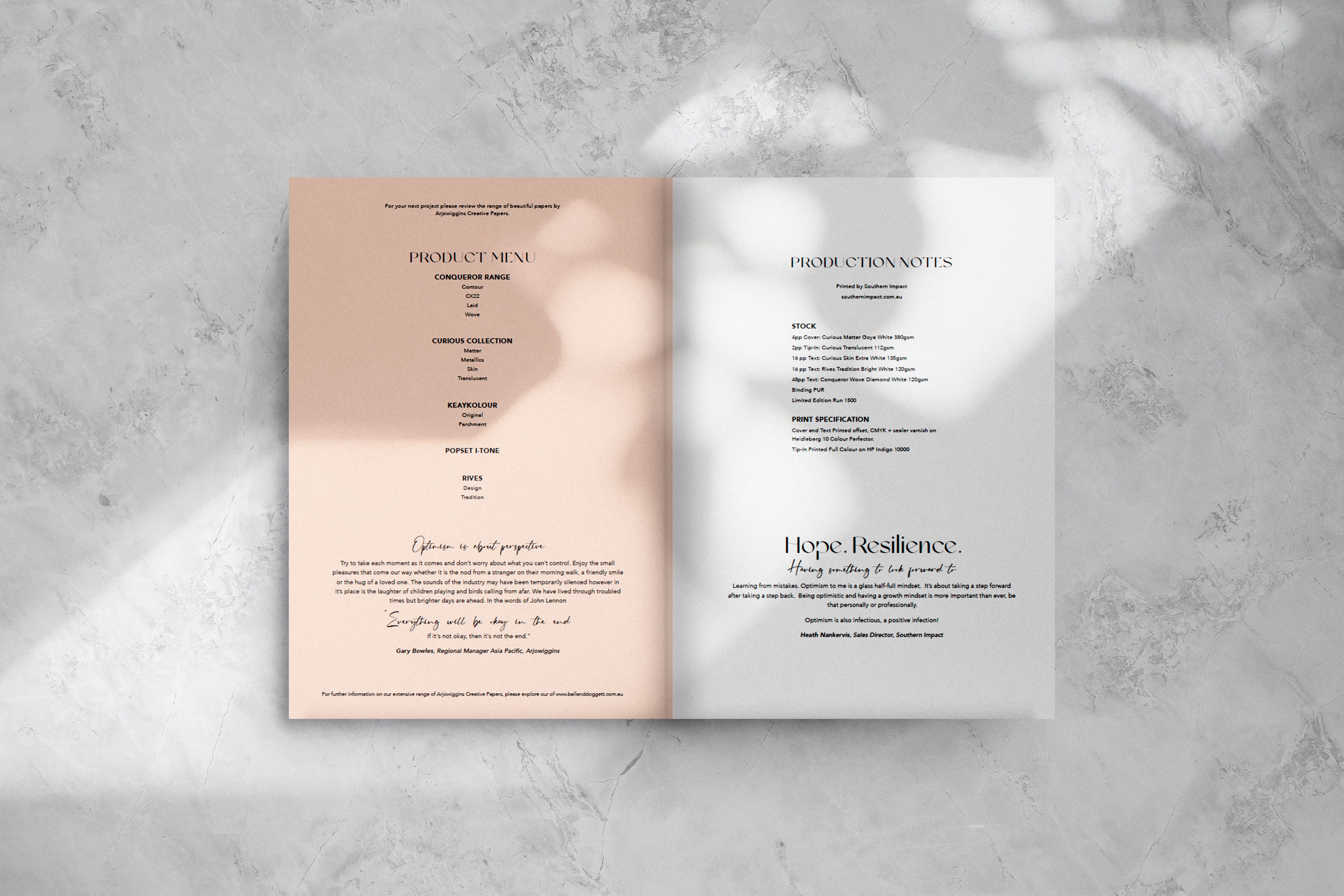 Production Notes:
Stock:
4pp Cover: Curious Matter Goya White 270gsm
2pp Tip-In: Curious Translucent 112gsm
16 pp Text: Curious Skin Extra White 135gsm
16 pp Text: Rives Tradition Bright White 120gsm
48pp Text: Conqueror Wove Diamond White 120gsm
Binding PUR
Print:
Four colour throughout with sealer varnish
Press: Heidelberg XL106 – 10 Perfector
Press for Tip in: Curious Translucent tip-in will be printed White only on HP Indigo 7800
Given our scope of the project and asking our teams to provide us with images was always going to be challenging. Ensuring the quality, image perspective and resolution would work for our design was always going to be a risk. One we wanted to take and it paid off! The rawness and sense of home is what makes these images work.
My first conversation with Heath from Southern Impact was about the parameters of how the images needed to be supplied. Given all images were supplied by our team from their iPhones, this was going to present with complexities in artwork preparation for optimum output. Specifically high definition resolution.
Quote Heath Nankervis, Southern Impact, Sales Director
Southern Impact was engaged by the team at Ball & Doggett in mid-2021 to produce a B&D Cookbook.
However, this was no ordinary cookbook, rather a beautiful collaboration between their industry supply partners; bringing people, their families and colleagues together in the name of delicious food and recipes. Recipes from B&D colleagues and suppliers were compiled to warm the hearts of families in a time where the country was dealing with a health pandemic.
The Concept: to create memories at home, have a good tactile feel and be a keepsake booklet for people to have for years to come.
The team at Southern Impact worked closely with B&D on testing different substrates, unique print methods (digital & offset print) and making sure the overall look and feel matched the quality this book deserved.
Engaging our staff throughout this process was also key. From seamless press checks between B&Ds Zaidee and our press operator Rhys, through to the communication with our bindery & fulfillment team to pack and distribute Australia wide was a team effort.
Southern Impact was proud to be asked by B&D to engage in this special book. The importance of strong supplier/manufacturer relationships is vital in reaching successful outcomes that can be enjoyed by all
Happy cooking everyone
From a stock perspective we discussed our specification in detail. We decided on running test prints on the five selected grades. Ensuring the stock supported our look and feel was pertinent to the desired result.
In particular we ran print tests on our Rives Tradition Bright White 120gsm and Rives Design Bright White 120gsm. Given the tactility of the sheets we were in a prime position to choose the best stock for the project, in particularly to elevate the images and work cohesively with our design layout.
Production Notes:
Stock:
4pp Cover: Curious Matter Goya White 270gsm
2pp Tip-In: Curious Translucent 112gsm
16 pp Text: Curious Skin Extra White 135gsm
16 pp Text: Rives Tradition Bright White 120gsm
48pp Text: Conqueror Wove Diamond White 120gsm
Binding PUR
Print:
Four colour throughout with sealer varnish
Press: Heidelberg XL106 – 10 Perfector
Press for Tip in: Curious Translucent tip-in will be printed White only on HP Indigo 7800
Given our scope of the project and asking our teams to provide us with images was always going to be challenging. Ensuring the quality, image perspective and resolution would work for our design was always going to be a risk. One we wanted to take and it paid off! The rawness and sense of home is what makes these images work.
My first conversation with Heath from Southern Impact was about the parameters of how the images needed to be supplied. Given all images were supplied by our team from their iPhones, this was going to present with complexities in artwork preparation for optimum output. Specifically high definition resolution.
Quote Heath Nankervis, Southern Impact, Sales Director
Southern Impact was engaged by the team at Ball & Doggett in mid-2021 to produce a B&D Cookbook.
However, this was no ordinary cookbook, rather a beautiful collaboration between their industry supply partners; bringing people, their families and colleagues together in the name of delicious food and recipes. Recipes from B&D colleagues and suppliers were compiled to warm the hearts of families in a time where the country was dealing with a health pandemic.
The Concept: to create memories at home, have a good tactile feel and be a keepsake booklet for people to have for years to come.
The team at Southern Impact worked closely with B&D on testing different substrates, unique print methods (digital & offset print) and making sure the overall look and feel matched the quality this book deserved.
Engaging our staff throughout this process was also key. From seamless press checks between B&Ds Zaidee and our press operator Rhys, through to the communication with our bindery & fulfillment team to pack and distribute Australia wide was a team effort.
Southern Impact was proud to be asked by B&D to engage in this special book. The importance of strong supplier/manufacturer relationships is vital in reaching successful outcomes that can be enjoyed by all
Happy cooking everyone
From a stock perspective we discussed our specification in detail. We decided on running test prints on the five selected grades. Ensuring the stock supported our look and feel was pertinent to the desired result.
In particular we ran print tests on our Rives Tradition Bright White 120gsm and Rives Design Bright White 120gsm. Given the tactility of the sheets we were in a prime position to choose the best stock for the project, in particularly to elevate the images and work cohesively with our design layout.
 Both options were successful which brought the decision down to texture.
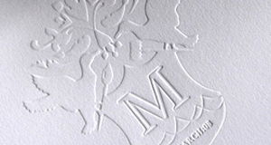
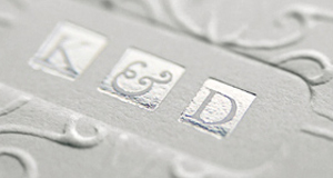
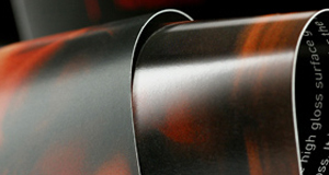
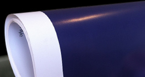
Stock selection using Arjowiggins Fine Paper was always going to be a fun experience creating both the aesthetic and celebrating the notion that paper is the body language of the message.
Quote – Gary Bowles, Arjowiggins, Regional Manager
“The Ball & Doggett cookbook was a positive initiative during what was a difficult period for many and from the moment I heard about the concept, I knew we wanted to be involved as a sponsor.
Connecting food, family and optimism was a project borne of passion and the best way to communicate this idea was with print.
There is no better way to share and gift the cookbook than with a printed copy that has been photographed, designed and printed to perfection on beautiful paper.
The enthusiasm of Zaidee and the Ball & Doggett team spread wide as quotes of optimism poured in from across the industry, all of which can be read throughout the cookbook.
We are proud and delighted to be a part of this project and look forward to working closely with Ball and Doggett on future activities.”
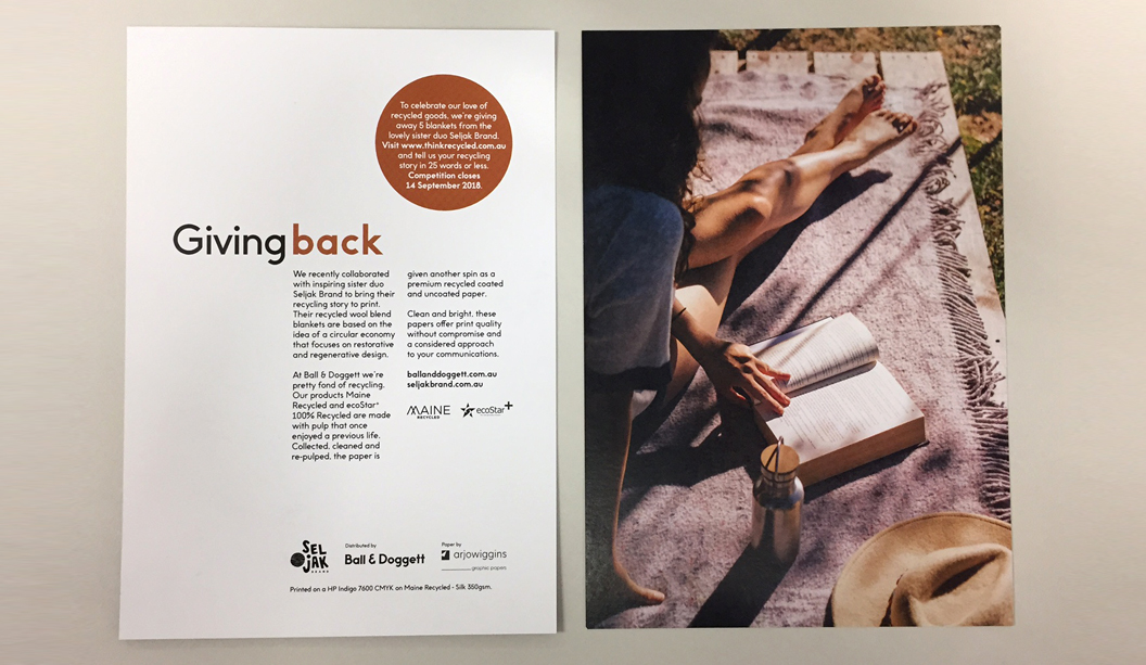
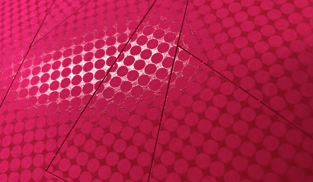
Paging through each page the reader immediately has a sense of connection and emotion. Whilst you hold the cook book, with a cover made from potato starch, you know that each stock was selected for specific characteristics. That’s exactly what you will be holding with our cover produced on Curious Matter Goya White 270gsm.
Both options were successful which brought the decision down to texture.
Stock selection using Arjowiggins Fine Paper was always going to be a fun experience creating both the aesthetic and celebrating the notion that paper is the body language of the message.
Quote – Gary Bowles, Arjowiggins, Regional Manager
“The Ball & Doggett cookbook was a positive initiative during what was a difficult period for many and from the moment I heard about the concept, I knew we wanted to be involved as a sponsor.
Connecting food, family and optimism was a project borne of passion and the best way to communicate this idea was with print.
There is no better way to share and gift the cookbook than with a printed copy that has been photographed, designed and printed to perfection on beautiful paper.
The enthusiasm of Zaidee and the Ball & Doggett team spread wide as quotes of optimism poured in from across the industry, all of which can be read throughout the cookbook.
We are proud and delighted to be a part of this project and look forward to working closely with Ball and Doggett on future activities.”
Paging through each page the reader immediately has a sense of connection and emotion. Whilst you hold the cook book, with a cover made from potato starch, you know that each stock was selected for specific characteristics. That’s exactly what you will be holding with our cover produced on Curious Matter Goya White 270gsm.
 Initially we selected a 380gsm for the cover with intention of creating a substantial experience to house the text. Upon discussion with the experienced team at Southern Impact a change to the 270gsm was decided on. We needed to ascertain any unforeseen issues given we had 100mm flaps on the front and back covers. We wanted a flush finish trim. Our print experience drove the question to the printer who guided us to make the correct decision. Working with Caroline, the Project Manager was a terrific experience to run ideas past, gain insight to technicalities in the process and how we could push the boundaries with the intent of producing a stellar cookbook.
The synergy in a project is critical to ensure all parties are on the same page throughout the process.
We experimented with the tip in which was produced on HP Indigo 7800. We wanted to connect the quote we were using, creating a fluidity that Curious Translucent 112gsm naturally offers.
A transparent sheet that was sitting on top of a full colour sheet.
The hope was to create a strong connection to the stock and quote, “Empathy is about finding echoes of another person in yourself.” By Mohsin Hamid. By printing the quote with five hits of white on the reverse, the idea was to create an ‘echo’ in the print and allow the stock, or as we like to call it, ‘the body language’, to translate that. Upon testing the print on the front and reverse we were able to make a sound decision. The best outcome for the production was to keep the print on the front.
This is hindsight coming to the fore and a luxury moment in production where most projects don’t have a budget and deadline to do a test.
The lesson here is always check in with your printer and collaborate for the best outcomes.
Education elevates experiences
What we can do as an industry is offer the education and language to those looking to elevate discussions with their own customers. Question, explore and investigate the notion; Why do we default to a commodity grade in paper? How can we convey the message to customers; by combining a more tactile connection to the printed piece, in conjunction with a commodity sheet, could in fact provide that elevated experience their brand offers the consumer.
For us at Ball & Doggett, it is an important part of the process when we engage with customers to take them on that journey. Ask those questions and bring the stock selection into the broader story.
Customers invest money and time on developing products and services and look to receive profitable returns. Part of their brand expression is ensuring the assets are reflective of that.
They invest in great design, photography and talent to tell their brand story to their market.
Our advice, always look to work with them to show them how they can elevate and deliver on their brand promise.
We are passionate about working with brands and exploring how we can partner to acknowledge their investment and tell their story through impactful and engaging print. It does not always have to a commodity grade based on price. Sometimes it’s simply tapping into our expertise that allows us to influence others and demonstrate other ways to bring their printed communication to life.
Initially we selected a 380gsm for the cover with intention of creating a substantial experience to house the text. Upon discussion with the experienced team at Southern Impact a change to the 270gsm was decided on. We needed to ascertain any unforeseen issues given we had 100mm flaps on the front and back covers. We wanted a flush finish trim. Our print experience drove the question to the printer who guided us to make the correct decision. Working with Caroline, the Project Manager was a terrific experience to run ideas past, gain insight to technicalities in the process and how we could push the boundaries with the intent of producing a stellar cookbook.
The synergy in a project is critical to ensure all parties are on the same page throughout the process.
We experimented with the tip in which was produced on HP Indigo 7800. We wanted to connect the quote we were using, creating a fluidity that Curious Translucent 112gsm naturally offers.
A transparent sheet that was sitting on top of a full colour sheet.
The hope was to create a strong connection to the stock and quote, “Empathy is about finding echoes of another person in yourself.” By Mohsin Hamid. By printing the quote with five hits of white on the reverse, the idea was to create an ‘echo’ in the print and allow the stock, or as we like to call it, ‘the body language’, to translate that. Upon testing the print on the front and reverse we were able to make a sound decision. The best outcome for the production was to keep the print on the front.
This is hindsight coming to the fore and a luxury moment in production where most projects don’t have a budget and deadline to do a test.
The lesson here is always check in with your printer and collaborate for the best outcomes.
Education elevates experiences
What we can do as an industry is offer the education and language to those looking to elevate discussions with their own customers. Question, explore and investigate the notion; Why do we default to a commodity grade in paper? How can we convey the message to customers; by combining a more tactile connection to the printed piece, in conjunction with a commodity sheet, could in fact provide that elevated experience their brand offers the consumer.
For us at Ball & Doggett, it is an important part of the process when we engage with customers to take them on that journey. Ask those questions and bring the stock selection into the broader story.
Customers invest money and time on developing products and services and look to receive profitable returns. Part of their brand expression is ensuring the assets are reflective of that.
They invest in great design, photography and talent to tell their brand story to their market.
Our advice, always look to work with them to show them how they can elevate and deliver on their brand promise.
We are passionate about working with brands and exploring how we can partner to acknowledge their investment and tell their story through impactful and engaging print. It does not always have to a commodity grade based on price. Sometimes it’s simply tapping into our expertise that allows us to influence others and demonstrate other ways to bring their printed communication to life.
 We were grateful for the collective experience that supported this project, delivering a publication we are all proud of.
Sign off it’s almost time to print!
The sign off process is a critical step in the printing process, especially with any publication.
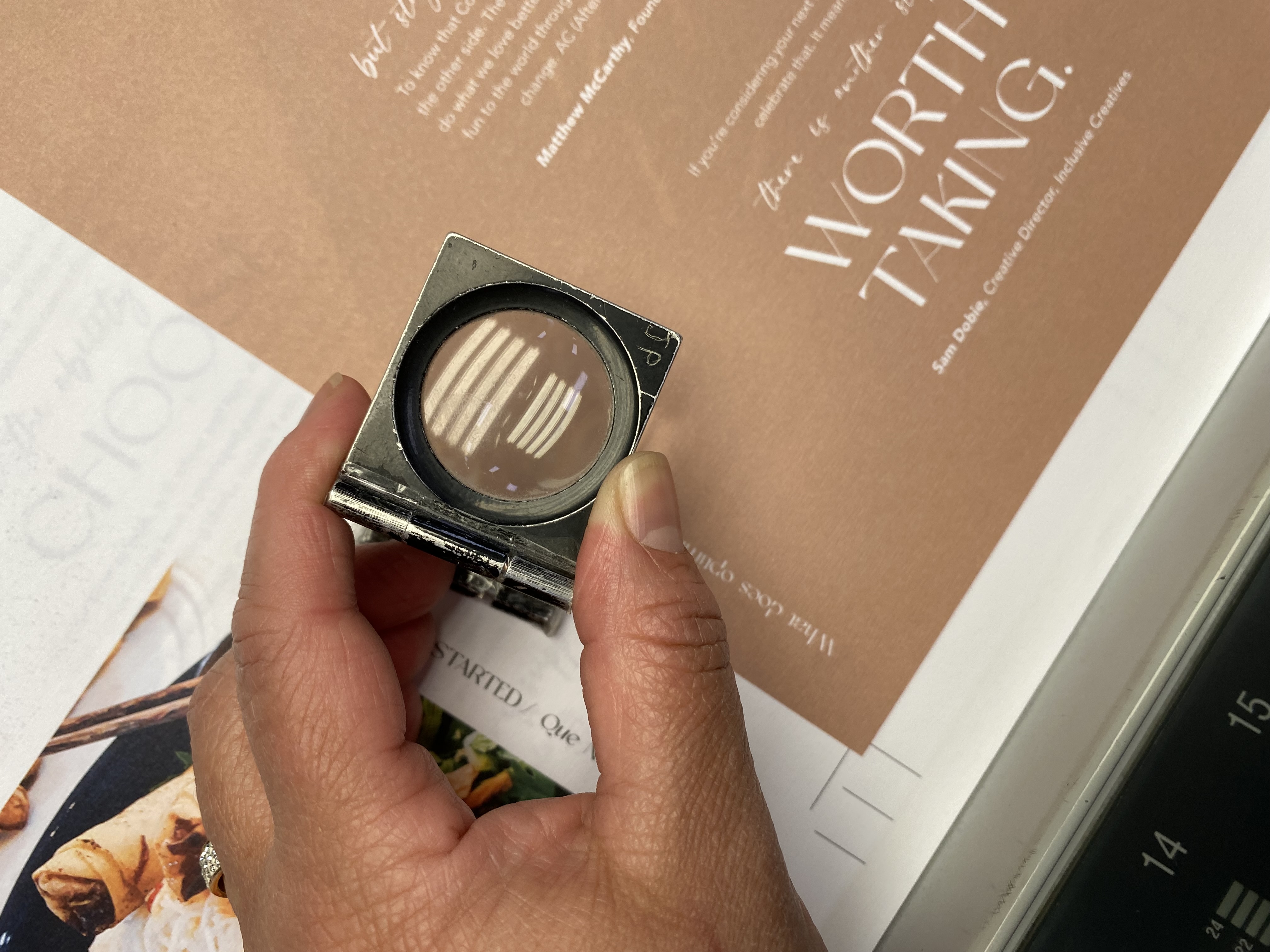
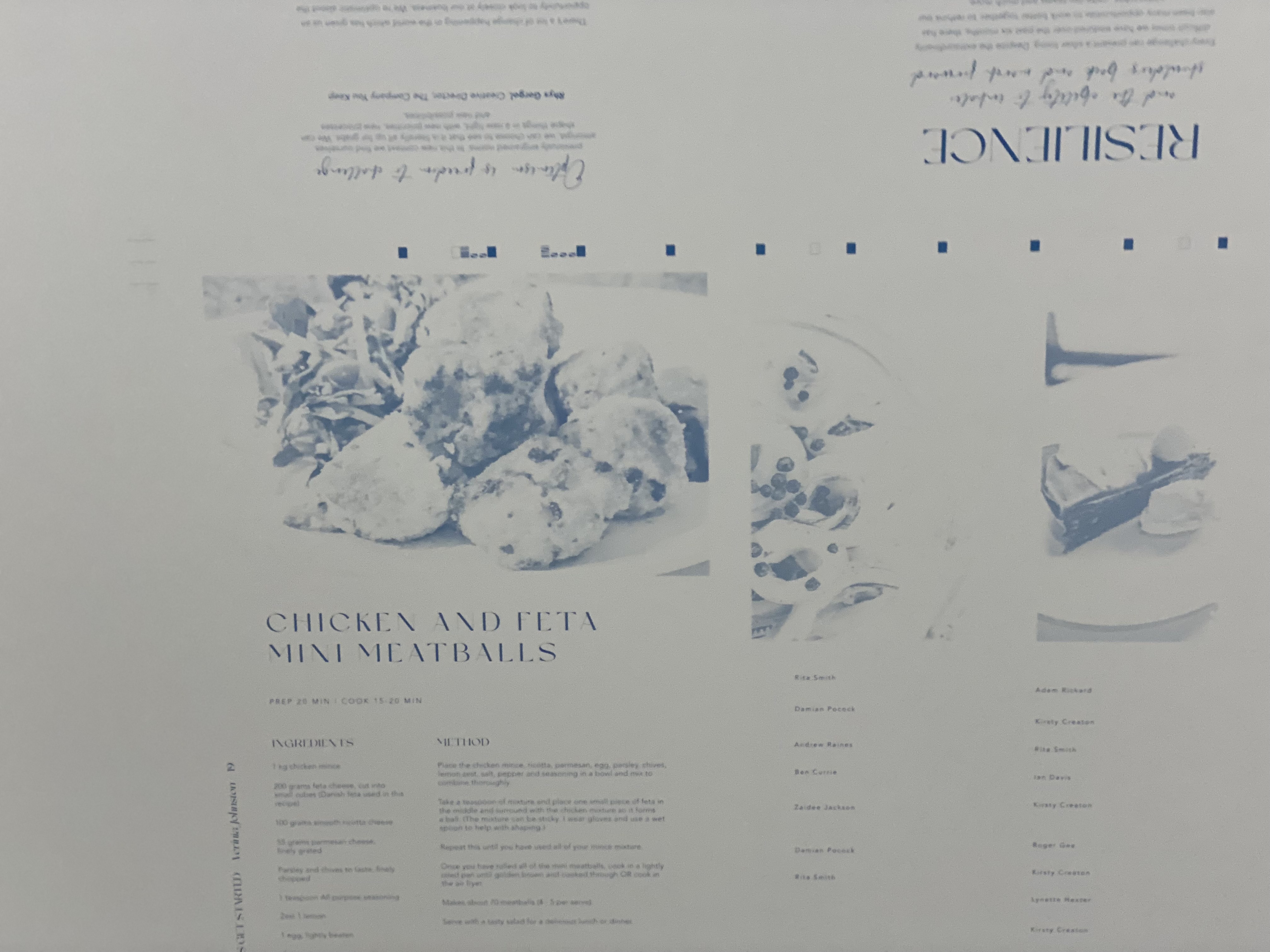
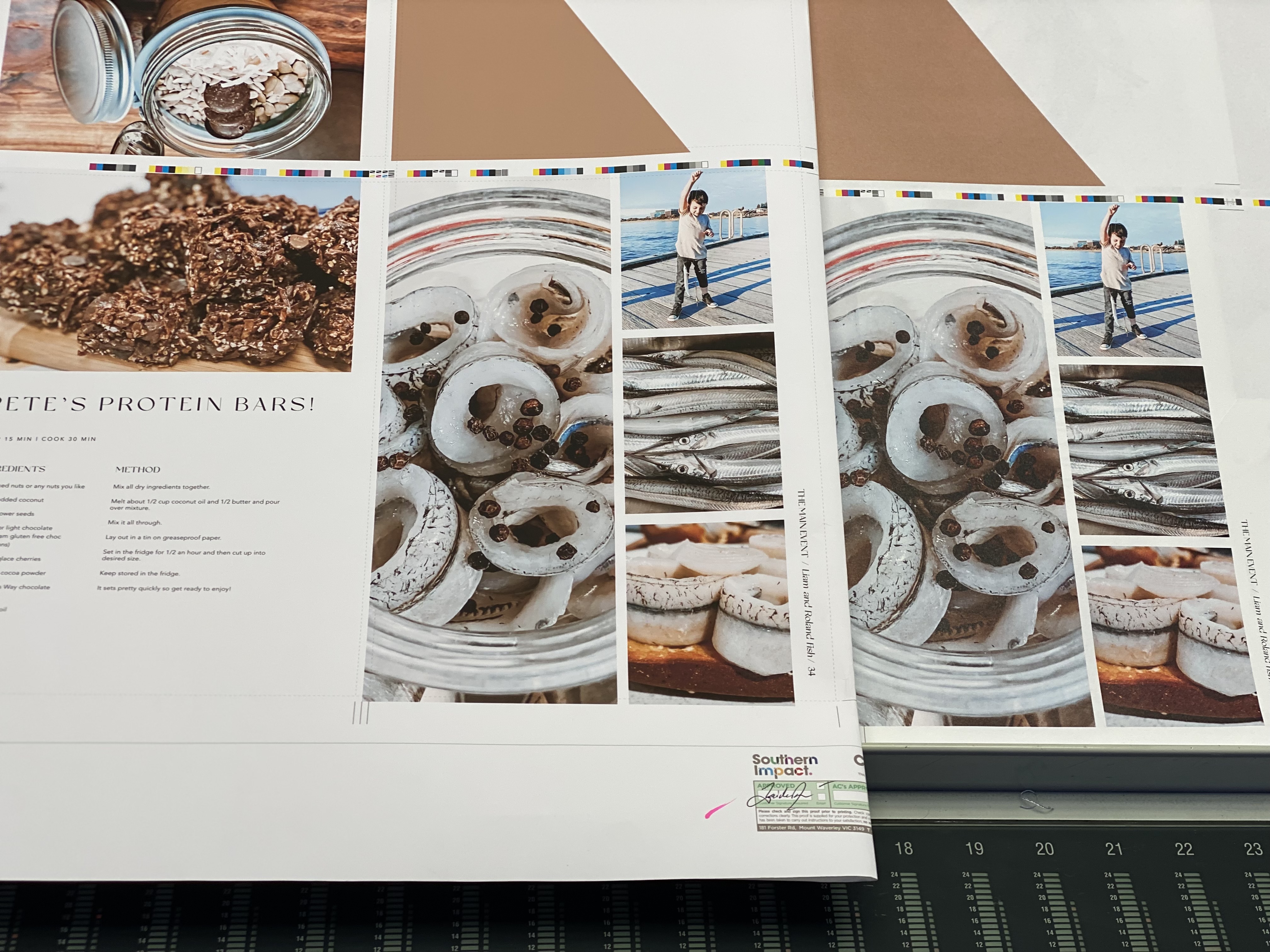
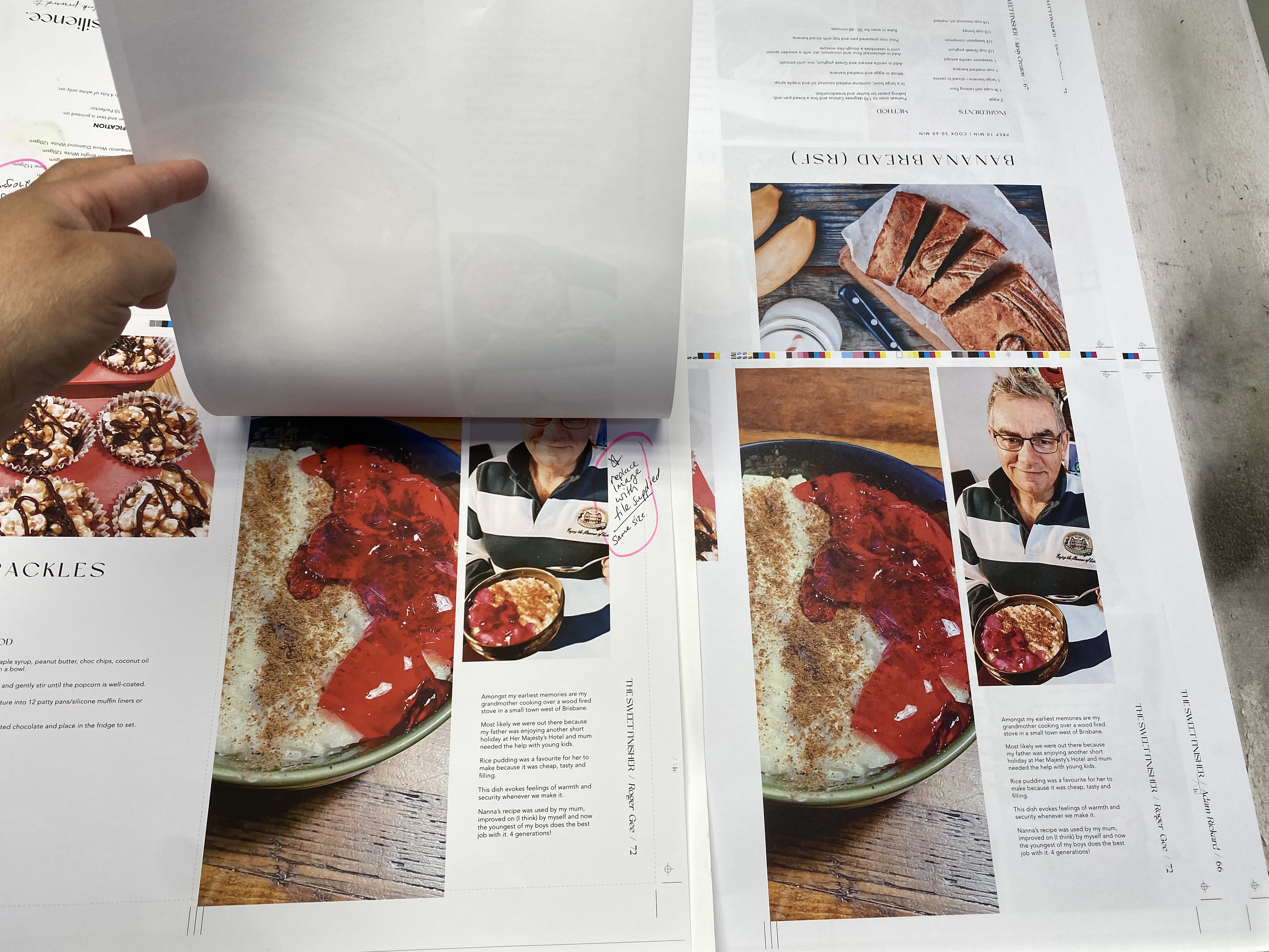
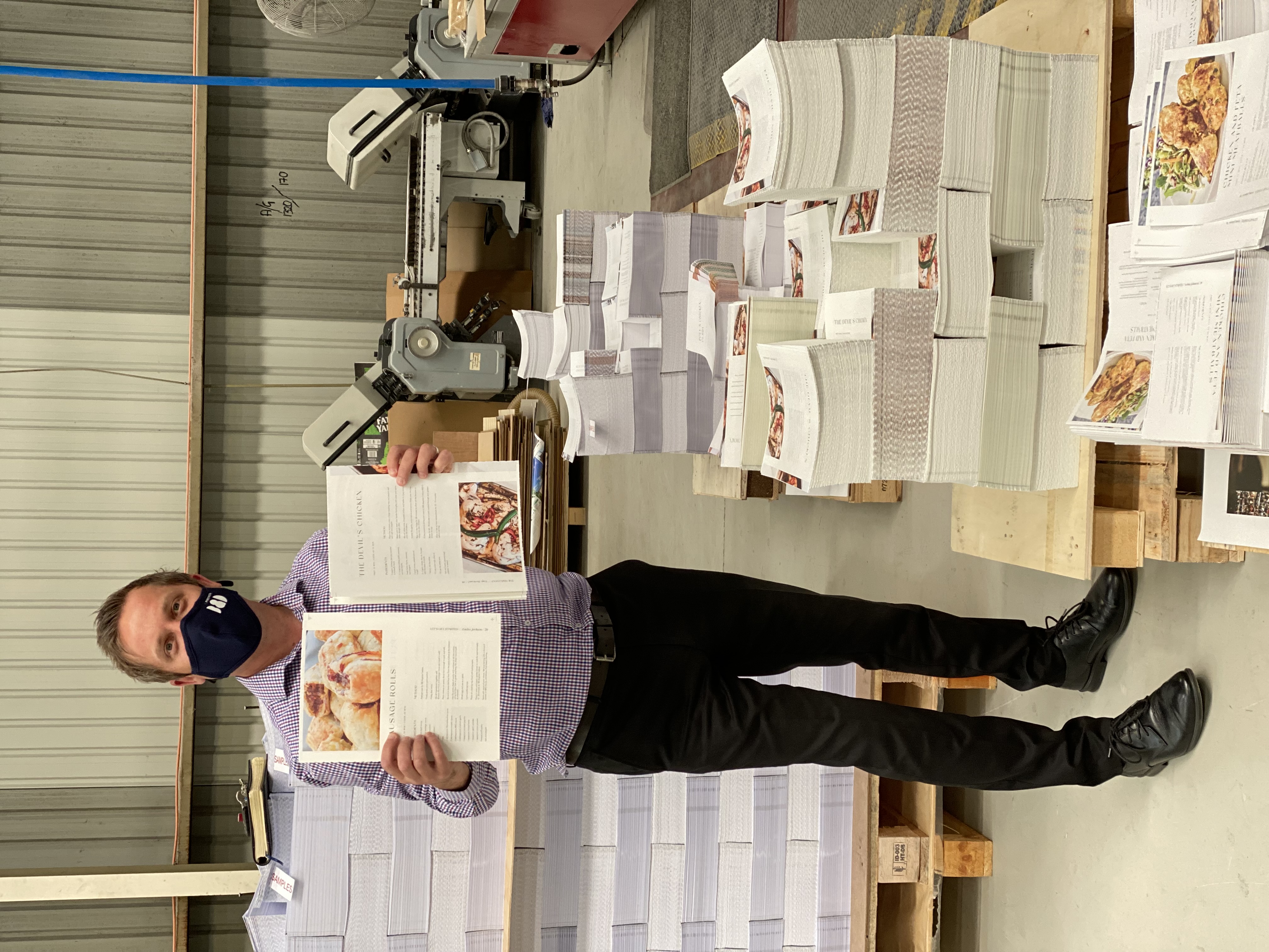
Each Epsom proof, assimilating uncoated stock was laid out across the boardroom table with as much natural light flooding in the room. Each page was checked by two individuals to ensure that we were not going to find surprises on press. Through this process we identified grammatical errors and a concern with one image. We were thankful to the prepress team who were able to manipulate that image for a great result!
This part of the game is one where you really have hindsight and a step never to be skipped. Whether it’s printed Epsom proofs or digital file, make sure you sign off!
From Design to the Press
We were grateful for the collective experience that supported this project, delivering a publication we are all proud of.
Sign off it’s almost time to print!
The sign off process is a critical step in the printing process, especially with any publication.
Each Epsom proof, assimilating uncoated stock was laid out across the boardroom table with as much natural light flooding in the room. Each page was checked by two individuals to ensure that we were not going to find surprises on press. Through this process we identified grammatical errors and a concern with one image. We were thankful to the prepress team who were able to manipulate that image for a great result!
This part of the game is one where you really have hindsight and a step never to be skipped. Whether it’s printed Epsom proofs or digital file, make sure you sign off!
From Design to the Press
 Once we had artwork almost finalised we supplied this to Heath and the team to review and to look for any unforeseen issues at the prepress stage. Given the filters applied to the images, resolution and allowances for various stocks this was a critical part of the process. A few elements were highlighted by the exceptionally skilled team working with us to correct image quality and enhance the resolution with some images. We even recreated a recipe to ensure we achieved the right resolution for output.
We needed to be flexible and open to change given the various shades of stocks and tactility within the book. Considerations for the filters on images to create a mutual look and feel, along with the layout and typesetting.
Once we had artwork almost finalised we supplied this to Heath and the team to review and to look for any unforeseen issues at the prepress stage. Given the filters applied to the images, resolution and allowances for various stocks this was a critical part of the process. A few elements were highlighted by the exceptionally skilled team working with us to correct image quality and enhance the resolution with some images. We even recreated a recipe to ensure we achieved the right resolution for output.
We needed to be flexible and open to change given the various shades of stocks and tactility within the book. Considerations for the filters on images to create a mutual look and feel, along with the layout and typesetting.
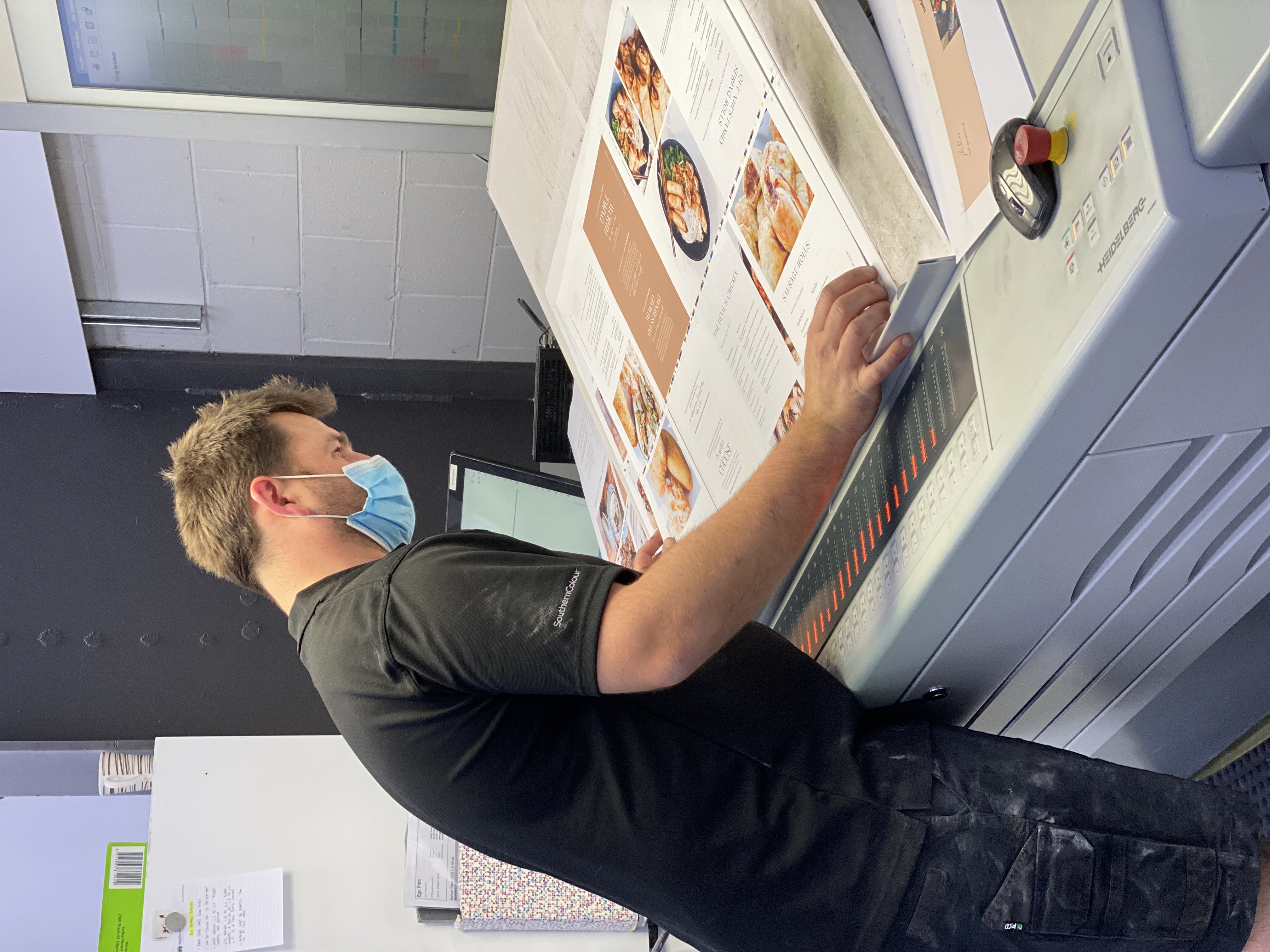
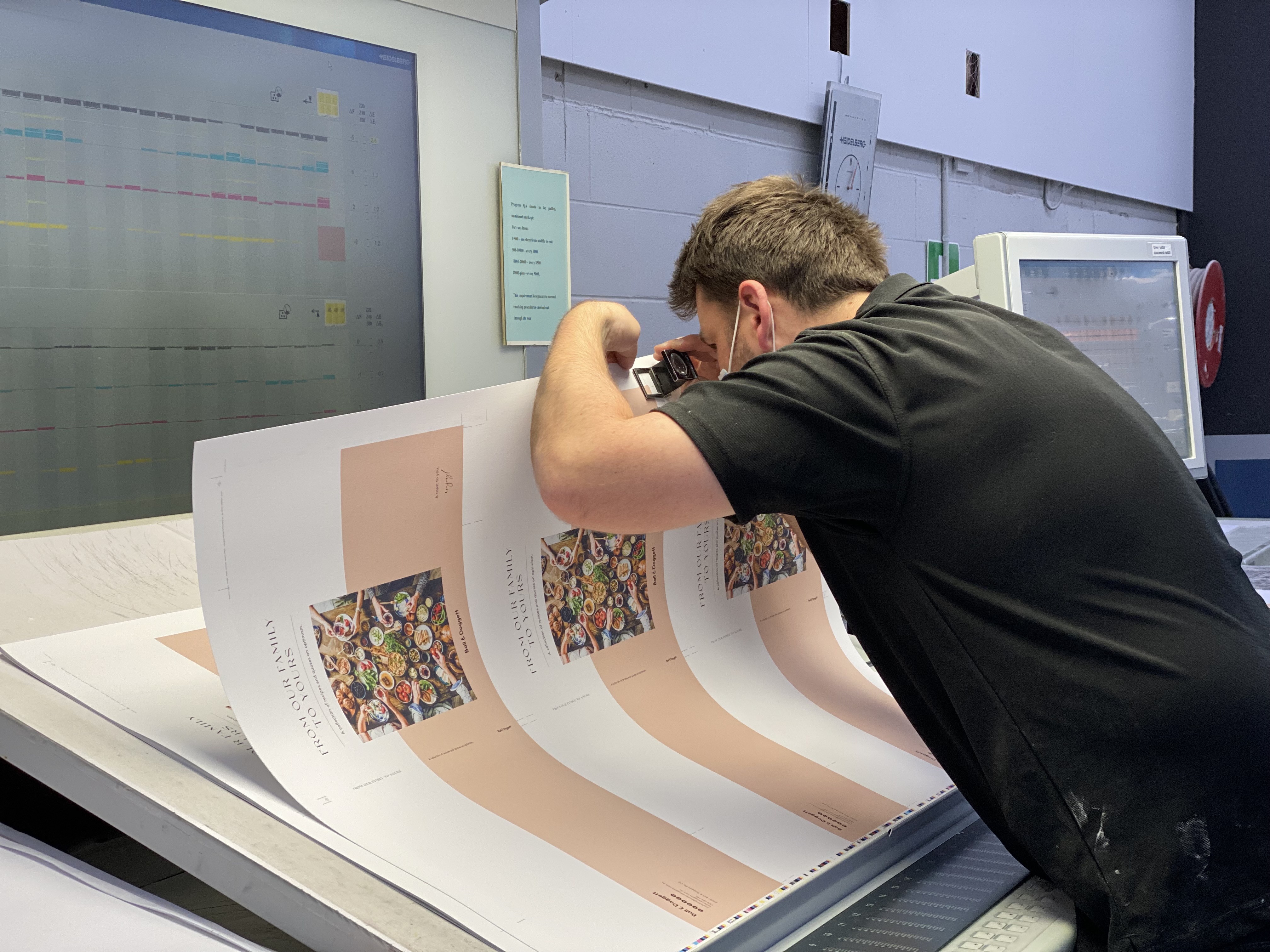
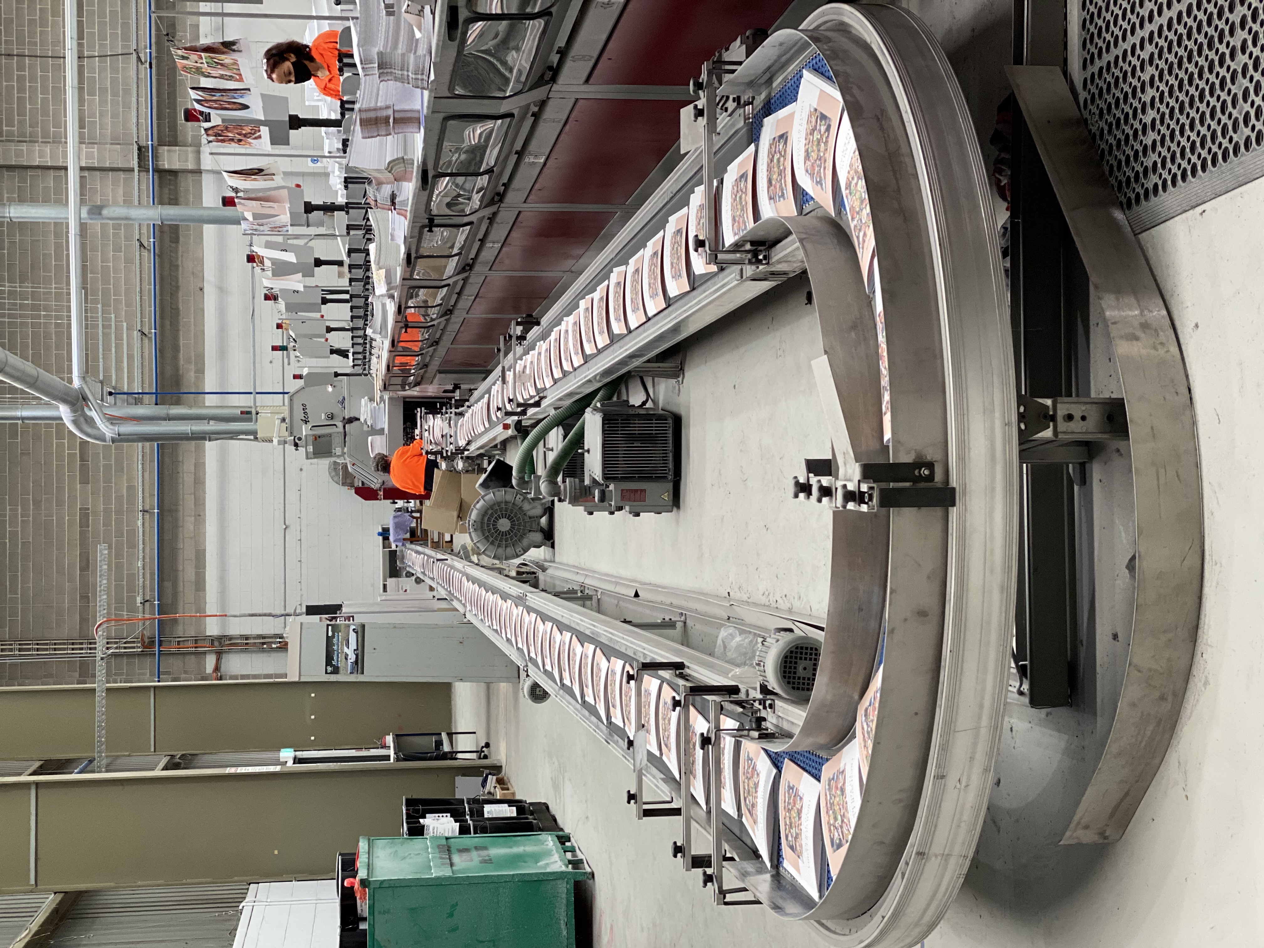
 The printing process in itself was always going to be collaborative experience!
From the moment I arrived on site, Rod Dawson greeted me with enthusiasm for our project that I certainly had.
I was led into a client workspace and introduced to Caroline that I had been dealing with via telephone and mobile only at this stage. We set our objectives for the day on press, got my workstation set and coffee ready to start the day.
The printing process in itself was always going to be collaborative experience!
From the moment I arrived on site, Rod Dawson greeted me with enthusiasm for our project that I certainly had.
I was led into a client workspace and introduced to Caroline that I had been dealing with via telephone and mobile only at this stage. We set our objectives for the day on press, got my workstation set and coffee ready to start the day.
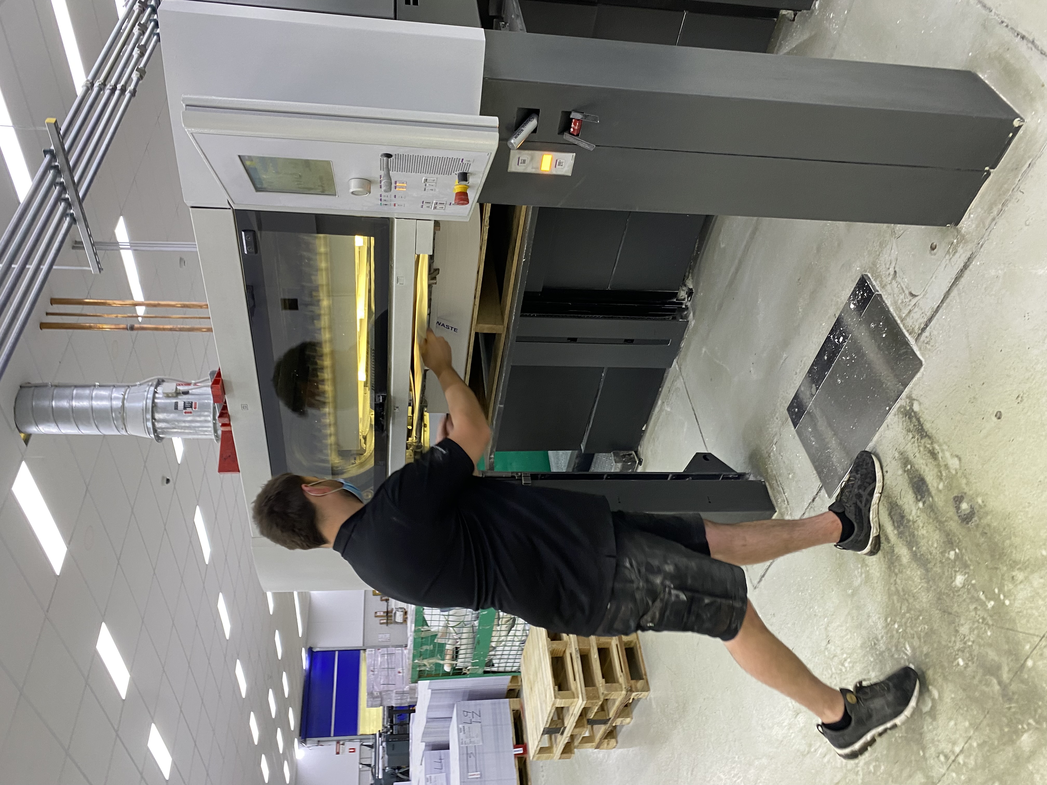
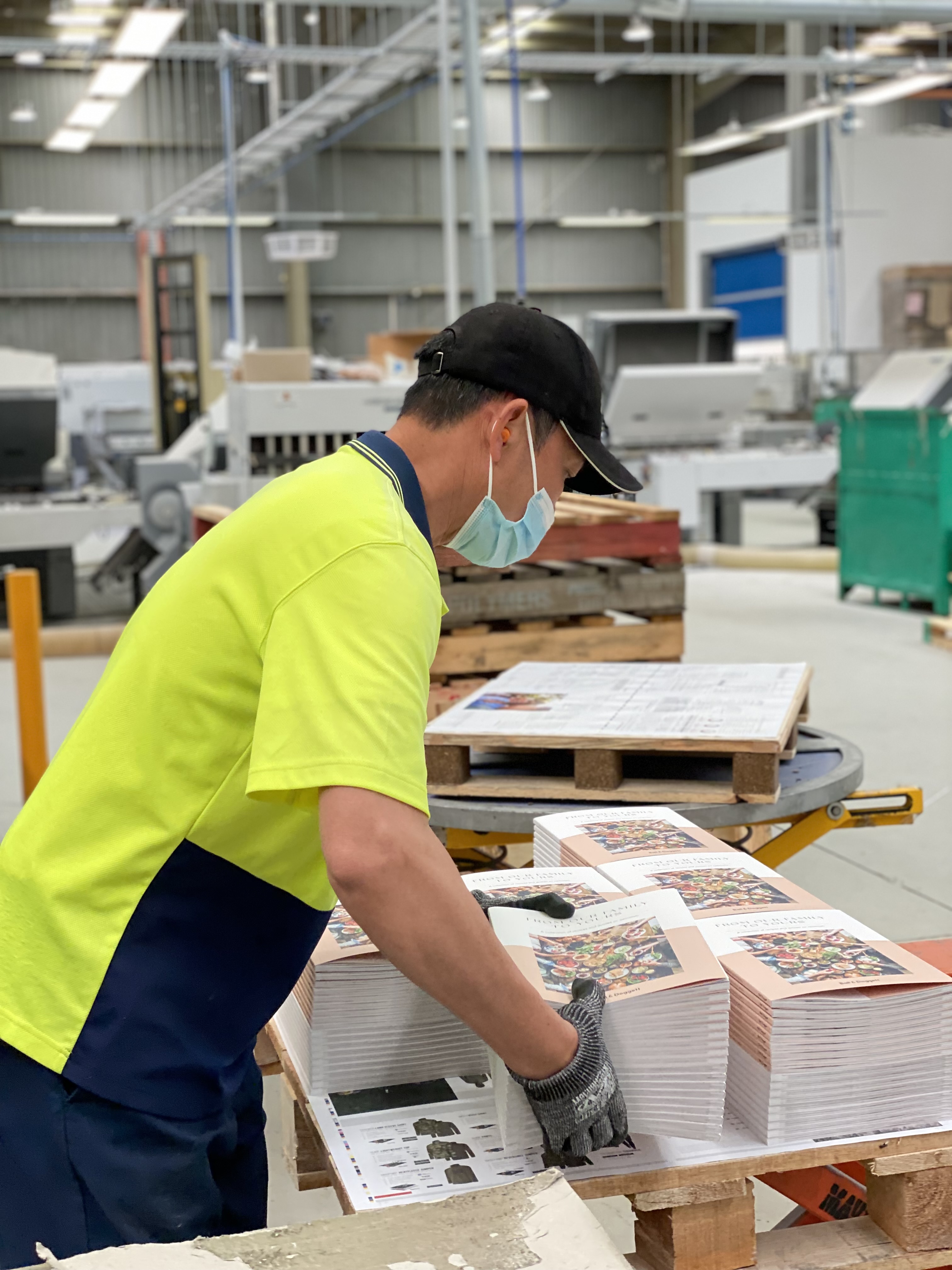
 Marshal White the Print Manager escorted me on the floor for the first section. My impression of going on site at Southern Impact is always one of favour. I love the energy on the floor, watching the presses at work and the operators pour their craft into the job.
 That was certainly my experience when I met Rhys Mullen!
 They managed my expectations around the printability of the stocks and how the print may appear more muted. I smiled knowing that we were about to impress each other, them with the print and me, well from a Ball & Doggett perspective, I had absolute faith our stocks would perform as they should!
 A word from our printer: Rhys Mullen, Printer, Southern Impact
I wasn’t thrilled to walk into work last week to find I had a recipe book, “From Our Family to Yours Ball & Doggett Cookbook”, to print using specialty uncoated stocks from Ball and Doggett.
Though I do always like a challenge, and always do my best to make a job look great, I couldn’t help of the negative thoughts I was having thinking of times I’ve ran stocks paper merchants and designers were excited about that looked great when blank but always looked like there was a lack of pressure when the sheets came off the press.
From the very first sheet I pulled out of the machine I could see this job was not going to be a challenge, but rather a pleasure.
Like Lennon and McCartney, Jay-Z and Beyonce, the paper and ink worked in perfect harmony with each other.
“I think I’ve been converted?!”
A word from our printer: Rhys Mullen, Printer, Southern Impact
I wasn’t thrilled to walk into work last week to find I had a recipe book, “From Our Family to Yours Ball & Doggett Cookbook”, to print using specialty uncoated stocks from Ball and Doggett.
Though I do always like a challenge, and always do my best to make a job look great, I couldn’t help of the negative thoughts I was having thinking of times I’ve ran stocks paper merchants and designers were excited about that looked great when blank but always looked like there was a lack of pressure when the sheets came off the press.
From the very first sheet I pulled out of the machine I could see this job was not going to be a challenge, but rather a pleasure.
Like Lennon and McCartney, Jay-Z and Beyonce, the paper and ink worked in perfect harmony with each other.
“I think I’ve been converted?!”
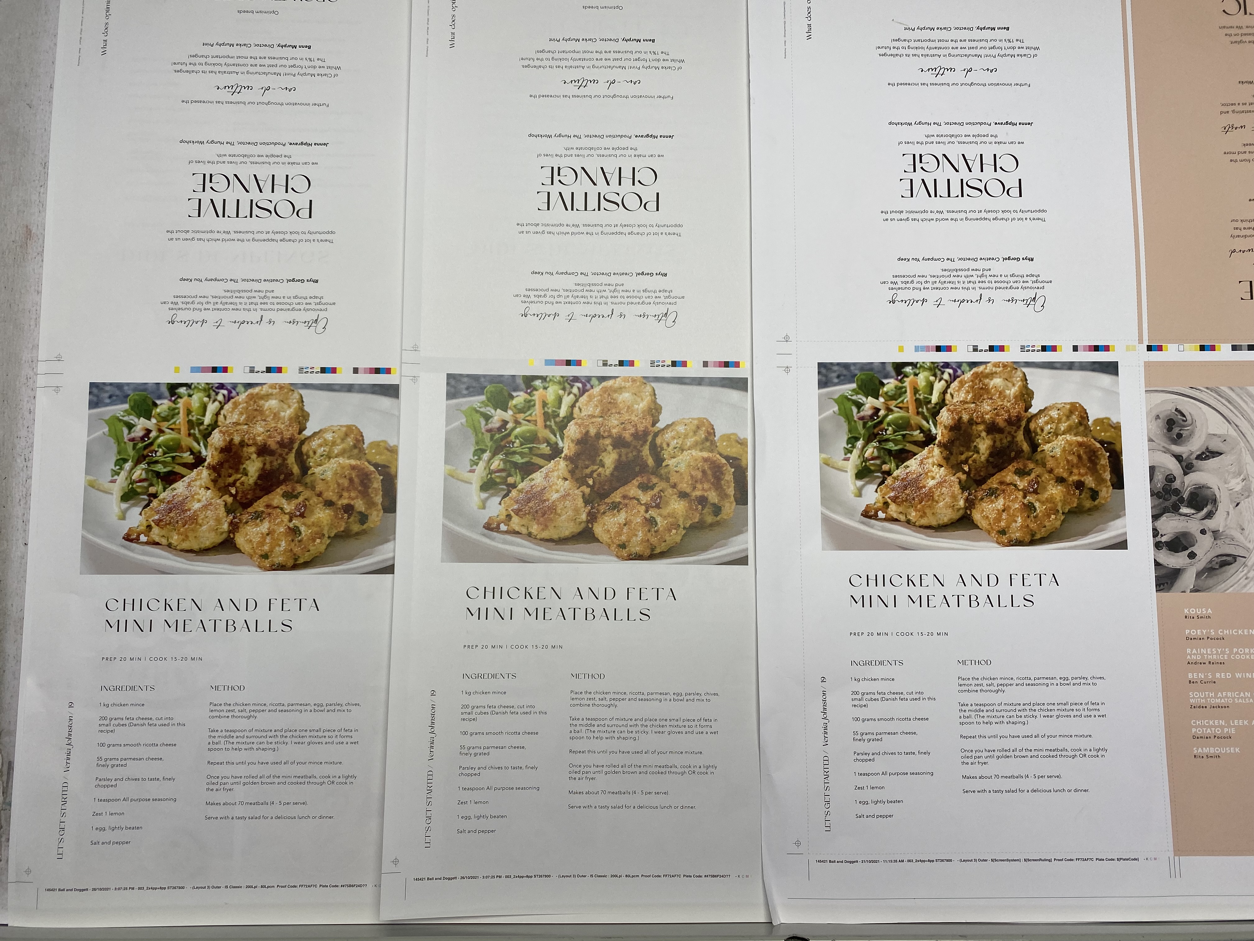
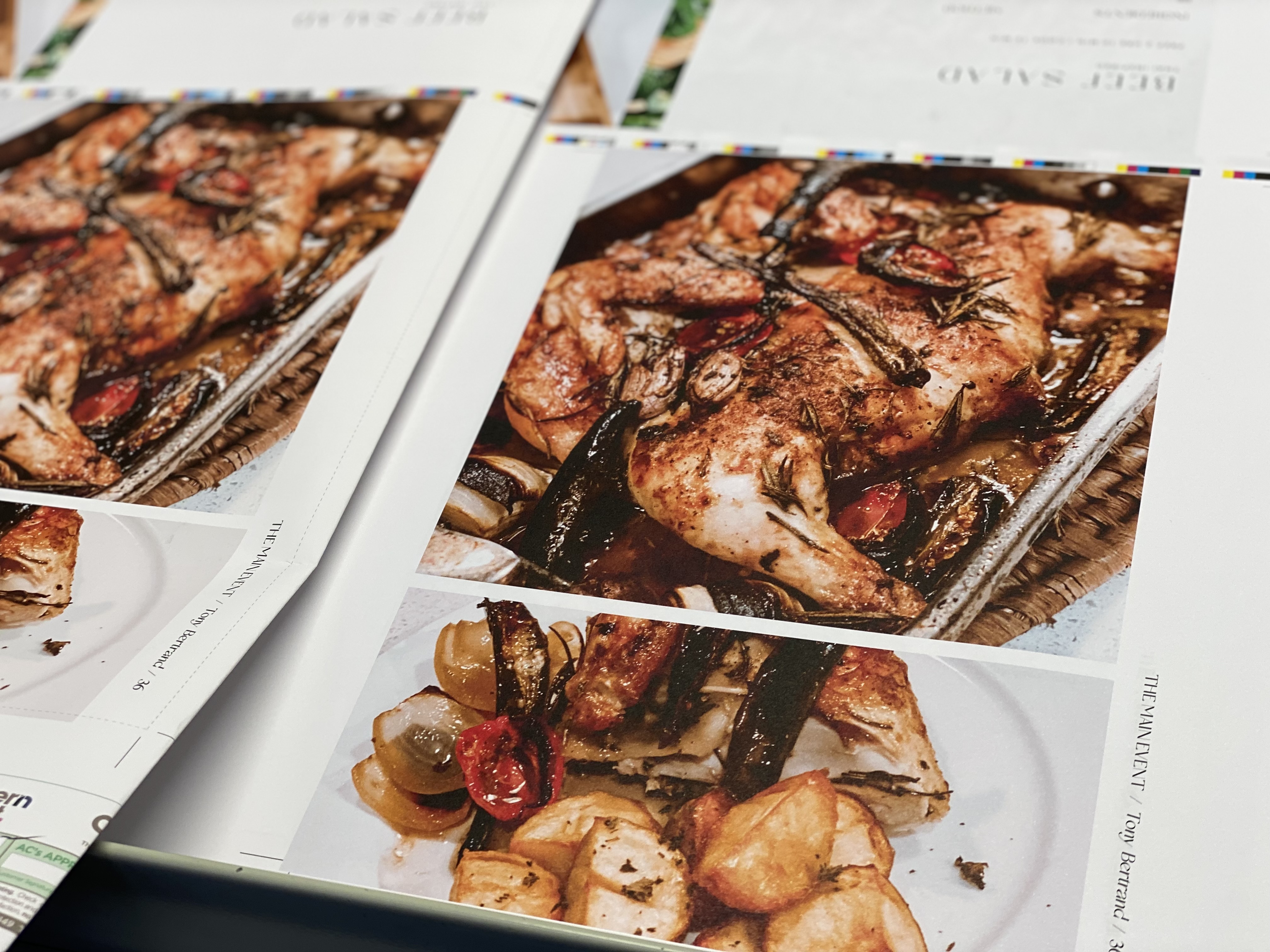
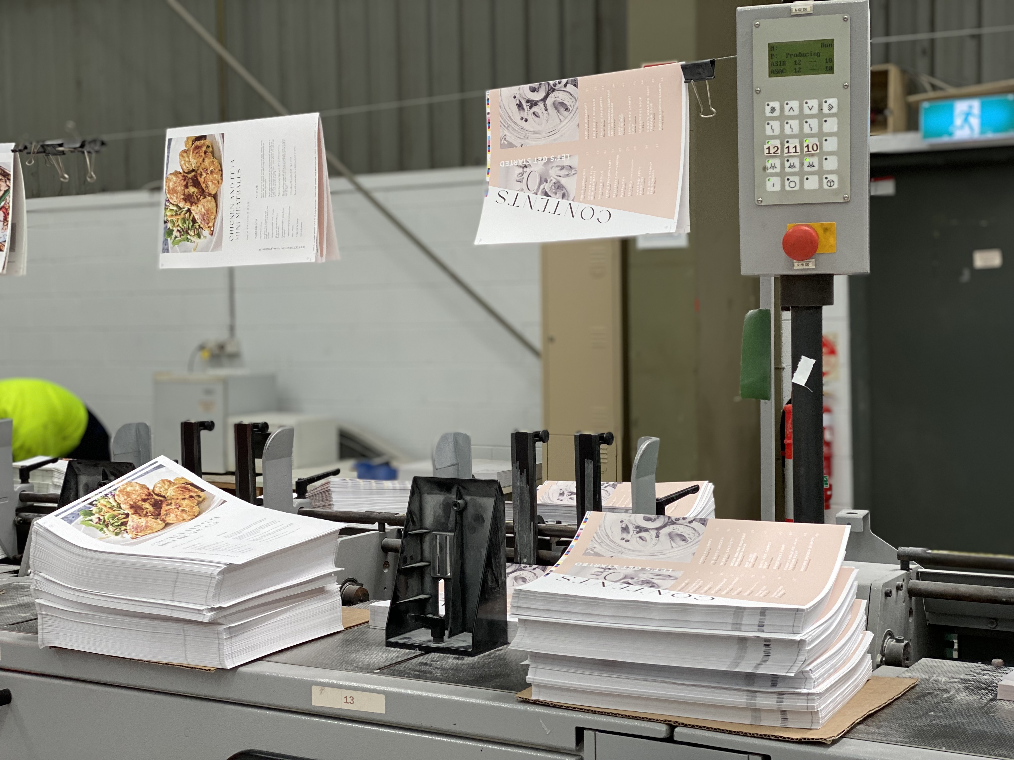
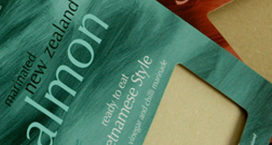
 The dishes I was printing on the different stocks looked so real that I’d felt like I’d tasted each dish by the time the job was done!! The grains of salt, the shreds of coconut and the glisten and shine of oil all looked so realistic.
I was salivating at each section change!
The dishes I was printing on the different stocks looked so real that I’d felt like I’d tasted each dish by the time the job was done!! The grains of salt, the shreds of coconut and the glisten and shine of oil all looked so realistic.
I was salivating at each section change!
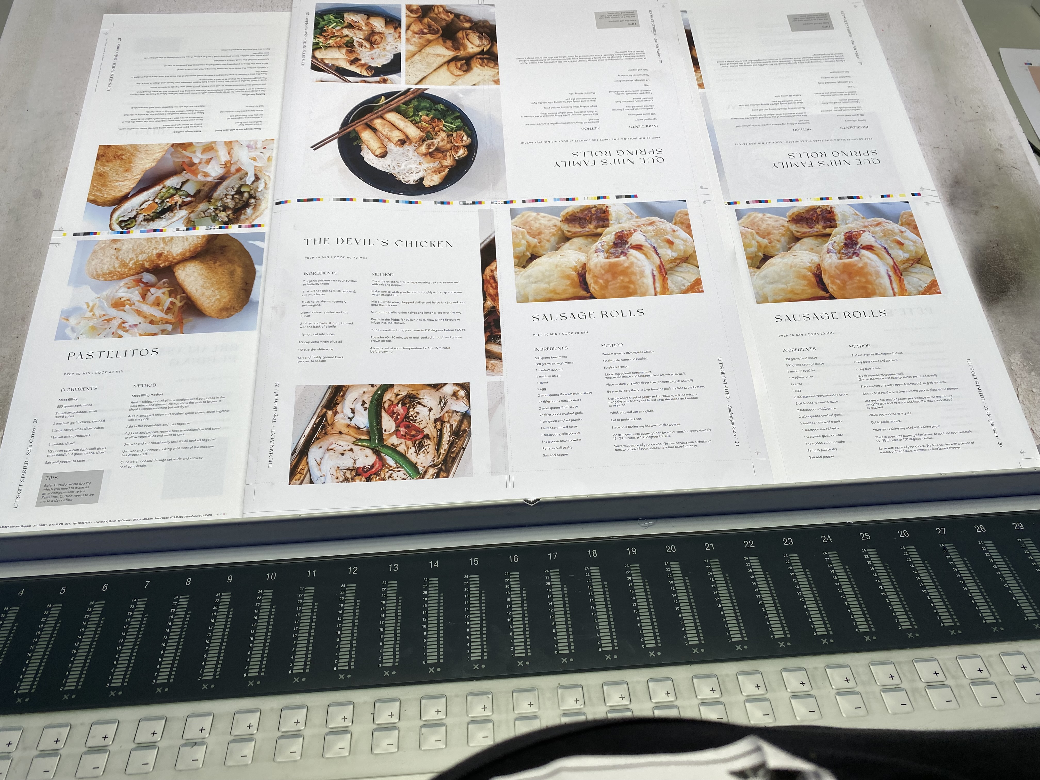 The first two stocks ran were 270gsm Curious Matter Goya White and 135gsm Curious Skin Extra White. Both had such natural whites and I even had to question if the stock was uncoated.
The other two stocks I ran were 120gsm Rives Traditional Bright White and 120gsm Conqueror Wave Diamond White. Although slightly warmer than the first stocks, they still showed off the food just as well. It was clear the dishes were the star of the book!
The first two stocks ran were 270gsm Curious Matter Goya White and 135gsm Curious Skin Extra White. Both had such natural whites and I even had to question if the stock was uncoated.
The other two stocks I ran were 120gsm Rives Traditional Bright White and 120gsm Conqueror Wave Diamond White. Although slightly warmer than the first stocks, they still showed off the food just as well. It was clear the dishes were the star of the book!
 Massive props to the client, Zaidee, we worked so in sync with each other during the print I felt like Tupac and Dre collaborating on California Love.
This job was such a great experience to print and I look forward to printing more jobs on Ball and Doggett uncoated specialty stocks.
Rhys’s connection to his craft coupled with Marshal’s expertise was exciting as I knew the result would be above and beyond. Thank-you gents, you both rock!
Massive props to the client, Zaidee, we worked so in sync with each other during the print I felt like Tupac and Dre collaborating on California Love.
This job was such a great experience to print and I look forward to printing more jobs on Ball and Doggett uncoated specialty stocks.
Rhys’s connection to his craft coupled with Marshal’s expertise was exciting as I knew the result would be above and beyond. Thank-you gents, you both rock!
 Time to bind it up!
The next phase of the project was ensuring we were able to create a true flush finish with those front and back flaps on the cover.
Time to bind it up!
The next phase of the project was ensuring we were able to create a true flush finish with those front and back flaps on the cover.
 I joined the team on the PUR line to discuss our options and ensure we were on the same page.
 Steve took me through our options and we collectively decided on the best course of action. I was shown examples to sign off on and along with Alan Didus, Victorian Sales Manager for Ball & Doggett we were permitted to watch the books come off the line!
 The moment of truth was in front of us, spinning on the belt ready for Quality Control, final trim and packing.
 It’s beginning to look a lot like Christmas
We decided to work with Southern Impact on the fulfilment process. We had several elements that were required to be packed into a purpose Australian made mailer we had ordered and had delivered directly to them.
Given we had a run of limited edition run of 1500, we supplied the team with both a PDF of the packing and video of how we wanted the job packed and labelled. That way there was no second guesses and we were managing our own expectations.
Mailer, packaging wrap, cookbook, seal with branded sticker, insert of Christmas card that had Basil seeds attached to it and an insert card noting all the elements were produced in Australia and each of their environmental credentials were wrapped with a Christmas wish to each of our team members and customers.
We always say don’t leave it to chance and provide the most detail you can to manage both parties expectations.
It’s a wrap!
We applaud our Print and Creative community for walking a path with us that at times were unknown. Through collaborations and conversations we continue to create opportunity for sustainable outcomes for the industry at large.
This cookbook allows us to share the craft that is print, the articulation of design and the platform to communicate. It’s a publication we can share with you the gift that is print.
The pandemic has created a new lens for us to view our industry as a whole, but as individuals that has experienced a deep shift in a new normal we now live. This extraordinary time of our lives is about navigation, an exploration of self, discovering how truly amazing we are as individuals.
Coming together to share food is one of the most giving expressions of love and community.
Our hope is that this book brings you the sense of community that is intended.
Presenting ourselves with an extension of empathy is just a small way we as a community, can be there for each other. This is our offering to let you know, we walk this path together.
Let’s continue to celebrate the craft of print, the expression of design and the fierce love we have for paper!
If you haven’t got a copy yet, you still can.
We have a limited 100 we are selling online through Pedigree Paper, the retail division for Ball & Doggett.
Check out the link below and happy cooking!
https://pedigreepaper.com.au/order-inspiration
It’s beginning to look a lot like Christmas
We decided to work with Southern Impact on the fulfilment process. We had several elements that were required to be packed into a purpose Australian made mailer we had ordered and had delivered directly to them.
Given we had a run of limited edition run of 1500, we supplied the team with both a PDF of the packing and video of how we wanted the job packed and labelled. That way there was no second guesses and we were managing our own expectations.
Mailer, packaging wrap, cookbook, seal with branded sticker, insert of Christmas card that had Basil seeds attached to it and an insert card noting all the elements were produced in Australia and each of their environmental credentials were wrapped with a Christmas wish to each of our team members and customers.
We always say don’t leave it to chance and provide the most detail you can to manage both parties expectations.
It’s a wrap!
We applaud our Print and Creative community for walking a path with us that at times were unknown. Through collaborations and conversations we continue to create opportunity for sustainable outcomes for the industry at large.
This cookbook allows us to share the craft that is print, the articulation of design and the platform to communicate. It’s a publication we can share with you the gift that is print.
The pandemic has created a new lens for us to view our industry as a whole, but as individuals that has experienced a deep shift in a new normal we now live. This extraordinary time of our lives is about navigation, an exploration of self, discovering how truly amazing we are as individuals.
Coming together to share food is one of the most giving expressions of love and community.
Our hope is that this book brings you the sense of community that is intended.
Presenting ourselves with an extension of empathy is just a small way we as a community, can be there for each other. This is our offering to let you know, we walk this path together.
Let’s continue to celebrate the craft of print, the expression of design and the fierce love we have for paper!
If you haven’t got a copy yet, you still can.
We have a limited 100 we are selling online through Pedigree Paper, the retail division for Ball & Doggett.
Check out the link below and happy cooking!
https://pedigreepaper.com.au/order-inspiration


