Studio Brave design a cook book for Cecconi’s

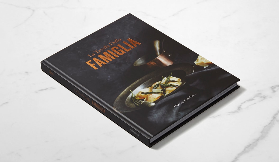
Title: The table of the family
Agency: Studio Brave
Client: Cecconi’s Restaurant
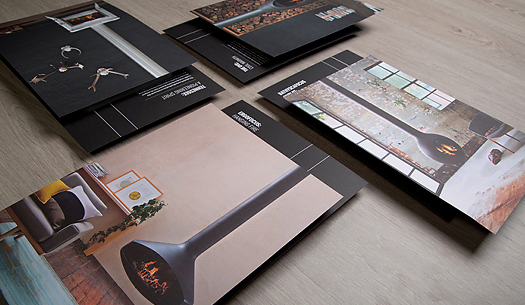
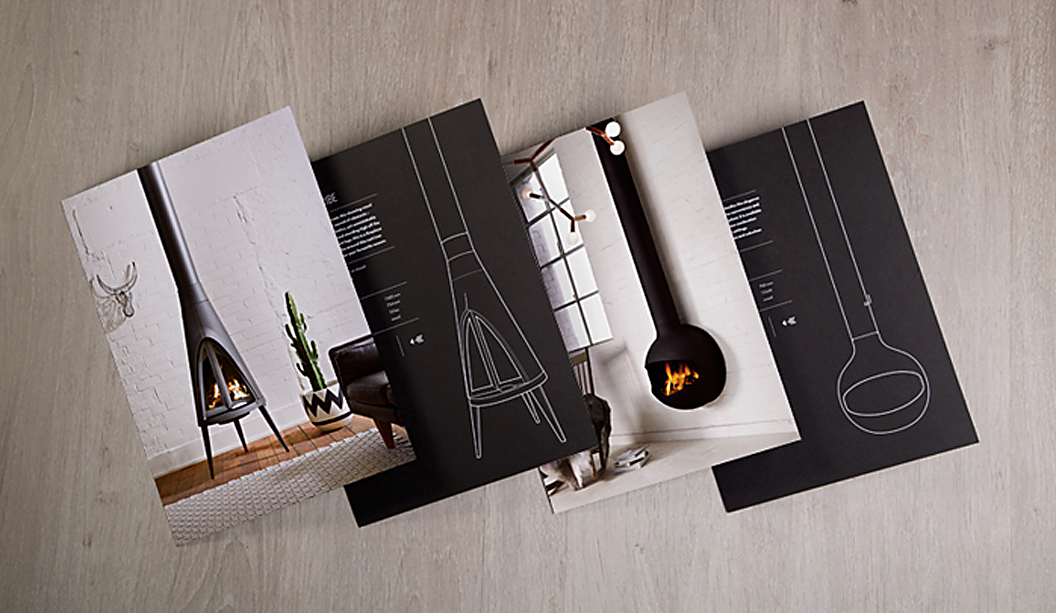
Stocks: Sovereign Silk and Sovereign Offset
Printing specs: Offset printed
Printed by: Bambra VIC

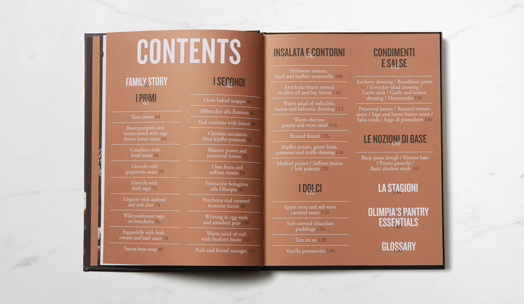
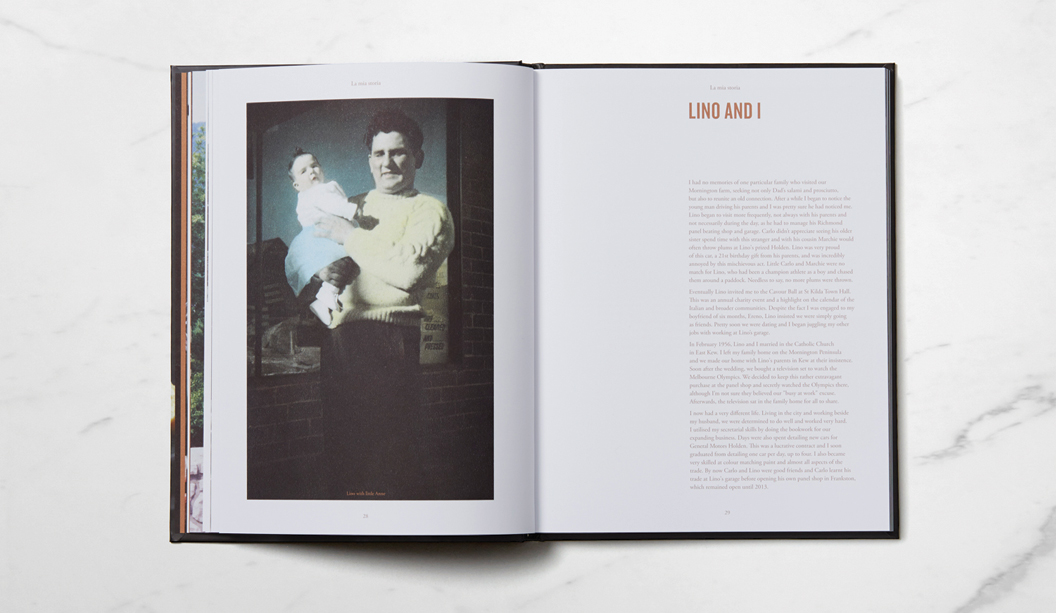
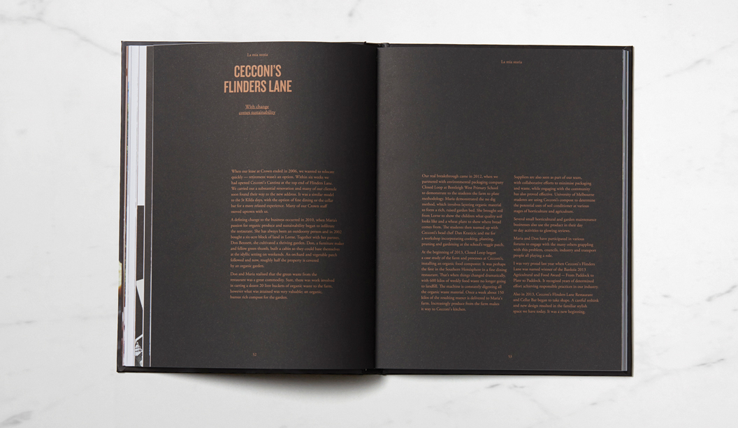
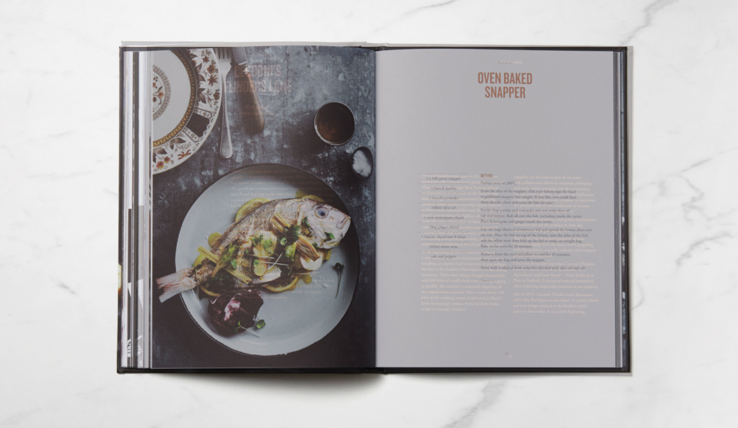
‘La Travola Della Famiglia’ (The Table of the Family), is not just a recipe book, it’s also a memoir and historical account of life in Australia for the Bortolotto family –  owners of iconic Melbourne eatery – Cecconi’s on Flinders Lane, that has a rich 30 year history to be proud of. Maria, daughter and business partner of Olimpia Bortolotto (the author), approached Studio Brave in Melbourne to produce the book. In true Italian style, the studio were invited to dine with the Bortolotto family at their restaurant, where they experienced first-hand the family’s passion for food and life in Australia.

Famiglia_2

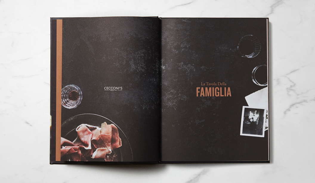
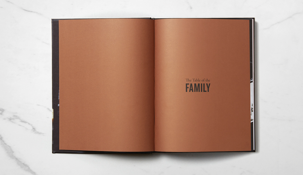
Working closely with photographer Sharyn Cairns, the design stemmed from their story – the notion that the restaurant was ever evolving and always at the forefront of Italian cuisine in Melbourne. Printed on Sovereign Silk 170gsm with copper foil for the cover and Sovereign Offset 135gsm for the text, the pages are filled with mouth-watering modern and traditional Italian recipes and carefully chosen typography to complement the old family photographs.

Studio Brave shared many interesting insights with us, like this one: “We felt it was integral to the Cecconi’s brand that we represent the beautiful copper highlights found throughout the Flinders Lane basement restaurant. Using a copper foiling on the cover, we were able to balance this with a copper metallic print throughout, which really brings the book to life and adds a sharpness that you cannot match using CMYK.”

This wonderfully tasty book is sure to inspire your inner Italian chef. Remember to invite us around if you ever unleash your culinary beast!

Famiglia_3

Famiglia_4

Famiglia_5

Famiglia_6

Famiglia_7

Famiglia_8

Oblica catalogue by Sense

Title: Oblica catalogue
Agency: Sense
Client: Oblica
Stocks: Knight Vellum
Printing specs: Offset printed
Printed by: Mckellar Renown Press VIC

Oblica’s first catalogue is out and it’s a beauty. Designed by the team at Sense in Melbourne, in collaboration with photographer Arnelle Habib and stylists Jacqui Moore and Julia Greenthe, the piece showcases Oblica’s unique product range of contemporary European fireplaces, stoves and accessories that truly are a work of art.

Obliqua-1

The clever loose-leaf design means the catalogue can be customised for each person and easily updated as new products arrive. The cover is Boxboard 2100gsm with black gloss foil and the inserts and brochure are printed CMYK on Knight Vellum 200gsm, all bound together with a brightly coloured rubber x-band for extra wow factor. The catalogue design is really well considered and complements the quality evident in the range. In other words, the printed piece does the range justice.

If you have an Oblica fireplace, all there’s left to do is grab a hot chocolate and toast a marshmallow or two. If, like us, you don’t have one, then it’s a hot chocolate and heater type scenario.

Obliqa-7

Obliqa-2

Obliqa-3

Obliqa-4

Obliqa-5

Obliqa-8

A blend of old and new at Chin Communications

Title: Chin Communications rebrand
Agency: Design By Bird
Client: Chin Communications
Stocks: Strathmore Premium Super Smooth – Ultimate White
Printing specs: Offset and digitally printed
Printed by: Inkifingus

Chin Communications is a well-known Chinese translation service, operating for nearly 20 years. They provide translation services to people and businesses across Australia. A recent re-brand carried out by Melbourne-based studio Design By Bird, is really special. They considered the historical, multicultural, language and modern angles to create the right branding for Chin.

Chin-1

Steeped in tradition, the Chin logomark (秦) pays homage to both the company’s founder Qin (pronounced ‘Chin’) Lushan as well as Qin Shihuangdi – China’s first emperor.  All great work comes from sound research. The studio looked into China’s rich history, discovering elements from the past they could take into Chin’s future. They found out that when Emperor Qin standardised currency, each coin was inscribed with seal script – an ancient Chinese technique. With this in mind, they re-worked the logo, included a bright colour palette and modern typography.

Chin-3

The studio shared many interesting insights like this one: “There are certain considerations that need to be taken into account when designing for a multicultural audience. For example, names should not be in red because in ancient China, red titles were reserved for the dead and particular white papers don’t sell in China because of their tones. Not only did we get to work with a great client on an exciting project, but we learnt a lot.”

Chin-6

The business cards and folders were printed on Strathmore Premium Super Smooth Ultimate White – 352gsm. The letterheads, with compliments slips and C4 envelopes were printed on the 118gsm. “The paper has a great texture, which the ink took to really well. We were particularly impressed with the clarity of the colours on the Ultimate White background,” reports the studio. Using a variety of processes and techniques including foils, block colour and photographic elements, everything was printed offset except for the with compliments slips, which were printed digitally.

The new suite of collateral is a lovely blend of the old and new, giving an ultra-modern lift to a well-recognised brand. What’s not to love?

Chin-7

Chin-4

Chin-5


The John Laurie folio by duo_d_uo pops with blue

Title: John Laurie folio
Agency: Duo d uo (VIC)
Client: John Laurie, Photographer
Stocks: Skin Curious Collection – Indigo
Printing specs: Offset printed plus gold foil
Printed by: Moule Print (VIC)

We can barely contain our excitement looking at all this blue. It was an ‘oooooo’ moment. Duo d uo is the brainchild of Cam Diamond and Nic Hawker who believe to get the best design, you need to look at things from every angle. A recent project of theirs features Skin Curious Collection – Indigo, creating as they call it ‘a perfect complement to John’s bold photographs’. Who is John Laurie you ask? He’s an esteemed food, travel and portrait photographer that goes that extra mile to get the perfect shot. When Cam and Nick took on the project, they “knew it needed to be as enduring as the imagery it would hold.”

Duo d uo - John Laurie folio pic 2

The hard cover book had to be robust with all the paws that would be touching it. Duo d uo considered how scuffed and damaged it would get so they choose to use Skin, an anti-scuff stock. The outcome is a modern yet timeless book.

Duo d uo - John Laurie folio pic 3

As Cam explains: “The folio cases and covers were custom made by a book binder so we could line the inside in Skin Curious Collection to match the rest of the collateral. We were very lucky that we could find a cloth in the same shade of indigo to create such a seamless look. We chose this coloured stock to not have to overprint all the collateral, which was an added cost we wanted to avoid. We decided to foil the business cards in gold to create both a visual and touch contrast to the super smooth satin finish of the stock.”

Duo d uo - John Laurie folio pic 4

This project looks so damn appealing, we can’t work out if we want to touch it or eat it. It’s always about food with us. And paper. And dogs.

Duo d uo - John Laurie folio pic 5

Take a walk on the Wild side

Title: Take a walk on the Wild side

Stocks: Wild
Printed by: Bambra Press (VIC). Avon Graphics (VIC). Hungry Workshop (VIC)

It’s a little bit naughty and very cheeky. It’s our new paper promotion for Wild, a creamy white paper with 35% cotton content. To launch this uniquely textured product, we asked internationally acclaimed illustrators Craig & Karl from Jacky Winter to create an illustration based on the theme ‘Wild’ and boy, did they have fun.

Wild-2

The promo is made up of four A5 cards with different print techniques applied to each and a custom envelope that features a rather interesting illustration. The theme is: ‘The player gets played’ which captures the idea that anyone can have a wild side. And in some cases even more wild then you would expect. Wait till you see the cards!

Wild has a lovely tactile quality to it and is ideal for letterpress and offset printing, as well as embellishments like embossing/debossing and hot foil stamping.

Stock and print specs
Envelope: Printed 4 colour process 2 sides on Wild 300gsm.
A5 cards: Offset: Printed 4 colour process on Wild 150gsm.
Foil: Printed Silver Shatter on Wild 300gsm.
Letterpress: Printed 2 colour (Warm Red + PMS285) on Wild 450gsm.
Blind emboss: Printed on Wild 850gsm.

Applications
Gift cards, invitations, presentation material, swing tags, business cards, cosmetic packaging, luxury packaging and confectionery.

So do you have a wild side?  We’ve shown you ours…

Wild-1

Wild-3

Wild-4

Wild-5

Wild-6


Gorman colouring book

Title: Double Visions colouring book
Agency: Tin&Ed
Client: Gorman Home Time
Stocks: Sovereign Offset
Printed by: Bambra Press (VIC)

Tin&Ed from downtown Fitzroy have created a colouring book (for big kids just like us), especially for the release of Lisa Gorman’s new home wares range – Gorman Home Time. The ‘Double Visions’ colouring book features hand drawn illustrations by the talented duo and at a neat $39.95, could be just the gift for your favourite person this Christmas.

Gorman_2

The limited edition 16pp book is printed 5 colours including an orange and red fluoro ink on Sovereign Offset 135gsm and cover Sovereign Offset 300gsm with a colossal holographic foil on the front and back for some extra bling!

For all of you chomping at the bit to feast your eyes on Gorman Home Time, the range is available in two special pop-up shop locations in Melbourne – Shop g08 at the GPO, and 336 Brunswick Street, Fitzroy AND of course it’s all available online too!

Gorman_3

Gorman_1

Doggett’s has some new dog tags

Our new look business cards have arrived and look smashing, bringing us from the 90’s to the noughties, oh yeah!! There has been a suite of four cards designed by David Lancashire Design (VIC), the same peeps that designed the Doggett branding many years ago. We used a variety of stocks and printing processes as part of the overall rebrand. B'card_2 Here is a description of the four cards: 1. Purple geometric dog – printed 1 PMS 266 (Doggett purple) and black on Strathmore Premium Super Smooth Ultimate White 432gsm. 2. Origami dog – printed matt white pigment foil stamp on Hercules Greyback 450gsm. 3. Silhouette dog – printed gun metal grey foil + matt black foil stamp on Conqueror Laid Concrete 300gsm duplexed to Conqueror CX22 Diamond White 320gsm. 4. Tangram dog – printed 4 colour process (high gamut*) plus 1 PMS on Knight Smooth White 200gsm and triplexed to Kaskad Fantail Orange 270gsm. Print specs: • All the shells were printed at Southern Colour (VIC). • Foiling was done at Lorimier (VIC). • All overprints done at Taylor’d Press (VIC). • Cards designed by David Lancashire Design (VIC). *Southern Colour have an offset process called high gamut that makes certain colours like blue, orange, green really pop. It’s a special process where two or three inks are added in addition to CMYK, to extend the colour gamut and enable the press to print a wider range of colours. This in turn makes images look more vibrant, or ‘pop’ with colour. Ask your local paper specialist or account manager to show you the cards if you’re keen to have a look at the re-design. Enjoy! Stocks: Conqueror CX22 / Conqueror Laid / Hercules Greyback / Kaskad / Knight – Smooth / Strathmore Premium Super Smooth. B'card_3 B'card_4 B'card_5

Eat, drink and be merry this Christmas!

Title: K.W.Doggett Fine Paper 2014 Christmas cards
Stocks: Kaskad / Strathmore Premium Cambric / Sun Offset
Printed by: Southern Colour. Embellishments (Avon). Express (Envelopes). Northern Tags (gift tags). All in VIC.

We had a very merry time creating our Christmas cards this year. For something extra special, we also created matching wrapping paper and some gift tags. It was an international affair this time around. The ‘Be Merry’ was crafted by the very talented calligrapher Henric Sjösten (Sweden). It was an LA based artist, Ashley Goldberg, who created the cheerful pattern on the inside of the envelope and two kinds of wrapping paper (a pink pattern and a green triangle pattern).

Be Merry_2

In keeping with the festive spirit, we wanted to have a bit of fun and showcase a variety of stocks and finishes:

  • Card – printed 1 colour black + red foil stamp on Strathmore Premium Cambric – Ultimate White 270gsm.
  • Envelope – custom made, printed 4 colour process +1PMS348 U (dark green) on Strathmore Premium Cambric – Ultimate White 216gsm.
  • Wrapping paper pattern 1 – printed  4 colour process +1PMS348 U (dark green) with gold foil highlights on Sun Offset 120gsm.
  • Wrapping paper pattern 2 – printed 4 colour process +1PMS348 U (dark green) on Sun Offset 120gsm.
  • Three coloured circle gift tags diecut – Kaskad Salmon 270gsm, Kaskad Puffin Blue 270gsm and Lustralux Metallic Gold 250gsm.

Phew! We love spreading Christmas cheer, did we mention we also moonlight as carollers?! Just kidding. Enjoy!

Be Merry_3


All good things come in small, colourful packages

Title: 2013 packaging promotions
Agency
Seesaw (VIC)
Client: K.W.Doggett Fine Paper
Stocks: Chill Board / Hercules Greyback
Printed by: Colna (boxes and coloured pad squares), Avon (foiling), Pala’s Print (pad squares with one colour print). All suppliers in VIC.

Thinking outside the box (gotta love a pun!), was the premise for the creation of these clever little stackable boxes. We thought it was about time to put some attention on our portfolio of packaging products so Chill Board and Hercules Greyback are the first to feature in this new look, developed by our friends at Seesaw.

The aim was to create promotions that were functional, fun and memorable. Something that wouldn’t be thrown into the (shock horror) bin when the rep leaves the building. It was important to create something unique yet complementary so we could add other packaging products to the suite down the track.

PProm_4

We like to have a bit of fun here at Doggett’s and Seesaw does too. The bold, colourful graphic patterns are a real stand-out. When Seesaw suggested a pad of samples to make the piece memorable and functional we thought: ‘Yeah for sure’ and they really had us at: ‘Let’s put a fortune cookie in the box’. They developed an icon for each so a snowflake for Chill Board, pointing to its freezer qualities and an anvil for Hercules Greyback, reflecting the strength of this particular product.

The first few pages of the pad, which acts as a mini swatch of sorts, talks about the features and benefits of the product and the remainder is a sample sheet from each grammage in the range. The idea is for our customer to be able to tear them off when visiting their client. Once again, clever.

The cookies include an assortment of five fortunes that are related to the benefits of each product. Chosen to fit in with the respective colour palettes and the products, we chose mint (green) for Chill Board and a banana (yellow) for Hercules Greyback. The sayings are the best like the ‘Freeze me baby one more time’ and ‘I want to pop your colour’ for Chill Board and ‘I give good stiffness’ and ‘Lean on me when you’re not strong’ for Hercules Greyback. It may just be us and our need for a holiday but we think they’re a crack up!

Speak to your paper specialist or account manager for a copy of the promotion if you haven’t already seen it. And if you ever have any specific packaging related questions, contact our business development manager John Alipan. He’s like a guru of packaging and even wears kaftans and burns incense in the office. Ok, so maybe not the last part but it would be great to see a kaftan around the office.

Applications (Hercules Greyback): All the necessities in your life, the ones you can’t do without – biscuits, nails, toiletries, tissues, soup, cereal, washing detergent and pharmacy products. Oh and popcorn too.

Applications (Chill Board): Only the most delicious things in life like ice cream, pizza, beer, frozen berries and pies.  Oh, and pretty cosmetics too.

Stock specs: Boxes and coloured pad squares – Hercules Greyback 350gsm and Chill Board 361gsm. Rest of the pads represent each grammage in the range.

Print specs: Boxes are offset printed with four PMS colours (PMS 333, PMS 102, PMS 1788, Warm Grey 11) plus some stipples. UV gloss varnish on boxes only. Grey squares warm grey 11 printed with a rubber stereo. Foils – silver confetti (Chill Board) and 098 red (Hercules Greyback).

PProm_3

PProm_1

PProm_2

PPromo

Property brochure for Six Thiele Doncaster

Title: Six Thiele Doncaster residential apartment project
Agency: Scharp
Client: Six Thiele Doncaster
Stocks: Curious Metallics
Printed by: Ellikon (VIC) Offset

Six Thiele Doncaster is the latest residential apartment project by Accord Property Group. The masterminds behind this impressive brochure design is Scharp, a multi-disciplinary creative studio specialising in property and development. Scharp came up with a full marketing campaign to promote the new development which included an animated movie, website, lifestyle photography, print and online advertising collateral, and much, much more. A very talented bunch indeed!

The cover is printed offset on Curious Metallics in Gold Leaf 300gsm. No ink was used on the cover. Instead, a full blanket blind deboss of the brand’s geometric motif (inspired by the architecture designed by award-winning architect Clarke Hopkins Clarke), has been impressed across the entire surface to create a stunning tactile experience. As a final touch of opulence, Six Thiele Doncaster’s bold logotype was centrally embellished using Milford Astor silver foil for a striking and eye-catching contrast.

Six-Thiele_1