Footy Tips

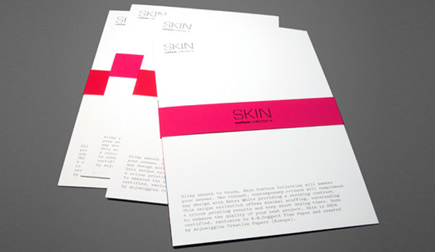
Title: Skin Curious Collection
Agency: Three60 (VIC)
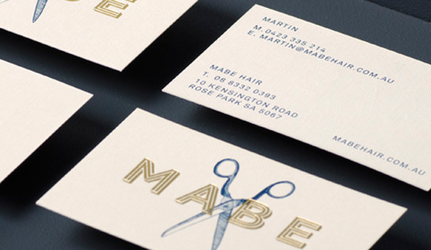
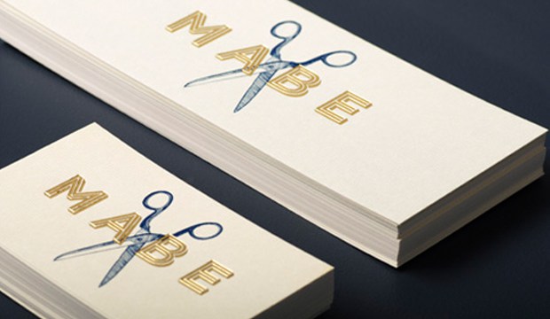
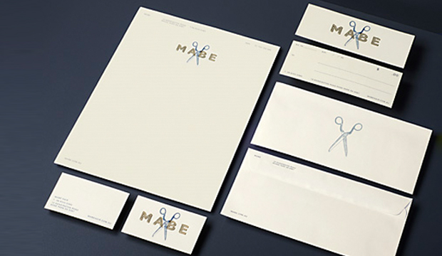
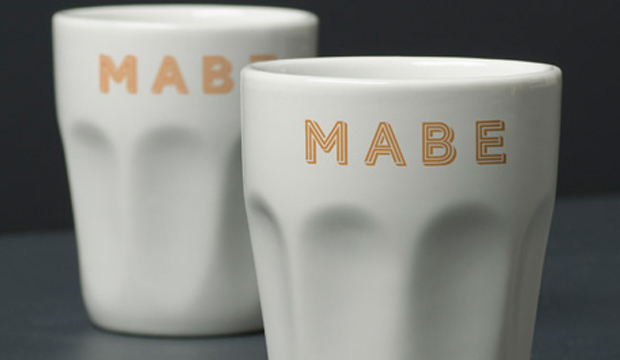
Client: K.W.Doggett Fine Paper
Stocks: SKIN Curious Collection / SKIN Curious Collection Digital
Printed by: Bambra Press (VIC)
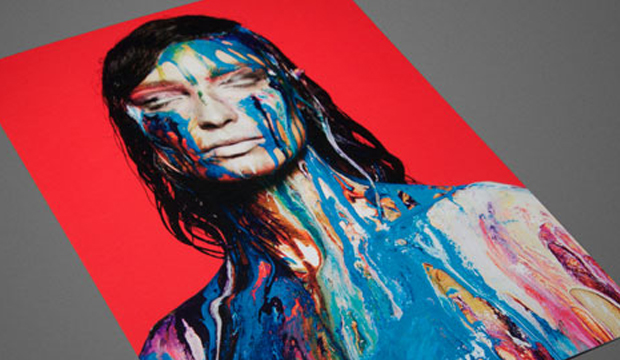
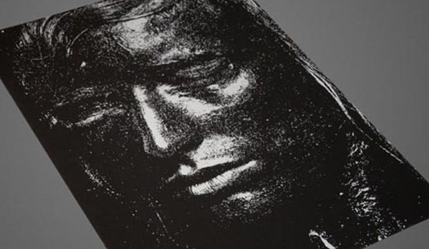
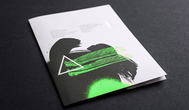
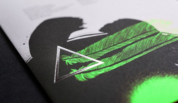
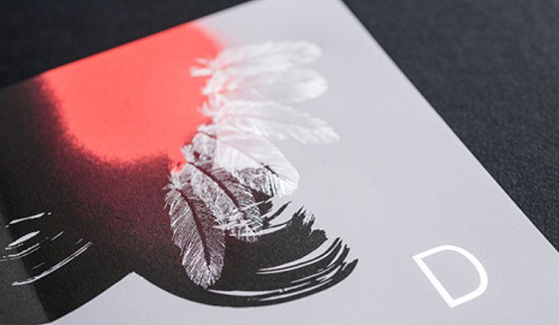
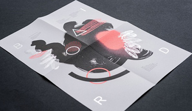
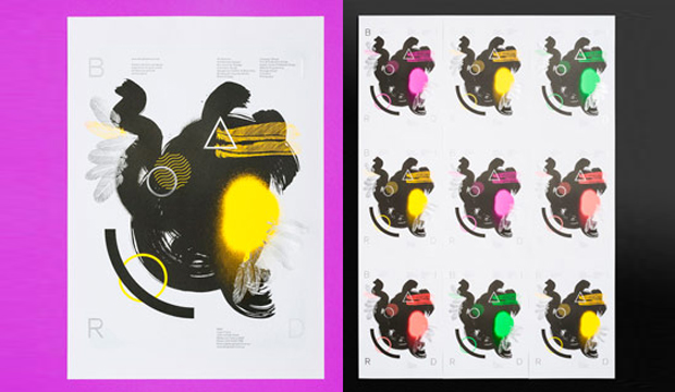
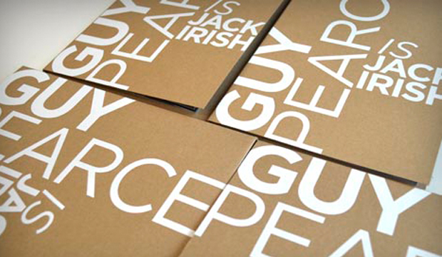
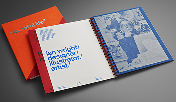
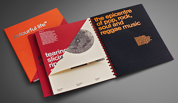
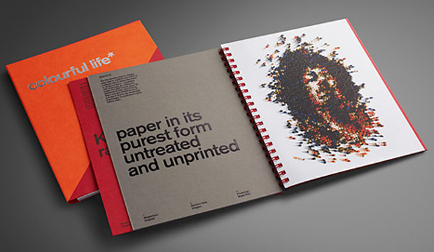
Did you hear? We recently revealed our Skin. A new unique collection of speciality papers that is. Skin Curious Collection is a smooth yet silky range with a distinct matt finish. To launch this exciting new product, we produced a small promo of four A5 cards to show the print quality of the stock as well as a brand spanking new swatch. Three60 created the promo, using the idea of a ‘second skin’ to develop the creative. Three60 often collaborate with some pretty cool cats. Enter photographer Pierre Toussaint and make-up artist Rae Morris. Next, organise a photo shoot of a striking male model with a set of lips most women would die for, add some glycerine and a mesmerising display of paint and you have some seriously stunning visuals that make up the mini promo.
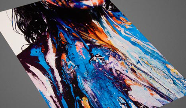
Three60 wanted to create energy and tension with the paint, with the ‘second skin’ made-up of texture and rich colour. They did this by covering the subject in paint so that he was almost non-existent. Hours of experimentation with the glycerine added thickness and body to the paint which was then applied with consideration and yet elements of randomness. We can honestly say when the first round of images came through, there was a touch of shock and yet a massive amount of intrigue. We were like ‘What is this?!’ and yet we absolutely loved it!
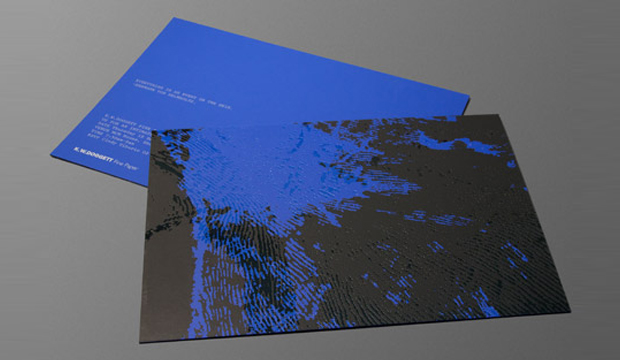
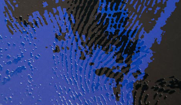
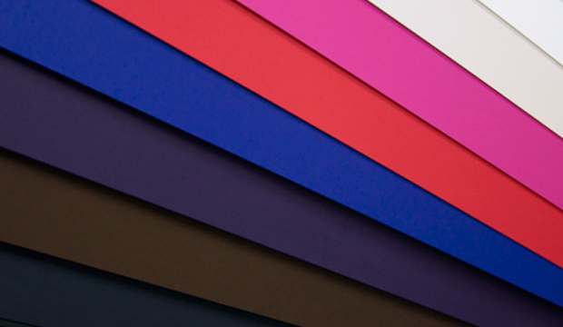
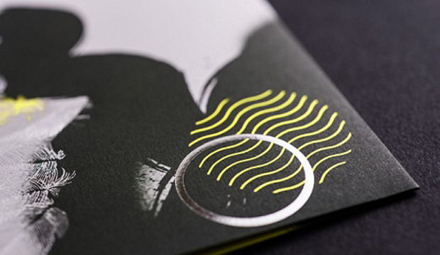
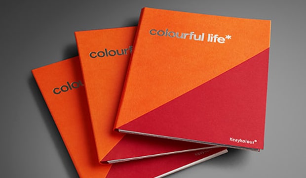
The postcards are printed on Skin Curious Collection Extra White 380gsm (offset printed), Extra White 380gsm (1 colour black offset) this is the spec card, Digital Extra White 270gsm (HP Indigo CMYK) and Black 270gsm (1 colour screen print – silver metallic ink). The range comes in a palette of contemporary colours, includes a digital sheet and is resistant to scuff and finger marks. The three pastel shades (Extra White, Ivory and Stone) handle 4 colour printing brilliantly. Alternating belly bands in either Red 270gsm or Pink 270gsm (1 colour black offset).
You can use Skin for offset printing, letterpress, digital (the certified sheet only) and some great embellishments (think navy foil on the Dark Blue stock or black foil on the black). FSC certified and exclusively sold in Australia by us, the range is created by Arjowiggins Creative Papers (Europe). It can be used for invitations, presentation folders, luxury packaging, business cards, fashion labels, prestigious brochures and books.
To launch the new range we held six intimate breakfast events in VIC, NSW, ACT, QLD and SA. The invite for the launch inadvertently became a second promo. It was a little beauty. A triplexed number with Skin Curious Indigo 270gsm on either side of some Keaykolour Jet Black 400gsm, one hit of silver on the back, see pictures above. There were lots of croissants and coffee, overseas paper samples to ogle at and general good times. Great to see those that did attend rise and shine so early. We loved hosting you!
Your paper specialist or account manager will be around with your Skin promo and swatch soon. Call your nearest samples department if you’d like some Skin samples.