Footy Tips

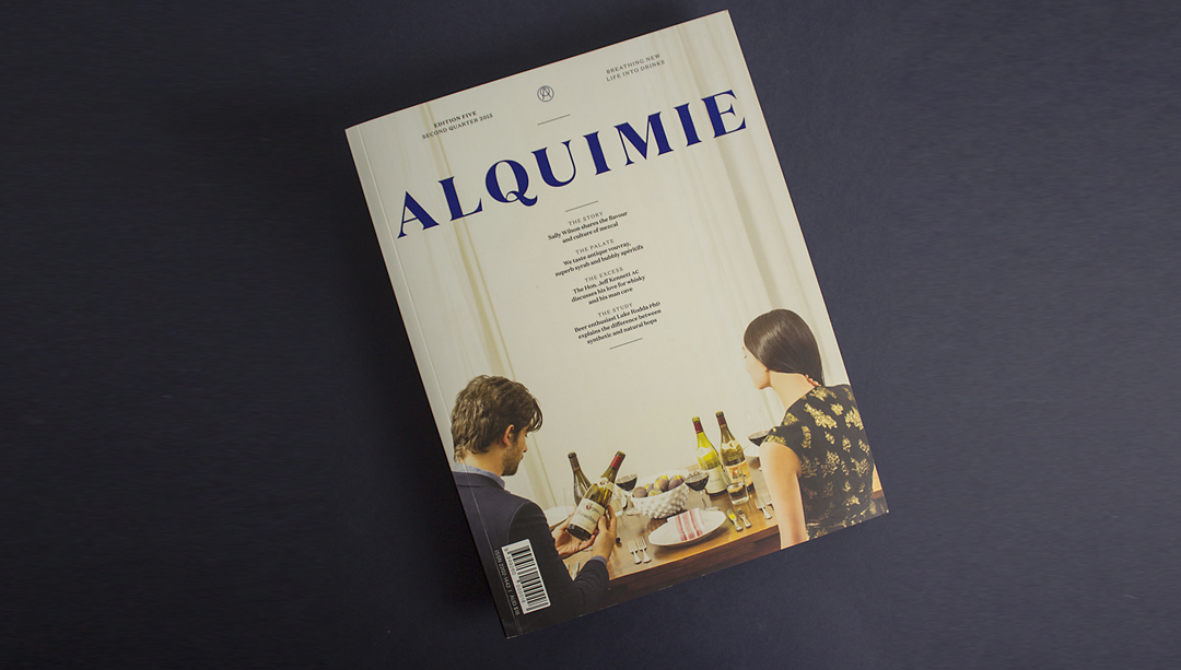
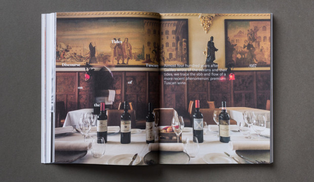
Breathing new life into drinks’ is what Alquimie is all about. Part magazine, part collector’s item, this publication shares the culture and stories behind drinks, from whisky to craft beers. We sat down with one of Alquimie’s owners and designers Nicholas Cary, who was putting the finishing touches on issue eight.*
Can you tell us a little bit about your background and how you became a magazine publisher?
After graduating from a degree in Visual Communication and Design from Monash University, I worked in a couple of smaller boutique design studios before branching out on my own. I landed a couple of big projects and slugged away with freelance stuff for a number of years, while also being the co-owner and creative director of Process Journal. After working on that title for eight editions it was time for a change and I decided to focus on my studio work for a year or so before the publishing itch struck again.
Luckily, this itch coincided with meeting Josh Elias, who’s the editor of Alquimie and James Morgan, the magazine’s photographer, through work. We started sharing glasses of wine after hours and it struck us that while there’s a number of great food titles around, there’s nothing about the world of drinks. Considering our skills killed all of the overheads (apart from printing and paper) we figured there was a gap in the market and so Alquimie was born.
Any favourite drinks you’ve profiled?
It would have to be a very special Japanese Single Malt Whisky by Suntory called the ‘Yamazaki’ Single Cask, which was distilled in 1998 and bottled in 2013 after being in a single sherry cask. As far as I know, Julian from Whisky and Alement in Melbourne had the only bottle in Australia. When I tried it I was blown away. Apart from that, I’m a big fan of lighter reds and we’ve featured a lot of great Pinot and Beaujolais in past editions.
How important is the relationship between branding and packaging in the beverage sector?
It is incredibly important! The majority of people are often overwhelmed and intimidated by the number of drinks on offer, whether it be wine, whisky or craft beer. It’s a very flooded market. It’s a mess! So considering we digest bottles with our eyes first, branding and packaging is very important.
Are there any wine labels you love and why do you dig them so much?
There are a plethora of amazingly intelligent and aesthetically pleasing labels out there – too many to name and choose. I think among the smaller Australian labels in particular there are some really well considered and executed designs. Outside of wine, I think The Company You Keep did a great job with The Everleigh pre-mixed cocktail packaging. On a side note, the bottles Alt Group previously sent out as Christmas presents were brilliant. Do they count?
Have you experimented with the design and paper?
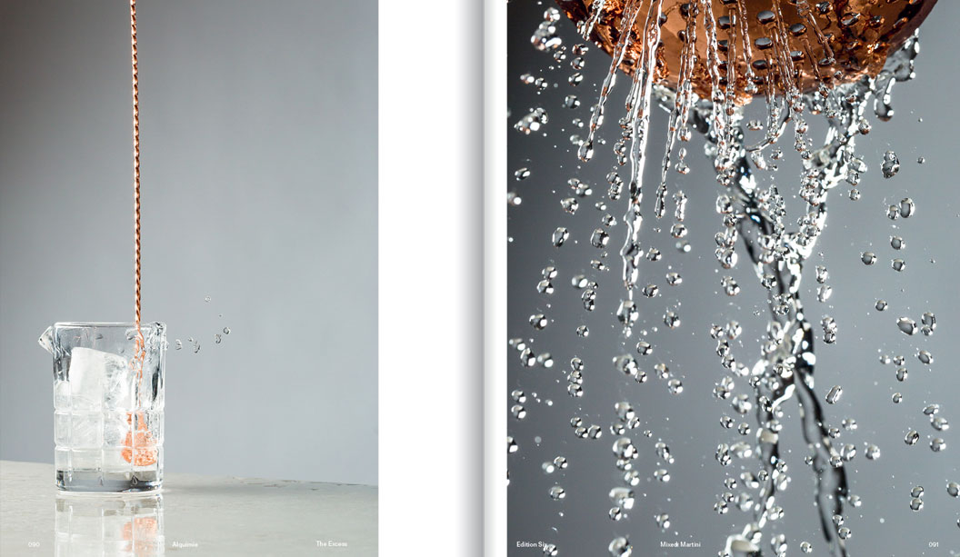
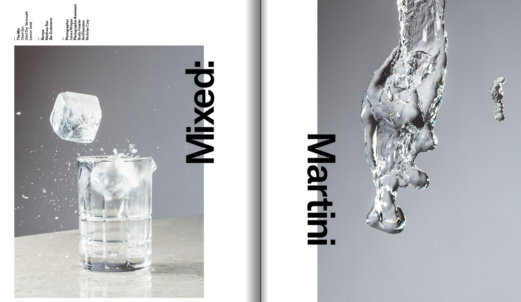
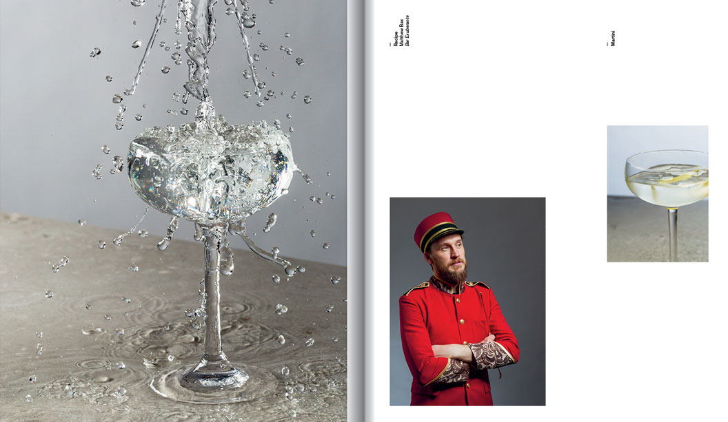
The design has been a constant evolution in regards to both layout and typography. One of my issues with Process was how constricting the design felt after a number of editions. While the brief was to let the design do the talking, I really wanted Alquimie to be more flexible. There are certain elements that have stayed the same, like grids, body copy and the general flow of the design, but I’ve made sure each edition is a definite evolution from the previous one, while being relevant to the content.
Likewise with the paper, this has been a subtle evolution which has included editions with gloss sections for photographic essays and experimenting with different production techniques for the cover. All of these changes shouldn’t be jarring to the reader and it keeps it even more enjoyable for us.
Why a printed magazine and not a digital one?
You can’t taste or smell drinks from a screen. For Josh, James and myself a digital magazine seems like a backward step for our readership. And it’s a self-indulgence – I love print.
What’s the most challenging aspect of designing a magazine like Alquimie?
Getting content from drinks journalists! That’s only a half-joke. As any small business owner knows, you have to put on different hats and do things outside of your comfort zone and for me personally, selling advertising is just that. In saying that, we’ve developed fantastic relationships with our advertisers and look forward to our catch-ups. Possibly because they always involve good wine too.
Designing a magazine must keep you pretty busy and we know you have other projects on the cook too. What else are you up to these days?
I’ve recently stepped into a new role as Creative Director for an appliance company, Residentia Group, a relatively new business dealing in appliances from Italy, Spain and China. After some very exciting growth, they made me an offer to come on board full-time and oversee the strategy and direction of the business and the five brands they own and/or distribute. Apart from this, I’m still undertaking freelance design commissions, including work for Bureaux coffee roasting collective, as well as a new Armadale wine bar called Wine 1160 and a new bistro pub in Fitzroy called The Recreation.
Do you have a dream project you’d love to work on?
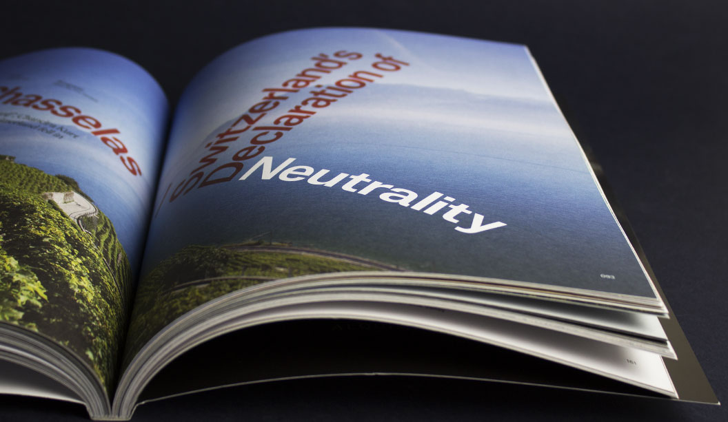
Can it include moving to Switzerland? If so, watch design. From the mechanics through to the face, typography and packaging. One can dream.
Out of interest, what is your favourite watch design?
From a design perspective, my favourite watch company would be A. Lange & Söhne or vintage chronographs from any of the main Swiss houses.
*Interview first appeared in Spot, our first print publication about all things paper, people, design and dogs. Ask your paper specialist for a copy today