Footy Tips
>Thanks to Mohawk for contributing this blog post! And if you don’t feel like reading, watch this video about the The Mohawk Maker’s Field Guide.<
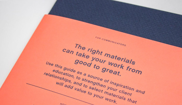
Audiences today are simply overwhelmed by the volume of communication they receive. A direct consequence of this ‘noise’ is that many communications fail to land their message and deliver with minimal impact. To be effective we need to create communication devices which slow people down, command attention, stimulate the senses and promote interaction.
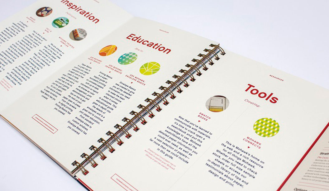
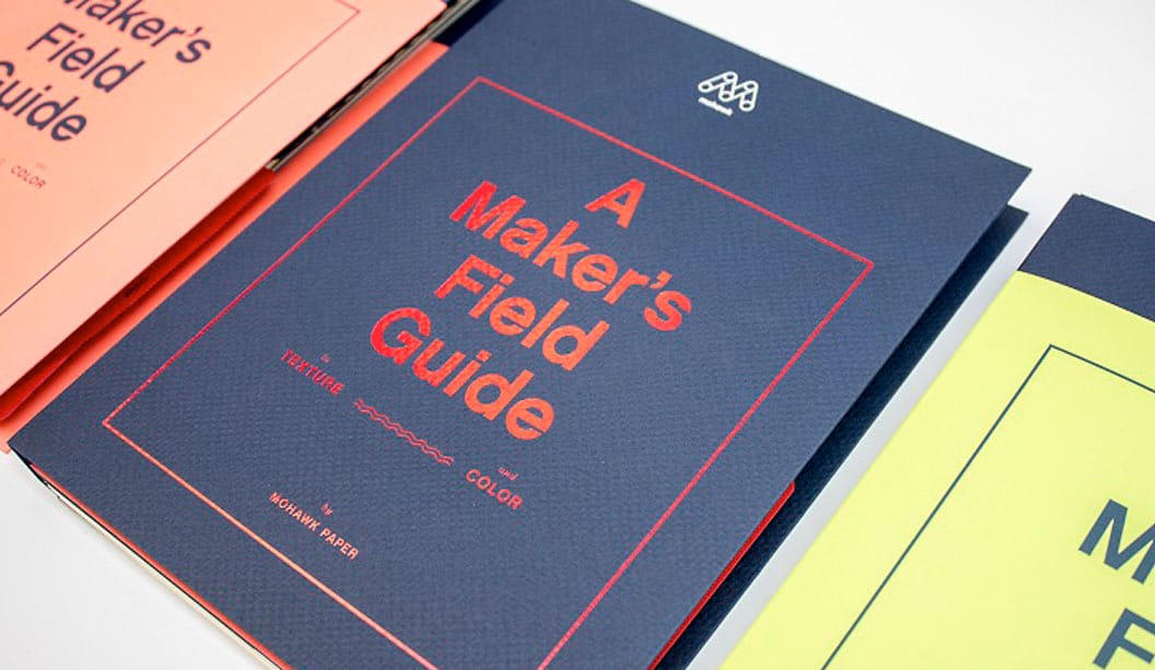
The Mohawk Maker’s Field Guide seeks to achieve these physical and emotional outcomes through highlighting the values and benefits of using uncoated textured and coloured paper to inform, inspire and engage.
Materials matter
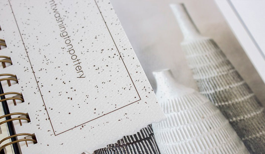
Evidence has indicated that the combination of visual and tactile stimuli creates a deeper and more lasting impression on the brain. Paper and print is the perfect vehicle for creating this visual and tactile experience – it can help to establish a physical interaction and relationship between you and your customer. Paper and print stir the emotions and engage the senses while textured and tinted papers can further enhance the physical and emotional experience
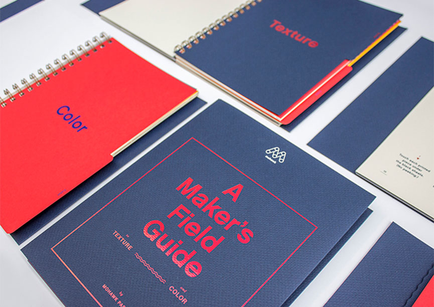
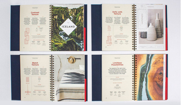
Textured paper
Touch supports the communication process – we read with our fingers and our eyes – evoking emotion and challenging expectation. The choice of material can directly impact on communication effectiveness. The correct materials can amplify the message while the wrong material can seriously compromise the message.
Marry texture with content to reinforce physical characteristics. Contrast textures to create interest, engage the senses and stimulate interaction and unify texture across the brand palette and experience to establish and reinforce brand consistency, personality and understanding.
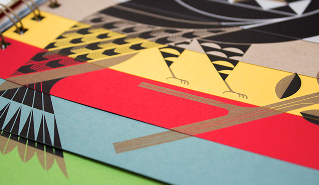
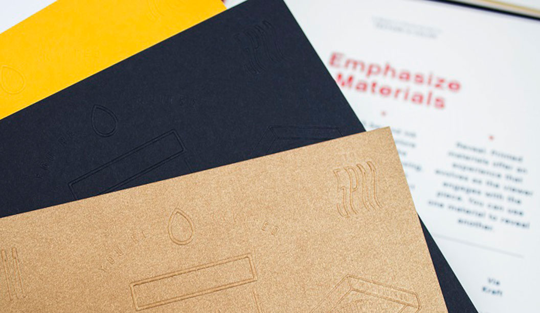
Coloured paper
Colour adds interest. Consider coloured paper to increase the impact – and change the perception – of the printed piece. Integrate paper fully into the design process – adopt paper as the fifth colour – and make paper part of the picture. Or use coloured paper to change the meaning and influence the reading of a photograph. Or dial down the ink and emphasise the personality of the paper, the product or organisation, through a simple and classic emboss, de-boss or foil treatment…or go to town and manage the mood, pace and energy of a design and document by combining a variety of tinted and coloured papers.
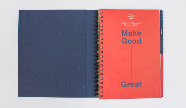
The MAKERS FIELD GUIDE provides a wonderfully engaging and questioning insight into the power of paper, colour and texture to ensure your good communications are great communications!