Footy Tips
Title: Flinders Hotel collateral
Agency: Seesaw Design (VIC)
Client: Flinders Hotel
Stocks: Buffalo Board / Knight – Vellum
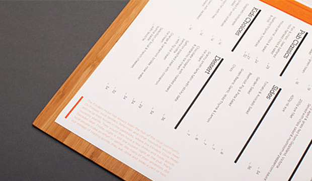
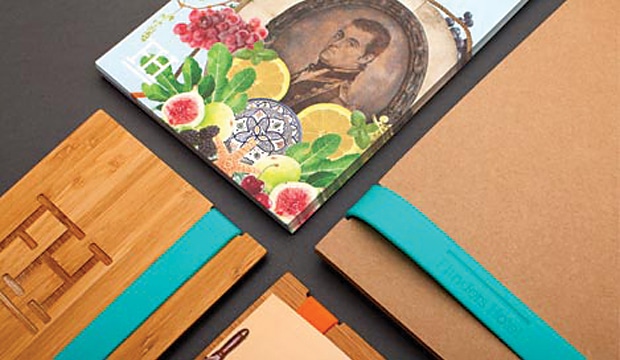
Printed by: Southern Colour (VIC); Avon Graphics – emboss (VIC); Cut it Out – bamboo sheet menu boards (VIC); Payless Promotions – silicon bands.
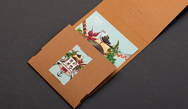
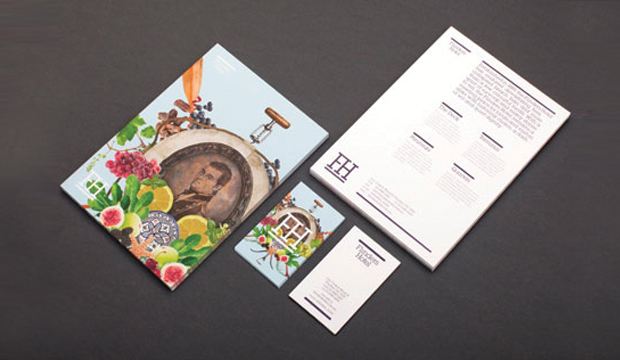
When we saw the Flinders Hotel collateral designed by Seesaw in Melbourne, we knew there was a special story behind it. Seriously – look at those collages!! The pictures are literally bursting off the page. So much fun and frivolity we had to know more about the project.
Seesaw won the tender to rebrand the iconic Flinders Hotel on the Mornington Peninsula which involved defining the various areas of the venue – a destination fine dining experience, a casual bistro area, function space and a boutique 40 room hotel. They fused the rich history of the pub and the culinary journey created by renowned chef Pierre Khodja to create this visual feast you see so the original collages portray the eclectic offering, rich history, dining experience and modern outlook of the Flinders Hotel. If you’ve got the chance, visit the website and read the opening statement – it sure is a colourful history the Flinders Hotel has, as vibrant as their new branding.
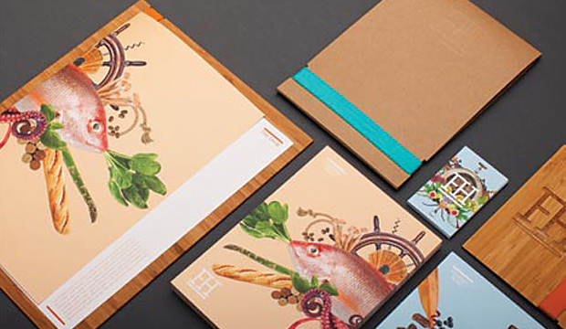
Seesaw felt that the use of uncoated, tactile stocks to contrast with the various other materials used such as silicon and bamboo was the best solution. They originally chose Concept Vellum for the entire range but with the menus being somewhat disposable, Knight Vellum was used instead. A presentation style folder was created using Buffalo Board to again enhance and contrast with the other stocks/materials used. The menu shells and postcards are printed on Knight Vellum 200gsm, the business cards on Knight Vellum 340gsm and the folders on Buffalo Board 330gsm.
Seesaw worked extremely close to their client throughout the project. What made a massive difference is the substantial research and strategy work they did at the beginning of the project. When it came to creating final artwork, the client really trusted the proposed creative direction. The client is an extended family which Seesaw say meant the project was brimming with love and emotion. The collaboration with their printer was equally as important. Seesaw had to factor in multiple kinds, variations and units and with the knowledge and support of Adrienne at Southern Colour, who completely understood the brief and desired outcome, the print job was a success that both Seesaw and the client are very proud of.
As Seesaw explained to us: “The project as a whole had a very short turnaround time. The client was extremely supportive and involved, but also respectful of our creative opinion and vision and allowed us a huge amount of creative freedom. As a studio we love collaborating with clients and suppliers. It really was a dream project – an open yet challenging brief, beautiful product, stunning food, rich history and trusting clients.”
This rebrand is an ongoing project. The work completed so far includes brand identity, brand strategy, naming, positioning, creative direction, image making, menu system design, uniforms, signage, copy writing, marketing direction, online and digital material and advertising.
So, a trip to Flinders anyone?