Title: Famous Visual Services business cards
Agency: Self-promotion
Stocks: Concept Vellum
Printed by: Taylor’d Press (VIC)
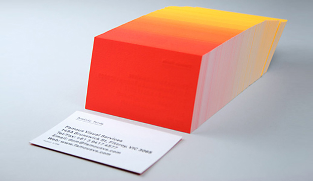
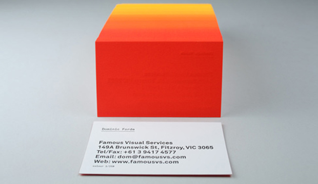
We love a bit of colour around here. We have even been known to say certain colourful designs remind us of 80s icy poles. These business cards are definitely a reminder of 80s Summer time goodness. These knockout cards were produced by Dom Forde from Famous Visual Services. For Dom, new business cards present the opportunity to experiment with ideas and materials. And experiment he did!
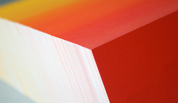
Concept Vellum Radiance was chosen for its ability to handle fluoro ink well. Dom wanted to enhance the vibrancy of the colours and he also knew, on advice from James Taylor at Taylor’d Press, that the stock handles letter press well. Especially the heavy grammage – 352gsm, which can take a robust indentation from the machine. The outcome is a vibrant set of cards with luxurious tactile qualities.
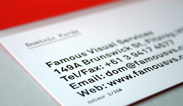
The patience of James Taylor was really important in the process. As Dom explains: “Our idea was to print a slightly different colour shade across the back of each card in the print run. First we printed a solid fluoro yellow on all 250 cards, then we then ran the cards back through the press adding dollops of fluoro red to the press as the cards were running.” The result is a 250 step gradation from yellow to red across the print run. The name details were letterpress printed in black. Now that’s a nifty business card print job if ever we saw one. And yes, he did say 250 step gradation. Amazing!

 Footy Tips


