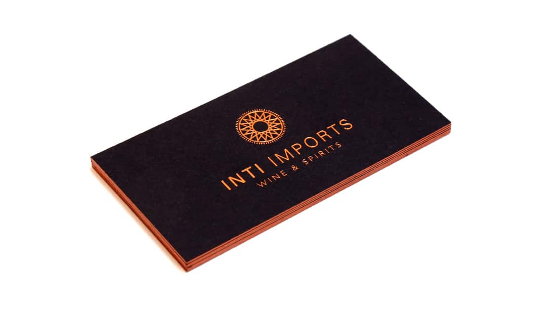
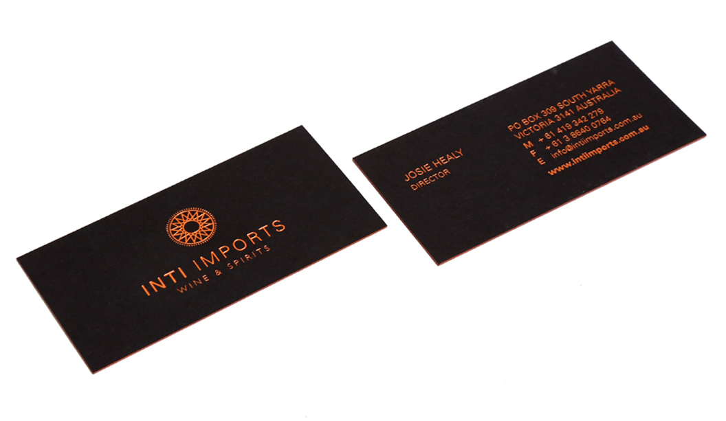
Title: Inti Imports Wine & Spirits Agency:Moko Creative Stocks: Keaykolour Original Jet Black 450gsm Printing specs: Copper foil and hand painted edges Printer: Blueprint (VIC)
These striking business cards by Melbourne based studio Moko Creative were designed for Inti Imports, a boutique wine and spirits importing company who required a new identity to launch into the wholesale industry. Sounds like a good bunch of people to know! Inti imports source their highly curated product range from South America, in particular Peru and Chile, so it was important the brand reflected the essence of South American culture.
The business cards, printed on Keaykolour Original Jet Black 450gsm feature copper foiling and delicate hand painted copper edging. Moko Creative explains: “We selected this stock due to its thick weight yet elegant and textural qualities. Keaykolour Original Jet Black also contrasts well with the copper foil. These cards have so far made a great lasting impression, especially with local business people.”
Be sure to check out Inti Imports to add a little South American spice to your next culinary experience.
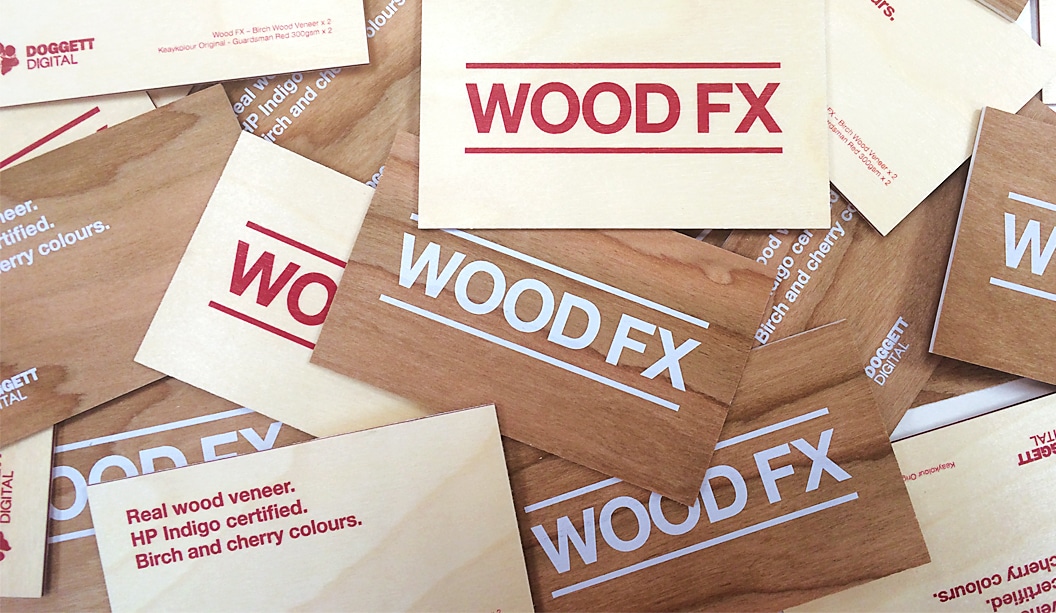
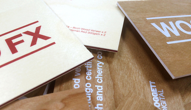
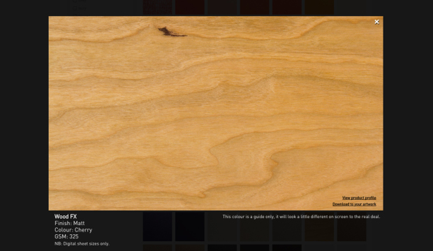
We all know paper comes from wood. Well, now wood is the paper. Whaaaa? Introducing Wood FX, a wood veneer board in cherry and birch colours with a white coated reverse so you can print both sides. We like to think of it as 60s office wood panelling meets modern log cabin. Made by Masterpiece Graphix (USA), it’s also HP Indigo certified, works on dry toner machines and is made from wood sourced from certified responsibly managed forests. But wait, there’s more…
This distinctive paper can also be printed offset, letterpress, screen and UV ink presses (prior testing recommended) and is also water resistant. Working and printing on wood is essentially the same as printing digitally on paper and Wood FX’s reverse coated back allows you to create all sorts of unique print jobs. Think vintage style laser cut invitations, duplexed business cards or maybe add an organic look to a menu design, packaging project, sustainability report and more.
A big bonus is that the ink dosen’t feather, giving sharp, defined ink lay down so things like printed bar codes scan properly and text is readable. Wood FX comes in sheets and is available in 305gsm. What ‘wood’ you rather choose for your next project?
Remember, you can always visit our website for more information about this range or explore our new ‘Colour wall‘ to see the real deal. Enjoy!
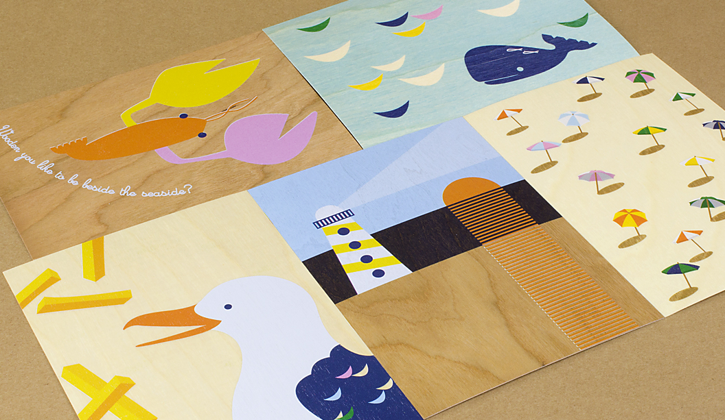
Above: Set of five A6 cards entitled ‘Wooden you like to be beside the seaside’ printed by Press Print Digital (VIC).
Card 1 (lobster) – Cherry Wood Veneer printed on a HP Indigo with three hits of opaque white ink base + CMYK.
Card 2 (whale) – Birch Wood Veneer printed on a HP Indigo CMYK.
Card 3 (umbrellas) – Birch Wood Veneer printed on a HP Indigo with two hits of opaque white ink base + CMYK.
Card 4 (lighthouse) – Cherry Wood Veneer printed on a HP Indigo with three hits of opaque white ink + CMYK.
Card 5 (seagull) – Side 1: Birch Wood Veneer printed on a HP Indigo with two hits of opaque white ink base + CMYK. Side 2: printed black only.
Above: Cherry Wood Veneer card – printed on a HP Indigo with two hits of CMYK. The two outer sheets are Cherry Wood Veneer 305gsm with two sheets of Keaykolour Original – Guardsman Red 300gsm sandwiched in the middle. Birch Wood Veneer card – printed on a HP Indigo with three hits of white ink. The two outer sheets are Birch Wood Veneer 305gsm with two sheets of Knight Smooth – White 300gsm sandwiched in the middle. Printed by Bambra Press (VIC).
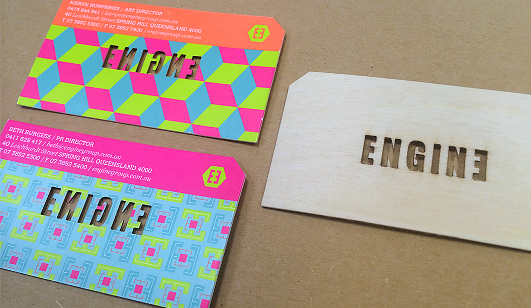
Above: Business cards for Engine Group printed offset on Birch Wood Veneer 305gsm duplexed to Sovereign Silk 300gsm by Platypus Graphics and laser cut by Potato Press (both in QLD).
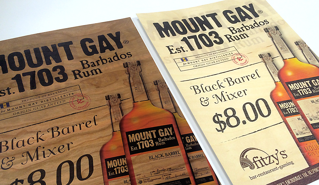
Above: A3 posters for Mount Gay Rum printed HP Indigo on Cherry Wood Veneer 305gsm and Birch Wood Veneer 325gsm by Greenridge Press QLD.
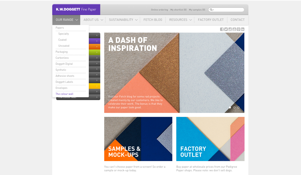
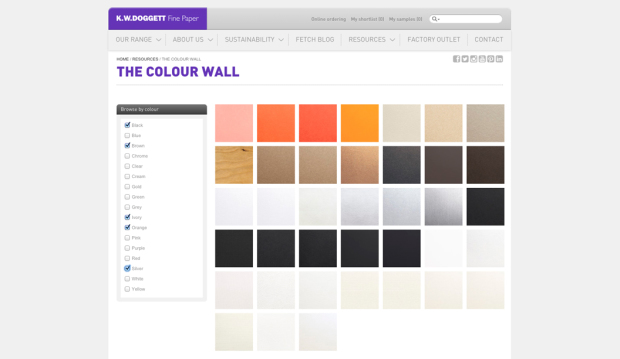
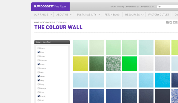
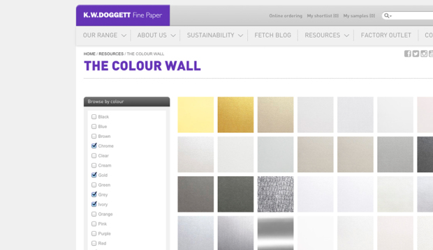
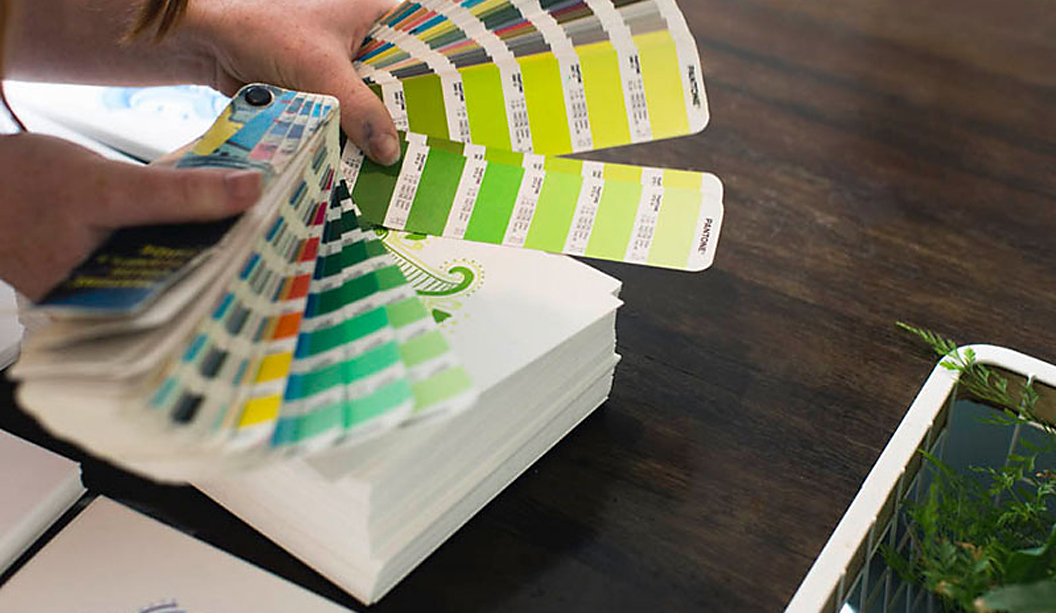
Paper and computer screens are not friends when it comes to choosing the right paper. There’s nothing like having the real deal in your hands. Soooo to help you out, we’ve created a colour wall which will give you a pretty accurate look and help you find the right shade.
There are over 200 hues to choose from and a high res photo for each paper. The textured papers have come up particularly well. Just click on the image and you can download the paper to your artwork to see how it will look when printed.
The colour wall in all its glory can be found in the ‘Our resources’ section of the website. And when you’re browsing for papers in the ‘Our range’ section, you can click on the ‘View’ button to see a photo of the stock. When you’re ready to order a sample, call your local samples team or send them a request via the world wide interweb. Enjoy!
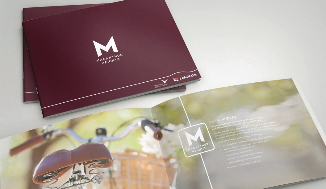
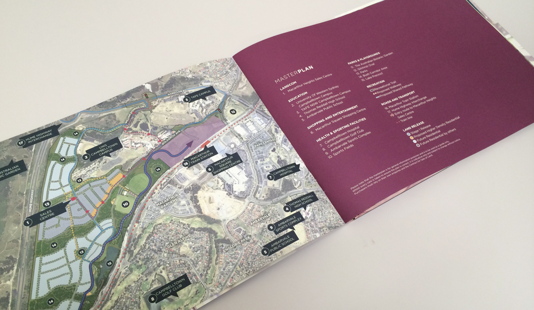
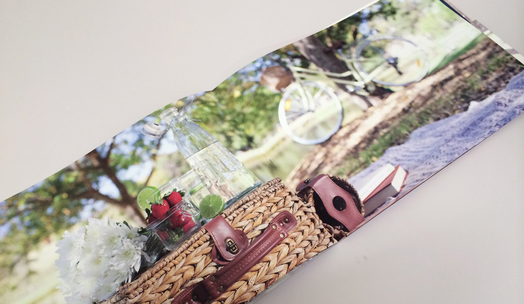
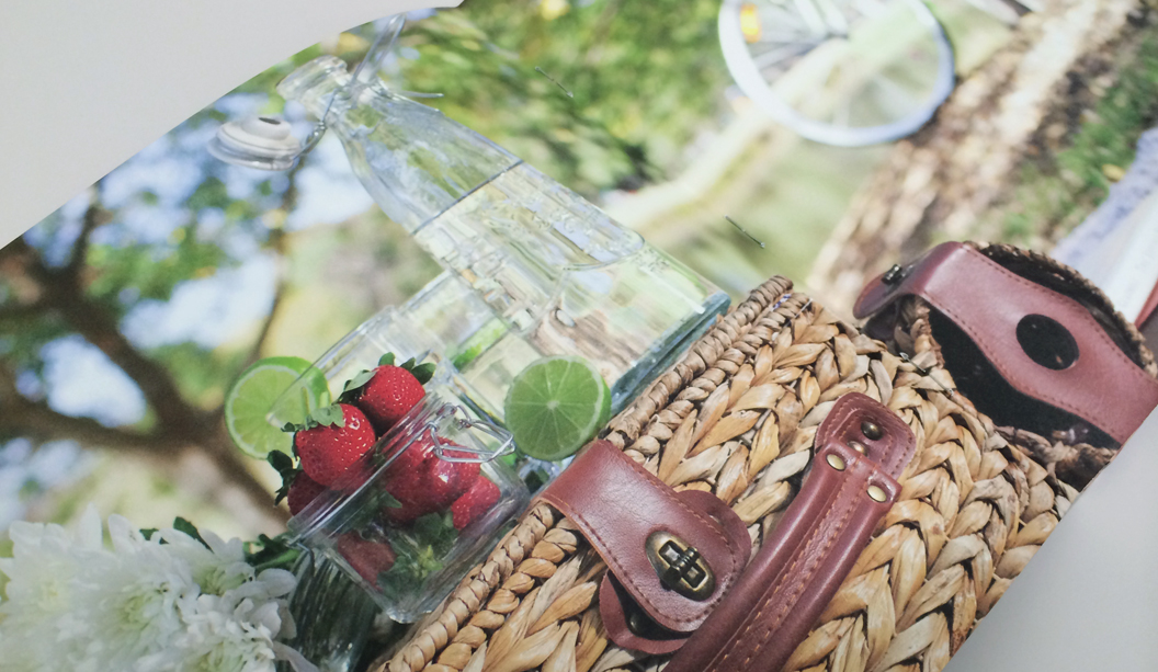
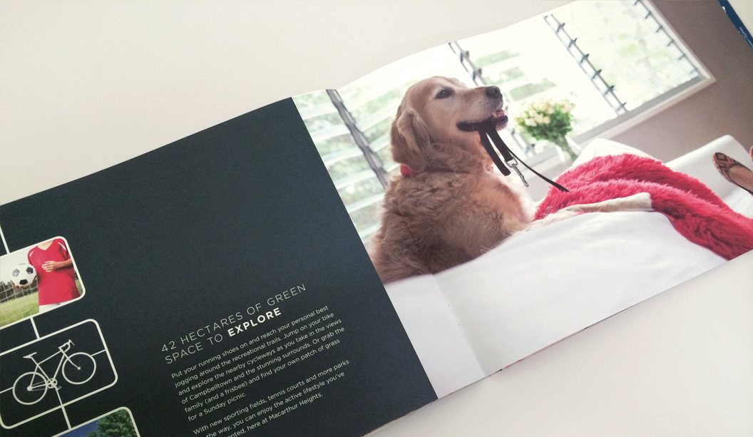
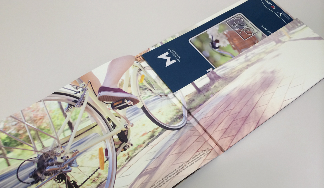
Macarthur Heights is a premium house and land release by developer Landcom in Campbelltown, NSW. Designed by the team at Enigma in Newcastle, the brief was to create a high-end brochure that captured the lifestyle offered by Macarthur Heights.
The property brochure comprises of a 4pp folder printed on Strathmore Premium Super Smooth Ultimate White 352gsm featuring an embossed “M” on the front. When it came to selecting the paper Enigma explains: “it was very important for the embossing to be sharp and tactile so we were looking for an uncoated stock that would be able to deliver the look and feel we were after.”
The 12pp brochure is printed on Strathmore Premium Super Smooth Ultimate White 148gsm with saddle stitched binding. The smooth, uncoated finish of the stock lends itself beautifully to lifestyle photography. “We were delighted with the finished product. The printed reproduction of the images is extremely sharp and the rich, solid colour throughout adds life and vitality to the piece. The client was extremely happy with the end result.”
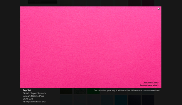
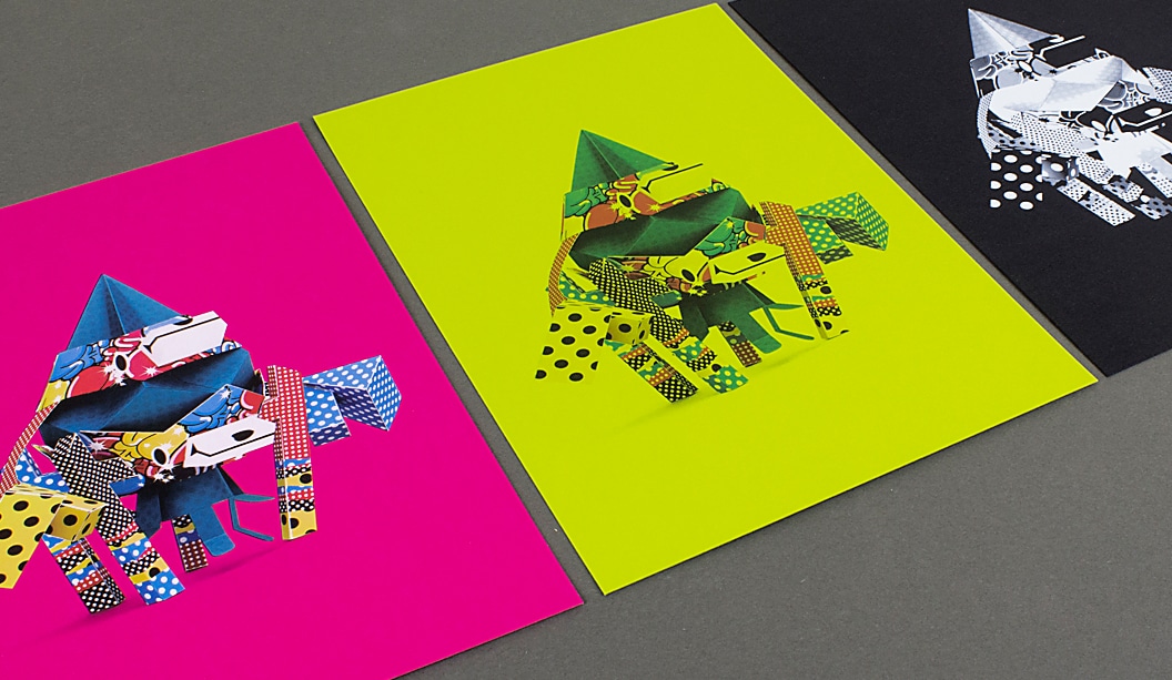
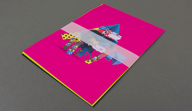
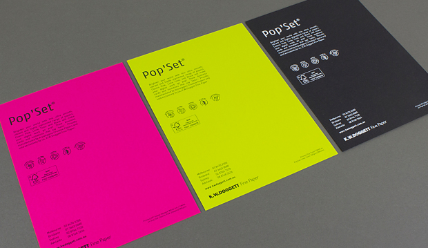
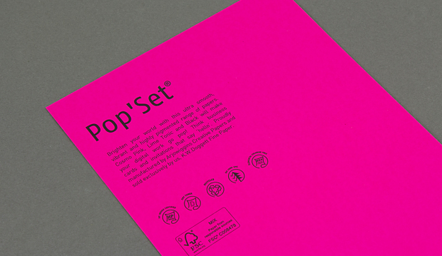
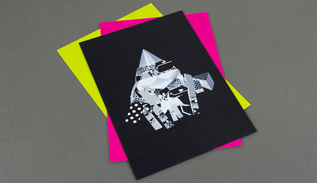
Say hello to Pop’Set, the latest and brightest addition to our Doggett Digital range. Pop’Set is an ultra smooth, vibrant and highly pigmented range of specialty papers. Our Cosmo Pink, Lime Tonic and Black are sure to make your project snap, crackle and pop! Made by Arjowiggins Creative Papers, Pop’Set is also HP Indigo certified, works on dry toner machines and is FSC certified with 30% post consumer waste.
To promote this fun range we have created three A5 postcards using a graphic to show what can be achieved with a digital printing process, as well as the versatility and print quality of the paper. The crazy character on the front is called C-Myk, from an Arjowiggins contest created overseas. The theme of the promo is all about making print jobs pop! Think business cards and invitations that say ‘look at me’ or you might like to inject a burst of energy into your next annual report, promotional or packaging project.
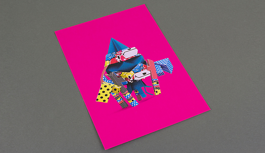
Check out the colour reproduction on the Cosmo Pink card. It’s pretty spesh. To achieve this we had to ensure two hits of opaque white ink were laid down first as the base, then we printed CMYK over the top on a HP Indigo printer. It’s an affordable and quick way to achieve a killer result.
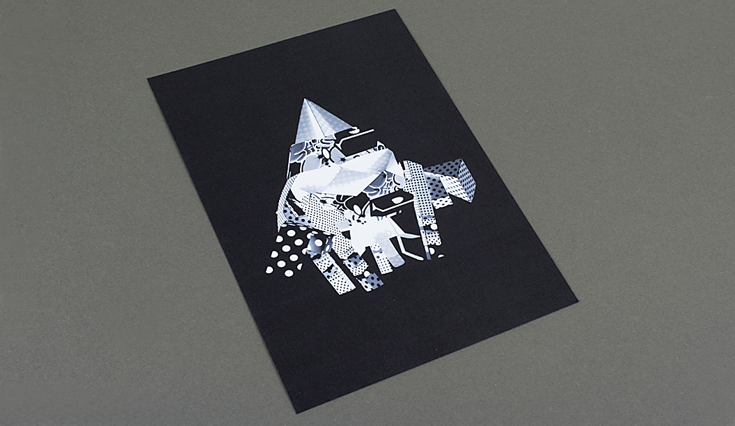
For something extra special, we printed the Black card with four hits of opaque white ink. We are loving the tonal effects between the denser and lighter areas.
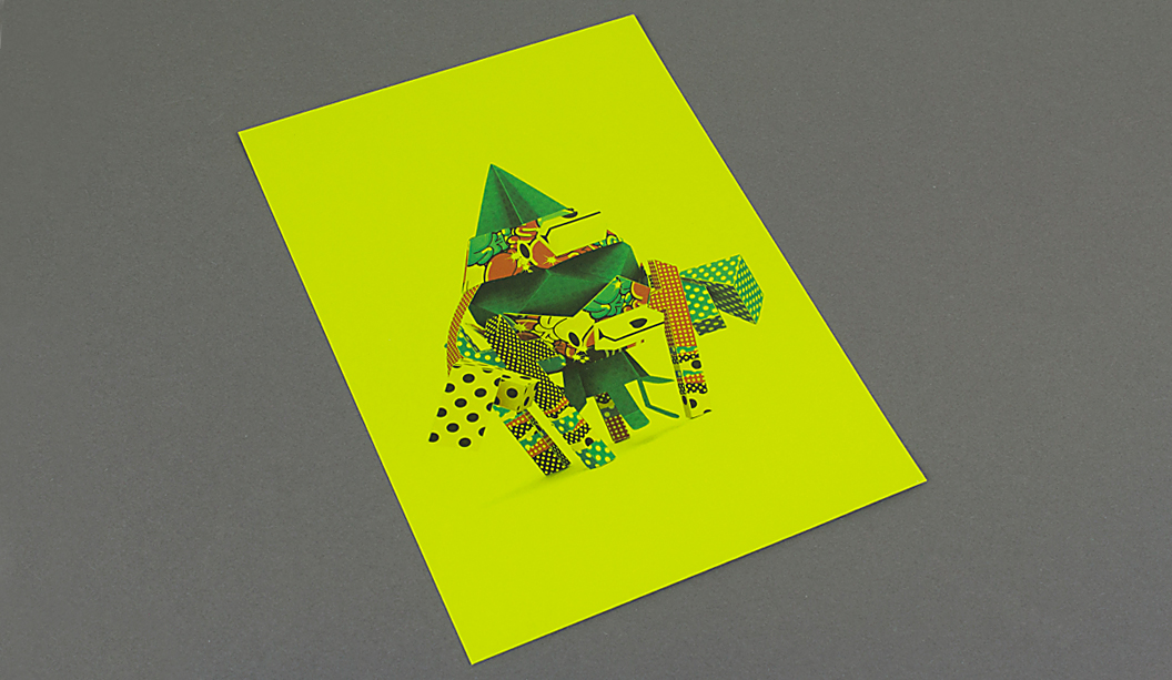
As a comparison, the Lime Tonic card was printed CMYK on a dry toner Xerox Colour 800 to show how the ink responds to the intensity of the pigmented paper. It’s a cool way to play with colour and shows how you can produce an entirely different effect.
Printing specs:
Card 1 – printed CMYK with two hits of opaque white ink base on Pop’Set Cosmo Pink 320gsm.
Card 2 – printed CMYK on Pop’Set Lime Tonic 320gsm.
Card 3 – printed with four hits of opaque white ink base on Pop’Set Black 320gsm.
Our paper specialists and account managers are coming around to see you soon with your own copy. Remember, you can always visit our website for more information about this range or explore our new ‘Colour wall’ to see the real deal. Enjoy!
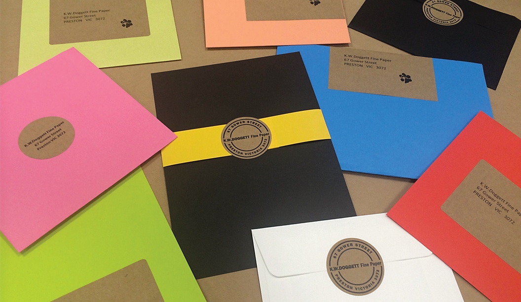
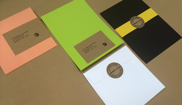
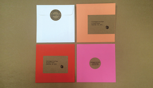
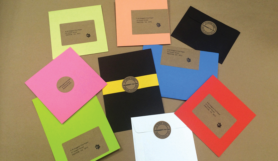
It’s time to get crafty with our latest label offering – Buffalo Kraft labels. Use them to add an extra bit of wow to a gift, envelope or to spruce up your wedding invitations. The natural brown, uncoated sheet offers a modern, subtle organic feel to your project. Food contact approved to FDA standards, Buffalo Kraft labels are also an ideal match for FMCG, confectionery and even heavy duty packaging.
Our labels are manufactured on site meaning you can die cut any one of our A4 series templates onto Buffalo Kraft. Compatible with digital and offset printing, these labels come standard with Doggett branding or plain for large quantities, just make sure you specify this in your order. Our website makes it easy to choose your label template and it’s also available to download ready to apply your artwork!
We recommend testing the product to ensure it is suitable for your project. Contact our friendly Samples team to organise your sample test sheet today. If you have any specific label related questions, please call Chris Jackson, Business Development Manager – Self Adhesives and Synthetic Papers (National) on 0438 368 406 or cjackson@kwdoggett.com.au
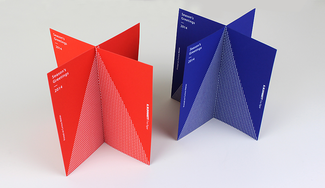
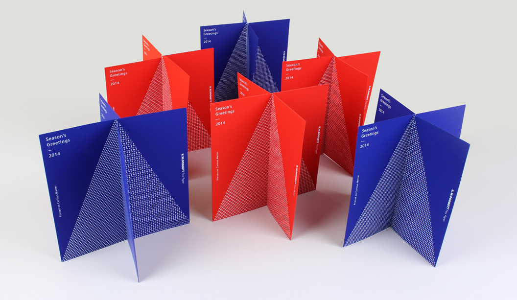
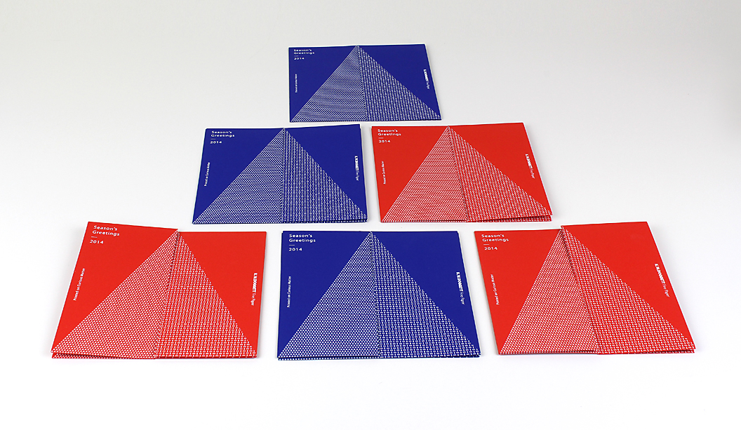
Our super cheery Christmas cards are printed on new specialty range Curious Matter. Hofstede Design have done a great job of creating a striking yet intentionally simple graphic, making the paper the star of the show. Each card is made-up of two pieces that interlock to make a four sided tree design. All we need now are teeny tiny presents to sit under the tree!
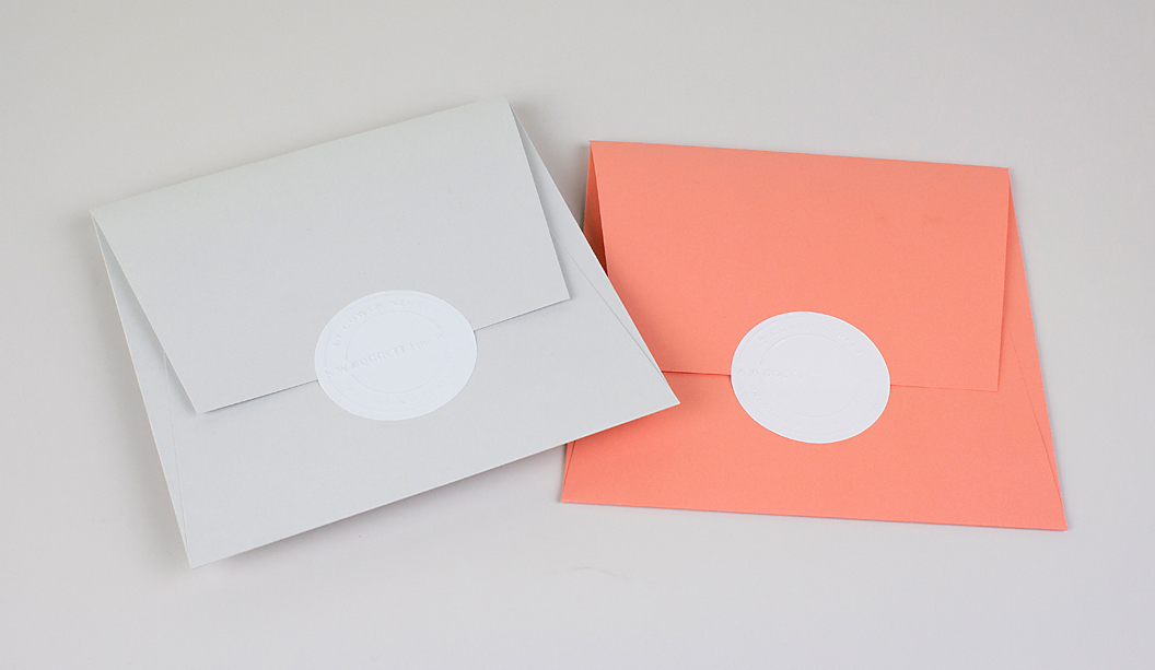
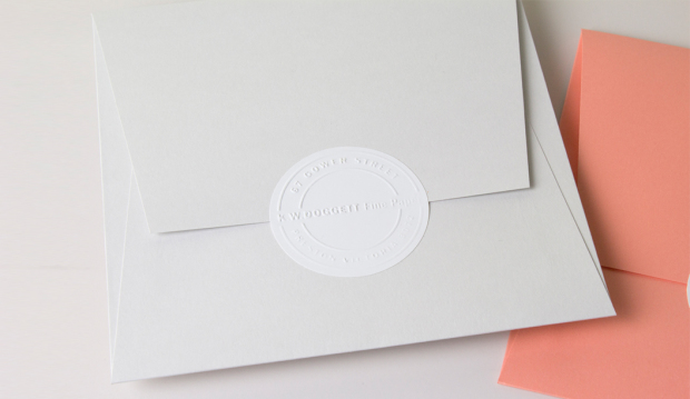
For something extra special, we created envelopes printed on Tablex Salmon and Kaskad Sparrow Grey plus some embossed return address labels to seal the deal.
Curious Matter
The Curious Matter range made by Arjowiggins Creative Papers, is all about the tactile experience of the paper. It’s sand-like yet silky feel (because of the potato starch it’s coated with) is sure to have you addicted. Did we mention it has a colour palette that really pops?! Available in 125, 135, 270 and 380gsm, it will fill your dreams with ideas about your next paper creation.
Printing specs:
Card 1 – printed white foil stamp on Curious Matter Desiree Red 380gsm.
Card 2 – printed white foil stamp on Curious Matter Adiron Blue 270gsm.
Envelope 1 – custom made, on Kaskad Sparrow Grey 160gsm.
Envelope 2 – custom made, on Tablex Salmon 150gsm.
Address labels – custom made on Doggett label white gloss.
Phew! Merry Christmas everyone and stay tuned for more updates on the official launch of Curious Matter in the New Year. Enjoy!
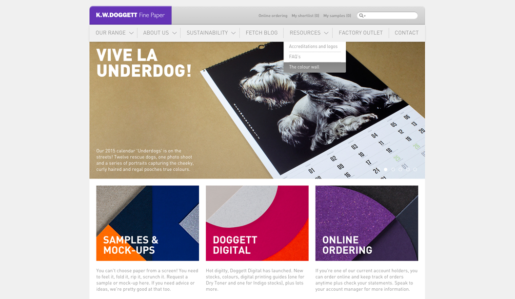
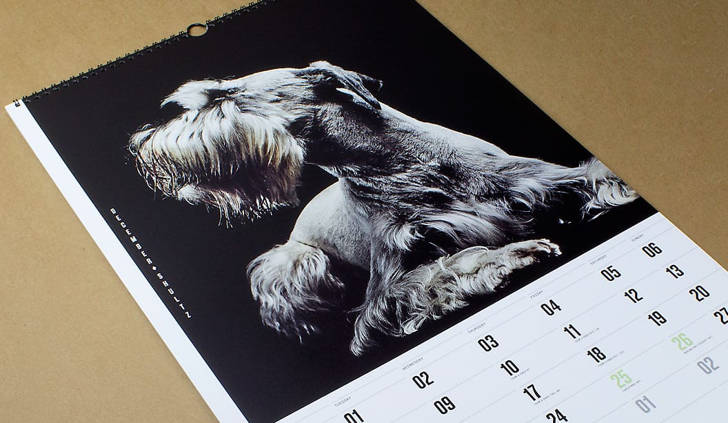
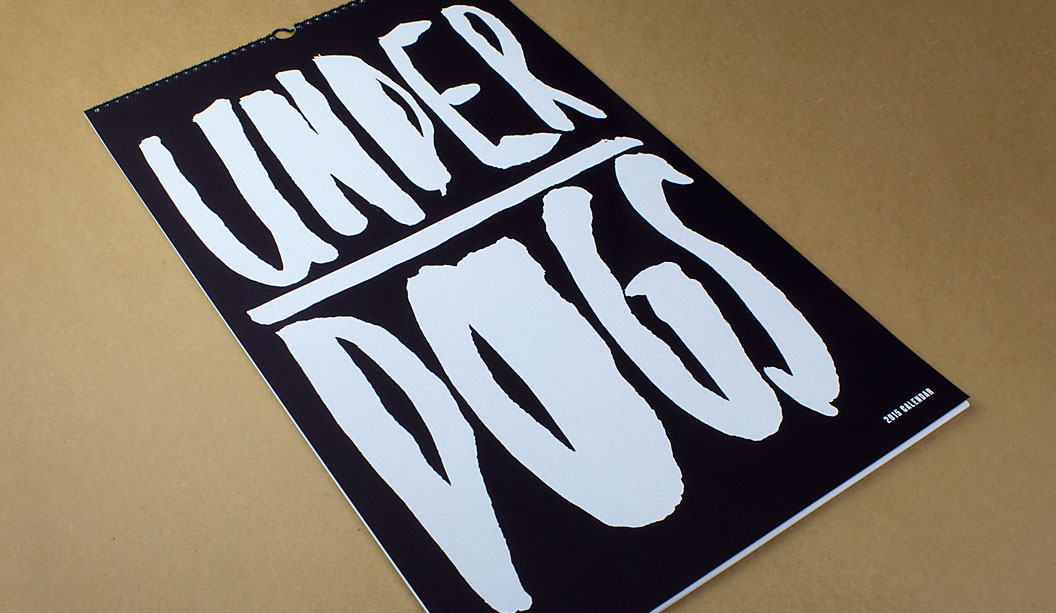
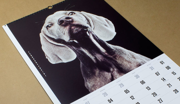
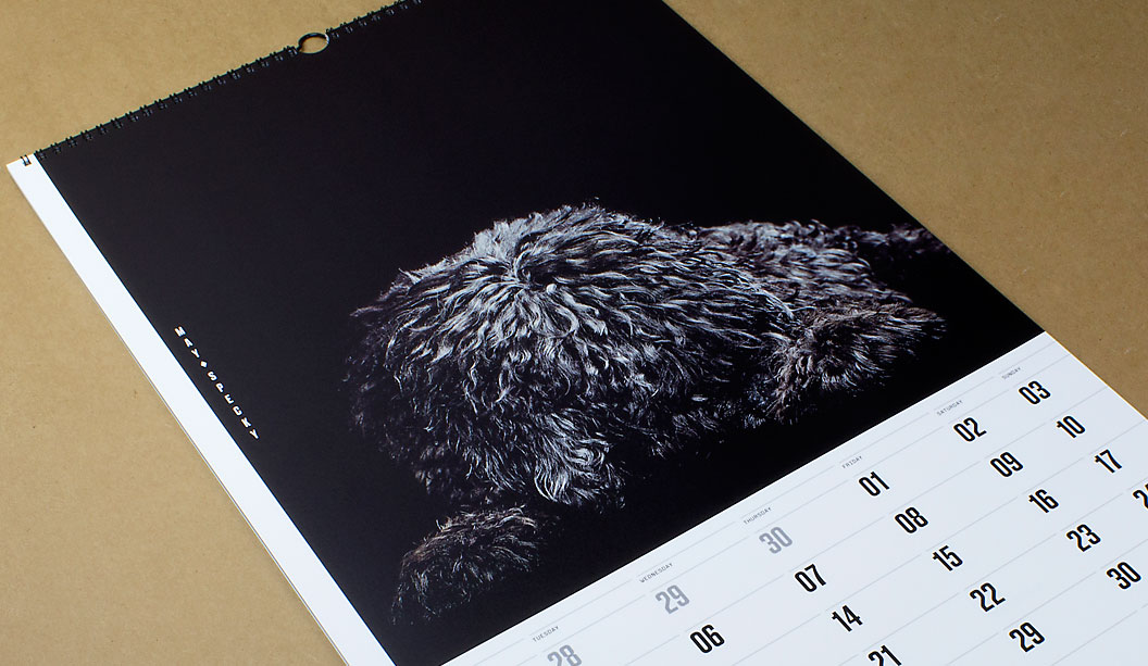
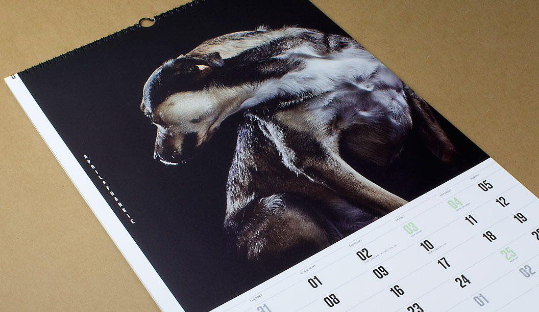
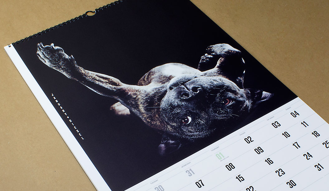
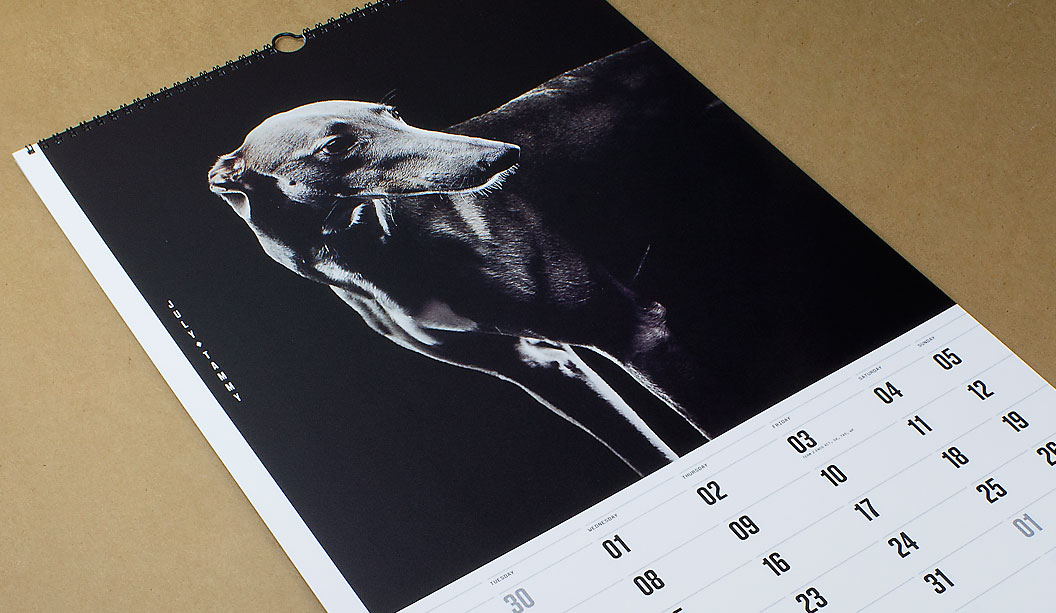
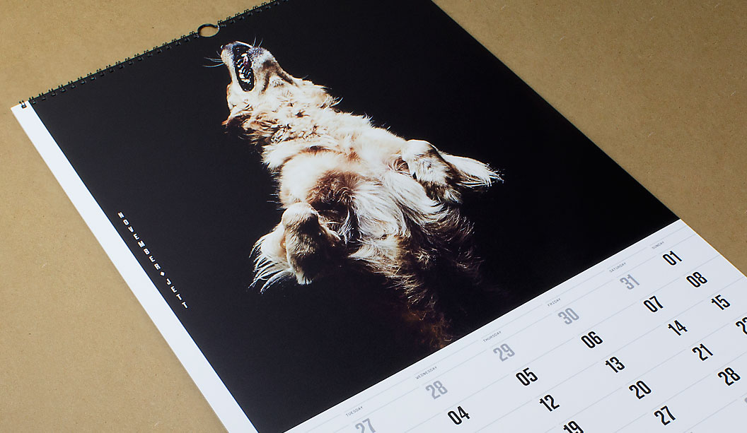
Next year marks our 40th year in the paper biz, so we called in the big guns to create our 2015 calendar which is given to key customers as a gift and a thank you. We assembled a team of poochie lovers that set-out on a collaboration that took nine months to complete. The result is a set of doggie portraits, fashion inspired images of 12 underdogs. The misfits and true Aussie battlers from the wrong side of the tracks.
The team of poochie aficondos was made-up of Marta Roca, Creative Director from online and print magazine Four&Sons along with some students which we found via a shout-out on desktop. The wonderful Caroline Beard and Anthony Stephens, two recently graduated RMIT students from VIC made the cut. They recently wrote to us saying how much they loved the experience, had loads of fun. That the project intensified their love of print and beautiful paper even more and they thanked us for the friendship and guidance provided. We think you guys rock! Ok, enough gushing.
When Catherine Doggett contacted Four&Sons to be a part of the calendar project, Marta says she: “Felt a sense of serendipity. From the KWD team, to the graduates Anthony and Caroline and James Geer, everyone got in sync with the underdog concept straight away. We all wanted to pay tribute to the unsung heroes and to give something back for all of those years of constant inspiration.”
To find the poochie models, we ran a doggy talent search among our VIC clients and customers. The criteria specifically asked for dogs that have been adopted or rescued. Each person submitted a photo and a bio of their dog. We received over 200 entries. A great response and so many great dogs! Marta, Anthony and Caroline chose the final 12 to appear in the calendar.
One camera shoot, one day and a lot of pooches coming and going from the studio in Melbourne’s leafy suburb of Elsternwick. We took the dogs for walks, helped them make friends and let them roam around in the hope we’d capture their true spirit which James did so brilliantly. We gave them lots of attention. It was a big love-in of our furry friends. “Maybe it was the treats, maybe we were just plain lucky. Or all of the above. Whatever the reason, magic just happened! We couldn’t have asked for better models,” said Marta to us recently. And internationally renowned photographer James Geer captured that magic.To say thanks for their hard work, we donated money to Pet Rescue Australia.
That’s it friends, we’re done for another year. We often joke that maybe, just maybe, one day, we will make the calendar about cats instead. Possibly even change our name to Cattett Paper. But we’re pretty keen on the dogs for now, so not just yet. Enjoy the 12 months of canine inspiration! Until next time…
Printing tips… Using the UV offset press (on an uncoated paper profile) means instant drying times and a slight sheen to the ink is created. The darker images were printed using a 225 line screen which gave us a richer black and even ink lay down. The lighter images were printed with a 175 line screen as there was more contrast between the lighter and darker areas. The cover is screen printed with two hits of white to give a bold ink lift.
The paper for the text pages is Strathmore Premium Super Smooth. Being a premium paper, it is ideal for high end photography with even ink lay down. Nice solids and sharp reproduction. It makes the images look great. The Ultimate White is slightly ivory in colour and does add a small amount of yellow to an image (you can compensate for this on press or when setting up artwork).
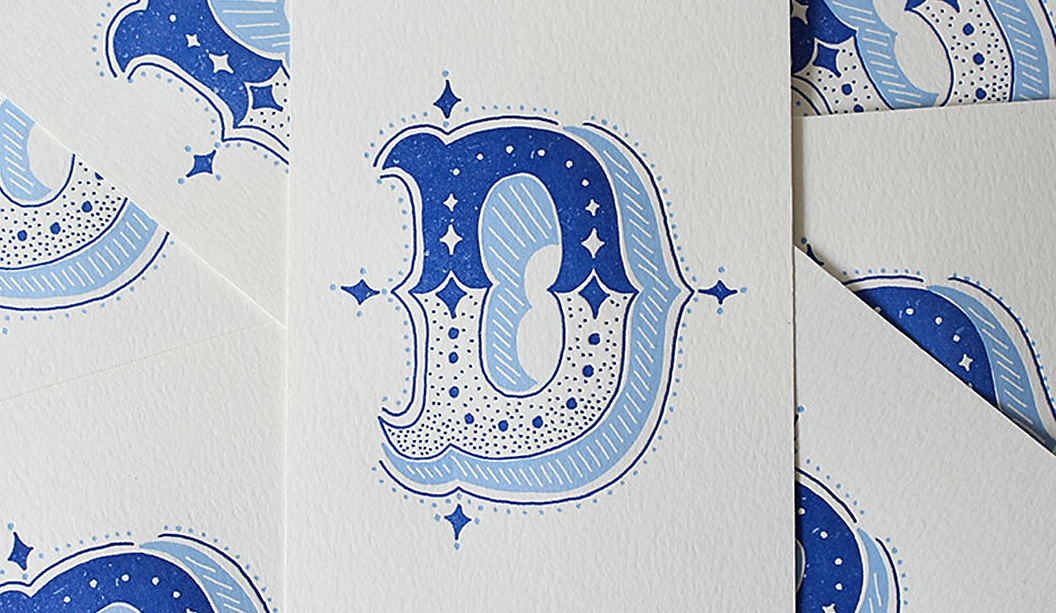
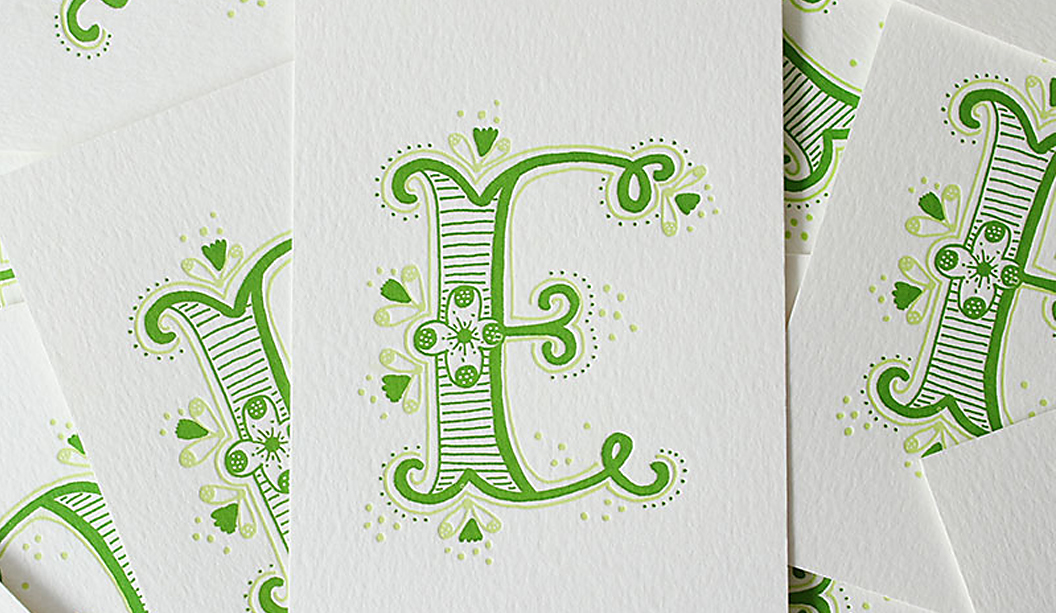
Ladies of Letters is a wonderful collaboration between super talented typographer Carla Hackett and letterpress extraordinaire Amy Constable aka Saint Gertrude and their latest project is called ‘Alphabet City’. Together they’ve created these beautiful two colour, A5 cards. Carla hand draws them in pencil and ink, then Amy prints them on Wild 450gsm on her letterpress machine called Gordon. Each card is signed, numbered and lovingly packaged in cellophane wrap.
The proceeds from the sale of the cards goes directly to supporting the Australian Literacy and Numeracy Foundation, such a brilliant creative idea for a well-deserving cause. Ladies of Letters share: “Our launch project, Alphabet City, has a small and achievable financial target of $1000, which is enough to set up a community Share-a-Book library. This can make a huge difference to people in a remote area where literacy levels fall below the national average and access to reading material may be limited.” Better still, Amy and Carla have chosen to keep donating to the charity even after the project is finished.
Love it? Buy it. You can pick up all letters of the alphabet here and help support the Australian Literacy Foundation.
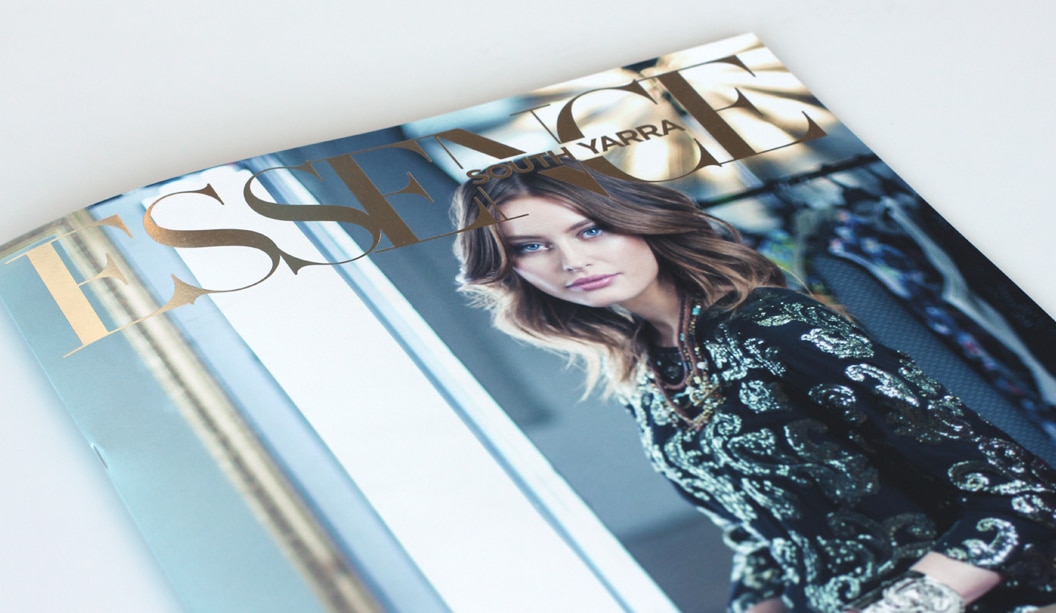
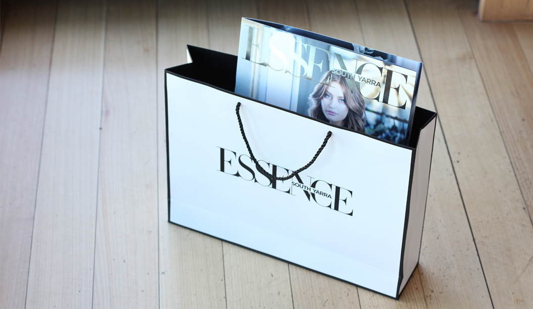
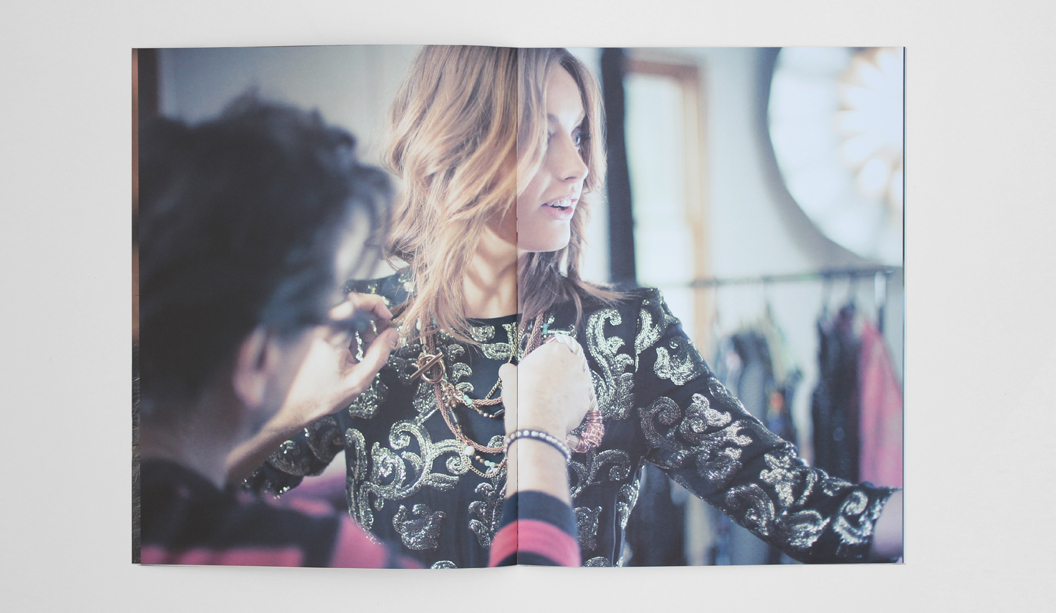
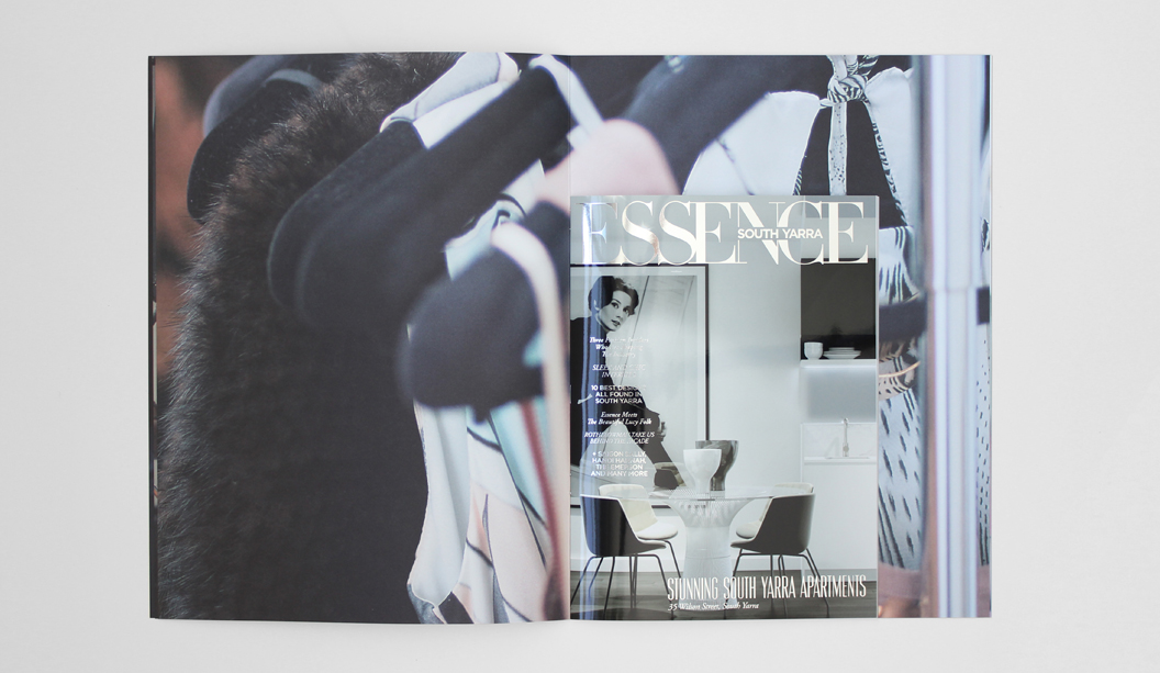
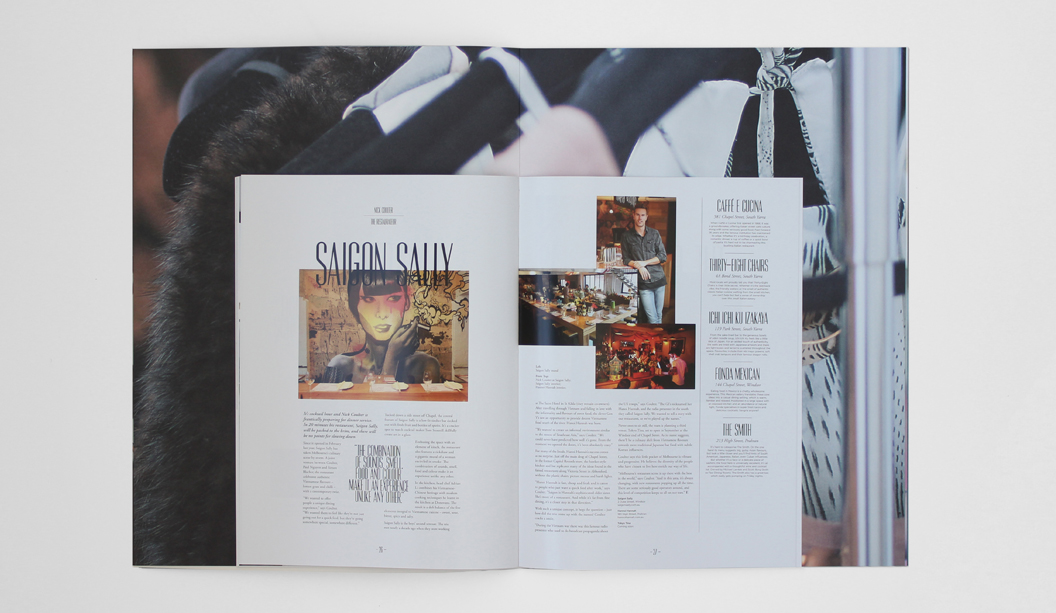
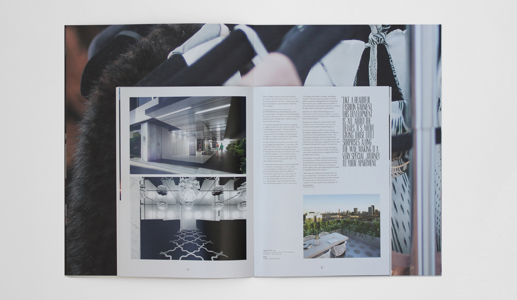
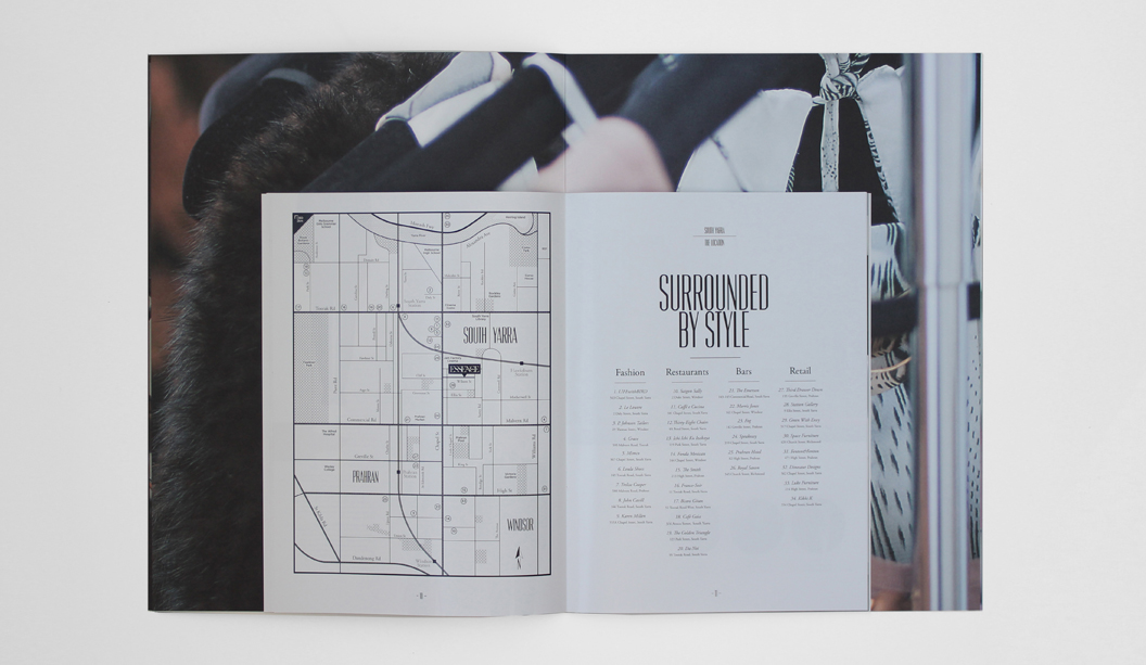
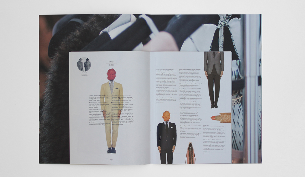
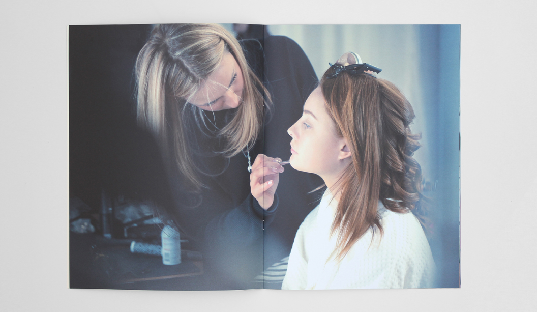
When it comes to property magazines, this beauty is pretty unique. Designed by the talented team at Hayman, Essence is an exciting new apartment offering by developer Salta in Melbourne’s fashion hot spot, South Yarra. The brief was to create a marketing campaign that captured the ‘essence’ of South Yarra’s edgy fashion scene and we think they nailed it. They’ve sold in aspiration very cleverly. The campaign included a behind the scenes fashion inspired photo shoot, high finish boutique bags, large format brochure and a boutique style display suite located in a Chapel Street shopfront. Ooh la la!
The stunning magazine inspired property brochure can be likened to Vogue or Marie Claire. It comprises of two sections, the large outer cover is printed on Strathmore Premium Super Smooth Ultimate White 352gsm with a generous silver foil and 216gsm for the text, featuring a photo essay of model Monique by Dennys Ilic. The smooth, uncoated finish of the stock lends itself beautifully to fashion style photography.
The second section is a smaller product and lifestyle brochure, printed on HannoArt Gloss 300gsm for the cover and 150gsm for the text. A high gloss laminate finish on the cover delivers a sharp contrast from its larger uncoated pages, a shiny hidden gem for its readers to discover. It just goes to show how a few bold paper choices can have great visual impact.
If you would like to feast your eyes on this paper goodness or need some advice on choosing the right stocks for your project, please contact your paper specialist.
 Footy Tips