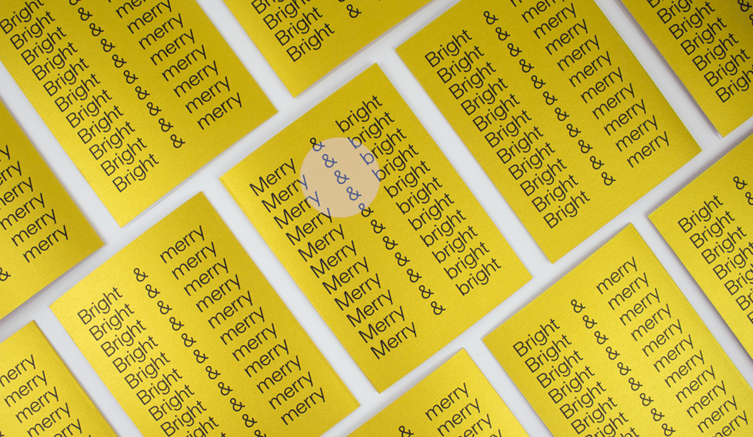
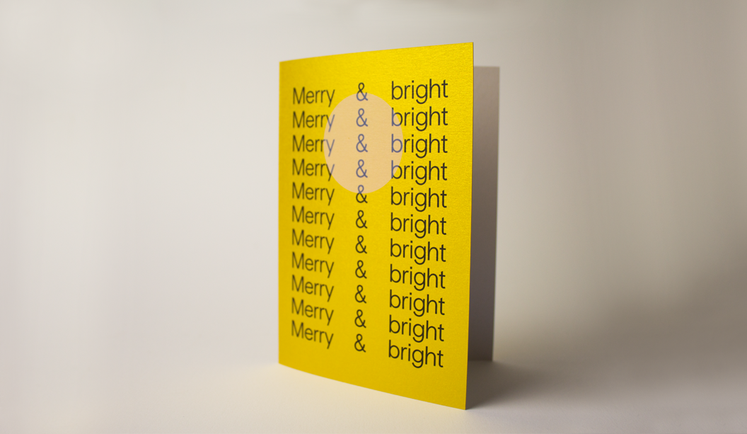
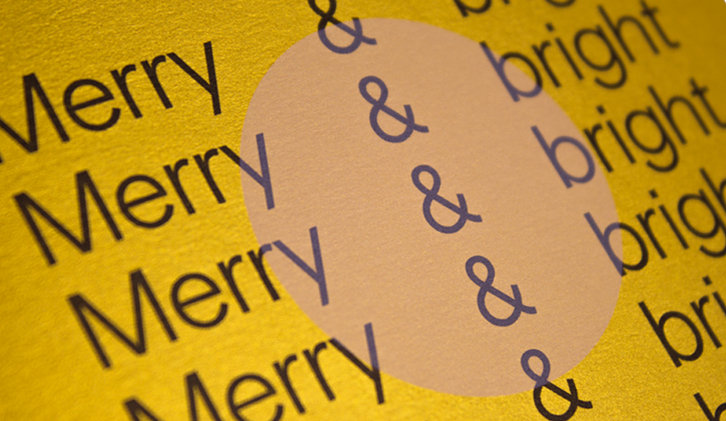
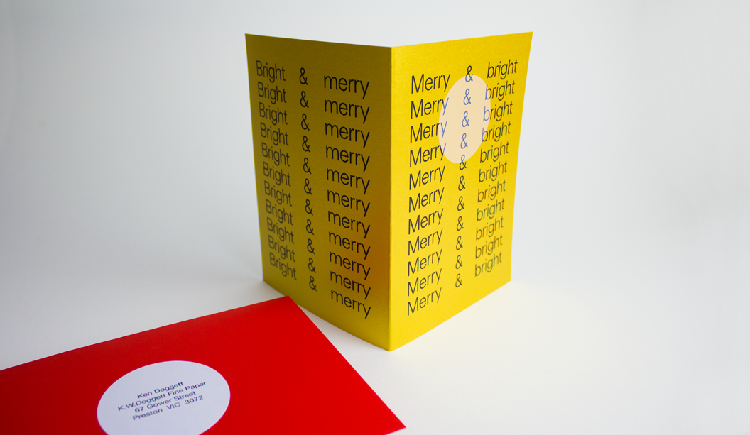
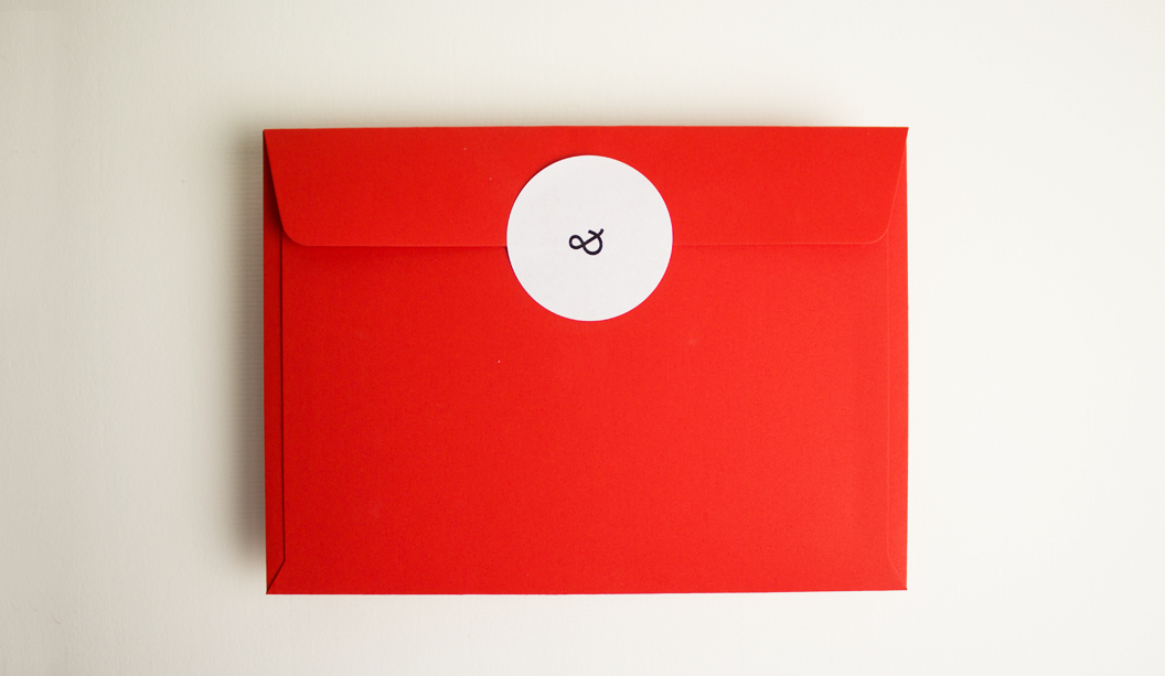
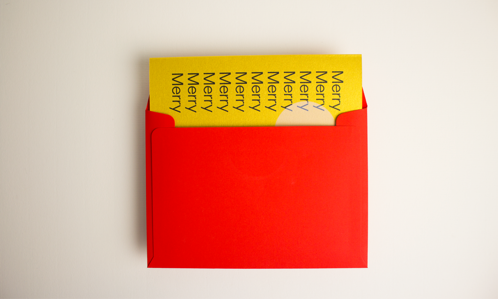
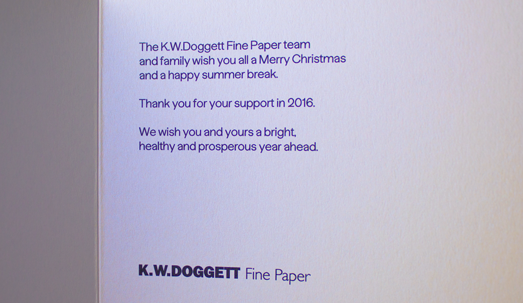
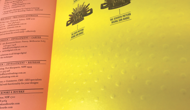
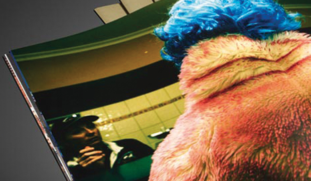
Our 2016 Christmas card is so bright that we reckon it could probably give you a sunnies tan line. Which is why we love it.
We asked David of Studio Constantine to get creative so the card would bring merriment to our rather broad client base (graphic designers to corporates). When looking for inspiration, we like to imagine that after a few eggnogs staring up at the overcast summer sky, David had a lightbulb moment. He would create a card featuring the bright Aussie sun we’ve all been waiting for.
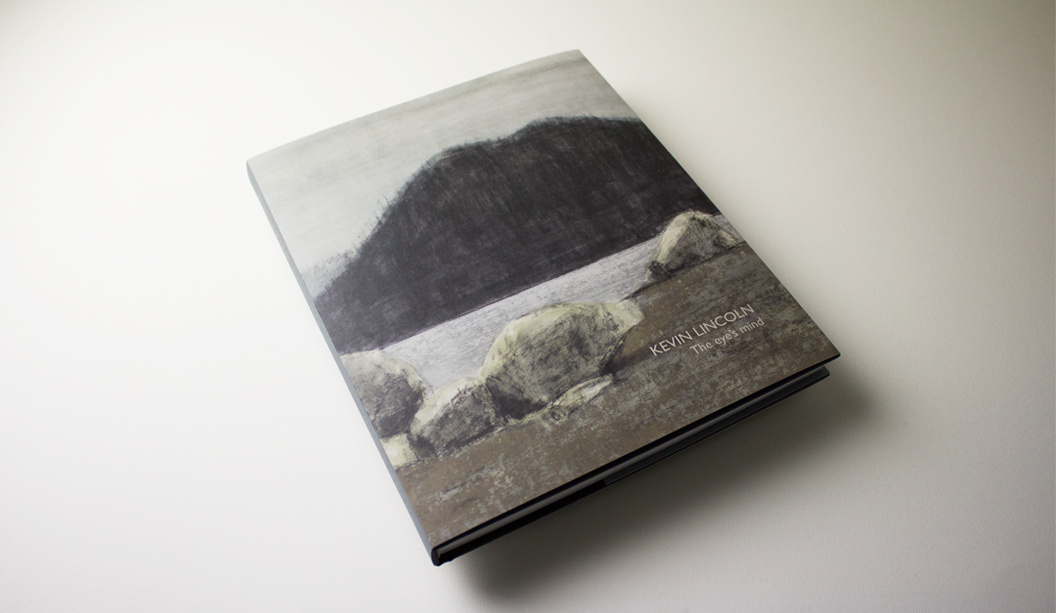
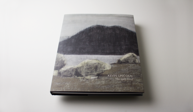
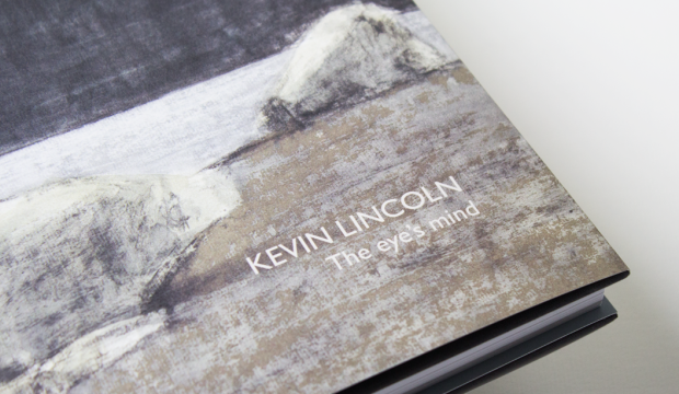
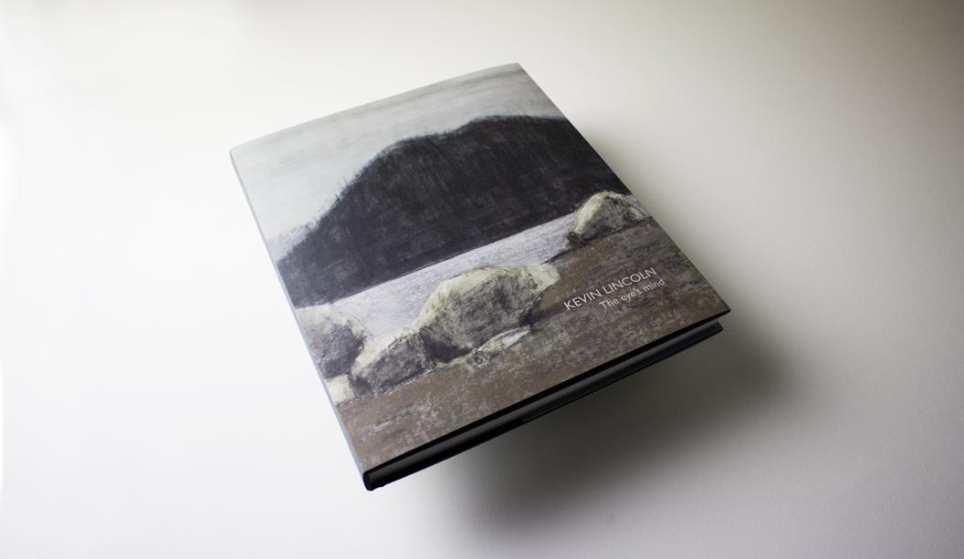
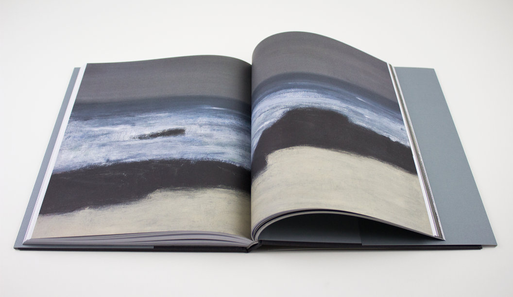
Artist: Kevin Lincoln. Title: The eye’s mind.
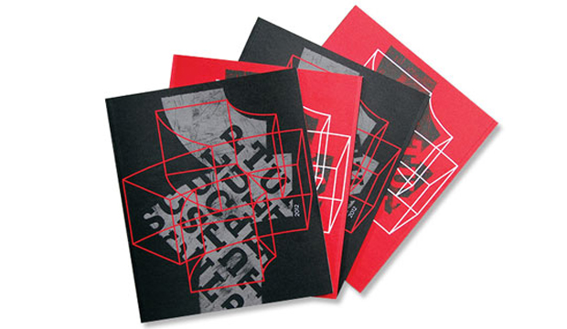
Designer: Ben Cox. Publisher: Art Gallery of Ballarat. Stocks: Curious Matter Goya White 270gsm (cover), Grange Offset 135gsm (text). Printing specs: 4 colour offset + PMS grey on the back and spine of the dust jacket.
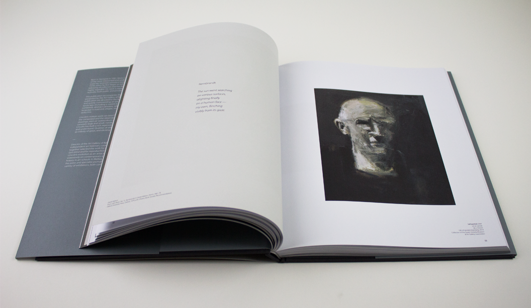
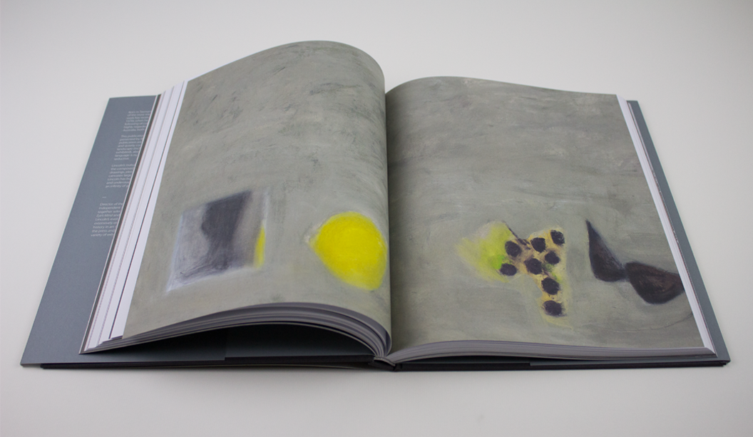
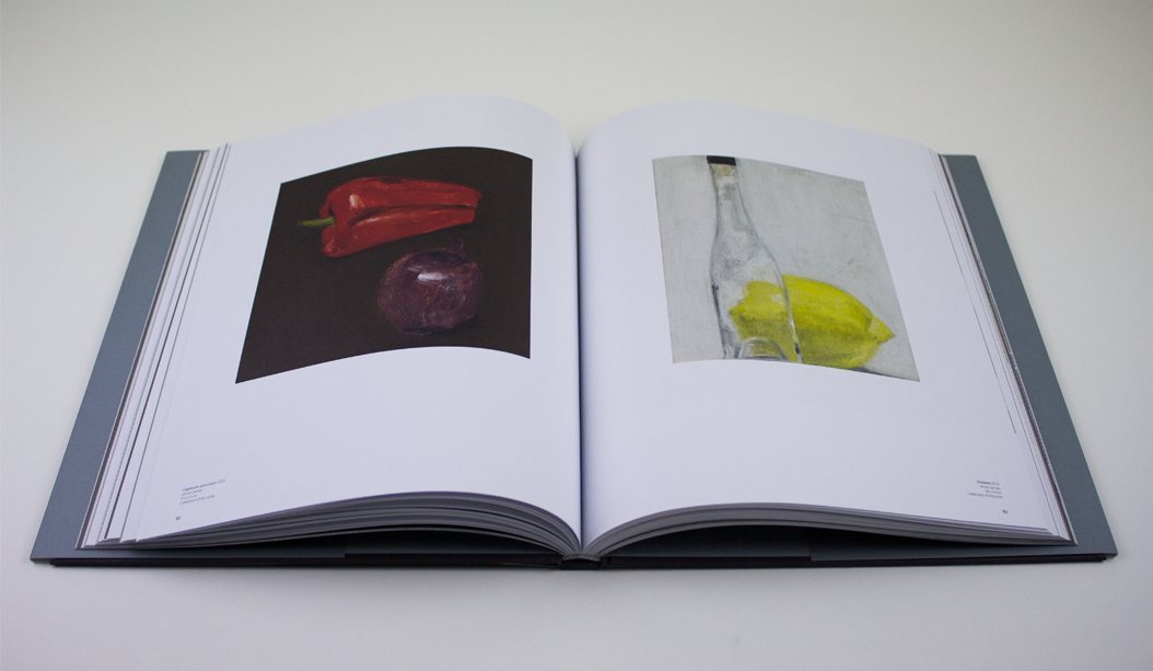
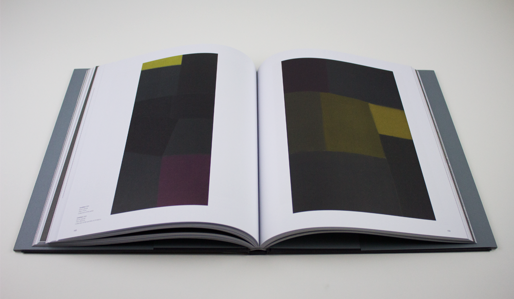
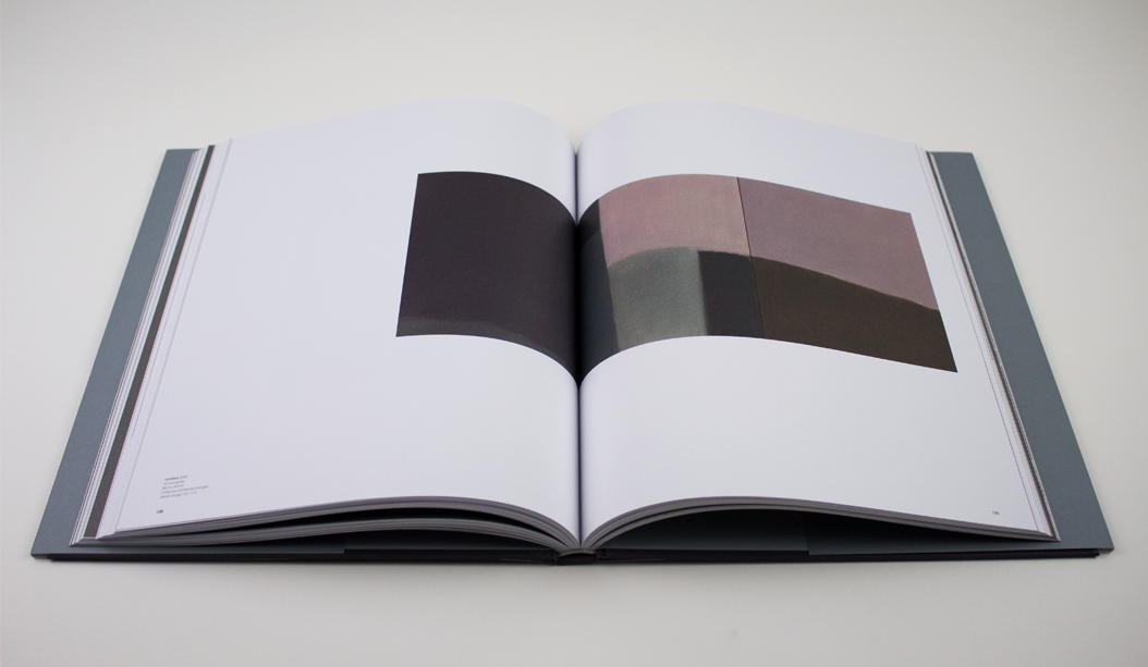
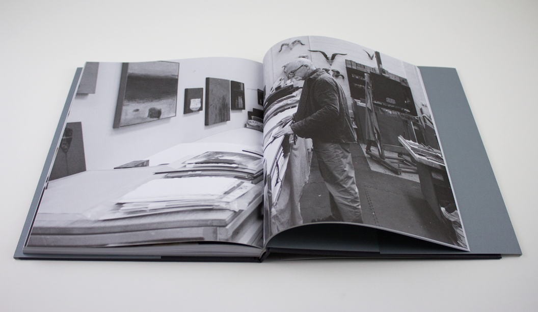
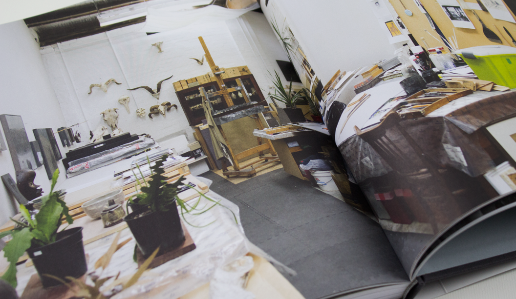
Feast your peepers on this collection of works by Australian artist Kevin Lincoln. With an impressive career spanning the decades, Kevin’s career although impressive isn’t widely known and yet has had a massive impact on the Australian art scene. So this 180 page publication not only accompanies his exhibition at the Art Gallery of Ballarat – the largest solo exhibition they’ve ever presented – but it’s also a highlight of the last 25 years of Kevin’s career which is described by The Art Almanac as poised, balanced and reflective.
The dust jacket is printed on textured Curious Matter Goya White 270gsm and the text pages are Grange Offset 135gsm. Production insight: the dust jacket is printed 4 colour offset with PMS grey on the back and spine. You have to feel this book to appreciate just how perfectly the paper complements the design. It couldn’t have been paired any better.
With an interesting foreword offering some perspective on Lincoln’s ‘impoverished and bruising childhood’, it becomes clear to see how his style has developed into a sea of greys and rural scenes. Exhibition Officer/Book Designer Ben Cox shares how he conveyed the tone of the works in the design of the book.
“The design of the catalogue aims to reflect the subtle, nuanced and understated surfaces that are key to Lincoln’s work. The use of tonal greys throughout, the weight and balance of pages, font selection and stock all come together and attempts to give a sense of Lincoln’s work. Particularly, we selected Curious Matter for the dust jacket stock as it matched perfectly the feel of Lincoln’s tactile, raw and beautifully elegant paint surfaces.” We think they’re a match made in heaven, too.
The exhibition ‘The eye’s mind’ runs at the Art Gallery of Ballarat from 23 April – 19 June 2016. You can get your mits on a copy of the book by calling the Gallery Shop on 03 5320 5790. They even have some signed limited edition copies. Hazah!
About the Gallery:
The Art Gallery of Ballarat is the oldest and one of the largest regional galleries in Australia. Founded in 1884 the gallery has expanded through numerous renovations and extensions, most recently in 2001, bringing 19th, 20th and 21st century architecture together. AGB houses one of the most significant collections of Australian art in the country, from early colonial to contemporary work. A vibrant temporary exhibition schedule complements the permanent collection and sees a large number of exhibitions in its four temporary galleries annually. They also have public programs, workshops, talks, concerts and many other events on the go.
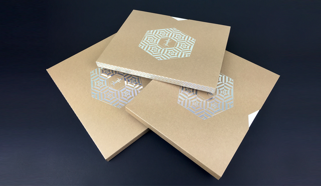
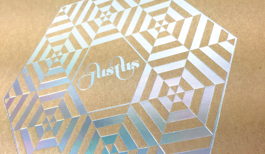
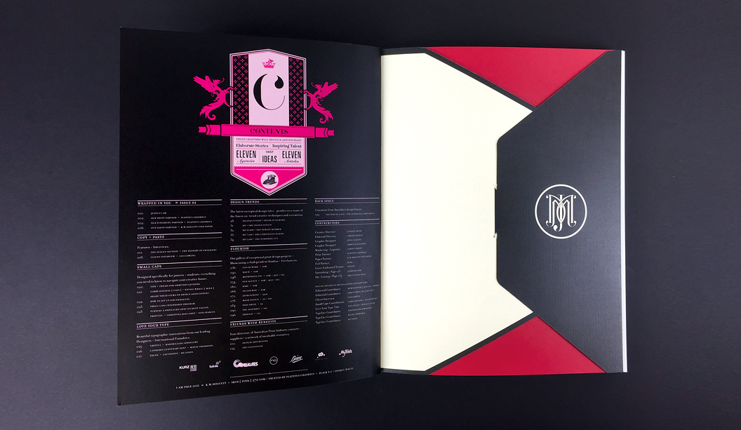
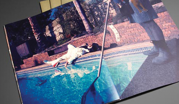
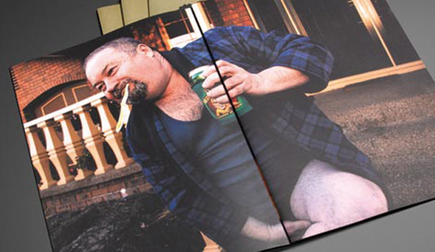
Justus issue 4 is about to hit the streets and we’re super excited to say it features a knockout selection of our finest fine papers. It’s like our paper dreams have come true.
With unlimited access to print and embellishment techniques, the Justus story starts with a Tafeda embossed Buffalo Board slip case, followed by a pearl ‘snowflake’ like foil on Wild paper. Opening the first pages, it shows UV printing on Strathmore Super Smooth and then it rolls on from there. Spot colours, copper foils, a silver reflectakote, French folds, die cuts and more. There is definitely nothing minimalist about Justus issue 4. More is more.
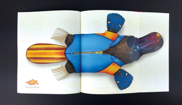
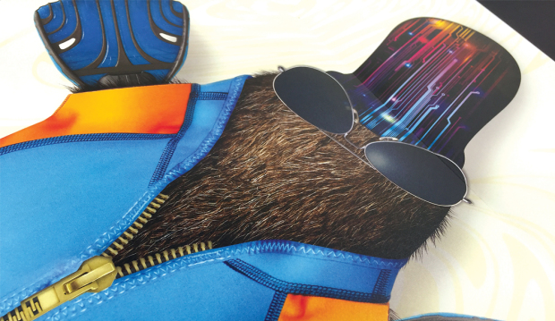
Designed and edited by Lindsay Smith of Eleven Eleven design, Justus Magazine is created to celebrate (and show off), the talent within the Australian print, paper and design industry. It is made by us, for us. Just us. Issue 4 ‘Wrapped in you’ has a central theme of packaging and is printed by Platypus Graphics. Based in Brisbane these guys run a slick operation and their skill as printers, foilers and finishers is clear to see. I addition, there’s also a special HP Indigo section which highlights what these new machines can do and how our paper responds to the new digital techniques.
Your K.W.Doggett Fine Paper specialist has a copy to show you in their next studio visit but if you can’t wait til then, log on to Justus and subscribe for yourself. We look forward to bringing this beauty to market soon.
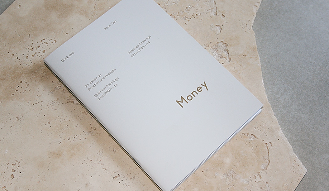
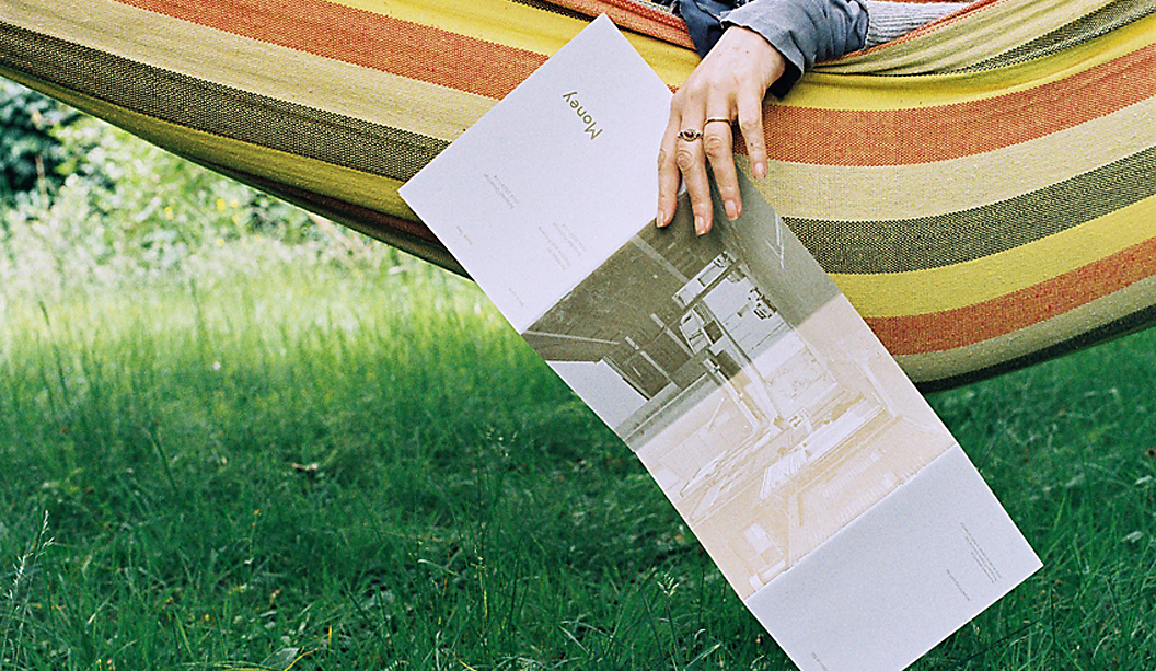
Title:James Money Monograph
Agency:Studio Constantine (VIC)Client:James Money, Artist
Stocks: Kaskad Sparrow Grey,Grange Offset, HannoArt Satin
Printing specs: Offset printed, Pantone 871 and duotonePrinted by:Adams Print (VIC)
So many songs and puns we’d like to share about ‘money’ right now but alas, it’s not the point of this post. We refer here to James Money, an accomplished Australian artist and Archibald finalist. To launch into the Hong Kong art market during Art Basel/HK 2014, he collaborated with Studio Constantine to create a limited edition monograph of his work. The outcome is this simple and elegant A5 piece printed on Kaskad Sparrow Grey, Grange Offset and HannoArt Satin.Money (we just have to keep using his surname, it’s so great!) is an award winning artist. He works in both portraiture and landscape, exploring themes of isolation. His work appears in private collections around Australia and New York. Studio Constantine worked on all the stages – planning, documenting, editing and production. As David Constantine explains, they were keen to: “Use a format that led readers through the work and articulated the different genres. The layout and typography was deliberately restrained, although quietly assertive in scale.”
So we now have this little A5 beauty to feast our eyes on. A double-spined, concertina fold cover printed with Pantone 871 on the Kaskad with two different text paper stocks – a coated sheet for the painted work (HannoArt Satin) and an uncoated sheet (Grange Offset) with a custom duotone for James’ pen and ink drawings. Dee-lightful.
Documentary images by SC & Flore Diamant.
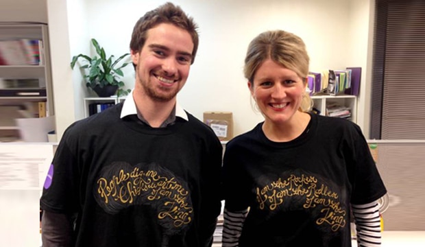
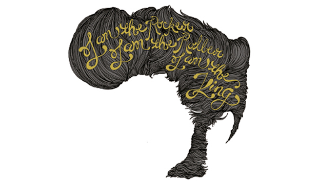
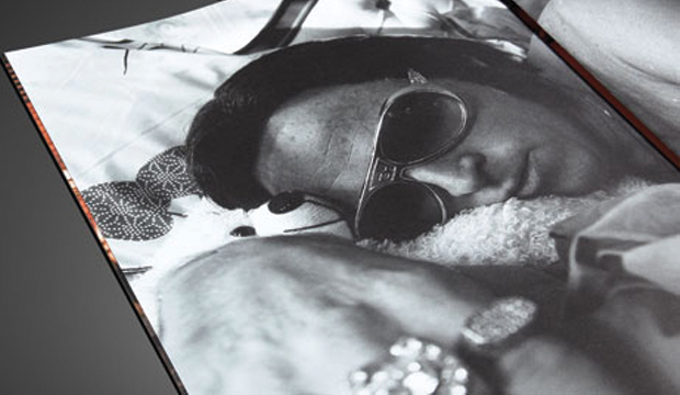
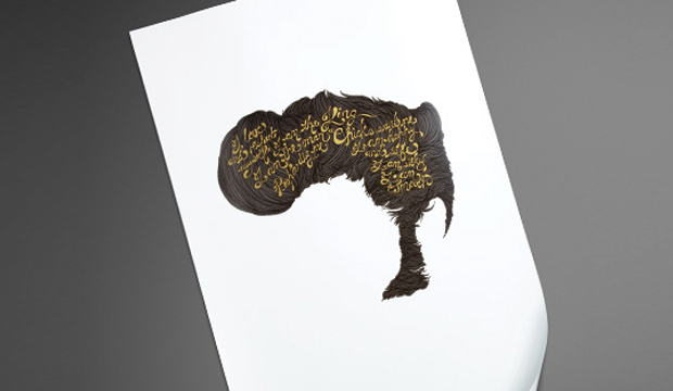
If you’re one of our print customers you may well be rocking out in one of these Sovereign A2 tees. Moons ago, we released this hair graphic and thought hey, why not bring it back and plonk it on a t-shirt for something fun. The slick, bouffant locks belong to our brand ambassador for Sovereign A2, Elvis ‘THE KING’ of coated paper. Wear them with pride friends, they’ll be collectors editions soon! Ha ha. Send us a pic of your noggin in one of these if you happen to own one. Or better still, post it on our Facebook page.
Matt is wearing the motif that says: ‘People dig me, chicks want me, I am the King’. Emma’s t-shirt reads: ‘I am the rocker, I am the roller, I am the King’.
Stocks: Sovereign A2 – Gloss / Sovereign A2 – Silk / Sovereign A2 Digital – Gloss / Sovereign A2 Digital – Silk
Title:McClelland Sculpture Gallery exhibition books
Agency: David Lancashire Design
Stocks:Barry Bleach Board / Grange Offset / HannoArt – SatinPrinted by:Mercedes Waratah (VIC)
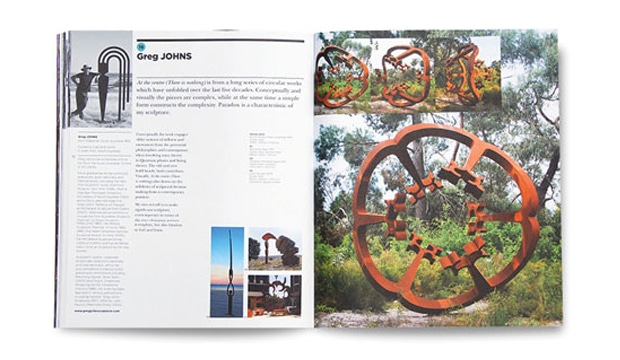
Renowned for its outstanding collection of outdoor sculptures and innovative exhibition programs, McClleland Gallery and Sculpture Park is located within 16 hectares of bush and landscaped gardens on the Mornington Peninsula in Victoria. David Lancashire Design (DLD) in Melbourne have worked with the gallery since 2006 and more recently, they’ve been busy designing and art directing the exhibition catalogues and print collateral using HannoArt – Satin and Grange Offset as their chosen stocks.
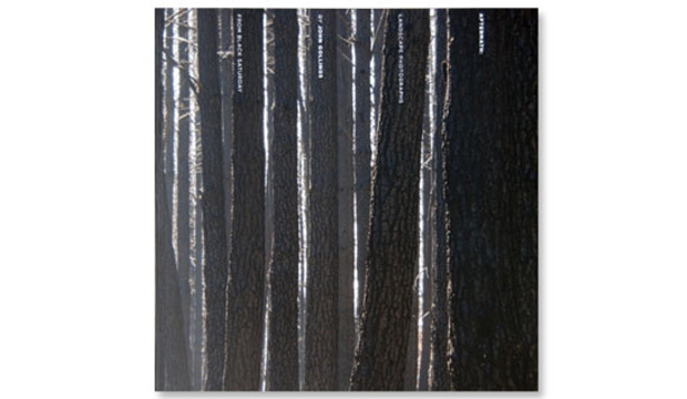
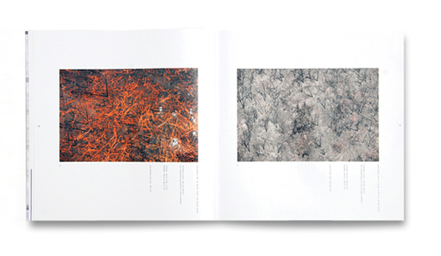
DLD work closely with both curators and artists when producing a full colour catalogue for each new exhibition. McClelland like to push the boundaries which allows DLD more creative freedom. They recently re-freshed the brand, creating a more dynamic, modern look across all print collateral, including brochures, event calendars and exhibition invitations. The suite of catalogues designed differ greatly, along with the subjects and styles within, but maintain an overall identity for the gallery. David Lancashire mentions: “Art direction and using a great photographer like John Gollings, as well as a good printer and choosing the right paper, all contribute to the reproduction of the artwork and a great end result.” We couldn’t agree more!
DLD enjoys using HannoArt – Satin for its great printability, cost effectiveness and colour reproduction. Stephanie Mulder, Graphic Designer from DLD explains why. “We’ve found that HannoArt – Satin consistently produces great results, especially important when reproducing artwork. Another bonus is the stock’s environmental credentials, as the studio is always aware of trying to encourage the use of sustainable practice.”
DLD have also introduced uncoated paper Grange Offset to contrast with the coated stock. The Sculpture Survey & Award 2012, 18 November 2012 – 14 July 2013 catalogue includes this sheet, chosen for its colour reproduction, ability to hold crisp detail, tactility and bulkiness. The identity and format for this catalogue required special treatment and stock selection to make it stand apart as the event is one of Australia’s most important outdoor sculpture exhibitions. In other words – it’s a big deal!
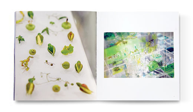
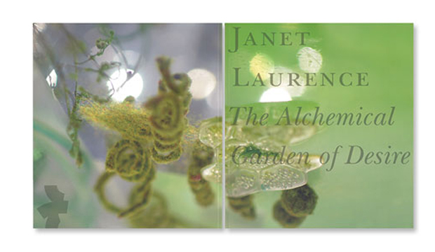
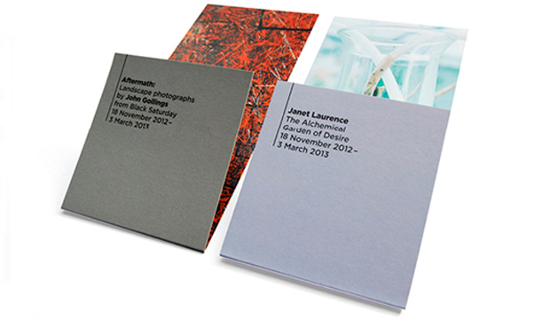
Janet Laurence: The Alchemical Garden of Desire 18 November 2012 – 3 March 2013 and Aftermath: Landscape Photographs by John Gollings from Black Saturday 18 November 2012 – 3 March 2013 (both sewn and burst bound, with matt cello on the cover) are printed on HannoArt Satin and make up the suite of new designs.
And for the exhibition invitations, the gallery now uses Barry Bleach Board 210gsm (with a gloss aqueous varnish on one side to make the colours pop and enhance the image detail) so the receiver has something more interesting to look at when the invite comes in the mail.
As a whole, we really dig this new design direction. Makes for an enticing reason to drive down to Mornington. Road trip anyone?
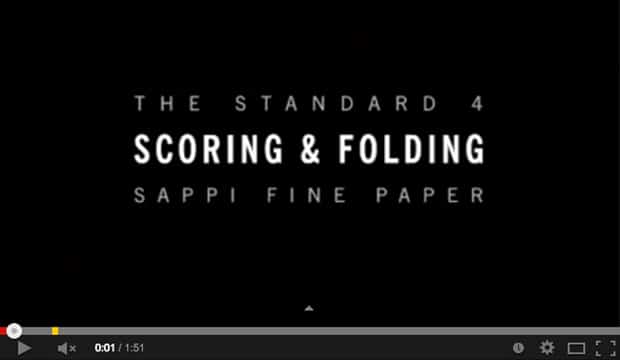
This awesome video is from Sappi Fine Papers, the manufacturers of our HannoArt Gloss and Satin papers. Who knew scoring and folding could create such interesting results! Guest speakers Kit Hinrichs, founder of Studio Hinrichs, and Trish Witkowski, chief folding fanatic at the online community foldfactory.com, open our eyes to the scoring and folding possibilities.
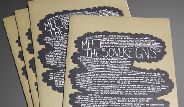
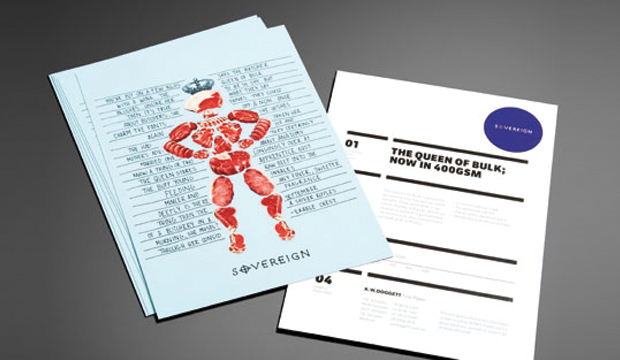
Title: Meet the Sovereigns
Agency: Three60Client: K.W.Doggett Fine Paper
Stocks: Sovereign A2 – Gloss / Sovereign A2 – Silk / Sovereign Hi-Bulk Art Board / Sovereign OffsetPrinted by: Southern Colour
A day in the life of a unique Aussie family…
Jack is an early riser and he wastes no time getting stuck into the day’s work. The Queen’s day begins with a trip to the local butcher. The King’s daily ritual is grooming himself until it’s show time. He wakes up, has a shower and works on his tan for a few hours. The Queen returns, Jack cooks up a BBQ and the royal family sit down to lunch.
This humorous new promotion plays up the characters of the Sovereign family, with each member corresponding to one of our best loved papers:
Sovereign Offset is shown as the Jack of all trades, no job is too big or too small, he gets the job done every time.
Sovereign A2 is The King, the real performer. He’s been selling strong for 32 years and is well loved by printers and designers alike.
And the Queen represents the heavy weight strength and durability of our Sovereign Hi-Bulk Art Board… guaranteed to outmuscle any competitor.
The Sovereign Family represents our best brands for performance, price and reliability. To see the Sovereigns in action for yourself, simply contact our sample department for your copy of the book.
 Footy Tips