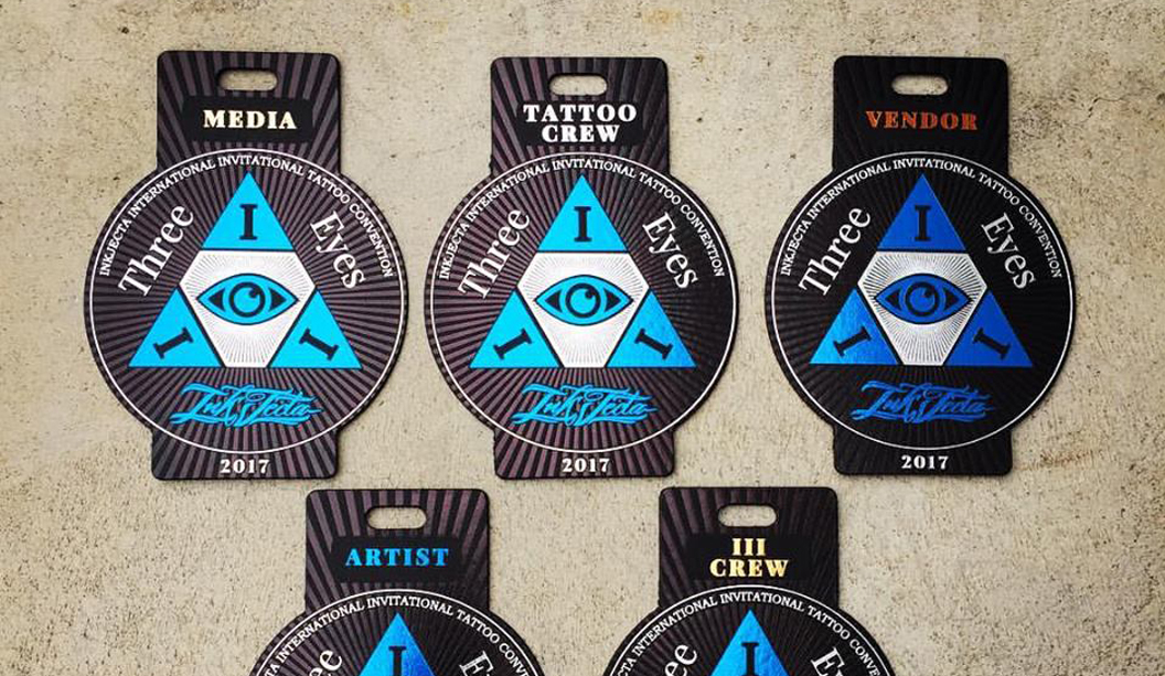
Footy Tips
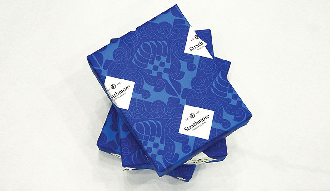
The final issue of BJ Ball New Zealand’s GSM covers a great story about the making of our brand. Designed by Sydney agency For The People, the task was not an easy one! Merging two prominent companies in the same industry and creating a new story, was a big task.
———————-
Mid-2017, two of the largest commercial print supply merchants in Australia merged; K.W. Doggett and BJ Ball—became Ball & Doggett. The merging of these two industry heavyweights was always going to present significant opportunities. One such opportunity was brand.
Historically, both entities have had their own stories to tell and legacies on which to draw. K.W. Doggett takes its name from the Doggett family who founded the company in the late 1960s. BJ Ball has been supplying paper in New Zealand for nearly 100 years, before moving into the Australian market in recent decades. But as the saying goes, ‘the past is the past, the future belongs to now’. And that future is Ball & Doggett.
GSM caught up with Jason Little, Creative Director and co-founder of Sydney-based For The People, AGDA Studio of the Year (2016)—to talk about paper, brand and everyone being on the same page.
GSM: How did you come to work with Ball & Doggett on the project?
JL: Getting to work on a project like this was quite fortuitous, but it’s equally an outcome of good relationships over time. Working in Australia since 2002, I’ve had my fair share
of print projects, and over those years developed some good working relationships with some lovely and helpful people at BJ Ball. During my stint as AGDA NSW Chairman a few years back, I began working even more closely with BJ Ball to support their needs as a sponsor. When I began For The People, Tony Bertrand at BJ Ball was very supportive, and gave us one of our first projects—The Mohawk Show.The relationship has been stronger ever since. After a proposal submission, discussions with representatives from both companies—Catherine Doggett & Tony Bertrand, we received the job.
GSM: Run us through the thought process behind the project.
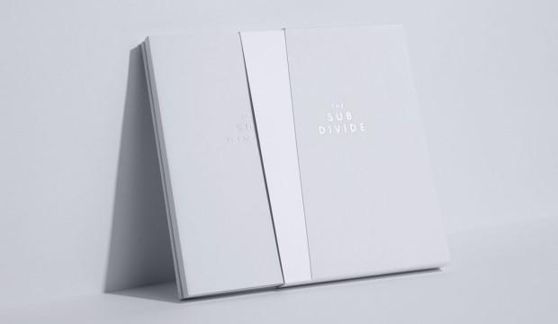
JL: Working in print has changed. The traditional paper industry has had to shift its thinking, and start looking at new avenues for growth. BJ Ball & KW Doggett know this, and have been working hard to adapt to the ever-changing needs of customers, staff, and the industry itself. In mid 2017 they joined forces as part of a merger to form the largest commercial print supply company in the Australian market, Ball & Doggett. This was big news and a big change for the Australian industry, which was essentially bringing two of the three largest players together. When the brief for this project arrived, there was an obvious enthusiasm from the studio. We assembled the team: Amanda, James, Liv, Damian, Sunil, Ed and myself. We worked through a rapid immersion in the businesses, research and intensive engagement with the people of both companies, the products, and a diverse array of clients and customers. A vast amount of interviews, site visits with impromptu conversations and desk research allowed us to really observe the strengths, cultures and ambitions of both businesses. From here we were able to formulate some hypotheses about the newly merged company and where it could potentially position itself.The final objective of this project was to build a brand for the newly named Ball & Doggett (the name was also part of the process), that was not only true to the two businesses and the people, but also one that sets a bold vision for its future. We needed to present back a strong point of view on what that vision could be; how the new direction could consolidate their ambitions and help them drive the business forward, whilst connecting with its highly diversified clients.
GSM: How did you come up with the new Ball & Doggett identity? What is it about?
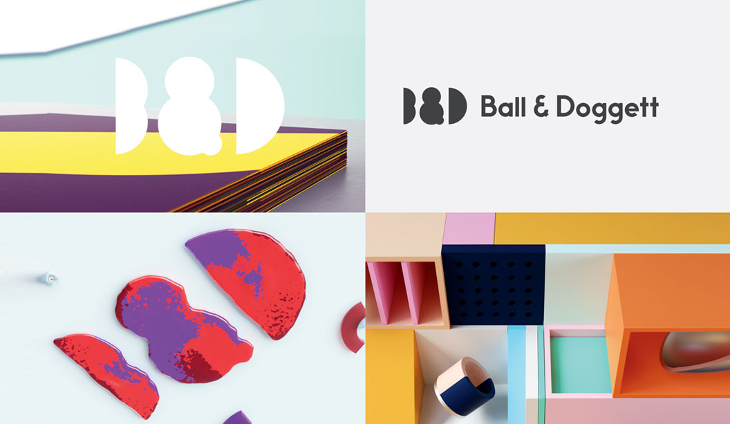
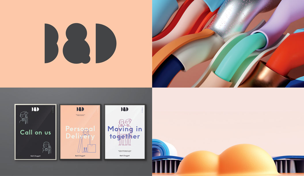
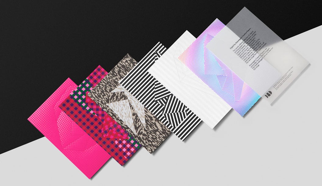
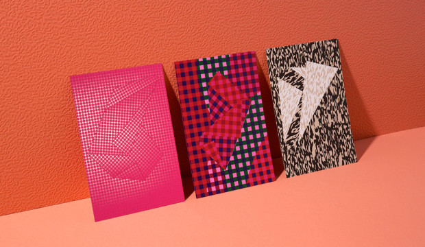
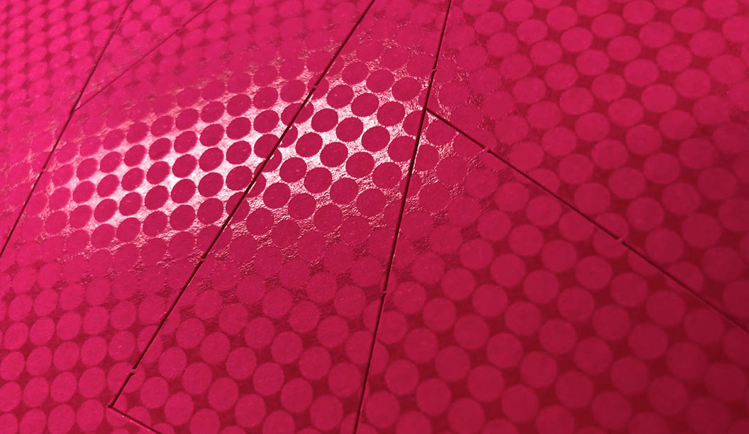
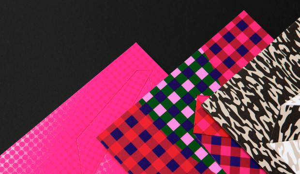
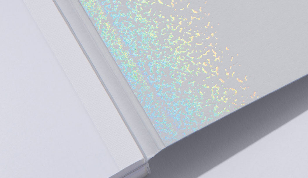
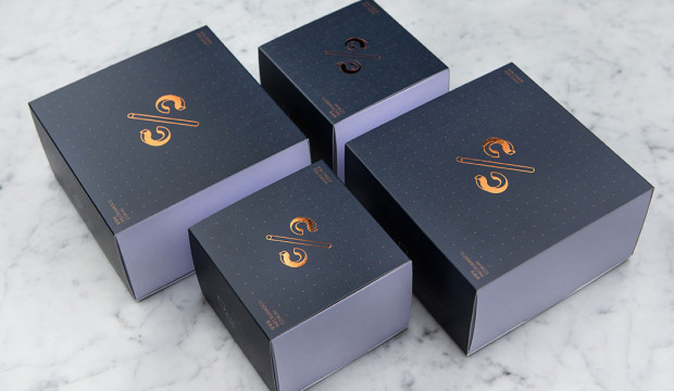
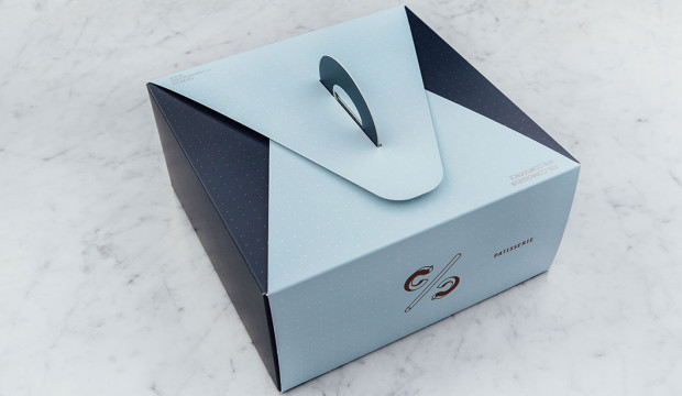
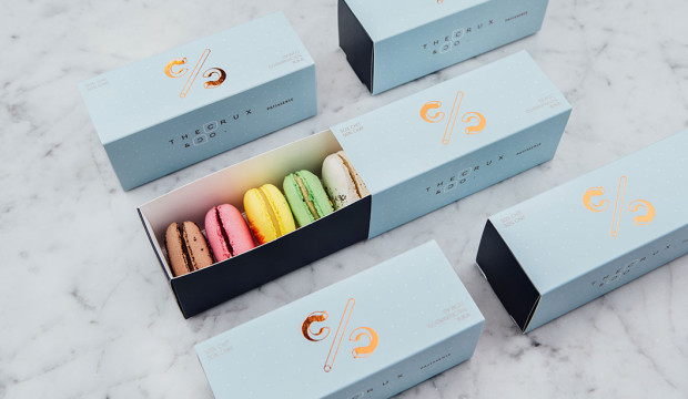
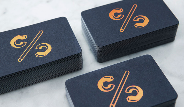
JL: The merger was as an opportunity to build a new identity that better reflected the true nature of the business—that of a highlydiversified, innovative company that supplies every material associated with the print and production supply chain. It needed to move beyond the perception of a paper merchant stuck in the past, and really start to show how the company fits into the digital ecosystem of today. The diverse set of customers meant that the identity needed to flex in tone whist maintaining a coherent story.We were very conscious of trying to show the company’s knowledge, passion and enthusiasm for their products and the relationships they’ve built with clients.
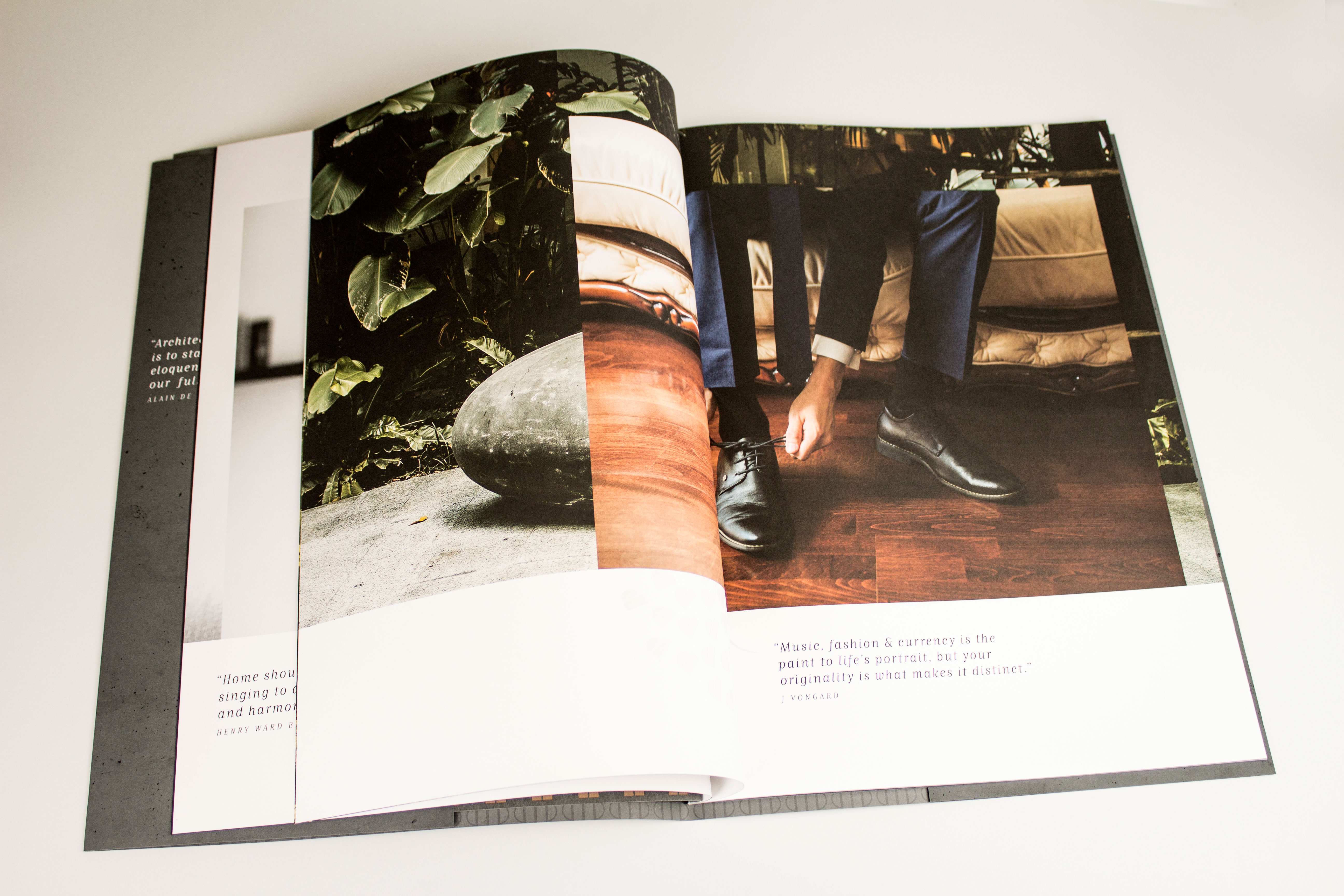
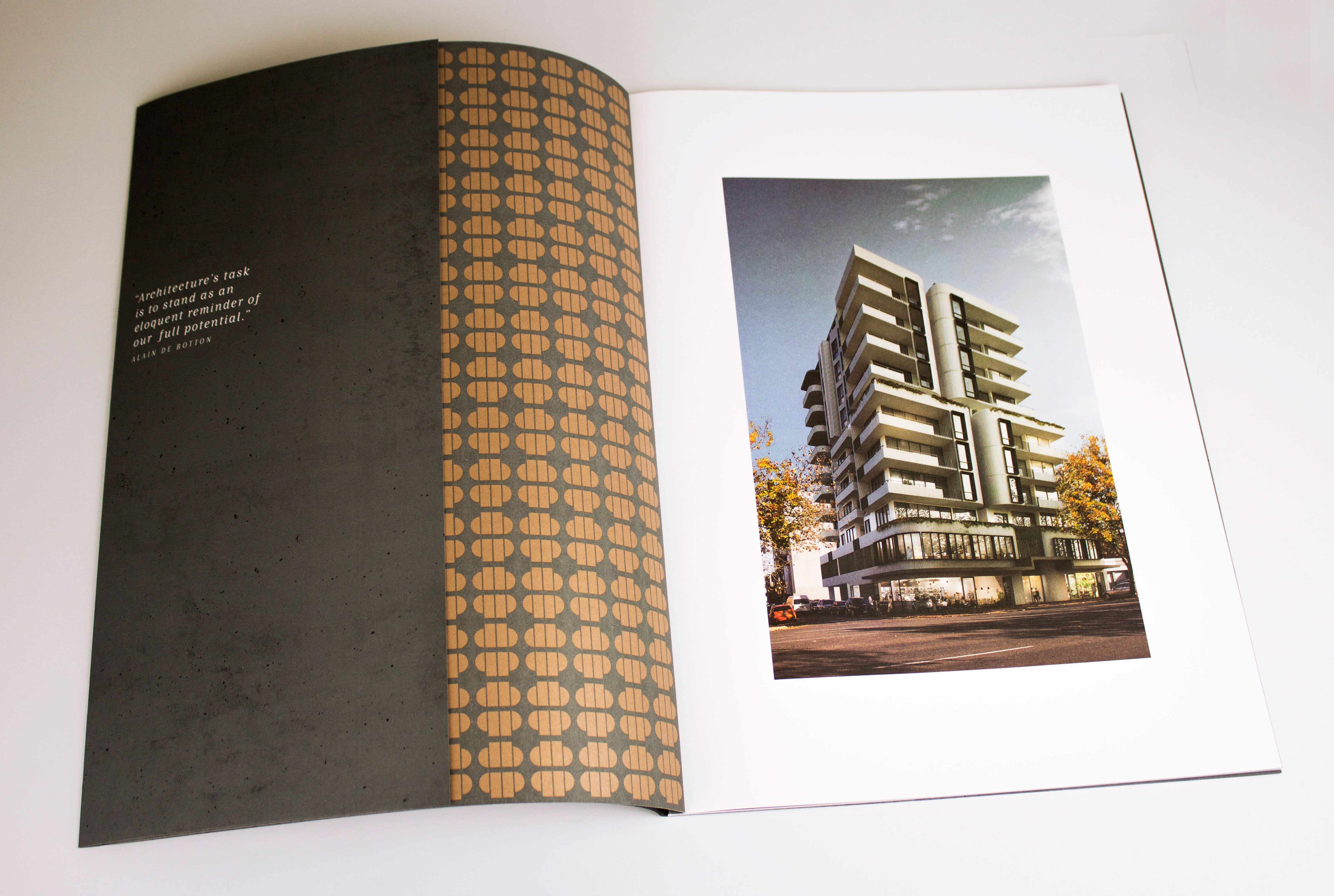
Testing paper weight, mixing ink and polishing foil were some we put through the lens of Willy Wonka and the materials factory, where thingsare never ordinary. And so the brand began to take shape from there.
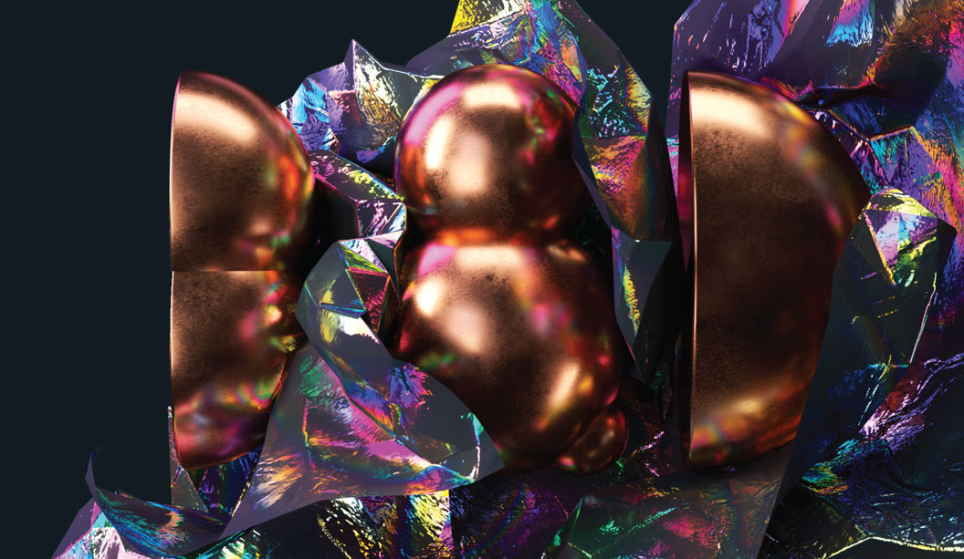
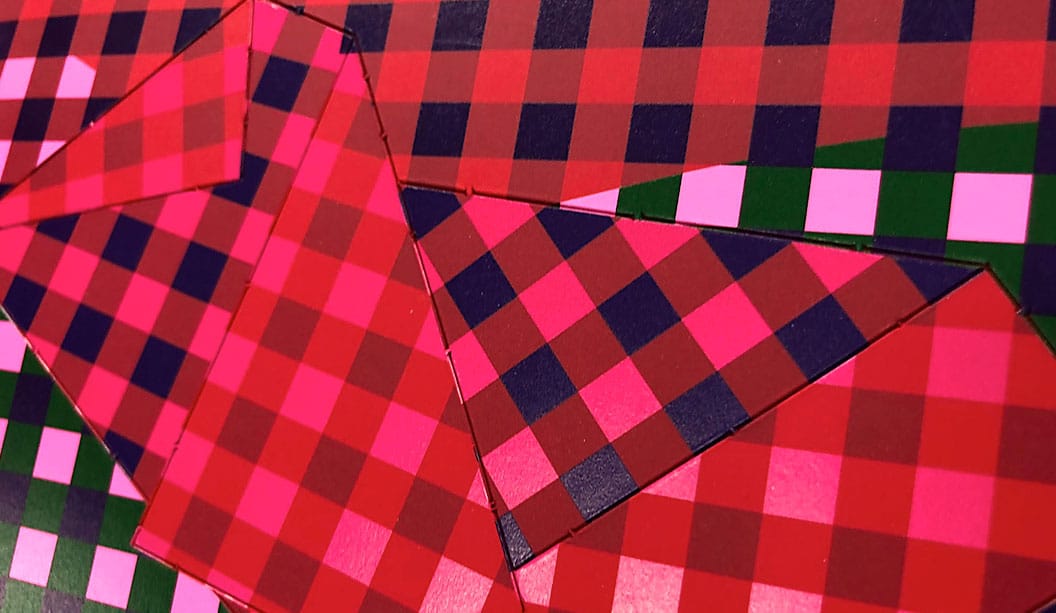
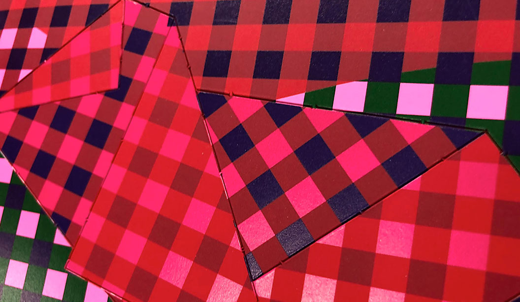
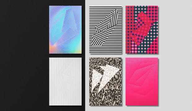
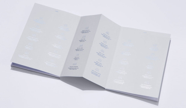
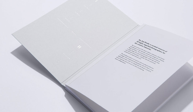
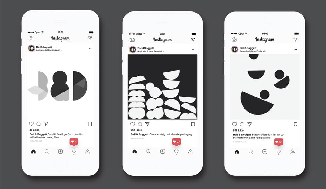
The simplified letterforms of the brandmark enable it to demonstrate various behaviours and material properties. This was coupled with the imagined weird and wonderful manufacturing processes to show the joy in all materials. When it came to anything printed, materials are pushed to the front in applications. This meant toning down or straight up avoiding excessive graphics, and instead leaning more towards utility of information, simplified typography and a focus on making the materials do all the talking. The material is the central piece—its colour, texture, smell, weight, and so on, and every piece of design is there to support it, not distract from it.Understanding the need to tell a human story, we also worked with illustrator Deborah Ho to create a series of character illustrations to reflect the people of Ball & Doggett. These are then used for navigation and informative elements online, and across internal communications to facilitate the merger transition.
GSM: You worked in a highly collaborative and transparent way with Ball & Doggett—can you elaborate on this approach?
JL: We’ve been working in a completely open and transparent partnership with clients since we began the studio three years ago. It has meant that there are little, or no, secrets. From the start, we really try to immerse ourselves in the project, and the client’s business, whilst intensively engaging with the client team. From there, everything is shared and communicated almost daily. We really throw ourselves head first, and look to work through a shared commitment and authorship.
There is a constant conversation: thoughts and progress are shared through Slack, lo-fi videos of internal discussion and developments are recorded and uploaded, there are regular phone and Skype chats, there are face-to-face meetings
to share the larger milestones of the project with a wider group. Essentially, the evolving process of our thinking is seen, shared and discussed throughout the process.
One particular instance of this was for a critical meeting to share our creative concept. It involved the team standing around a wall in our studio, iPhone in hand, with Catherine Doggett on Skype, at the other end. The video discussion bounced around from talking to the screen, to pointing the phone at stuff on the walls, moving in closer to show specific details or information, and then back to me or a member of the team. It was presenting the main creative idea in its early and imperfect iteration. However, it was building on prior ad-hoc conversations we’d been having, so was less of a ta-da moment and more of a thought share. This kind of loose chat is typical. It’s not for everybody, but for most of our clients it works. There is no pretence or formality once the project gets going. We’re all in it together trying to find the best outcome, and it makes the process far more enjoyable.
GSM: What challenges did you face while working on the project?
JL: This is an enviable project to work on—ensuring it delivers on the needs of the organisation and its people, whilst delivering a good creative result, is probably the main one.There were obvious concerns about a potential convoluted decision-making process, but this never materialised—it was a very straightforward process, we were working closely with the decision makers, and consensus was easily achieved on the work. We hit a brick wall for a period during the design sprint, where we had some issues in crafting the identity so that it could showcase the material properties. We finally cracked it once we brought a level of simplicity to the logo. This allowed us to go further in execution through the 2D and 3D work.
GSM: Where is the identity at and what’s next?
JL: The brand is still very new to the market. We’ve developed the core parts of the identity and developed the design intent for a number of areas. We’ve created 3D illustrations and animations with some cracking animators, Dominik Grejc and Georgiy Kuznetsov, for use online and in marketing publications. Various pieces of print and digital communications are being worked on by the B&D team, The Company You Keep, and ourselves. We’ll be looking to build out and shoot some of the material testing experiments when the opportunity presents itself further down the track.As Ball & Doggett look to the future, this new brand gives them the flexibility to adapt and develop in untapped markets, create new tools for their customers, and stay relevant as the market changes. I’d anticipate further collaborations, with great designers and studios, to interpret the branding and help it live up to the ambitions I have for it.
GSM would just like to clarify for our Kiwi readers that Ball & Doggett is the Australian entity for BJ Ball. In New Zealand the company remains known as BJ Ball. Thanks.