VoPP Pantone Queen case study

BACKGROUND:

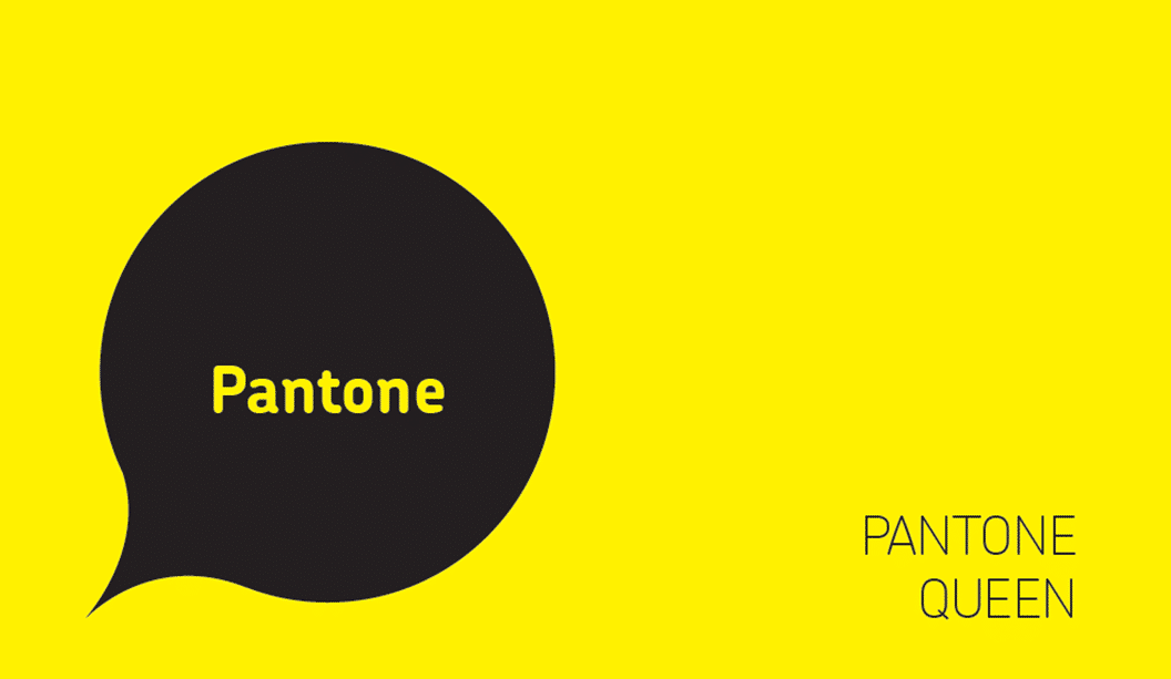
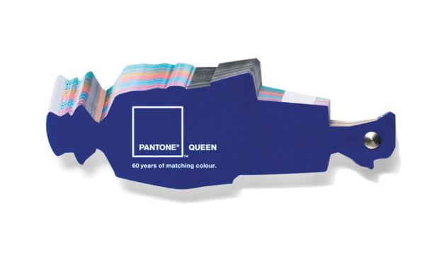
To celebrate Queen Elizabeth II’s Diamond Jubilee, Pantone created a Queen shaped colour guide. To ensure maximum exposure and engagement, they used direct mail.

Rather than targeting creative directors or design agencies with a mass direct mail campaign, Pantone targeted media publications and bloggers in order to attract a huge amount of PR. This strategy also ensured the resulting social media hype, which grew the campaign’s awareness exponentially. In doing so, Pantone extended the reach of the campaign far beyond that of an ordinary direct mailer.


OBJECTIVE:

Pantone worked with design agency Leo Burnett London in order to create a unique piece of memorabilia that celebrated the Diamond Jubilee as well as grab the attention of new and existing customers in a way that was both original and surprising. Pantone has been the definitive authority on colour within the printing industry for decades, and the omnipresence of their iconic swatch books in design studios worldwide has been a source of inspiration for generations. To remind their target audience of the capabilities of their colour matching system, Pantone decided to colour match a variety of the Queen’s most famous monochromatic outfits worn throughout the 60 years of her reign.

Pantone-Queen-1


“Building true brand engagement is about creating dialogue. Don’t consider direct mail or email or web in isolation, but consider the right combination to achieve the best response” 

Kevin Slatter, Director of Data & Analytics at Geometry Global

METHOD: 

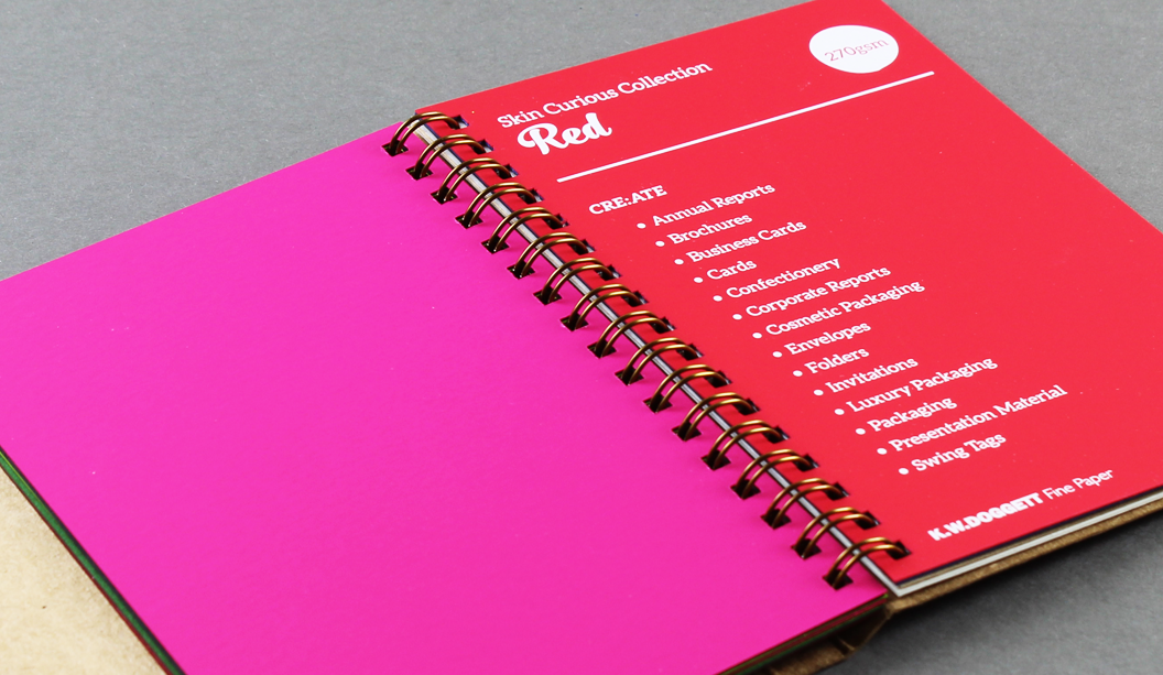
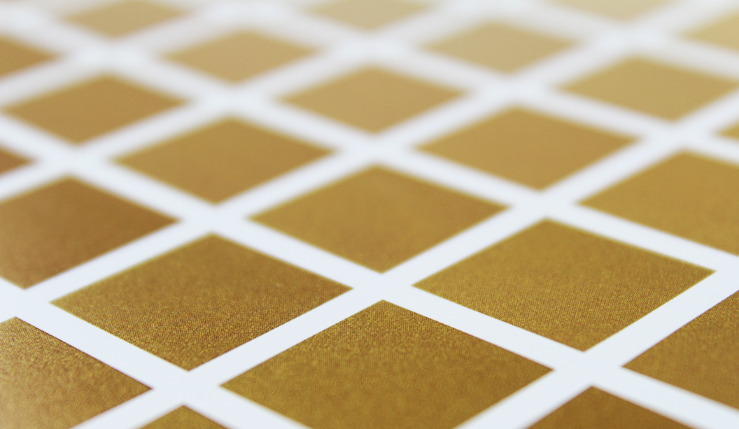
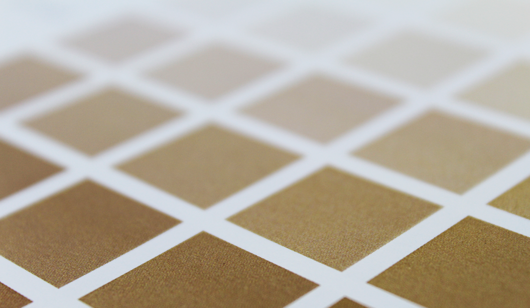
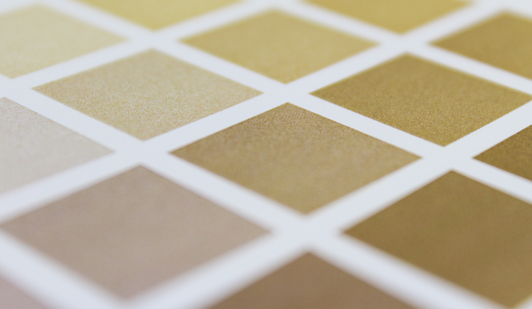
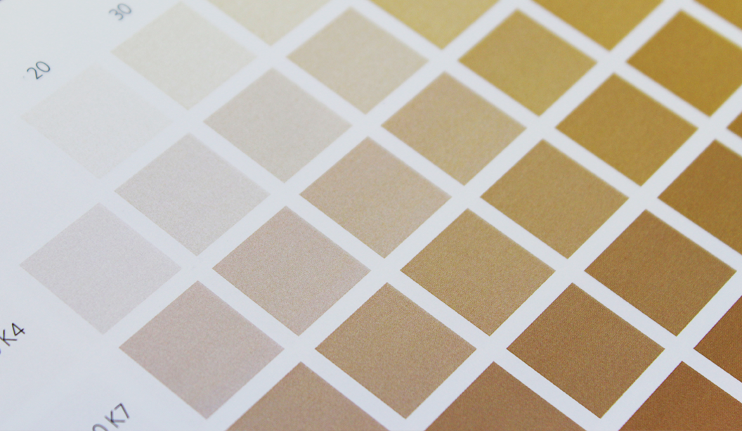
A limited edition queen-shaped swatch book was created with each outfit painstakingly matched by Pantone’s colour expert technicians to the exact Pantone reference, date and location where each was worn. Each of the 60 cards in the spiral guide shows Queen Elizabeth II in the same formal suit with only the colour changing.

Leo Burnett approached Buckingham Palace with the concept which was so well received it was made an official piece of Diamond Jubilee memorabilia and became royally endorsed. An ultra-short run of 60 copies were produced and sent out to a highly targeted mailing list consisting of media publications including magazines and newspapers, influential design bloggers and prominent designers.


Pantone-Queen-2


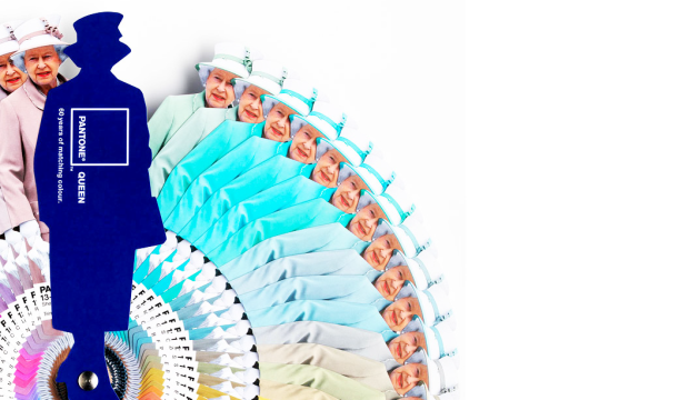
“Our 7 colour HP Indichrome Pantone emulation process was capable of matching all 60 colours, exactly. From Primrose yellow to Lilac Snow, the palette subtly evolves yet always regal” 

Precision Printing

RESULTS: 

Within 24 hours the campaign had been written about in over 1.2 million website and blogs with #pantonequeen trending on Twitter. Numerous design publications also covered the innovative direct mailer which ensured it had maximum publicity with a targeted audience of existing and potential Pantone customers. Since Pantone only produced a small run for the Direct Mail campaign, printing and shipping fees were kept to an absolute minimum, translating into an incredible return on investment.


CONCLUSION: 

The Pantone Queen is a great example of how brands can combine the power of print and direct mail with the mass reach of online media. By targeting media publications and bloggers instead of customers, Pantone were able to extend the reach of its campaign far beyond what they could have expected to achieve with an ordinary direct mailer.

Direct mail continues to play a significant role in the marketing mix, offering more personally relevant content to customers and converting brand awareness into action. Creative Direct Mail, such as the Pantone Queen, has the ability to create a lot of online buzz and pushes the message out to a far greater audience.

Direct mail and online media, particularly social media, should be considered complimentary mediums as they greatly improve the effectiveness and reach of campaigns when used in conjunction. Direct mail is personal and more engaging whilst social media such as Facebook, Twitter and blogs offer a better platform for discussion and mass reach. Integrating the two mediums is a logical step for any brand to strive for as it reflects the multi-channel world in which we all consume content in.


VoPP_3

Thanks to Kellie Northwood, Executive Director of VoPP/Two Sides Australia for allowing us to republish this case study, made available to us as Foundation Sponsors of TSA Limited, the publishers of the VoPP (Value of Paper and Print) report. Find out more via www.valueofpaperandprint.com.au.


Pentagram’s Abbott Miller designs Dance Ink magazine (again!)

Not sure when the last time was that we (ok maybe just some of us), got THIS excited about a magazine being launched, or in this case, relaunched. So just imagine the excitement of all the lovers of dance, photography and design out there when niche publication Dance Ink was brought back from the publishing graveyard!

The magazine acts as an alternative performance space for dance. Originally published from 1989-1996, the quarterly performing arts journal is pretty unique. The dance works you see beautifully photographed on the pages are, we kid you not, specifically commissioned just for the magazine. What a concept! The cover of the first issue of the new Dance Ink features Silas Riener performing Merce Cunningham’s ‘Changeling’ which is a bit of a homage to the amazing performer.

Published by Patsy Tarr and designed and edited by Abbott Miller from Pentagram, both taking up their original roles (ah-mazing), Dance Ink has literally picked up where the last one left off. What could be a more perfect quote for the relaunched mag which appears in the first few pages from Merce Cunningham himself: “We begin again.” From what we’ve read on Pentagram’s blog, this time in history is shaping up to be: “…something of a renaissance in independent magazine publishing.” And it’s given them a primo opportunity to experiment with print.

dance1dance4

dance7

As noted on the Pentagram blog: “The new issue returns to the original premise of creating a unique and enduring stage for dance, using great photography, powerful design and the beauty of high-quality printing.” Printed offset, the mag is housed in a clear sleeve and throughout the pages, the design plays with the effect of transparency of ink on the page.


dance5


dance3

The other super cool thing is the mag has totally moved with the times. Yes it’s available in print form, but the publishers have also experimented with different formats eg you can also purchase large scale posters with every issue, a custom mural for a wall and videos were created as well. So print and wide format too. Raddy McRad. The new issue of Dance Ink has a print run of only 500 copies and can be purchased online at 2wice.org.


dance10


dance9

Thank you to Pentagram for allowing us to repost this story. We love your work! Get yourself over to their blog for a more in depth look at this issue of Dance Ink. It’s well worth it.

dance2

dance6

dance8

Five hacks when printing photographic images on uncoated paper

1. Perform ‘Under Colour Removal’ (UCR) on your files.
Under Colour removal (UCR) is a process whereby you eliminate overlapping yellow, magenta and cyan that would normally add to a dark neutral (black) and replace it with black ink only ie a ‘Full Black’. This is done during the colour separation process. Replace the coloured inks with black in shadowy or neutral areas to reduce the risk of mottling or a muddy look which can happen with excessive ink coverage.

2. Use the right colour profile.
Start with your images in RGB then convert to CMYK uncoated profile. Domestic printers work with CMYK and are therefore able to create a narrower range of colours.

3. Choose the right paper to match your imagery.
We know, we know, it seems so obvious but sometimes it’s still not considered. When reviewing your proofs, keep the shade of paper you’re actually printing on in mind eg if using a creamy white paper you may want to reduce the yellow (especially with skin tones). With a blue white paper you might want to take out some cyan. Proofs are often on a coated paper so consider this too. Best papers to use if printing lots of photography with skin tones is all papers really, but these kinds of images really lend themselves to blue-white uncoated papers.

4. Ask to see samples.
We have loads of samples on-hand. Some with specials, embellishments, specialty covers etc and if we don’t have it, we’ll find it! Let your paper specialist know the desired result you want and they’ll work backwards with you to find the best paper and print method. They really know their stuff when it comes to matching paper with imagery.

5. Print production is key.
This involves preparing the files as mentioned, checking the proof and also making sure that when on press, you consider some things eg you can make minor adjustments to colour and density but mostly this should be done in the pre press stage. And most importantly, allow for dry back. When on press, approve the sheet that comes off and then ensure you allow for dry back, so increase the ink pressure by about 10%.

Knight-4

Photograph-Knight-1

Knight-3

Photograph-Knight-2

VoPP Community Bonding Case Study


CASE STUDY 1:
Ogilvy Brazil & Life Support Group: ‘This Poster is HIV Positive’

Agency Ogilvy Brazil partnered with organisation Life Support Group to deliver a consumer education and awareness campaign in São Paulo, Brazil.

OBJECTIVE:
The campaign set out to break down the stigma and confusion surrounding HIV/AIDS and how the virus is transmitted.

METHODOLOGY:
Posters were created that contained 1 drop of blood from an HIV positive individual and distributed throughout São Paulo. The text on the posters read, “My measurements are 40 by 60 centimetres. I was printed on high brightness paper. And my weight is 250 grams. I’m just like any other poster. Except for one thing: I’m HIV positive.. I’m living with the virus. At this point you may be taking a step back, wondering if I offer any danger.”

RESULTS:
The campaign was effective at educating readers that HIV can’t survive for more than an hour outside the human body, so like the poster, HIV positive individuals are completely harmless. The campaign provided highly emotional responses from the public, with some touching and even kissing the poster after reading it, proving that the message was received and the misinformation was corrected.

“The poster humanizes the problem and brings people together for the cause, showing that it’s possible to live in a prejudice-free society.”

Aricio Fortes, Ogilvy Brazil’s Chief Creative Officer

VOPP-Image-Community-Spirit-1

CASE STUDY 2:
New Zealand Rugby Union & Adidas: ‘Bonded by Blood’

The New Zealand Rugby Union partnered with Adidas New Zealand to produce a campaign that exemplified how supporting the All Black players is in New Zealand’s DNA.

OBJECTIVE:
To create a poster that reflects the unwavering depth of support from All Blacks fans, as part of Adidas New Zealand’s annual limited-edition posters.

METHODOLOGY:
All Blacks players each donated a sample of blood that was combined with ink to produce 8000 special edition posters. The digitally imposed posters featured the All Blacks team performing the haka in Fiordland National Park. Slogans such as “Stand in black. It’s in our blood” and “Rugby. It runs through your veins” were used in the campaign. These ‘Bonded by Blood’ edition posters came with a certificate of authentication and given to those fans who purchased an All Blacks jersey.

RESULTS:
The posters were very well received within the community, achieving the goal of enhancing national pride and connection with the All Blacks team. This campaign allowed the All Blacks to acknowledge the depth of support received by fans over the years, and cultivate a strong sense of community.

“Adidas believes rugby is an essential part of New Zealand’s DNA and we wanted to show how the players and their supporters are inextricably linked – how supporting the All Blacks is in our blood.”
Craig Waugh, Adidas New Zealand’s Marketing Manager

VOPP-Image-Community-Spirit-2-wide

CONCLUSION:
Both of these campaigns are excellent examples of how companies are pushing the limits with print, yielding results. Incorporating blood into the posters ink created a strong tangible and sensory experience, forging a deeper emotional response to the campaigns. Thus generating both a memorable and impactful experience. Using print media to appeal and relate to consumer’s senses proves much more effective than just using images and text to get the message across. Print allows brands to communicate their values and message in a highly engaging and emotional manner.

VoPP_3

Thanks to Kellie Northwood, Executive Director of VoPP/Two Sides Australia for allowing us to republish this case study, made available to us as Foundation Sponsors of TSA Limited, the publishers of the VoPP (Value of Paper and Print) report. Find out more via www.valueofpaperandprint.com.au.

A raised or ‘multi-level’ emboss is next level

In our latest Knight campaign, we used a variety of print techniques. One of the most simple is the multi level or ‘raised’ emboss. A slightly different take on your standard emboss technique.
What is a raised emboss?

A raised or multi level emboss means the image or type area is raised to multiple levels to create a 3D type effect and in this case, with different depths.

What other kinds of embossing are there?
There is also blind embossing where you emboss the paper and leave it ‘as is’. The other option is to fill the indentation with ink or foil. You can also sculpt the die to have a bevelled edge which looks really good.

So it’s not a deboss?
That’s right, it’s not. A deboss means the surface is depressed instead of a raised impression which is what happens with embossing. So you inprint the image or type by pushing it into the paper (with embossing the impression is made from underneath).

Is it an expensive embellishment technique?
It can be pricey, depending on the area you want to embellish. The money is in the block that is made. So sometimes, if it suits the project, you’d get one block made and use it across different stationery items.

Is there anything I should avoid?
Make sure you allow for space in your design and also type, particularly with type because when your design is pressed into the paper, it will naturally appear closer together. For multi-level embossing use colour codes in your artwork to indicate various levels. Always best to speak to your printer before you deliver the files and find out how best to set them up. Also let them know what paper you are using.

Does it work better on some papers compared to others?
Long fibred papers don’t lend themselves too well to embossing but really, you can do it on both coated and uncoated paper with different results depending on the gsm, whether it’s textured etc. For example, an emboss may not turn out as deep on an coated paper due to a few things like the coating, but it still looks good. We used Knight Smooth Cream 250gsm in our promo and it worked a treat.

Do most printers do this type of work?
Some printers offer this service and usually, it’s the services of an embellisher you would seek. We used Avon in VIC in the case of the Knight promo. Call your paper specialist for the heads up on embellishers in your area.

Knight-11

Knight-7

Knight Smooth Cream 250gsm
• Foil produced by Avon
• Multilevel emboss with foil. 2 passes.
• Matt Gold 25

Our Digital Synthetics range

Did you know we stock synthetic products engineered for digital printing? Well, we sure do. In fact, we’ve got three absolute winners – PicoFilm, EnDURO and Tacky Dry Super Tuff Poly. They’re all high temperature resistant (meaning they won’t melt), durable, tear proof and weather resistant.
 
PicoFilm
A coated polyester (PET) that offers excellent colour reproduction, stiffness and trouble free feeding. This product is suitable for both Dry Toner and HP Indigo presses.
 
EnDURO
A high white paper laminate reinforced with a polypropylene (PP) or polyester (PET) film. Comes in ICE (PET – transparent) or Classic (PP – paper face). The ideal combination of paper feel, with the strength and printability of a synthetic. It’s easy to convert, has great printability and is easy to fold. Suitable for Dry Toner and HP Indigo presses.
 
Tacky Dry Super Tuff Poly
A polyester based, non adhesive paper with a white satin finish. Tacky Dry Super Tuff Poly has a soft tactile quality and comes in adhesive options too. Suitable for Dry Toner printing only.
 
Applications
There are so many uses for these products including point-of-sale, overlays, envelopes and protective jackets, maps, golf/membership cards, tags, entrance tickets, numbered bibs for sporting events, use-by dates for food, menus, personalised certificates, training manuals, blue prints, parking tickets, horticulture tags, boating maps and hotel door handle tags. Those and many more.
 
Follow the links above for more specifications, or call you trusty rep for more information.
 
 
Synthetics-Blog-image1
 
Synthetics-Blog-image3

‘Strength and Beauty’ Knight Promotion 2016.

Title: Knight campaign 2016 ‘Strength and Beauty’.

Agency: Three60 (VIC).
Client: K.W.Doggett Fine Paper.
Stocks: Knight Vellum / Knight Textures – Hammer / Knight Smooth White / Knight Smooth – Cream
Print specs: Dust jacket, cover, text, x4 postcards.

Dust jacket: Knight Vellum 100gsm.
• 6 colour printed Dust Jacket in one pass on Heidelberg A1 press
• Conventional offset
• 2 spot colours are Pantone Purple and PMS 375
• The rest of the channels in the artwork are process CMYK.
• We swapped out the standard process colours for more vibrant options of:

– Swapped process cyan for ‘Process Blue’
– Swapped process magenta for ‘Rubine red
– Swapped process yellow for ‘PMS 012’

Cover: Knight Hammer 280gsm with Knight 140gsm ‘gold inlay’.
• No print
• Copper Staples done by Bambra
• Gold inlay in two foils over the top of each other
• Base foil is Matt Gold 429
• lmage foil Is Dark Mirror Gold 425
• Hammer cover has been debossed to fit gold inlay

Text: Knight Smooth, Cream 140gsm, Knight Smooth, White 140gsm, Knight Vellum, 140gsm.
• CMYK print throughout
• Pages 22/23 have bump plate 021U
• Page 18/19 we 3D printed that piece of futuristic armor. Designed by RMIT student Amelia Agosta and printed in Melbourne by 3D objective
• Text is printed with a 400 Hybrid Screen. Part line screen and part stochastic

Postcards:

#1 Knight Smooth Cream 250gsm
• Black print only.
• Foil produced by Avon
• Multilevel emboss with foil. 2 passes.
• Matt Gold 25

#2 Knight Smooth White 400gsm
• CMYK conventional offset GTO Anicolor

#3 Knight Indigo, Vellum 325gsm
• CMYK Indigo 7500

#4 Knight Linen 350gsm
• CMYK conventional offset GTO Anicolor

Belly band and sticker:
• Curious Translucent 90gsm
• Jac Serilux black vinyl 30mm


Knight-2

Knight-1

Knight-6

Knight-5

Knight-4
Knight-3

Knight-12

Knight-7

Knight-11Knight-8

Knight-9

Knight-10

Knight-Belly-band1

Kevin Lincoln’s book: ‘The eye’s mind’.

Artist: Kevin Lincoln.
Title:
The eye’s mind.  
Designer:
 Ben Cox.
Publisher: Art Gallery of Ballarat.
Stocks: Curious Matter Goya White 270gsm (cover), Grange Offset 135gsm (text).
Printing specs: 4 colour offset + PMS grey on the back and spine of the dust jacket.

Feast your peepers on this collection of works by Australian artist Kevin Lincoln. With an impressive career spanning the decades, Kevin’s career although impressive isn’t widely known and yet has had a massive impact on the Australian art scene. So this 180 page publication not only accompanies his exhibition at the Art Gallery of Ballarat – the largest solo exhibition they’ve ever presented – but it’s also a highlight of the last 25 years of Kevin’s career which is described by The Art Almanac as poised, balanced and reflective.

The dust jacket is printed on textured Curious Matter Goya White 270gsm and the text pages are Grange Offset 135gsm. Production insight: the dust jacket is printed 4 colour offset with PMS grey on the back and spine. You have to feel this book to appreciate just how perfectly the paper complements the design. It couldn’t have been paired any better.

With an interesting foreword offering some perspective on Lincoln’s ‘impoverished and bruising childhood’, it becomes clear to see how his style has developed into a sea of greys and rural scenes. Exhibition Officer/Book Designer Ben Cox shares how he conveyed the tone of the works in the design of the book.

“The design of the catalogue aims to reflect the subtle, nuanced and understated surfaces that are key to Lincoln’s work. The use of tonal greys throughout, the weight and balance of pages, font selection and stock all come together and attempts to give a sense of Lincoln’s work. Particularly, we selected Curious Matter for the dust jacket stock as it matched perfectly the feel of Lincoln’s tactile, raw and beautifully elegant paint surfaces.” We think they’re a match made in heaven, too.

The exhibition ‘The eye’s mind’ runs at the Art Gallery of Ballarat from 23 April – 19 June 2016. You can get your mits on a copy of the book by calling the Gallery Shop on 03 5320 5790. They even have some signed limited edition copies. Hazah!

About the Gallery:
The Art Gallery of Ballarat is the oldest and one of the largest regional galleries in Australia. Founded in 1884 the gallery has expanded through numerous renovations and extensions, most recently in 2001, bringing 19th, 20th and 21st century architecture together. AGB houses one of the most significant collections of Australian art in the country, from early colonial to contemporary work. A vibrant temporary exhibition schedule complements the permanent collection and sees a large number of exhibitions in its four temporary galleries annually. They also have public programs, workshops, talks, concerts and many other events on the go.

Kevin-Lincoln-Spine

Kevin-Lincoln-Cover-1

Kevin-Lincoln-Corner-Blog

Kevin-Lincoln-Cover-3

Kevin-Lincoln-Spread-8

Kevin-Lincoln-Spread-7

Kevin-Lincoln-Spread-6

Kevin-Lincoln-Spread-5

Kevin-Lincoln-Spread-4

Kevin-Lincoln-Spread-3

Kevin-Lincoln-Spread-2

Kevin-Lincoln-Spread-1

A label fit for an ice bucket

Did you know we sell all sorts of sticky labels? Address, beer, wine, invite, closure and loads more. We’ve pretty much got labels for all types. One of our self adhesive ranges that’s exclusive to us is Wausau. It has loads of colours and finishes. Everything from metalised silver, gloss or matt, natural kraft, black vellum, eggshell, white or even fine mesh like texture finishes.

Wausau Estate #8 Vellum – Ever Opaque is our latest fave. An elegant, white face stock with a toothy, vellum finish used for prestigious wine, beer and spirits labelling. It’s a strong, durable, ‘wet strength’ label that maintains its opacity and adhesion (the fibres are less likely to separate so the integrity of the label is not compromised), even hours after immersion in an ice bucket. Say whaaaat?! The under laminate film stops the general creasing and bubbling you get with other uncoated labels. It also reduces the wet-out (transparent) look you can sometimes get. Winning!

If you find yourself working on a brief to create a boutique brew, wine or spirit label, Wausau Estate #8 Vellum – Ever Opaque now comes in SRA3 sheets for use on HP Indigo and Dry Toner presses (traditionally it’s a roll label product). Some pros of now being able to digitally print this label on a HP Indigo or Dry Toner press are:

– No minimum orders required so now you can do short runs.
– Cheaper in sheets than buying it as a roll.
– Come in both solid and split backs (if you need a special die cut, call us and we can sort out a manufacturing order).

If you’re one of our customers and have an ‘Adhesive Rolls’ swatch, check it out for some samples of the Wausau range. Or call you trusty rep for more information.


Wausau-Estate-8-Central-Park-1

Wausau-Estate-8-Central-Park-2

Wausau-Estate-8-Capo-Dei-Fiori-2

Wausau-Estate-8-Capo-Dei-Fiori-3

Wausau-Estate-8-Chill-1

Wausau-Estate-8-Chill-2

Wine-label

Wausau-Estate-8-Chill-3-Close-Foil

Wausau-Estate-8-Fizz-2-Left


Five ways to achieve bling on a tight budget

Not that long ago, adding bling like foil or opaque white ink to a print job was either too expensive or only available if you went to a particular printer. BUT! Now we’re going to give you the very good news. Adding embellishments on a minimal budget is more accessible. Embellishments may seem out of reach when you’re on a small budget, but we’re here to tell you the TOTAL opposite. Shock, horror, gasp. Here are five digital printing machines that can give you bling for minimal cost.

1. Opaque white ink is now available on HP Indigo presses 5500 and above ie the 5500/5600, 7600/7800. Please note that the B2 Indigo ie the HP Indigo 10000 press, doesn’t offer a white ink station. So you can do white ink on its own (see first and second pics below) or add CMYK over the top (refer to the Pop’Set Pink card below).

2. The OKI C711WT does white ink and can handle a large range of printing papers. We’ve seen it used on everything from Buffalo Board to Skin Curious Collection and even Tacky Dry Crystal Cling Clear Gloss (an electrostatic product you can use for window applications among other things). See pics in post.

3. Ricoh C7100X does white or clear ink and you can do multiple hits of the white in one pass without any concern for mis-registration.

4. Kodak NexPress does Gold Dry Ink or Clear. The NexPress colour charts have hundreds of shades of gold through to copper and many other colours too (see images at the end of this post).

5. Fuji Xerox Colour 1000i does Clear Dry Ink, Metallic Gold or Metallic Silver. Use this machine to replicate foil stamp, metallic, spot or flood effects.

Remember to contact your paper specialist for a heads up on printer(s) in your area. They may also have a print sample of the techniques mentioned above which they can show you.


Ricoh Curious Skin Black

HP-Indigo-Poset-1

HP-Indigo-Poset-2

HP-Indigo-Popset-3

PS-Creative-Paper-Guide-OKI-Print-1

PS-Creative-Paper-Guide-OKI-Print-2

PS-Creative-Paper-Guide-OKI-Print-3

Kodak-Gold-Full

Kodak-Gold-5

Kodak-Gold-4

Kodak-Gold-3

Kodak-Gold-2

Kodak-Gold-1