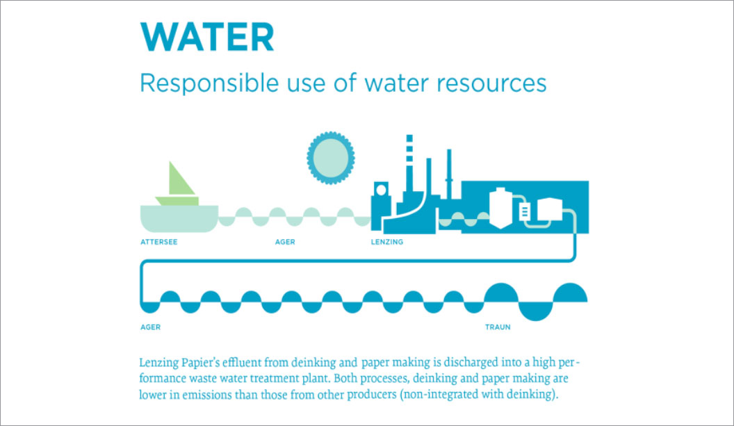
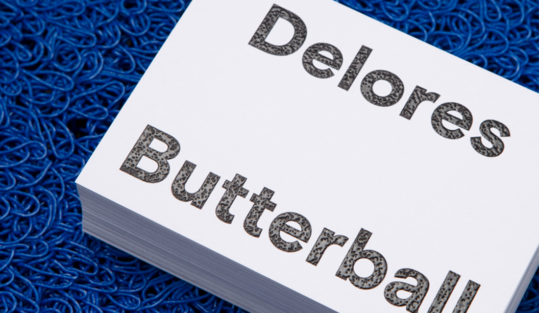
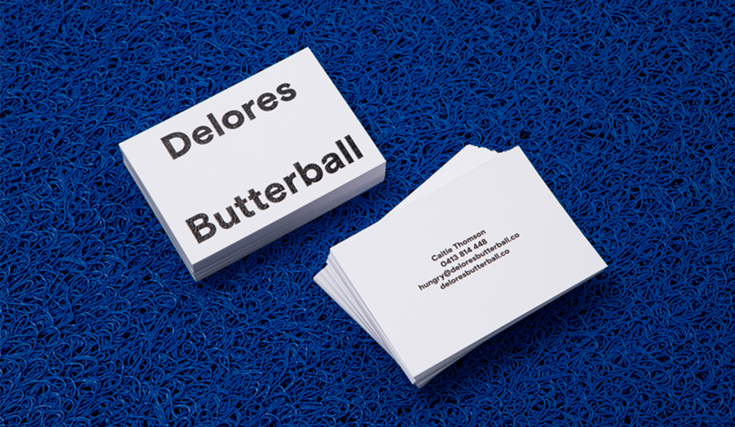
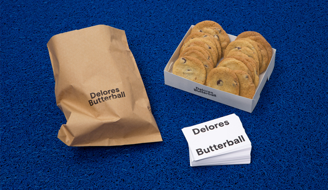
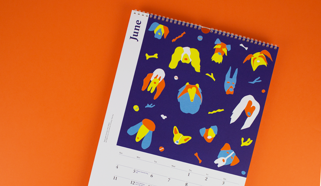
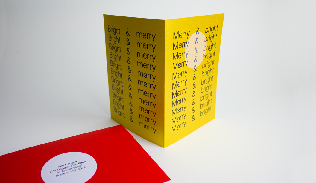
A unique scented product range by Grosz Co.Lab

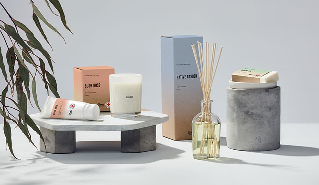
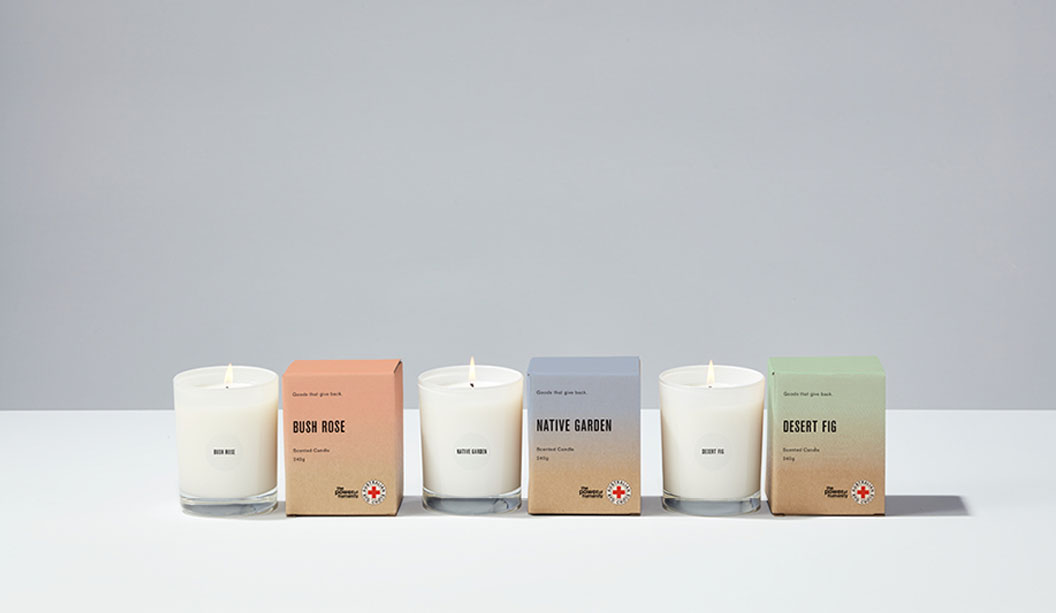
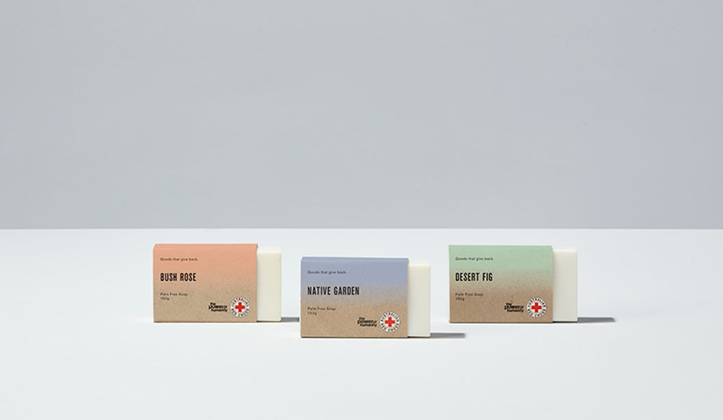
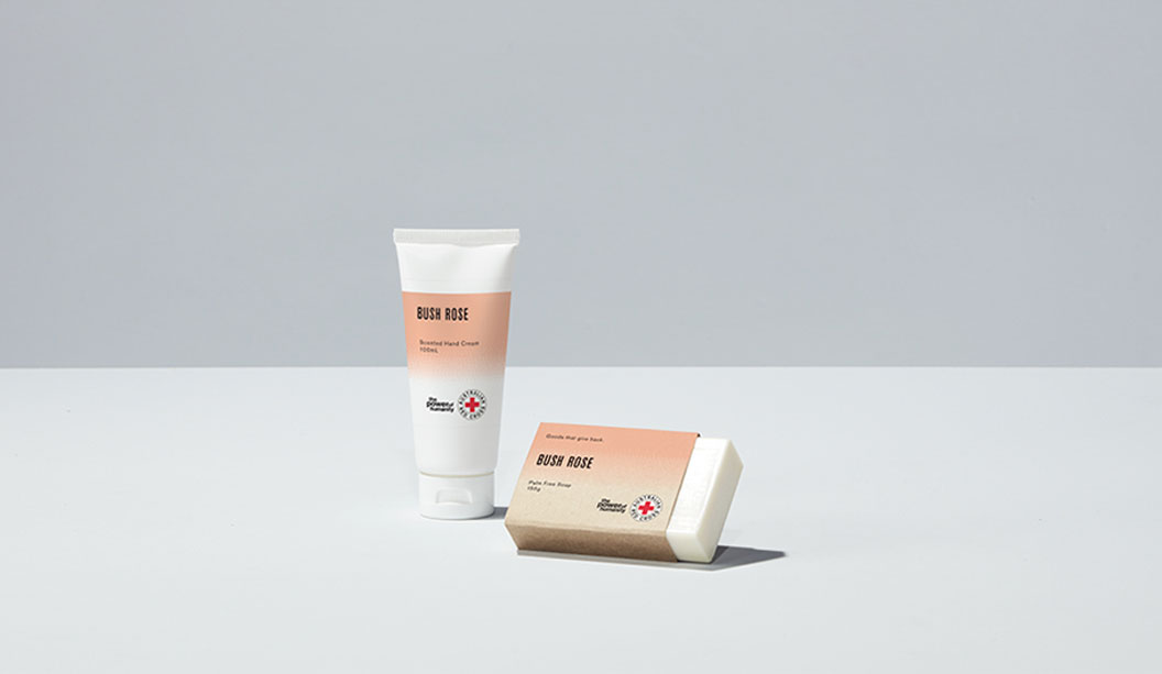
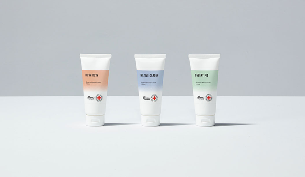
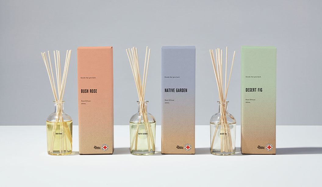
We are suckers for scented products, especially ones that are beautiful and best of all for a good cause!

The makers are Grosz Co.Lab, an inter-disciplinary creative studio in Melbourne run by Ben and Laura. Working closely with long-time client Red Cross, they have developed a bespoke range of packaging for diffusers, candles, soaps and creams. The first project of this kind that Red Cross have embarked upon.

Printed on Buffalo Board 332gsm and 225gsm, each product is inspired by the Australian Landscape. “It was actually established very early on from the Red Cross team that they’d like to explore the use of a natural brown stock for the range as a reference to their heritage,” says Ben. And who can resist delish scents like Bush Rose, Native Garden and Desert Fig?

The super cool print effect (designed to mimic the scent materialising and dissipating) is a bitmap gradient allowing the colour of the stock to come through each of the three PMS colours. Working with Scott Henry at Colna Print & Pak, white ink was then mixed in with each colour and the level of opacity was adjusted on press to get just the right effect. Nice!

Available at Red Cross shops (they just sold out online but will be back soon), the funds raised helps to support the vital work of the organisation locally and abroad. “We feel fortunate they entrusted it to us – especially as it was not only the packaging design that we created, but also establishing the vision for the product range, naming and also consulting on the curation of the scents. We’re thrilled it’s been a success for them,” says Ben. See more of the project on www.groszcolab.com.au.

When asked what they’re dreams were for the future, Ben shares “…something that combines design across a range of disciplines, along with music, dance, fashion and/or scent would be a dream. Or perhaps a design museum! We have many ideas – we just need the funds.”  No doubt we’ll be seeing more from Grosz Co.Lab very soon.


Groz-Co_4

Groz-Co_6

Groz-Co_5

Groz-Co_3

Groz-Co_2

Lenzing Papier, more than just a regular mill

Lenzing Papier, manufacturers of Envirocare 100% Recycled and Impact, is not your average paper mill. Their tagline ‘Simply sustainable’ is in reality, what they live by. As a fully integrated paper mill with a minimal carbon footprint, they’re all about making the world a little greener, driven by the need to preserve the unspoilt natural environment of their Austrian mill’s site for current and future generations. We spoke to General Manager Ernst Brunbauer about the positive outcomes of a green approach.*

What does the Lenzing Papier mill do differently to other mills with regards to manufacturing paper?

Paper mills making recycled products are usually not integrated with a pulp mill. Lenzing Papier is in a unique position as our mill is integrated with a de-inking plant and a pulp mill. There are two categories of recycled paper producers: the ones like Lenzing Papier, who operate their own waste paper facility and de-inking plant, and the ones who buy de-inked pulp on the market. Making the de-inked pulp in-house gives us a significant advantage in terms of avoided carbon emissions, because there’s no need to dry the de-inked fibres for transportation and shelf-life, as it’s made and used simultaneously. The fibres are made-to-measure for the paper machine and the respective product, giving a consistent output.

How can the mill’s carbon footprint be so small?

Predominantly because Lenzing Papier’s paper mill is integrated with the pulp mill (which is fairly uncommon), so we’re only using the carbon neutral energy from the pulping process. The pulp itself is a dissolving pulp grade used to make textile fibres and we use this energy, which is a side product of making dissolving pulp. The carbon footprint is very low because the energy is from renewable sources.

How many people work at the mill?

There are 160 people working in Lenzing Papier and most of them live in the area. The company was founded in 1892 and we have fourth and fifth generation employees.

What does the company primarily stand for and believe in when it comes to the environment?

The staff of Lenzing Papier loves nature. Most of our employees enjoy the outdoors and so their attitude towards protecting the environment is natural. They have a lot of pride in their work and want to be the best in environmental performance. Continually improving processes is an ongoing task for us and we believe in gentle chemical technologies, where nature is our guide, such as using enzymes instead of conventional chemistry.

Is this how you de-ink your pulp?

The de-inking process is usually done by using a flotation system in combination with air and de-inking chemicals to flotate the printing. At Lenzing we have developed a process using enzymes instead of the standard chemistry with very good success.

How much paper do you produce each year?

With a production of 85.000 metric tons per year, Lenzing Papier is a small paper mill compared to commodity producers, but it’s among the market leaders in the field of uncoated recycled papers.

Is it true you swim in the same lake the water from the mill is pumped into?

Yes, that’s true. We take all our fabrication water out of the lake’s outflow and use it with only mechanical cleaning for production. After responsible use and careful cleaning of the water, we put it back into the river. People swim and fish after the outlet from the waste water treatment plant.

How much waste does the mill actually produce?

We’re very proud of the fact that we do not produce any waste that has to go to landfill. The raw materials are re-used as much as possible and at the end of their lifecycle those substances are incinerated in a very efficient incinerator. The generated energy is then put back into the milling process.

*Interview first appeared in the April 2017 issue of Spot, our print publication about paper, people, dogs and design.

Lenzing_7

Lenzing_5

Lenzing_1 copy

Lenzing_2 copy

Lenzing_3 copy

Lenzing_4 copy

Alastair Swayn book by Swell Design

We talk a lot about paper as a powerful platform for communication so we couldn’t go past this bright publication, the Alastair Swayn book* by Swell Design with its bold coloured pages and strong message.

The inspiration for the eye-popping publication was two-fold; to celebrate a much loved architect and friend of Swell and to promote the Alastair Swayn Foundation. A charity that supports young Australian architects.

We spoke to Swell Design about their experience working on the project, the creative process and their new Groundswell website, a charity to raise money for brain cancer.

Can you elaborate a little more on the creative direction for the book?

Alastair Swayn was an amazing architect, friend, mentor and supporter of Swell for close to two decades. He passed away on the 4th of August 2016 after a long battle with brain cancer. As part of his final project (planning his own memorial and party), Alastair engaged Swell to create a legacy book that would help to promote the Alastair Swayn Foundation. 

Out of respect for Alastair, we undertook this 100pp challenge as a pro bono exercise and created an oversized publication with a case bound hard cover option and two different soft cover variations. Partly due to our exposure to Alastair’s illness, Swell has started a charity to raise $20,000 to help combat brain cancer — the Groundswell website will be available very soon.

Why did you choose to use Knight Smooth Digital – Indigo and what as the print result like? 

We chose Knight Smooth Digital – Indigo 140gsm because of its smooth surface and crisp white colour which help the bold layouts and Alastair’s architecture to pop. Knight Smooth and the Indigo where a great combination — the colours jump from the page (as planned).

How is the Groundswell website going?

The groundswell for Groundswell has started. We’ve now had a couple of close encounters with this terrible disease. Back in 2010, Col’s (Swell Director) son had a (fortunately benign), brain tumour removed. We then sponsored Brainstorm for a Cure, a local charity event created by Sarah Mamalai, a stage 5 brain cancer survivor (one of few). Lastly, in 2016, Swell lost a strong friend and advocate in Alastair Swayn, one of Canberra’s most successful architects.

We’ve started slowly by producing water bottles and cycling jerseys and selling these for $5 and $50 respectively (bargain). Basically, we fund the production and all proceeds so 100% goes straight into our fund managed pro bono by Grant Alleyn, Director of Allegra Wealth. Further fund raising will centre around events (cycling and running), sales of GroundSwell branded coffee and corporate donations. A website is coming, so stay tuned and let’s help beat this thing! In the mean time check out Swell’s new site.

*Thanks to Swell Design for taking their time to answer our questions and allowing us to feature their work in the ‘Snippets’ section of Spot, our very first print publication about all things design, paper, people and dogs.

AlastairSwayn_01-1056x615

AlastairSwayn_03b-1056x615

AlastairSwayn_06-1056x615

AlastairSwayn_04-1056x615

AlastairSwayn_08-1056x615

AlastairSwayn_09-1056x615

AlastairSwayn_05-1056x615

AlastairSwayn_10-1056x615

AlastairSwayn_11-1056x615

Two rad jobs from Mildred & Duck

Two person design studio in Melbourne, Mildred & Duck, punch way above their small team weight. The team being Daniel Smith and Sigiriya Brown. Their branding job for Delores Butterball posted below, we recently featured in the ‘Snippets’ section of Spot, our first ever print publication. Speak to your paper specialist for a copy. And in the meantime, check out more of their awesome work on Instagram.

Title: Unfurl
Stocks: Curious Collection Skin Stone 270gsm, Knight Smooth Digital – Indigo White 160gsm, and Grange Tinted Bond Pink 80gsm
Print specs: Black metallic foil + CMYK
Printed by: Ellikon
Photography: Mark Lobo of Foliolio

The ‘Unfurl’ publication showcases the work of RMIT’s Visual Arts graduates. The publication was designed to unify the diverse range of works created across different disciplines. Mildred & Duck used a consistent grid structure to create a cohesive experience, and allowing for easy navigation. Housed within an understated black-foil exterior, the publication reveals a playful pink section containing the text pages.

Unknown-1

Unknown-2

Unknown-3

Unknown-5

Unknown-6

Unknown-7

Unknown

Stocks: Knight Smooth White 350gsm
Print specs: Raised verko + black
Printed by: Moule Print
Photography: Mark Lobo of Foliolio

Delores Butterball is a small batch baked goods stall serving cakes and cookies across Melbourne. Mildred & Duck created a visual identity for Delores Butterball that is bold and confident and can be easily applied to boxes and bags as needed without losing legibility. The oversized business card doubles as a with comps slip, with raised verko printing that looks like the texture of icing. Yum!


Blog-Delores Butterball-1

Blog-Delores Butterball-2

Blog-Delores Butterball-3


VoPP Outback Brewery case study

BACKGROUND:

An independent microbrewery in Sydney wanted to grow direct-to-consumer sales through their website as well as increase brand awareness of their boutique beers. To achieve this, a multi-channel campaign utilising personalised URLs and direct mail was created.

OBJECTIVE:

Outback brewery aimed to tap into direct mail’s ability to drive traffic both online and in stores by coupling relevant messaging with measurable response mechanisms.

METHOD: 

Outback Brewery created 5,000 personalised postcards that were sent to select consumers that had a specific lifestyle, age, income and propensity to spend. Postcard recipients were asked to “name the lizard” on the beer’s logo and submit their answer to a personalised URL. Recipients were incentivised to participate by a chance to win free beer for a year, $10 off a mixed case of beer via their new online shop and a free bottle opener. Participants were brought to a personalised landing page that was an extension of the branding found on the postcard, maintaining the continuity and connection with the brand both offline and online.

RESULTS:

The campaign proved to be a huge success for the company, increasing consumer engagement and driving sales. Outback Brewery received over 120 online orders and more than 2,300 unique web visitors. A 10% response rate was achieved within 72 hours, growing to 20% within two weeks and eventually reaching 33%.

CONCLUSION:  

Outback brewery was able to reinforce their brand identity and stand out from the competition by adopting a personalised and colourful direct mail campaign. The personalised mail was able to capture attention and drive traffic to Outback Brewery’s online platform where recipients could enter the competition and make purchases. Direct mail was vital in this campaign, and exemplifies how it can be used as part of a multi-channel campaign to engage consumers and drive sales.


Brewery_2


Thanks goes to Kellie Northwood, Executive Director of VoPP/Two Sides Australia for allowing us to republish this case study, made available to us as Foundation Sponsors of TSA Limited, the publishers of the VoPP (Value of Paper and Print) report. Find out more via www.valueofpaperandprint.com.au.

VoPP_3

Our 2017 Calendar ‘A Cut Above’

Our 2017 calendar ‘A Cut Above’ is a shout-out to Henry Matisse who, in his later years, created amazing artworks in his ‘cut-outs’ series using just scissors and paper. A collaboration with Spencer Harrison (who project managed and designed the calendar) and two workshops later and we have the super colourful 2017 K.W.Doggett Fine Paper calendar!

This is traditionally a student only project but this time, we opened it up to industry folk too. We put it out to ballot and chose the participants from there. Equipped with paper (including some awesome custom designed sheets by Spencer), heaps of glue and scissors, pizza and tunes, we ran two workshops in SA and VIC with Spencer at the helm sharing his expertise and guiding the participants through the creative process. Choosing the final 12 pieces was tough (so many fabulous pooches!) and the wonderful Mark Lobo shot the masterpieces.

Thanks to everyone that entered, those that attended the workshops, the artists who made it to the final 12 and the pizza guy. A big shout-out to UniSA and CATC/Billy Blue College of Design for giving us their digs to use. And of course the one and only Spencer Harrison. Wooooo hoo!

Check out our YouTube channel soon for behind the scenes videos!  bit.ly/2017calendarvideo

Printing specs:

The calendar was printed offset by Adams Print in VIC. Clear gloss foil on cover over the title by Avon Graphics in VIC.

  • Cover: CMYK plus PMS orange* and clear gloss over the title on Strathmore Super Smooth Ultimate white 176gsm. Artist: Spencer Harrison.
  • Credits: CMYK plus PMS orange* on Sovereign Offset 160gsm.
  • January ‘Grandpa soda pop’: CMYK plus PMS orange* on Maine Recycled – Silk 200gsm. Artist: Beth MacDonald.
  • February ‘Sausage roll’: White ink (2 hits wet on 2 hits dry) plus CMYK on Kaskad – Bullfinch Pink 160gsm. Artist: Jack Stobart, UniSA.
  • March ‘Jeff Sniffs’: CMYK plus PMS orange* on Rives Design Bright White 250gsm. Artist: Yan Yan Candy Ng from Thoughts Come True.
  • April ‘Space dog’: CMYK on Sovereign Offset 160gsm. Artist: Panhavuth Kret, Holmesglen Institute.
  • May ‘Get ’em’: CMYK on Knight Vellum 140gsm. Artist: Nana Utsugi, RMIT University.
  • June ‘Field day’: CMYK plus PMS orange* on Sovereign Offset 160gsm. Artist: Lauren Conti, Monash University.
  • July ‘That happy dog’: CMYK plus PMS orange* on Maine Recycled – Silk 200gsm. Artist: Duncan Crawford, UniSA.
  • August ‘Dog & bone’: CMYK plus PMS orange* on Sovereign Offset 160gsm. Artist: Liam Kenny, Torrens University Australia.
  • September ‘It’s a dog’s life’: CMYK plus PMS orange* on Knight Vellum 140gsm. Artist: Spencer Harrison.
  • October ‘Walkies’: CMYK plus PMS orange* on Maine Recycled – Silk 200gsm. Artist: Alex Seret from Alex Seret Design and Illustration.
  • November ‘Sleeping dog’s lie’: CMYK on Rives Design Bright White 250gsm. Artist: Phil Koo, Torrens University Australia.
  • December ‘Shut up!’: CMYK plus PMS orange* on Knight Vellum 140gsm. Artist: Tanya Bickers, graphic designer and illustrator.
  • Backing: Doggett Boxboard 310gsm/520ums.

*Orange is PMS 1505 U. We altered the colour slightly to be 65% Orange 021 and 35% transluscent white (traditionally it would be 50/50). Adams have a special recipe for their CMYK and we boosted the Rhodamine and Yellow 012 too. Looks so good it could be UV.

1 - January

2 - february - 2

3 - march - 1

3 - march - closeup

0 - cover-orange

4 - april

5 - may

6 - june

0 - cover - yellow

7 - july-2

8 - august

0 - cover-red

9 - september - 2

10 - october - 2

0 - cover-pink-2

11 - november

12 - december

2016 Doggett Christmas Card

Designer: Studio Constantine (VIC).
Card Stock: Duplexed Curious Collection Metallics – Super Gold 250gsm and Virtual Pearl 120gsm.
Envelope Stock: Curious Collection Matter – Desiree Red 135gsm*.
Printed by:Blue Print (VIC).
Duplexed by: Cartonlux (VIC).
Envelopes by: Direct Envelopes (VIC).
Finished by:Blue Print (VIC). Scored, trimmed and folded.

Our 2016 Christmas card is so bright that we reckon it could probably give you a sunnies tan line. Which is why we love it.

We asked David of Studio Constantine to get creative so the card would bring merriment to our rather broad client base (graphic designers to corporates). When looking for inspiration, we like to imagine that after a few eggnogs staring up at the overcast summer sky, David had a lightbulb moment. He would create a card featuring the bright Aussie sun we’ve all been waiting for.

What we have is a duplexed card on Curious Collection Metallics – Super Gold 250gsm and Virtual Pearl 120gsm. It was printed HP Indigo black with white ink overprint (2 hits @ 50%) on the front ala the setting sun. We also had envelopes custom made in Curious Collection Matter – Desiree Red 135gsm* and printed Doggett Labels circular (C45 & C60) stickers in-house for postage and closure labels.

The combo of the red and the gold is very Christmas and a little bit Chinese New Year too. All in all – party time.

*Grammage not stocked by KWD – available on request from Arjowiggins.


2016-christmas-card-standing

2016-christmas-card-closeup

2016-christmas-card-and-envelope

2016-christmas-card-envelope-shadow

2016-christmas-card-envelope-back

2016-christmas-card-inside-envelope

2016-christmas-card-inside


Pop’Set bubble gum scented postcard

Design: In-house.
Stocks:
Pop’Set Cosmo Pink 320gsm.
Printed by: Intelligent Media, (VIC) on a HP Indigo 7800
Finishing:
tlc digital+ (VIC).
Printing specs: Six hits of white ink + CMYK + screen printed bubble gum scent.

You lay six hits of white ink plus CMYK down on a paper like Pop’Set and you’ve got yourself a postcard that…well…pops! The colour is super vibrant and the best bit is that bubble area is a bubble gum good time waiting to happen. We screen printed a bubble gum scent over the image and ever since we’ve been reminiscing about primary school and those amazing scratch ‘n’ sniff stickers we all loved so much.

It’s an interesting process adding scents to paper. It’s done via micro-encapsulated scented capsules that are mixed into UV curable carrier varnish. The UV-curable slurry is then applied to the printed sheet (or substrate) using a screen printing application. As the capsules are broken (like an egg shell) the scent is then released. Flick over to Instagram to see some pics showing the process.

Key selling points:

  • Highly pigmented colours in the range: Cosmo Pink, Lime Tonic, Black.
  • 30% recycled, ultra smooth board.
  • HP Indigo certified and suitable for dry toner printing too.
  • Available in SRA3 sheet size in 320gsm.

We have a list of scents available if you need. We’ve done banana in the past and know there is everything from fruity scents like grapefruit and pear all the way through to flowers like Yellow Rose and then Green Lawn, Horse Stable and Camp Fire. Sunscreen smell would have to be the most random though. Ha!

In all seriousness, this kind of thing is sensory branding at its best. Smells can trigger emotions so this is not only an easy but a fun and valuable way to make a marketing promotion stand out and increase brand recall.

And even more seriously, stay away from the horse stable scent.

popset1

pop'set-for-blog-2

VoPP Pantone Queen case study

BACKGROUND:

To celebrate Queen Elizabeth II’s Diamond Jubilee, Pantone created a Queen shaped colour guide. To ensure maximum exposure and engagement, they used direct mail.

Rather than targeting creative directors or design agencies with a mass direct mail campaign, Pantone targeted media publications and bloggers in order to attract a huge amount of PR. This strategy also ensured the resulting social media hype, which grew the campaign’s awareness exponentially. In doing so, Pantone extended the reach of the campaign far beyond that of an ordinary direct mailer.


OBJECTIVE:

Pantone worked with design agency Leo Burnett London in order to create a unique piece of memorabilia that celebrated the Diamond Jubilee as well as grab the attention of new and existing customers in a way that was both original and surprising. Pantone has been the definitive authority on colour within the printing industry for decades, and the omnipresence of their iconic swatch books in design studios worldwide has been a source of inspiration for generations. To remind their target audience of the capabilities of their colour matching system, Pantone decided to colour match a variety of the Queen’s most famous monochromatic outfits worn throughout the 60 years of her reign.

Pantone-Queen-1


“Building true brand engagement is about creating dialogue. Don’t consider direct mail or email or web in isolation, but consider the right combination to achieve the best response” 

Kevin Slatter, Director of Data & Analytics at Geometry Global

METHOD: 

A limited edition queen-shaped swatch book was created with each outfit painstakingly matched by Pantone’s colour expert technicians to the exact Pantone reference, date and location where each was worn. Each of the 60 cards in the spiral guide shows Queen Elizabeth II in the same formal suit with only the colour changing.

Leo Burnett approached Buckingham Palace with the concept which was so well received it was made an official piece of Diamond Jubilee memorabilia and became royally endorsed. An ultra-short run of 60 copies were produced and sent out to a highly targeted mailing list consisting of media publications including magazines and newspapers, influential design bloggers and prominent designers.


Pantone-Queen-2


“Our 7 colour HP Indichrome Pantone emulation process was capable of matching all 60 colours, exactly. From Primrose yellow to Lilac Snow, the palette subtly evolves yet always regal” 

Precision Printing

RESULTS: 

Within 24 hours the campaign had been written about in over 1.2 million website and blogs with #pantonequeen trending on Twitter. Numerous design publications also covered the innovative direct mailer which ensured it had maximum publicity with a targeted audience of existing and potential Pantone customers. Since Pantone only produced a small run for the Direct Mail campaign, printing and shipping fees were kept to an absolute minimum, translating into an incredible return on investment.


CONCLUSION: 

The Pantone Queen is a great example of how brands can combine the power of print and direct mail with the mass reach of online media. By targeting media publications and bloggers instead of customers, Pantone were able to extend the reach of its campaign far beyond what they could have expected to achieve with an ordinary direct mailer.

Direct mail continues to play a significant role in the marketing mix, offering more personally relevant content to customers and converting brand awareness into action. Creative Direct Mail, such as the Pantone Queen, has the ability to create a lot of online buzz and pushes the message out to a far greater audience.

Direct mail and online media, particularly social media, should be considered complimentary mediums as they greatly improve the effectiveness and reach of campaigns when used in conjunction. Direct mail is personal and more engaging whilst social media such as Facebook, Twitter and blogs offer a better platform for discussion and mass reach. Integrating the two mediums is a logical step for any brand to strive for as it reflects the multi-channel world in which we all consume content in.


VoPP_3

Thanks to Kellie Northwood, Executive Director of VoPP/Two Sides Australia for allowing us to republish this case study, made available to us as Foundation Sponsors of TSA Limited, the publishers of the VoPP (Value of Paper and Print) report. Find out more via www.valueofpaperandprint.com.au.


Pentagram’s Abbott Miller designs Dance Ink magazine (again!)

Not sure when the last time was that we (ok maybe just some of us), got THIS excited about a magazine being launched, or in this case, relaunched. So just imagine the excitement of all the lovers of dance, photography and design out there when niche publication Dance Ink was brought back from the publishing graveyard!

The magazine acts as an alternative performance space for dance. Originally published from 1989-1996, the quarterly performing arts journal is pretty unique. The dance works you see beautifully photographed on the pages are, we kid you not, specifically commissioned just for the magazine. What a concept! The cover of the first issue of the new Dance Ink features Silas Riener performing Merce Cunningham’s ‘Changeling’ which is a bit of a homage to the amazing performer.

Published by Patsy Tarr and designed and edited by Abbott Miller from Pentagram, both taking up their original roles (ah-mazing), Dance Ink has literally picked up where the last one left off. What could be a more perfect quote for the relaunched mag which appears in the first few pages from Merce Cunningham himself: “We begin again.” From what we’ve read on Pentagram’s blog, this time in history is shaping up to be: “…something of a renaissance in independent magazine publishing.” And it’s given them a primo opportunity to experiment with print.

dance1dance4

dance7

As noted on the Pentagram blog: “The new issue returns to the original premise of creating a unique and enduring stage for dance, using great photography, powerful design and the beauty of high-quality printing.” Printed offset, the mag is housed in a clear sleeve and throughout the pages, the design plays with the effect of transparency of ink on the page.


dance5


dance3

The other super cool thing is the mag has totally moved with the times. Yes it’s available in print form, but the publishers have also experimented with different formats eg you can also purchase large scale posters with every issue, a custom mural for a wall and videos were created as well. So print and wide format too. Raddy McRad. The new issue of Dance Ink has a print run of only 500 copies and can be purchased online at 2wice.org.


dance10


dance9

Thank you to Pentagram for allowing us to repost this story. We love your work! Get yourself over to their blog for a more in depth look at this issue of Dance Ink. It’s well worth it.

dance2

dance6

dance8