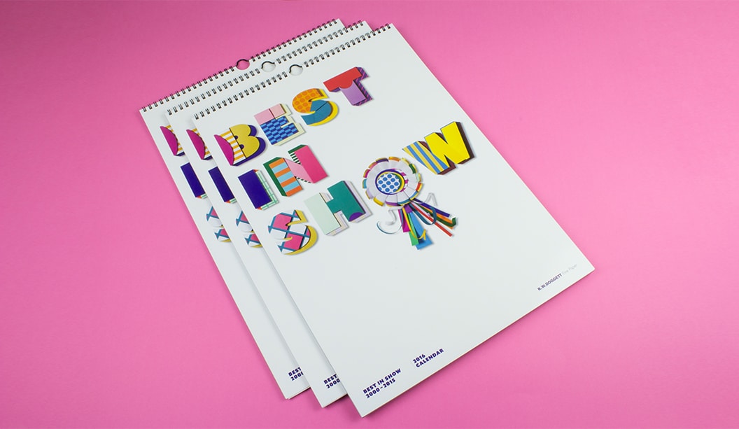
Footy Tips
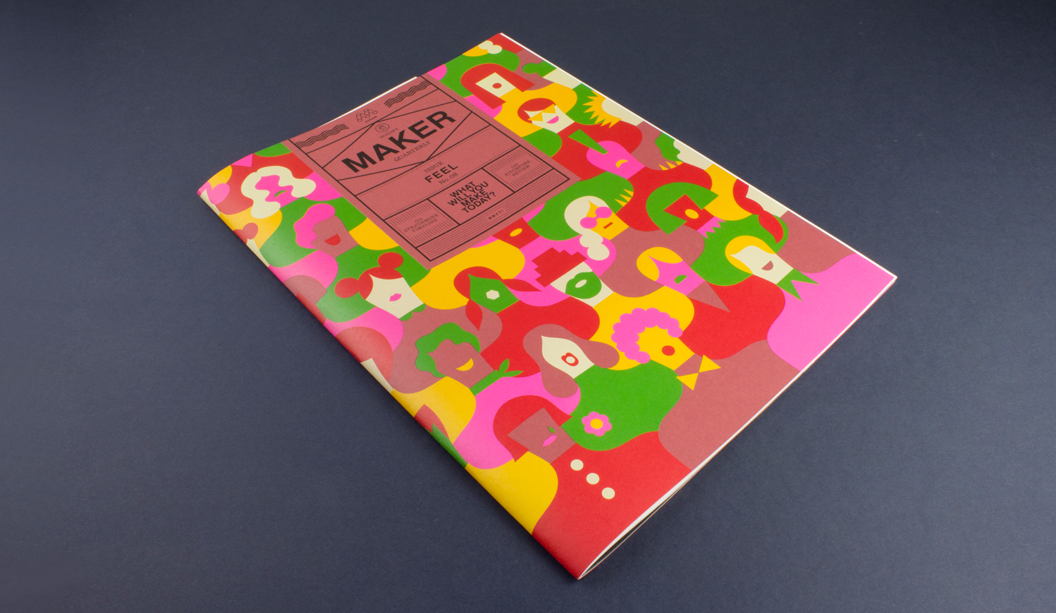
This is issue #8 of the Mohawk Maker Quarterly, designed by Hybrid Design and brought to you by one of our eminent mill partners – Mohawk. This issue is particularly special because it combines the Strathmore range and also Curious Collection which is from the Arjowiggins mill (Mohawk are now the North American suppliers of the Curious Collection range which makes us rather happy because we’re the Australian ones!). Maker is always a gift to the senses, a showcase of high quality printed matter in what is an increasingly digital era. It’s a real print treasure and celebration of creative, hands-on makers of this world.
Mohawk stands by the fact that embracing the medium is just as important as the message in creating an experience and building an emotional connection and with this issue, themed ‘Feel’, this premise is taken to a whole new level. This quote from the publication says it all: “Customers don’t necessarily remember what you do for them as much as they remember how you made them feel.”
We love the eight distinctive papers combined with a killer print job (offset printed using conventional and UV inks). They’ve boldly and cleverly combined half sheets, textured papers with photography, metallic papers with artworks and a deckled edge. The print medium, in our eyes at least, creates ‘feeling’ like not many other mediums can. Colour, texture, visuals. Print has the power to create a lasting memory and give anyone who loves design, print and paper all the feels.
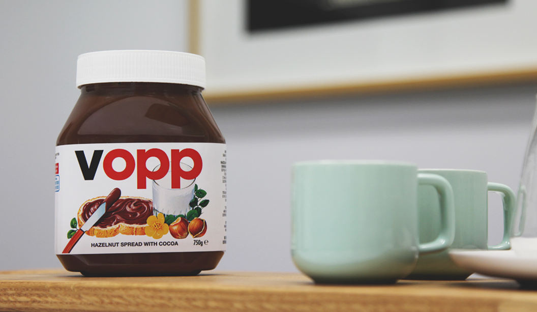
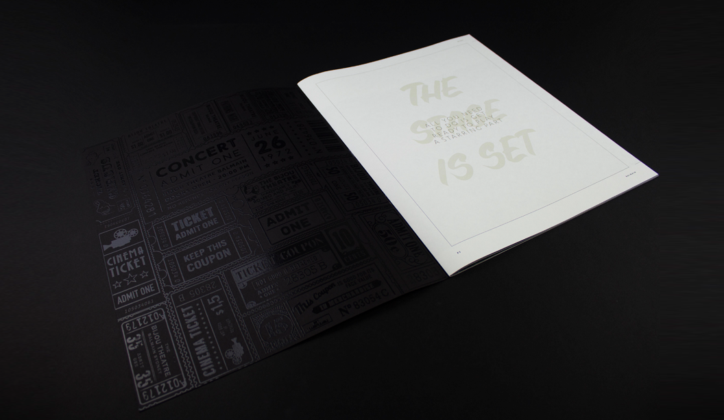
Cover – What’s firstly most striking is Olimpia Zagnoli’s beautifully bold pattern illustration that blends so seamlessly with the Strathmore Wove Riveria Rose (one of four Strathmore Heritage Collection colours introduced in 2015). We don’t sell it but can look to order it for you, just keep in mind there would be a minimum order amount. Read this blog post by Parse and Parcel for an excellent read and print production tip when printing on dark coloured papers. Mohawk hit the sheet with opaque white ink, twice, then used UV inks which dry instantly and don’t soak into the sheet so are much more punchy.

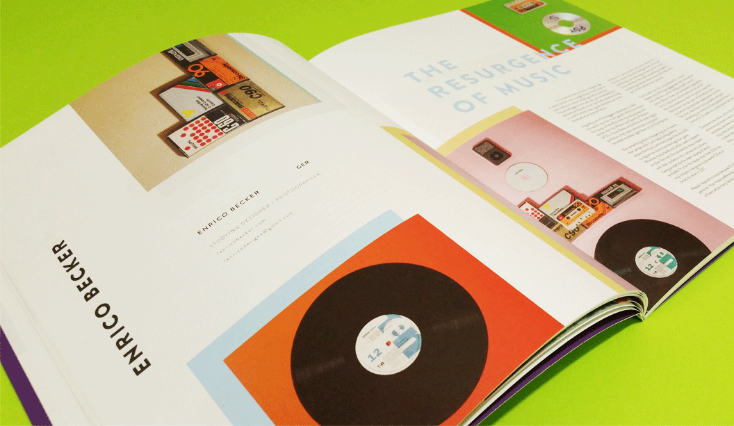
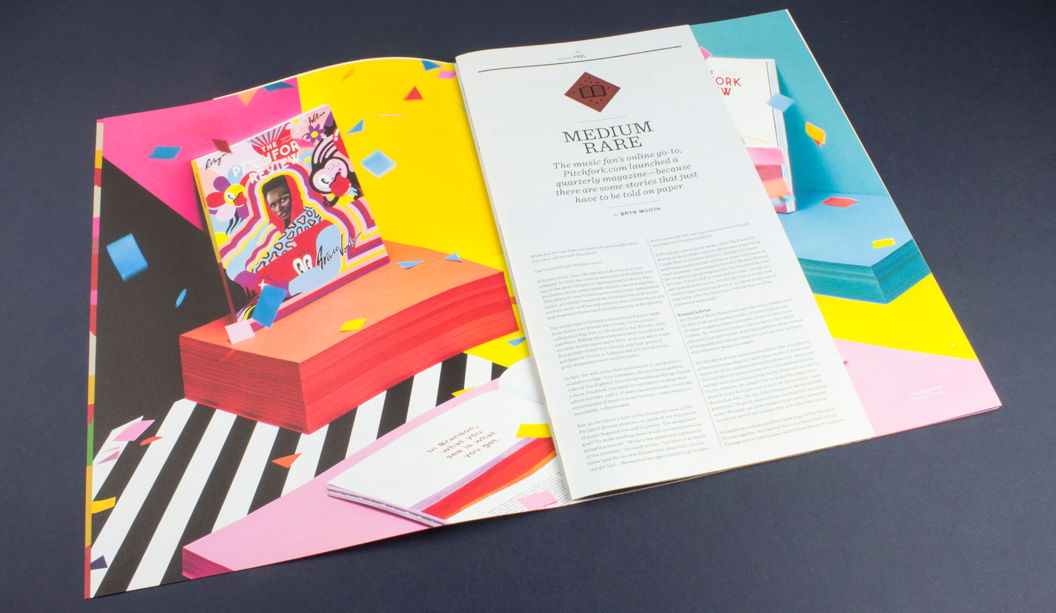
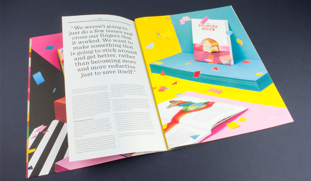
Medium Rare – Music fans online go-to is pitchfork.com and they’ve just release a quarterly magazine – because there are some stories that just have to be told on paper. An online presence going offline. The travesty! Flies in the face of convention it does. The Pitchfork Review showcases the striking beauty of Curious Collection Metallics – Ice Gold, against vibrant images printed on Strathmore Premium Wove and Smooth – Platinum White. This is a fun spread. The half page looks rad.
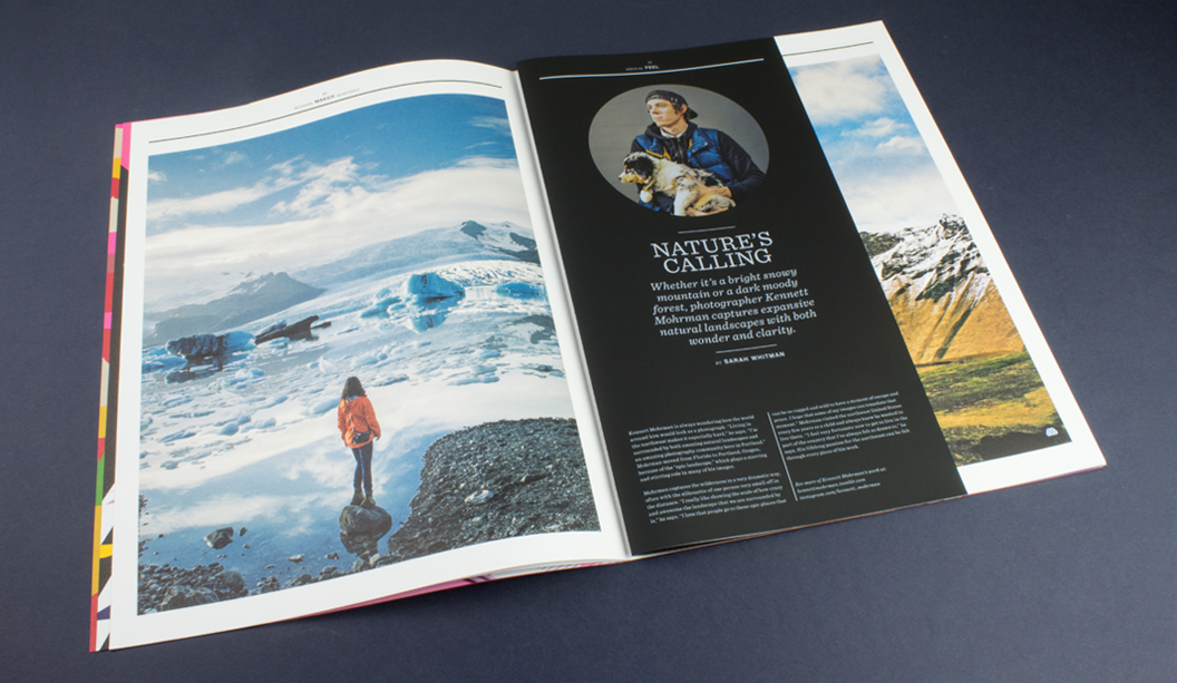
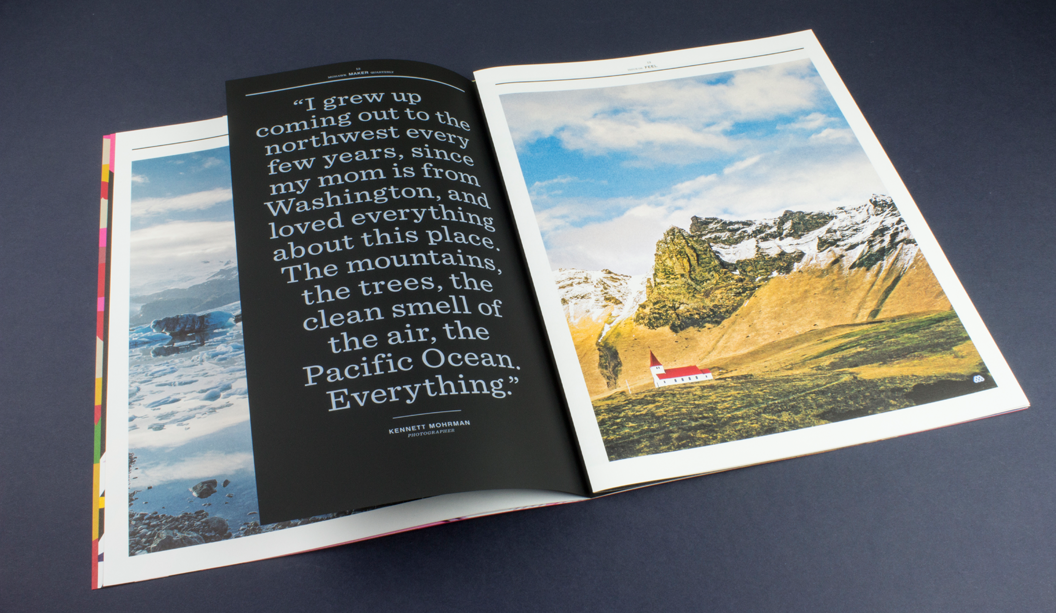
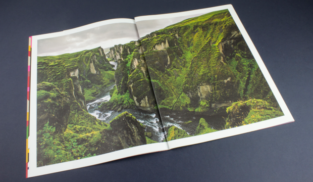
Nature’s Calling – We stand by the choice to use uncoated papers for photography, as long as you prepare the files the right way and work with a printer that is willing to push it with you. A great example of how to make this combo work is the section on Kennett Mohrman which looks amazing on uncoated Strathmore Pastelle that has a felt finish. The mossy covered terrain appears as a double page spread printed partly on Strathmore Cambric that has a linen finish and the Strathmore Pastelle. Same photo across two different papers, one Platinum White the other Bright White. And geez it looks a-ma-zing! The photo is a beauty. So much depth and richness. The half sheet on Skin Curious Collection – Black printed with white ink even comes with augmented reality components.
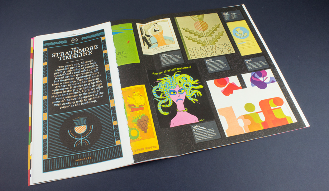
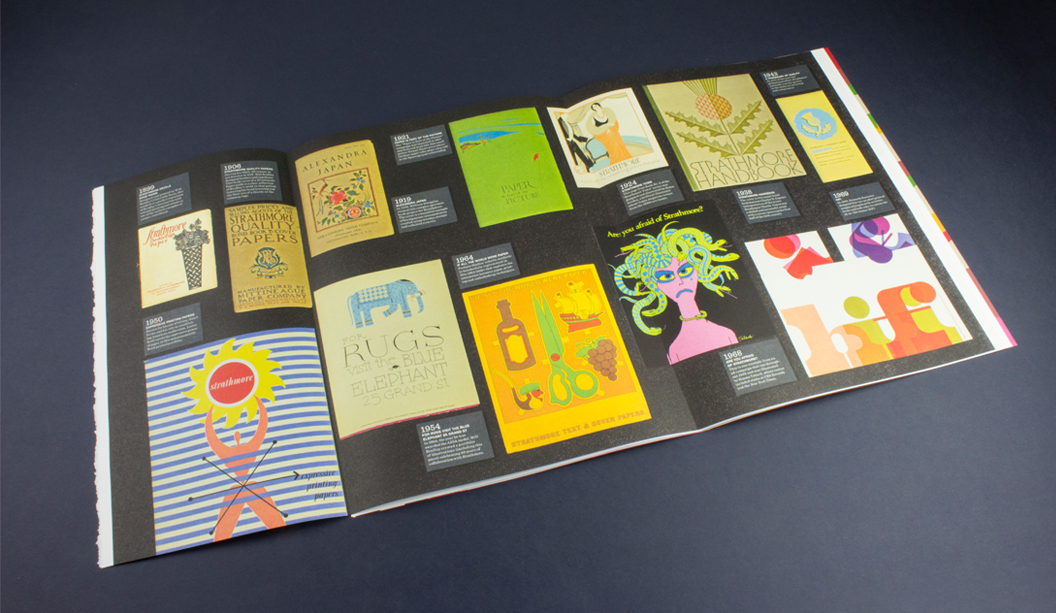
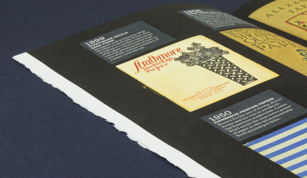
Strathmore Archive – We absolutely love this double page spread called The Strathmore Archive. The team at Mohawk found all these swatches and print samples, boxed-up in their warehouse. Literally over 100 years of print design in America, discovered in some dusty boxes! The deckled edge. Swooooon.
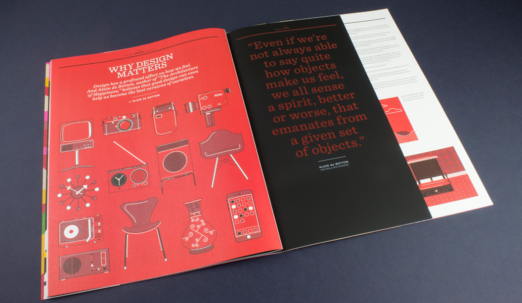
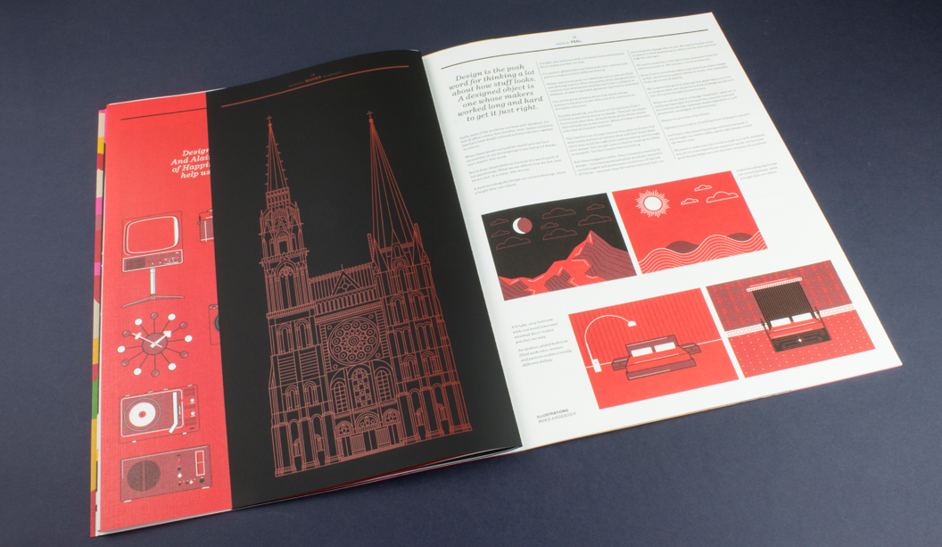
Why Design Matters – Another half sheet and mixed paper goodness combo that gives us the design feels. Strathmore Premium Cambric (a linen finish) with Skin Curious Collection – Black and a half sheet thrown in for good measure. A perfect backdrop for Alain de Botton’s article on how objects make us feel – how good design can assist us with becoming even better versions of ourselves. As one blog mentions, the mid century illustrations look awesome printed on the linen sheet, as does the cathedral printed with red ink on the black. Clever.
See more pics and another write-up here, via the Mohawk blog Felt & Wire.
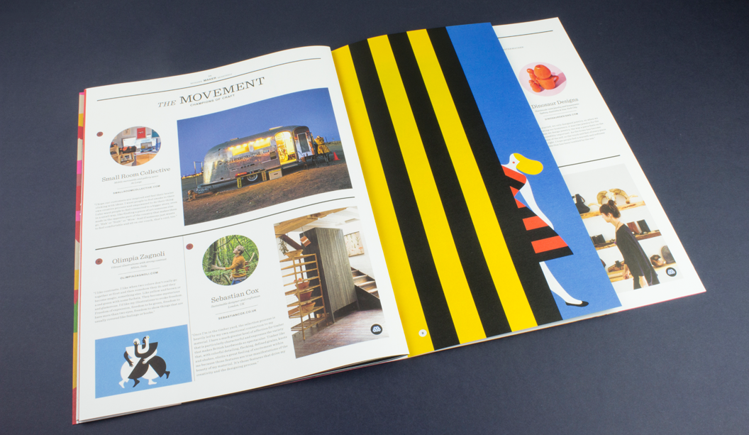
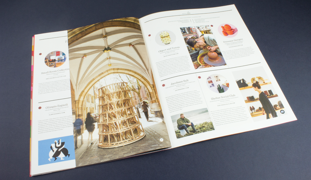
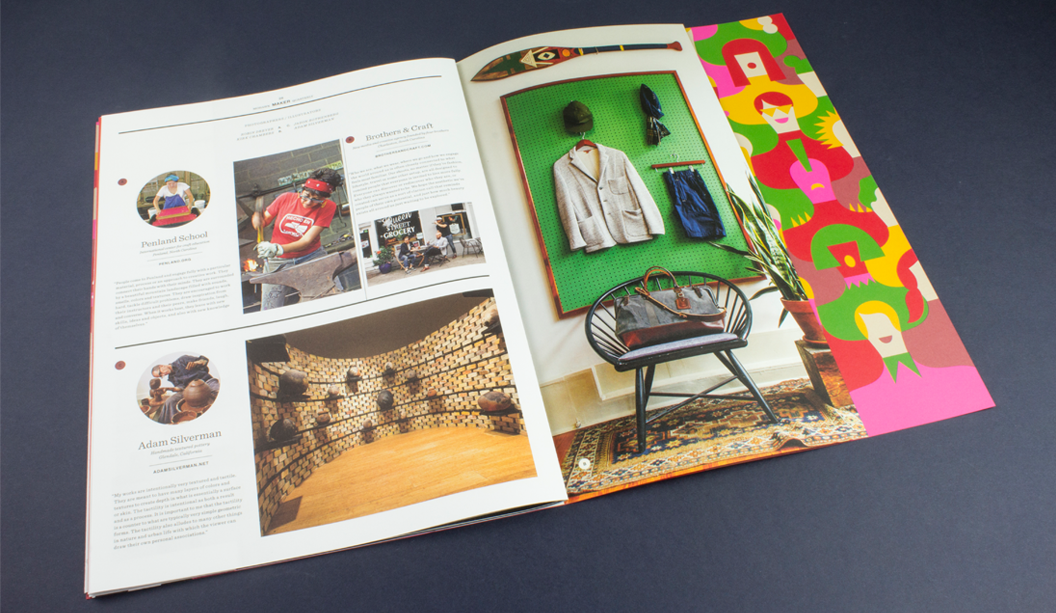
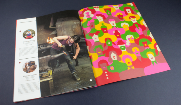
The Movement – This is what the Maker does really well – covers some really talented champions of craft – small manufacturers, artisans, printers, designers and artists from around the world still using their skills in this so called age of the digital revolution. Our very own Australian brandDinosaur Designs even get a mention in this one! Other makers include Shelter Social Club, Penland School, Brothers & Craft, Sebastian Cox, Object and Totem and Adam Silverman. Plus there’s some more augmented reality to enjoy.
It is impossible to tell from this picture but the smart cookies at Hybrid and Mohawk have paired the photograph of this wooden sculpture with Curious Metallics – Ice Gold which literally has a gold shimmer finish. We’ve said it before and we’ll say it again. Clever.
And if this wasn’t enough for your senses, see more pics and another write-up here, via the Mohawk blog Felt & Wire.