Title:Bijou. Agency:Hoyne (NSW).
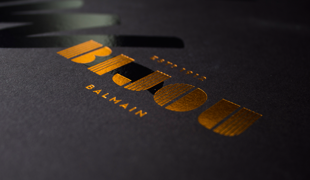
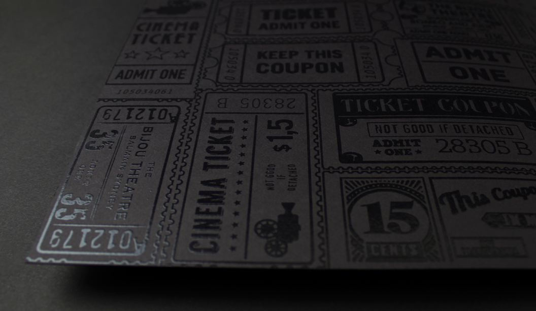
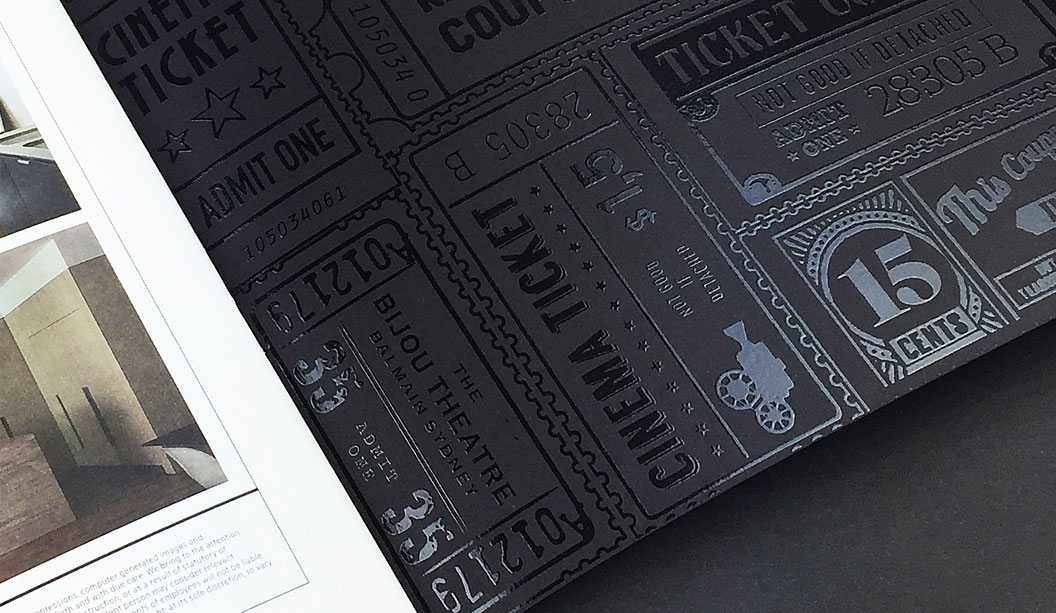
Stocks:Keaykolour Black 300gsm (cover) Keaykolour Ultra White 170gsm (text). Printing specs: High Build Spot UV on the entire outer and inner cover + copper foil logo on front/back Print managed by:Green & Gold.
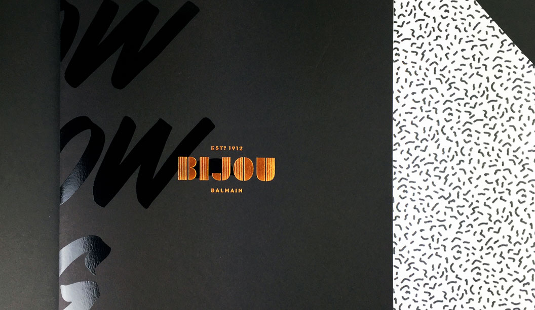
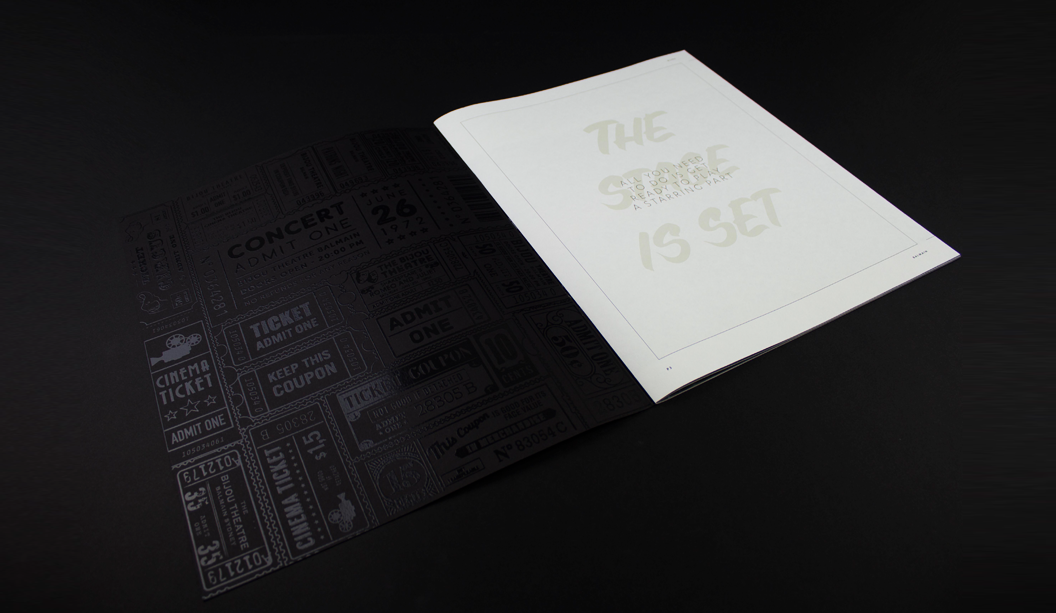
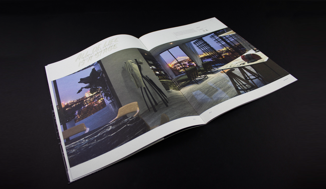
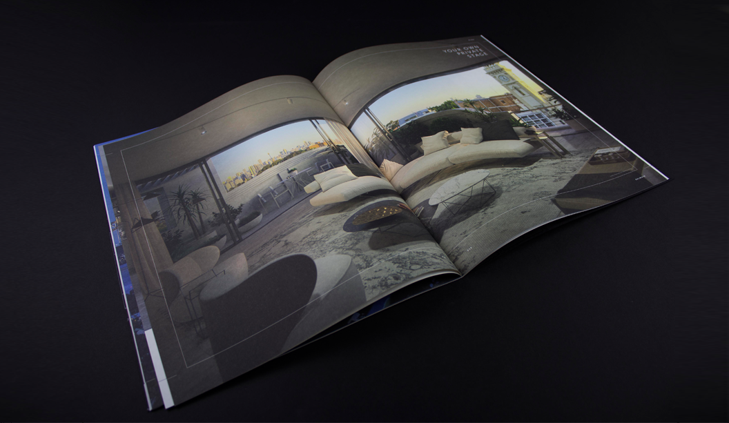
With the boom in property development seeing no sign of slowing down just yet, we bring you yet another stunning piece by Hoyne in NSW for the Bijou development. Led by developer MADE and SJB interiors, the former Bijou Theatre in Balmain is being adapted to create 29 apartments that will exude style and panache.
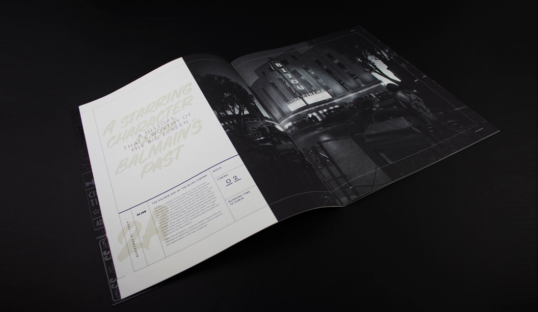
The whole of Balmain exudes a feeling of nostalgia and charm with its colonial sandstone buildings, Victorian institutions and small workers cottages set among leafy streets. The Bijou itself is a robust art deco building well recognised by locals.
The entire brand identity developed by Hoyne references the art deco heritage of the building in a contemporary style. And the campaign features a script reminiscent of retro movie credits and theatre posters that points to the building’s past life as a theatre and cinema. What’s old is new again.
Hoyne chose Keaykolour Original mainly for its texture. As Leesa from Hoyne adds: “This project was all about the art deco influences, so we wanted a paper that felt vintage but lush.” It’s a great pairing and another fabulous example of how the right paper complements the design.
We really do see a lot of property pieces come across our desk and it’s great to see considered pieces like this one. Some simple embellishments, great design, print and paper choices has set this piece apart from others we’ve had come across our desk. Kudos.
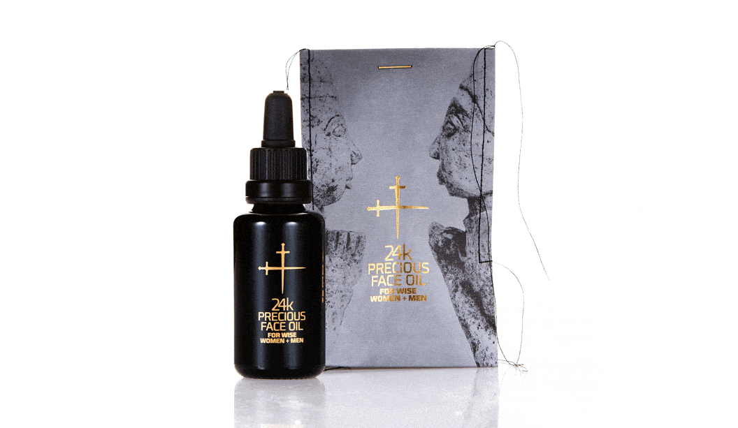
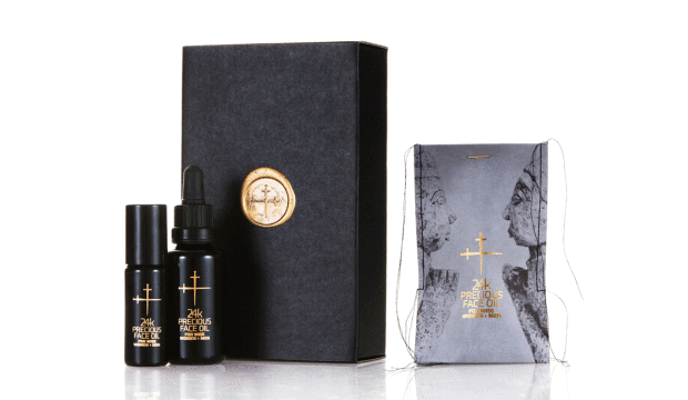
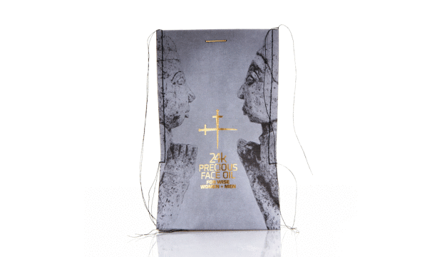
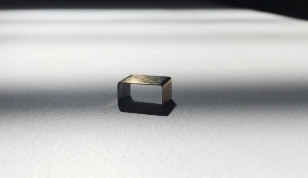
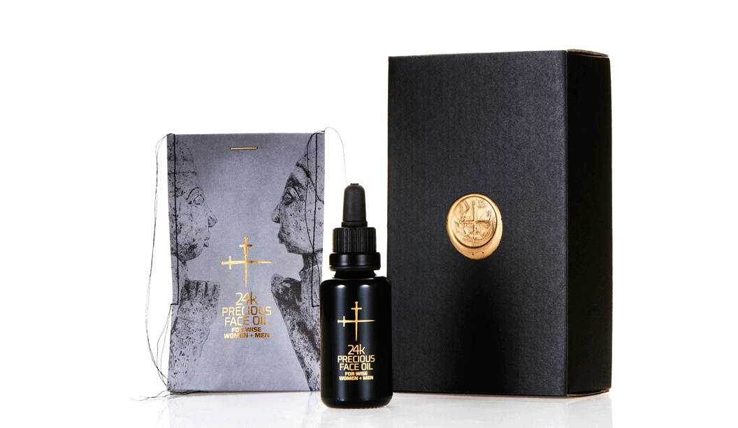
Title:24k Precious Face Oil For Wise Women + Men. Agency:Lepaar (NSW) – Johanna + Christo Everingham. Stocks: Knight Textures – Linen 2-sided 280gsm Printing specs: Offset, CMYK + PMS + Pantone Blue 072U and Pantone 7579U. Printed by: Lindwall + Ward, Marrickvile NSW (1c black offset + sealing varnish). Gold detailing + embossing: Goldcraft, Marrickville NSW. Embellishments: Stitching: Christo Everingham. The 14k gold plated staple from: OOOMS design studio, Netherlands.
Talented much are the first two words that spring to mind when speaking to Johanna, one half of Lepaar (the other half is…her other half Christo!). Drawing inspiration from the Knight promotion we released many years ago, the Lepaar design duo set about creating the packaging for their 24k Precious Face Oil.
Good design comes from lots of places but without a doubt, a brand’s philosophy will shape how good the outcome is. Lepaar are out to design exquisite products and objects of quality, beauty and function. They work with the best manufacturers, craftsmen and materials. They’re also staunch supporters of Australian companies and goods, plus they’re opposed to today’s throwaway kinda culture. The ingredients for the face oil are organic, biodynamic and from ethical growers and producers. We picking up what you’re putting down Lepaar.
Time for us to hand it over to Johanna, who has shared some great insights into the process…
“Because of our focus on local business, Doggett’s has been our first point of call throughout our years as brand designers. It’s a family run paper house, based in Australia and I’ve had brilliant personal service all the way through from Nathan Doggett. Living in the same suburb and bumping into each other over coffee or at house parties helps!
The Knight range has always been my personal favourite. The stock is one of the nicest to print deep blacks on without actually using rich blacks. For this particular job, we picked Knight Linen because it’s got a fabric-like stretchy quality to it which we needed to squeeze the bottle into the sleeve after stitching. The texture allows for stretch and handling without crinkling.
We know the stock, so did expect it to look and feel expensive and luxurious. Yet we were amazed by the richness of the black, given that we only printed 1c black, without extra screens. We did print offset rather than digital, which I believe made a difference.
We wanted the sleeves to be very avant-garde, expensive and luxurious looking, showing off the hand-made character of the stitching without making it look ‘crafty’. Our objective was beautiful, luxurious packaging that is not wasteful, has a collectors-item quality to it, is different and communicates the precious nature of the product.
We spend a long time sourcing packaging and found it tough trying to find someone who would produce small quantities in luxury materials and finishes in Australia, without much luck. Because we stitch all our products into paper packaging we ended up trying different versions of sleeves on the sewing machine one day, reluctantly cutting up my well-loved Knight promo which I consider a collectors item. It worked and looked stunning. Different and modern and rock ’n roll all at once.
The closure was a headache, until lateral thinking kicked in. We had stapled it just to see what it looks like closed, got the gold ink marker out and painted the staple. Bit of night time googling produced OOOMS, a dutch design co who had released 14k gold plated staples a few years back and Guido the owner was only too happy to send some our way. We love them and suggest to customers to reuse them as lapel pins or make earnings out of them.
We believe we have created packaging that conveys language – one interacting string of things that mix and match and talk to each other. In this case all the ingredients, inside and out, sing.”
Thanks Lepaar, our fellow paper obsessed customers. You’ve created truly beautiful and unique home grown packaging that we love, love, love.
Agency: Tiliqua Press with students from Billy Blue. Publisher: Felix Oppen.
Stocks: Grange Offset 300gsm/110gsm. Printed by: Seed Print Group in NSW. Printing specs: CMYK Offset printed.
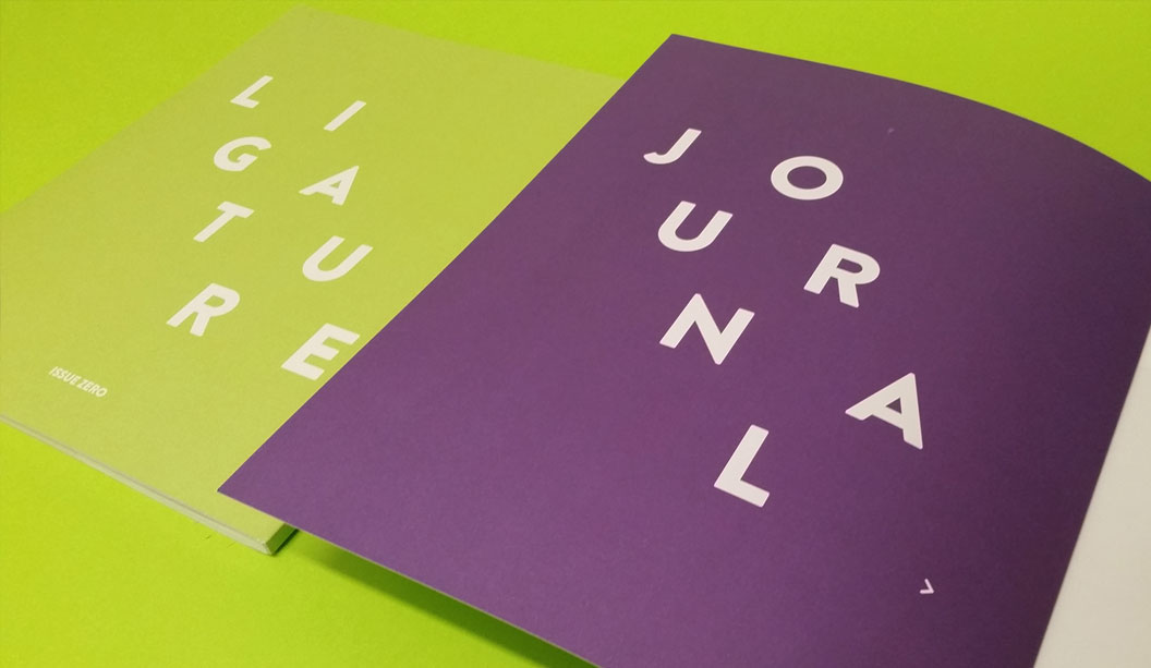
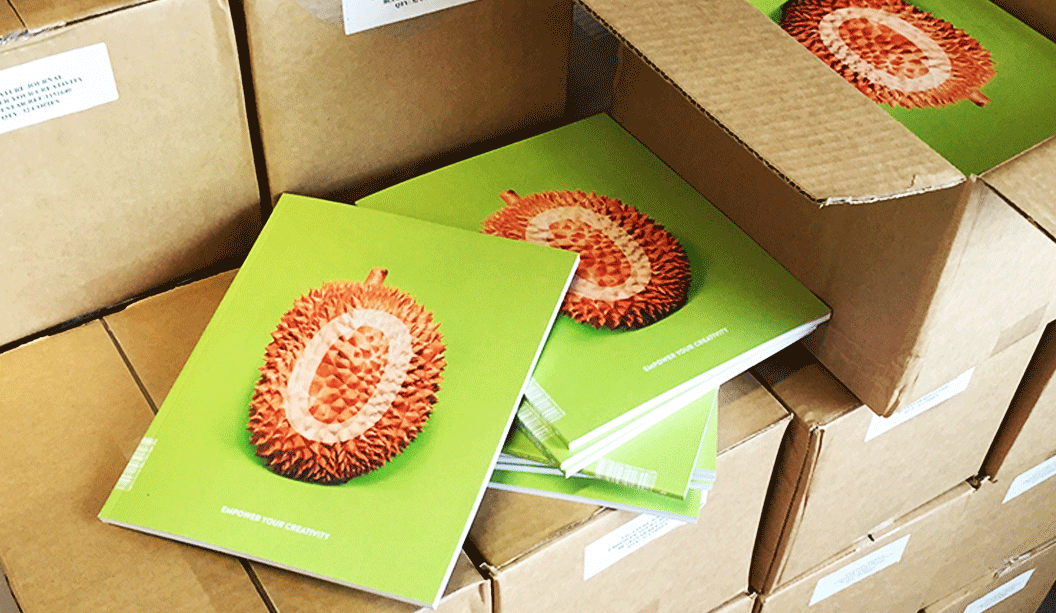
Every once in a while, someone dreams a little dream, yanks it out of the matrix, thrusts it into reality and watches it take shape. It’s a beautiful thing. This is the case with Felix Oppen, who recently launched the inaugural Ligature Journal, a publication made in collaboration with a bunch of hard working and enthusiastic students at Billy Blue College of Design.
If you’re looking for a fresh compilation of ripper content featuring local artists and student work that spans graphic design, illustration and photography, call off the search party. One of the many cool things about Ligature Journal is that every aspect is student managed from content to press checks to building the digital version. While some may be dismissive of a student magazine, it totally stands up on its own as a top shelf, relevant publication. This is exactly the vision Felix had for Ligature Journal – that it would add to the design and creativity discourse in Australia, New Zealand and beyond.
The team chose to release print and digital versions of Ligature Journal. Felix believes the future of publishing is to let each medium play to its strengths but work together. Smart. It is intended to be a tri-annual publication and you can already buy Issue Zero here.
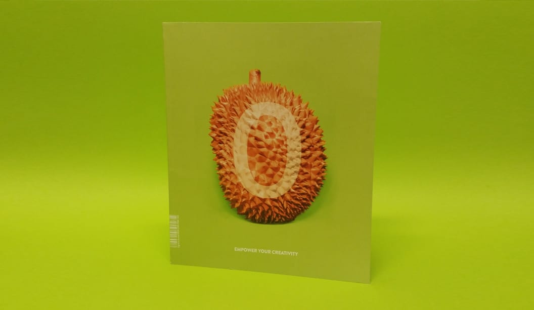
The stock chosen for this work is Grange Offset 300gsm/110gsm, an economical, bright white uncoated paper which Felix says punches way above its weight and is regularly mistaken for a specialty paper. We agree that the print job looks bang-on, and we look forward to watching the development of the concept across future issues.
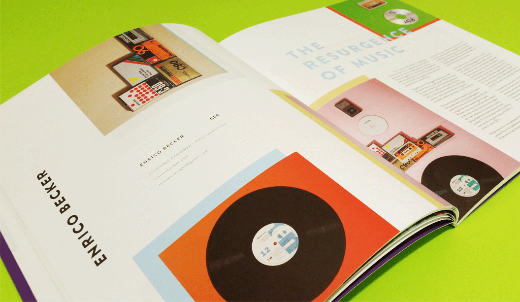
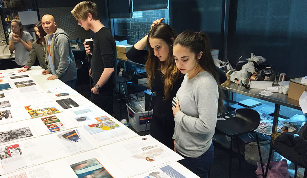
Pictured: Students reviewing layouts and the running order of articles, with Kuen Kam – the Billy Blue lecturer/mentor.
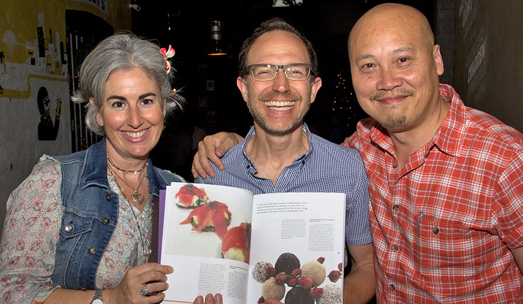
Pictured: At the launch, a very happy contributor, Neil Barnett (centre) and is partner, Vicki (left), with Neil’s article on raw food. Kuen Kam (right) is the Billy Blue lecturer/mentor for the students.
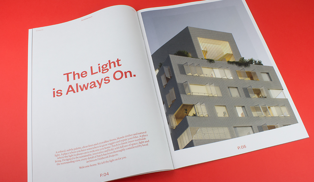
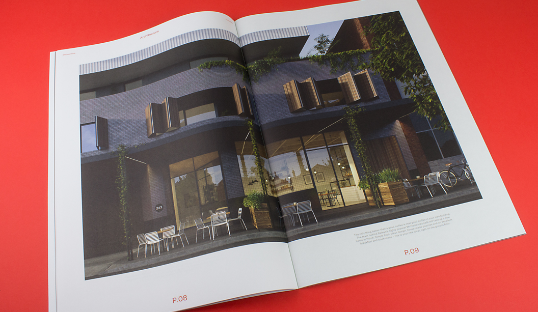
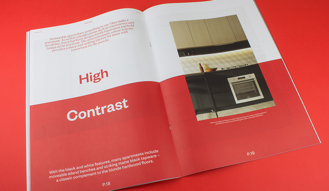
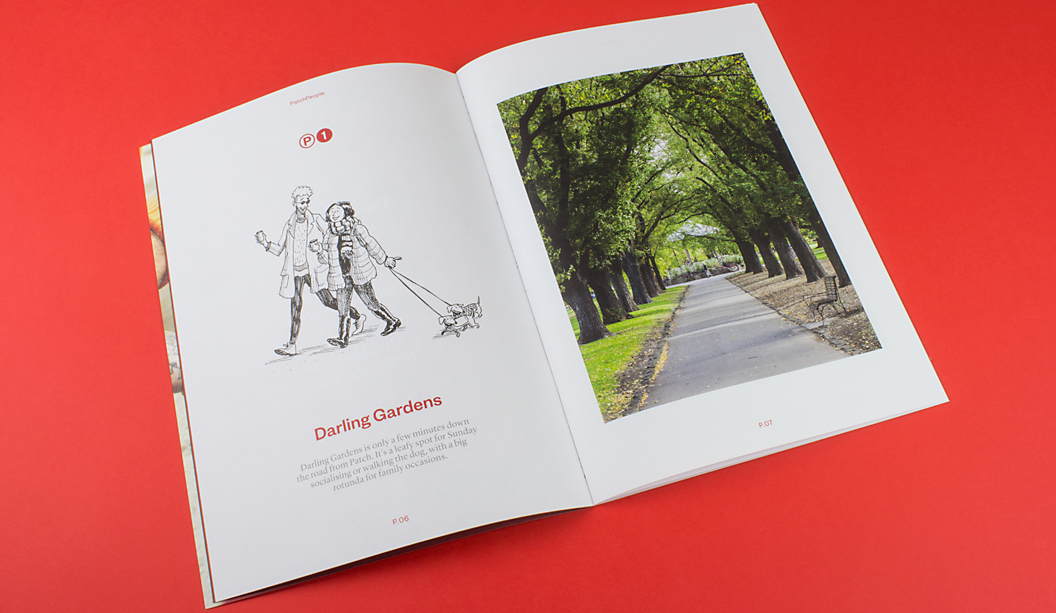
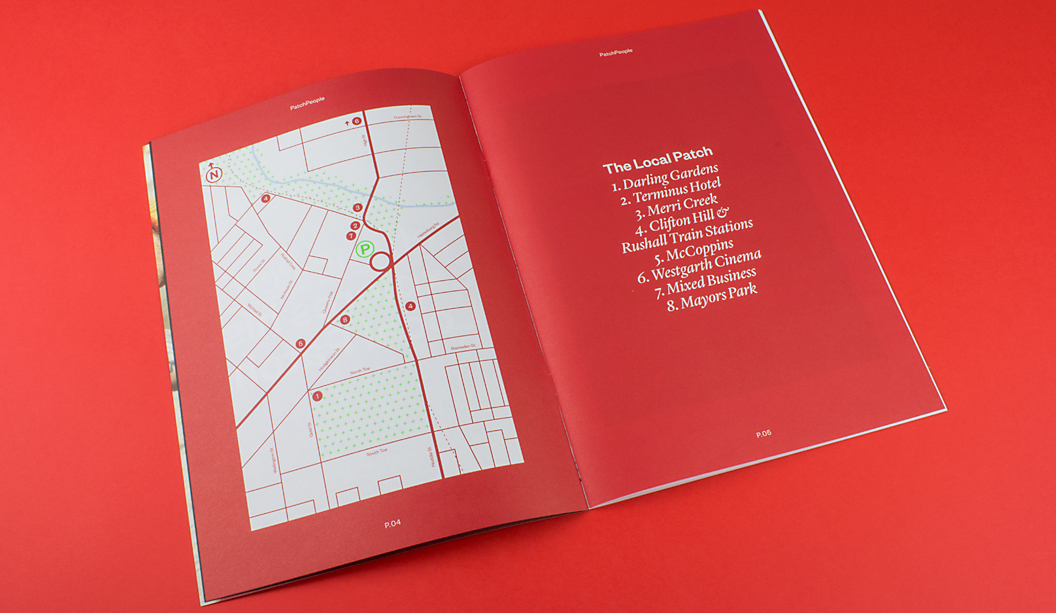
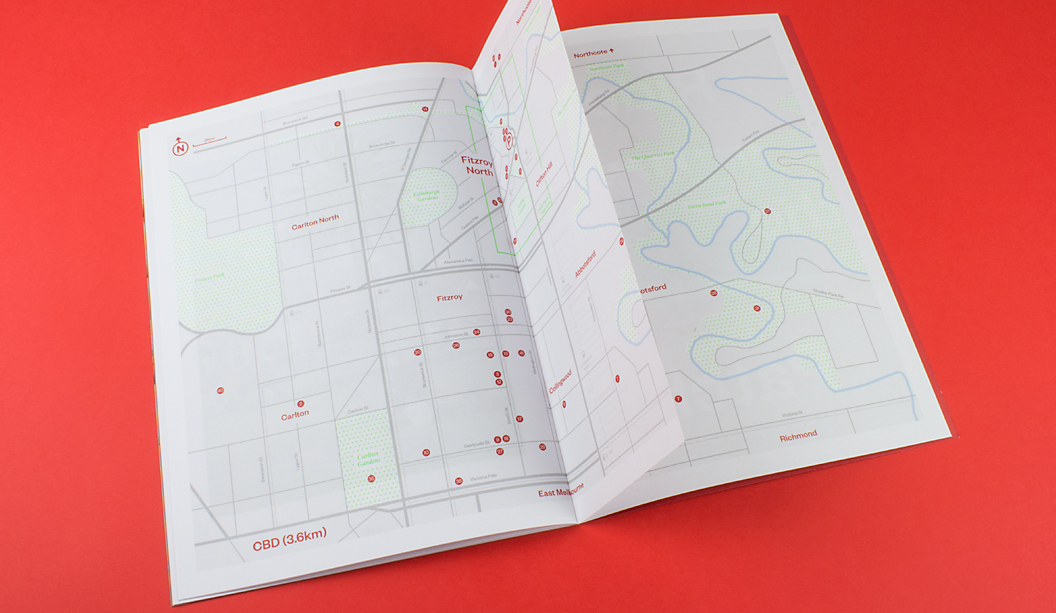
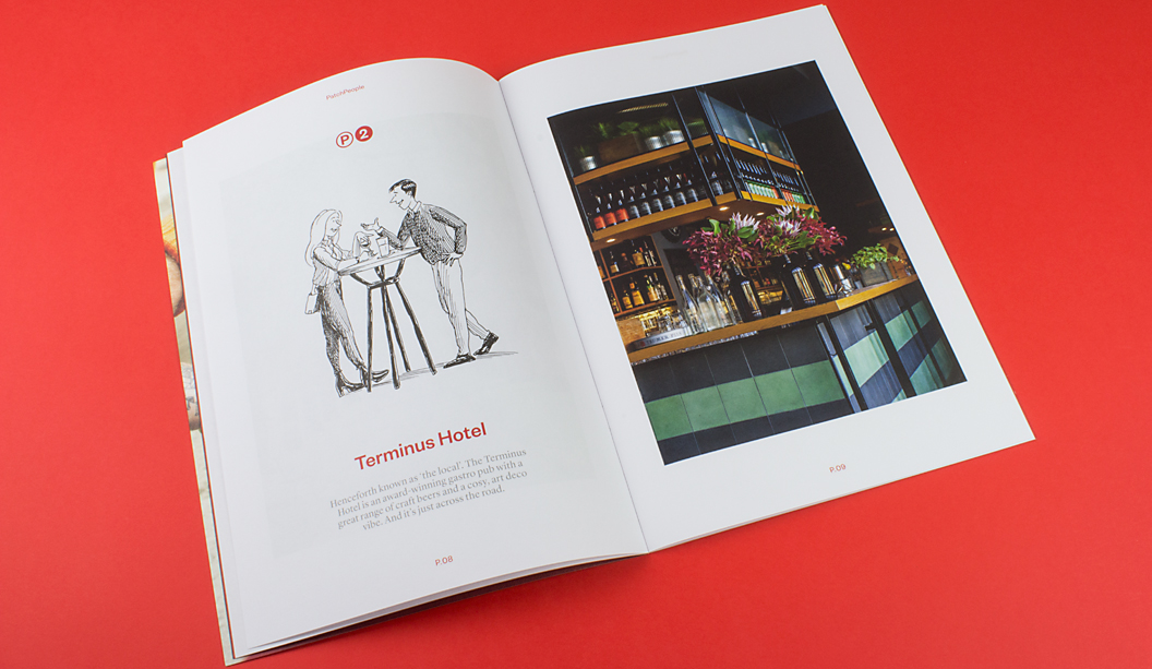
Take a look at ‘Patch’ designed by Studio Hi Ho in Melbourne. It’s a job that really stood out as one of the simplest but coolest property brochures of 2015. There’s a quote inside the brochure that states: “Patch provides a sharp and striking interior for those with a penchant for punchy.” What a great quote. And we think the brochure more than lives up to the rhetoric.
The print piece starts off with a Sovereign Offset 100gsm cover that features a killer 4 colour red logo on a custom ‘vellum’ emboss pattern from Tafeda. The inside pages showcase full bleed blacks, bold reds and knock out 4 colour images on the Knight Vellum 100gsm text. The reproduction by Adams Print is truly outstanding. We were amazed it wasn’t a special red PMS.
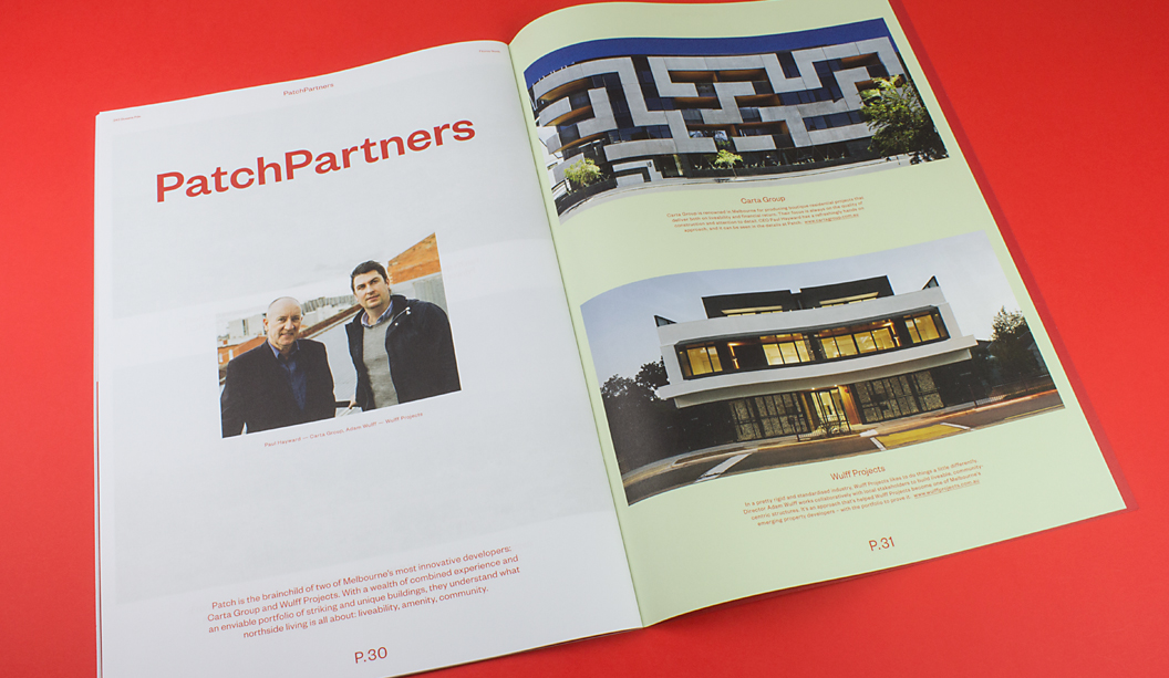
Our favourite bit though is ‘Patch People’ with the quirky and truly spot on illustrations of locals by Jeff the Peff. One of our marketing team staff lives right near the development (ok it’s Catherine), and she is sure Jeff has drawn one of her neighbours. A spot on interpretation of ‘Tim’ (you know who you are). Tim, you’re famous!
Jokes aside, it’s a job that really made us want to pick it up and have a good look. That’s a big deal among the masses of excellent property brochures we’ve seen this year. We did a property week feature on Facebook and Instagram back in August and that was just a snap shot of the great pieces we’ve seen in 2015. Check it out for some more property work inspiration.
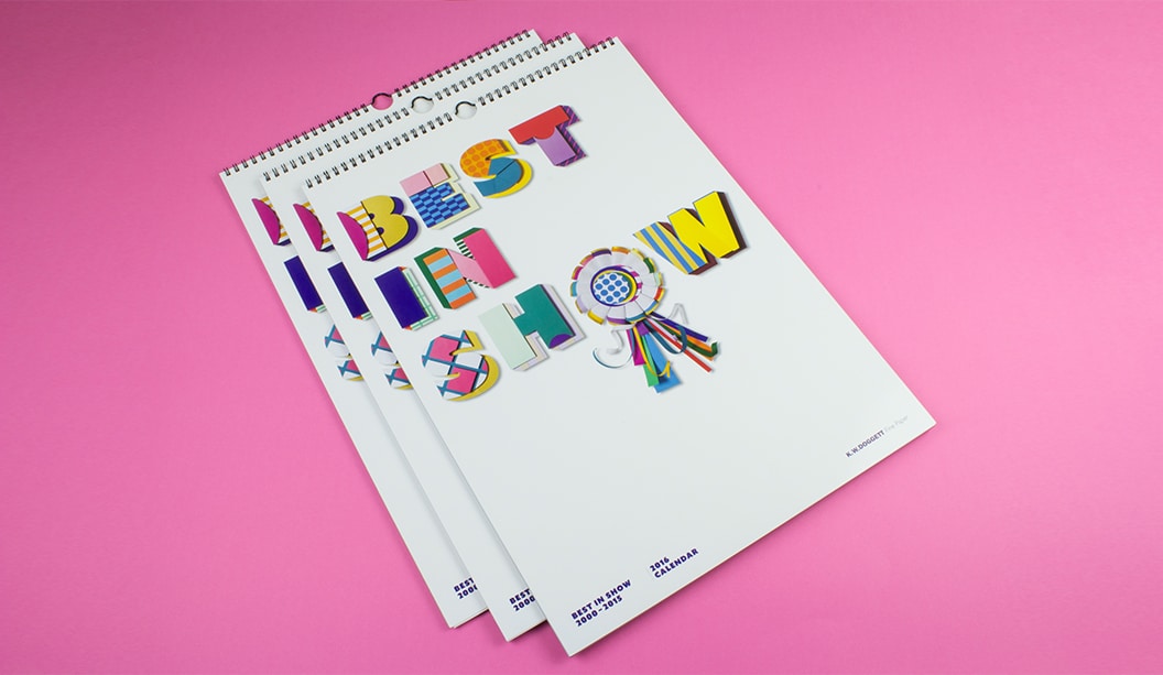
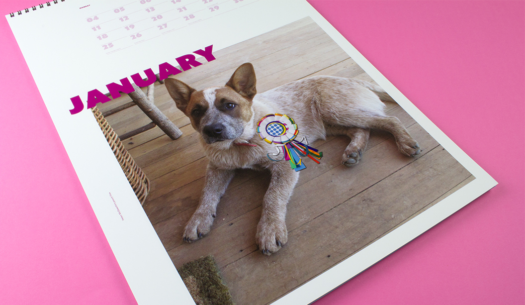
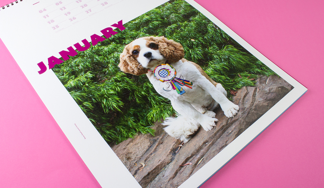
Bring on the 2016 Doggett calendar, as voted by YOU! Featuring many of our favourite papers and a few bells and whistles, ‘Best in Show’ is a celebration, a paper and poochie bonanza showcasing the most popular images dating back to 2000. The fate of the calendar was put in the hands of our customers, paper lovers and social family and over 1000 people submitted a vote. So a huge thank you, to everyone, who participated.
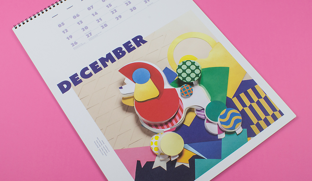
The cover and December artwork is by paper genius and friend Benja Harney. That man can fold paper like nobody’s business and also happens to be the loveliest guy. Benja also made the paper rosette worn by 100 pooches from around Australia that took part in the ‘Pimp my Pooch’ campaign.
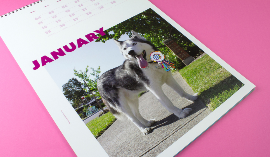
What is this you speak of?! Pimped pooches?! We offered all our customers the opportunity to have their pooch feature as the January star in a custom Indigo printed calendar. Some of the stars are shown below and you can check out others on our Insta page.
To all of our lucky customers that receive a calendar, your rep is coming around in the weeks before Christmas with your copy. Enjoy!
Printing specs:
Cover: CMYK plus emboss on Finesse Cast Coated 250gsm.
Credits page: CMYK on Wild 150gsm.
January: CMYK on HannoArt Plus Gloss 200gsm.
February: CMYK on Knight – Smooth 140gsm.
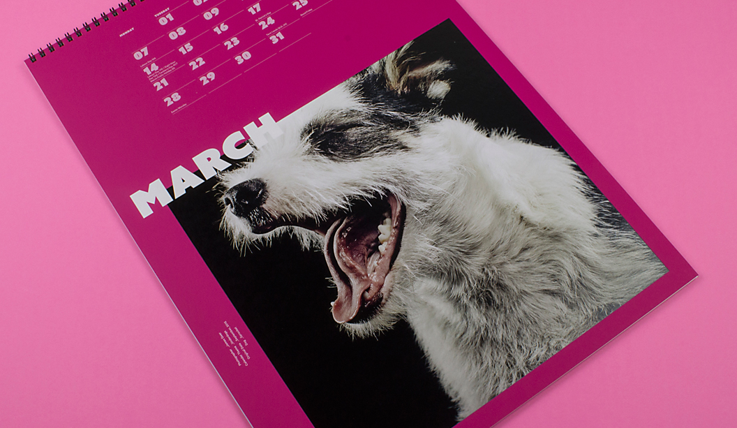
March: CMYK plus 4 hits white ink (title of month) and 2 hits white ink (dates and image) on SKIN Curious Collection – Pink 270gsm.
April: CMYK on Curious Metallics – Virtual Pearl 240gsm.
May: CMYK on Envirocare 100% Recycled 250gsm.
June: CMYK on Cambric – Colonial White 270gsm.
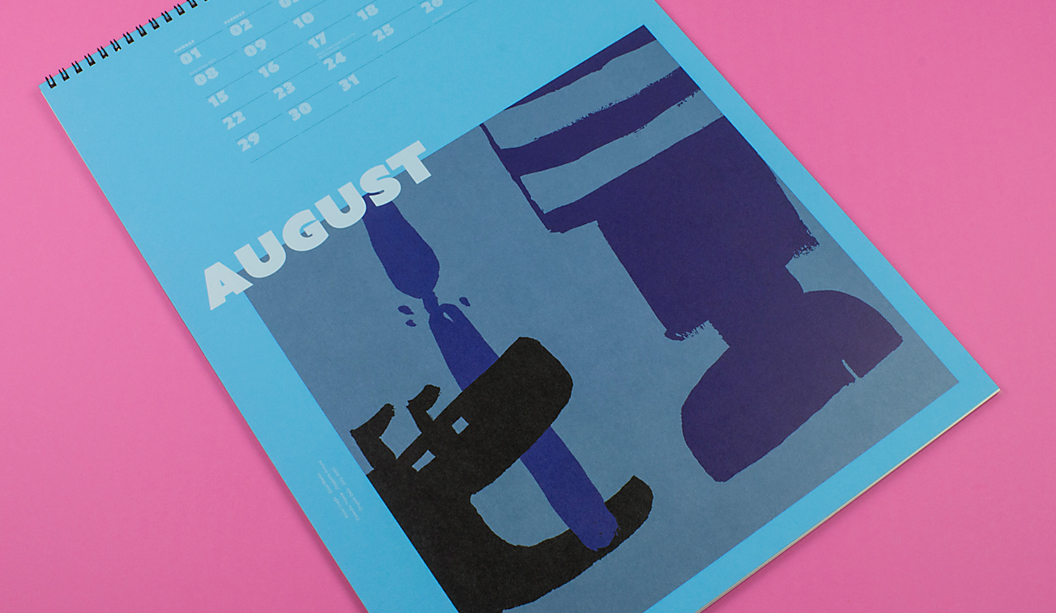
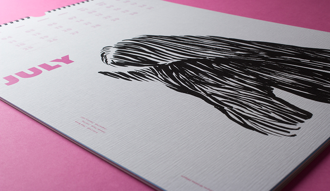
July: CMYK on Tablex – Textures Wrinkles 280gsm.
August: CMYK on plus 4 hits white ink (title of month) and 2 hits white ink (dates and image) on Kaskad – Peacock Blue 160gsm.
September: CMYK on Sovereign A2 – Silk 250gsm.
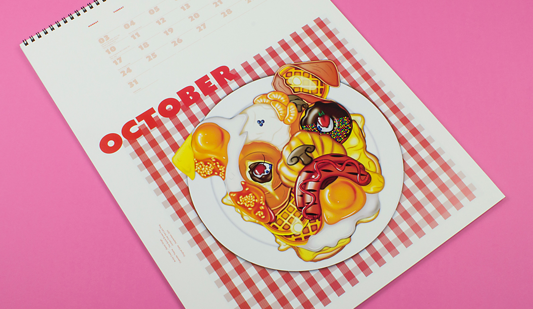
October: CMYK plus Spot Gloss UV on Barry Bleach Board 170gsm.
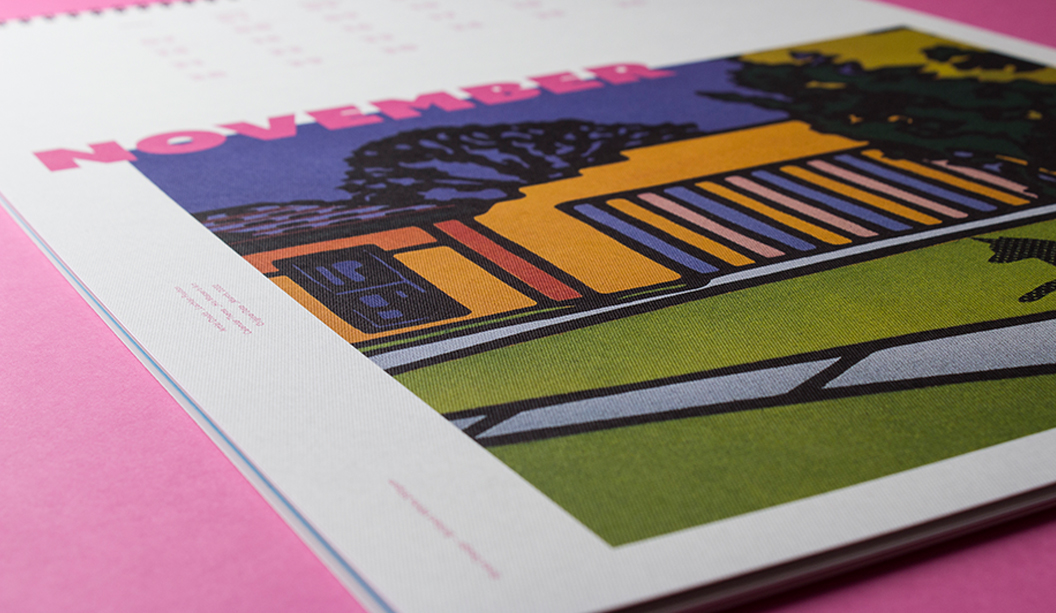
November: CMYK on Rives Design – Brilliant White 250gsm.
December: CMYK on Sovereign Offset 160gsm. ‘Pimp my pooch’
Custom January month: Indigo CMYK on Sovereign A2 – Digital Gloss 200gsm. Please read the contents page and blurb of calendar.
Check out some of the ‘Pimp my Pooch’ entries. Woof!
Dot Georgoulas’ pooch Diego
Helen McGeachin’s pooch Finn
Renee Stead’s pooch Snoop
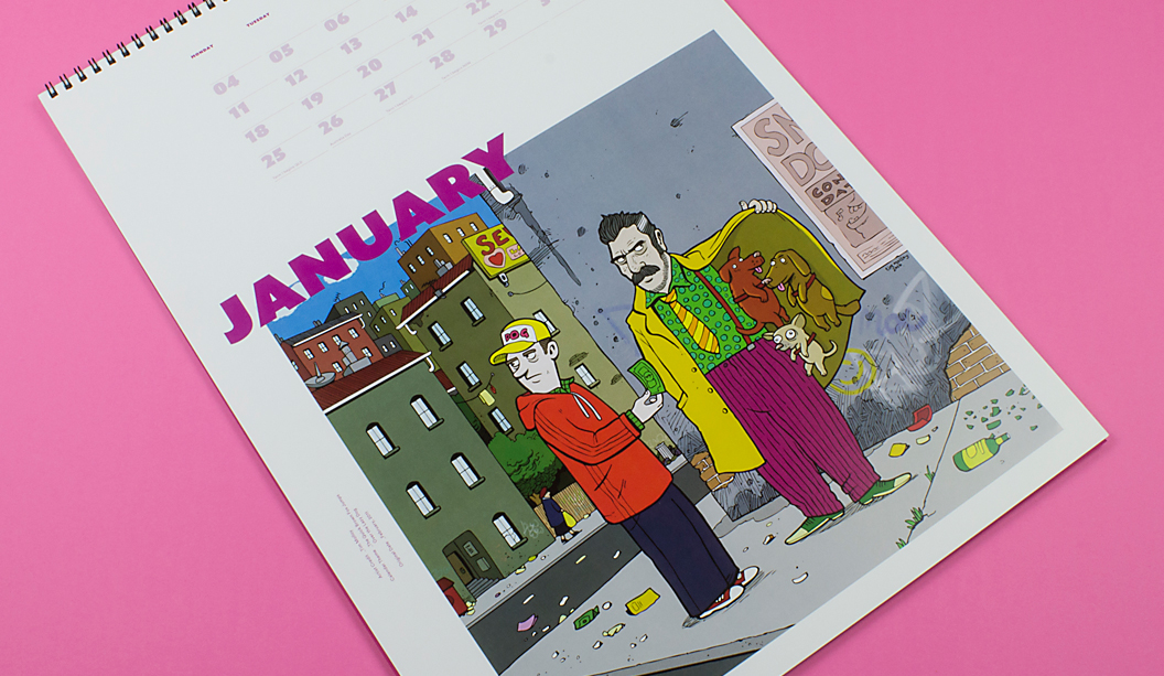
A little about us, a little about the calendar: Dogs for Doggett seems a logical connection. But it wasn’t always the case. In the early 90s (hello purple, green and orange corporate colours!), David Lancashire suggested we should incorporate dogs into our marketing material. It took a fair bit of persuading to get Ken and John across the line. Who would have thought a funny name like Doggett would turn out to be such an asset! Fast forward to 2016 and ‘Best in Show’ is a celebration of doggie themed calendars from the last 15 years. It’s worth mentioning that over the years, the calendar has been just as much about the students/emerging talent that create it, as it is about dogs. Each year we brief in the doggie theme and are blown away by the creative ideas we get back. We’d like to say thanks to the students, lecturers and creatives that have helped us make the Doggett calendar such a success.
Author:Tara Watson Publication:desktop magazine online Published: 20 November 2015
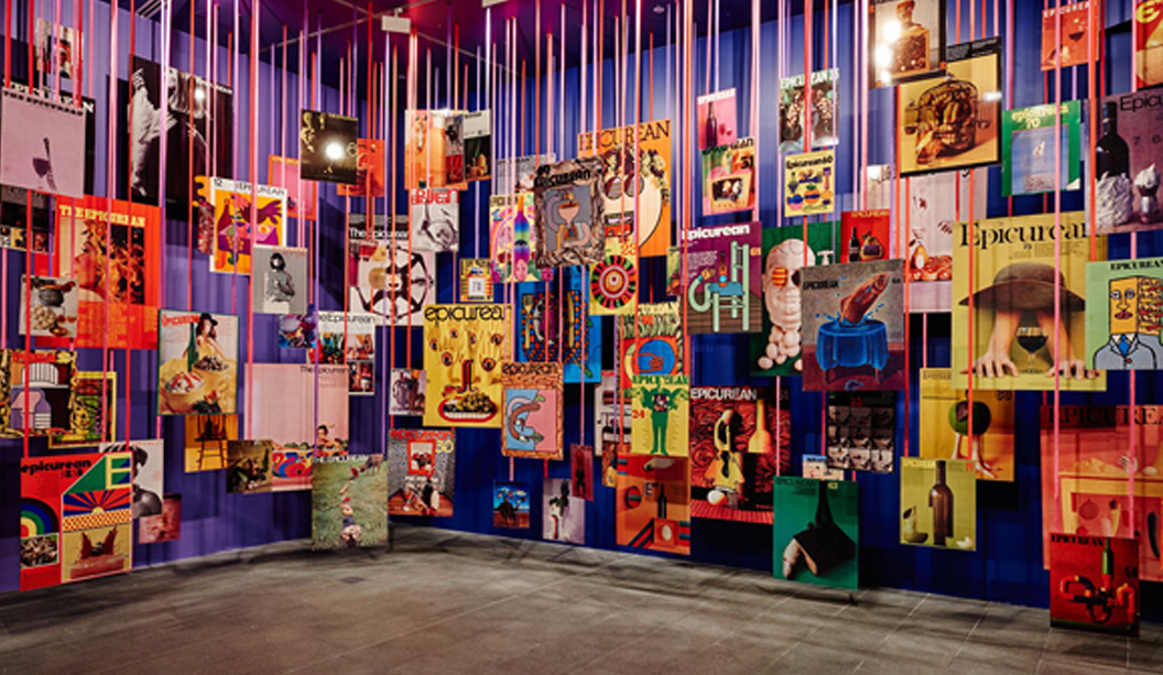
Before the days of Photoshop, undo’s and quick fixes, one artist using a hands-on approach revolutionised the graphic art industry through shifting attitudes to Australian design. Graphic art pioneer Les Mason was one of the first to establish the profession of graphic design in Australia and to mark the opening of the new National Gallery of Victoria (NGV) Design Studio, the NGV presents a retrospective of the artist’s prolific and durable design portfolio.
Les Mason: Solo highlights Mason’s significant body of work spanning over 30 years and his maverick attitude towards design and unstoppable quest for artistic perfection. Known to many as the father of graphic design in Australia, Les Mason: Solo exhibition showcases more than 200 designs and photographs, revealing design process and methods. “This exhibition celebrates Mason’s pioneering spirit and pervasive influence, highlighting his role as a seminal figure in graphic design, both as a practitioner and a provocateur,” said director of the NGV, Tony Ellwood.
The retrospective offers visitors a categorised timeline, tracking Mason’s move from California to Melbourne in 1961, drawing from archives of his evolving work contribution until his death 2009.
The exhibition presents Mason’s diverse scope of designs accomplished across packaging, corporate identity, advertising, architectural graphics and magazine. Highlights include the now classic Tarax Solo lemon soft drink packaging from 1975, the brand identity of Bowater Scott, Glo-weave visual merchandising material, Trusty Dog Food Packaging and more involved work with the State Bank of Victoria and the Salvation Army.
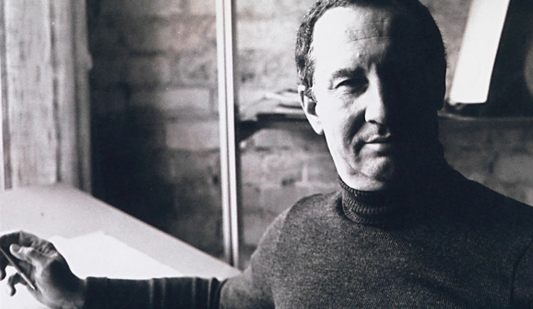
Wife, widower and artistic collaborator Gail Devine worked with the NGV in the curation of the exhibit and said she was thrilled seeing the final design space. Devine drew from her personal collection of Mason’s history of works from packaging, wine labels, architectural graphics, advertising and corporate design.
“I had all this work of Les’ and since he passed away it had been my task to make his memory alive again because he had done so much,” Devine reflects.
Mason outlook on design was diversified and informed by his background in fine art and interior design, drawing on these formative techniques when working on advertising, company identity works and developing processes. Devine adds that Mason started in the industry when “graphic design was just beginning. It was like the days of Mad Men. It was just starting to snowball in the States,” said Devine.
Bringing his unique vision to Australia, Mason opened his first studio in South Melbourne, producing commercial designs and establishing an unheard-of business model where design was in the hands of artists rather than the printers and agencies.
Mason catalysed studio based design practice and incorporated influences such as Dada, Op art and Surrealism into his designs, while establishing typography as a professional craft and breaking convention utilizing mediums such as sculpture in his works.
“I think Les showed what the profession of graphic design could be for all that came after him. How it stood in its own right. How it was as powerful as architecture. It’s a communication. It can connect with a person and be empathetic,” Devine remarked.
“It has got to be powerful and the best that it can be and that’s Les’ legacy: he couldn’t stand crap.”
Mason was a pioneering force behind artists thoughtfully examining the psychology of packaging and design in conceptual process, researching the psychology of gender and colour in consumer-decision making. Mason visited over 500 supermarkets in the US photographing food packaging to compile an advanced research library for reference.
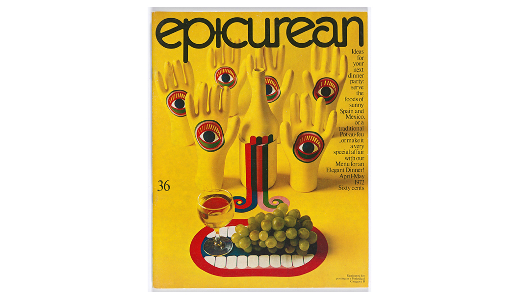
Mason’s most pivotal contribution came from his work on the Epicurean magazine covers from 1966 to 1979. The 77 covers created by Mason remain as relevant and cutting edge as ever, appreciated for pushing the envelope of design norms and presenting graphic design as art; embracing in his work movements such as Arte Povera, Surrealism, Pop Art, geometric abstraction, colour field painting and Op Art.
“Epicurean was a unique process. It was a very select audience, the top food and wine writers. But they had little money to spend so he couldn’t spend the money on photographing food looking gorgeous with luscious photography, so he used his knowledge of fine art in his depictions of food, his knowledge of sculpture, photography and man-made construction,” said Devine.
“For each cover and issue he would develop a theme and go for it. It didn’t have anything to do with anything, usually some relationship to food but more or less it was a fine art depiction.”
Mason’s Salvation Army collaborations displayed at the end of the exhibition would go on to become some of his more controversial designs. Taking an emotive and evocative stance to raise the public profile of their annual Red Shield Appeal fundraiser, positioning confronting imagery, iconography and language as a platform for depicting the harsh realities of exclusion, social disadvantage and as Devine puts it the publics increasing “indifference to man”.
Les Mason: Solo final exhibit features Mason’s last work ‘Unplugged Faces AGI Conference Istanbul Poster’ created just before his death in 2009, inspired by his visit to the conference in Turkey with Devine, offering visitors a personal glimpse of Mason’s final days.
Devine said she was immensely grateful to the NGV for bringing Mason’s life’s work to new audiences, to learn more about the early days of graphic design in Australia and the people that paved the way for the industry that thrives today.
“It was a lot of work and it was very emotional,” said Devine. “People say to me it would have been cathartic, but for me it was more than that. I wanted Les to have the recognition that he deserved because he did so much for graphic design in Australia and he loved Australia. He never looked back when he came here. It was his home.”
Thanks to desktop for the approval to re-post this story.
_
Les Mason: Solo will be exhibited at the National Gallery of Victoria at the Ian Potter Centre from Friday, 6 November 2015 – 21 February 2016. Open daily, 10am-5pm. Free entry.
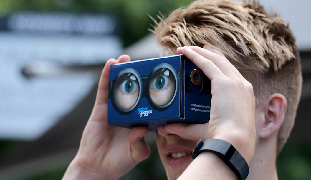
BACKGROUND: To reinforce QUT’s positioning as a forward-thinking and innovative tertiary institution, they utilised Google Cardboard to deliver a truly sensory experience to prospective students.
Google Cardboard is a virtual reality (VR) platform that uses a fold-out cardboard mount for a smartphone. Once mounted with the relevant app installed, it becomes a VR Viewer and replicates an environment that simulates physical presence through sensing movement and rotating the image accordingly. It is a highly immersive and engaging platform, already utilised by numerous brands. Due to its low-cost, sustainable and environmentally-friendly design, Google Cardboard has proven itself to be a very effective application to grab an audience’s attention – and keep it.
QUT is a highly successful and globally positioned Australian university based in Brisbane and is consistently ranked as one of the best performing in the country and the world. With school leavers showing a growing awareness and genuine interest in the importance of global opportunities, QUT wanted to emphasise that their graduates were widely recognised as ‘global ready’. Google Cardboard enabled QUT to encapsulate the message of ‘global ready’ within an engaging and memorable multimedia channel.
“By embracing VR technology, instead of taking QUT students to the world, we brought the world to them.” (Tony Wilson, Director of marketing, QUT).
OBJECTIVE: QUT worked with Brisbane based agency BCM to develop the Global Goggles campaign which created a virtual reality experience for prospective students. It showed a 360-degree rendering of the Brisbane skyline with landmarks from all over the globe, such as the Eiffel Tower and Big Ben popping into view. It was designed to visualise the university’s claims that its students are ‘global ready’ whilst demonstrating its credentials of being a forward-thinking and innovative institution.
METHODOLOGY: 15,000 prospective students and their families who visited the QUT Open Day at the Garden Point campus were given a pair of Global Goggles.
The Google Cardboard device had been branded with the Global Goggles and QUT logos and was constructed by the users from flat pack form. The Global Goggles could be used again and again and for a multitude of different apps freely available to download. This ensured that they would remain with their users for a long time serving as a physical reminder of the positive brand experience they had whilst at the Open Day.
RESULTS: Feedback from prospective students who tried the Global Goggles was extremely positive with a high proportion of users stating that it was the first time they had experienced virtual reality. Global Goggles was a highly effective branding opportunity for QUT and reinforced their brand positioning of being at the forefront of innovation and global technology.
“That was insane. I really felt like I was there. I didn’t expect it to be like that. It was like nothing I’ve ever experienced.” (Prospective QUT student, 2015)
CONCLUSION:
Virtual Reality has the potential to become one of the big trends for marketers to embrace within their multimedia channel campaigns. Because Google Cardboard is a cost effective, accessible and portable adoption of VR, it enables brands to create immersive experiences for consumers and get them to market quickly.
Like all print, Google Cardboard can be easily customised, through shape, colour and branding allowing marketers to maximise impact with their own VR campaigns.
QUT is not the only university utilising Goggle Cardboard to attract prospective students. University of Tasmania was keen to engage students with a tour of their campus locations with an immersive panoramic experience. This proved to be a great attraction to visitors of Open Days who took the virtual tour.
The ability to send a Google Cardboard pack to potential students nationwide, or even worldwide, who cannot feasibly visit before applying to study, offers a novel approach to making remote students feel included and aids the explorative phase students go through before choosing their university.
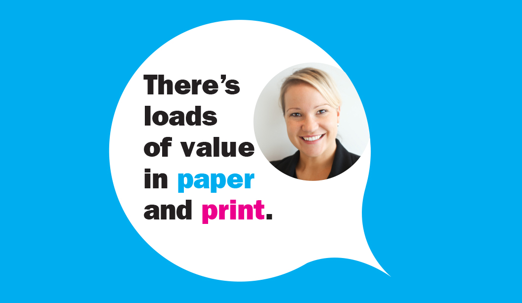
Thanks to Kellie Northwood, Executive Director of VoPP/Two Sides Australia for allowing us to republish this case study, made available to us as Foundation Sponsors of TSA Limited, the publishers of the VoPP (Value of Paper and Print) report. Find out more via www.valueofpaperandprint.com.au.
We love a good package here. Yes siree. Paper, label, texture, colour, it’s all part of our love.
We recently read-up on Landor’s predicted trends for 2016. There’s more on consumers craving authentic interaction, but we feel that one’s been thrown around for a while. One of the big and interesting trends however is the return of bricks and mortar stores, experiencing brands though multichannel/multi sensory experiences, a heightened focus on storytelling and incorporating products into peoples lives more than ever before. Product packaging could be even more important now than it ever has before.
Our top packaging job picks for 2015 are here for your eyes to feast on.
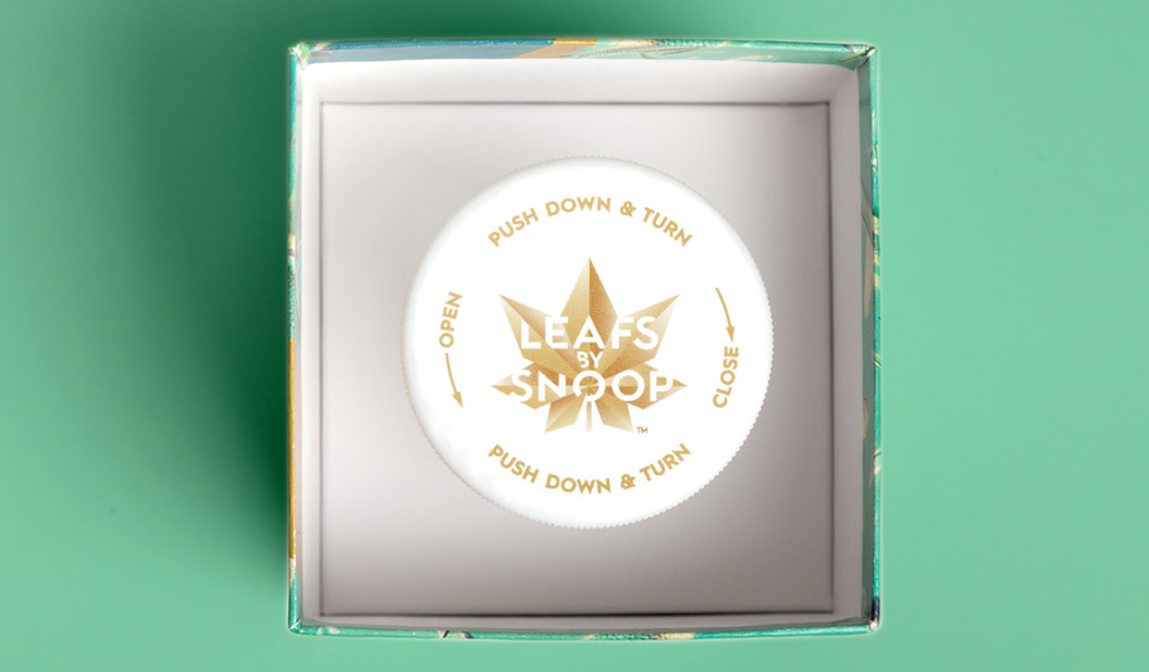
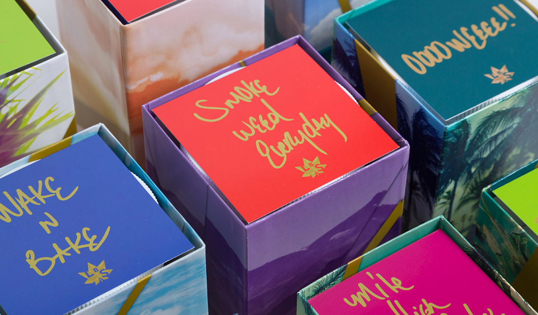
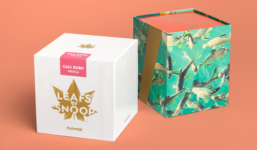
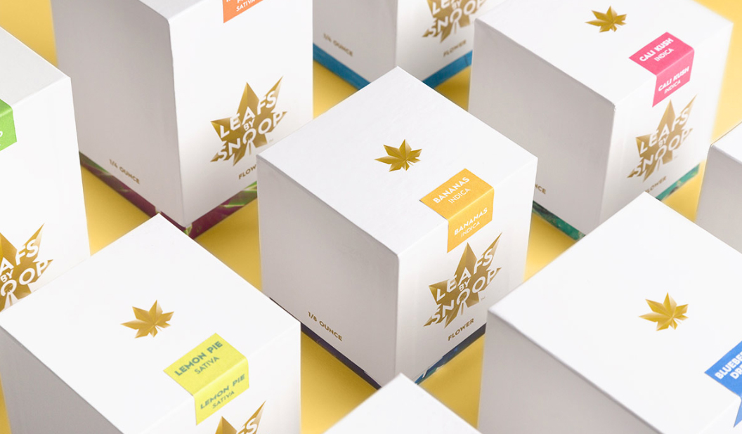
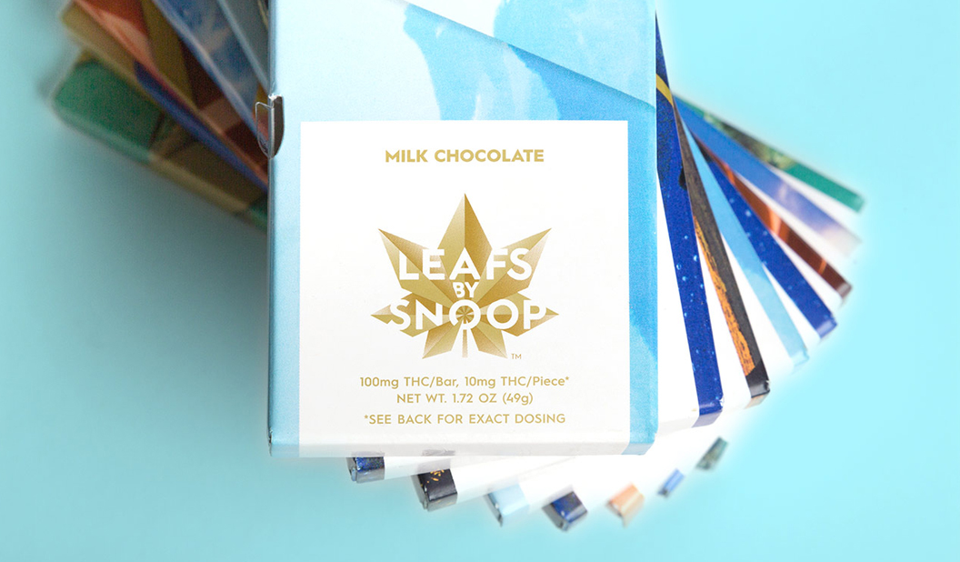
1. Snoop Dogg’s ‘Leafs by Snoop’, designedby Pentagram. We love this colourful and somehow sophisticated, California cool (to reflect Snoops roots) packaging that is promoting his cannabis range. Who are we to judge? It’s legal in Colorado! Everything from the beautifully designed logo to the colourways and use of interesting dies for the paper packaging makes the range a winner. We like the quotes below, written in Snoop’s own handwriting.
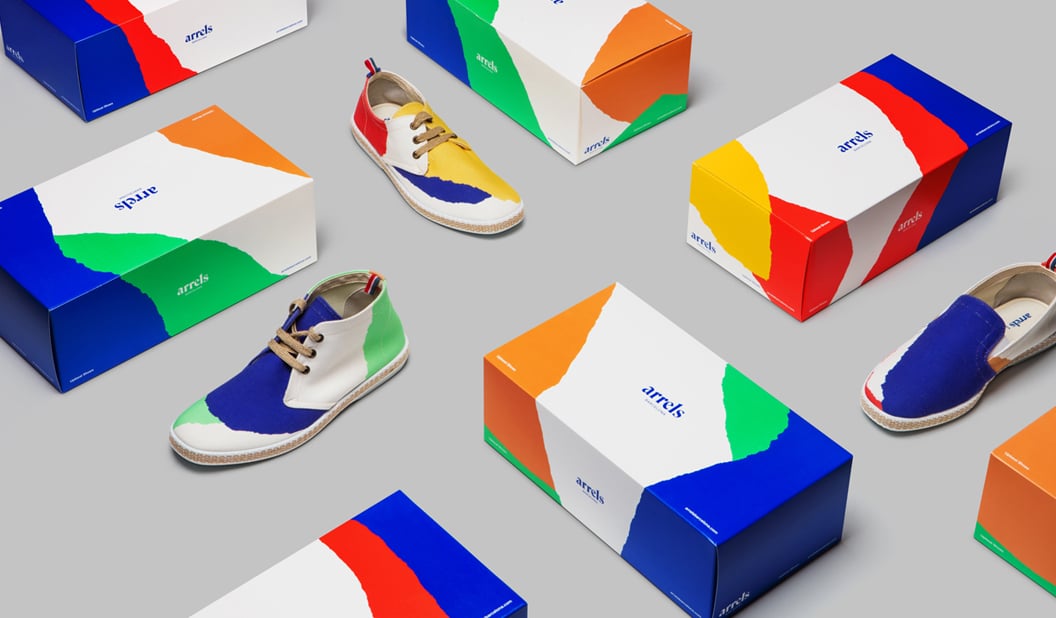
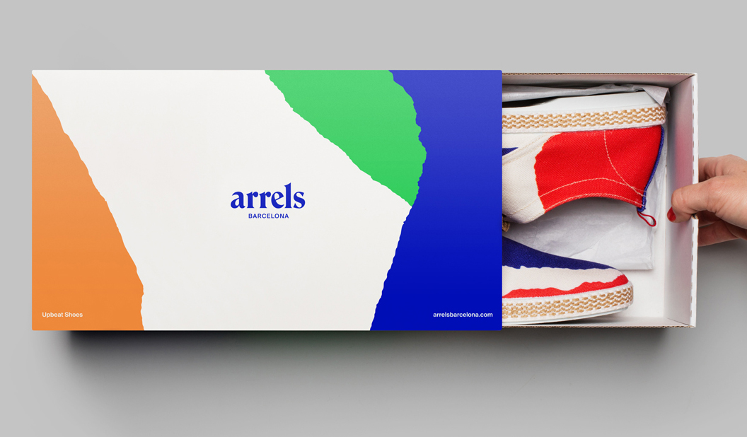
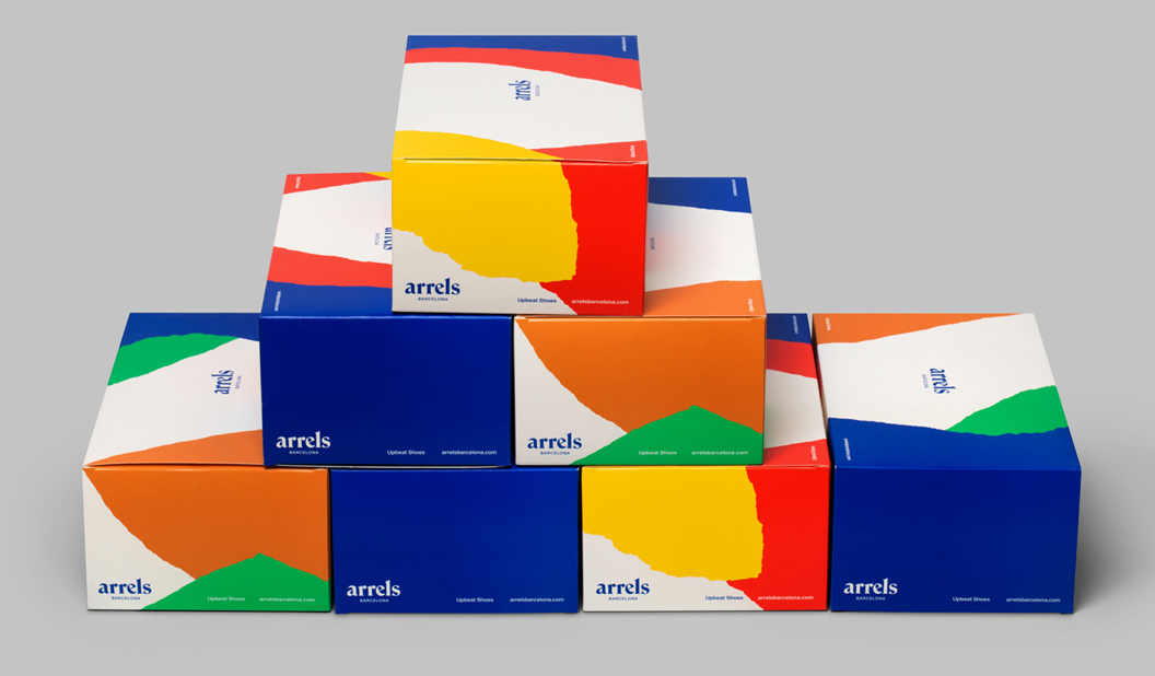
2. Hey Studio’s packaging for Arrels, Barcelona. Buy, buy, buy me now! If only the packaging could talk for sure this is what it would be saying. Colourful, bright graphics that perfectly complement the goods, mmmm m. The pattern created for the boxes extends into the printed brochure and is meant to represent the natural surface of the earth. Read the whole story here.
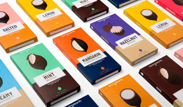
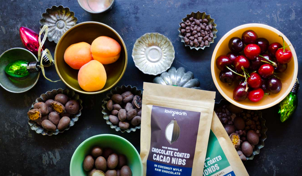
3. Loving Earth rebrand by Studio Round.We’ve got a bit of a soft spot for Loving Earth. The range speaks our language: Australian, chocolate, organic. This latest re-brand is beautiful. With the colourful identity system, illustrations and bold type, it’s a stand-out on the shelves. Read more about the project here.
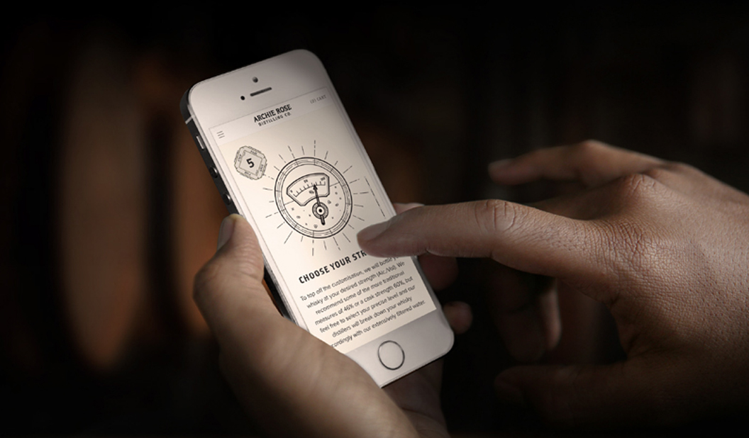
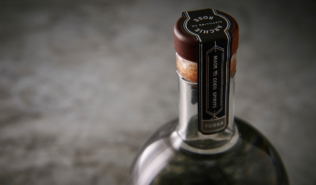
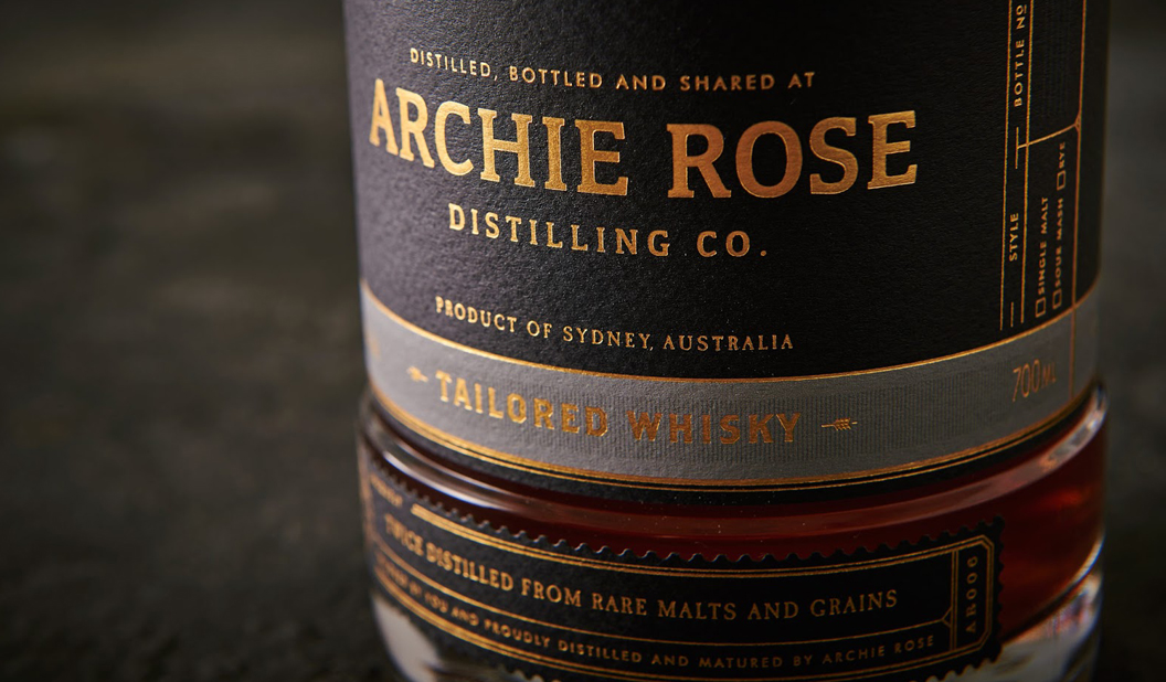
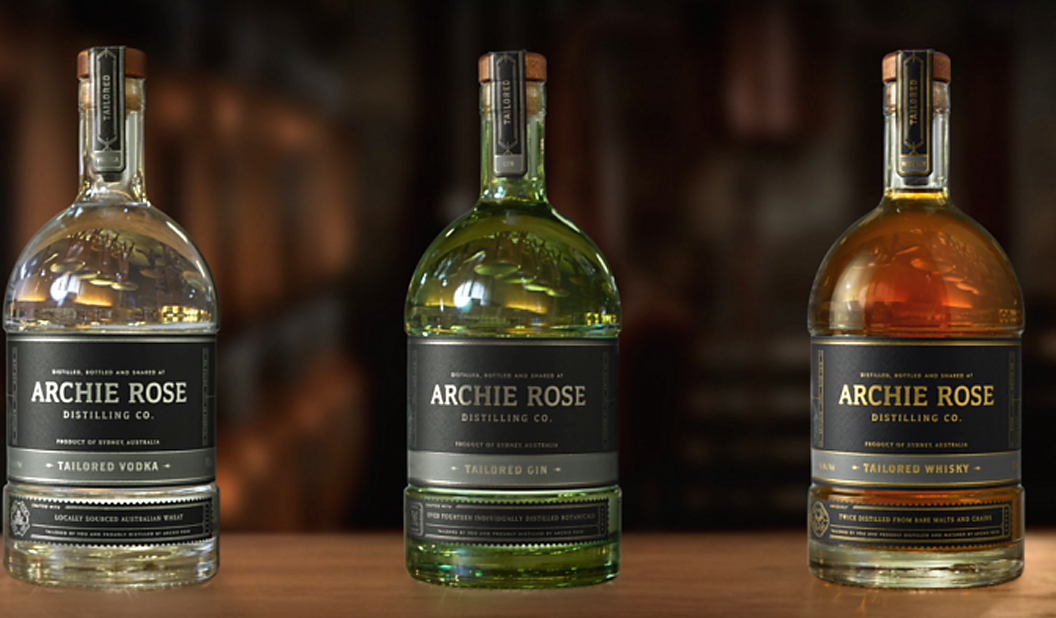
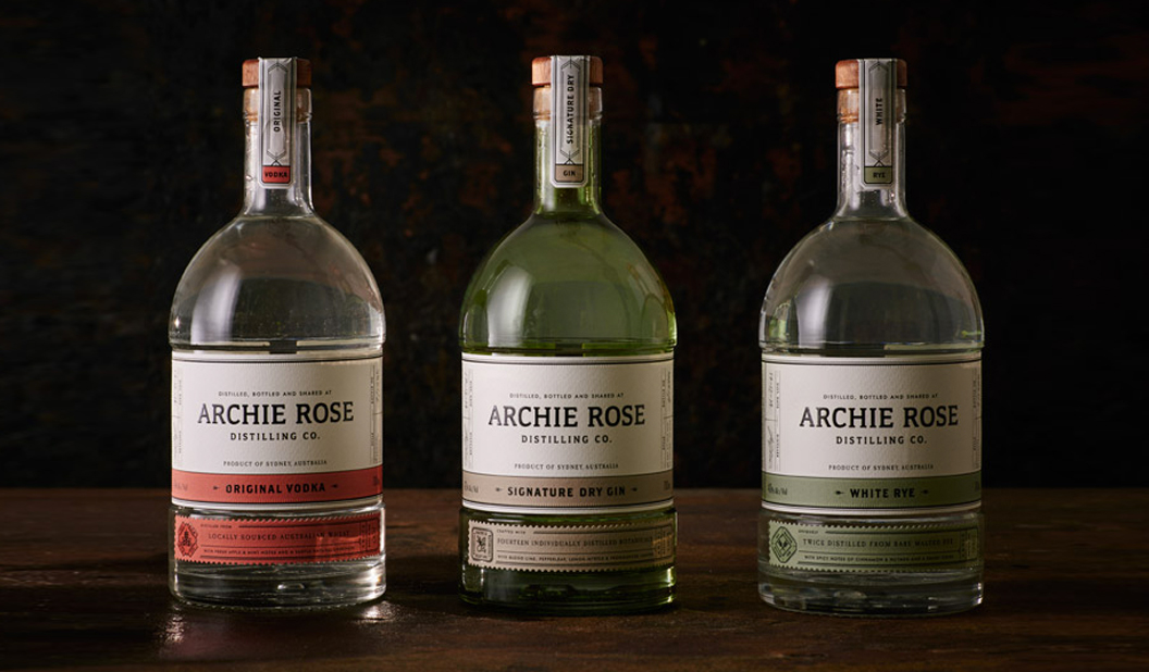
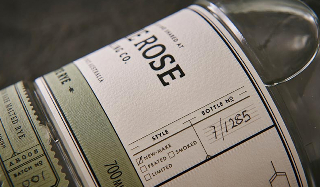
4. Archie Rose Distilling Co. branding by Squadink. This is one of our overall fave projects from 2015 which includes the packaging design, bar and venue branding. There are now two rounds of packaging. The first round saw Original Vodka, Signature Dry Gin and White Rye designed with a creamy white textured label. The second round of spirits are the tailored Vodka, Gin and Whisky. This time on a black label with silver, gun mental and gold foils. And when we say tailored, we mean tailored. You can customise your own bottle from your phone and even get your name on it.
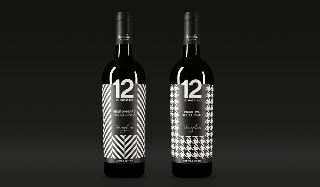
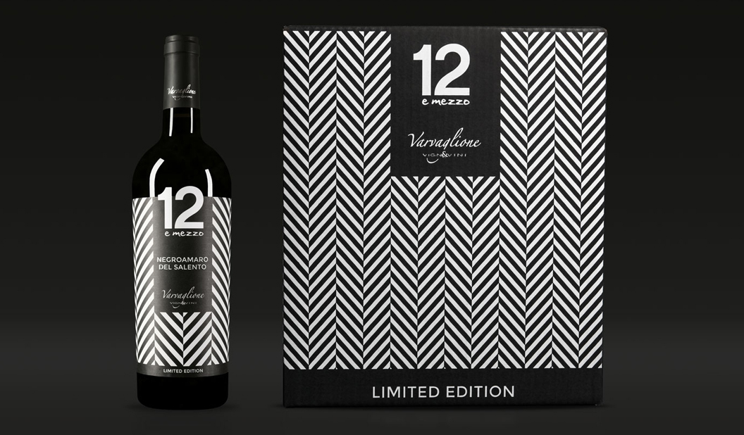
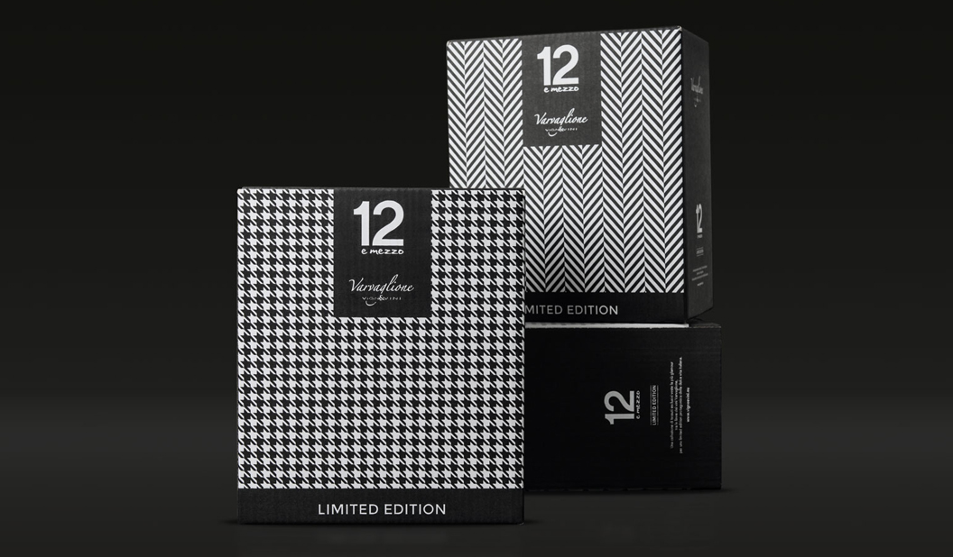
5. Limited edition collection of Varvaglione wines by Idem Design. Inspired by the fashion world, these unique wine labels are dressed to impress. Created by Idem Design in Italy, the three textured patterns represent iconic brands in the fashion world, designed to be collected and admired. And of course to be enjoyed with a delicious Italian meal, preferably in Italy (let’s say Positano for the sake of it).
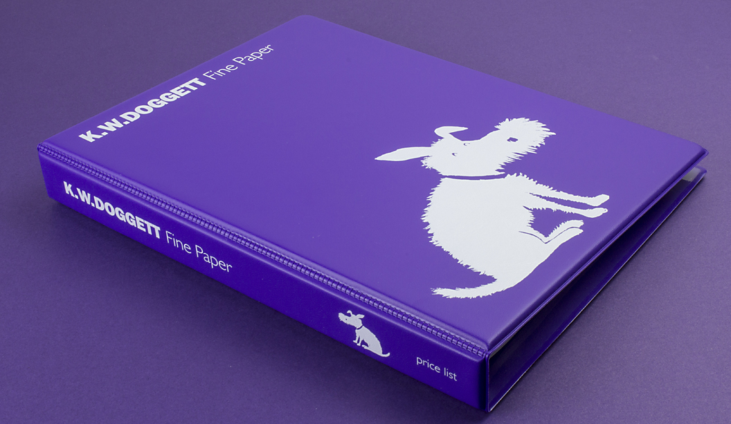
As we enhance our ecommerce platform, our focus is to make ordering paper from us even more streamlined. The latest addition to our offering is digital price books. As in, our purple ‘paper’ price book is now also available electronically. The digital version reflects your most up-to-date pricing information and is just a mouse click away.
Features of the digital price book are:
Familiar format (looks identical to our printed purple price book).
Accurate and up-to-date custom pricing ie net pricing for each customer.
Comes as a downloadable PDF.
Printable: print the digital price book to our ‘folder’ size and have it in hard copy format (we can provide this for you).
Soon it will be accessible for download via your ecommerce online ordering account.
Wide format pricing will be included by early 2016.
Future improvements planned include:
Enhanced navigation: hyperlinked bookmarks in the index for each product category which take you directly to the correct page.
New format: being able to view the price book on your iPhone (currently it’s built for larger screens only).
Finally, we’re also offering you the option to receive customised price data feeds, suitable for automatic upload into your MIS system. We created this to save you time in having to double handle the pricing. Ea-sy. Just ask your account manager about it.
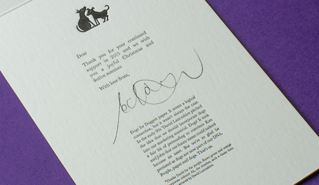
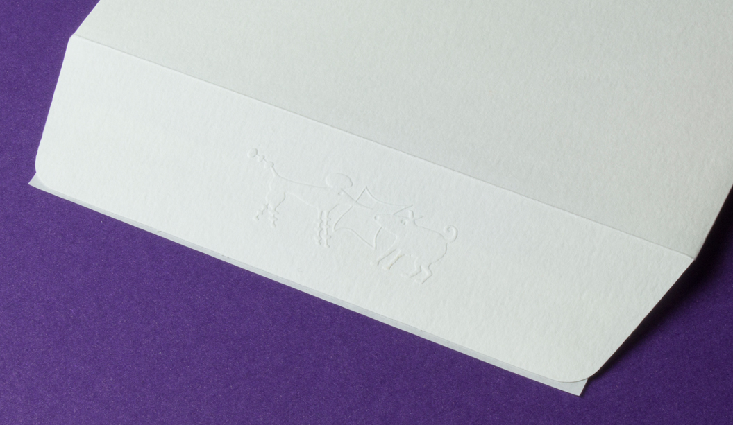
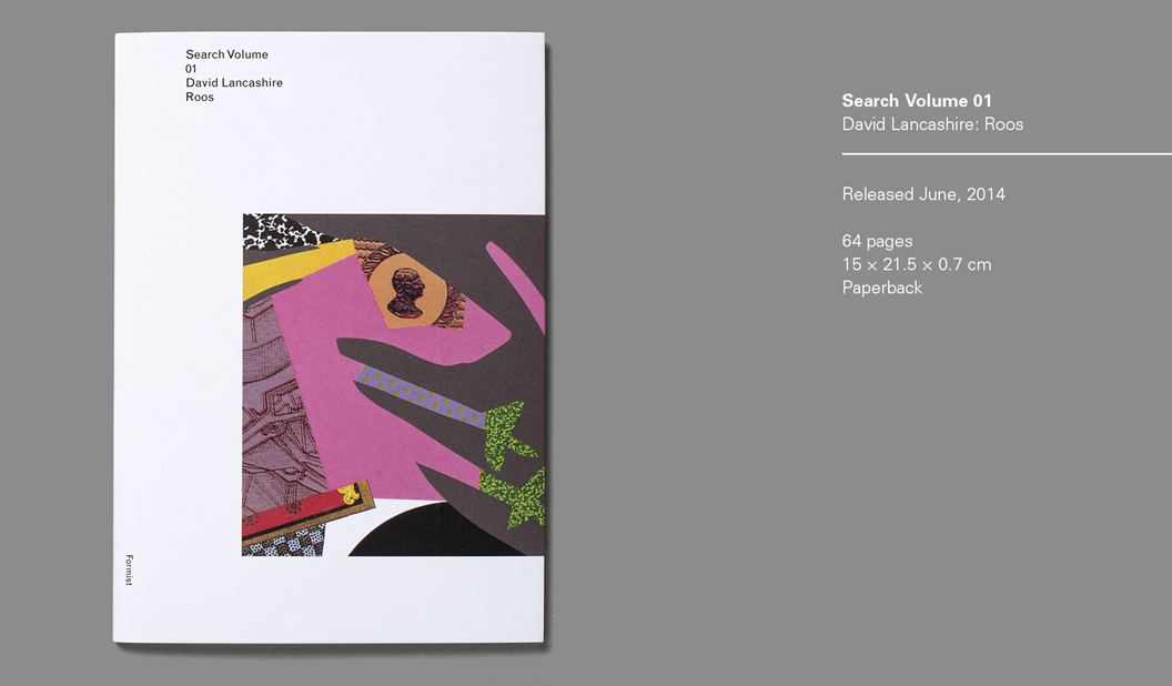
Designer: David Lancashire VIC. Stock: Wild 450gsm (invite) and Wild 150gsm (envelope). Printing specs: Blind emboss, foil and letterpress. Printed by:Watermarx Graphics (blind emboss, foil and letterpress). Envelope printed by Social Printing. Both in NSW.
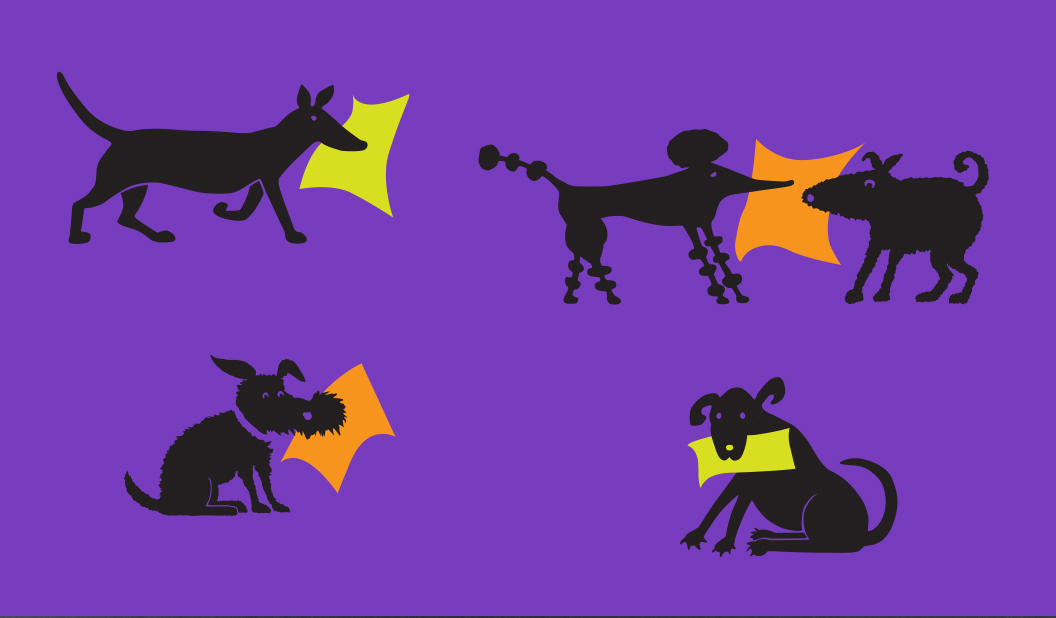
This story comes in two parts and is really, mainly, about the great man himself David Lancashire. Not only can we thank David for the doggie branding he created in the 90s waaaay back when MC Hammer pants were cool and bum bags were an accessory of choice, he also custom illustrated our Christmas card this year. Being our 40th year in the paper biz, we thought it fitting David designed our Christmas card.
Each pooch represents one of the Doggett’s that work in the business today. Ken (Director), John (Director), Simon (Managing Director), Nathan (National Sales Manager), Heath (Sales Manager, Victoria) and Catherine (National Marketing and Sustainability Manager) holding the star.
We used Wild for the card, a 35% cotton paper combining softness with strength, a luxurious feel and very high bulk. The 450gsm card is printed with a blind emboss and foil on the front, letterpress on the inside. The 150gsm envelope features a blind emboss of ‘poodle and fatty’ (more of our doggie branding). Embellishments and Wild go together like brandy sauce and Christmas pudding (cue tummy grumbling).
A conversation with David: We wanted to celebrate David’s history and career too, so we sat down and had a bit of a chin wag. Here’s how it all started…
A young David Lancashire came to Australia as an 18 year old 10£ pom in search of sun and adventure. At first he found work on the factory floor and production line of Weyland Motors. Hardly adventurous for him! David soon realised that he was not cut out for such a repetitive job and after two long weeks quit in search of something ‘creative and stimulating’. He found his way to Claret St Studio, in Vogue House in Sydney. He stayed there for a few years before a driving trip back from Adelaide saw him pass through Melbourne. He decided Melbourne was a pretty good place to try. He drove in his Land Rover straight from Sydney to the doors of Art Associates, brushed off his folio and walked in and asked for a job. He started that day.
Flash forward 10 years and David started his own studio and began working for lots of big names including Spicers and Daltons paper. Ken Doggett saw the great work David had been doing and approached him to revamp the Doggett branding. At first David said no due to a conflict of interest! But Ken persisted and David eventually came around to see the potential.
He pitched the idea that our funny name should be highlighted to create a memorable campaign. Ken and now John were NOT keen. Names like dogs body, dogs s**t were commonly thrown around at school and they didn’t plan to bring more attention to it. But David presented the concept of ‘Doggett’s take the lead’ and illustrated our first dog. It was a big hit with the staff and customers and from there the concept took off.
The purple, green and orange corporate colours came next. “The other merchants all had very traditional branding, Doggett’s were the new kid on the block and we needed to stand out. Purple certainly did that!” said David.
“The swatch kit came next, based around the theme of ‘the dog ate my shoe’ with each one representing the different papers. We sourced some great old shoes from the powerhouse museum and included even some of my families old shoe.”
And of course there’s the 266 PMS purple iconic doggie trucks. We thank our lucky stars that David pitched the idea to wrap our trucks and often when we tell people where we work they say: “Oh you work at that place with the purple trucks.” They’re hard to miss!
That’s a wrap. Thanks to everyone for your continued support in 2015 and we wish you a joyful and festive summer.
 Footy Tips