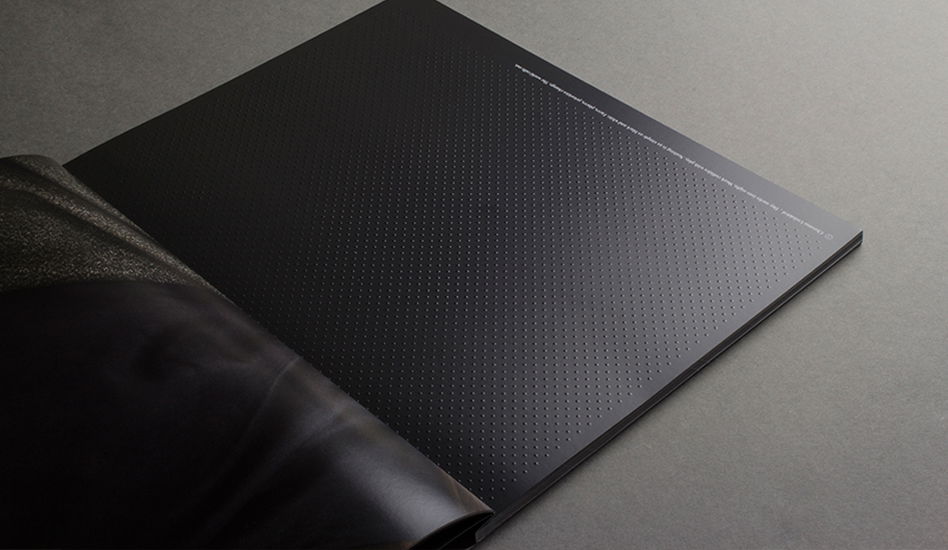
It’s been a busy year with lots of new products, promotions and events. Here’s the low down on key updates to some of our core ranges in 2015, plus the new swatches we produced HannoArt Plus, King Kong Hi-Bulk and the big kahuna, Curious Collection.
New product lines and key changes:
NEW! Sovereign Offset Indigo B2.
NEW! Knight Vellum Digital – Indigo SRA3.
Saxton discontinued.
Grange Offset and Board shade change to a brighter 160CIE whiteness.
Grange Tinted Board (replaced tablex boards) plus new colours added.
HannoArt Plus Gloss and Silk
The new range launched at the start of 2015 and has grown to be a firm printer favourite. It offers exceptional value and great printability. It’s FSC certified, dry toner suitable and HP Indigo compatible, optional carbon neutral and food contact approved to ISEGA standards like its predecessor. Benefits of the new range include:
Bulkier sheet than previous HannoArt.
More in line with style of an A2 coated paper.
Significantly less cracking than Traditional European sheets.
Less reflection and therefore better readability.
Less curl after varnishing.
Improved surface in particular in the board weights.
The recent Seafolly brochure featuring Gigi Hadid, is printed on the new HannoArt range.
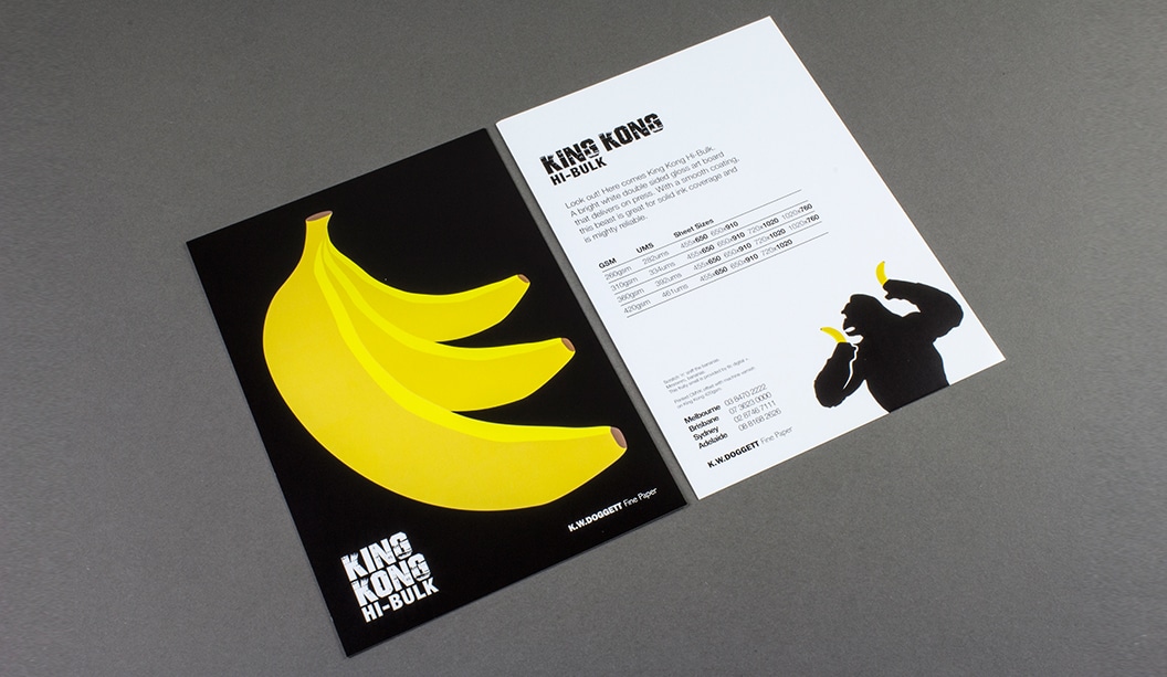
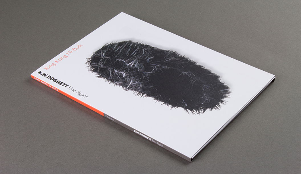
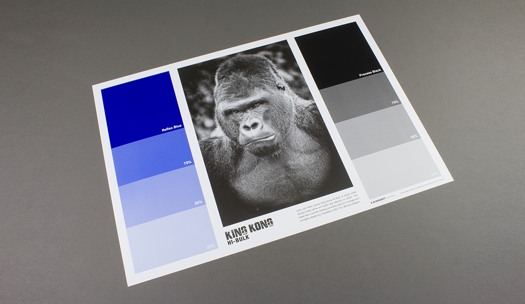
King Kong Hi-Bulk
Like its name, King Kong Hi-Bulk is a formidable new player in our coated product range. This bright white double-sided art board with gloss finish delivers on ink lay down, scoring, folding, laminating and spot varnishing. It’s also economical and highly reliable so you can feel confident about great press performance. AND it requires minimum drying time.
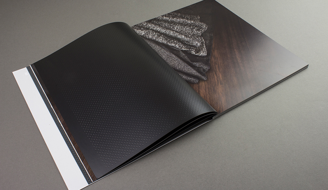
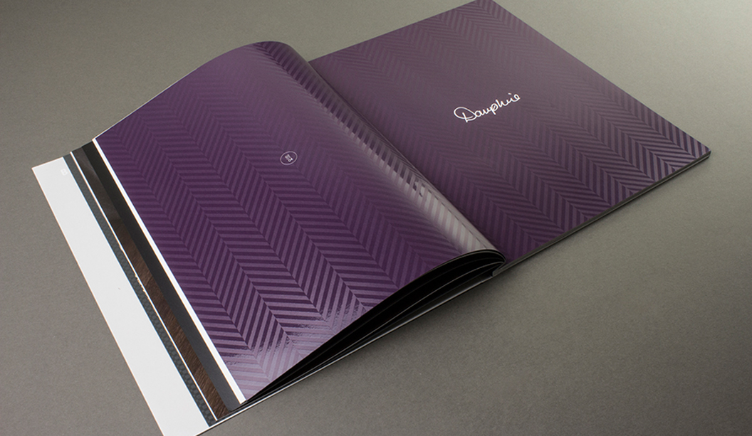
Curious Collection
This swatch now combines four of our specialty range products: Skin, Metallics, Translucents and Matter. We call it the big kahuna and it was created to give you, our customers, an easy and simple way of comparing some of our primo products under one ‘roof’.
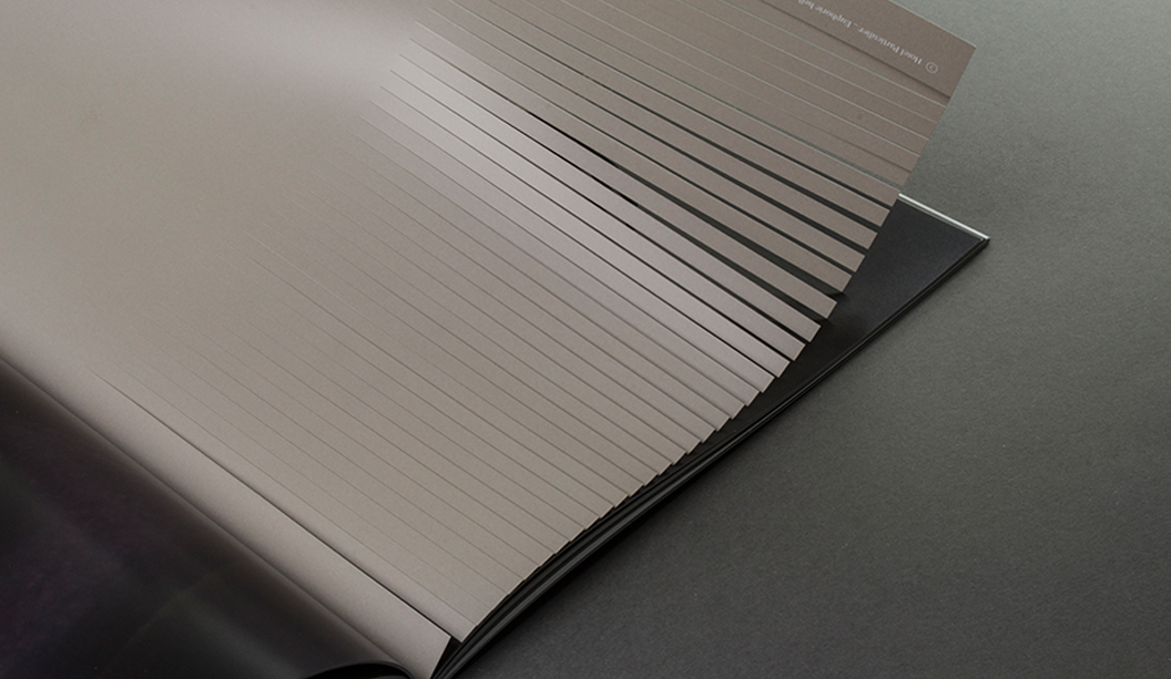
Brief history of the swatch
The swatch is pretty much our primary selling tool, showcasing each product range’s features and technical info. The shoes on the front represent the range/name, like the hairy slipper that represents King Kong Hi-Bulk. Ha!! The theme of using shoes was originally developed by David Lancashire (the same guy behind our doggie branding). The thinking behind it was a dog’s cheeky habit of chewing on their owner’s much loved footwear. Fast forward 15 plus years and the shoes are still a hit!
If your swatch kits hasn’t been updated already, please get in touch with your account manager for the latest swatches. Head to our website for more information about the products.
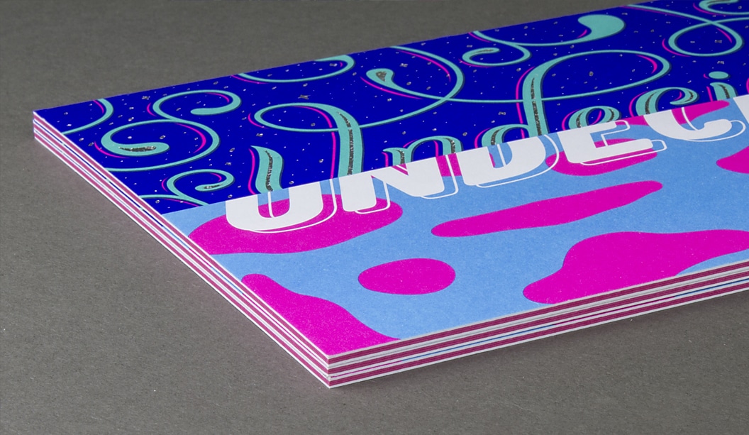
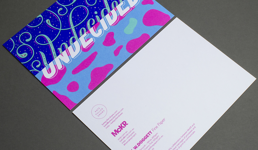
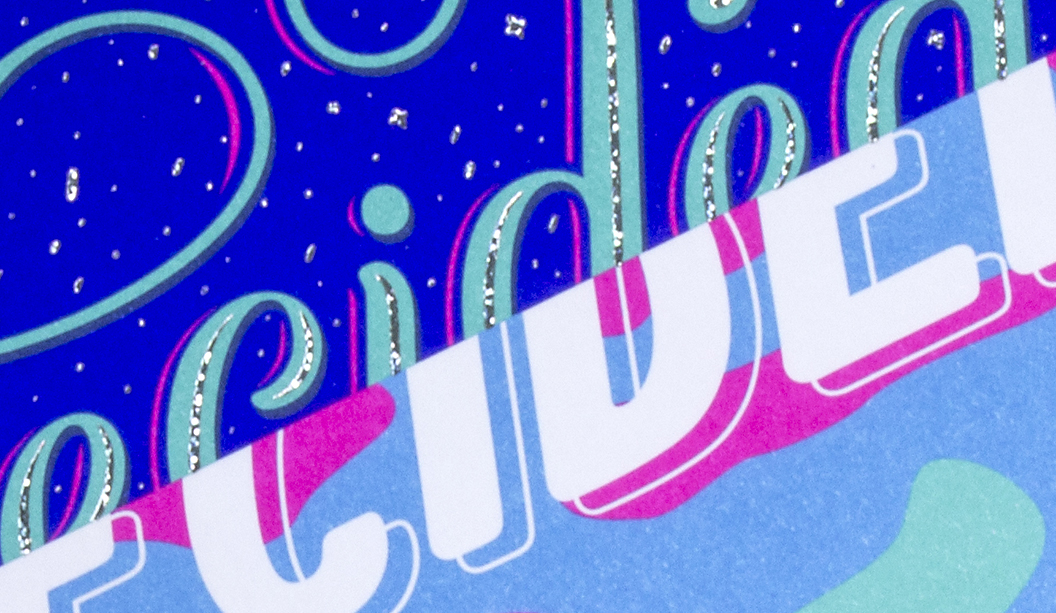
We always say it’s not about our paper, it’s what you do with it. And you’ve got to admit, this is a pretty rad example of taking paper and making it pop. The project concept itself is also pretty damn rad. McKellar Renown Press have been running The Make Project for a while now, each month releasing a new print piece that showcases design, print/embellishments and paper, direct to people’s mail box. Yes, that’s right. a DM piece. Who would have thunk it in this ‘digital age’.
The offset printed combo is Knight Smooth White 400gsm on the outer with Pop’Set Cosmo Pink 320gsm in the middle. We love the Kate Pullen Draws illustration and the hint of gold foil bling. It doesn’t take a lot to just print something, but it does take the attention and skills of a printer who cares, to make a piece look this good. We’re loving the installments of #themakeproject so keep em coming McKellar Renown!
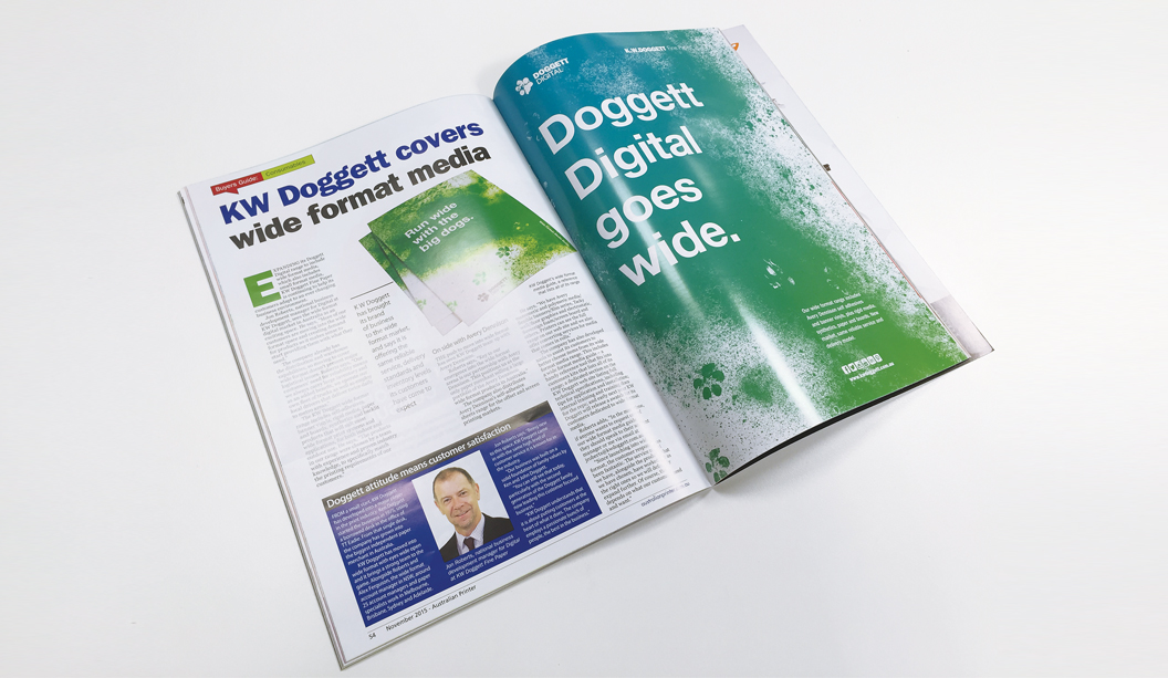
This article has been re-published, courtesy of Australian Printer. Article appeared in their November 2015 edition in their ‘Buyers Guide: Consumables’ section.
“KW Doggett covers wide format media”
EXPANDING its Doggett Digital range to include wide format media, which also includes small format media, KW Doggett Fine Paper is continuing to help its customers adapt to an ever changing business environment.
Jon Roberts, national business development manager for Digital at KW Doggett, sees the wide format digital market in Australia as an exciting space. He says, “More of our customers are moving into the wide format space and creating demand for products so it makes sense to start providing them with what they need.”
The company already has the distribution and warehouse capabilities, so moving to cover wide format doesn’t present major logistical issues. Roberts says, “Our customers’ need for reliability means we always carry large inventory and as an added benefit, we operate our own fleet of trucks as well as employ local drivers that deliver twice daily to metro areas.”
The KW Doggett wide format range includes self-adhesives, banner vinyls, rigid media, paper and boards, synthetics and backlit products that will suit most wide format print systems and applications, for both indoor and outdoor use. He says, “The products in our range were chosen by a team with experience and proven industry knowledge, to specifically match the printing requirements of our customers.”
On side with Avery Dennison
THE push to move into wide format has seen KW Doggett team up with Avery Dennison.
Roberts says, “Key to our emergence into the wide format arena is our partnership with Avery Dennison. This positions us as the only paper merchant selling a large portfolio of the Avery Dennison wide format products in Australia.”
The company also distributes Avery Dennison’s self-adhesive sheets range for the offset and screen printing markets.
He says, “We have Avery monomeric and polymeric media/flexible banners/film series, Tacky wall/floor graphics and electrostatic, Sovereign foam/screen board and others. Printers can see the full range on our web site and we also offer converting services for media that comes in rolls.”
The company has also developed tools to assist its customers to better choose items from its wide format media range. This includes a wide format media guide – a handy reference tool that fits into customers kits that lists all of its range; a dedicated section on the KW Doggett web site listing full technical specifications, including tips for application and installation; internal training and training docs for the reps; and early next year KW Doggett will release a swatch for its customers dedicated to wide format media.
Roberts adds, “In the meantime, if anyone wants to request one of our wide format media guides, they should speak to their account manager or me via email at jroberts@kwdoggett.com.au.
“Since launching into wide format, the customer response has been fantastic. The service model we have, alongside the products that we have chosen, have worked out as the right ones so we will definitely expand further. Of course, that depends on what our customers need and want.”
“K W Doggett has brought its brand of business to the wide format market, and says it is offering the same reliable service, delivery standards and inventory levels its customers have come to expect.”
Pictured above: Jon Roberts, national business development manager for Digital at KW Doggett Fine Paper.
Doggett attitude means customer satisfaction
FROM a small start, KW Doggett has developed into a major player in the print industry. Ken Doggett started the business in 1975, using a borrowed desk in the office of TT Eadie. From that single desk, the company has grown into the biggest independent paper merchant in Australia.
KW Doggett has moved into wide format with eyes wide open and it brings a strong team to the game. Alongside Roberts there are around 25 account managers and paper specialists that work in Melbourne, Brisbane, Sydney and Adelaide.
Jon Roberts says, “Being new to this space, KW Doggett came in with the same high level of customer service it is known for in the industry.
“Our business was built on a solid foundation of family values by Ken and John Doggett. “You can still see that today, particularly with the second generation of the Doggett family now leading this customer focused business.
“KW Doggett understands that it is about putting customers at the heart of what it does. The company employs a passionate bunch of people, the best in the business.”
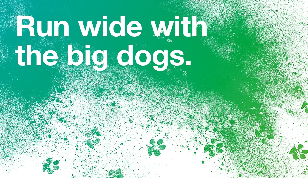
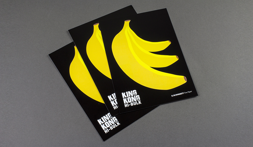
Go bananas for King Kong Hi-Bulk! Like its name, King Kong Hi-Bulk is a formidable new player in our coated product range. Boasting a bright white double-sided art board with gloss finish, it delivers on ink lay down, scoring, folding, laminating and spot varnishing.
For its price and class, you would think this beast of a sheet is off limits, au-contraire paper peeps. It’s surprisingly economical and highly reliable so you can feel confident about great press performance whilst keeping your budget in a happy place. Did we mention it also requires minimum drying time? Available in 260, 310, 360 and 420gsm, you can really go to town with applications including business cards, direct mail, folders, POS, stationery and swing tags to name a few. Coated is the new uncoated, remember that.
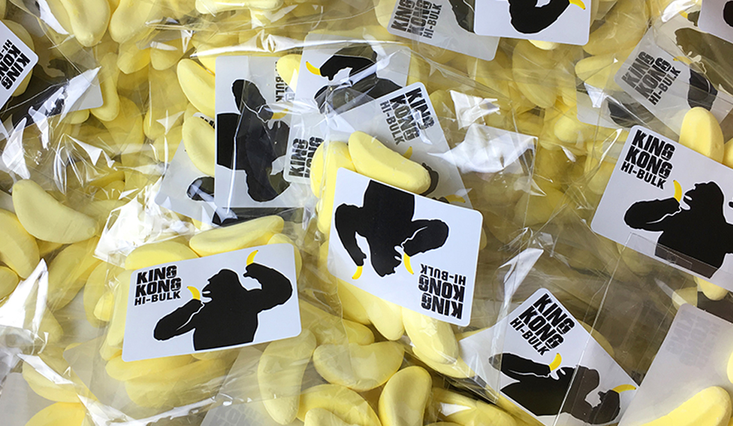
To really show off what this big boy can do, we’ve created ‘scratch n sniff’ A5 postcards with big bright yellow bananas that smell just like…a barn yard. Just making sure you’re paying attention. Smells like b-a-n-a-n-a-s. Pretty cool huh? Printed offset by Whirlwind, the scent was screen printed by TLC. The result came up a real treat, rich in colour with a lovely gloss sheen. And for some super lucky customers, we’re giving out banana lollies.
Finally, we have also created King Kong Hi-Bulk A3 print tests to further demonstrate its on-press performance. Printed offset by Print Graphics with Reflex blue, process black and an overall machine varnish, the blue dried well and the press operator was very happy with the sheet.
Be on the look out for your friendly rep who will be by soon to drop off some delicious smelling (and tasting) goodies. Remember, you can always visit our website for more information. Enjoy!
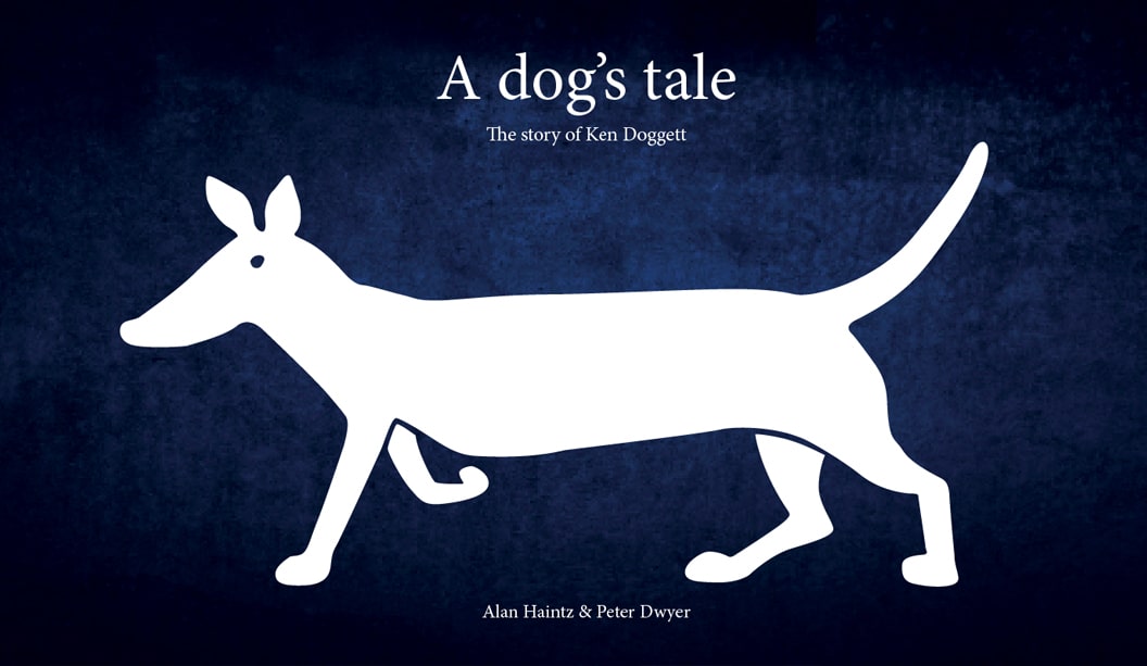
This year, two of Ken’s long time swimming buddies Alan Haintz and Peter Dwyer decided to write a story about Ken Doggett and the creation of K.W.Doggett Fine Paper, thinking it would make a good yarn. And so it did. They set about putting pen to paper and documented the story in their book: A dog’s tale. A timely release with our company turning 40 (that’s 280 dog years), this year.
It has lots of great old photos of Ken starting out at the Wiggins Teape Shoalhaven mill. Think lots of men wearing ties, short sleeve shirts and 50s style thick rimmed spectacles (sounds like a Fitzroy hipster!). The journey then moves through to Ken starting the Doggett business, the expansion to bigger warehouses, family members joining and runs right up to the present day trading. It highlights a bit of family history and gives a glimpse into how the paper industry has changed too.
Among the array of rich content, quotes and interviews with key people within and outside the business, a common thread is clear. Ken, John and the second generation of Doggett’s currently working in the business are regarded as being extremely generous, genuine, respectful and they’re very much admired. The Doggett’s have built a business that has become so much more than just a place to work.
The book is bit of an inside job, but if you’re interested in reading the tale, we’d be happy to send out copies of the book to you. Email: nlaketa@kwdoggett.com.au with your name and address details.
Woof!
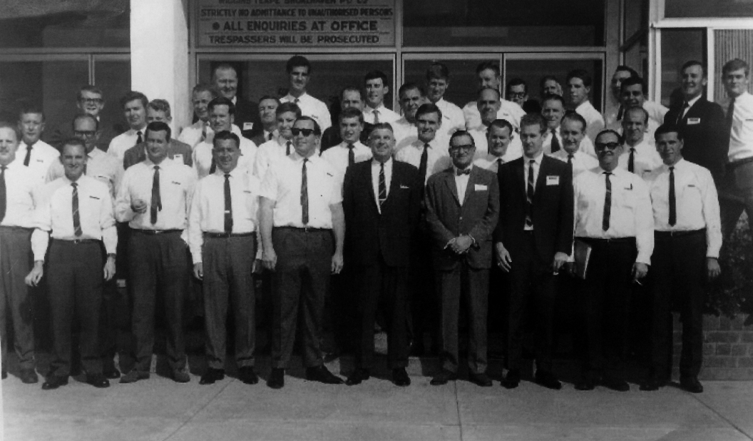
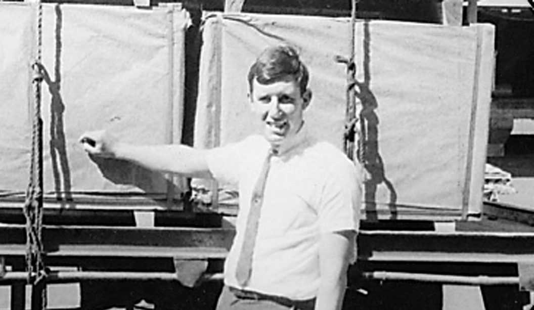
This photo was taken around 48 years ago at the Shoalhaven Mill during a sales reps conference.
Pictured above: The young Ken Doggett.
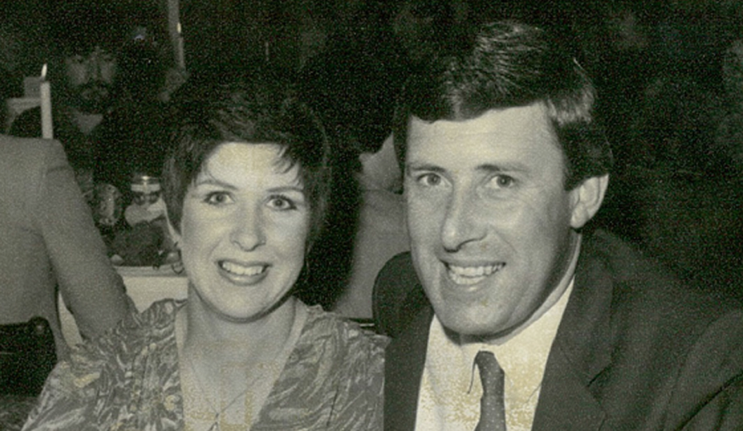
Pictured above: Ken Doggett and his wife Christine.
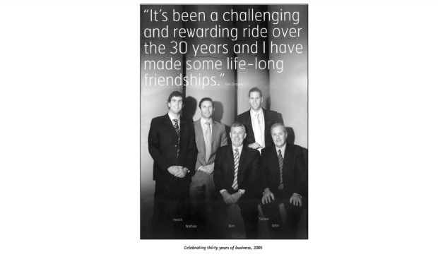
Pictured above: The Doggett family celebrating 30 years in the business.
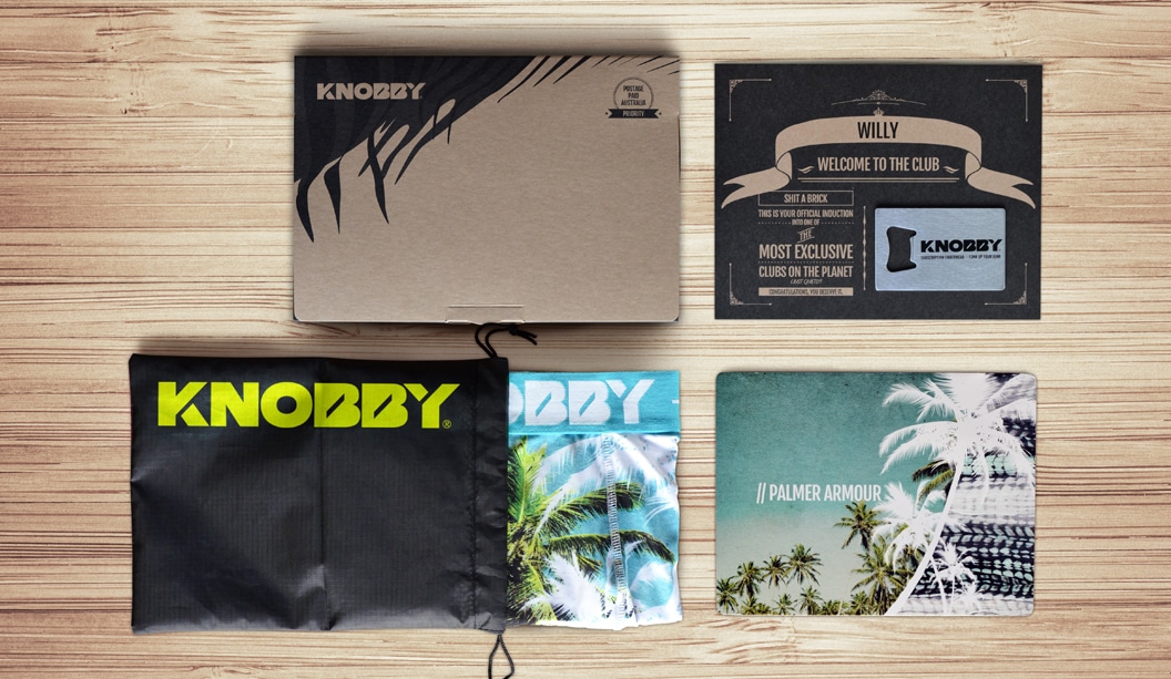
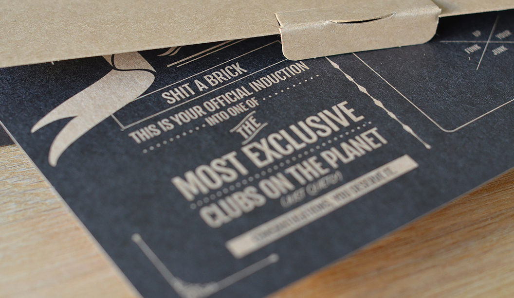
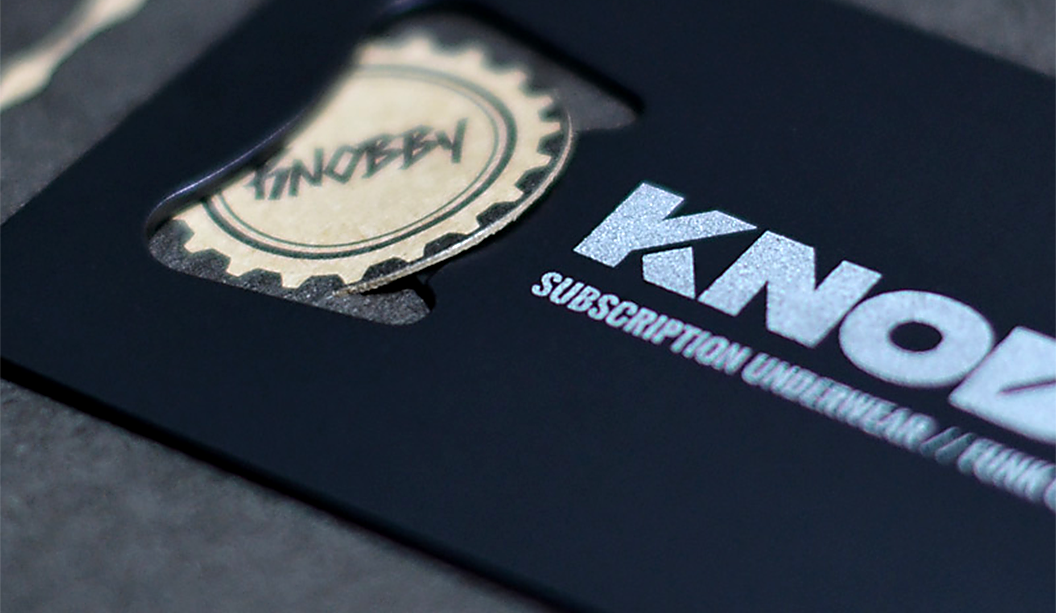
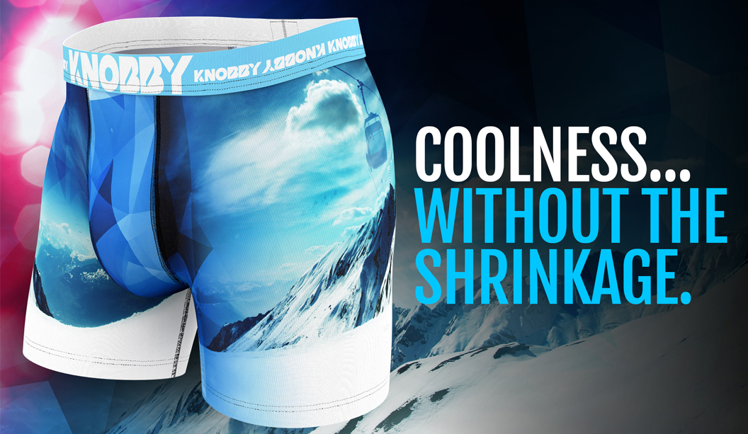
Knobby Men’s underwear you can only get by subscription. What a concept! Started by Rob Rand, a man who harboured a quiet hatred for poorly made, over priced undies that lacked imagination (plus he really didn’t like going to the shops). If you don’t like something, change it right? Fast forward to present day and the Knobby brand is growing in leaps and bounds with thousands of members worldwide.
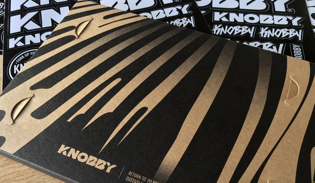
So what’s makes these undies so great? Well, the swanky packaging for one! Printed offset on Buffalo Board 332gsm/610UMS by Platypus Graphics (QLD), Buffalo Board is an ideal choice for packaging plus it’s extra strong, durable and made from natural kraft fibres that are fully recyclable. The new subscribers welcome card is printed on Buffalo Board too, by Limehouse Press. And most importantly, each pair of briefs is made to breathe, quick dry and stay put (no wedgies or riding up to see here). And they look pretty damn nice too.
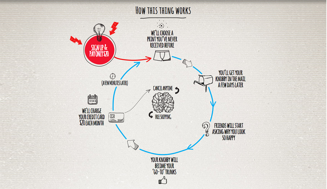
Keen to wear a Knobby? Firstly, become a member and each month for a small fee of $20 you’ll receive a new pair of limited edition undies direct to your door, no delivery fees, no hassle. You’ll never get the same print twice, so every time you open the box you get: ‘A surprise package. For your package’. Is that not the best tag line ever?!
Based in Queensland and shipping worldwide every day, Knobby men can be rest assured there’s no more shopping or running out of undies. Oh, and there’s a female line launching next year for the ladies. Bonus.
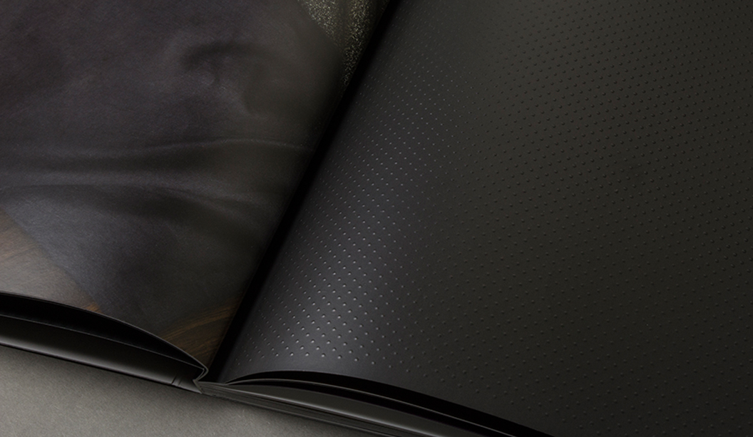
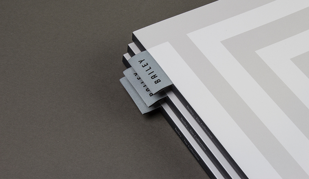
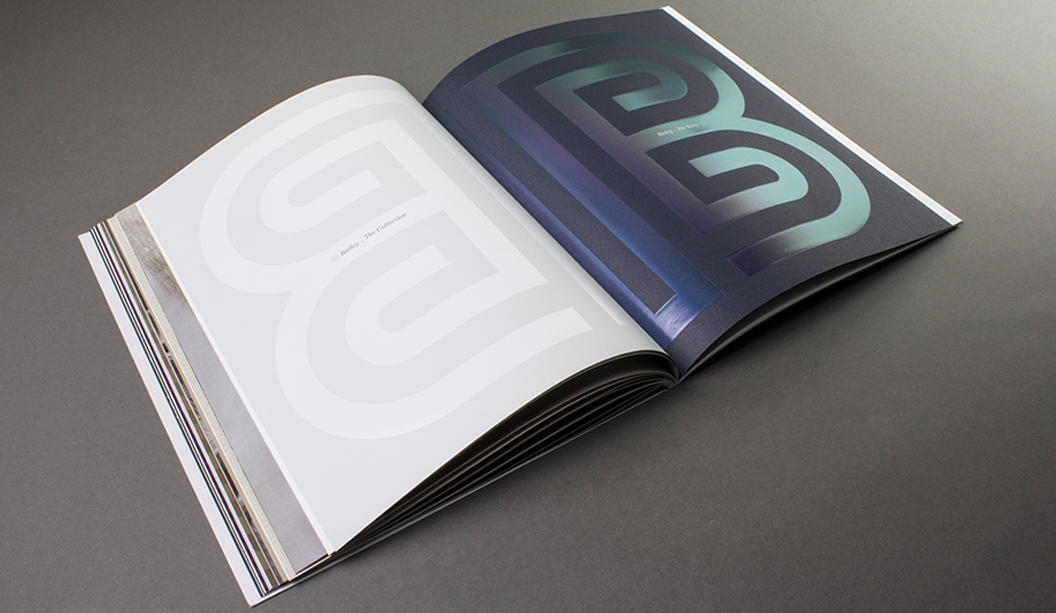
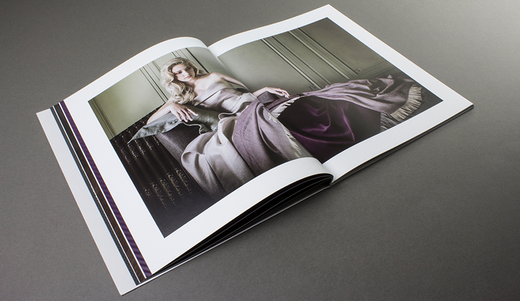
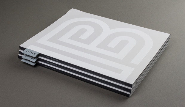
The latest Bailey Luxury Bedding catalogue by Hoyne Design really is a work of art, showcasing the best of the best in layout, photography and print production. One flick through its pages and you’ll be wanting to deck-out your bedroom in their beautiful, sumptuous bed linen which includes throws, pillow cases, sheets and duvet covers.
Hoyne Design did a stellar job of creating the catalogue using subtle, beautiful details like the satin material tag on the spine, embellishments and use of textured and glossy papers. It makes flicking throug the catalogue a really interesting, tactile experience and tunes into the right senses. The enviable list of embellishments include a clear gloss foil, black gloss foil, spot gloss UV, embossing, die cutting and laser cutting. It’s no wonder they were nominated as an AGDA Award finalist (Design Craft category) this year. The cover is printed on Curious Matter Goya White 270gsm plus Sovereign A2 – Silk 270gsm and Strathmore Premium Enhance Ultimate White 118gsm for the text.
The Bailey brand has quite a story to tell too. A bespoke bedding manufacturer, they partner with top craftspeople from around the globe to create their collections. To produce Bailey’s Belgian linen for example, they worked with masters of linen – who move the flax into the factories, make the yarn and undertake the finishing. Italian weavers from the historic milling town of Biella are chosen for their reputation in producing high quality wools and yarns. Mills nestled in the north east of Scotland produce Bailey’s cashmere throws. If you like the sound of this, visit their site for more juice. It’s a pretty amazing story.
Interested in getting a look-see at the exceptional printed piece that is the Bailey catalogue? Please contact your friendly paper specialist.
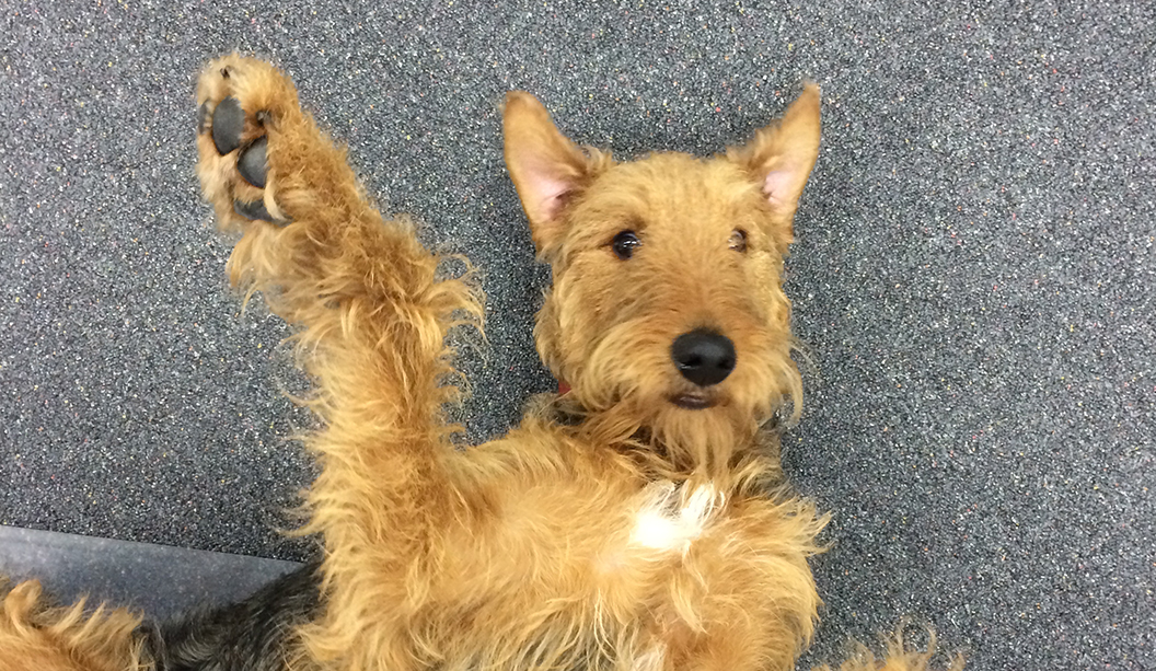
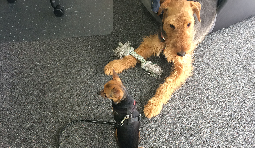
When the Bambra Press and McKellar Renown businesses merged this year, one of the big questions was: “How are the pooches going to get along?” Well, at least for us it was! We got the low down on the state of play.
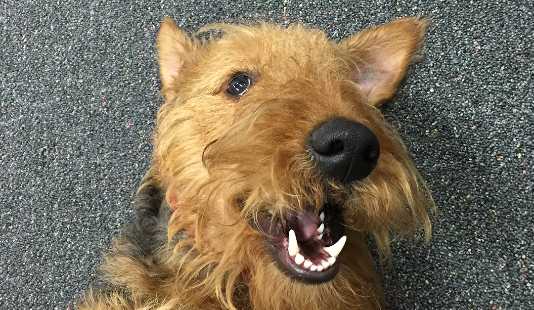
Who is the tough pooch around the office. Jaffa or Winston? They’re both tough but they’re in different weight divisions. It’s like Mike Tyson/Floyd Mayweather. Do they play nice together? It depends on your definition of ‘nice’. Winston doesn’t do ‘nice’, especially before midday. Jaffa on the other hand only does ‘nice’ and ‘hungry’. Any funny stories re when they first met? Jaffa originally thought Winston was a toy (probably still does) and was very confused when the new odd looking rat barked at her. Winston would prefer Jaffa wasn’t in his territory, which encompasses our offices, homes and probably most of Australia.
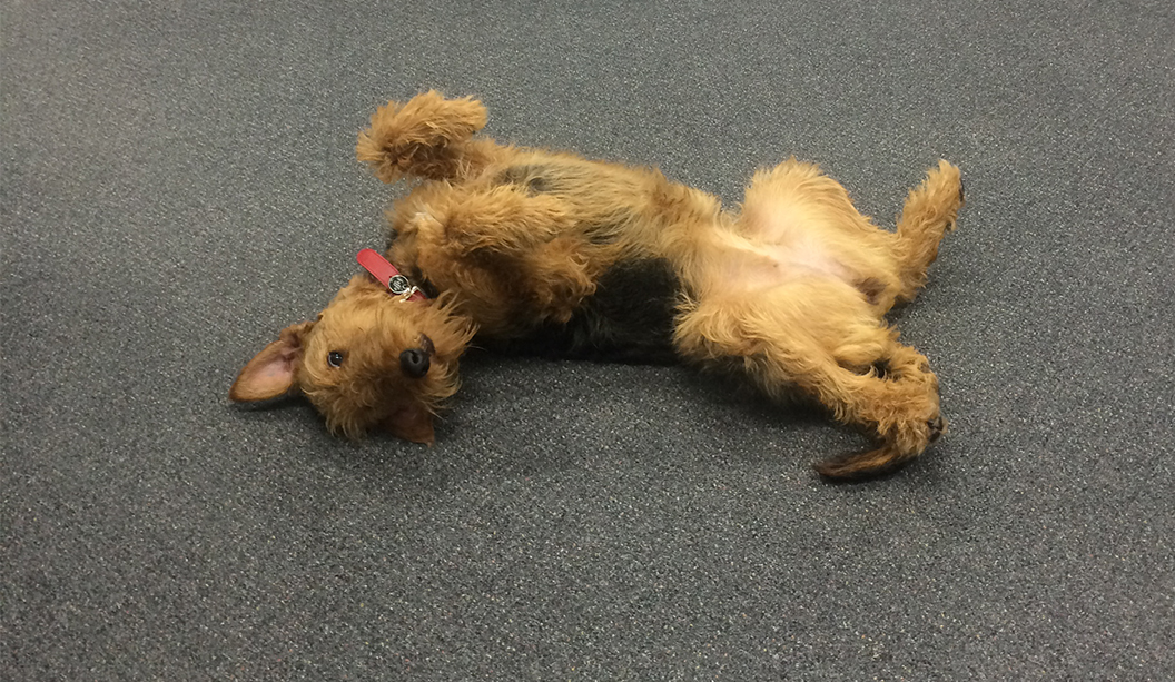
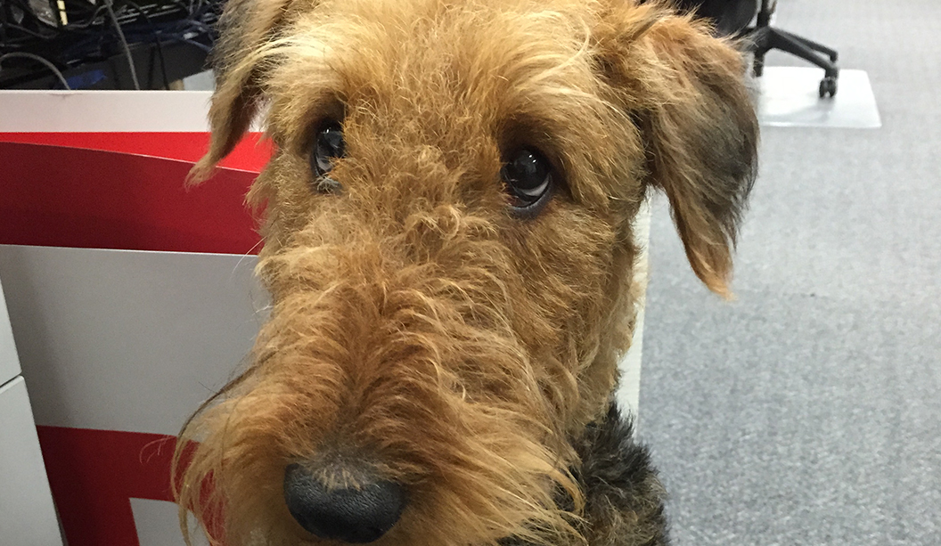
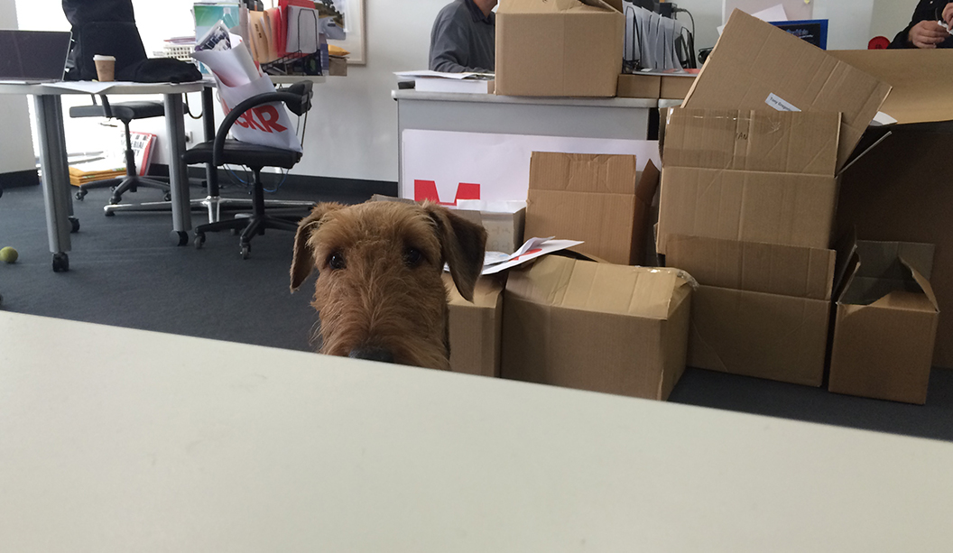
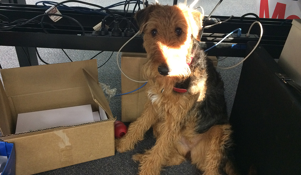
Some facts about both pooches: Jaffa Sex: Female Age: 1 y.o. Breed: Airedale Star sign: Cancer Jobs include: kitchen guard, draw/handbag inspector, print sample taste-tester.
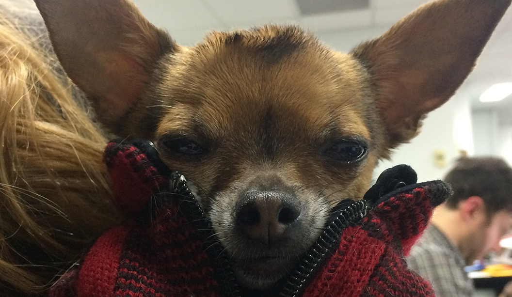
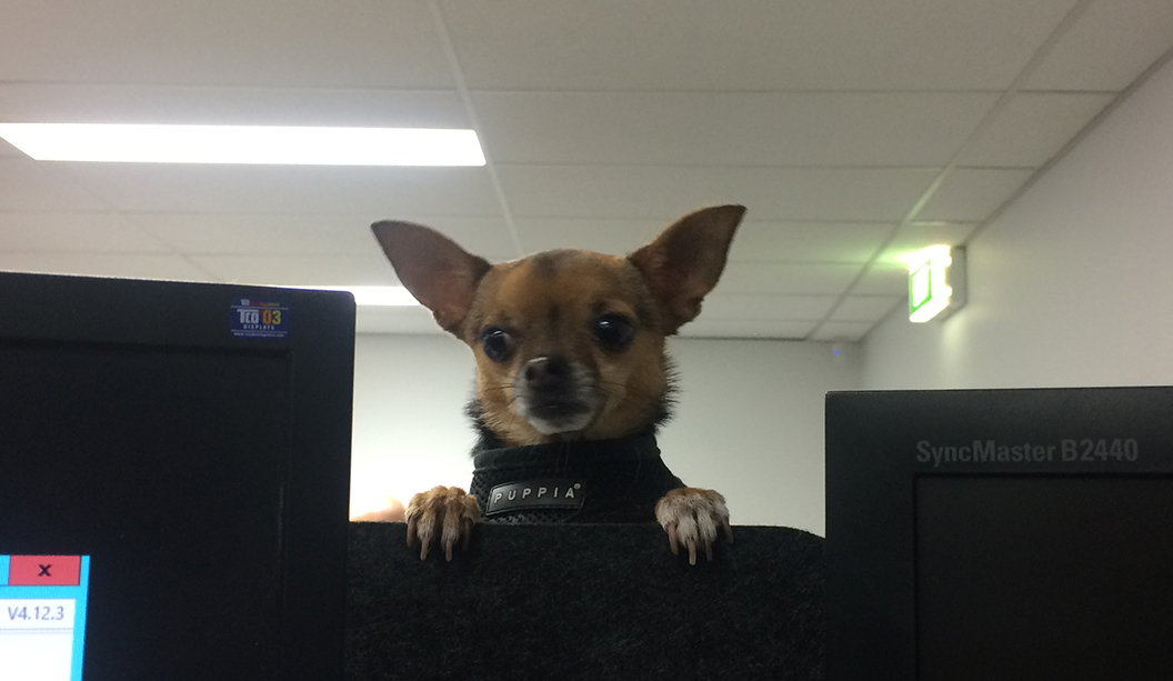
Winston Sex: Male Age: 6 y.o. Breed: Chihuahua Star sign: Sagitarius Jobs include: security guard, self-declared boss of everything.
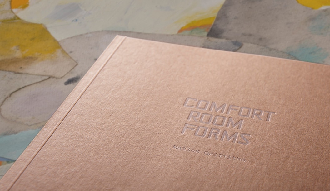
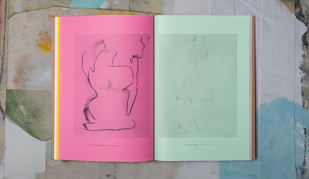
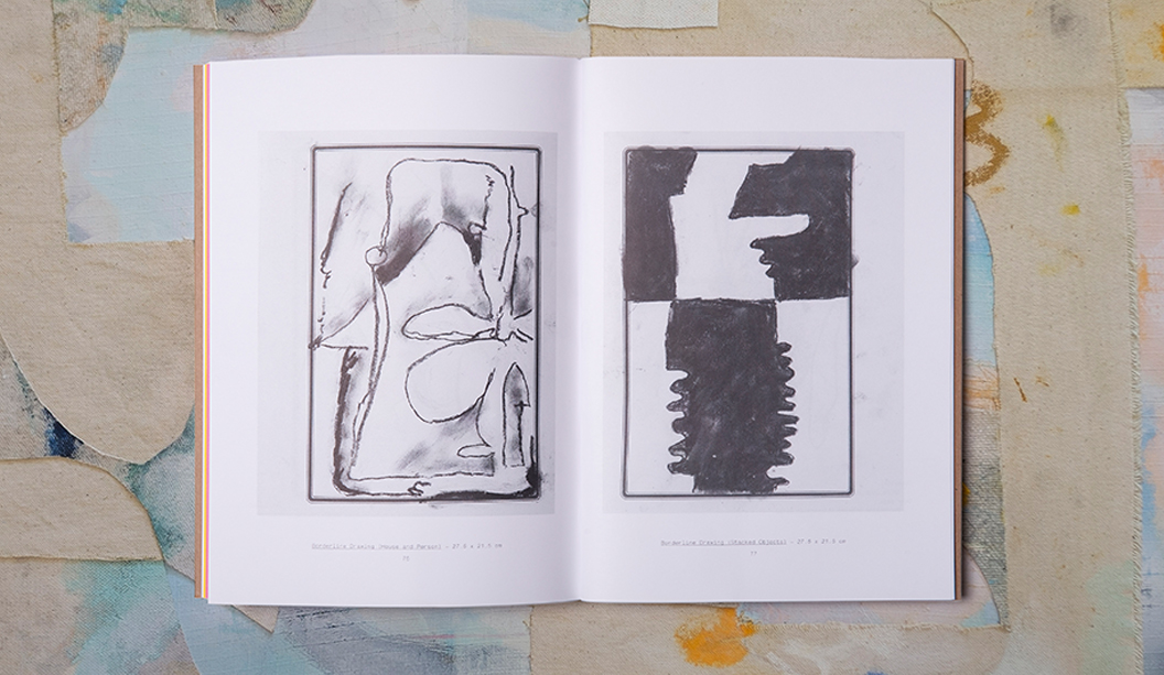
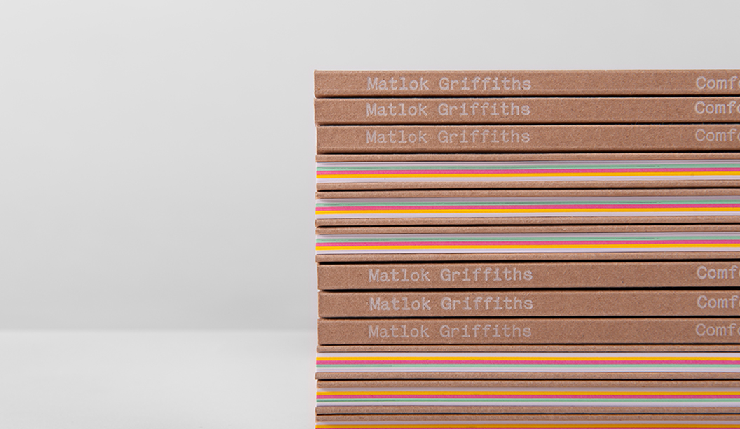
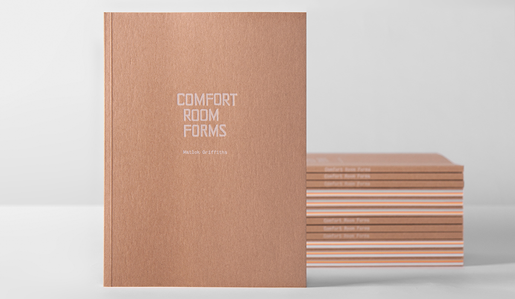
We love a good page-turner and Matlok Griffith’s book‘Comfort Room Forms’ is no exception! Combining an exotic blend of drawings, vibrant papers and print techniques, it is the complete creative package.
Designed in collaboration with Shane Loorham from Liquorice/Silent Partner (VIC), the 80 page book is a mix of full colour and one colour reproductions of Matlok’s drawings, made while he lived in the tropical island city of Dumaguete in the Philippines, surrounded by the smell of fried chicken and gasoline.
We picked Shane’s brain about the creative: “The book was designed in very close collaboration with the artist. We had been collaborating for a few years, designing and in some cases, hand-printing exhibition catalogues for him with a heavy degree of DIY coming through in the production. We were excited when this opportunity to create something a bit larger and more involved came up.”
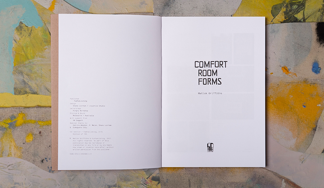
Matlok’s original drawings were completed on a varied mixture of Filipino commodity papers, many of which were pretty bright and cheerful. In an effort to best reproduce them in printed form, the book was primarily printed offset in one colour on a variety of vibrant coloured stocks including Kaskad Oriole Gold 100gsm, Leafbird Green 100gsm and Bullfinch Pink 100gsm and Knight Smooth 120gsm. The credits and title pages were printed digitally on Knight Digital Indigo 120gsm. But wait, there’s more production goodness…
Shane explains: “We chose Buffalo Board for the front and back covers and had them letter pressed using Opaque white ink by our friends at The Hungry Workshop. Printing the covers this way was a bit of a gamble as no one was quite sure how the white ink would reproduce on the board. We were ready to change the colour at the last minute if need be, but the guys at The Hungry Workshop worked their magic and did a wonderful job for us!”
To see more of Matlok’s beautiful work, you can visit his website here http://matlokgriffiths.com/ or you can ask your friendly paper specialist to show you a printed sample the next time they pop by your studio.
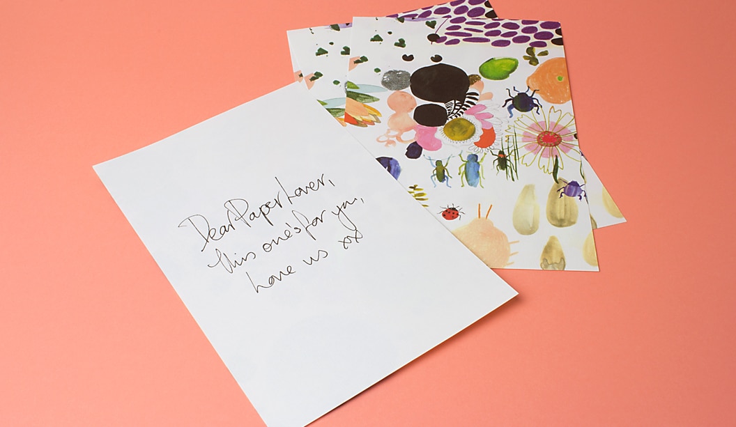
The last time I received a handwritten letter, I was about 16. A group of friends of mine and I would write countless pages of notes to one another detailing everything from the books we were reading, the boys we were crushing on, and the kinds of silly adventures our families were getting up to over the summer breaks. Even now, I still find letters filled with tiny grains of sand from a friend’s holiday in Ningaloo and wisps of Guinea Fowl feathers from a family friend’s farm in Southern W.A. All beautifully nostalgic and tangible reminders of our lives in that point of time.
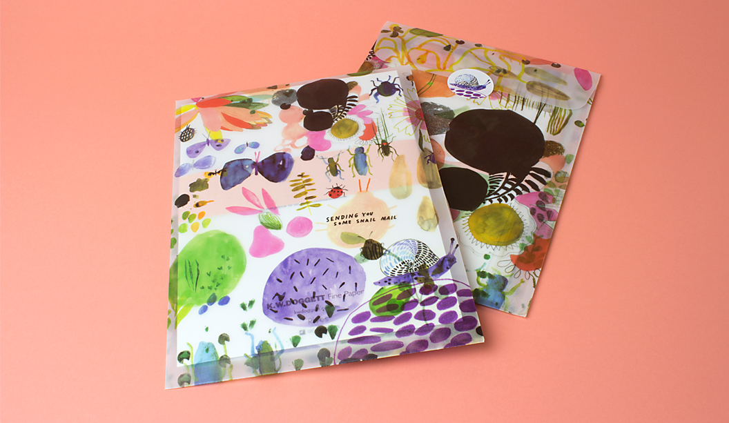
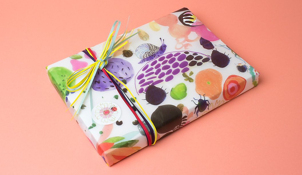
In collaboration with Ortolan’s illustrator and designer, Kat Macleod and the lovely team at Ortolan studio, K.W.Doggett Fine Paper have created ‘Snail Mail‘, a beautifully whimsical stationery set that celebrates the idea of love letters, intimate notes and whimsical celebrations, while showcasing the versatility of Rives’ latest range. With shiny silver foil bugs, blind-embossed weeds and tiny die-cut snail bitten edges, the gorgeous set is sure to inspire people to send someone they love some snail mail.
desktop spoke to Kat about the new Rives range, her love of hand written notes letters, and the importance of paper stock in the design industry.
You recently worked on the illustrations for Rives’ ‘Snail Mail’ project by Ortolan celebrating romance and whimsy; do you think work like yours keep handwritten words relevant in the digital age?
At Ortolan, we think that handwritten notes and letters are always relevant! No matter what the occasion, a handwritten note will always feel so special, and so completely different to a text message or an email. When K.W Doggett briefed us to create a special piece to promote Rives, Holly Canham and myself saw it as a great opportunity to design an exciting new stationery set (we made another one for Rives a couple of years ago), we hope to inspire people to send someone they love some snail mail. Rives is such a beautiful paper stock, with the range of textures and subtle colour shifts. It felt like the perfect project to create a letter writing kit out of the beautiful paper.
In reference to the relationship between paper stocks, textures and ink, what do users gain from a tangible product of design that they don’t gain from a digital product, and which do you prefer?
I love both! I love digital design. It can be so flexible and easy to reach a wide audience instantly. And obviously I also really love to create a printed product that you can hold and feel. They’re very different outcomes.
Holly and I wanted to create an exciting experience for people when they open up the Rives envelope and discover all the different cards and papers within. The different paper weights and textures can only really be appreciated by holding the piece in your hands. And we’ve incorporated lots of special finishes that can only be reproduced in a physical product. Shiny silver foil bugs, blind-embossed weeds and tiny die-cut snail bitten edges should surprise and delight as you make your way through the set.
Did you used to write and receive handwritten letters as a child? Do you think children today who don’t would gain something from this experience?
I loved sending and receiving letters and drawings as a child. I had family overseas I wrote letters to, as well as at least two pen pals I wrote to regularly. I adored making special packages to send off to my friends and family, and it was so exciting to receive something unexpected in the mail in return. Kids today should definitely send and receive snail mail! My four year old son loves to ‘post’ drawings to his grandparents when we are visiting their place (by post, he just rolls up a drawing and sticks it in their letterbox). I genuinely think he loves the making and sending part of the process equally as much as he loves watching them open up the letter and basking in their enthusiastic reaction.
With acronyms and email, people are becoming less romantic and intimate in the way that they communicate to one another, what do you think about that and how do you think your work can help change that?
Time changes many things and communication seems to be one thing that’s changed so much in recent years with hand written letters less common and email, text and phone conversations the norm. I don’t think it’s a bad thing or less romantic as such, just different to what was. Perhaps receiving a hand written note or letter is even more special now that it’s less frequent.
Should the skill of hand-written typography and illustration design continue to be something that is taught and encouraged in schools and universities? Or should tablets and design software rule supreme?
Hand drawn illustration and typography are certainly still great skills to learn and explore, among many other crafts. Hand drawn marks and drawings are unique to the individual who makes them, I feel like there’s more opportunity to create unique work. Also, it is so inspiring to create something with a pencils or paints and paper and draw what comes to mind, embracing mistakes and exploring new ideas as they come.
The imagination is such a huge resources of ideas and new thoughts, it’s such an important skill to develop and creating things by hand is a great way to cultivate and express ideas. In saying that, it’s always important to know how to use software and it is so vital in our industry, but it’s nice to start on paper and see where it takes you.
Watercolour illustrations can often be hard to digitise, in the sense that their look and feel can be difficult to replicate. How did you overcome this for the digital range in ‘snail mail’?
I paint all my watercolour illustrations on paper and scan them it into the computer, I haven’t ever tried to replicate watercolour directly on the computer, I need to use my hands and brushes and water to create the marks! And I love all the natural textures and marks the brush makes. It just wouldn’t be possible to recreate that on the computer. When I scan my illustrations, I clean up the files in Photoshop to remove dust and any errors, but I tend not to alter them much once on-screen. I do however, love to layer them up with other illustrations. Many of the illustrations in the Snail Mail stationery set are created by layering my illustrations together.
Kat Macleod is a Melbourne-based illustrator and graphic designer. Her whimsical and dream-like illustrations have appeared in Chinese Vogue, Numero Tokyo and The Age. More of her work can be found here.
 Footy Tips