Title: Indigenous Cultural Map and Guide Agency:Ecocreative (SA) Creative direction: Matthew Wright-Simon. Designer: Clare Andrew. Stocks:Maine Recycled – Silk Printed by:Finsbury Green (SA)
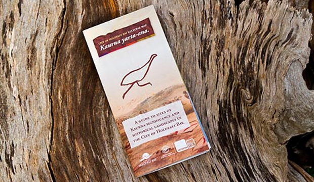
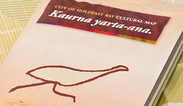
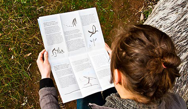
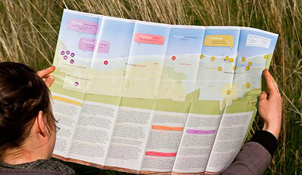
‘Marni naa putni Kaurna yarta-ana’. Beautiful isn’t it? This is how the locals from the City of Holdfast Bay in South Australia would have greeted you around 200 years ago. By the way, the translation is: ‘Welcome to Kaurna country’. The cultural map you see is by Ecocreative in Adelaide. It’s a beautifully designed guide created in consultation with the Kaurna Indigenous people of the Adelaide Plains, historians and academics. It explores language, history, biodiversity and storytelling and is printed on Maine Recycled – Silk 115gsm.
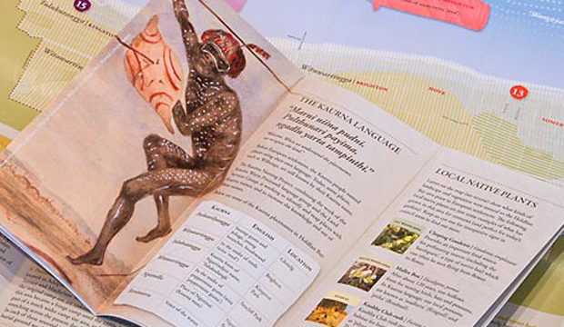
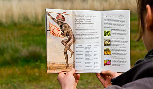
As the first council guide of its kind in South Australia, a strong visual identity was needed so Ecocreative set to work with this key piece of information in mind. The map highlights locations where native plants should be planted, forming a connection to Kaurna language and signage in the area. It also visually recreates the past, complemented with engaging stories. A Kaurna warrior painting is featured on the first page (suggested by one of the Kaurna participants), simplified figurines and an earthy colour scheme have also been used.
Printed four-colour process with vegetable-based inks by Finsbury Green (SA), the paper stock, Maine Recycled, was recommended to Ecocreative as the best environmental choice with a high resistance to cracking. “A very important aspect when producing a walking guide that will be opened and refolded repeatedly throughout its life,” Sarah van Maarseveen, Sustainability & Operations Manager from Ecocreative explains, “We chose Maine Recycled – Silk 115gsm because its hardy coated nature would stand up to coastal outdoor use.” Other sustainability credentials were also important, particularly the 60% recycled content, relevant especially in a project that emphasises past and future care of country and culture.
Many months and a lot of hard work later, Ecocreative have created a map that is being really well received by locals. They hope that this will set a precedent and help to share why ancient Aboriginal culture and language is so special. If it helps communicate to a broader audience in seeing their surroundings a little differently, even better. We think this is a case of ‘mission accomplished’.
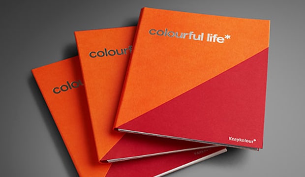
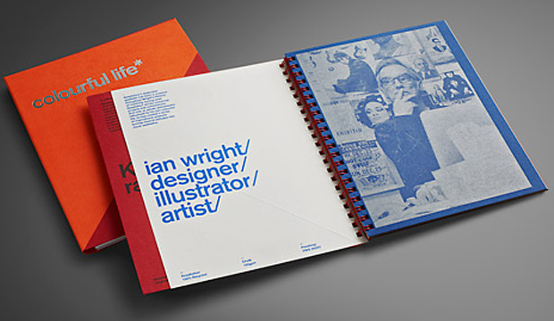
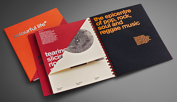
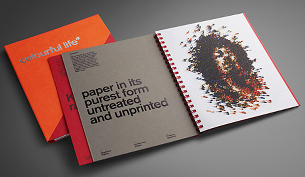
Keaykolour collaborated with Ian Wright, a contemporary artist, illustrator and designer based in the UK to come up with this musically inspired promotion. Ian has had a truly ‘colourful life’ at the forefront of contemporary design and illustration, creating iconic images for culturally hip clients. He has an original approach to image making, reflected in his three works of paper art.
The pieces include the replica of a JVC Boombox, portrait of Jimi Hendrix and a 7” disk of black vinyl. All of them have been created using paper from the Keaykolour range and by cutting, slicing, folding (and in the case of Jimi, rolling 2250 cones of paper, each 20cm high, into pre-drilled holes!), some original pieces of art have been created. Thank you Ian for reminding us how much fun paper can be. It’s like he has taken the primary school days of cutting and gluing and experimenting with paper to new heights!
Not too many tricks with this little beauty designed in collaboration with There Design (NSW) and the wonderful company behind Keaykolour – Arjowiggins Creative Papers. There is a duplex cover showcasing the new Tangerine 300gsm and favourite – Guardsman Red. The promo also features the new deeper coloured Jet Black and new grammages. We’ve used some screen printing, PMS 877U, silver and black foil action. The book comes flat, with some pages scored so that people can interact with them. We had a recent range update so we’ve included the revised stock table in the promotion.
If YouTube floats your boat, please visit our channel showing where you’ll find some behind-the-scenes footage and interviews with Ian Wright and the creative process he followed to create the homage to music that is the ‘colourful life’ promotion.
“The time I burned my guitar it was like a sacrifice. You sacrifice the things you love. I love my guitar,” Jimi Hendrix. Ok, so does that mean we need to burn paper to prove we love it? We figured a bonfire in the back of the warehouse would most likely breach an OH&S rule. A paper promotion seemed a much safer option!
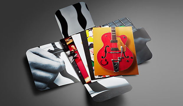
In our latest HannoArt promo, we pay homage to the worlds of music and paper. We added an educational twist by including tips about grain direction, colour, printing with blacks, stochastic/conventional line screen and also ink limits. Not to forget the awesome colour and visuals. We really wanted to showcase how well HannoArt handles solid colour and sharp detail. We pondered, we collaborated (with David Lancashire Design in Melbourne), we held production meetings (with Southern Colour in Melbourne) and fleshed out ideas over and over to come up with a promotion that uses achievable print techniques and includes technical information.
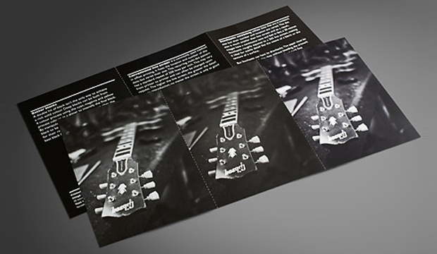
This post is going to provide you with some tips and insights into a few of the cards we printed. If you’re not keen on reading any of this, thanks for being here or call your rep and ask them for an in person demonstration. Soak up their technical knowledge!
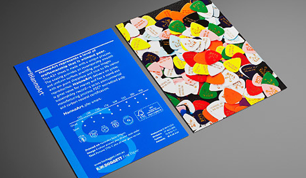
The spot matt etch, which appears on the front cover is probably the only technique that isn’t offered by a majority of printers. We firstly printed the cover with the fluoro pink, then had it laminated. The spot matt etch was done in a second pass. It’s a matt varnish technique has been applied to the black leather grain area only, leaving the glossy laminate to shine on the plectrums and the ‘IS’.
We purposefully designed some of the cards to be a comparator. The 4pp ’56 Gretsch Atkins card, is one of these. The left image is printed 4 colour process with all over gloss varnish. For the right image, we added a Pantone 877 Silver and spot OP matt and spot OP gloss varnish. We then perforated the card so our customers had the option to take one with them to a meeting and potentially leave one with their client. Now, there’s nothing wrong with the 4 colour image – it looks really good actually. But you can tell the difference with the contrasting card. The silver brightens up the bridge of the guitar, and the varnishes make the guitar pop off the page.
We used Pantone 2935 C for one card because it’s the HannoArt blue. This is such a tricky colour to print with and can be really challenging. The result shows how there is no mottling on the paper which is a really good result. No extra pressure was used for this card but we did use a stochastic screen to produce crisp, clean edges in the small logos and tiny type. Gloss varnish was used to seal in the colour better.
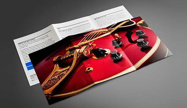
We’ve got an unofficial favourite – the 6pp red guitar. We tricked this one up on purpose. It was good for us to see what difference the Pantone Rubine Red C bump plate could make with this type of image. The body of the guitar just looks so much brighter and richer with it. And the Pantone Silver underlay boosts up the hardware. On the back, there are tips on colour, so we replicated a small square of the Pantone Blue with a CMYK blue to show the difference. It’s pretty obvious, the difference, and handy to know the compromise you’ll make if budget doesn’t allow for a PMS.
The final card in the pack shows three images – a 4 colour b&w stochastic, monotone stochastic and monotone conventional. On the reverse we have printed three blacks. The 4 colour b&w printed stochastic is a stand-out in this set, a much warmer black. On the reverse, we’ve show just how different stock looks with a varnish, we printed each card with a strip of satin sealer, gloss varnish and then no varnish. We perforated this card as well so you can compare the blacks next to each other.
You may recognise the images we’ve used are from the 2010 promotion Sappi released called ‘Dave’s Guitar Shop’. In Wisconsin USA, Dave’s famed guitar shop houses a rare collection of guitars by legends like Gibson, Fender and Gretsch and other music legends. This place is apparently a mecca for guitar lovers from all over. As an extra bonus, we have a Dave’s Guitar Shop plectrum in the promos! Just like the iconic instruments at Dave’s, HannoArt bears the hallmarks of quality and craftsmanship.
Printing specs:
Folder (outside): Satin 250gsm, 4 colour + Pantone 806 C (plectrums). Spot matt etch. All over gloss laminate.
Folder (inside): 4 colour black and white image, matt laminate.
Card 1: 2pp, Satin 350gsm.
Text: 4 colour process plus all-over satin sealer.
Image (close-up of the Dave’s 25th anniversary guitar) : 4 colour process + all over gloss varnish.
Card 2: 2pp, Satin 350gsm.
Text: 4 colour process plus all over gloss machine varnish, Pantone 2935 C.
Image (branded plectrums from the front cover): 4 colour process. All-over satin sealer.
Card 3: ’56 Gretsch Atkins. 4pp, Gloss 300gsm.
Left image: 4 colour process. All-over gloss varnish. Perforation at 6 TPI (teeth per inch).
Right image: 4 colour process. Spot Pantone Silver (first pass). (Second pass) Spot OP gloss varnish over the guitar and spot OP matt varnish over background to create a contrast. Black plus all over gloss varnish.
Tip: Ink limits.
Card 4: Three Fender Telecasters from the 50s. Gloss 170gsm.
Image: 4 colour process. All-over gloss aqueous varnish. Scored and folded.
Text: Black plus 2 hits Pantone Silver 877 C. All-over gloss aqueous varnish.
Tip: Grain direction.
Card 5: 60s Gibson ES 355. Gloss 250gsm.
Image: Pantone Silver (separation). First pass. 4 colour process. Second pass. Pantone Rubine Red C (separation). Bump plate in second pass. Spot OP gloss varnish on timber areas.
Text: Black plus all-over gloss varnish. Left card has two squares: PMS 2935 (same as the blue on card 2) – CMYK (which shows the nearest match you can get using a CMYK breakdown).
Tip: CMYK and spot colour.
Card 6: Satin 250gsm. 6pp.
Image (left): Black monotone printed stochastic. FM screen, 20 microns. Satin sealer.
Image (middle): Black monotone printed conventional. AM screen, 200 lines per inch. Satin sealer.
Image (right):4 colour black and white, printed stochastic. FM screen, 20 microns. Satin sealer.
Text (left. Tip – Better blacks: 4 colour black. K100 with underprint of C40, M20, Y20.
Text (middle). Tip – Conventional line screen: Dense black.
Text (right). Tip – Stochastic screening: Standard process black.
Varnishes Each text card has three varnishes applied to it in columns. First column is gloss varnish, then satin sealer then no varnish.
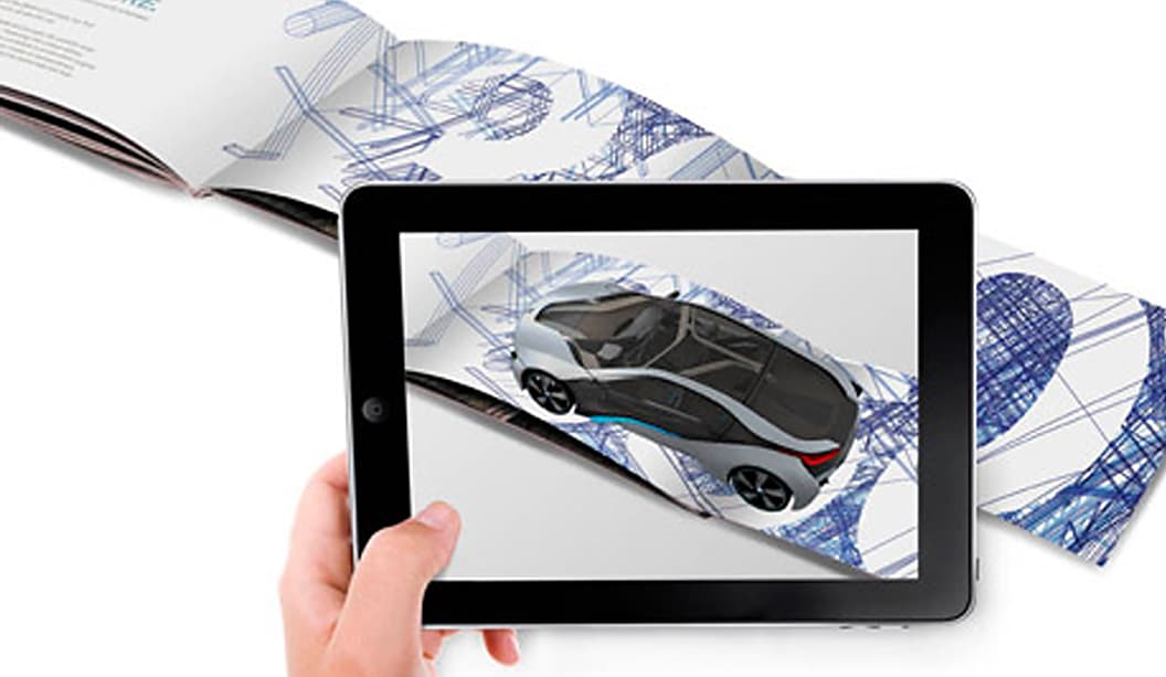
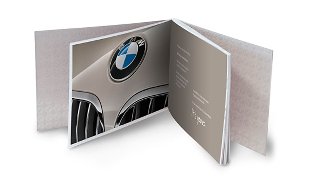
This is a story about a small yet very exciting printed piece indeed. Why is this so you may be thinking/asking/pondering? It’s because it merges offset and digital print, paper, AR (augmented reality) and IR (image recognition) technology all in one tasty package. Safe to say, we like it a lot.
Ogilvy in Melbourne were asked to design a piece for new BMW drivers. Something that would connect them to the BMW experience, even when they’re not behind the wheel of the new car they’ve just purchased. The piece also needed to generate a relationship between the buyer and their dealer.
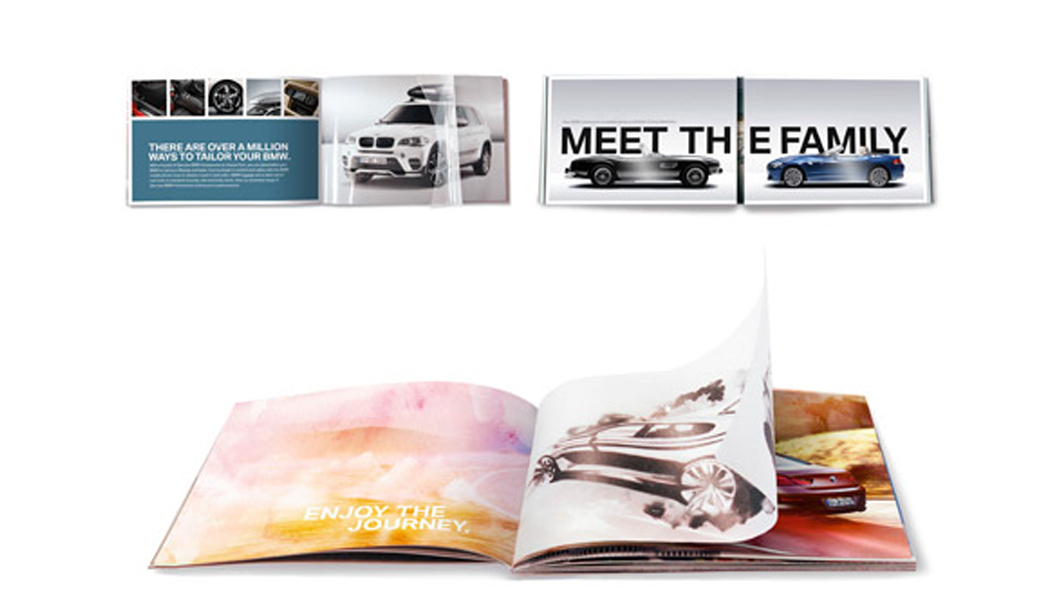
Two of our stocks feature in the booklet. The cover was printed on 340gsm Knight Vellum, text 170gsm HannoArt Silk, 140gsm Knight Vellum and 200gsm Knight Vellum (a 112gsm clear translucent trace paper and 96 micron clear acetate were also used). On some pages, a high build UV varnish appears on a matt stock, which feels good to touch. In other cases, it’s a heavier textured stock followed by a silk page.
The variety of grammages, papers and print techniques have transformed this brochure into ‘an experience and an adventure’. The additional use of IR and AR technology enhances the interactive nature of the booklet. Watching some of the pages come to life, revealing behind-the-scenes video footage, is pretty damn cool. Especially the page that starts with an engine rumble which makes your phone/iPad vibrate! Seriously, you’ve gotta love technology. Stick it together with paper and you may have created Paperland heaven right there.
As Dave Scott from Ogilvy explains: “Although some of the techniques are there to wow, elements like the acetate page also serve a purpose, demonstrating options you can buy for your BMW. We wanted it to be subtle, to feel designed, something that every second page would surprise or delight without shouting.” Mission accomplished.
This job is a great example of offset working seamlessly with digital print and using outside embellishments to gain the best possible results. Increasingly, we’re seeing great examples of print and digital technologies working really well together as a complete package. The possibilities are becoming more and more exciting and a bonus for brands wanting to create a unique experience. We might be biased but can you blame us? Exciting times people. Get on board!
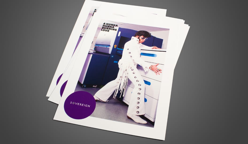
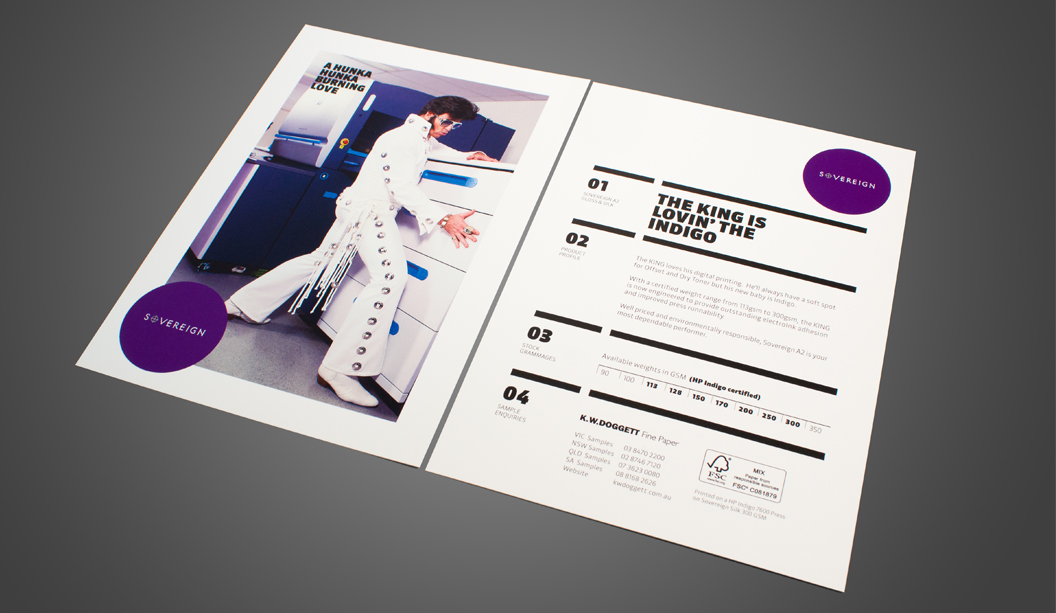
This A5 postcard designed by Three60 in Melbourne introduces the HP Indigo certified range. From 113gsm to 300gsm Sovereign A2 Digital is engineered to provide outstanding electroInk adhesion and improved press runnability. Available in both gloss and silk finishes, you may also choose to purchase Sovereign A2 as carbon neutral (minimal additional charge of 3%) ask us about it when you place your order.
Printed on Sovereign A2 Digital – Silk 300gsm with 4 colour process on the HP Indigo 7600 press. This bright white quality coated paper assures excellent ink lift with renowned qualities of smoothness, opacity and bulk. Sovereign A2 Digital is available in 320 x 450mm short grain and long grain sheet sizes.
Elvis really stole the show at the press check. Some of the staff from Bambra Press (VIC) were ‘all shook up’ (pardon the pun) and enjoyed singing along with The King during the photography shoot. We heard that the job made for a very interesting morning!
If you’d like to know more about this range or for your copy of the postcard, please ask your paper specialist.
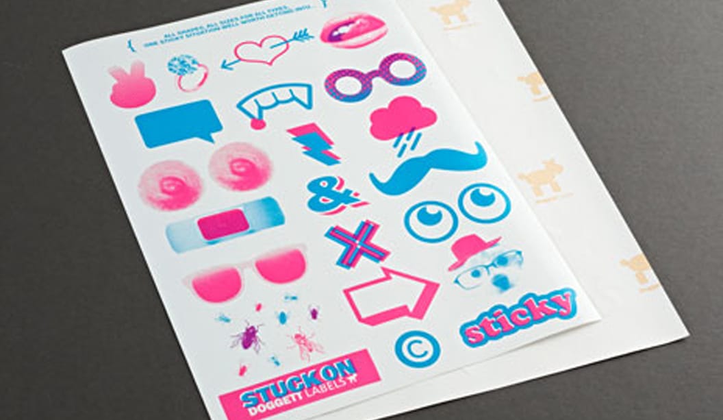
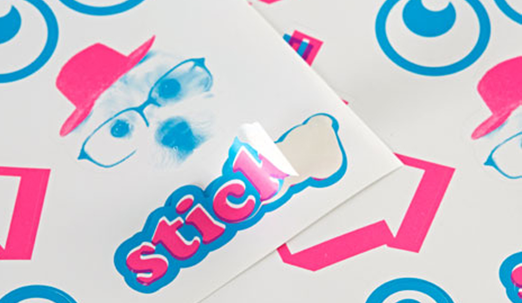
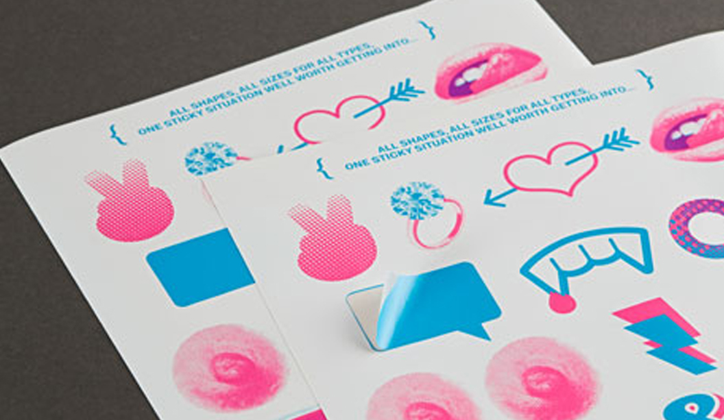
Let’s talk about…stickers. They come in all shapes and all sizes for all types. This Doggett Labels promotion was designed by Work Art Life. Featuring a set of cheeky labels, it’s designed to be a bit of fun.
Lips, a moustache, nipples (that’s right, no holds barred here!) and an engagement ring are just a few wicked shapes we’ve included. Many of us use labels in some way, so we’re here to remind you that not only do we share the love for sticky labels, but that we make and sell pre-cut labels too.
Doggett Labels are made on site in our Melbourne branch and offer an extensive choice of stocks, sheet sizes and adhesives. With face sheets of A4, CG, A3 and SRA3, we can help you find the perfect label for your project. Doggett Labels are boxed in sheets of 100 and come standard with Doggett branding on the backing sheet, or plain on request for bulk orders. Michael Moodie our label guru, will help you with those tricky jobs or any custom make, contact him at mmoodie@kwdoggett.com.au or call our VIC office on 03 8470 2244.
To get your hands on a copy of this A4 label promotion, please contact your paper specialist or your nearest sample department. And remember, if you can’t find your perfect label, we’ll make it for you!
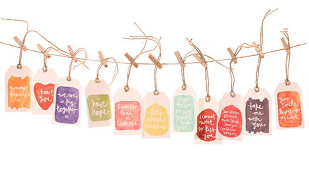
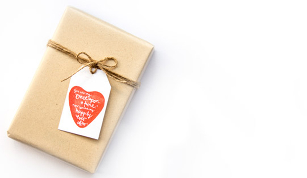
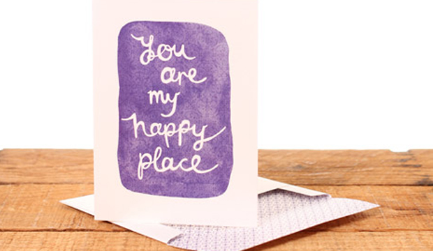
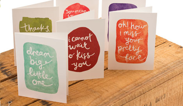
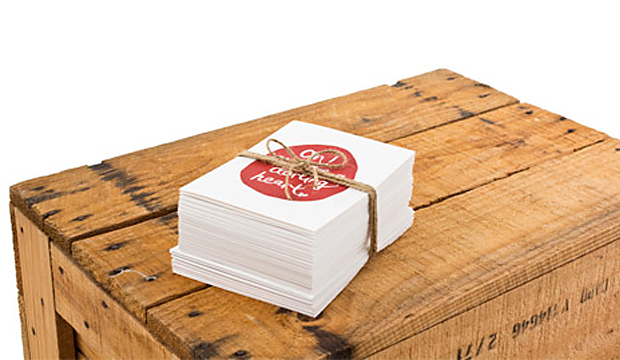
The collection of 36 handwritten messages are full of ‘wild romance, candid emotion, creative abandon and happy wanderers’ (we poached that line from her website – it sounds so dreamy, we just had to!). Whimsical watercolours from Italy of apricot, olive, strawberry and periwinkle have been used to paint the cards that are each presented with a pattern-lined envelope in coordinating hues. There are gift tags available too, tied with natural jute string.
Emma Kate Codrington is a passionate freelance designer based in South Australia with a love for polka dots and anything French. Her inspiration comes from the thrill of her adventures while living abroad. “Basing myself in Montpellier in the South of France for six months and travelling through Europe, I freelanced for my lovely clients from the cobbled streets of Stockholm, cafés in Florence and underneath the Eiffel Tower.” We’re not jealous much at all. Emma sent packages and love letters to friends and family back home, so to capture all of the emotion she developed her messages into a product line – and that’s where Emma Kate Paperie was born.
A confessed tree hugger, Emma uses uncoated and environmentally responsible paper for all of her print work: “The texture and tactility of Conqueror Laid attracted me first and when I heard the stock was made carbon neutral, my mind was made up!” The greeting cards and gift tags are printed digitally on an HP Indigo 5000 on Conqueror Laid Digital Brilliant White 300gsm and 120gsm for the envelopes.
This beautiful and unique collection is available online, so if you’re curious to see more, visit Emma Kate Creative’s website.
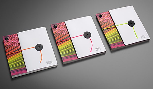
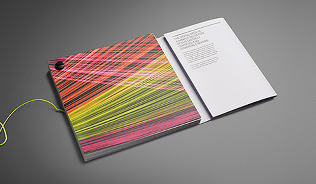
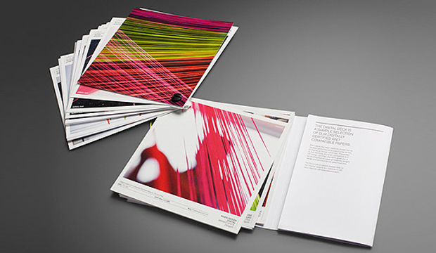
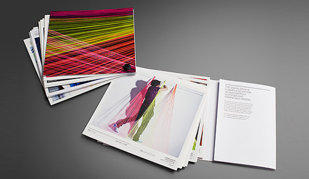
If you would like to step through this doorway please. Soon, you will enter the world of digital printing and dry toner technologies. There are lasers, line screens and precision crafted instruments galore – they could be dangerous so mind your head and watch your step. Ok, enough indulgence. There actually is a point here! Our brand spanking new Digital Deck has arrived, complete with whacky fluoro string art to make any 80s child brim with pride.
The fluoro string images that make-up the creative for our Digital Deck were created by Seesaw (VIC). The inspiration came from research into the world of digital printing – the lasers, precision tools etc. They created string art as a tactile response and link between the paper and digital worlds (for a behind-the-scenes look at the development of this imagery, check out our YouTube channel).
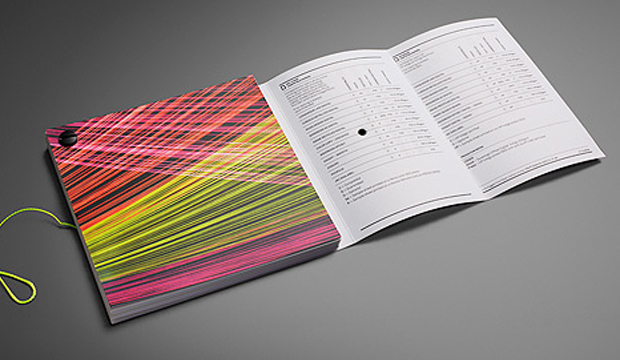
We’ve sectioned the Digital Deck into two parts – Dry Toner and HP Indigo. The stocks featured have been carefully selected for their performance capabilities. A compatibility chart is featured on the inside cover. The left column is for dry toner products and the right lists the Indigo papers. The table shows each of the featured stocks, their environmental credentials and compatible weight ranges.
A particular highlight is the new Knight and Sovereign Offset digital papers. Both are high white papers that are well priced for their class and offer exceptional press results, specifically for dry toner and HP digital applications. Also, they are identical to their offset versions in shade and finish which is a bonus for customers that need to match communications across offset and digital technologies.
Our journey in creating this deck was a learning curve, even for us. We soon realised the importance of working closely with the press operators to ensure they had profiled the stock correctly and weren’t just using a generic profile. To get the best result, especially when working with textured papers, is setting up the profile to suit the paper. When a digital machine is set-up properly, excellent print results can be achieved.
Chris Jackson, our Business Development Manager Digital and Synthetics, is available if you have any questions about our digital range. Call him on 03 8470 2244 or email him at jroberts@kwdoggett.com.au
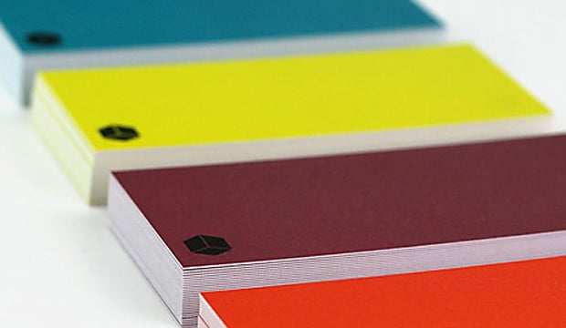
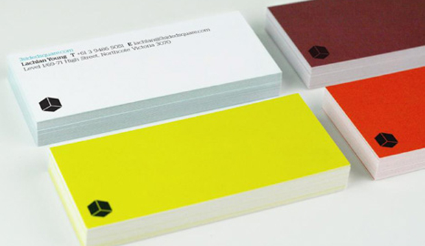
We’re definitely keen on visually appealing business cards. They say so much in a small amount of space. And we always remember the stand out ones. That’s the point right? In this case, take a handful of bright sparks from 3sidedsquare, a design and web studio in Melbourne, add a personalised colour palette and you have a pocketful of business card goodness right there.
So how does one achieve a pared-back design combined with eye popping bursts of colour? Hmmm? You go through various rounds of restraint and indulgence, do the loop a few times and then choose a lovely, uncoated stock to ensure the end result is crisp and clear. Knight Smooth White 400gsm made for a great outcome with its bright white and smooth surface. Another great example that shows the importance of choosing the right paper for your design.
Each member of the team selected their own striking hue to make up the set of vibrantly coloured cards. So, not only does the team have an important business tool, they have a neat little ice breaker that is a talking point with clients. As Lachlan Young from 3sidedsquare tell us: “The colours injects personality into the most personal of stationery items.” Besides the cards we love the opening graphic on their website – check out that pattern!
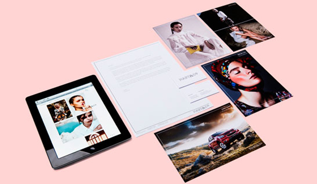
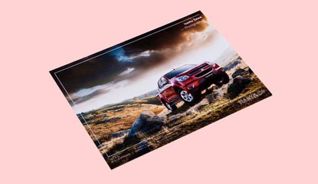
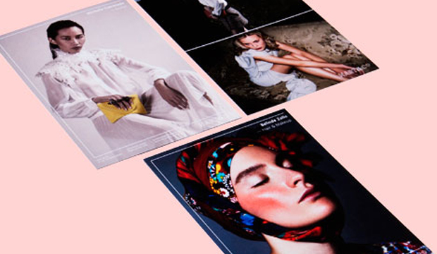
Title:Hart&Co business cards, collateral and website Agency:duo d uo (VIC) Client:Hart&Co (VIC) Stocks:Knight – Smooth Printed by:TS Press (VIC) verko (thermographics), embossing re business cards and comp cards by Press Print (VIC)
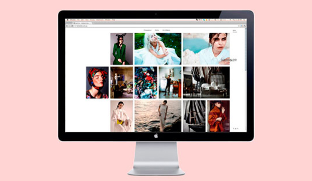
The brief from Hart&Co (a boutique creative management agency in Melbourne that represents a small selection of highly skilled creative types) was to deliver an identity and website that complements not detracts from the photography. And then ensure the end result stands out and expresses the brand. In come our friends at duo d uo, also from Melbourne and whom you may remember from earlier blog fame, with a top solution.
Duo d uo chose Knight for the Hart&Co collateral including the business cards and comp cards. Not to forget the simple and refined website they designed, built by Nice Device (VIC). The business cards are printed offset on Knight Smooth White 350gsm and embossed with black verko, a print technique we think deserves more cred! The comp cards, a promotional tool used to showcase the artists work, are printed on an HP Indigo 5500 on Knight Smooth White 400gsm. The stock was sapphire coated by the printer for use on their digital machine (FYI our Knight Digital – Indigo range comes with a HP certification up to 325gsm).
Cam Diamond from duo d uo shares his thoughts on working with Knight: “The stock has a great ability to hold ink and translate colour, perfect for showcasing photography. Knight also allows us to print both offset and digital. It’s a cost effective stock that can be used across all print related media and is easy available.” Safe to say duo d uo are fans of Knight. And they definitely know how to work with uncoated papers. Nice one.
 Footy Tips