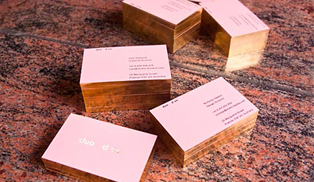
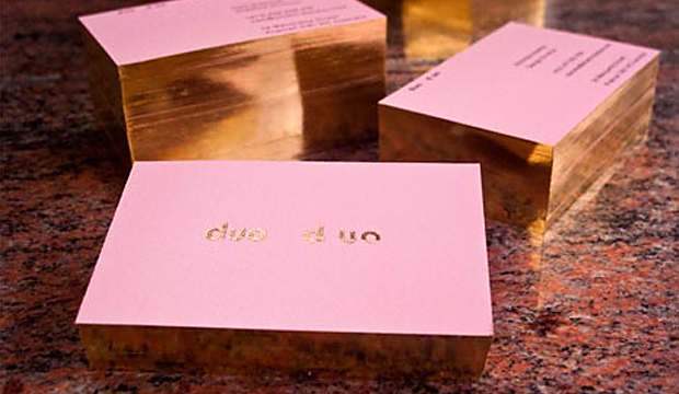
This newly formed creative studio based in Melbourne wanted their business cards to resemble their love of design and focus in the fashion industry. These alluring cards printed one colour black on Rives Design 350gsm definitely impressed us. Who can honestly say that some gold foil and gilded edges doesn’t make them just a little excited? Come on, be honest, you know it does!
Founded by designers Cam Diamond and Nicholas Hawker, duo d uo created an identity that complemented and combined their different backgrounds and design aesthetics. Cam’s motivation behind the design and choice of paper was to find a complementary solution to all of these aspects. He explains: “We chose Rives Design Bright White for its elegance, gilded edges for its subtlety and a foil for its boldness. The result is a card that resembles our image…a mix of traditional techniques and future thinking.”
Cam’s hot tip is: Don’t be afraid to foil on Rives Design.
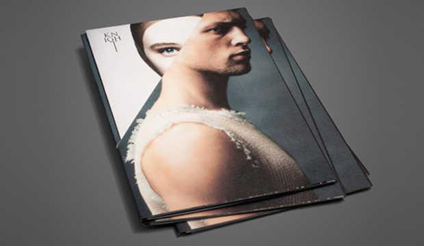
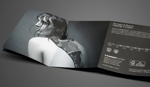
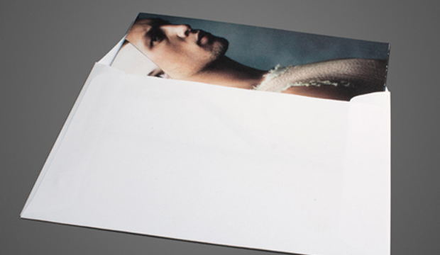
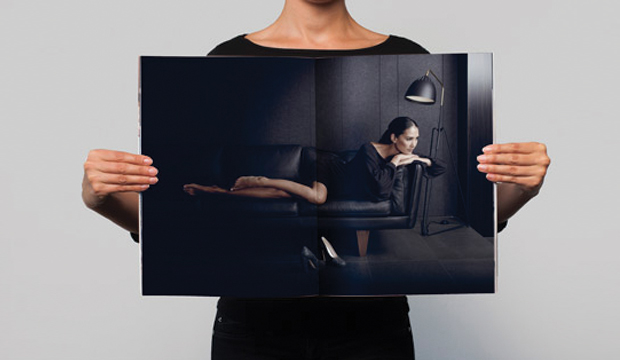
Title: Strength and Beauty – digitally certified (direct mail piece) Agency: Three60 Client: K.W.Doggett Fine Paper Stocks: Knight Digital – Indigo Printed by: Bambra Press (VIC)
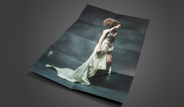
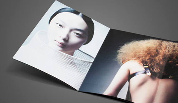
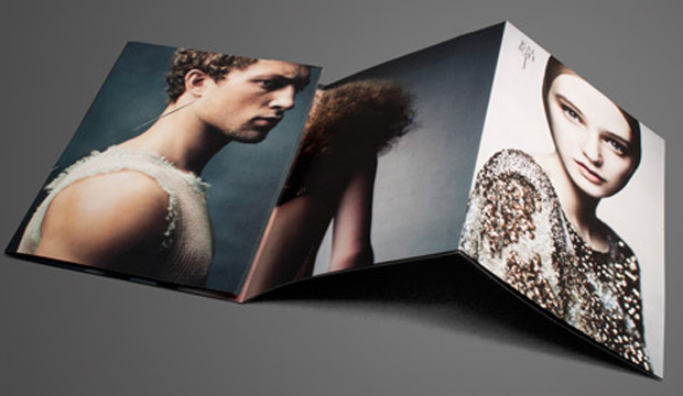
After much anticipation, Knight Digital – Indigo, the newest addition to our stunning collection of Knight papers, has hit our shores. This beautiful, uniquely folded A6 parcel showcases similar images from our 2011 Strength and Beauty campaign, which is one of our most talked about promotions. Three60 in Melbourne are the innovative design team behind the initial Knight campaign and this exquisite piece.
John Wilson from Three60 tells us the idea behind the unique format: “The idea was to reference the Knight sword with the cut, while contrasting strength and beauty with the male/female on the cover.” Printed on 100gsm with 4 colour process on an HP Indigo 5500, the parcel unfolds to reveal an A3 size poster with an unedited, never-before-seen original campaign image. When trying to decide how to launch this promotion, we were torn between handing it out personally or sending it as a direct mailer, so we decided to do a little of both. Everyone likes a little bit of snail mail every now and again!
Knight Digital – Indigo is FSC certified and features a crisp white finish with an even, silky smooth surface. It’s specifically designed and certified for HP Indigo printing technology, producing high resolution imagery and full colour digital print. Available in the most popular weights and 320 x 464mm sheet size (the maximum size that will run through an HP Indigo press). The benefit is that printers have an extra 13mm to play with, meaning extra trim or bleed area.
If you’d like to know more about the new digital range please speak to your paper specialist.
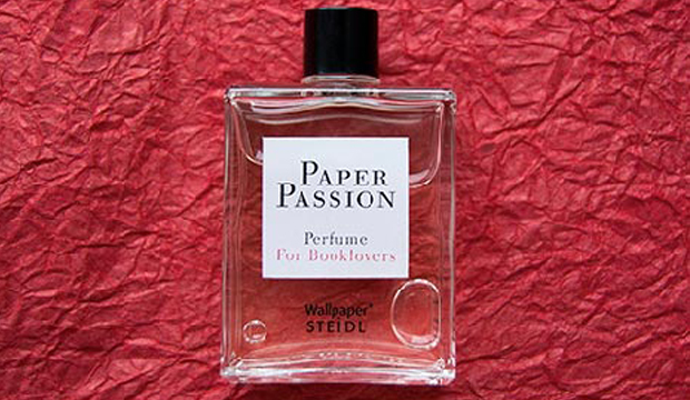
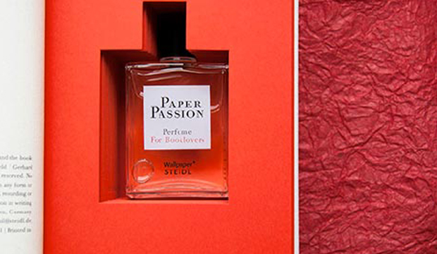
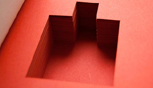
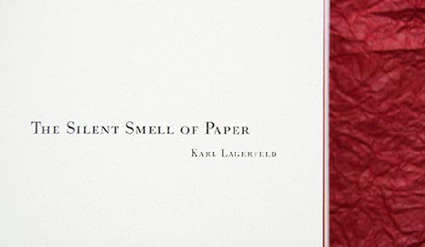
Who would have thunk it. A perfume that smells like paper! Needless to say we llllllllove it. Pure genius, of the Karl Lagerfeld, Geza Schoen (master perfumer), Gerhard Steidl, and Wallpaper* magazine variety. Housed neatly inside the book, you’ll find a bottle of ‘Paper Passion’. The nifty packaging is designed by the talented Lagerfeld and Steidl. The scent of ‘Paper Passion’ is meant to relax you, just like when you read a book. That’s good to hear isn’t it? We’re not sure too many people want to be known for smelling like a library stacked full of old books collecting dust! The book tells the story of passion, and the twisting plot to put this particular bouquet of freshly printed books in a bottle. The text bits are by Karl Lagerfeld, Günter Grass, Geza Schoen and Tony Chambers. We’ll leave you with this uplifting little pearler from Mr Lagerfeld: “The smell of a freshly printed book is the best smell in the world.”
If you want to purchase the perfume/book, visit the Steidl website.
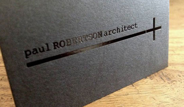
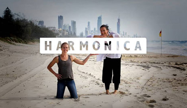
Title: Paul Robertson’s business cards Agency:Harmonica (QLD) Client:Paul RobertsonStocks:Keaykolour OriginalPrinted by: Gold Coast Foil Printers (QLD) Paul Robertson is an award winning architect from the Gold Coast. He’s also a creative, laid-back surfer (who lives on a boat) and is very modest about the beautiful structures he creates. Thanks to a local studio named Harmonica, made-up of long term friends Rachel Smith and Kate Moloney, some very classy business cards have been created using Keaykolour Jet Black. The cards appealed to Paul’s understated style and arrived just in time as he was jetting off on a whirlwind trip to Spain. Adios Amigo!
In designing Paul’s business cards, Harmonica had to walk a fine line between corporate, casual and creative without appearing too flash or in their words ‘without all the bedazzle’. To Rachel and Kate, using Keaykolour was an obvious choice having worked with the stock before. Kate tells us: “We knew the standard of finish we wanted to achieve and instantly knew that Jet Black would fit the bill for our black card dreams and desires.” Gold Coast Foil Printers in Queensland helped them out with foil selections which the Harmonica team said was invaluable. They’re big supporters of using on shore services (just quietly, so are we!) even if it means the price is higher. Harmonica’s advice: “Support local suppliers and talk to them if you don’t understand anything. Old school service is the way forward.” It also meant they could get the job done yesterday. The black gloss foil combined with the heavy 400gsm stock created the perfect balance of contrast and discretion. The result is a sophisticated and simple design and we’re guessing the Spanish like them too. Olé! We have to say, studios like Harmonica are yet another example of the amazing creative coming out of the Sunshine State. Kate commented on the fact there are heaps of rad designers, illustrators, photographers and web gurus right in their backyard. We definitely agree. Projects designed by Queensland agencies are coming across our desk in a steady stream and we’re continuously impressed with what we see. You can also check Harmonica out on their Facebook page.
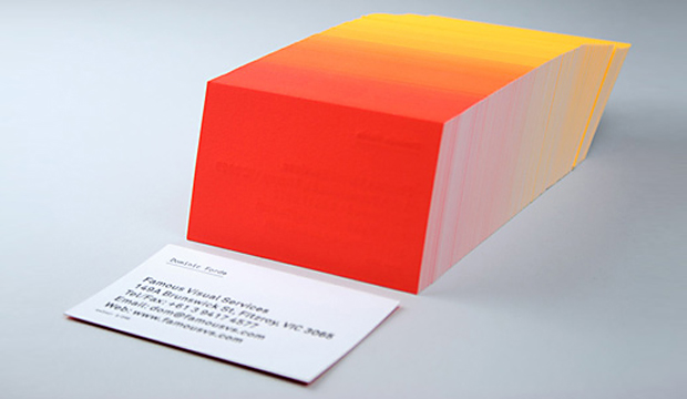
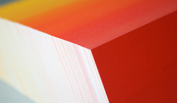
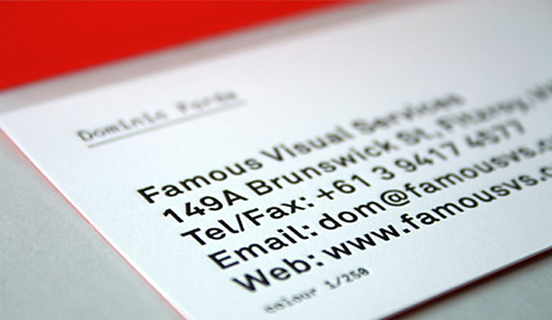
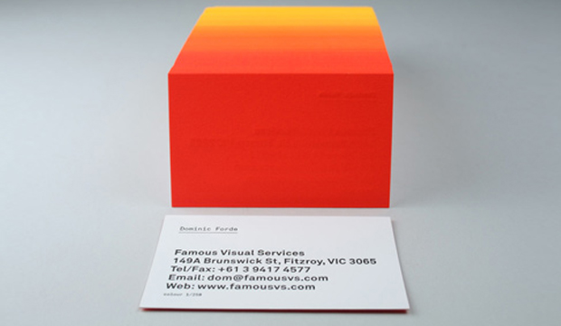
Title: Famous Visual Services business cards Agency: Self-promotion Stocks:Concept Vellum Printed by:Taylor’d Press (VIC)
We love a bit of colour around here. We have even been known to say certain colourful designs remind us of 80s icy poles. These business cards are definitely a reminder of 80s Summer time goodness. These knockout cards were produced by Dom Forde from Famous Visual Services. For Dom, new business cards present the opportunity to experiment with ideas and materials. And experiment he did!
Concept Vellum Radiance was chosen for its ability to handle fluoro ink well. Dom wanted to enhance the vibrancy of the colours and he also knew, on advice from James Taylor at Taylor’d Press, that the stock handles letter press well. Especially the heavy grammage – 352gsm, which can take a robust indentation from the machine. The outcome is a vibrant set of cards with luxurious tactile qualities.
The patience of James Taylor was really important in the process. As Dom explains: “Our idea was to print a slightly different colour shade across the back of each card in the print run. First we printed a solid fluoro yellow on all 250 cards, then we then ran the cards back through the press adding dollops of fluoro red to the press as the cards were running.” The result is a 250 step gradation from yellow to red across the print run. The name details were letterpress printed in black. Now that’s a nifty business card print job if ever we saw one. And yes, he did say 250 step gradation. Amazing!
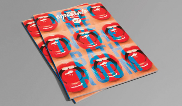
Two of the team from Esperanto Magazine – Ming-En Koh and Rupert Carr-Gregg, came to see us months ago about their idea to revamp the Monash University, Caulfield Campus student mag. They wanted to create something special in 2012, to showcase different paper stocks for each edition and include educational information on the importance of stock choice in design and business, types of finishings, bindings and embellishments. They had us at ‘paper’. But seriously, we love being able to support students in their creative pursuits and getting to contribute our knowledge about paper (which we love) and doing this at the same time was a no brainer.
We spoke to Ming-En Koh, Creative Director and Advertising contact at Esperanto about their first edition. It’s a racy one! We loved it – the humour, layout and content is really well put together. “The theme for our first issue was sex, therefore we wanted the graphic direction to be as provocative and striking as the topic itself. We tend to avoid busy or cluttered design in preference for an aesthetic focused on typography and film photography. Funnily enough we are the first student magazine at Monash University to be perfect bound and embellished.”
We were particularly excited about the cover. The vibrant red lips pop right off the page with a matt laminate and a spot UV on top to create a visual contrast. HannoArt Silk 300gsm was used for the cover and Sun Offset 120gsm for the text. We chose HannoArt and Sun Offset for this magazine because of their excellent colour reproduction and press performance.
Part of the team’s mission was to create a magazine that could look good on a shelf next to ‘proper’ published print magazines. They’ve definitely ticked that box. What say you? Does this look like the type of student mag you wish you had been a part of back in the day? A quick poll around the office confirms a yes on that one for us here in Paperland.
Have you ever seen a Great Dane being walked down the street? If the answer is yes, can you honestly tell us that you don’t stare at it. Even for a moment. Hmmm? Perhaps it’s the beauty of such a big creature, the fact that it stands out from the crowd maybe. The Great Dane Furniture brochure recently created by Hoyne is much like that moment when you spot the oversized dog pacing down the street. It’s mesmorising, it catches your eye and you can’t help but stare.
Hoyne was approached to reposition Great Dane Furniture as being a modern and contemporary furniture company (even if some of the pieces were designed 60 years ago). How, pray tell, does a design agency turn a brand that is feeling old and heavy into one that embodies qualities like: crisp, spacious, authentic, beautiful and represents ‘the home of Scandinavian design’? You have a vision and you stick to it, that’s how. The result is an A2 size publication that excites and inspires with its sheer size and beautiful, stylish imagery, all topped off with a gorgeous Great Dane on the front cover.
Hoyne used Sovereign Offset 120gsm for the catalogue simply because it’s their favourite stock. They have used Sovereign Offset numerous times in the past for other brochures and knew that it would print images well. This catalogue was printed 4 colour process at a 175 line screen ruling.
Andrew Hoyne, Principal at Hoyne, really inspired us with stories about their persistence and commitment to achieving a great result. He tells us how a lot of their ideas scared the client. Everything from the size, printing the inside pages pink to resemble a publication within a publication and not being able to include all of the products or all of their favourite photos from the shoot, made them very uncomfortable. The client was even dead set against using illustration but Andrew went ahead and did it anyway! “Chairs stacked to the height of a bridge and chairs floating through the air were ideas that made no sense to the client (or anyone else who heard them). After much coaxing and after promising I’d pay for it if they hated it, the client finally agreed to let us create something memorable and differentiated from what they had done in the past. Something different from what people expect in a furniture catalogue.”
Not a bad way to celebrate your 10th anniversary is it? Hip hip hooray and a happy birthday to you – Great Dane Furniture!
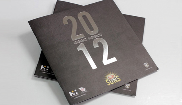
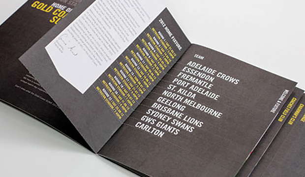
It’s not often an AFL football team and one of our specialty papers (Knight Smooth White in this case), appear together in a sentence. Then again, the tagline ‘Strength & Beauty’ could be applied to to footy! TUSK, a design studio on the Gold Coast, have a long standing relationship with the Gold Coast SUNS and apart from designing their amazingly detailed website, they recently revamped their corporate hospitality collateral using one of our high quality uncoated papers – Knight Smooth White.
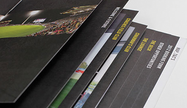
The look and feel developed for the corporate hospitality team needed to be distinguishable from the overall club branding but still look like it’s part of the SUNS family. TUSK utilised existing branding components such as typefaces and textures, treating and applying these in a way that would be distinct but still recognisable. First piece of collateral to be developed was the brochure. As one of the primary sales tools for the corporate team, it needed to clearly communicate all the relevant information.
The brochure is a 16pp + 4pp cover with the cover printed on Knight Smooth White 350gsm and 200gsm for the text. TUSK opted for a square format to provide visual interest and firm it up, so the brochure feels premium and substantial when someone is holding it. TUSK intentionally designed an understated cover to maximise the impact of the imagery and colour of the internal pages, which are stepped to assist with easy and quick access to the information. The other collateral included a presentation folder which featured a foil, some facility information sheets and an oversized folded DL ticket holder.
Darren Gill from TUSK mentioned to us that they’ve worked with Knight before and have loved it. “It provides a premium finish without blowing the budget. We wanted a stock that we could use across all the collateral – brochure, presentation folders, info sheets etc. and provide a consistent, high quality finish.”
The great thing about having a close and long standing working relationship with a client is that they tend to trust you. The positive about this for TUSK, is that the SUNS know they’ll provide a great solution to their brief and meet their budget needs too. The Gold Coast SUNS were chuffed with the outcome of this project which has taken their corporate hospitality marketing collateral to a new level this year. Meat pie anyone?
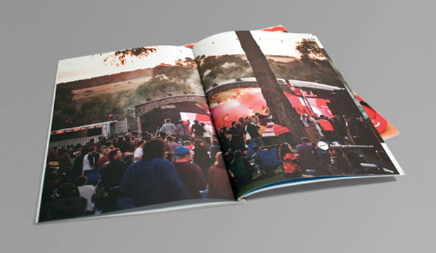
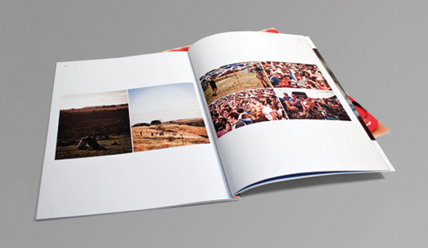
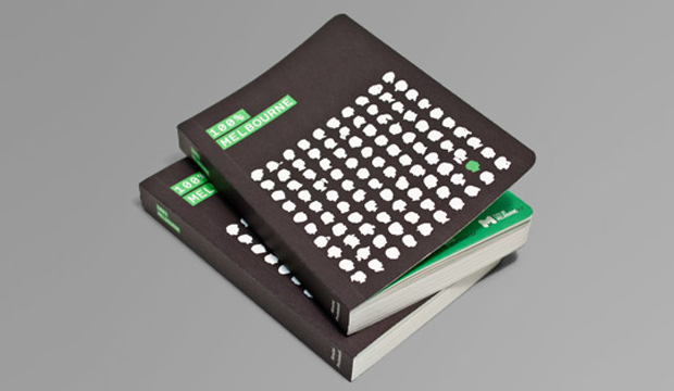
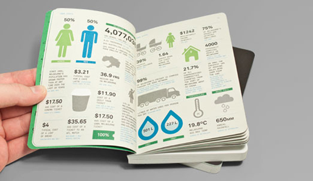
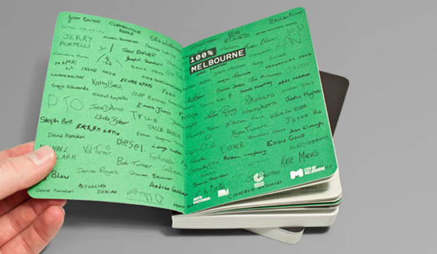
This little pearler is called the ‘100% Melbourne’ book. It’s beautifully designed (all 272 pages of it), with an enchanting story to match. A collaboration with Berlin theatre makers Rimini Protokol, the City of Melbourne and Famous Visual Services, the book reflects statistics from Melbourne city’s research department, contrasted with the story of each Melburnian. The 100 participants were also gathered together on stage to create a living breathing portrait of Melbourne. It was part theatre, part reality and of course ‘100% Melbourne’. Sounds like fun!
The cover is printed on Tablex Freckles 280gsm and the text is on Impact 80gsm. We’re really impressed with the use of Tablex Freckles. It has to be one of the best examples we have seen in ages. Impact 80gsm was chosen for its flickability, minimum show through and great environmental credentials. The A6 format ensured the book could be easily carried home after the show. Just the right size to stash in your hand/man bag isn’t it? On the flip side, Famous Visual Services needed the outcome to be robust so they used Tablex Freckles 280gsm for its bookish texture and durability.
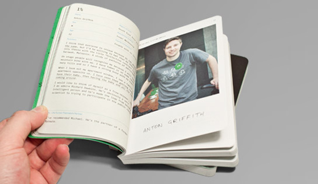
This book shows the importance of great digestable design. The aesthetic Famous Visual Services developed for the book highlights the contrast between the formal language of data and passports as well as the informal visual style of hand writing and casual portrait photography.
Dom Forde from Famous Visual Services shared some production insights with us: “A consistent colour treatment was added to every image to soften the hard edge of the digital shots. The colour palette was an important part of the identity and the stock chosen added the same tactile quality we were after. We used a rich black on the Tablex cover which handled that well and held the detail of our illustration really well.” This lovely little Melbourne treasure was finished off with some section sewing and bevelled edges.
Now that the team has had a taste of book binding, they’re considering some more lengthy publication projects.
The start of a new idea often starts with a ‘blank sheet of paper moment’. The one where the future is open – you start from nothing and can literally create anything. This can be a challenging moment, a call to arms even. In their commitment to encourage individuals and businesses to be more innovative, thoughtful and sustainable, Arjowiggins Creative Papers, in association with D&AD, developed a unique and pretty neat project which explores how four creatives of global renown approach that moment – and so was born ‘The Blank Sheet Project’.
So far, Arjowiggins Creative Papers have asked Neville Brody, Sir John Hegarty and now Renzo Rosso: ‘How will you leave your mark?’ Each creative shares their creative process, from inspiration to finished idea. They also nominate the pieces of work they would leave behind for future generations, discuss their own views on the role of paper today, the future of the creative industry and the responsibility of creatives to always be more innovative, thoughtful and sustainable.
Back to Renzo for a moment. He’s a man who uses a blank sheet every day to design some of the most iconic fashions of the modern day world. He has created a brand which changed perceptions and broke every pre-existing rule there is, and he’s the founder of the ‘Only the Brave’ foundation. His approach is unique and his mantra is ‘be stupid’. We’re not joking, it really is! It’s also the fundamental philosophy of the Diesel brand. Renzo says: “When you did things before others, they think you are stupid…smart people think how things are today but stupid people are those who think how things could be.” Touche Renzo! The interview reveals a man who is, without doubt, a single-minded, self-confessed workaholic, yet, surprisingly, a firm believer in collaboration and communal effort.
The background to this project makes for a great story too. Arjowiggins Creative Papers asked themselves: “If we started again; if we had a blank sheet of paper; if we put sustainability at the very top of the agenda; what would we do? How could we do things differently?” They launched an internal ‘blank sheet project’ in 2010. It was a chance for the company to rethink, evolve and ensure that they always make responsible business decisions, focusing on how they will leave their mark – socially, economically and environmentally. It made sense on a business level too. We love the idea – absolutely amazing.
Complementary to the launch of this is ‘Leave Your Mark’. Every two weeks, an ambassador (personality, artist, creator etc) express their vision of creativity and how they will leave their mark.
If you want to find out more about the ‘The Blank Sheet Project’, call our marketing department 03 8470 2244 or speak to your paper specialist.
 Footy Tips