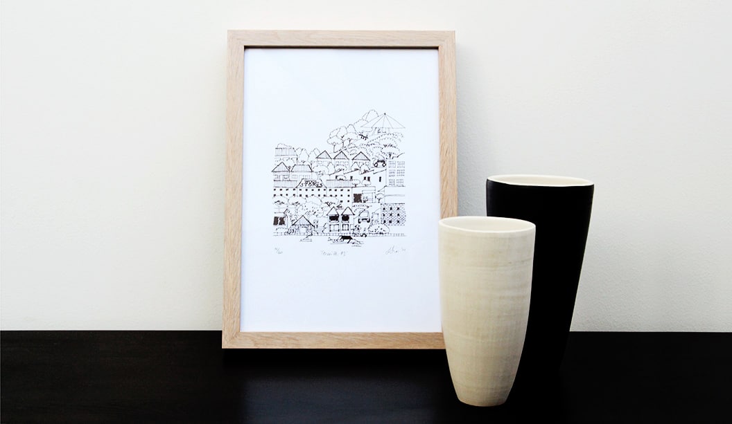
Title: Limited edition prints by Liesbeth Thie from Two Tone Design Stocks:Knight Vellum Printing specs: Screen printed Printed by:Cosmic Screenprinting QLD
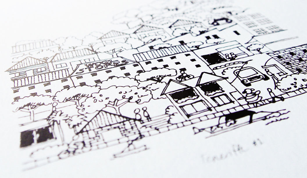
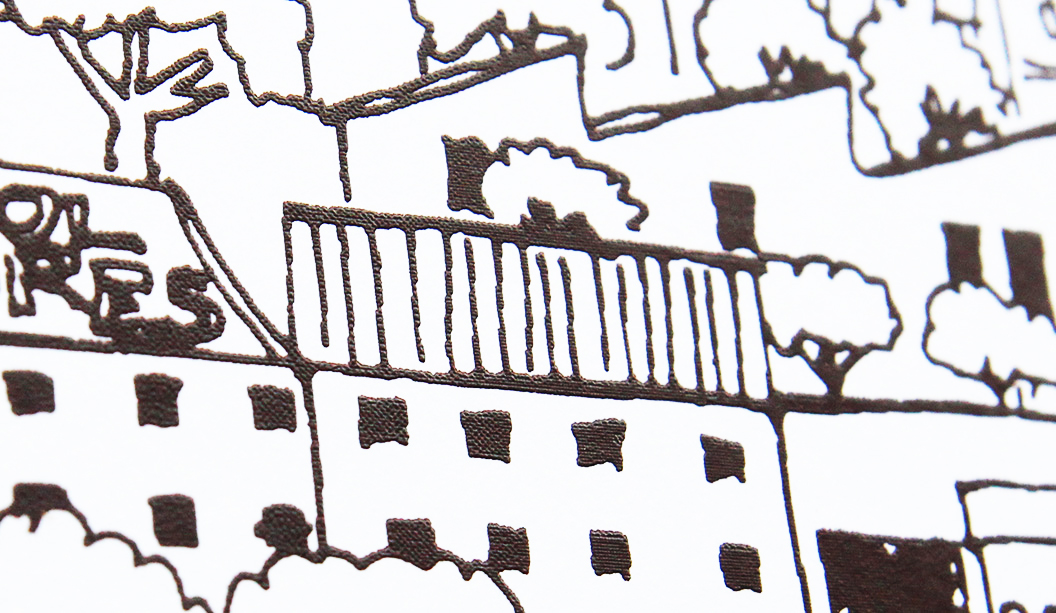
Everyone digs something limited edition. It makes the item all the more special. This lovely range of prints are just that. Graphic designer Liesbeth Thie from Two Tone Design has created some limited edition prints that capture the cosmopolitan Brisbane suburb of Teneriffe, showcasing her love of architecture, history and design with a modern Brisbane flavour.
Her original line drawing has been screen printed in a range of colours on Knight Vellum White 280gsm. Liesbeth shares: “The bright white paper has a crisp finish which was important for positioning the prints as a premium product. I chose to screen print the artwork as it creates a great raised effect in the line work and adds a hand-made touch to the range.”
The prints are the first in what Liesbeth hopes will become a series of beautifully designed and printed keepsakes promoting the city she grew up in and still calls home. You can get your paws on some via https://www.etsy.com/au/shop/TwoToneDesign or New Farm Editions in Brisbane, as well as the Museum of Brisbane shop in City Hall.
Hooray for Kellie Northwood, Executive Director of TSA Limited which runs Two Sides Australia (environmental campaigns) and VoPP (effectiveness campaigns) for the paper and print industry. Kellie has loads of experience and her writing is backed by research. She’s fed up with the pervasive lack of confidence in the industry about the future of print. Instead, she encourages people to stick to their guns, do the research and talk up the benefits with customers. We dig her attitude!
By Kellie Northwood.
Whether an industry event, a training session or a meeting, as I journey throughout the print industry, I find myself twitching when I hear some people talk in a way that concerns me. A voice that can become more powerful and more concerning than declining industry metrics, government cut-backs and site closures – I twitch when I hear a lack of confidence. Nervous comments over whether there will be a print industry in ten years, five years or three years. Fear over whether people will have the skills to work in the industry. A lack of confidence that print has no value and more.
Some fears have merit – with print companies folding we can be concerned as to our future employment prospects. With a communications revolution we can also be guaranteed that our industry has and will continue to change over the years ahead. However fears concerning print’s value, relevance and future prospects carry no weight with me. As an industry we must stop focussing on each other and start focussing on print as an effective, cost-efficient and powerful media channel.
A media channel that offers greater return on investment (ROI) than Online, TV and Radio. Is reported by the largest research companies across Australia – Roy Morgan Research, Neilsen, and GfK to name a few – as the strongest performer in effectiveness and influence surveys. Surveys that deliver consistent high-performance results across all socio-economic and age demographics and reveal print is the most trusted, credible and reliable. Print is also the most sustainable media channel from carbon footprint, renewable raw materials and industry initiatives over TV, Radio, Digital and Email.
No need to gain confidence from me, the research and data supports everything I am saying – Roy Morgan reports ‘Heavy print media users are more likely to be above average income earners, better educated and big spenders’. Music to marketer’s ears. Roy Morgan continue, ‘Print media continues to be the dominant media channel among those who are asked for advice on a range of product and service categories’.
Psychology reports continue to reinforce the strength of print when retaining messaging – brand awareness is stronger when communicated via print and commercial communication is most effective via paper and print. Your customer’s need to have these conversations not ones forecasting the industry’s doom and gloom. If we as an industry believe our industry has no merit then how can we expect our customers to invest valuable marketing budgets in print?
When asked are printers doing enough? My advice is to stick to your guns, declare proudly that print is still king, gather the research, collate the case studies and take them out to every sales call, every cross-media event, tag them to your websites, brochures and other marketing initiatives. When your real competitors – TV, Radio, Digital, Outdoor – talk to their customers they do not focus on who has the best camera equipment, microphones or ADSL line. They talk about one thing – results. They talk to their prospects about the effectiveness of TV, the ROI of Digital and so on. It’s time we do the same and start reclaiming some of the precious marketing dollars our industry may have lost in recent years. Trust me, the research and data will back you up.
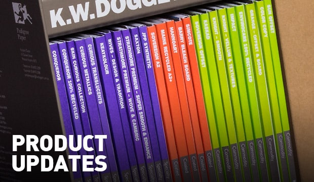
The following is a snapshot of the changes and updates we’ve made. Some exciting new product lines, sheet sizes, weights and reels are now available. Please speak to your account manager for any of the finer details.
Doggett Digital:
The new Doggett Digital price book includes the digital sheets you already know about, but some old favourites as well as some newbies are also now available in digital sizes:
Synthetic
• JPP Synthetic – C Grade now available in 566gsm/500ums and 905gsm/800ums in 760×1020 sheet size
Doggett Labels
• Envirocare 100% Recycled material is now discontinued
Plus, over the next couple of months we’ll be rolling out these changes so stay tuned for more on these:
• Sovereign Offset is becoming carbon neutral.
• Tacky 760×1000 white and clear electrostatic for UV offset
• New shade coming for Grange Offset and Grange Board
With the never ending treasure trove of visual inspiration on Pinterest, to the cool paper projects our customers have posted on Instagram, there’s hours of fun to be had. So this is really just a super quick reminder we’re on the social airwaves and we’d love you to be part of our online family.
Pinterest: We want our Pinterest page to bring into reality your wildest paper dreams. You’ll find loads of inspiring boards like embellishments, binding and packaging. For a bit of fun, there’s a board dedicated to our four legged friends too. Well, it’s not going to be cats is it?! Our search for the latest and greatest pins means means we invite a guest pinner to contribute to our page every now and again. Recently it was graphic designer Masaki from Three60 in Melbourne. You can check out one of Masaki’s very cool boards here. We’re always adding new pins so be sure to check in often.
Instagram: We’re so amazed at the creativity out there. It’s not about our paper, it’s what you do with it and Instagram is the perfect platform to showcase this. Keep on posting those paper projects, we love them.
Facebook: Find out about design and print events, videos about paper and sustainability, design projects showing cool print techniques, the odd competition and more.
LinkedIn: We post industry news, insights and company updates on our company page. We’d love you to connect with the Doggett’s team on LinkedIn and we can all share in the paper and print news together.
Twitter: We usually tweet about industry related information and fact based news on paper and sustainability.
YouTube: Visit this platform to be entertained whether it’s a video about iPads v toilet paper or the more serious ones like the video about paper created with citronella to keep people from dying of dengue fever,
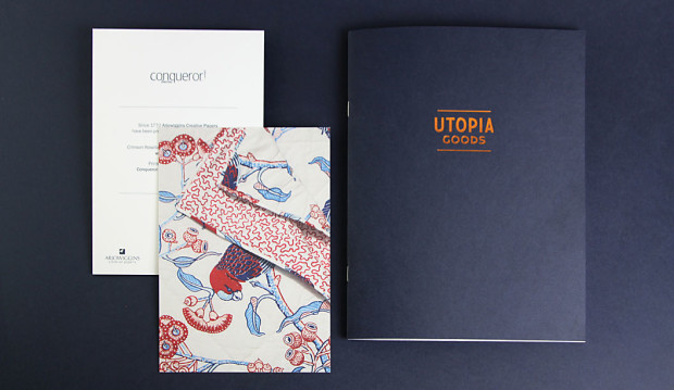
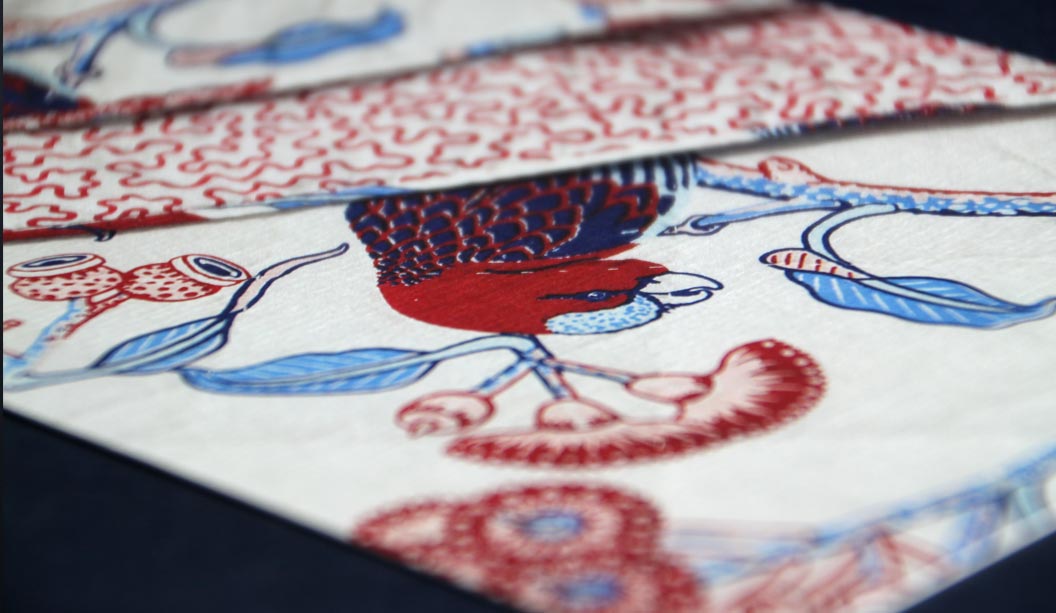
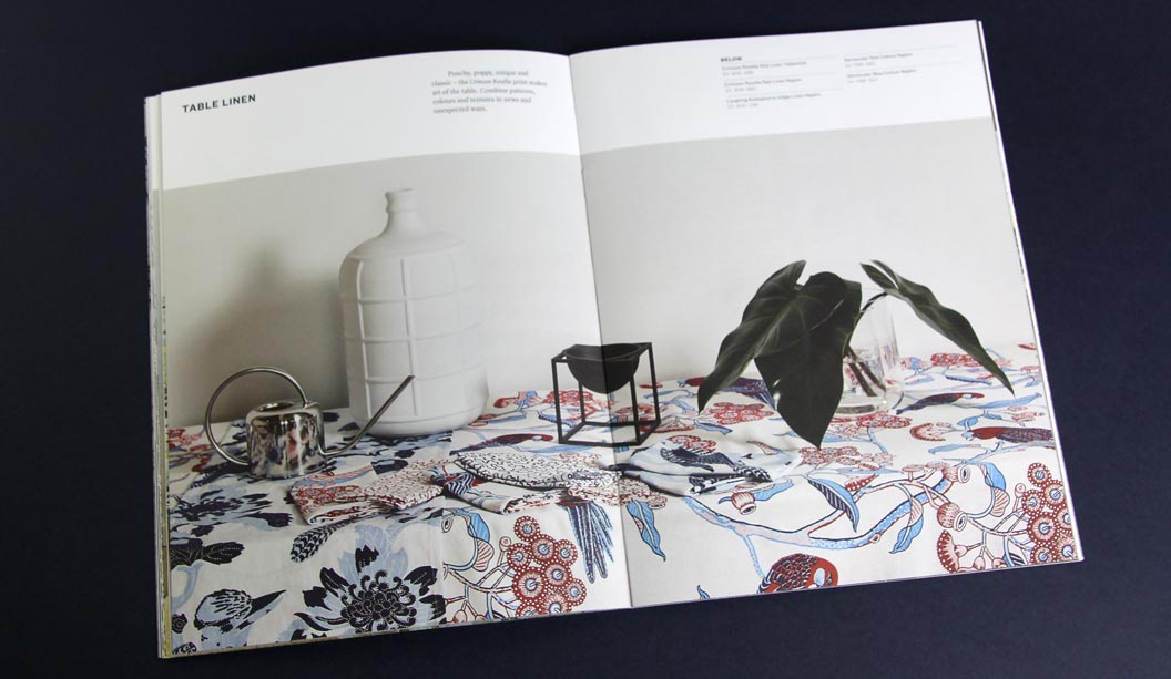
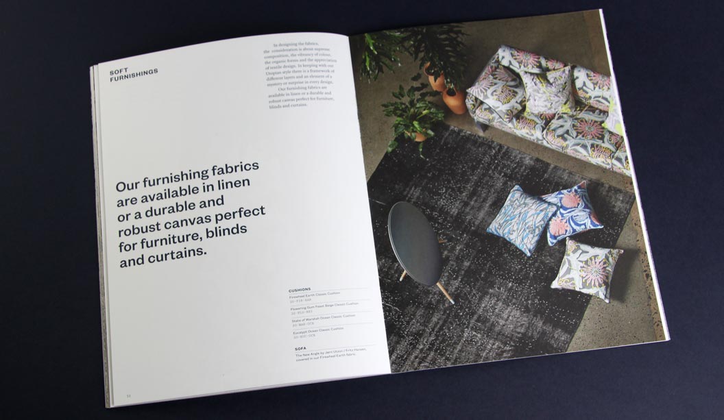
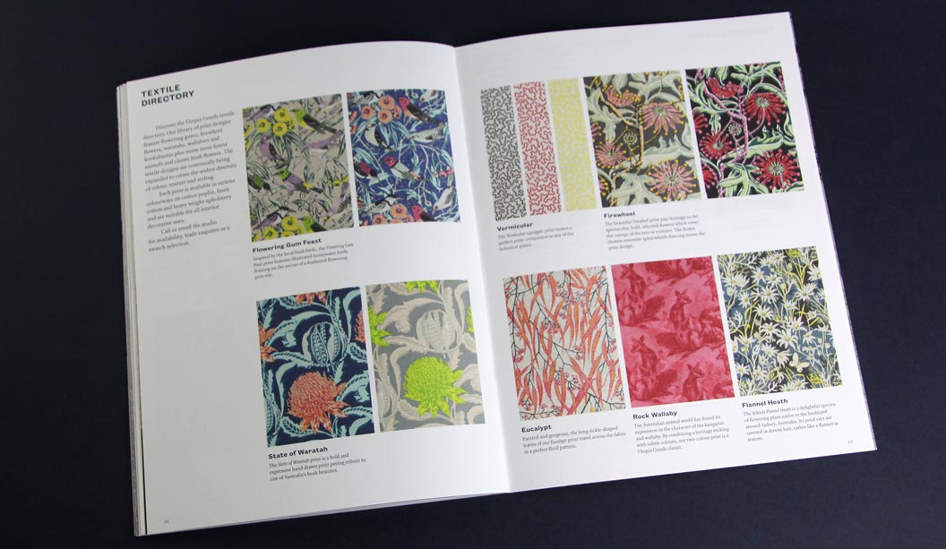
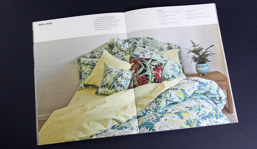
By day Bruce Slorach and Sophie Tatlow run the highly regarded Deuce Design. By night these two crafty cats dream up beautiful modern Australian homewares. Utopia Goods is a range of soft furnishings that centre around Bruce’s illustrative work. It features hand drawn native flora and fauna and is, in their words: “Part maximalist and part sumptuous fabric feast.” We love the colour, the chaos and the maximalist nature of it all. The perfect contrast to all that Danish minimalism of recent times.
For their printed catalogue, Duece were looking for a paper that would reproduce the beautiful bold colours of the collection and still offer the handler a natural finish. We chose Conqueror Wove Diamond White 120gsm, paired back with a Keaykolour Original Navy Blue cover in 250gsm. The Wove paper is soft to touch, not smooth but certainly not rough. The perfect softer style sheet for a brand such as Utopia Goods. Kudos to Special T Print in Sydney, a superb print job.
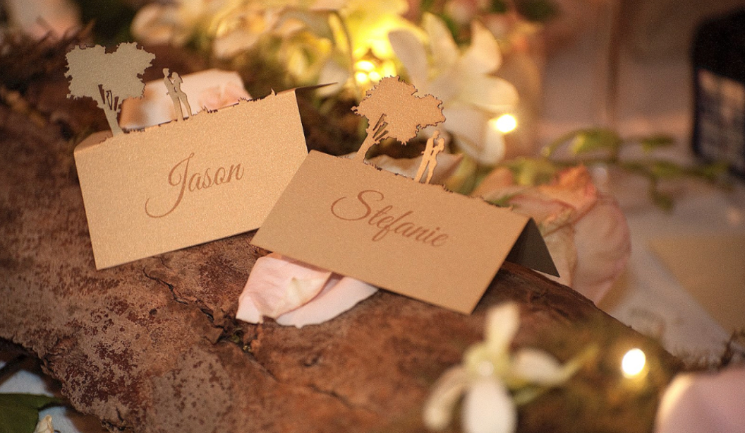
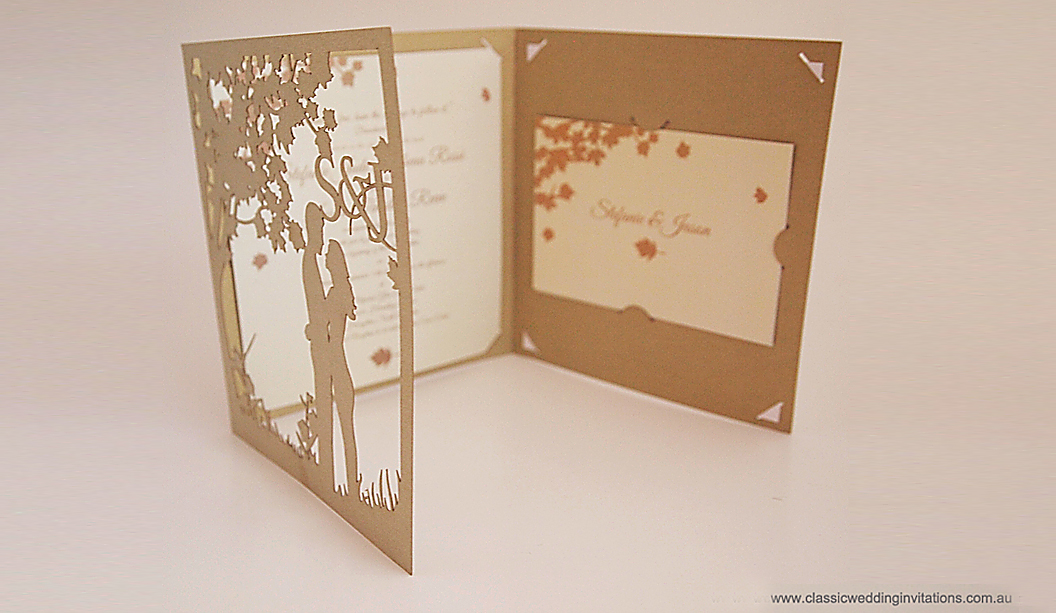
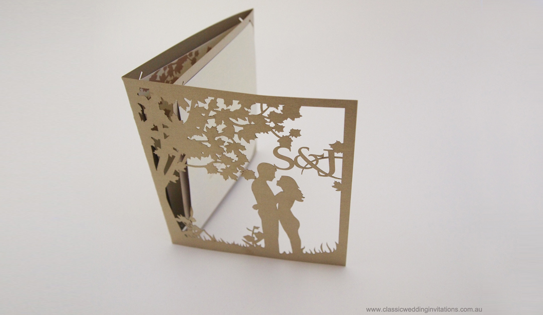
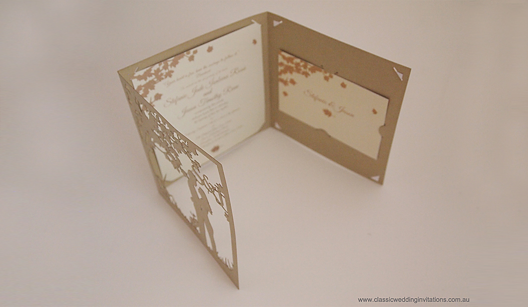
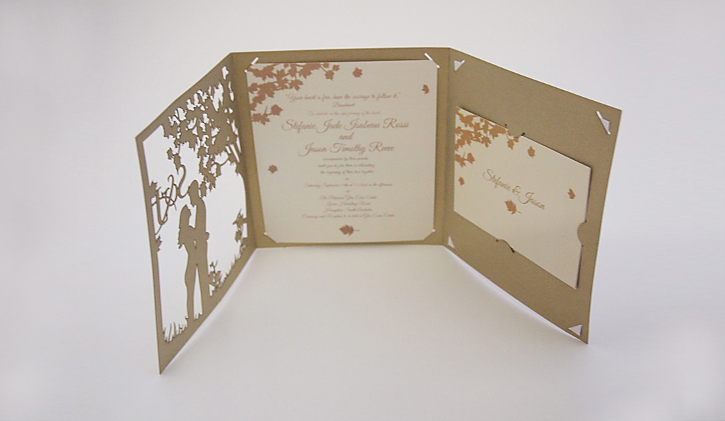
Classic Wedding Invitations are the makers of unique wedding stationery. Working as part of a collective under the Lydra Group, they design, laser-cut and print everything in-house and also offer digital fabric printing, laser cutting for businesses and custom projects. In other words they’re very busy creatives! There’s lots of unique stationery to choose from and you can even have your invitation custom made which is what Stefanie Rossi and her partner Jason did.
To complement their fairytale themed wedding, they chose a traditional tri-fold design using Curious Metallics Gold Leaf 280gsm. Linda Vydra from Lydra Group says: “It’s our most popular stock for weddings and we use a lot of pearl papers for laser cutting as the result is really effective.” To add a personal touch, the couple’s silhouette standing beneath a tree was laser cut out of the paper. So lovely! The main invitation, inserts, place cards, menus, table numbers and wedding sign were printed on Knight Smooth Cream 280gsm to tie the theme together.
With wedding season fast approaching, Classic Wedding Invitations is sure to inspire and delight all the soon-to-be brides out there. To view their range of laser cut invitations and bold modern invites made from wood, go to www.classicweddinginvitations.com.au
The world of printing is a wondrous but complex beast with all the proofs, colour correction, press checks, papers to choose from etc. Yet it’s very rewarding too. Seeing that printed piece come off press is a damn good feeling. But, it can also be tricky to know which print method to choose, particularly between offset v digital, so we’ve put together a list of important facts you should know when designing and printing digital jobs.
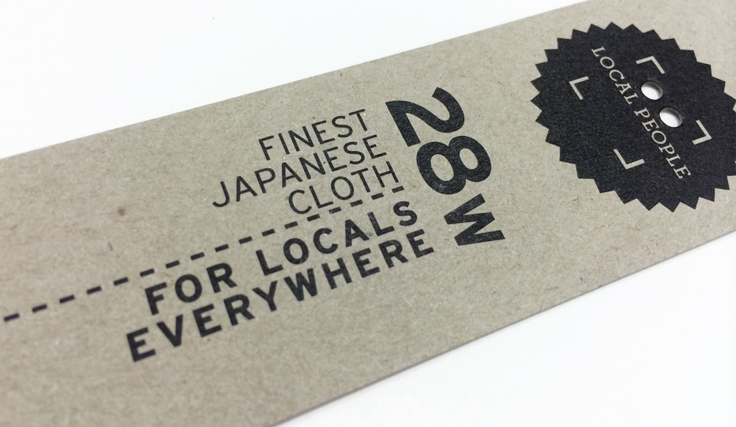
1. What is digital printing? It is the term used to describe printing technology that links printing processes to computers. There are various technologies available but the two main types of machines fall under the HP Indigo or Dry Toner banners. Dry toner (powder toner) printers are the Kodak Nexpress, Fuji Xerox, Ricoh, Canon, Lanier, Konica Minolta. The HP Indigo (liquid electrostatic ink) presses include the 3550, 5600, 7600 and 10000 models.
2. Paper. You need to use digitally certified papers, particularly important for the HP Indigo. Some printers will use non certified stocks and that’s ok, but it’s up to them. It’s also handy to advise them of the gsm and ums. Check our ‘Doggett Digital’ section for our range.
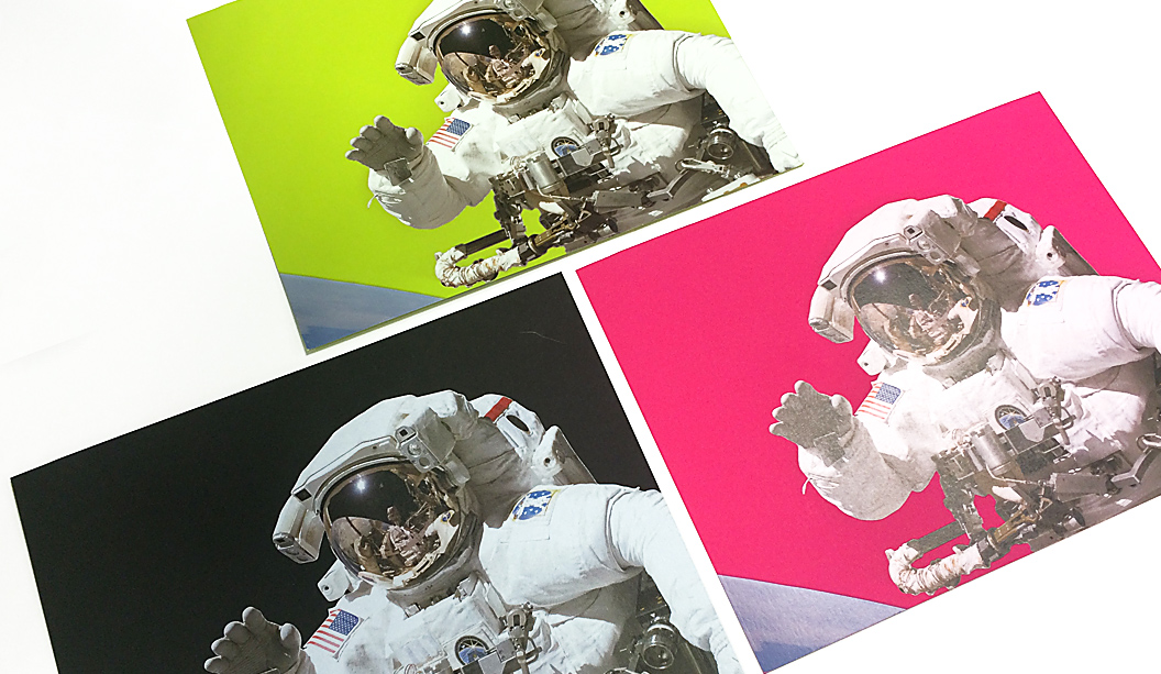
3. Print quality. Improvements in digital printing means machines like the HP Indigo presses can produce similar print results to offset printing. Check out the astronauts below printed on Pop’Set Lime Tonic, Cosmo Pink and Black 320gsm with four hits of white ink and CMYK over the top.
(Project above printed by Intelligent Media).
4. Speed. Digital printing is a simpler process compared to offset. Without the need for plates, mixing inks etc the final print can be delivered faster.
5. Cost effective. No set-up costs, no minimum print quantities and no plate costs. Some digital machines are also capable of doing inline finishing like binding eg saddle stitch, perfect bound or wire binding, so costs and turnaround times are reduced.
6. Short runs. It’s ideal for printing small to medium quantities ie 1-1000 units.
7. Personalisation. Also known as variable data. This allows you to tailor your message to your audience so you can personalise invites with the recipient’s names ie wedding invitations. We’ve heard of a national retail store using this method for posters given each store had different details, they printed the job digitally in one go.
8. Effects. Some digital machines such as HP Indigo have the ability to print special effects like white ink, special Pantone PMS colours, UV red invisible ink that fluoresces under ultraviolet light, clear varnish and gloss effects and raised ink, like an emboss effect. Here are some examples of Buffalo Board 283gsm printed using CMYK and white ink.
9. Green. There are lots of positive environmental factors like no pre-press stages so no films, plates or photo chemicals which means less waste. Printing can use a lot of water but digital presses are now waterless saving thousands of litres of water per year.
10. Last minute jobs. Lucky for you, digital printing can be done on demand and you have the ability to make last minute changes at the time of printing via the computer.
There are also many reasons why you would use offset printing too like the fact you can tweak the colours on press, do long runs etc. So just make sure you go for the right print method depending on your desired outcome. Stay tuned for more printing tips and production information in the next issue of Fetch. This final piece is printed CMYK on Knight Digital Indigo 270gsm.
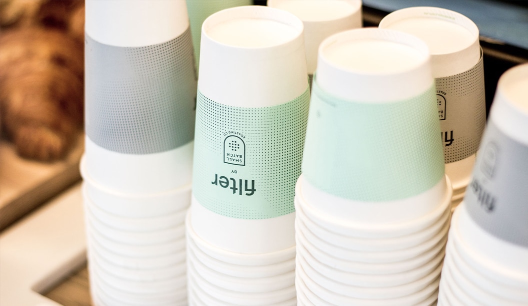
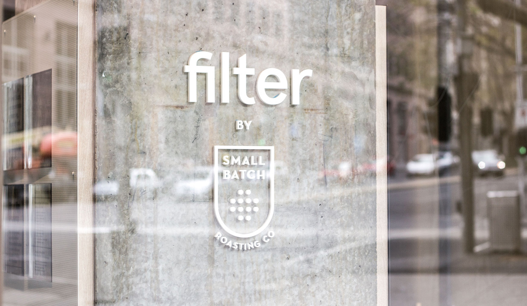
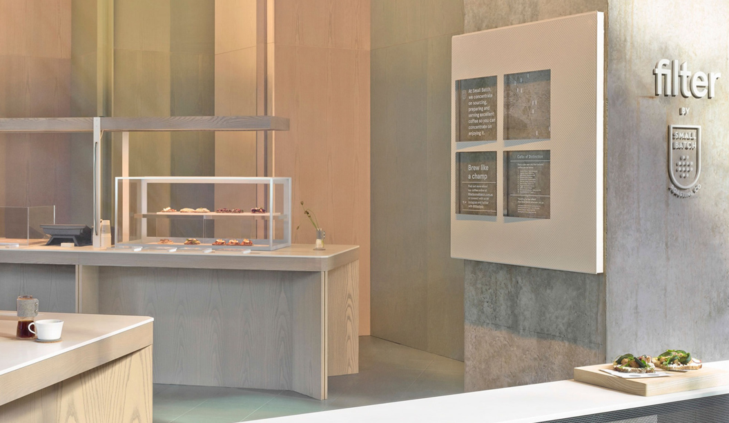
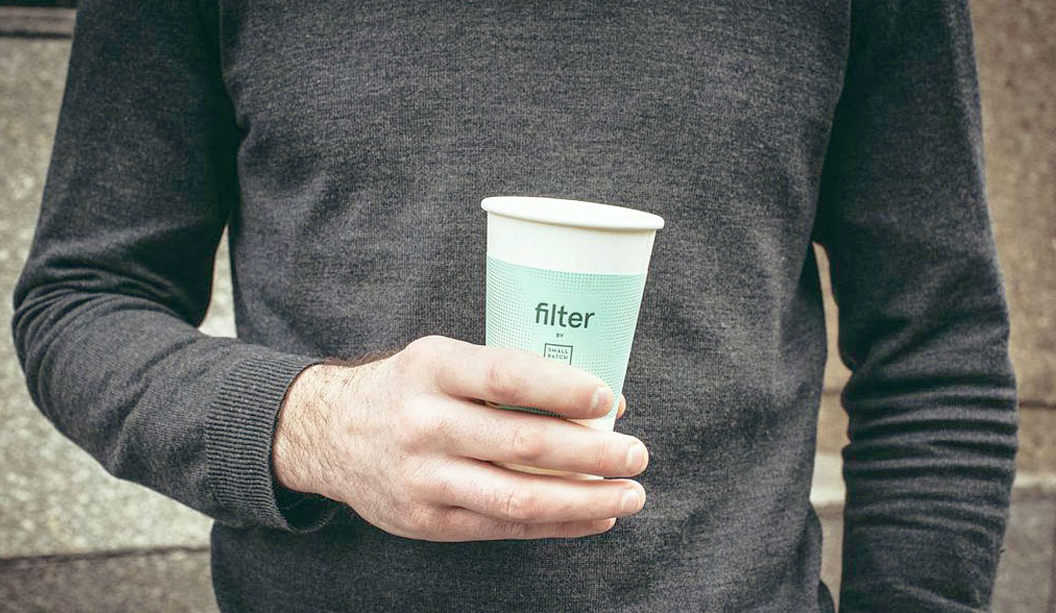
Title: Coffee cup paper sleeves from Filter café Stocks:Wild, Tablex and Kaskad Printing specs: Letterpress printed Printed by:The Hungry Workshop
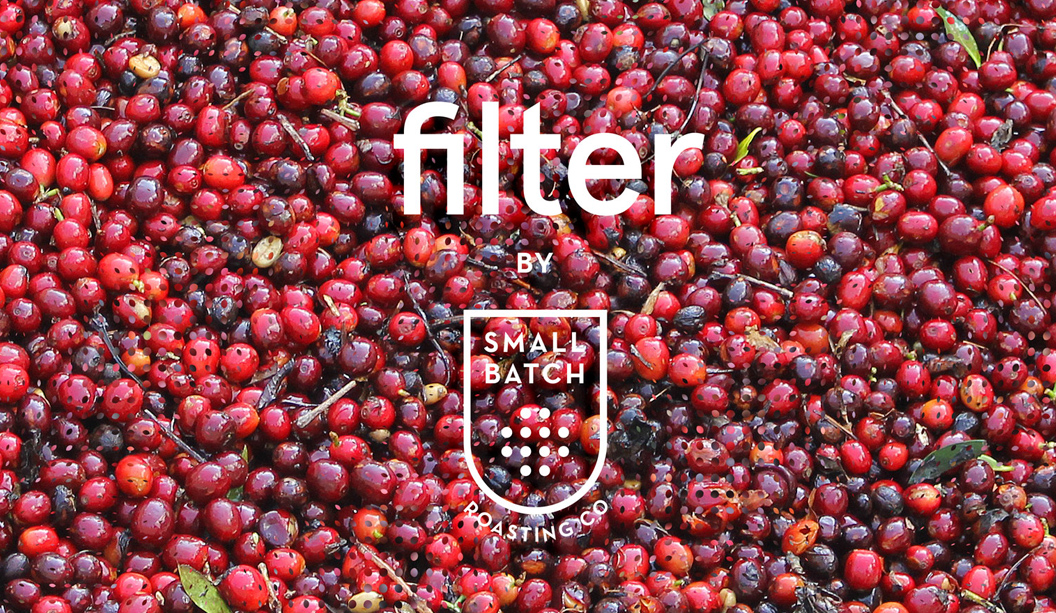
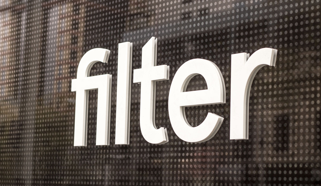
We’re very excited to feature new café ‘Filter’, the latest venture from Andrew Kelly and the team at Auction Rooms and Small Batch Roasting Co in Melbourne. The uber stylish branding was designed by The Hungry Workshop and we’re particularly loving the letterpress coffee cup sleeves. Such a great way to brand the coffee cups and because they’re printed on paper, the café has the option to use different colours and stocks later on.
Filter is all about celebrating the simplest method of preparing coffee, not too fussy and not too niche. A Scandinavian style typeface paired with a fine filtered moiré pattern, forms the core of the graphic for Filter. Jenna from The Hungry Workshop says: “The brand we crafted reflects this directness. A straightforward, clean and simple identity inspired by the effortlessness and layered subtlety of the offering. Simple coffee paired with the smørrebrød.”
The business cards are printed on Wild 450gsm and the coffee cup sleeves on Tablex Grey 200gsm and Kaskad Leafbird Green 160gsm. Both items were letterpress printed on The Hungry Workshop’s antique Heidelberg Windmill. The finished product is definitely a showstopper. Now we can enjoy the delicious coffee from Filter and collect the paper sleeves. We’re just spoilt for choice with two of our biggest loves – coffee and paper. A winning combo.
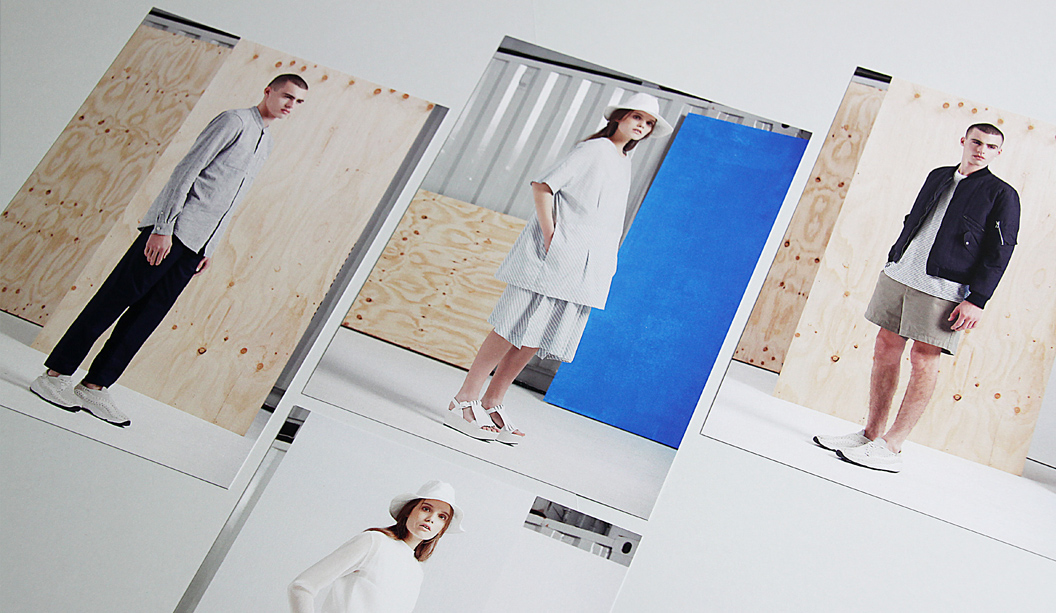
With spring only a few short weeks away, Melbourne fashion label Kloke have released a set of four A5 promotional cards to celebrate the launch of their 2014 spring/summer range. We are loving their latest creations and true to form, Kloke continue to create fresh and simple designs that leave us wanting more, more more. If you do want more of their previous ranges, check out the other Fetch stories: Kloke’s autum/winter Collection 2013 and Kloke spring/summer catalogue 2013.
The cards are digitally printed on a HP Indigo on Conqueror Wove Brilliant White 300gsm and packaged together with a Kaskad Sparrow Grey 160gsm belly band. Conqueror Wove is a great match for fashion photography, the images look sharp and the colours are really striking. Conqueror Wove isn’t digitally certified though. It was sapphire coated by the printer to make sure it would run through the digital machine. There are a small batch of printers that will treat the stock with this kind of coating (at a cost). Like the old adage states, where there’s a will, there is a way!
Be sure to check out Kloke’s beautiful new range online https://kloke.com.au/ or in store at 270 Brunswick Street, Fitzroy.
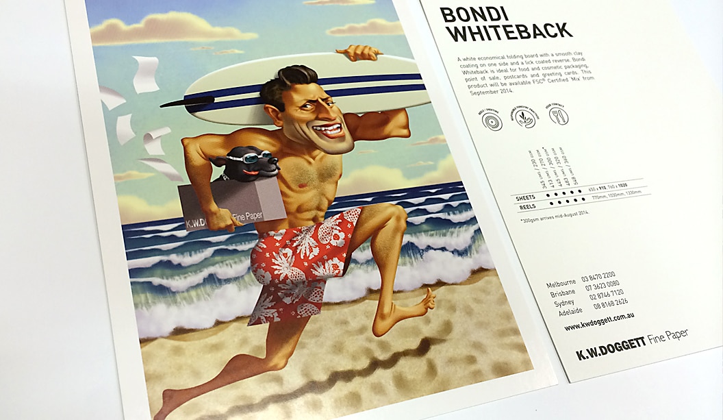
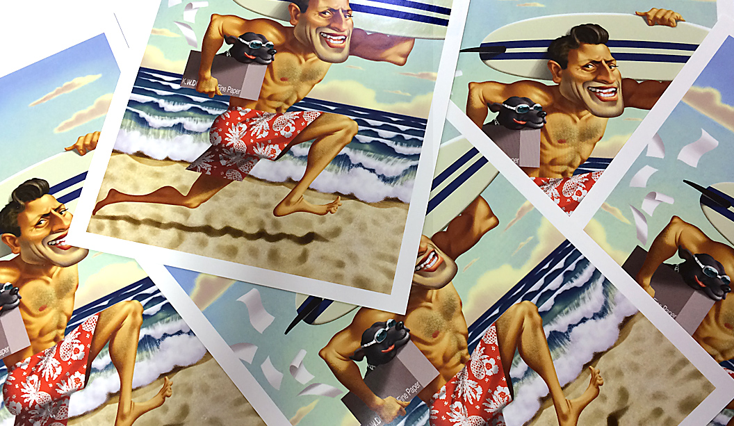
To announce the release of Bondi Whiteback, our newest packaging grade, we released two A5 postcards. One was printed offset and the other digital on a HP Indigo 7500. The image is a cracker and happens to be a custom illustration of a Doggett’s NSW staff member!
Bondi is an economical alternative and sits between our Simcote and Barry Bleach boards regarding price. A high white folding bleach board, it’s FSC certified, has a clay coating on one side and a lick coating on the other (this means the coating is not not as heavy on the back). It’s also food contact approved to ISEGA standards (the European version of FDA), which is excellent to know if you’re going wrap it around some chocolate. If you are, best send some to us.
Bondi Whiteback is ideal for cosmetic packaging, point of sale, postcards/greeting cards. Since releasing it, we’ve also seen it used for confectionery packets and pharmaceutical products.
Call John Alipan (National) 0434 692 446 or Chris Churchward (NSW) 0488 440 131 if you want to know more about any of our packaging stocks.
 Footy Tips