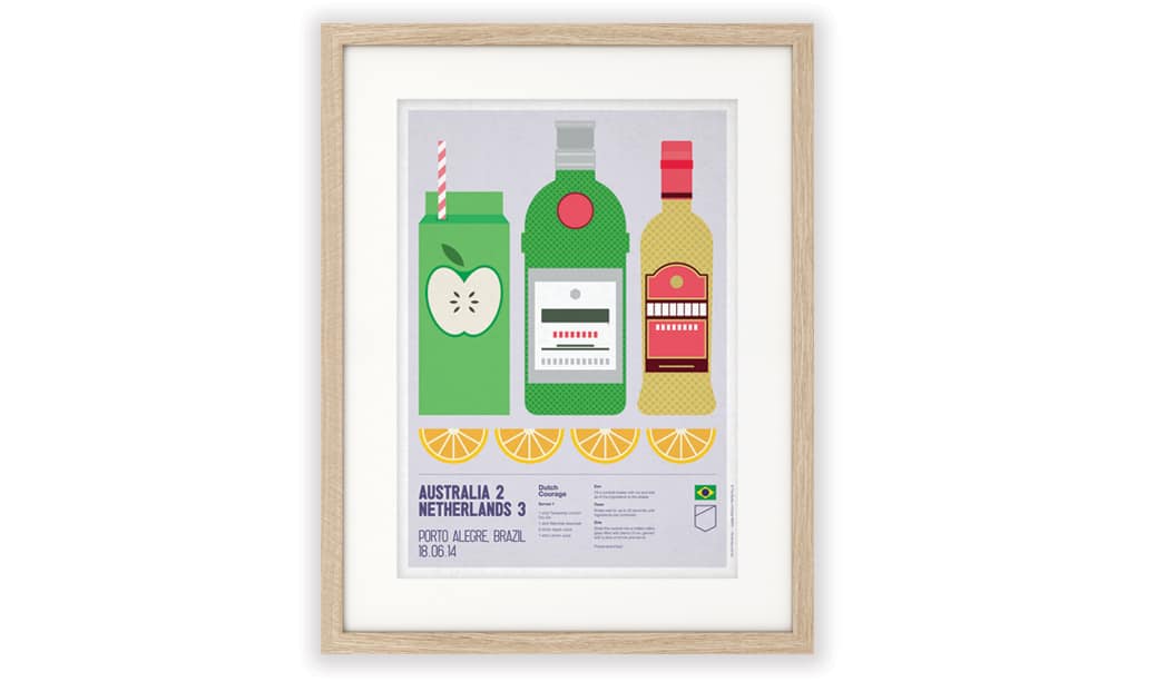
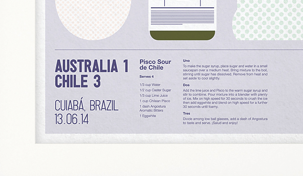
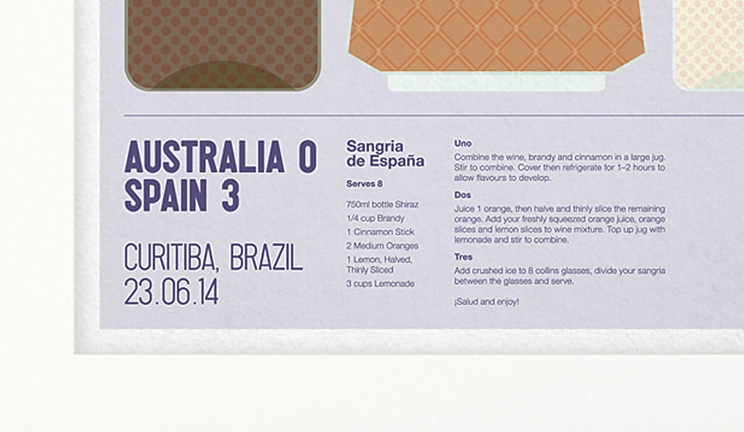
Our revamped packaging swatch

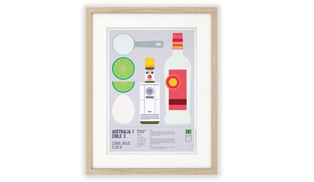
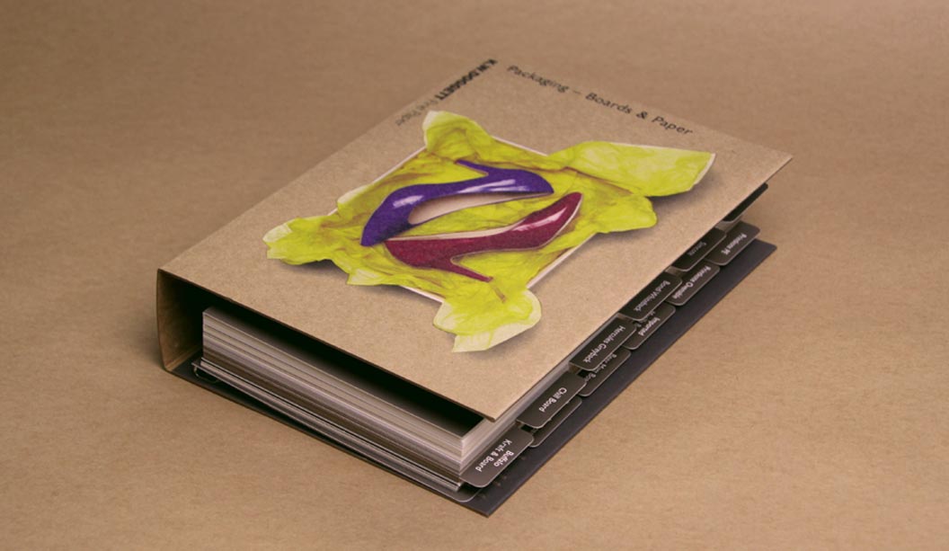
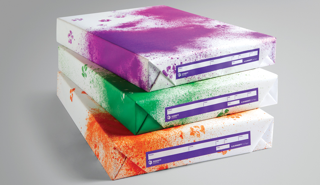
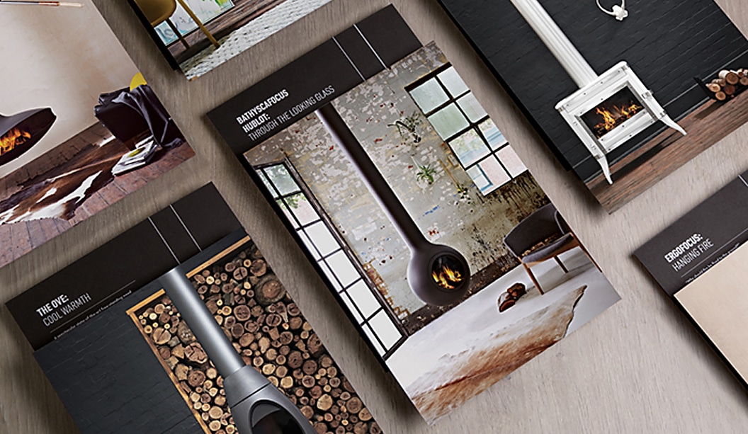
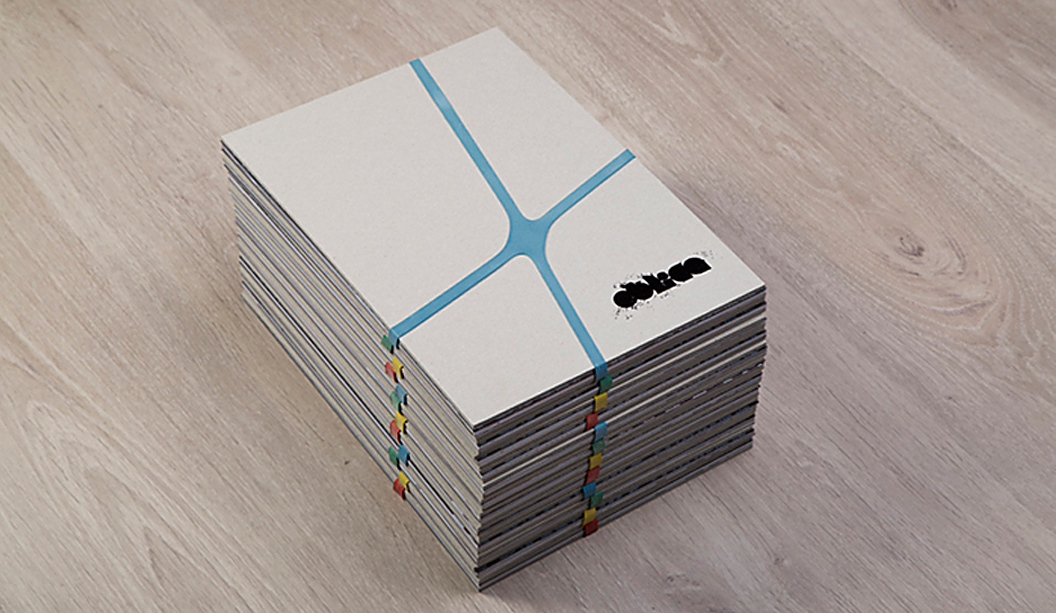
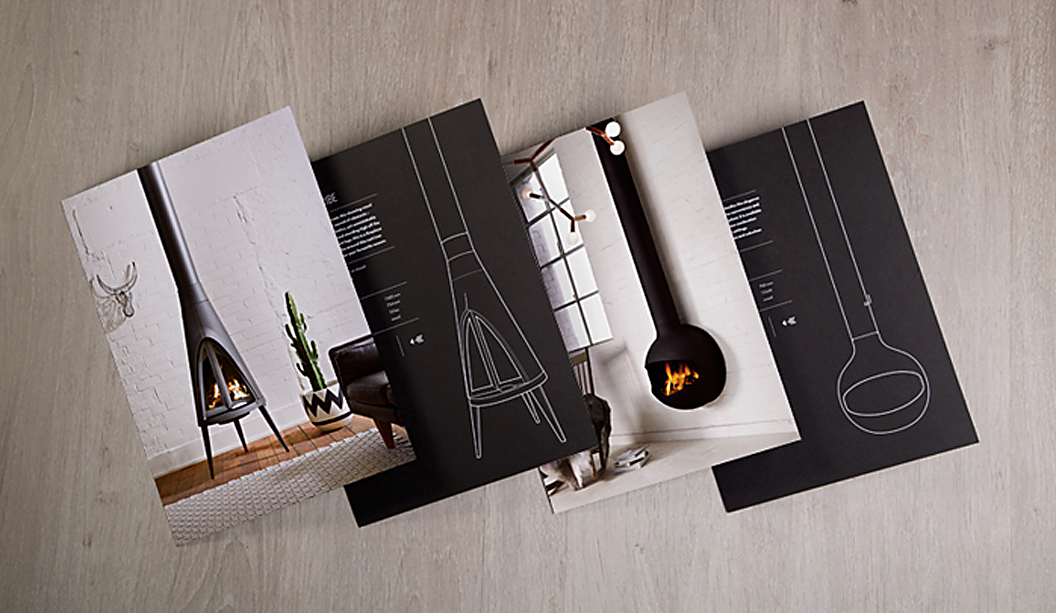
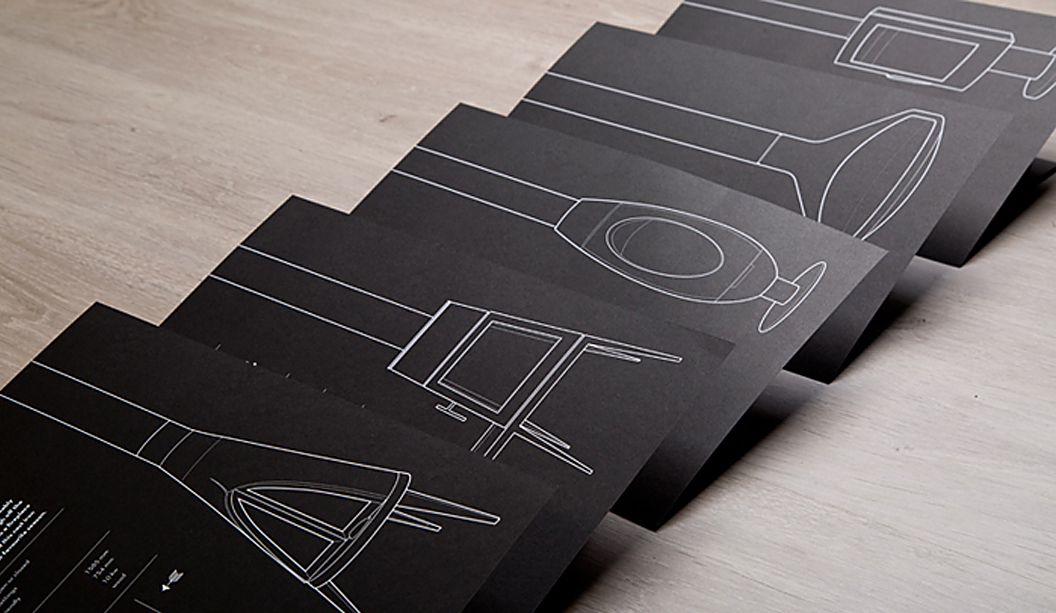
We don’t normally talk-up our swatches but the packaging swatch warrants some air time. In a few years we have grown our portfolio of packaging products from only a handful to now 13. We’ve added new products and weights that provides our customers with a lot more choices and flexibility to ensure they can find what they need.

Packaging_4

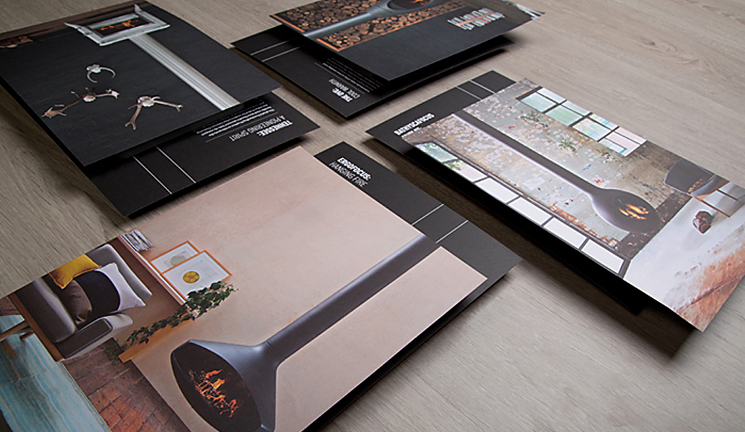
The revamped swatch, developed for customers that work in the packaging arena or do board work, now includes tabbed sections for each product including stock availability, applications and logos. A good variety of our different grammages are featured too, with the all important measurement (ums) also listed.

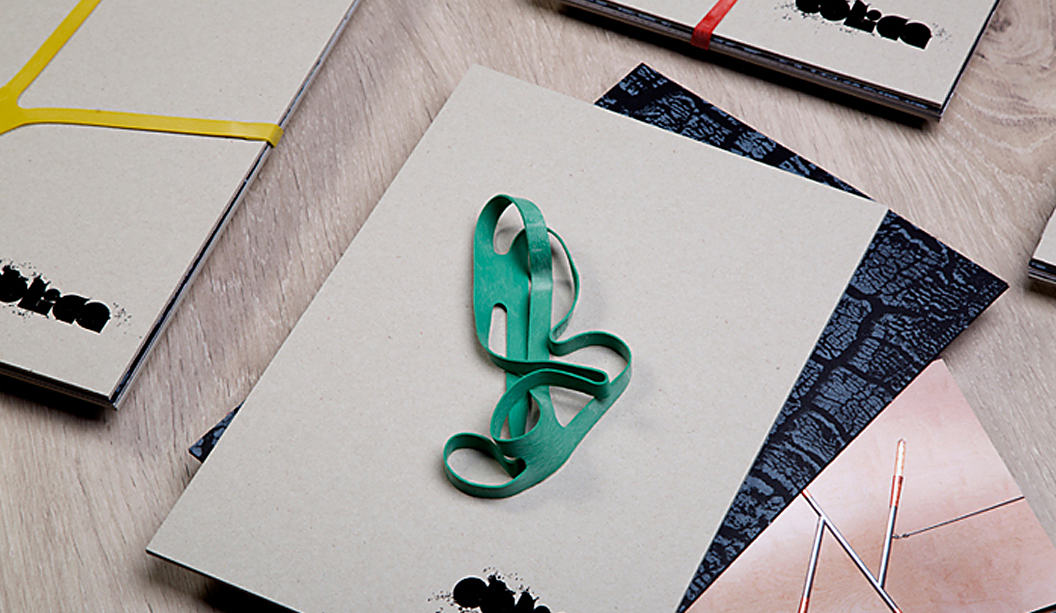
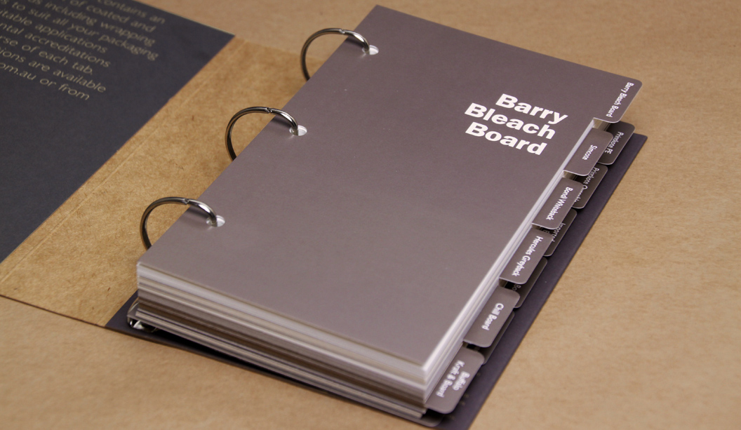
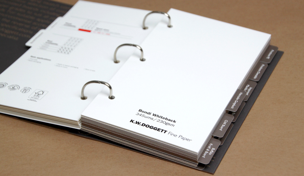
We have all of the faves in there like Barry and Buffalo Board, alongside packaging products that didn’t appear in the original swatch like Beer Matt Board (great for letterpress jobs) and Enviro Board. Plus some newbies like Bondi Whiteback (economical, high white economical folding bleach board) and Printkote Ovenable Board (good for freezer-to-oven applications). All the stocks included in the new swatch are:

Barry Bleach Board
Simcote
– Bondi Whiteback
– Hercules Greyback
– Chill Board
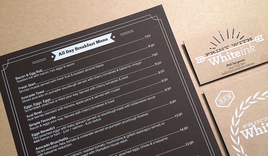
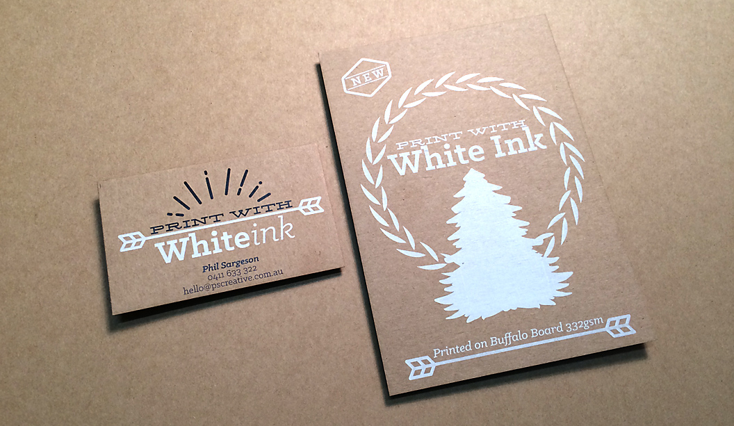
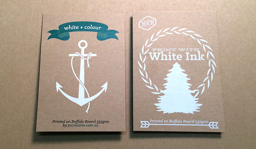
– Buffalo Kraft & Buffalo Board
– Printkote PE
– Printkote Ovenable
– Imported Manilla Board
– Beer Matt Board
– Doggett Boxboard
– Enviro Board

Packaging_2

With our packaging products appearing on supermarket and chemist shelves, to famous chocolate store wrappers, fashion label swing tags, covers of real estate brochures, eco product catalogues and greeting cards, there’s an endless stream of things to get excited about. Paper, we love it.


White ink goes with PS Creative

Title: PS Creative white ink printed pieces
Agency: PS Creative
Stocks: Skin Curious Collection and Buffalo Board
Printing specs: Digitally printed with white ink
Printed by: PS Creative QLD

PS Creative specialises in white ink digital printing. Located in lovely Wynnum in Queensland, the boutique creative agency does lots of business cards, menus and wedding/event stationery. Their latest two jobs – a café menu and self-promotional card showcases their craft.

The menu, printed on Skin Curious Collection Mocha 270gsm was a job they got to work on after PS Creative approached the café to redesign their menu, showing them examples of what white ink can do. Daily wear and tear, some maple syrup and a car tyre (yup, one literally blew onto the road and a car ran over it)! later, these menus are still holding up. As Phil Sargeson from PS Creative explains: “The owners of the cafe wanted something completely different and long lasting, that’s when I contacted Corinne (our paper rep) to see if the Skin range would suit. The café have had really great comments on them.”

White-Ink_4

This set of images relates to their A6 self-promotional card. It’s printed full CYMK with white ink on Buffalo Board 332gsm, chosen for its natural/recycled look. Phil said to us: “I love the way the ink fuses with the board which gives the print a rustic vintage look – great for wedding invitation sets, but not just limited to that. We are now printing our own business cards on this stock and also a small handful of others to our clients.” Bring on the white ink we say! Have a read of an article we wrote on the process a couple of years ago for some hints and tips.

And if you happen to be a graphic designer, letterpress studio, agency or invitation designer, then PS Creative can offer you trade pricing. Get in contact with them by calling 0411 6333 22 or hello@pscreative.com.au

White-Ink_1

White-Ink_3

The Tailor on Brunswick property brochure

Title: The Tailor on Brunswick property brochure
Agency: ERD
Stocks: Keaykolour and Knight Smooth
Printing specs: Digitally printed
Printed by: Bambra Press VIC

This story is about a property developer, textiles factory and astute design studio. ERD recently designed the property publication ‘The Tailor on Brunswick’, for a boutique development located in funky East Brunswick in Melbourne. To make it happen, they had to convince developer Gutch & Co to do it after their real estate agent said it wasn’t necessary. Boo!! ERD knew: “The printed piece would reflect the style and attention to detail that defined the development.” We concur.

The brochure features singer sewn (black thread) binding that cleverly ties in with the building’s historical roots (in its original life it was a textile factory). The publication is 28pp with a 4pp cover, printed on Keaykolour Sombre Grey 300gsm for the cover and Knight Smooth 160gsm for the text. The beautiful stock choices were made all the more special with photography by Joe Vittorio and Mattia Scarfo and digital rendering by Andrew Clarkson.

Tailor-3

Tailor-1

Tailor-2


M is for monograph, James Money’s, by Studio Constantine

Title: James Money Monograph Agency: Studio Constantine (VIC) Client: James Money, Artist Stocks: Kaskad Sparrow Grey, Grange Offset, HannoArt Satin Printing specs: Offset printed, Pantone 871 and duotone Printed by: Adams Print (VIC) So many songs and puns we’d like to share about ‘money’ right now but alas, it’s not the point of this post. We refer here to James Money, an accomplished Australian artist and Archibald finalist. To launch into the Hong Kong art market during Art Basel/HK 2014, he collaborated with Studio Constantine to create a limited edition monograph of his work. The outcome is this simple and elegant A5 piece printed on Kaskad Sparrow Grey, Grange Offset and HannoArt Satin. Constantine_1 Constantine_2 Money (we just have to keep using his surname, it’s so great!) is an award winning artist. He works in both portraiture and landscape, exploring themes of isolation. His work appears in private collections around Australia and New York. Studio Constantine worked on all the stages – planning, documenting, editing and production. As David Constantine explains, they were keen to: “Use a format that led readers through the work and articulated the different genres. The layout and typography was deliberately restrained, although quietly assertive in scale.” Constantine_3 Constantine_4 So we now have this little A5 beauty to feast our eyes on. A double-spined, concertina fold cover printed with Pantone 871 on the Kaskad with two different text paper stocks – a coated sheet for the painted work (HannoArt Satin) and an uncoated sheet (Grange Offset) with a custom duotone for James’ pen and ink drawings. Dee-lightful. Documentary images by SC & Flore Diamant. Constantine_5

The Cocktail Cup by The Bureau

Title: The Cocktail Cup
Agency: The Bureau
Stocks: Sovereign Offset
Printing specs: Digital printed
Printed by: Press Print Digital VIC

To celebrate the 2014 FIFA World Cup™, The Bureau in Melbourne created a series of illustrated posters complete with match details and recipe instructions so you can kick off your own ‘cocktail cup’ at home. Genius! It’s a special time of year, as the studio puts it: “We all suddenly become experts on match tactics and whether Tim Cahill is better in the air or with his feet!”

Inspired by host city, Brazil (the home of Samba, sandy beaches and sunshine), these one-of-a-kind designs are printed CMYK on an HP Indigo using Sovereign Offset 160gsm. The Bureau’s Creative Director, Jarrod Bransden, explains: “If you’re looking for a little consistency after an up and down Spanish campaign, you can’t go past the humble Sangria. Match the ingredients to the illustrations, follow the recipe and hold your glasses high to celebrate a brave Australian performance at the 2014 World Cup. If we can’t beat them, at least drink like them.” Ha!

So if you feel like a little opponent-inspired tipple from Chile, The Netherlands or Spain, go to henryandson.com and purchase your very own poster. A perfect wall adornment whether you’re drowning your sorrows or just feel like some general merriment.

Soccer-5

Soccer-6

Soccer-2

Soccer-1

Soccer-3


A range of digital papers that are best in show

Roll out the toner splattered carpet, Doggett Digital has arrived! Thanks to the wonderful Seesaw in Victoria and their delightful dogs Klaus and Louie, we have this unique visual (that’s the pooches paw prints you can see) for our new sub-brand, Doggett Digital. It was about time we unified our digital product offering under one recognisable banner. We have a steadily growing range of products we stock suitable for the HP Indigo and Dry Toner machines including paper, boards, labels, vinyls and synthetics.

DD_2

Here’s what we’ve rolled out with the new branding:

  • Swatch kit (for digital printers).
  • Price book (for digital printers).
  • Printing guides ie one for our Dry Toner products and one for our HP Indigo certified ones.
  • Wrapping paper
  • Eye candy samples (a range of colours and awesome print techniques

We have some exciting new colours and ranges like the Pop’Set from Arjowiggins Creative Papers (UK) in Lime Tonic, Black and Cosmo Pink in 320gsm and the new Mohawk Loop Digital i-Tone Antique Vellum in Straw and Urban Gray. These new products add colour to what is normally a predominantly white range of papers. Coming soon is Tacky for Dry Toner, following on from the Tacky for Indigo range released at the beginning of the year. And look out for our Doggett Digital branded trucks, on a street near you soon.

The pattern Seesaw created is meant to replicate a toner splatter on paper and the footprints of a dog (two in this case) that have walked right through the centre of the mess. We love it.

Need a digital expert?  Call or email Jon Roberts, Business Development Manager – Digital and he’d be happy to assist. Phone: 0409 411 546 or jroberts@kwdoggett.com.au

DD_3

DD_4

DD_5

DD_6

DD_7

Studio Brave design a cook book for Cecconi’s

Title: The table of the family
Agency: Studio Brave
Client: Cecconi’s Restaurant
Stocks: Sovereign Silk and Sovereign Offset
Printing specs: Offset printed
Printed by: Bambra VIC

‘La Travola Della Famiglia’ (The Table of the Family), is not just a recipe book, it’s also a memoir and historical account of life in Australia for the Bortolotto family –  owners of iconic Melbourne eatery – Cecconi’s on Flinders Lane, that has a rich 30 year history to be proud of. Maria, daughter and business partner of Olimpia Bortolotto (the author), approached Studio Brave in Melbourne to produce the book. In true Italian style, the studio were invited to dine with the Bortolotto family at their restaurant, where they experienced first-hand the family’s passion for food and life in Australia.

Famiglia_2

Working closely with photographer Sharyn Cairns, the design stemmed from their story – the notion that the restaurant was ever evolving and always at the forefront of Italian cuisine in Melbourne. Printed on Sovereign Silk 170gsm with copper foil for the cover and Sovereign Offset 135gsm for the text, the pages are filled with mouth-watering modern and traditional Italian recipes and carefully chosen typography to complement the old family photographs.

Studio Brave shared many interesting insights with us, like this one: “We felt it was integral to the Cecconi’s brand that we represent the beautiful copper highlights found throughout the Flinders Lane basement restaurant. Using a copper foiling on the cover, we were able to balance this with a copper metallic print throughout, which really brings the book to life and adds a sharpness that you cannot match using CMYK.”

This wonderfully tasty book is sure to inspire your inner Italian chef. Remember to invite us around if you ever unleash your culinary beast!

Famiglia_3

Famiglia_4

Famiglia_5

Famiglia_6

Famiglia_7

Famiglia_8

Oblica catalogue by Sense

Title: Oblica catalogue
Agency: Sense
Client: Oblica
Stocks: Knight Vellum
Printing specs: Offset printed
Printed by: Mckellar Renown Press VIC

Oblica’s first catalogue is out and it’s a beauty. Designed by the team at Sense in Melbourne, in collaboration with photographer Arnelle Habib and stylists Jacqui Moore and Julia Greenthe, the piece showcases Oblica’s unique product range of contemporary European fireplaces, stoves and accessories that truly are a work of art.

Obliqua-1

The clever loose-leaf design means the catalogue can be customised for each person and easily updated as new products arrive. The cover is Boxboard 2100gsm with black gloss foil and the inserts and brochure are printed CMYK on Knight Vellum 200gsm, all bound together with a brightly coloured rubber x-band for extra wow factor. The catalogue design is really well considered and complements the quality evident in the range. In other words, the printed piece does the range justice.

If you have an Oblica fireplace, all there’s left to do is grab a hot chocolate and toast a marshmallow or two. If, like us, you don’t have one, then it’s a hot chocolate and heater type scenario.

Obliqa-7

Obliqa-2

Obliqa-3

Obliqa-4

Obliqa-5

Obliqa-8