A blend of old and new at Chin Communications

Title: Chin Communications rebrand
Agency: Design By Bird
Client: Chin Communications
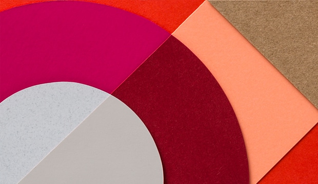
Stocks: Strathmore Premium Super Smooth – Ultimate White
Printing specs: Offset and digitally printed
Printed by: Inkifingus

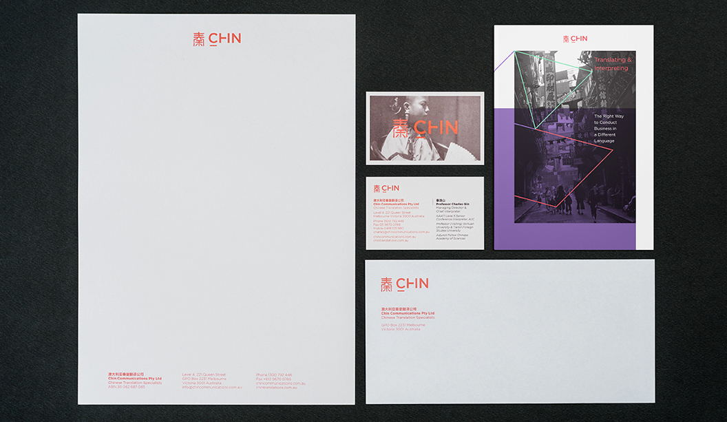
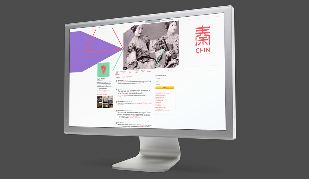
Chin Communications is a well-known Chinese translation service, operating for nearly 20 years. They provide translation services to people and businesses across Australia. A recent re-brand carried out by Melbourne-based studio Design By Bird, is really special. They considered the historical, multicultural, language and modern angles to create the right branding for Chin.

Chin-1

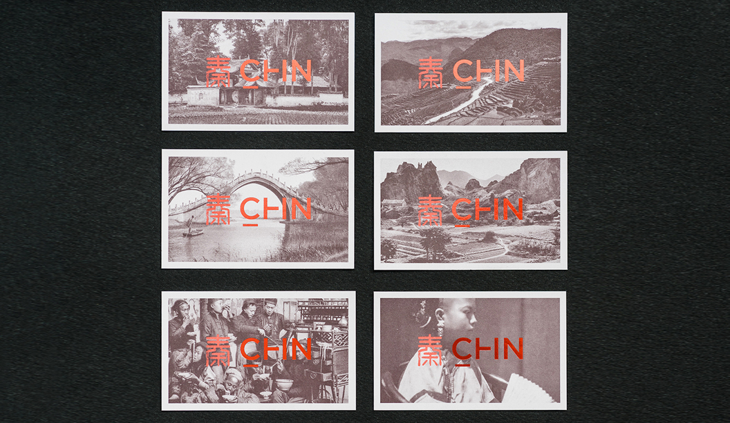
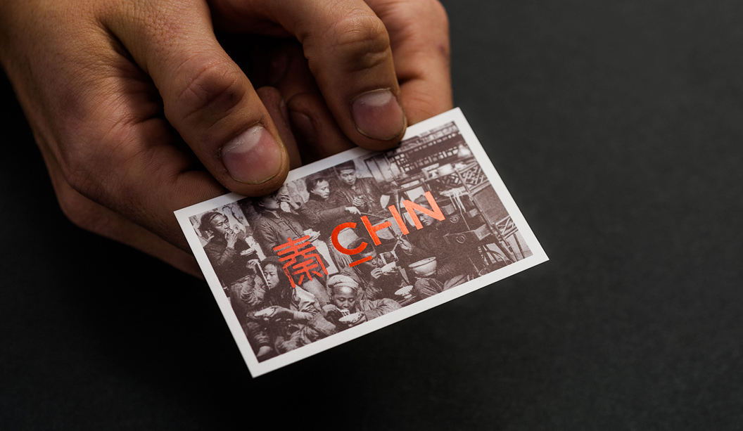
Steeped in tradition, the Chin logomark (秦) pays homage to both the company’s founder Qin (pronounced ‘Chin’) Lushan as well as Qin Shihuangdi – China’s first emperor.  All great work comes from sound research. The studio looked into China’s rich history, discovering elements from the past they could take into Chin’s future. They found out that when Emperor Qin standardised currency, each coin was inscribed with seal script – an ancient Chinese technique. With this in mind, they re-worked the logo, included a bright colour palette and modern typography.

Chin-3

The studio shared many interesting insights like this one: “There are certain considerations that need to be taken into account when designing for a multicultural audience. For example, names should not be in red because in ancient China, red titles were reserved for the dead and particular white papers don’t sell in China because of their tones. Not only did we get to work with a great client on an exciting project, but we learnt a lot.”

Chin-6

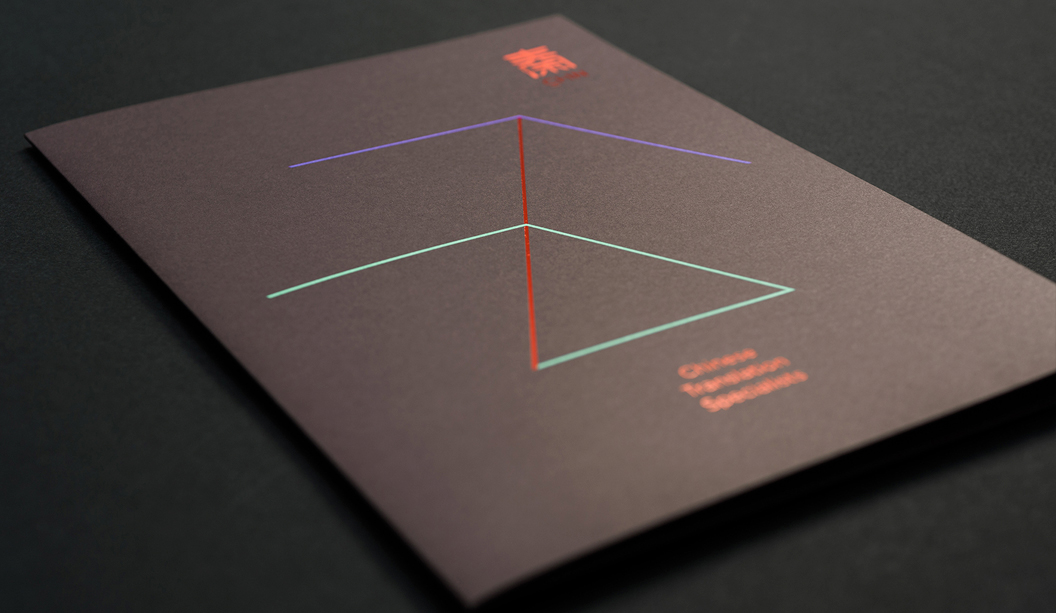
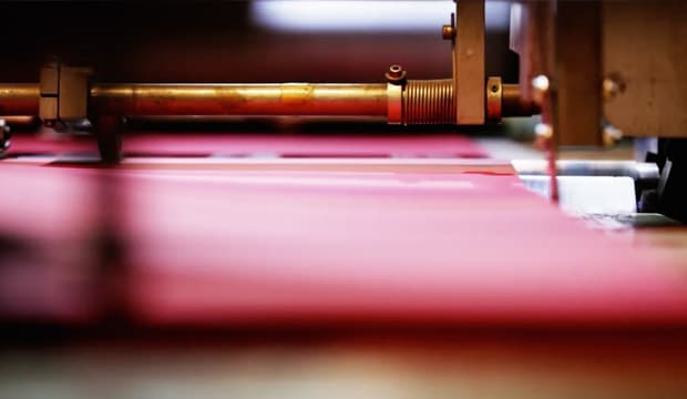
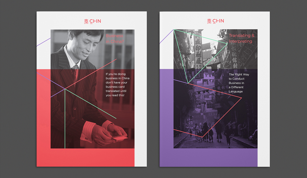
The business cards and folders were printed on Strathmore Premium Super Smooth Ultimate White – 352gsm. The letterheads, with compliments slips and C4 envelopes were printed on the 118gsm. “The paper has a great texture, which the ink took to really well. We were particularly impressed with the clarity of the colours on the Ultimate White background,” reports the studio. Using a variety of processes and techniques including foils, block colour and photographic elements, everything was printed offset except for the with compliments slips, which were printed digitally.

The new suite of collateral is a lovely blend of the old and new, giving an ultra-modern lift to a well-recognised brand. What’s not to love?

Chin-7

Chin-4

Chin-5


The John Laurie folio by duo_d_uo pops with blue

Title: John Laurie folio
Agency: Duo d uo (VIC)
Client: John Laurie, Photographer
Stocks: Skin Curious Collection – Indigo
Printing specs: Offset printed plus gold foil
Printed by: Moule Print (VIC)

We can barely contain our excitement looking at all this blue. It was an ‘oooooo’ moment. Duo d uo is the brainchild of Cam Diamond and Nic Hawker who believe to get the best design, you need to look at things from every angle. A recent project of theirs features Skin Curious Collection – Indigo, creating as they call it ‘a perfect complement to John’s bold photographs’. Who is John Laurie you ask? He’s an esteemed food, travel and portrait photographer that goes that extra mile to get the perfect shot. When Cam and Nick took on the project, they “knew it needed to be as enduring as the imagery it would hold.”

Duo d uo - John Laurie folio pic 2

The hard cover book had to be robust with all the paws that would be touching it. Duo d uo considered how scuffed and damaged it would get so they choose to use Skin, an anti-scuff stock. The outcome is a modern yet timeless book.

Duo d uo - John Laurie folio pic 3

As Cam explains: “The folio cases and covers were custom made by a book binder so we could line the inside in Skin Curious Collection to match the rest of the collateral. We were very lucky that we could find a cloth in the same shade of indigo to create such a seamless look. We chose this coloured stock to not have to overprint all the collateral, which was an added cost we wanted to avoid. We decided to foil the business cards in gold to create both a visual and touch contrast to the super smooth satin finish of the stock.”

Duo d uo - John Laurie folio pic 4

This project looks so damn appealing, we can’t work out if we want to touch it or eat it. It’s always about food with us. And paper. And dogs.

Duo d uo - John Laurie folio pic 5

Jasper Margaritis’ illustrations are mind blowing

Jasper Margaritis was born on 10 December 2001. His drawing skills are so impressive that we’re rather jealous. His series is called ‘Internals’, a set of intricate illustrations that are an imaginative and playful exploration of the inner life of objects, animals and creatures. We’re talking a cloud, turtle, castle bug, snake, jet plane, octopus, a muscle man and more. He has also turned some of his creations into greeting cards, printed on our very own specialty stock Wild.

Jasper6

Jasper3

Can you guess what he uses to create these inspiring images? It’s a humble Sharpie. A simple, black, Sharpie which he applies to the canvas with the skill of someone far beyond his years. Did we mention we’re jealous? Visit Jasper’s blog here.

Jasper’s dad is a dear customer of ours, George Margaritis from Peel Design. Thanks for the pics George!

Jasper2

Jasper1

Eiko Ojala is a master at light and shade

E is for Eiko Ojala from Estonia (that’s him with the hand sticking out of this head). He’s an illustrator/designer with a ridiculously good eye for colours, light and shadow. His simple illustrations play with negative space and simple shapes that turn into intricate and interesting images. He keeps the images minimal. He’s a craftsmen, no doubt about that.

Ekio_3

We collaborated with Three60 and Eiko to create a unique set of images. We were intrigued to see how he responded to the brief, bringing to life the sketches Three60 produced for him to work off. Needless to say and as naff as it sounds, our paper dreams were exceeded. You can see a couple of examples of our new dogs on the home page.

Eiko was nominated for the ‘Young IIlustrators Award 2013’ as well as the ‘YCN professional Award 2013’ and ‘ADC Young Gun 2013’. His work has appeared in Wired, New York Times, New Yorker, New York Observer, Sunday Times, Harvard Business Review, V&A Museum, Dwell magazine, Le Monde and Intel. Eiko has also been featured on multiple platforms and forums, including Trendland, It’s Nice That and Etapes. You can check out Eiko’s work on the Behance network or via his own website

Ekio_1

Images we’ve used are mainly from the blog Design&Paper This David Bowie one above
is one of our favourites.

house of card, a portable, sustainable wonder

house of card was originally designed for disaster relief housing and measures 10ft tall x 8ft wide x 12ft deep. Founder, Georgia Hopkins, first took this wonderful structure to music festival SXSW in Texas, where she collaborated with an Australian coffee company in LA and Sounds Australia, to set up pop-up coffee house that promoted quality design, coffee, music and sustainability.

1Then house of card went to an art exhibition in Santa Barbara, the Abbot Kinney Festival in Venice Beach, California and now it’s here in Oz-tray-lia! Georgia is creating a hotel out of the structure, soon to appear in a secret Melbourne location. She’s collaborating with local brands that share similar values around design and sustainability. While in Melbourne, house of card will also be a series of mini-dinner parties, with profits going to charity ‘Food for Thought’, founded by Ben Whittaker. Have a read of ben’s story here.

7You can follow the progress of house of card on Instagram @houseofcard or via the web www.houseofcard.com.au You can also follow Georgia on Facebook @gigihop

Photos credits:

Pics 1 & 2. The Creative & The Planner

Pic 3. AUST.

Prostate Cancer Foundation Australia new collateral

Title: Prostate Cancer Foundation of Australia collateral
Agency: Thursday Design (NSW)
Client: Prostate Cancer Foundation of Australia
Stocks: Sovereign Offset 120gsm
Printing specs: Offset printed with three PMS colours plus a black.
Printed by: Oxygen (NSW)

Thursday Design have a knack for teaming up with great illustrators. This time it was Lew Keilar who did a super job of illustrating real people from the prostate cancer community for a series of three A5 brochures. Using PMS colours like the foundation’s blue, PMS 3005 and PMS 144, PMS 305, PMS 583 plus a black, Thursday Design have done a great job of making this collateral a real stand-out. The campaign launches nationally this month so keep a look out for it.

Thursday Design, prostate cancer 2

Thursday Design, prostate cancer 3


Important changes to our paper offering

Here’s a snapshot of the changes and updates we’ve made to our range in the last few months. There are some exciting new product lines, sheet sizes, weights and reels available. Please speak to your account manager for any of the finer details.

Coated:

  • Sovereign Hi-Bulk is now available in 320x450 and 450x320 in 400gsm.
  • New Sun Art Publication now available in a Matt finish (SA only).

Uncoated:

  • Reflex Laser is now certified NCOS carbon neutral.

Packaging:

  • Simcote sheet size 720x1020 has transitioned to 760x1020. This product has also transitioned to slightly lighter grammages, while retaining the same thickness.
  • Buffalo Board is now PEFC certified.
  • Bondi Whiteback is now available in 230gsm/345ums in 650x910 and 760x1020 sheets and 770, 1030 and 1330mm reels. This product has also transitioned to slightly lighter grammages, while retaining the same thickness.

Digital & Office:

  • New Tacky, an adhesive vinyl range suitable for printing with HP Indigo technology has now arrived.
  • Conqueror Laid Digital 120gsm has transitioned from 450x320 to 460x320.
  • Rives Design Digital has been discontinued.

Envelopes:

  • Curious Metallics C5 envelopes now available in Ice Silver.
  • Rives Design C5 envelopes now available in Bright White and Natural White.
  • Kaskad C5 envelopes now available in Rosella Red.


Tacky, for communications that stick!

Title: Tacky Indigo promotion
Agency: Andy Ashton, WorkArt Life (VIC)
Client: K.W.Doggett Fine Paper
Stocks: Six in total – Permanent (white only), Removable (clear and white), Wall Graphics (white only), Static (clear and white). Envelope printed on Sovereign A2 Digital – Gloss 300gsm.
Printing specs: HP Indigo 5000, CMYK.
Printed by: BGS (VIC)

Tacky Indigo is our new digital range of vinyl adhesives made specifically for printing on the HP Indigo (coming soon is Tacky Dry which is a digital polyester range suitable for dry toner printing). We’re talking short runs, high quality printing with variable data options. Tear and weather resistant, Tacky Indigo is ideal for indoor and outdoor advertising. Things like point of sale signs, wall decals, car livery, shop decorations. The promo features all six specs in the range that play on the word ‘tacky’.

Tacky-9

A collaboration with the cheeky and talented Andy Ashton from WorkArtLife has added the touch of fun and humour we often like to see in our promos. Not that there’s anything wrong with super charged cars, 80s perms or crocheted toilet roll holders! But they are pretty tacky.  Ha!

Our range includes White Permanent, Clear Removable, White Removable, White Wall Graphics, White Electrostatic, Clear Electrostatic. The promo includes an image or text on all six specs in the range. The products are eco-friendly and made with state-of-the-art ‘green’ water-based adhesives. They still provide superior pressure sensitive control/product quality while minimising environmental impact.

In a nutshell:

  • Our lady with the 80s perm is on the white permanent, great for projects that require a permanent fix like car bumper stickers.
  • The supercharged car is on the clear removable and the writing appears on the white removable product.  They both have a low-tack adhesive, good for interior and exterior applications. No solvents are needed for fixing or removal.
  • The toilet roll holder is on our white wall graphics product. It’s an easy to fix and remove interior decal solution. The perfect white surface for quality display on painted walls, most wall papers and wood panelling.
  • Dog dressed up in pig costume is on the white electrostatic and the disguise ie the glasses and moustache the clear electrostatic.  These are self-clinging vinyls which require no adhesive, are easily removed and apply quickly to most smooth polished surfaces.

We have a challenge! If you’re on Instagram we’re inviting you to take a pic behind the disguise and post it! There is a pair of glasses and moustache printed on the Electrostatic Clear spec. So apply it to your nearest window and snap away. Use the #tackybydoggettdigital and @kwdoggett in your post

If you have any specific questions about Tacky Indigo, you can call Jon Roberts on 0409 411 546.

Tacky-8

Tacky-2a

Tacky-3a

Tacky-4

Tacky-5

Tacky-6

Tacky-7


A Friend of Mine add a touch of colour

A Friend of Mine was a stand-out choice for executing this idea. They’re brilliant with colour and we love their work. So off Suzy Tuxen and Cassie Brock set with a lot of paper to put together some amazing overprinting (without actually printing) banner images. Here’s a brief interview with Suzy that allowed us to gain an insight into the creative process. Thank you ladies and also a big thanks to Sarah Anderson (photographer) for your very fast and inspiring work!

Us: What was it like working with paper as your main medium?
Suzy: We love working with paper. It’s great to get a break from the computer and work with our hands! We originally sketched the designs by hand, then designed them on the computer with colours roughly from the paper range. We had to plan it very carefully before actually making them – planning the designs in advance is always key when we work with paper! We then laid out the entire range in our studio, using up all the available surfaces to fit. We then made snap decisions as to whether the papers we had chosen on computer worked together in the flesh.

Us: What was the rest of the process like in terms of execution?
Suzy: We wanted to get an array of colours, shine, tonality and texture to keep things interesting. We loved the more unusual papers such as crocboard and parchment – these made for fun and unusual combinations!  Using sharp blades, compasses, rulers and paper templates, we tried to achieve accuracy and strong lines in each piece. We wanted the paper images to be strong, geometric and architectural.

We also had to work at a small scale to ensure that the textures of the papers could be seen and celebrated in the photography. This meant that we had to be quite precise with our details and careful with piecing the works together. We also wanted to achieve a bit of depth, so we often cut out duplicates of the shape, and chocked them up before glueing to gain a bit of height and shadow in the composition.

Us:
One challenge is making paper look like paper! Yet you did that really well. How?
Suzy: Sarah Anderson really managed to perfect the lighting technique for the photoshoot. She worked with us to do three different exposures for each image so lights, mid tones and darks were correctly represented, with special lighting for metallic paper, so that the paper range could be captured as it looks in real life. We then combined the different exposures together in Photoshop to get just the right light for each paper.

Us: The way you put colours together is interesting and beautiful.  Tell us more about your thinking behind the colours and layouts.
Suzy: We had the concept of the overlapping shapes in which the overlapped sections would ‘mix’ – except of course this would be achieved with paper, instead of traditional overprinting! It was this founding idea from which all of the compositions stem from, and this informed some of the colour choices.

We wanted to have a mix of colour palettes so each banner varies. We chose eclectic and unusual colour combinations for some banners and then for others we chose harmonious colour ways. Brights are often teamed with neutrals to achieve a balance. We also explored some more neutral palettes of neutral whites and creams and also a palette of dark hues. On the whole we were aiming for bold, strong and unusual – and the bright and contrasting colours really assisted by echoing the strong geometric feel.