A big hunk o’ love

Title: A hunka hunke burning love
Agency: Three60 (VIC)
Stocks: Sovereign A2 Digital – Silk
Printed by: Bambra Press (VIC)

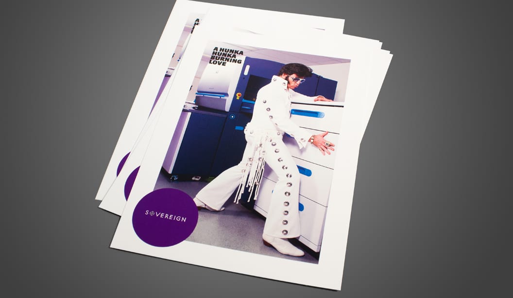
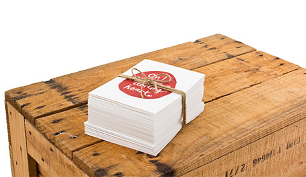
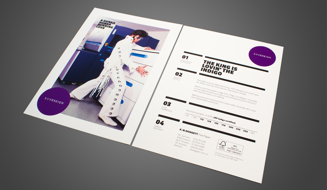
This A5 postcard designed by Three60 in Melbourne introduces the HP Indigo certified range. From 113gsm to 300gsm Sovereign A2 Digital is engineered to provide outstanding electroInk adhesion and improved press runnability. Available in both gloss and silk finishes, you may also choose to purchase Sovereign A2 as carbon neutral (minimal additional charge of 3%) ask us about it when you place your order.

Printed on Sovereign A2 Digital – Silk 300gsm with 4 colour process on the HP Indigo 7600 press. This bright white quality coated paper assures excellent ink lift with renowned qualities of smoothness, opacity and bulk. Sovereign A2 Digital is available in 320 x 450mm short grain and long grain sheet sizes.

Elvis really stole the show at the press check. Some of the staff from Bambra Press (VIC) were ‘all shook up’ (pardon the pun) and enjoyed singing along with The King during the photography shoot. We heard that the job made for a very interesting morning!

If you’d like to know more about this range or for your copy of the postcard, please ask your paper specialist.
Elvis_3

Stuck on Doggett Labels

Title: Stuck on Doggett Labels
Agency: Work Art Life (VIC)
Stocks: JAC Brilliant Gloss

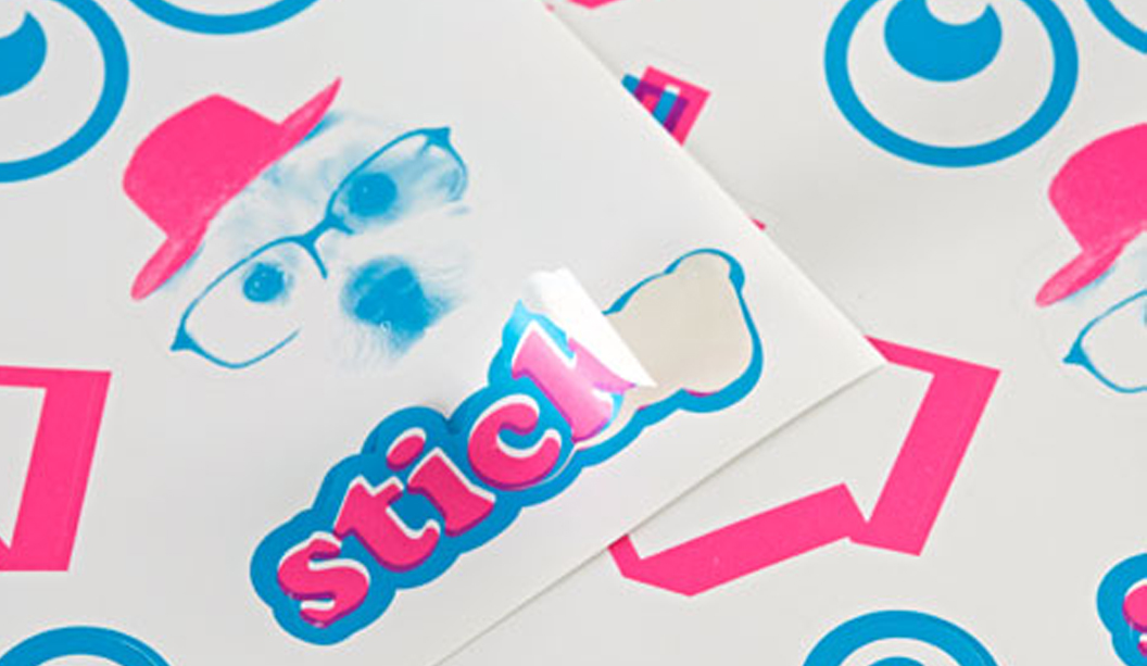
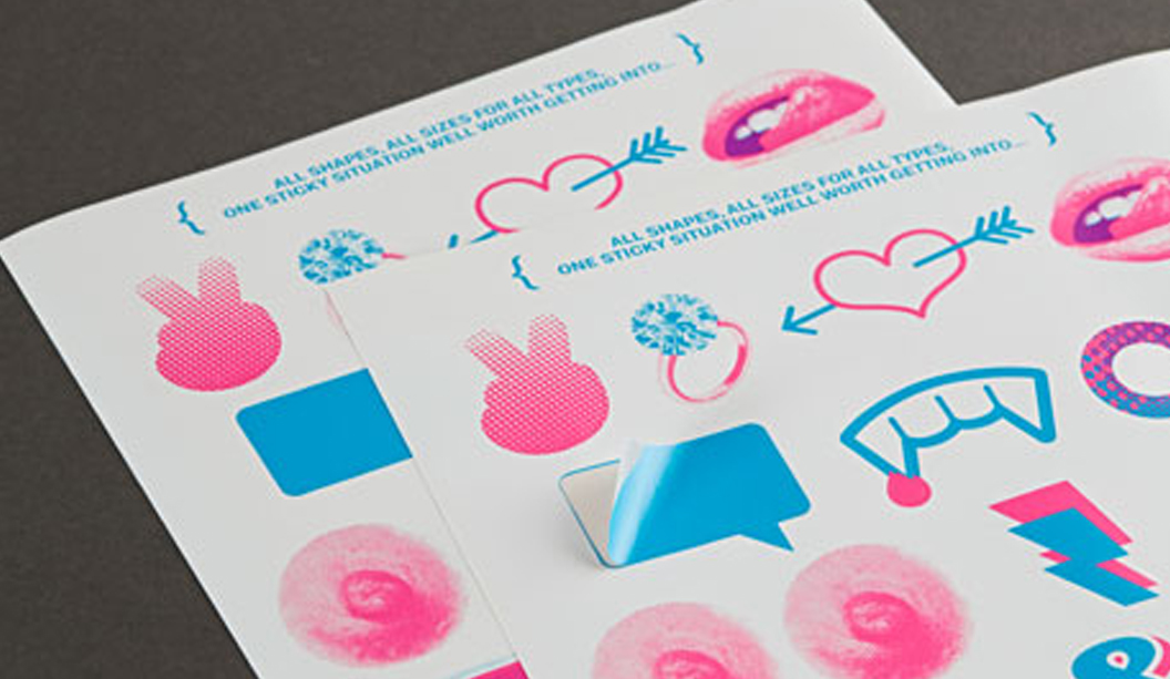
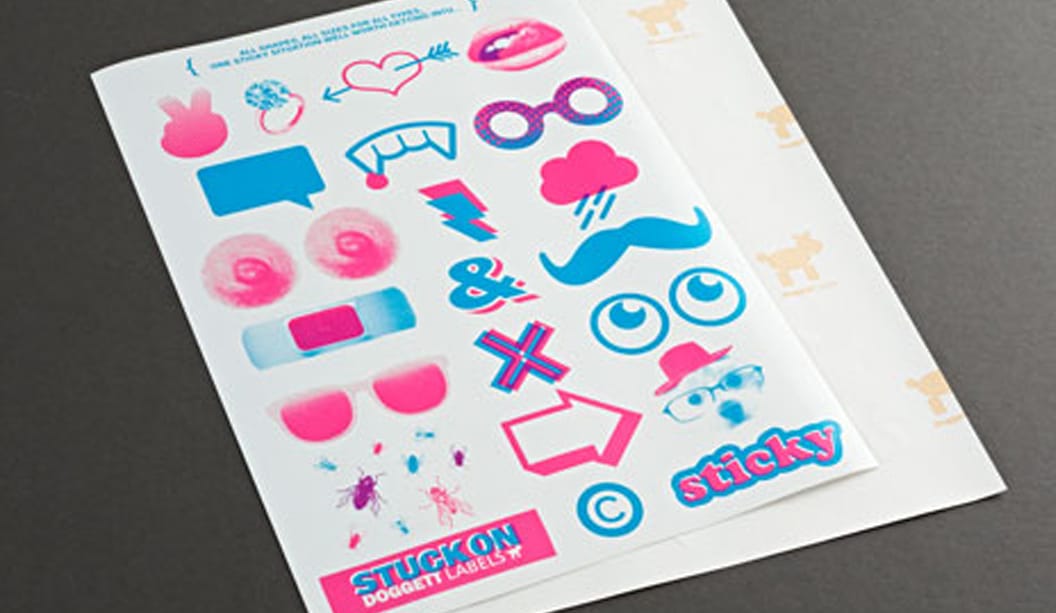
Let’s talk about…stickers. They come in all shapes and all sizes for all types. This Doggett Labels promotion was designed by Work Art Life. Featuring a set of cheeky labels, it’s designed to be a bit of fun.

Lips, a moustache, nipples (that’s right, no holds barred here!) and an engagement ring are just a few wicked shapes we’ve included. Many of us use labels in some way, so we’re here to remind you that not only do we share the love for sticky labels, but that we make and sell pre-cut labels too.

Doggett Labels are made on site in our Melbourne branch and offer an extensive choice of stocks, sheet sizes and adhesives. With face sheets of A4, CG, A3 and SRA3, we can help you find the perfect label for your project. Doggett Labels are boxed in sheets of 100 and come standard with Doggett branding on the backing sheet, or plain on request for bulk orders. Michael Moodie our label guru, will help you with those tricky jobs or any custom make, contact him at mmoodie@kwdoggett.com.au or call our VIC office on 03 8470 2244.

To get your hands on a copy of this A4 label promotion, please contact your paper specialist or your nearest sample department. And remember, if you can’t find your perfect label, we’ll make it for you!

Label_1

Label_2

Some sweet stationery by Emma Kate Creative

Title: he{art}full stationery
Agency: Emma Kate Creative
Stocks: Conqueror Laid Digital
Printed by: Kwik Kopy (SA)

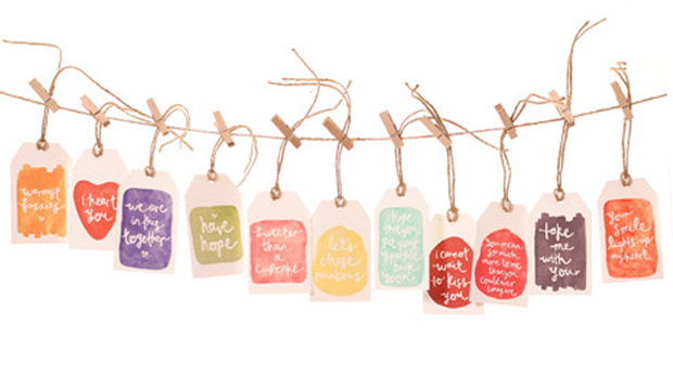
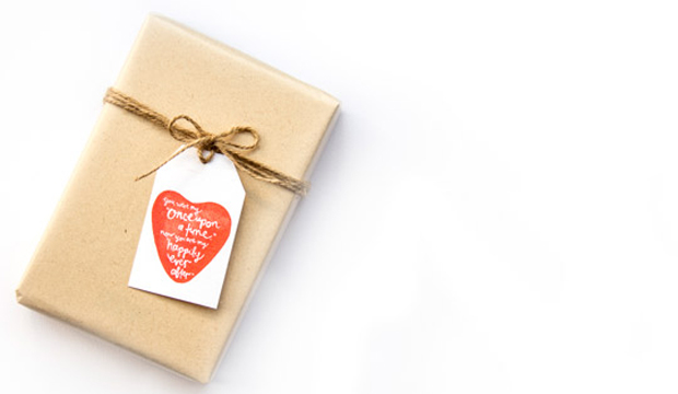
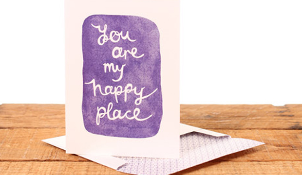
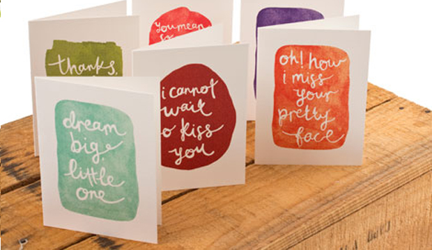
The collection of 36 handwritten messages are full of ‘wild romance, candid emotion, creative abandon and happy wanderers’ (we poached that line from her website – it sounds so dreamy, we just had to!). Whimsical watercolours from Italy of apricot, olive, strawberry and periwinkle have been used to paint the cards that are each presented with a pattern-lined envelope in coordinating hues. There are gift tags available too, tied with natural jute string.

EmmaKate_1

Emma Kate Codrington is a passionate freelance designer based in South Australia with a love for polka dots and anything French. Her inspiration comes from the thrill of her adventures while living abroad. “Basing myself in Montpellier in the South of France for six months and travelling through Europe, I freelanced for my lovely clients from the cobbled streets of Stockholm, cafés in Florence and underneath the Eiffel Tower.” We’re not jealous much at all. Emma sent packages and love letters to friends and family back home, so to capture all of the emotion she developed her messages into a product line – and that’s where Emma Kate Paperie was born.

A confessed tree hugger, Emma uses uncoated and environmentally responsible paper for all of her print work: “The texture and tactility of Conqueror Laid attracted me first and when I heard the stock was made carbon neutral, my mind was made up!” The greeting cards and gift tags are printed digitally on an HP Indigo 5000 on Conqueror Laid Digital Brilliant White 300gsm and 120gsm for the envelopes.

This beautiful and unique collection is available online, so if you’re curious to see more, visit Emma Kate Creative’s website.

EmmaKate_2

EmmaKate_4

EmmaKate_3 EmmaKate_5

Our Digital Deck has arrived!

Title: Our Digital Deck has arrived!
Agency: Seesaw Design (VIC)
Client: K.W.Doggett Fine Paper
Stocks: Barry Bleach Board Digital / Color Copy – Uncoated / Conqueror Laid Digital / Curious Metallics Digital / EnDURO / JAC Digilabel / Knight – Smooth (dry toner) / Knight Digital – Indigo / Maine Recycled Digital – Gloss / Maine Recycled Digital – Silk / PicoFilm / Rives Design Digital / Sovereign A2 Digital – Gloss / Sovereign A2 Digital – Silk / Sovereign Offset (dry toner) / Sovereign Offset Digital – Indigo
Printed by: Bambra Press (VIC). Advance Mailing Solutions (VIC). CMYK Online (VIC). Composite Colour (VIC). Collation: Northern Tag Stringers (VIC).

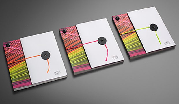
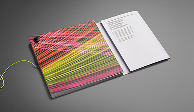
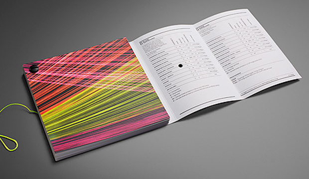
If you would like to step through this doorway please. Soon, you will enter the world of digital printing and dry toner technologies. There are lasers, line screens and precision crafted instruments galore – they could be dangerous so mind your head and watch your step. Ok, enough indulgence. There actually is a point here! Our brand spanking new Digital Deck has arrived, complete with whacky fluoro string art to make any 80s child brim with pride.

Digital Deck_3

The fluoro string images that make-up the creative for our Digital Deck were created by Seesaw (VIC). The inspiration came from research into the world of digital printing – the lasers, precision tools etc. They created string art as a tactile response and link between the paper and digital worlds (for a behind-the-scenes look at the development of this imagery, check out our YouTube channel).

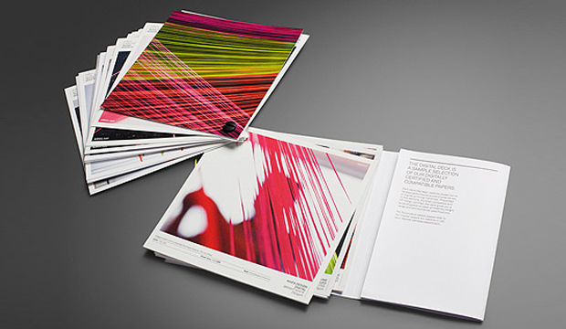
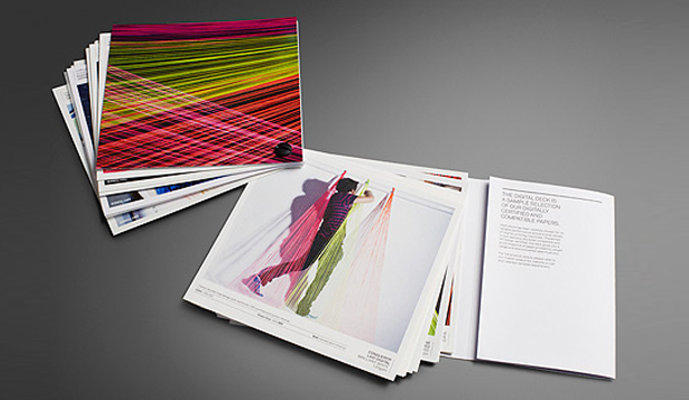
We’ve sectioned the Digital Deck into two parts – Dry Toner and HP Indigo. The stocks featured have been carefully selected for their performance capabilities. A compatibility chart is featured on the inside cover. The left column is for dry toner products and the right lists the Indigo papers. The table shows each of the featured stocks, their environmental credentials and compatible weight ranges.

As you move through the deck and see the narrative unfold, you’ll notice that each page clearly lists the machine and stock description/info. Samples of both text and cover stocks appear in the deck. The stocks featured include: Barry Bleach Board Digital / Color Copy – Uncoated / Conqueror Laid Digital / Curious Metallics Digital / EnDURO / JAC Digilabel / Knight – Smooth (dry toner) / Knight Digital – Indigo / Maine Recycled Digital – Gloss / Maine Recycled Digital – Silk / PicoFilm / Rives Design Digital / Sovereign A2 Digital – Gloss / Sovereign A2 Digital – Silk / Sovereign Offset (dry toner) / Sovereign Offset Digital – Indigo.

A particular highlight is the new Knight and Sovereign Offset digital papers. Both are high white papers that are well priced for their class and offer exceptional press results, specifically for dry toner and HP digital applications. Also, they are identical to their offset versions in shade and finish which is a bonus for customers that need to match communications across offset and digital technologies.

Our journey in creating this deck was a learning curve, even for us. We soon realised the importance of working closely with the press operators to ensure they had profiled the stock correctly and weren’t just using a generic profile. To get the best result, especially when working with textured papers, is setting up the profile to suit the paper. When a digital machine is set-up properly, excellent print results can be achieved.

Chris Jackson, our Business Development Manager Digital and Synthetics, is available if you have any questions about our digital range. Call him on 03 8470 2244 or email him at jroberts@kwdoggett.com.au

Digital Deck_1

Digital Deck_2

Digital Deck_5

3sidedsquare business cards

Title: 3sidedsquare business cards
Agency: 3sidedsquare
Stocks: Knight – Smooth
Printed by: Moule Print (VIC) on an Heidelberg SM52 Speedmaster.

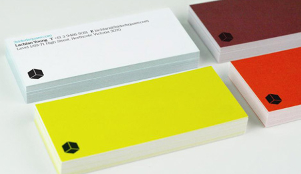
We’re definitely keen on visually appealing business cards. They say so much in a small amount of space. And we always remember the stand out ones. That’s the point right? In this case, take a handful of bright sparks from 3sidedsquare, a design and web studio in Melbourne, add a personalised colour palette and you have a pocketful of business card goodness right there.

So how does one achieve a pared-back design combined with eye popping bursts of colour? Hmmm? You go through various rounds of restraint and indulgence, do the loop a few times and then choose a lovely, uncoated stock to ensure the end result is crisp and clear. Knight Smooth White 400gsm made for a great outcome with its bright white and smooth surface. Another great example that shows the importance of choosing the right paper for your design.

Each member of the team selected their own striking hue to make up the set of vibrantly coloured cards. So, not only does the team have an important business tool, they have a neat little ice breaker that is a talking point with clients. As Lachlan Young from 3sidedsquare tell us: “The colours injects personality into the most personal of stationery items.” Besides the cards we love the opening graphic on their website – check out that pattern!

square_1

Hart&Co collateral

Title: Hart&Co business cards, collateral and website
Agency: duo d uo (VIC)
Client: Hart&Co (VIC)
Stocks: Knight – Smooth
Printed by: TS Press (VIC) verko (thermographics), embossing re business cards and comp cards by Press Print (VIC)

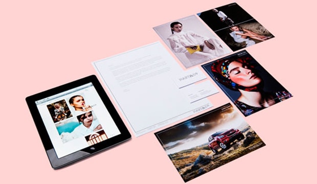
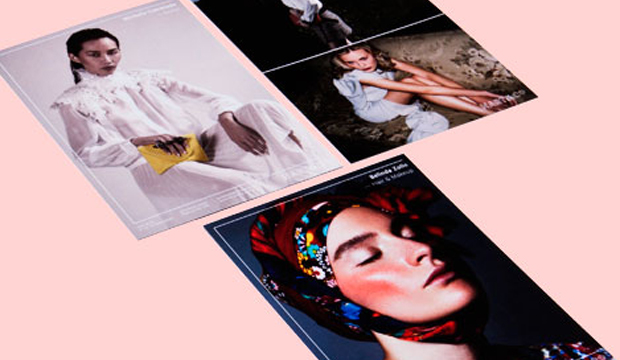
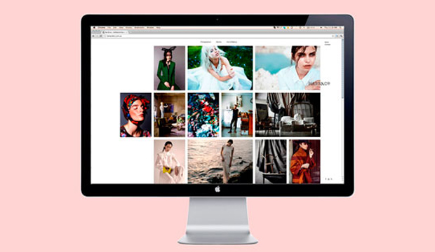
The brief from Hart&Co (a boutique creative management agency in Melbourne that represents a small selection of highly skilled creative types) was to deliver an identity and website that complements not detracts from the photography. And then ensure the end result stands out and expresses the brand. In come our friends at duo d uo, also from Melbourne and whom you may remember from earlier blog fame, with a top solution.

Hart_4

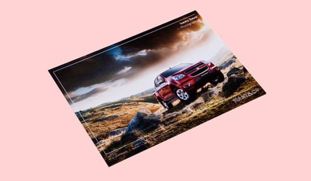
Duo d uo chose Knight for the Hart&Co collateral including the business cards and comp cards. Not to forget the simple and refined website they designed, built by Nice Device (VIC). The business cards are printed offset on Knight Smooth White 350gsm and embossed with black verko, a print technique we think deserves more cred! The comp cards, a promotional tool used to showcase the artists work, are printed on an HP Indigo 5500 on Knight Smooth White 400gsm. The stock was sapphire coated by the printer for use on their digital machine (FYI our Knight Digital – Indigo range comes with a HP certification up to 325gsm).

Cam Diamond from duo d uo shares his thoughts on working with Knight: “The stock has a great ability to hold ink and translate colour, perfect for showcasing photography. Knight also allows us to print both offset and digital. It’s a cost effective stock that can be used across all print related media and is easy available.” Safe to say duo d uo are fans of Knight. And they definitely know how to work with uncoated papers. Nice one.

Hart_1

Hart_2

Hart_5

duo d uo business cards

Title: duo  d uo business cards
Agency: duo  d uo (VIC)
Client: Self-promotion
Stocks: Rives Design
Printed by: TS Press (VIC). Guilding and foiling by The Melbourne School of Bookbinding (VIC)

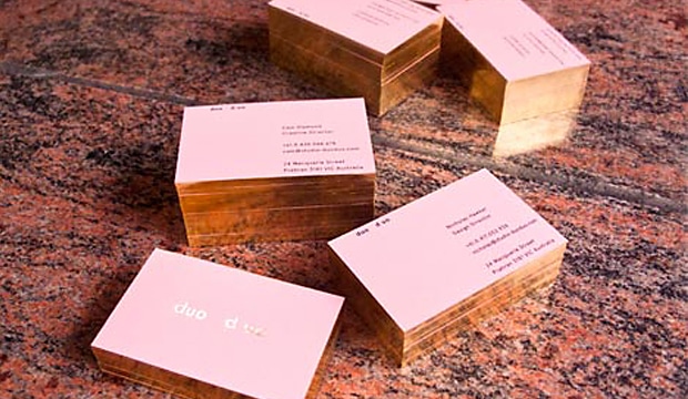
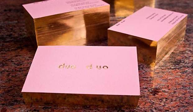
This newly formed creative studio based in Melbourne wanted their business cards to resemble their love of design and focus in the fashion industry. These alluring cards printed one colour black on Rives Design 350gsm definitely impressed us. Who can honestly say that some gold foil and gilded edges doesn’t make them just a little excited? Come on, be honest, you know it does!

Founded by designers Cam Diamond and Nicholas Hawker, duo  d uo created an identity that complemented and combined their different backgrounds and design aesthetics. Cam’s motivation behind the design and choice of paper was to find a complementary solution to all of these aspects. He explains: “We chose Rives Design Bright White for its elegance, gilded edges for its subtlety and a foil for its boldness. The result is a card that resembles our image…a mix of traditional techniques and future thinking.”

Cam’s hot tip is: Don’t be afraid to foil on Rives Design.

Duo_2

Knight is now digitally certified

Title: Strength and Beauty – digitally certified (direct mail piece)
Agency: Three60
Client: K.W.Doggett Fine Paper
Stocks: Knight Digital – Indigo
Printed by: Bambra Press (VIC)

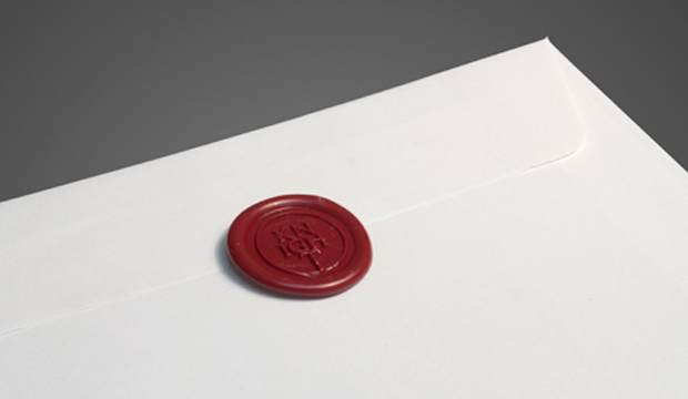
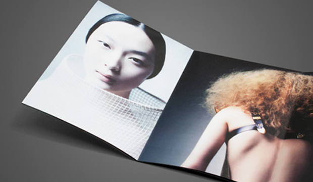
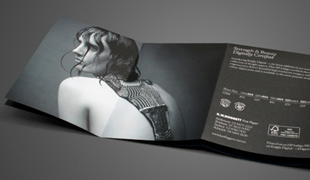
After much anticipation, Knight Digital – Indigo, the newest addition to our stunning collection of Knight papers, has hit our shores. This beautiful, uniquely folded A6 parcel showcases similar images from our 2011 Strength and Beauty campaign, which is one of our most talked about promotions. Three60 in Melbourne are the innovative design team behind the initial Knight campaign and this exquisite piece.

Knight Digital_1

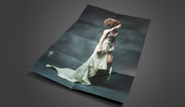
John Wilson from Three60 tells us the idea behind the unique format: “The idea was to reference the Knight sword with the cut, while contrasting strength and beauty with the male/female on the cover.” Printed on 100gsm with 4 colour process on an HP Indigo 5500, the parcel unfolds to reveal an A3 size poster with an unedited, never-before-seen original campaign image. When trying to decide how to launch this promotion, we were torn between handing it out personally or sending it as a direct mailer, so we decided to do a little of both. Everyone likes a little bit of snail mail every now and again!

Knight Digital – Indigo is FSC certified and features a crisp white finish with an even, silky smooth surface. It’s specifically designed and certified for HP Indigo printing technology, producing high resolution imagery and full colour digital print. Available in the most popular weights and 320 x 464mm sheet size (the maximum size that will run through an HP Indigo press). The benefit is that printers have an extra 13mm to play with, meaning extra trim or bleed area.

If you’d like to know more about the new digital range please speak to your paper specialist.
Knight Digital_2

Knight Digital_3

Knight Digital_4

Knight Digital_5

Knight Digital_6

Paper Passion – a perfume that is ‘the silent smell of paper’

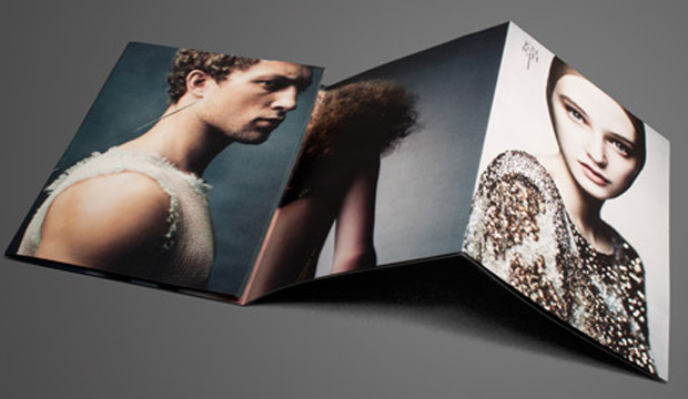
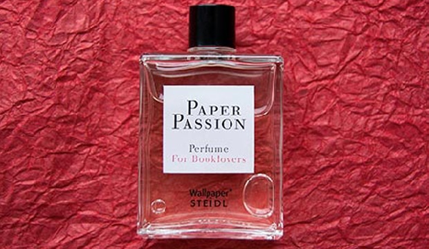
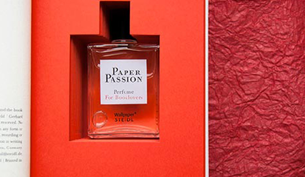
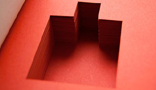
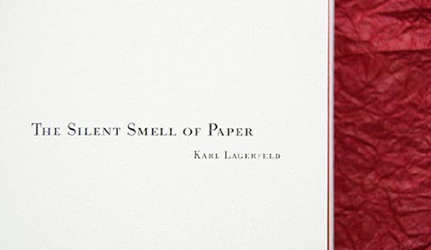
Who would have thunk it. A perfume that smells like paper! Needless to say we llllllllove it. Pure genius, of the Karl Lagerfeld, Geza Schoen (master perfumer), Gerhard Steidl, and Wallpaper* magazine variety. Housed neatly inside the book, you’ll find a bottle of ‘Paper Passion’. The nifty packaging is designed by the talented Lagerfeld and Steidl. The scent of ‘Paper Passion’ is meant to relax you, just like when you read a book. That’s good to hear isn’t it? We’re not sure too many people want to be known for smelling like a library stacked full of old books collecting dust! The book tells the story of passion, and the twisting plot to put this particular bouquet of freshly printed books in a bottle. The text bits are by Karl Lagerfeld, Günter Grass, Geza Schoen and Tony Chambers. We’ll leave you with this uplifting little pearler from Mr Lagerfeld: “The smell of a freshly printed book is the best smell in the world.”

If you want to purchase the perfume/book, visit the Steidl website.

Paper-4

Paper-2

Paper-3

Paul Robertson’s business cards

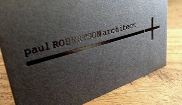
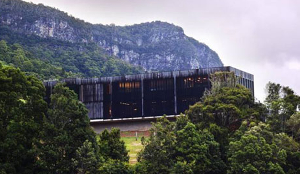
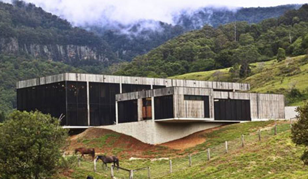
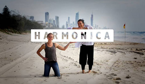
Title: Paul Robertson’s business cards Agency: Harmonica (QLD) Client: Paul Robertson Stocks: Keaykolour Original Printed by: Gold Coast Foil Printers (QLD) Paul Robertson is an award winning architect from the Gold Coast. He’s also a creative, laid-back surfer (who lives on a boat) and is very modest about the beautiful structures he creates. Thanks to a local studio named Harmonica, made-up of long term friends Rachel Smith and Kate Moloney, some very classy business cards have been created using Keaykolour Jet Black. The cards appealed to Paul’s understated style and arrived just in time as he was jetting off on a whirlwind trip to Spain. Adios Amigo!
Paul_4

In designing Paul’s business cards, Harmonica had to walk a fine line between corporate, casual and creative without appearing too flash or in their words ‘without all the bedazzle’. To Rachel and Kate, using Keaykolour was an obvious choice having worked with the stock before. Kate tells us: “We knew the standard of finish we wanted to achieve and instantly knew that Jet Black would fit the bill for our black card dreams and desires.” Gold Coast Foil Printers in Queensland helped them out with foil selections which the Harmonica team said was invaluable. They’re big supporters of using on shore services (just quietly, so are we!) even if it means the price is higher. Harmonica’s advice: “Support local suppliers and talk to them if you don’t understand anything. Old school service is the way forward.” It also meant they could get the job done yesterday. The black gloss foil combined with the heavy 400gsm stock created the perfect balance of contrast and discretion. The result is a sophisticated and simple design and we’re guessing the Spanish like them too. Olé! We have to say, studios like Harmonica are yet another example of the amazing creative coming out of the Sunshine State. Kate commented on the fact there are heaps of rad designers, illustrators, photographers and web gurus right in their backyard. We definitely agree. Projects designed by Queensland agencies are coming across our desk in a steady stream and we’re continuously impressed with what we see. You can also check Harmonica out on their Facebook page.

Paul_5

Paul_3