Famous Visual Services business cards

Title: Famous Visual Services business cards
Agency: Self-promotion
Stocks: Concept Vellum
Printed by: Taylor’d Press (VIC)

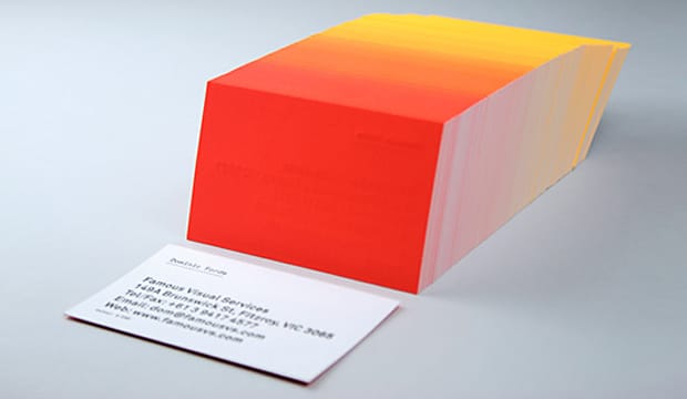
We love a bit of colour around here. We have even been known to say certain colourful designs remind us of 80s icy poles. These business cards are definitely a reminder of 80s Summer time goodness. These knockout cards were produced by Dom Forde from Famous Visual Services. For Dom, new business cards present the opportunity to experiment with ideas and materials. And experiment he did!
Visual_1

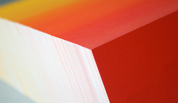
Concept Vellum Radiance was chosen for its ability to handle fluoro ink well. Dom wanted to enhance the vibrancy of the colours and he also knew, on advice from James Taylor at Taylor’d Press, that the stock handles letter press well. Especially the heavy grammage – 352gsm, which can take a robust indentation from the machine. The outcome is a vibrant set of cards with luxurious tactile qualities.

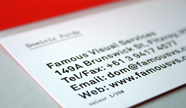
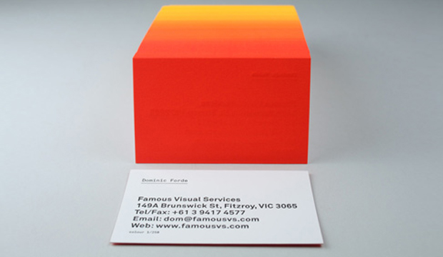
The patience of James Taylor was really important in the process. As Dom explains: “Our idea was to print a slightly different colour shade across the back of each card in the print run. First we printed a solid fluoro yellow on all 250 cards, then we then ran the cards back through the press adding dollops of fluoro red to the press as the cards were running.” The result is a 250 step gradation from yellow to red across the print run. The name details were letterpress printed in black. Now that’s a nifty business card print job if ever we saw one. And yes, he did say 250 step gradation. Amazing!
Visual_2

Visual_3

Esperanto – the Monash University student mag

Title: Esperanto Magazine
Stocks: HannoArt – Silk / Sun Offset
Printed by: Bambra Press (VIC) and embellishments by Avon Graphics (VIC)

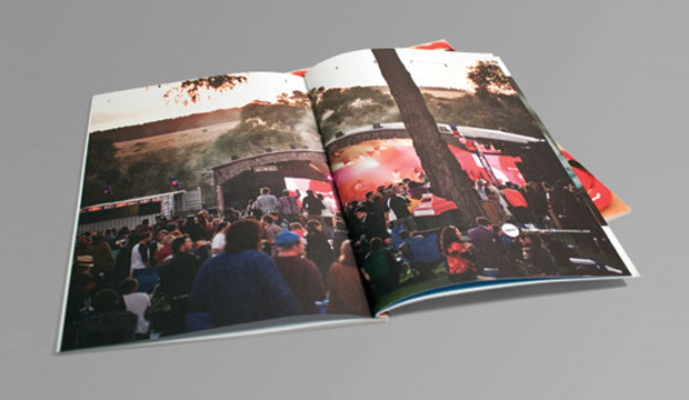
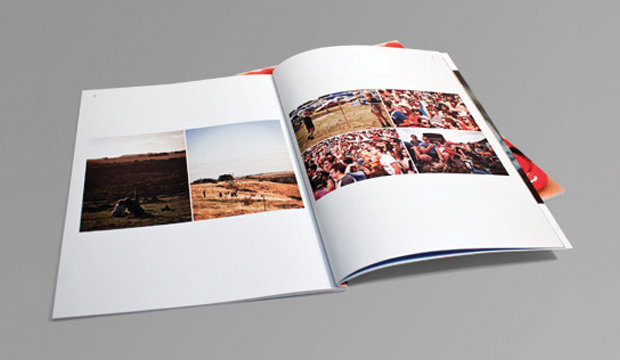
Two of the team from Esperanto Magazine – Ming-En Koh and Rupert Carr-Gregg, came to see us months ago about their idea to revamp the Monash University, Caulfield Campus student mag. They wanted to create something special in 2012, to showcase different paper stocks for each edition and include educational information on the importance of stock choice in design and business, types of finishings, bindings and embellishments. They had us at ‘paper’. But seriously, we love being able to support students in their creative pursuits and getting to contribute our knowledge about paper (which we love) and doing this at the same time was a no brainer.

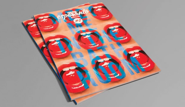
We spoke to Ming-En Koh, Creative Director and Advertising contact at Esperanto about their first edition. It’s a racy one! We loved it – the humour, layout and content is really well put together. “The theme for our first issue was sex, therefore we wanted the graphic direction to be as provocative and striking as the topic itself. We tend to avoid busy or cluttered design in preference for an aesthetic focused on typography and film photography. Funnily enough we are the first student magazine at Monash University to be perfect bound and embellished.”

We were particularly excited about the cover. The vibrant red lips pop right off the page with a matt laminate and a spot UV on top to create a visual contrast. HannoArt Silk 300gsm was used for the cover and Sun Offset 120gsm for the text. We chose HannoArt and Sun Offset for this magazine because of their excellent colour reproduction and press performance.

Part of the team’s mission was to create a magazine that could look good on a shelf next to ‘proper’ published print magazines. They’ve definitely ticked that box. What say you? Does this look like the type of student mag you wish you had been a part of back in the day? A quick poll around the office confirms a yes on that one for us here in Paperland.

Esperanto-1

Esperanto-3

Great Dane Furniture catalogue

Title: Great Dane furniture store catalogue
Agency: Hoyne
Client: Great Dane
Stocks: Sovereign Offset
Printed by: Lindsay Yates (NSW)

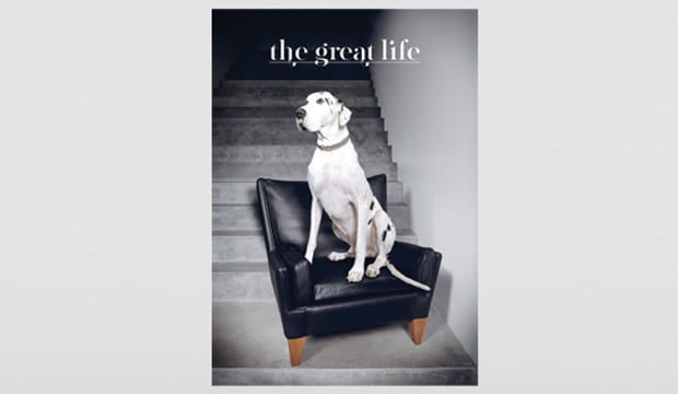
Have you ever seen a Great Dane being walked down the street? If the answer is yes, can you honestly tell us that you don’t stare at it. Even for a moment. Hmmm? Perhaps it’s the beauty of such a big creature, the fact that it stands out from the crowd maybe. The Great Dane Furniture brochure recently created by Hoyne is much like that moment when you spot the oversized dog pacing down the street.  It’s mesmorising, it catches your eye and you can’t help but stare.

GD-5

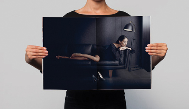
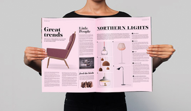
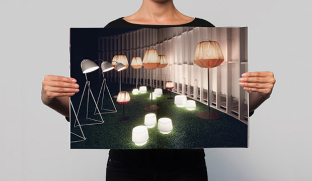
Hoyne was approached to reposition Great Dane Furniture as being a modern and contemporary furniture company (even if some of the pieces were designed 60 years ago). How, pray tell, does a design agency turn a brand that is feeling old and heavy into one that embodies qualities like: crisp, spacious, authentic, beautiful and represents ‘the home of Scandinavian design’? You have a vision and you stick to it, that’s how. The result is an A2 size publication that excites and inspires with its sheer size and beautiful, stylish imagery, all topped off with a gorgeous Great Dane on the front cover.

Hoyne used Sovereign Offset 120gsm for the catalogue simply because it’s their favourite stock. They have used Sovereign Offset numerous times in the past for other brochures and knew that it would print images well. This catalogue was printed 4 colour process at a 175 line screen ruling.

Andrew Hoyne, Principal at Hoyne, really inspired us with stories about their persistence and commitment to achieving a great result. He tells us how a lot of their ideas scared the client. Everything from the size, printing the inside pages pink to resemble a publication within a publication and not being able to include all of the products or all of their favourite photos from the shoot, made them very uncomfortable. The client was even dead set against using illustration but Andrew went ahead and did it anyway! “Chairs stacked to the height of a bridge and chairs floating through the air were ideas that made no sense to the client (or anyone else who heard them). After much coaxing and after promising I’d pay for it if they hated it, the client finally agreed to let us create something memorable and differentiated from what they had done in the past. Something different from what people expect in a furniture catalogue.”

Not a bad way to celebrate your 10th anniversary is it? Hip hip hooray and a happy birthday to you – Great Dane Furniture!

GD-2

GD-3

GD-4

Gold Coast SUNS corporate hospitality brochure

Title: Gold Coast SUNS corporate hospitality brochure
Agency: TUSK (QLD)
Client: Gold Coast SUNS
Stocks: Knight – Smooth
Printed by: Fast Proof Press (QLD)

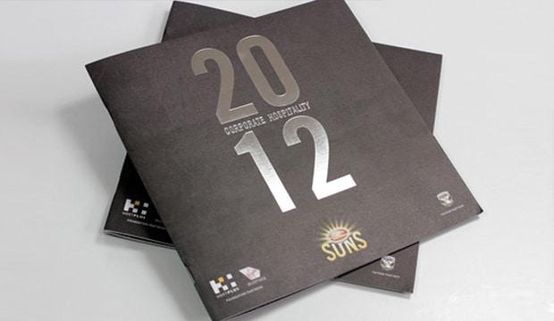
It’s not often an AFL football team and one of our specialty papers (Knight Smooth White in this case), appear together in a sentence. Then again, the tagline ‘Strength & Beauty’ could be applied to to footy! TUSK, a design studio on the Gold Coast, have a long standing relationship with the Gold Coast SUNS and apart from designing their amazingly detailed website, they recently revamped their corporate hospitality collateral using one of our high quality uncoated papers – Knight Smooth White.

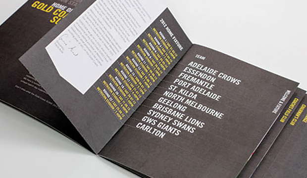
The look and feel developed for the corporate hospitality team needed to be distinguishable from the overall club branding but still look like it’s part of the SUNS family. TUSK utilised existing branding components such as typefaces and textures, treating and applying these in a way that would be distinct but still recognisable. First piece of collateral to be developed was the brochure. As one of the primary sales tools for the corporate team, it needed to clearly communicate all the relevant information.

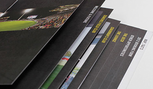
The brochure is a 16pp + 4pp cover with the cover printed on Knight Smooth White 350gsm and 200gsm for the text. TUSK opted for a square format to provide visual interest and firm it up, so the brochure feels premium and substantial when someone is holding it. TUSK intentionally designed an understated cover to maximise the impact of the imagery and colour of the internal pages, which are stepped to assist with easy and quick access to the information. The other collateral included a presentation folder which featured a foil, some facility information sheets and an oversized folded DL ticket holder.

Darren Gill from TUSK mentioned to us that they’ve worked with Knight before and have loved it.  “It provides a premium finish without blowing the budget. We wanted a stock that we could use across all the collateral – brochure, presentation folders, info sheets etc. and provide a consistent, high quality finish.”

The great thing about having a close and long standing working relationship with a client is that they tend to trust you. The positive about this for TUSK, is that the SUNS know they’ll provide a great solution to their brief and meet their budget needs too. The Gold Coast SUNS were chuffed with the outcome of this project which has taken their corporate hospitality marketing collateral to a new level this year. Meat pie anyone?

SUNS-2

SUNS-3

100% Melbourne book

Title: 100% Melbourne book
Agency: Famous Visual Services (VIC)
Client: City of Melbourne
Stocks: Impact / Tablex – Textures
Printed by: Bambra Press (VIC)

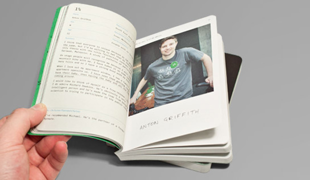
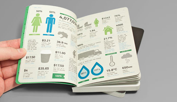
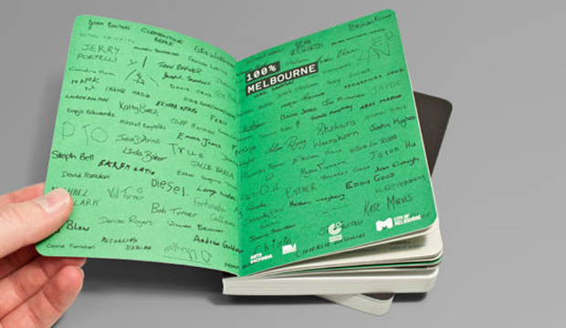
This little pearler is called the ‘100% Melbourne’ book. It’s beautifully designed (all 272 pages of it), with an enchanting story to match. A collaboration with Berlin theatre makers Rimini Protokol, the City of Melbourne and Famous Visual Services, the book reflects statistics from Melbourne city’s research department, contrasted with the story of each Melburnian. The 100 participants were also gathered together on stage to create a living breathing portrait of Melbourne. It was part theatre, part reality and of course ‘100% Melbourne’. Sounds like fun!

Melbs_2

The cover is printed on Tablex Freckles 280gsm and the text is on Impact 80gsm. We’re really impressed with the use of Tablex Freckles. It has to be one of the best examples we have seen in ages. Impact 80gsm was chosen for its flickability, minimum show through and great environmental credentials. The A6 format ensured the book could be easily carried home after the show. Just the right size to stash in your hand/man bag isn’t it? On the flip side, Famous Visual Services needed the outcome to be robust so they used Tablex Freckles 280gsm for its bookish texture and durability.

This book shows the importance of great digestable design. The aesthetic Famous Visual Services developed for the book highlights the contrast between the formal language of data and passports as well as the informal visual style of hand writing and casual portrait photography.

Dom Forde from Famous Visual Services shared some production insights with us: “A consistent colour treatment was added to every image to soften the hard edge of the digital shots. The colour palette was an important part of the identity and the stock chosen added the same tactile quality we were after. We used a rich black on the Tablex cover which handled that well and held the detail of our illustration really well.” This lovely little Melbourne treasure was finished off with some section sewing and bevelled edges.

Now that the team has had a taste of book binding, they’re considering some more lengthy publication projects.

Melbs_4

Melbs_3

The Blank Sheet Project and Renzo Rosso, Founder of Diesel

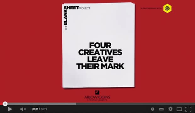
The start of a new idea often starts with a ‘blank sheet of paper moment’. The one where the future is open – you start from nothing and can literally create anything. This can be a challenging moment, a call to arms even. In their commitment to encourage individuals and businesses to be more innovative, thoughtful and sustainable, Arjowiggins Creative Papers, in association with D&AD, developed a unique and pretty neat project which explores how four creatives of global renown approach that moment – and so was born ‘The Blank Sheet Project’.

So far, Arjowiggins Creative Papers have asked Neville Brody, Sir John Hegarty and now Renzo Rosso: ‘How will you leave your mark?’ Each creative shares their creative process, from inspiration to finished idea. They also nominate the pieces of work they would leave behind for future generations, discuss their own views on the role of paper today, the future of the creative industry and the responsibility of creatives to always be more innovative, thoughtful and sustainable.

Back to Renzo for a moment. He’s a man who uses a blank sheet every day to design some of the most iconic fashions of the modern day world. He has created a brand which changed perceptions and broke every pre-existing rule there is, and he’s the founder of the ‘Only the Brave’ foundation. His approach is unique and his mantra is ‘be stupid’. We’re not joking, it really is! It’s also the fundamental philosophy of the Diesel brand. Renzo says: “When you did things before others, they think you are stupid…smart people think how things are today but stupid people are those who think how things could be.” Touche Renzo! The interview reveals a man who is, without doubt, a single-minded, self-confessed workaholic, yet, surprisingly, a firm believer in collaboration and communal effort.

The background to this project makes for a great story too. Arjowiggins Creative Papers asked themselves: “If we started again; if we had a blank sheet of paper; if we put sustainability at the very top of the agenda; what would we do? How could we do things differently?” They launched an internal ‘blank sheet project’ in 2010. It was a chance for the company to rethink, evolve and ensure that they always make responsible business decisions, focusing on how they will leave their mark – socially, economically and environmentally. It made sense on a business level too. We love the idea – absolutely amazing.

Complementary to the launch of this is ‘Leave Your Mark’. Every two weeks, an ambassador (personality, artist, creator etc) express their vision of creativity and how they will leave their mark.

If you want to find out more about the ‘The Blank Sheet Project’, call our marketing department 03 8470 2244 or speak to your paper specialist.

Two Sides Australia booklet

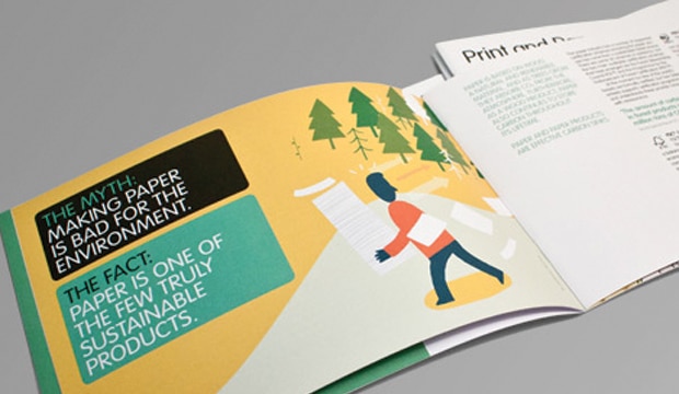
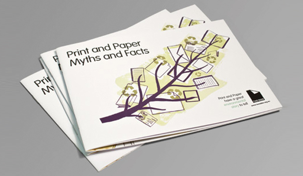
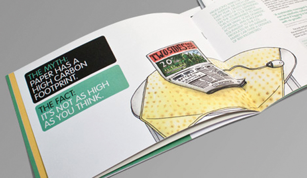
Have you ever been at a dinner party or gathering and a friend starts talking about how bad paper is for the environment? Maybe you’ve heard loads of facts about the good things the paper and print industry have done in the past 20 years but can’t remember or articulate the points correctly? Well, take a look at Two Sides Australia, an organisation committed to promoting the responsible production and use of print and paper. They work to correct common environmental misconceptions by providing users with verifiable (and easy to understand) information on why print and paper is an attractive, practical and sustainable communications medium.

The new A5 booklet will be coming to your print or design company soon. It gives you the opportunity to improve your ability to dispel the myths by dealing with the facts. We have found it to be a really handy tool. For way too long now, our industry has not defended paper as a sustainable product. Perhaps we haven’t had the words to promote it or the confidence in our message. But now more than ever, we need to protect and stand up for our industry and livelihood. Two Sides Australia, hopefully, makes it that little bit easier. Please visit their website if you’d like to more information and to keep up-to-date with news from the world of print and paper.

TS-2

TS-3

Sun Art Publication flyer

Title: Sun Art Publication Flyer
Stocks: Sun Art Publication – Gloss

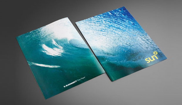
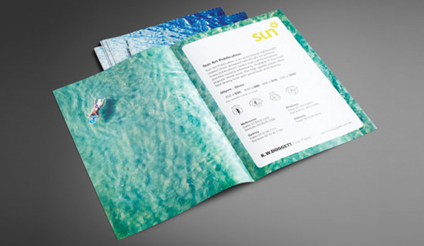
The latest addition to the Sun Art range is our new A2 coated Sun Art Publication – Gloss sheet. Introducing this bright white paper is a handy A5 flyer printed four colour process. Sun Art Publication outshines its competitors by offering good bulk for an 80gsm coated and an excellent print finish.

The flyer showcases the stocks lightweight properties yet with superior opacity, show-through isn’t an issue for Sun Art Publication. With an increase in demand for lighweight coated sheets, this new addition has arrived just in time. Designed specifically for printing mass publications, fast moving advertising and direct communication materials, it’s best used for annual and corporate reports, magazines and brochures. John Alipan, Business Development Manager – Packaging comments: “This sheet works really well through high-speed folding and collating machines, some other grades tend to slip and slide everywhere, whereas Sun Art Publication is more stable.”

Made with pulp sourced from responsibly managed forests, Sun Art Publication comes in 80gsm Gloss and Matt finish is available on indent. It’s also available in the most popular weights and sheet sizes. Please speak to your account manager for a copy of the flyer.

Sun-art-1

Maine Recycled promotion ‘A beautiful journey’

Title: Maine Recycled promotion
Agency: Thursday Design
Client: K.W.Doggett Fine Paper
Stocks: Maine Recycled – Gloss / Maine Recycled – Silk / Maine Recycled Digital – Gloss / Maine Recycled Digital – Silk
Printed by: Southern Colour (NSW). Carbon8 (NSW) – digitally printed postcards.

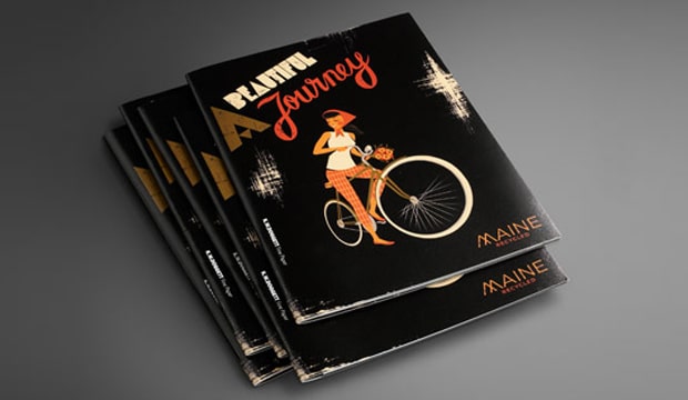
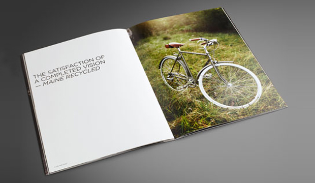
Albert Einstein once said: “Life is like riding a bicycle, in order to keep your balance, you must keep moving.” Wise words from a very wise soul but why on Earth are we talking about bicycles when we’ve just launched a paper promotion?! The quote is reflective of the unexpected and surprising element to our printed promotion – our beautiful Maine Recycled bike. Yep, we restored an old Speedwell frame into a modern classic. It’s a real beauty. What’s old is new again.

Maine Recycled_2

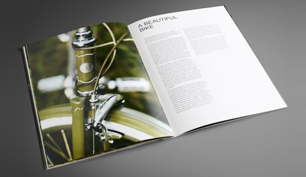
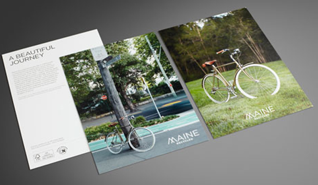
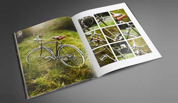
Thursday Design in Sydney are the creatives behind this project which they built based on the single minded proposition ‘Maine Recycled highlights the beauty of the world’. The photographic essay/brochure is called ‘A beautiful journey’. It’s printed CMYK on a Heidelberg Speedmaster CD102-6 with dry gloss varnishes (dust jacket Silk 130gsm, cover Silk 300gsm, text Silk 150gsm). The other parts include an offset postcard (Gloss 350gsm), two digital postcards (Gloss 350gsm and Silk 350gsm) and an A1 poster (Silk 200gsm). We chose to print the postcards in offset and digital form because we often get asked how an image looks in comparison so we reproduced the shot of the bike on the grass using an offset press and an HP Indigo 5500 press (we’ve included the printing specs on the back for handy reference).

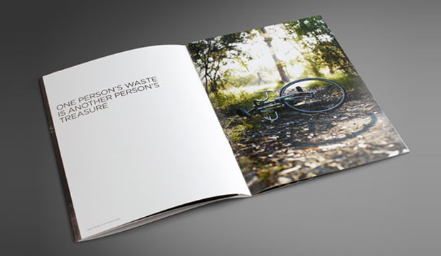
Craig Johns, Creative Director at Thursday Design sums it up perfectly: “A decision to restore (or recycle) a once beautiful bicycle, seemed to be the perfect metaphor for the brand. Commissioning a beautifully shot photographic essay of a once great bike being restored reinforces the key brand message.” And we think it cleverly conveys a neat little environmental story too!

Maine Recycled is an A2+ coated paper available in gloss and silk and suitable for offset and digital printing. It’s made with an amazing 60% FSC® certified post consumer waste fibre and 40% FSC® certified virgin fibre, and is even certified carbon neutral from cradle to printer. The pulp is produced at Greenfield Mill in France, Europe’s number one producer of recycled pulp. In comes the waste (mainly sorted office waste), and out comes a shiny new generation, bright white sheet. There’s literally so much pulp you could fill thousands of velodromes!  We’re pretty proud of this sheet and the fact that it has one of the highest recycled contents going around among the coated papers.

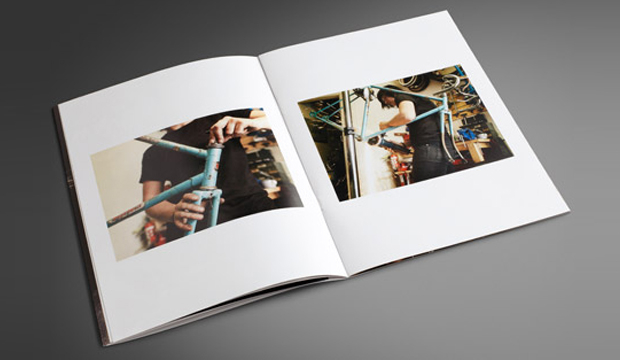
It took hours to find the right frame. The Speedwell road racer was discovered in unrideable condition, unloved and uncared for. Many more hours were spent finding the right person to rebuild the bike. Saran Langdon from Stallion Bikes in Redfern was chosen and she lovingly restored the frame via an incredibly detailed process. Her brief was to keep as much of the original bike as possible. Some gorgeous new bits like the classic seat and saddlebag from English company Brooks, brake callipers from Tektro and Soma vintage style light set, made our bike a true beauty. Speedwell frames were made in the late 1950s and early 1970s by a bike manufacturer in the same suburb as Stallion Bikes! There was also an  unexpected challenge of completing the bike build before Sarah went on maternity leave (her partner was due to give birth the same week of the bike restoration). Pressure much?

The gorgeous cover illustration is designed by Christoper Nielsen who you may have seen on The Design Files and who is well known around the traps for producing some colourful and exciting vintage inspired illustrations. He recently unveiled the creative process he undertook to produce the ‘Maine girl’ and it’s definitely worth a read.

So there you have it friends. Maine Recycled is a great on press performer and has a sweet environmental story which we hope you like as much as we do. Please speak to your paper specialist or account manager for more information. A copy of the promotion should be coming your way as we speak.

Maine Recycled_1

Maine Recycled_3

Maine Recycled_4

Maine Recycled_5

Maine Recycled_6


Fairytale wedding invitations

Title: Nichole and Ben’s Wedding Invitations
Agency: 22% More Chicken
Stocks: Kaskad / Knight – Smooth / Rives Tradition / Tablex
Printed by: 22% More Chicken

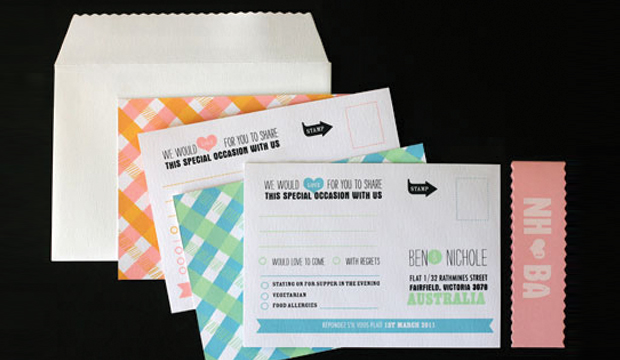
Once upon a time, not that long ago, two talented designers met, fell in love, created some fabulous wedding invitations and shared their wonderful story with us. So, now we’re sharing it with you!

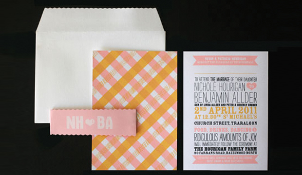
Ben and Nichole Allder, both designers of 22% More Chicken (best business name ever!), were married in April 2011. As soon as we saw their charming wedding stationery come across our desk, we fell in love with it. With over 12 years of graphic design experience in Melbourne and London it didn’t take long to design their invitations (wouldn’t we all love that talent?!). Nichole explains: “Being a couple makes working together easy, we understand where each others strength lies. We work like playing tennis, where one passes it to the other and then back again until we’re both happy.”

FT-wedding-2

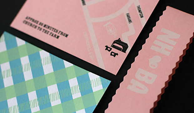
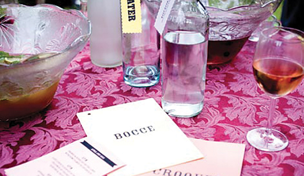
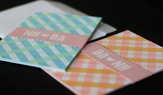
Using a combination of different paper grades allowed the couple to mix and match colours and finishes. Nichole and Ben both wanted a thick stock for the invitation card, so they hose Knight Smooth – White 350gsm. They found that it had a real ´paper´ feel to it, with just enough texture and a bright white shade that really popped against the colours. They also wanted some bright colour, but not necessarily primary hues. Leafbird Green 270gsm from our Kaskad range of papers and Pink 250gsm from Tablex complemented each other perfectly for the destination maps. A few other pastels from each range were used for booklets, water bottle tags and place settings.

For years, Nichole and Ben had been printing with a Japanese gocco machine. But with such fine detail in their stationery, they decided to splurge by purchasing a two colour jig and silk screened the invitations, map, reply card with belly band and thank yous. Nichole explained to us that it took a whole weekend to print and dry, cut out all 150 invitations, map and thank you cards by hand, plus the added detail of the crinkle cut belly band and envelopes. Phew!

For all those soon-to-be-bride’s out there, all that hard work is totally worth it in the end. Nichole agrees: “We were really happy with the result, the paper was so lovely to print on, really smooth and held the inks so well. Screen printing is such a  lovely process to use; the slight variation in print makes each piece unique. We had a bit of trouble getting replies back as no one wanted to give up their reply cards!” I think we’d all agree that this story definitely has a very, happy, ending.

FT-wedding-1

FT-wedding-3

FT-wedding-5

FT-wedding-6