Buffalo Kraft illustrative poster

Title: Wheel ´O cheese
Agency: Seesaw Design (Melbourne)
Client: K.W.Doggett Fine Paper
Stocks: Buffalo Kraft
Printed by: Bambra Press (Melbourne), 2 colour process – PMS 485 C and Black 6 C

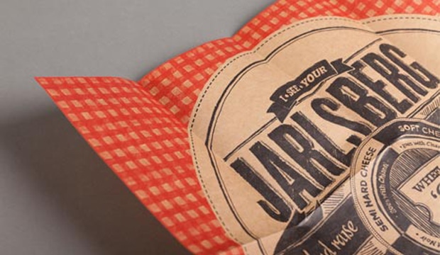
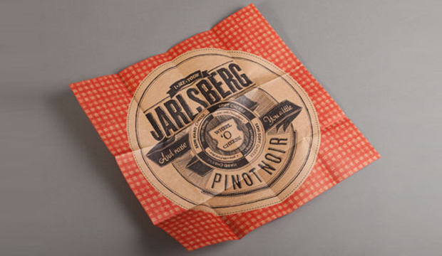
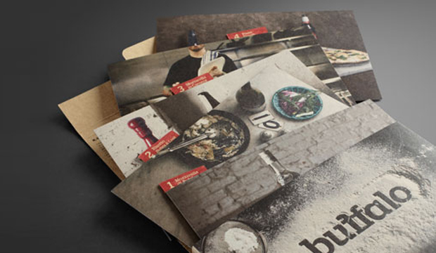
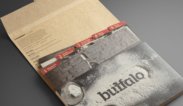
´I see your Jarlsberg and raise you a little Pinot Noir´. Wine and cheese. Is it the perfect match? We think so! This illustrative poster is printed on Buffalo Kraft, the newest addition to the Buffalo range and complements our recent Buffalo Board promotion showcasing delicious recipe cards.

Buffalo Kraft is a natural looking brown Kraft paper and versatile packaging grade with FDA approval for direct food contact. For Seesaw Design in Melbourne, cheese and wine was the perfect match, so with this tasty inspiration in mind, they set out to create an illustrative piece that was loosely informative, matching specific wines with cheese.  After enjoying the Buffalo Board promotion so much, Seesaw were excited to create a second piece for the Buffalo range. From the onset because this paper FDA approved, it was obvious that this piece had to relate to the world of fast moving consumer goods (FMCG) or hospitality, but it also needed to go that extra step. With gorgeous vintage and modern cheese label designs in mind, their inspiration came from the tongue-in-cheek style of info-graphics and the intricate details contained within them.
Buffalo Kraft_5

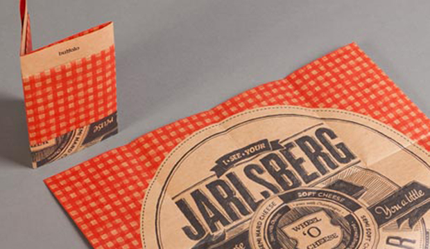
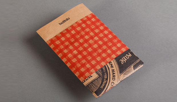
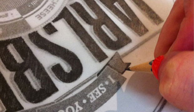
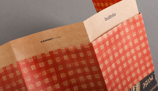
Jess Pigot from Seesaw says: “The brief came to us with the potential for foiling, embossing or any number of finishes. We found that the stock has so much character and personality, that it really doesn’t need a lot of finishes to make it look fantastic. I guess the lesson was a simple one… keep it simple!” The result is a small A6 parcel on Buffalo Kraft 80gsm, with a tablecloth graphic (suddenly our thoughts turned to a sunny Sunday afternoon picnic) wrapping around the middle like a belly band. Containing a series of unique and unusual folds, the parcel gradually reveals the artwork step by step, opening to a 450mm square poster. Kudos to Seesaw for this clever illusion. The final touch was physically drawing the entire piece, which enhances the raw, organic and handmade look and feel of the stock.

When we asked Jess what the studio liked about Buffalo Kraft, she was all smiles: “The stock was fantastic to work with. The print result was crisp and clean and the stock handled the colours really well. Strengthening the colours at press check stage can achieve great richness and a lovely rich black that is a great contrast to the colour of the stock. The warm colour allows for a completely different aesthetic to any artwork.”

Buffalo Kraft is an unbleached, natural brown Kraft paper. Featuring high tensile strength it’s perfect for sacks or bags containing foodstuffs, animal feed even ready-mix building materials. Buffalo Kraft is versatile and even comes in a range of envelopes. Lightweight with good opacity, it’s perfect for wrapping bread, chocolates or even the odd piece of Jarlsberg cheese. Yum!

Your K.W.Doggett Fine Paper specialist will be out to see you soon with a copy of this promo. Otherwise, please call our samples departments. If you have any specific packaging related questions, please call our dedicated packaging business development manager John Alipan on 0434 692 446 or email him jalipan@kwdoggett.com.au.
Buffalo Kraft_1

Buffalo Kraft_2

Buffalo Kraft_3

Buffalo Kraft_4

Paper hearts by Le Cordon Bleu

Stocks: Curious Metallics

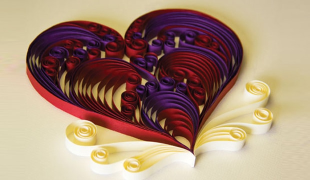
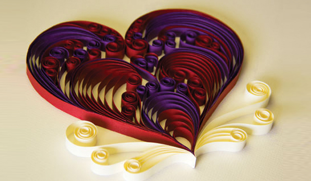
Oh the joy when a piece of paper art crosses our path. This gorgeous and colourful creation was sent out by Le Cordon Bleu Australia as part of a Valentine’s Day email. If you’re not familiar, Le Cordon Bleu offers training in cuisine, pastry, management and gastronomy. The email sent out on 14 Feb, titled: ‘Cooking for love, for the love of cooking’, offered a dessert recipe – chocolate flavoured puff pastry crisps with fromage blanc and orange cream, cherry and banyuls wine sauce. Need we say more?

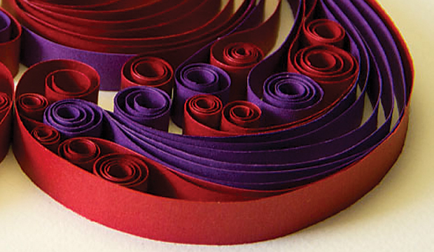
Darren Taljaard from Le Cordon Bleu wanted to create something handmade, novel and unique ie nothing kitsch, overly used and definitely no stock images! He used the Curious Metallic range (Violette, Red Lacquer and White Gold) in 120gsm to create this little beauty. As he mentioned to us: “The rich colours and luxurious metallic effect worked perfectly to convey the feelings of the heart! They evoke wealth and suggest that the message is a valued gift. The deep purple of the Violette created a lush backdrop for the very rich and intense Red Lacquer. The White Gold, because of the golden metallic component, stood out beautifully on the white background and complemented the two intensely coloured papers used in the rest of the heart.” And in case you didn’t notice, the thin strips are conceptually linked to the blue ribbon in the company’s logo.

Darren was happy with the Curious Metallics range, he mentioned: “The paper is of a high quality and it’s smooth so was easy to work with. It has a certain ‘memory’ when curled and so was easy to ‘draw’ with.” And for any budding paper art enthusiasts out there, it’s best to use a lighter GSM in order to bend and curl the strands smoothly. Darren says that in the end, each strip needed to look like a fusion of calligraphy and paper.

The heart received loads of positive feedback. It seems that hand made, traditional illustration techniques are still very much appreciated. It could be the recognition of the effort that goes into designing something hand made, the delicate nature of the process, the precision, using real materials – all of it strikes a chord with people in a very postmodern age.

Working with paper has been highly satisfying for Darren. It has opened a new direction in paper illustration for him and he’s certain to follow up with more increasingly elaborate designs. We’ve had a chat in the office and the only thing that could make this heart better is if it was edible. Preferably something chocolatey like the recipe. Yes, it’s unanimous, that would make our day!

Cordon-2 Cordon-1

Bird Design business cards

Title: Bird Design business cards
Agency: Bird Design (VIC
Stocks: Conqueror Laid
Printed by: Taylor’d Press (VIC), Edging – OrtBindery (VIC).

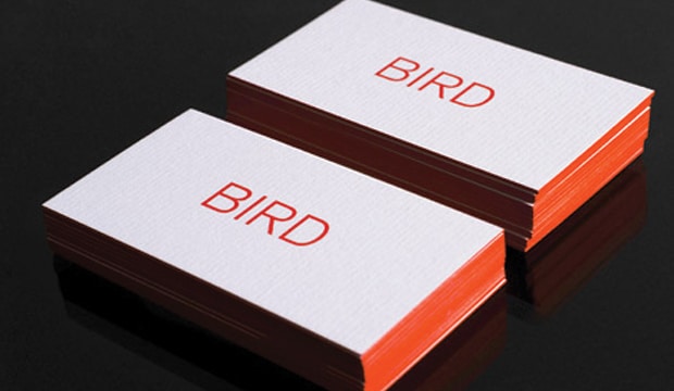
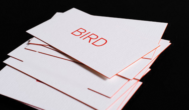
In the previous story, we talked about Bird Design’s stationery suite project for Owen & Peach, and now we’re going to talk about the designers themselves. Meet Bird, a Melbourne based graphic design studio that develops engaging design experiences across architectural and environmental signage/graphics, branding and print mediums. Their studio business cards are an expression of the studio’s character – a less is more approach which is greatly influenced by Director Luke Carson’s design philosophy.

Bird-2

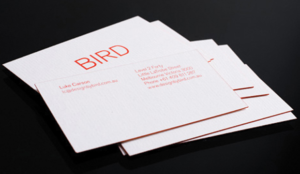
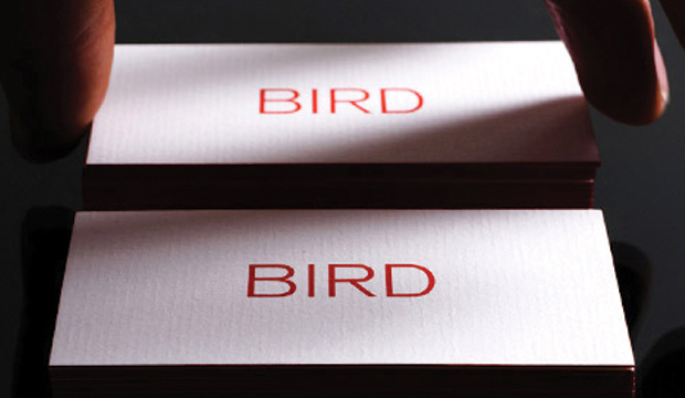
There is an underlying grid system which supports the constructive design so Bird wanted to choose a stock that complemented this approach. They decided on a natural, exposed paper that has texture, something you can feel. Conqueror Laid Brilliant White ticked all the boxes for them. Bird ended up choosing the beefiest option, going with the bulky 400gsm which they say made the painted edges slightly more visible. This, combined with the textured feel of the paper, added a softness to the constructive design.

The cards are printed 1 colour both sides with edge colouring to match the PMS 1788. A tip if you ever chose to do something similar – paint small stacks to avoid any colour bleeding. So, there you have it, a pretty sweet and simple business card that screams ‘less is more’.

Photographs provided by Albert Comper.

Bird-3

Bird-4

Owen & Peach stationery

Title: Owen & Peach stationery suite
Agency: Bird Design (Melbourne)
Client: Owen & Peach
Stocks: Knight – Smooth
Printed by: Taylor’d Press (Melbourne)

Newly formed graphic design studio – Bird Design in Melbourne, created a bold, confident new look for Owen & Peach (chartered accountants) and TVA Partners after they merged in late 2011. Corporate stationery is often pretty uniform – you’ve got your corporate colours and a brandmark. And then, when a company throws in a blind emboss or two, you get a corporate stationery suite with a dash of something special. We love a little embellishment – of the print variety that is!

Peach-4

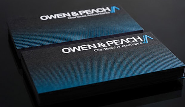
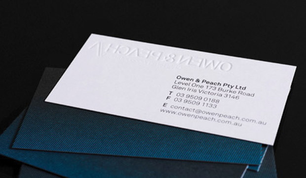
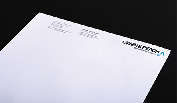
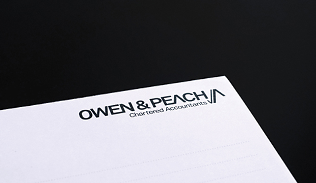
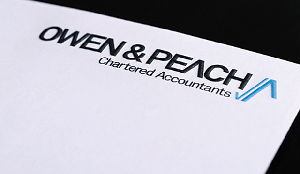
And who can overlook a strong brandmark? Something that is as memorable as it is simple. Bird Design created an upward blue tick/arrow for the Owen & Peach branding to emphasise growth and positive movement. Combined with the use of bright blue and black, it gives the stationery a much more contemporary feel. Knight Smooth White was chosen as the stock for the entire suite to complement this direction. The suite includes notepads (105gsm), letterhead (105gsm), with comps (105gsm) and business cards (350gsm) printed 2 colour with an embossed brandmark on the business cards, letterhead and with comps.

Bird Design shared some of their thoughts about the print finish on the Knight Smooth White: “The stock held the ink/colour beautifully. A nice flat coverage with the natural fibre of the paper was still visible. An initial concern was how the fine blue lines on the business card would look on the press but the colour held very well and the contrast of the black, blue and the whiteness of the stock is very punchy. The stock held the emboss well too.” We think the business card is particularly impressive with the discreet yet stylish pattern. Who said blue and black should never be seen. We love it!

The Bird Design recipe for success included a thorough understanding of the brief and also the history of both companies which they started to unravel out in the initial meeting. This helped drive and direct choices later in the process including the selection of paper which needed to be bold and contemporary and include suitable stock weights throughout the range. What can be better than a happy client at the end of the day? Bird Design delivered a suite that was on brief and successfully delivered the intention to create a confident and bold stationery suite.

Photographs provided by Albert Comper.

Peach-1

Peach-3

Peach-5

Flinders Hotel rebrand

Title: Flinders Hotel collateral
Agency: Seesaw Design (VIC)
Client: Flinders Hotel
Stocks: Buffalo Board / Knight – Vellum
Printed by: Southern Colour (VIC); Avon Graphics – emboss (VIC); Cut it Out – bamboo sheet menu boards (VIC); Payless Promotions – silicon bands.

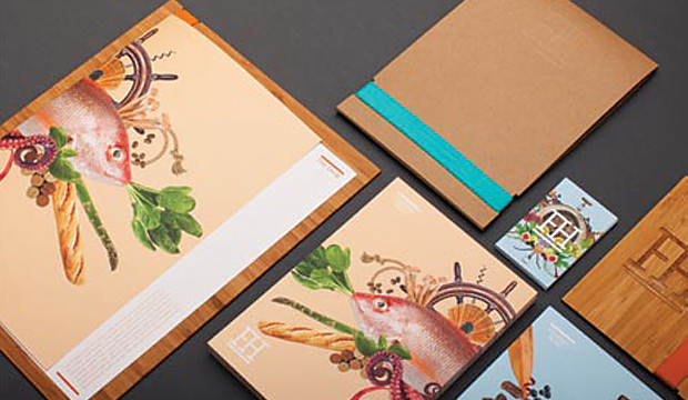
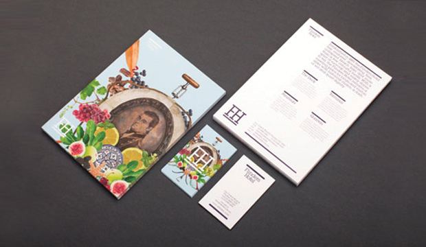
When we saw the Flinders Hotel collateral designed by Seesaw in Melbourne, we knew there was a special story behind it. Seriously – look at those collages!! The pictures are literally bursting off the page. So much fun and frivolity we had to know more about the project.

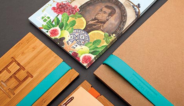
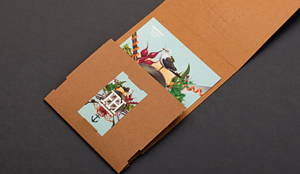
Seesaw won the tender to rebrand the iconic Flinders Hotel on the Mornington Peninsula which involved defining the various areas of the venue – a destination fine dining experience, a casual bistro area, function space and a boutique 40 room hotel. They fused the rich history of the pub and the culinary journey created by renowned chef Pierre Khodja to create this visual feast you see so the original collages portray the eclectic offering, rich history, dining experience and modern outlook of the Flinders Hotel. If you’ve got the chance, visit the website and read the opening statement – it sure is a colourful history the Flinders Hotel has, as vibrant as their new branding.

Flinders-4

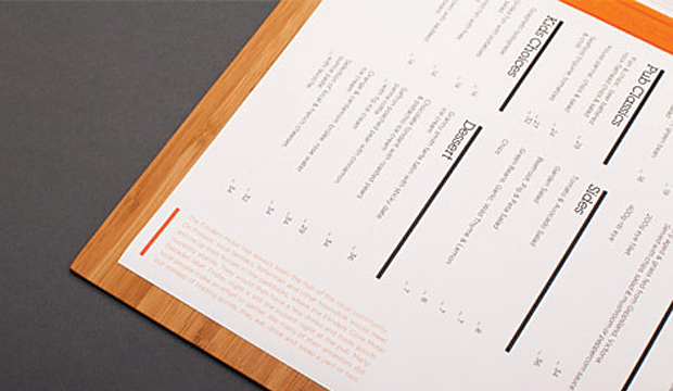
Seesaw felt that the use of uncoated, tactile stocks to contrast with the various other materials used such as silicon and bamboo was the best solution. They originally chose Concept Vellum for the entire range but with the menus being somewhat disposable, Knight Vellum was used instead. A presentation style folder was created using Buffalo Board to again enhance and contrast with the other stocks/materials used. The menu shells and postcards are printed on Knight Vellum 200gsm, the business cards on Knight Vellum 340gsm and the folders on Buffalo Board 330gsm.

Seesaw worked extremely close to their client throughout the project. What made a massive difference is the substantial research and strategy work they did at the beginning of the project. When it came to creating final artwork, the client really trusted the proposed creative direction. The client is an extended family which Seesaw say meant the project was brimming with love and emotion. The collaboration with their printer was equally as important. Seesaw had to factor in multiple kinds, variations and units and with the knowledge and support of Adrienne at Southern Colour, who completely understood the brief and desired outcome, the print job was a success that both Seesaw and the client are very proud of.

As Seesaw explained to us: “The project as a whole had a very short turnaround time. The client was extremely supportive and involved, but also respectful of our creative opinion and vision and allowed us a huge amount of creative freedom. As a studio we love collaborating with clients and suppliers. It really was a dream project – an open yet challenging brief, beautiful product, stunning food, rich history and trusting clients.”

This rebrand is an ongoing project. The work completed so far includes brand identity, brand strategy, naming, positioning, creative direction, image making, menu system design, uniforms, signage, copy writing, marketing direction, online and digital material and advertising.

So, a trip to Flinders anyone?

Flinders-1

Flinders-2

Flinders-5

Queensland Sugar Limited corporate brochure

Title: QSL Corporate Brochure
Agency: Lloyd Grey Design
Client: Queensland Sugar Limited
Stocks: Cambric Linen
Printed by: Inprint Limited (Brisbane)

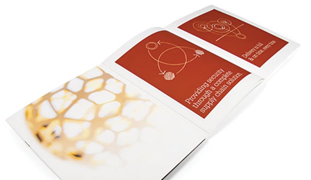
They say success is sweet. So most days at Queensland Sugar Limited (QSL) must be pretty good then! QSL is an Australian marketing and logistics company based in Brisbane, responsible for the marketing of the majority of bulk raw sugar exports produced in Queensland. Lloyd Grey Design have been working with QSL since 2009 to redesign their identity, build brand equity and the QSL brand experience. Last year, QSL approached them to come up with a high quality corporate brochure to further position them as the leading raw sugar marketer in Asia.

Sugar-4

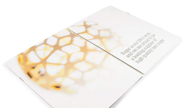
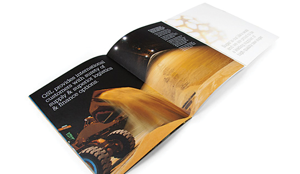
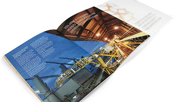
Ok, so sometimes we read ‘corporate brochure’ and think bo-ring. But not this time. Lloyd Grey Design went down the unconventional route with this one. The brochure needed to appeal to international customers and trade houses and showcase QSL’s expertise and innovation. The brochure has 24 pages and the eight page cover has two internal sections (each containing eight pages), which were collated and saddle stitched into the gatefold cover. They combined a memorable design with feature photography, key messages and relevant diagrams and there you have it, a corporate brochure minus the boring factor. Not surprising then that the brochure created quite the impression during face-to-face meetings.

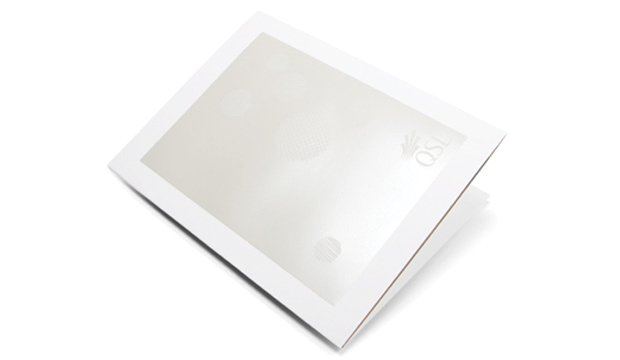
The brochure was printed on Cambric Linen Arctic 271gsm/118gsm in 4 colour process plus PMS 7497u, featuring a white pearlised foil on the front cover. Here’s a neat story about why Lloyd Grey Design chose the stock. “We thought it was well suited to QSL as it shares strong symbolism with what forms the basis of QSL’s business – sugar cane. Like the cane, Cambric Linen is fibrous and has a natural, textured feel, without overwhelming the design. We felt the pearl foil contrasted with the paper texture for a beautiful finish.” Like we always say, there is a paper to match every occasion!

Sugar-2


Sugar-1  Sugar-5

Buffalo board packaging promotion – it’s good enough to eat

Title: Buffalo Board recipe cards
Agency: Seesaw Design (Melbourne) – concept, design and photography
Client: K.W.Doggett Fine Paper
Stocks: Buffalo Board
Printed by: Bambra Press (Melbourne), foiling by Avon (Melbourne).

As the buffalo roam the Serengeti, they dream about eating ‘Mozzarella in Carozza’. Of course we’re not being serious but wouldn’t it be a sight to see! Seriously though, did you know the Italians have been making buffalo mozzarella (bufala as they call it), since the 12th century? So what on Earth does buffalo mozzarella have to do with Buffalo Board? Well, Buffalo Board has many applications, one of which is food packaging. We collaborated with Seesaw Design in Melbourne who suggested we focus on this angle considering the stock is FDA approved for direct food contact. The concept of incorporating a food by-product led them to buffalo mozzarella (provided by La Latteria), a common ingredient on pizzas and salads.  It then seemed a perfect fit to work with Ladro, a popular pizza restaurant in Melbourne. And there you have it folks, the beginning of a delicious paper promotion.

Buffalo Board_4

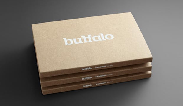
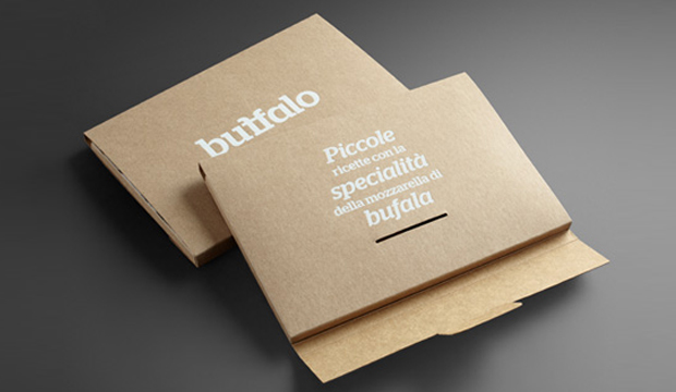
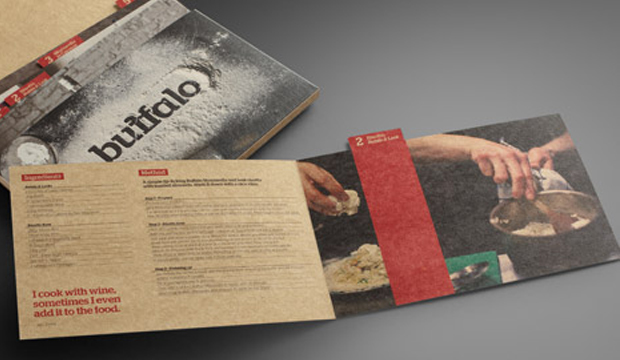
The promotion consists of an A5 folder made from 332 gsm/610ums Buffalo Board, printed with a matt white foil. Five recipe cards featuring buffalo mozzarella (ie mozzarella di bufala; risotto – bufala and leek; mozzarella in carozza; pizza dough; pizza bianco) are contained within the folder, and printed on 283gsm/508ums stock. The folder and outside of the cards are printed 4 colour process with double hit of opaque white highlights printed wet on dry. The inside of the card is printed 4 colour process.

The recipe cards are such little treasures and are so tasty they’re good enough to serve to your mama. Ladro provided a great location for the photo shoot. The photographs showcase the stock’s raw look, a bonus for people that want to convey a distinctive, clean and natural design. The rustic dishes were captured in a beautiful and elegant way, and it looked like the team had fun doing it! Here’s a video with some behind-the-scenes footage of the shoot. The food styling is thanks to Vicki Valsamis who has done such a stellar job of making the dishes look downright dreamy and scrumptious. It’s like we can hear them calling out: ‘Eat me, eat me’.

Seesaw set out to create something special with this promotion rather than a novelty piece. As Anita Ryley from Seesaw explains: “We wanted to produce a finished product that is designer orientated while showcasing the stock. We wanted the promotion to be interactive, engaging and original. Using images of stock buffalo seemed a little obvious. It needed to be a solution that was beautiful, clever, professional and a little left of centre. We wanted to create a stock sample that wasn’t just another pretty design piece. As a studio, we love the samples we can engage with. The ones that have a dual purpose.”

Buffalo Board is a low density, high yield product. It’s an uncoated, moisture-resistant folding carton board that is cost effective, has a verifiably low bacteria content compared to many other paperboard products and outstanding strength and durability. Buffalo Board is also available in 386gsm/711ums and is also used for health, beauty, fashion and beverage applications. It’s made from natural kraft fibres that are responsibly sourced and fully recyclable and it even has a low carbon footprint (measured exit mill gate).

Your K.W.Doggett Fine Paper specialist will be out to see you soon with a copy of this promo. Otherwise, please call our samples departments. If you have any specific packaging related questions, please call our dedicated packaging business development manager John Alipan on 0434 692 446 or email him jalipan@kwdoggett.com.au

Buffalo Board_1

Buffalo Board_2

Buffalo Board_3

Curious postcards – digital and offset

Title: Curious postcards
Agency: Naughtyfish (Sydney)
Client: K.W.Doggett Fine Paper
Stocks: Curious Metallics / Curious Metallics Digital
Printed by: Offset card – Green & Gold (Sydney), Digital card – Bambra Press (Melbourne)

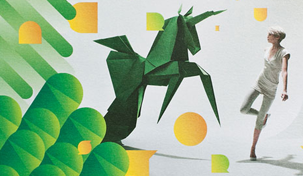
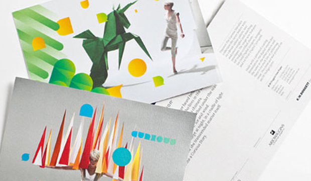
The enchanting Curious Collection story continues with the release of two postcards using the stunning imagery from the book. The Curious Metallics range now comes with HP Indigo certified sheets –Ice Gold Digital (120gsm, 300gsm) and Ice Silver Digital (300gsm). The great thing about this collection is that it offers a vibrant colour palette, text and cover weights and matching envelopes and it’s suitable for offset and digital printing. For offset printing, we recommend using either fully oxidising or traditional offset inks. The offset postcard is printed using stochastic screening on the Ice Gold 300gsm. The digital sheets are great – they’re made with a patented coating formulation and feel the same as the other papers. There is no shelf life or yellowing issues either. We printed the digital card on Ice Silver Digital 300gsm using an HP Indigo 5500. The Curious Metallics range is manufactured by Arjowiggins (UK).

Curious Postcards_2

Curious Postcards_1

–

Jack goes digital

Title: Sovereign Offset Digital ‘Jack of all Trades’ postcard
Agency: Three60
Client: Self-promotion
Stocks: Sovereign Offset Digital – Indigo

Sovereign Offset, the great all-rounder adds digital to its kit. This new sheet is specially engineered to deliver outstanding print results on all digital presses and is guaranteed by HP Indigo for 100% ElectroInk adhesion. Available in five of the most popular weights – 100, 120, 160, 200, 300gsm and digital sheet size 320 x 450mm. Sovereign Offset digital shares the same whiteness and texture as regular Sovereign Offset; a handy tool when matching offset and digital communications.

Here comes the Sun (again)!

Title: Sun water bottle and notepad promotion
Client: Self-promotion
Stocks: Sun Art A2 – Gloss / Sun Art A2 – Matt / Sun Offset
Printed by: Notepad: Pinnacle (Melbourne). Bottle: designed in-house, printing organised via Goldstem (Sydney).

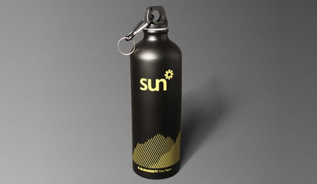
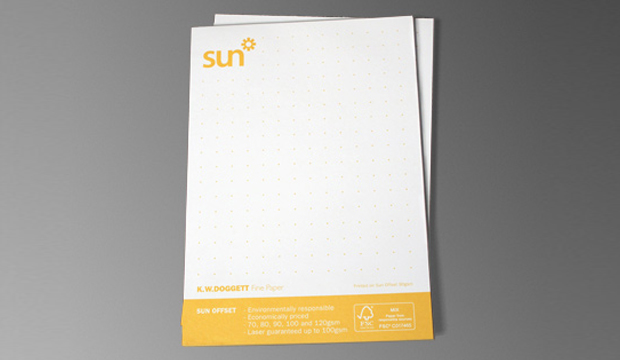
We thought it was about time to welcome back some sunshine. Some of you might remember our competition from last year. Well, we couldn’t keep the Sun Art A2 coated and Sun Offset papers down for long. With their economical, laser guaranteed (Sun Offset only), FSC certified credentials, top notch runnability and economic value, we just had to let these brands shine so we developed a Sun branded aluminium water bottle and Sun Offset notepad.

Sun Art A2 Matt and Gloss coated is available in 115gsm, 128gsm and 150gsm weights. Sheet sizes include 455 x 650; 635 x 880, 650 x 910 (bold figure indicates grain direction).

Sun Offset is an uncoated woodfree sheet and comes in 70gsm, 80gsm, 90gsm, 100gsm and 120gsm, in a variety of sheet sizes.  Please refer to the Sun Offset swatch for further technical specs.

Both papers are great for those big jobs, they are environmentally responsible and suitable for all types of general printing processes. Your K.W.Doggett Fine Paper representative will be around to see you soon with the bottles and notepads.

Sun Offset Waterbottle_2