Barry Bleach Board pops back into the mainstream

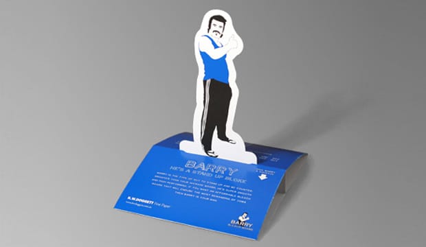
Title: Barry pop-up card
Agency: GuerrillaTV (Melbourne)
Client: K.W.Doggett Fine Paper
Stocks: Barry Bleach Board
Printed by: William Troedal (Melbourne). Managed by Printbound (Melbourne). Gluing – CP Gluing (Melbourne).

Barry is the type of guy to stand up and be counted. Brighter than your average board, he’s super smooth and high performing. If you want an affordable bleach board that will endure the most demanding of jobs then Barry is your man.

Our big bustling Barry has returned. Well, he didn’t really go far. He was sort of on a holiday after generating so much fame from his initial promotion. He’s back to remind you of his superb printing qualities and new grammage –170gsm. Barry wants you to know that he delivers very attractive print results for offset, gravure, flexo and serigraphy printing. Overall, his printability is top class. He has a yield advantage of 20%+ against other SBS (Solid Bleach Sulphate) boards.

We’ve noticed that Barry gets around. He often leaves the office and we find him in shop window displays, point of sale, on greeting cards, and in high end packaging like food and blister applications. It’s really quite hard to look past Barry. A. He’s so good looking. B. He has some solid environmental credentials. Barry is made with PEFC certified fibre sourced from responsibly managed forests. Manufactured in a facility that is accredited with the ISO 14001 EMS certification and he’s even made with elemental chlorine free pulp.

Please call your K.W.Doggett Fine Paper specialist for your own Barry pop-up promo or speak to John Alipan, Business Development Manager, Packaging 03 8470 2244 or jalipan@kwdoggett.com.au for more detailed information on Barry’s many uses.
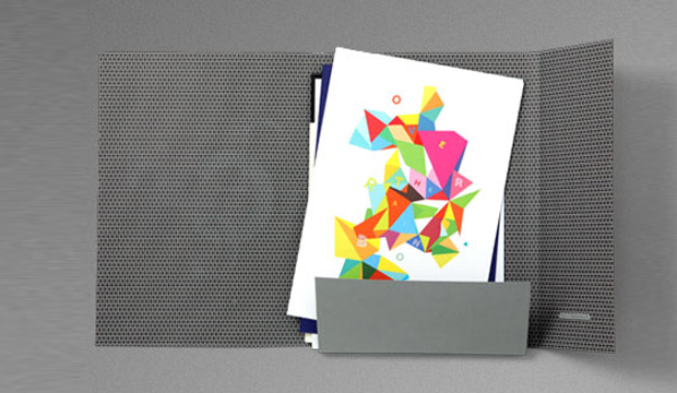
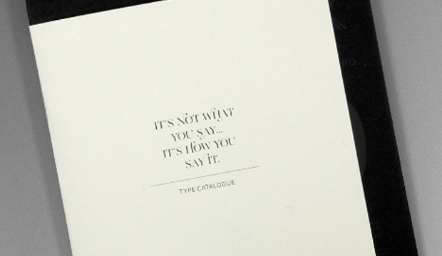
It’s not what you say…

Title: It’s not what you say…
Agency: Naughtyfish
Client: K.W.Doggett Fine Paper
Stocks: Conqueror CX22 / Conqueror CX22 100% Recycled / Conqueror Laid / Conqueror Laid Digital / Conqueror Wove
Printed by: Green and Gold, Superscreen, Goldcraft, Bambra. Embellishments – Goldcraft.

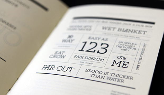
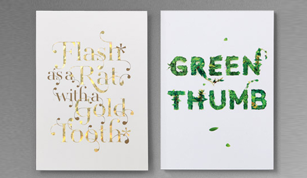
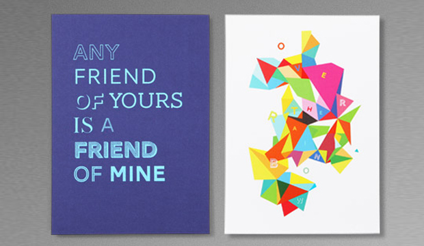
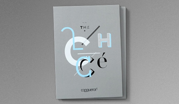
…it’s how you say it!  If someone told you to stroke a cliché until it purrs like a metaphor, would you? The promo features funny quotes like this one, loads of cheeky clichés and the five new Conqueror type faces created by Jean François Porchez exclusively for Conqueror. You can download them for free here! You’ll think outside the box when you see the refreshed colour palette in action and may even exclaim ‘far out’ when you read about Conqueror’s green credentials. The whole range is FSC accredited and made CarbonNeutral®, certified by The CarbonNeutral Company. All emissions produced in the manufacture and delivery of Conqueror from raw materials to K.W.Doggett Fine Paper warehouses nationally have been offset.

Conqueror_Its not what you say_6

We collaborated with independent design studio Naughtyfish on this project and had some fun times pouring over the clichés. The concept was inspired by the theme from the European promo: ‘It’s not what you say, it’s how you say it’. And not only will it tickle your funny bone, it’s educational too! We’ve included some handy printing hints covering topics like foiling and scoring.

Although clichés are generally avoided in the quest for originality, Naughtyfish took a walk on the wild side and decided to celebrate them! We wanted to challenge the perception that Conqueror is traditionally specified for stationery by using different printing techniques, weights and embellishments. We used 4 colour process, screen printing, foils, and digital printing to showcase the versatility of the range.

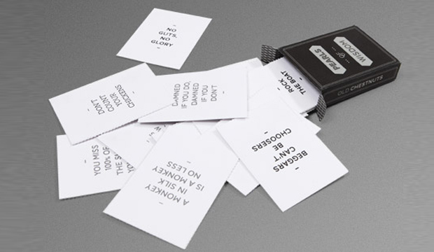
The promotion is a handy A5 size folder that houses the various pieces including four A5 postcards, a typeface book, and a deck of cards called the ‘Pearls of wisdom’. The type catalogue is a font lovers dream! With a short blurb about the creative inspiration behind each type face, there’s lots to enjoy. As Paul from Naughtyfish mentioned, “the type faces are quite classic but offer the potential for creative exploration and are designed to be combined in different ways. Most of the fonts have ligatures, which allow for nicely crafted typography.”

A variety of stocks were used from the Conqueror and Conqueror 100% Recycled ranges. We included the new colours like cobalt and calligraphy (which is so much blacker than the old black) which we thought you might like. Conqueror is a really tactile collection and comes in paper and board weights, randing from 90gsm to 400gsm. It’s manufactured by Arjowiggins (UK) and is exclusively distributed by us!
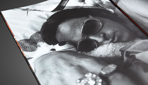
Your K.W.Doggett Fine Paper representative will be coming to see you in the following weeks with your own sample. Oh, and remember to get your creative pants on and enter the Conqueror ‘It’s how you say it’ design competition. All entrants get to join a webinar with Jean François Porchez. It’s now or never! Enter here (competition no longer open).

Conqueror_Its not what you say_1

Conqueror_Its not what you say_2

Conqueror_Its not what you say_3

Conqueror_Its not what you say_4

Conqueror_Its not what you say_5

You say goodbye, I say hello

Title: You say goodbye, I say hello
Agency: Ortolan
Client: K.W.Doggett Fine Paper
Stocks: Keaykolour Original / Rives Design / Rives Tradition
Printed by: Bambra Press

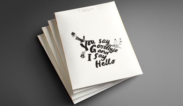
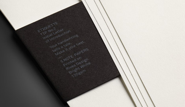
I am covetable, colourful and exciting. You want to use me, but I often get forgotten. What am I? Introducing our latest promotion for Rives – a modern day stationery set, complete with communication etiquette tips! The Rives promotion reminds us that in this day and age, we often forget the art of old fashioned communication. What? There is no hash tag involved? Impossible!

You say goodbye_4

‘You say goodbye, I say hello’, is a promotion that showcases the versatility of Rives, a stock often used for letterheads, business cards and invitations. This provided the foundation for the creative development. We were fortunate enough to collaborate with two self-confessed Rives lovers – Kat Macleod and Narelle Brewer from Ortolan.
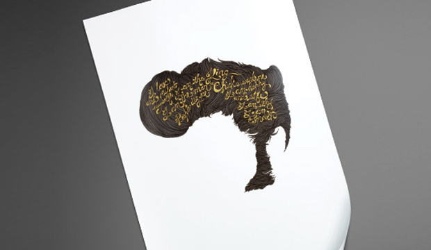
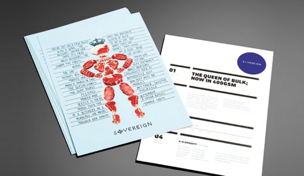
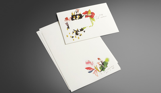
Kat and Narelle played further with the idea of tradition, took inspiration from the classic art form of botanical illustration, and included a twist. The result is a contemporary illustrative approach, featuring water colours of classic botanic specimens combined with made-up mutant flora. The word mutant conjures up a frightening image, but these illustrations are anything but that – they’re beautiful.

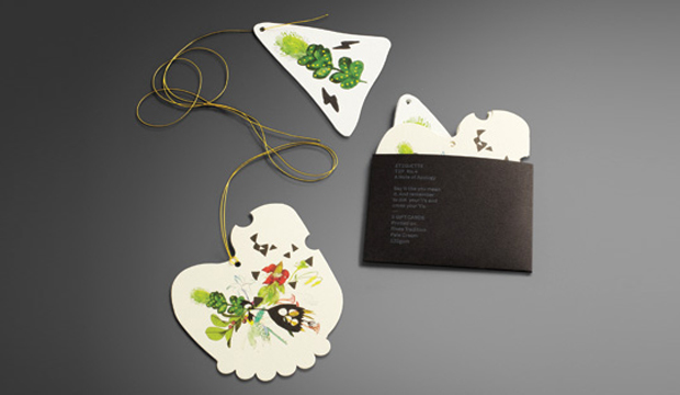
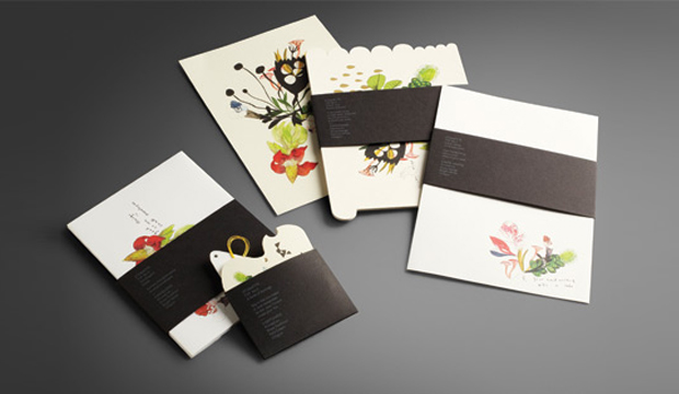
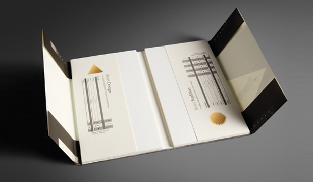
The stocks used for the 2011 Rives promotion include Rives Design and Tradition. It consists of post cards (die cut with the most gorgeous illustration and embellished with a hint of gold foil – see pics above), note paper, envelopes and gift cards (that even come with their own yellow string ready to attach to a gift!) and a paper chart.

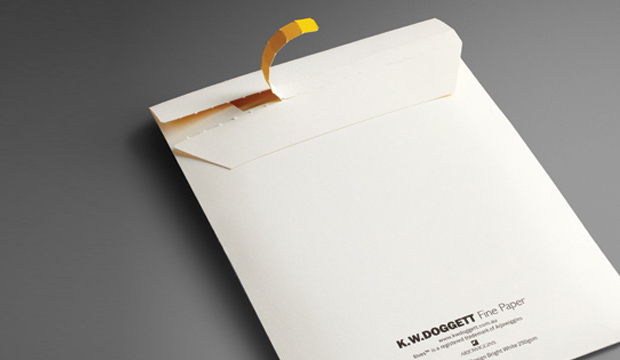
The promo is printed four colour process, the belly bands with two spot colours (one hit of silver and one hit of white), and everything is perfectly packed into a main envelope (printed outside one colour (black) and inside one colour (yellow PMS 109). Printed on the belly bands are cheeky etiquette tips like: ‘If you want to be invited back, think ink! An email is not a thank you note’; and, ‘Your hand writing tells a tale, make it your best’.

Fusing the strength of tradition with the energy of the present, Rives is a naturally elegant collection ideal for even the most contemporary communications. Available in Design – a discreet, fine mesh texture; Tradition – a refined felt-like finish; and, Design Digital – an indigo compatible sheet. Rives is exclusive to K.W.Doggett Fine Paper and proudly made FSC certified by Arjowiggins Creative Papers (France).

You say goodbye_1

You say goodbye_2

You say goodbye_3

You say goodbye_5


Go out on a limb – that’s where the fruit is!

Title: Envirocare 100% Recycled Promotion
Agency: David Lancashire Design
Client: K.W.Doggett Fine Paper
Stocks: Envirocare 100% Recycled

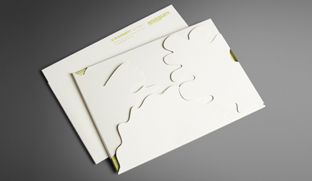
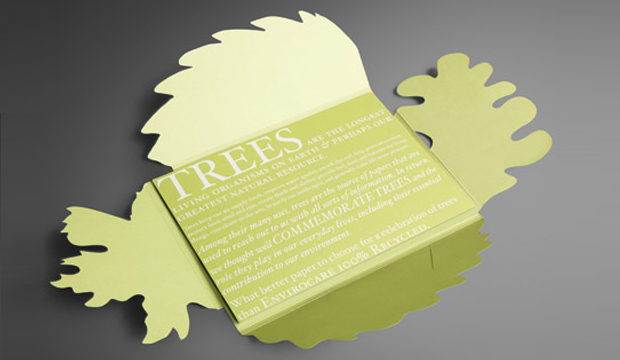
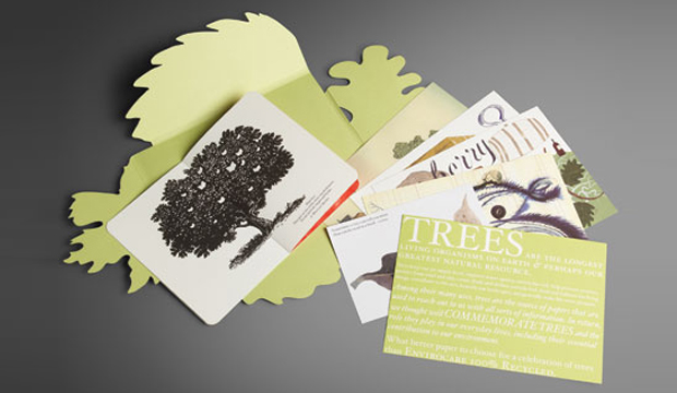
In collaboration with David Lancashire Design we wanted to create a fresh, new look for Envirocare 100% Recycled. The outcome is a promotion that celebrates trees, one of our greatest natural resources. This fun promotion showcases the paper, showing its warm natural whiteness, earthy tactility and individual finish. We wanted to highlight the fact that trees provide loads of benefits for both human life and the environment. The combination of illustrations and quirky quotes tells a story that honours trees for creating shelter, shade, fuel, food and of course paper! A great medium for all sorts of communication.

Envirocare Recycled_4

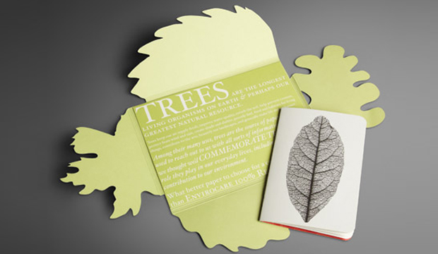
The promotion consists of a beautiful leaf shaped folder containing five postcards, a small booklet and a pre-cut label. The illustrations were done by a talented bunch including Sara Fanelli (Italy), Peter Till (UK), Jeff Fisher (Aus/France), George Hardie (UK) and David Lancashire (Aus).

We’re continuously committed to managing our impact on the environment, which includes stocking environmentally sound papers. Envirocare 100% Recycled is uncoated, made entirely from waste paper, printed with chlorine-free pulps and without the addition of any optical brighteners or bleach. It’s a raw yet elegant paper with excellent bulk and opacity and produces rich solids and sharp detail for high quality results.

Take a fresh look at Envirocare 100% Recycled by getting your own copy. Contact your K.W.Doggett Fine Paper Specialist or alternatively, call your local samples department.

Envirocare Recycled_3

Envirocare Recycled_2

Envirocare Recycled_1

Keaykolour gilded edge postcards

Title: Keaykolour gilded edge postcards
Agency: Hunt Studio
Client: K.W.Doggett Fine Paper
Stocks: Keaykolour Original
Printed by: Foiling – Avon Graphics (VIC), Gilded edges – Ort Bindery

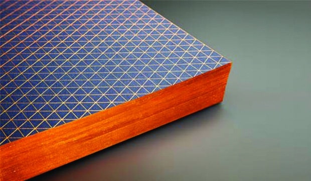
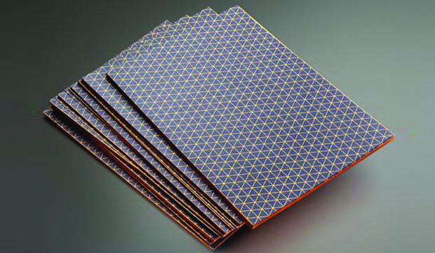
Our customers often ask what techniques they might use to help them stand out from the rest, so we’re always looking out for something new to offer them. Recently, we discovered a business card with beautifully gilded edges, a technique that we just had to try for ourselves!

Keaykolour gilded postcards_2

We commissioned Thomas Williams from Hunt Studio to design an A5 gilded edged card on Keaykolour Antique, Navy Blue 250gsm. He came up with a mesmerising isometric pattern, wrapping around to the gilded edges and text typeset in Akkurat Mono, all in Kurz copper foil.

Originally the job was specified with a red foil, but we found that it wasn’t adhering well during testing. After experimenting with a few other similar colours, we found the copper foil adhered the best.

If you would like to use this process on your next job, our suggestion is to do some testing first, as each foil may react differently depending on the paper stock used. Also, ensure a sharp guillotine blade to avoid rough patches, or alternatively forme cut the job for greater accuracy.

Although this is a brilliant technique, there is a lot of manual labour involved, therefore we wouldn’t recommend using this process for large jobs. It’s perfect for boutique jobs and jobs with small runs, such as business cards.

To see one of these beautifully crafted cards, call our samples department or contact your KWD paper representative.

Keaykolour gilded postcards_1

Strength and Beauty is Knight

Title: Strength and Beauty
Agency: Three60 (VIC)
Client: K.W.Doggett Fine Paper
Stocks: Knight – Smooth / Knight – Textures / Knight – Vellum / Knight Smooth – Cream
Printed by: Bambra Press (VIC)

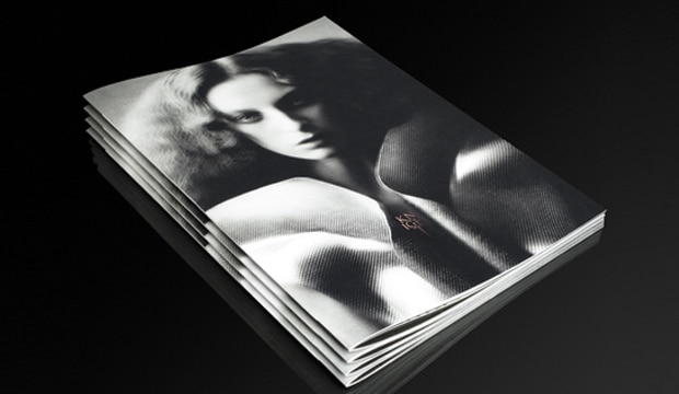
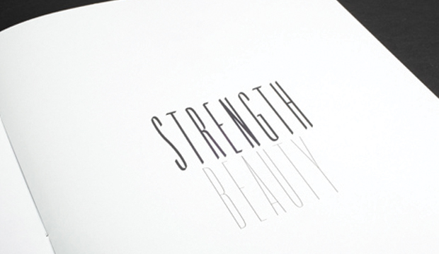
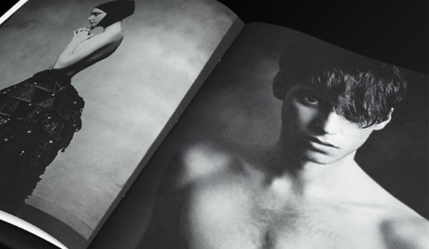
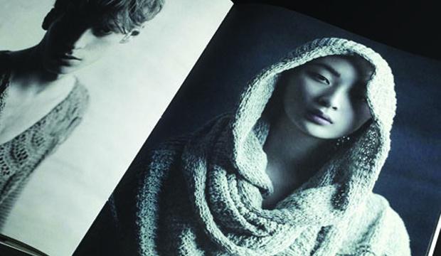
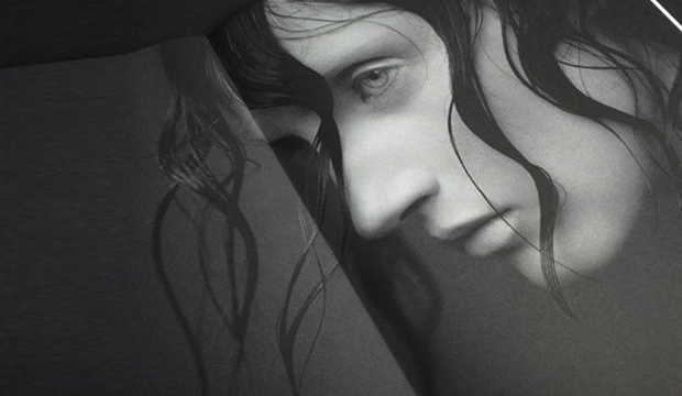
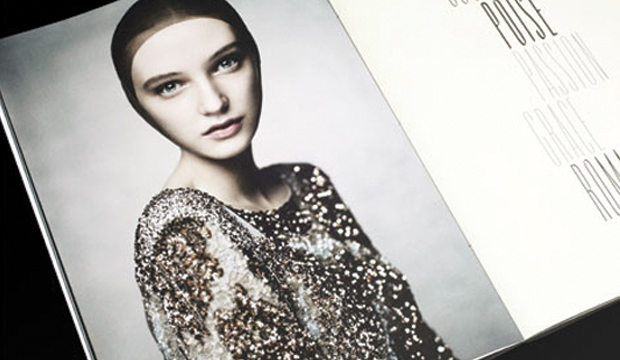
This was a truly special project for us, a collaboration of creativity, inspiration and fashion, where everyone involved was fully immersed in the process. The large format book ‘Strength and Beauty’, and three complementary A5 postcards, feature a stunning series of photographs that are a modern interpretation of medieval heroes and heroines. The book and cards showcase Knight, a unique collection of high quality uncoated papers.  With a delicate and even surface, Knight is finished to ensure beautiful printed results for communications that require elegance, strength and beauty.

Beauty-is-Knight_6

We had the privilege of working with some really talented people including (but not limited to!), Three60 who provided the design and creative direction, talented photographer Justin Cooper, Visual Thing & Mr Woolf in charge of post-production, and some of Australia’s top stylists and fashion houses namely Jolyon Mason, who provided the expert styling, and fashion labels like Romance was Born,Toni Maticevski, Skin and Threads, Zambesi, Diesel and Manning Cartell among others.

The book really is a tactile and visual experience, capturing the outstanding print quality, high resolution imagery and versatility of the range which boasts a comprehensive choice of weights and finishes and is even made from environmentally sustainable pulp. The images reveal how beautifully the Knight range prints 4 colour process, handles rich solids and sharp detail with ease, and how it adds distinct warmth and beauty to enhance skin tones.

Handy hint: Re the 4 colour process set-up, we used the ISO uncoated colour profile and 2 colour process made up of Process black and Warm Grey 6. We opened up the mid-tones to allow for gain and images were over sharpened to allow for ink swell on the press.

For your very own copy of the Knight book, please contact our samples department or call your specifications representative.

Beauty-is-Knight_1

Beauty-is-Knight_2

Beauty-is-Knight_3

Beauty-is-Knight_4

Beauty-is-Knight_5

A Curious Story

Title: A Curious Story
Agency: Reflex Group Paris, Photographer – Gregoire Alexandre
Client: K.W.Doggett Fine Paper
Stocks: Curious Metallics / Curious Metallics Iridescent / Curious Touch Soft Touch / Curious Translucents
Printed by: Norman McGrigor Printing

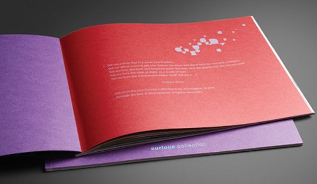
Tell me a story that I’ve never heard before.
Tell me about a young girl who lives in the stars, and about how she met with a chimera.
Tell me how she lived and breathed under the seas, how she played with fire, ice and wind.
Tell me how she slept at night, in a cradle of light.
Tell me how she transcended matter itself.

Tell me a…Curious Story.

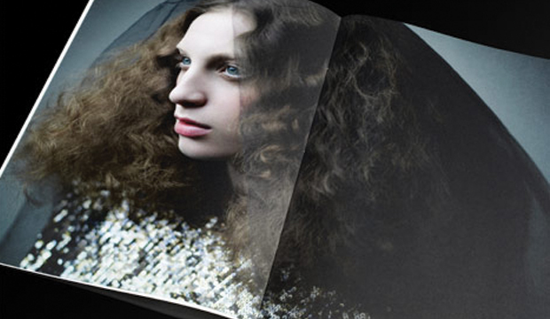
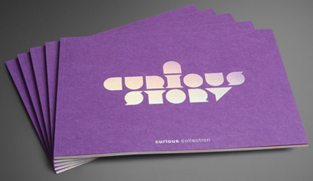
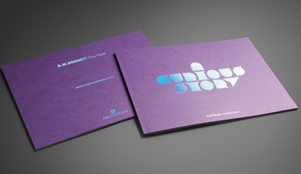
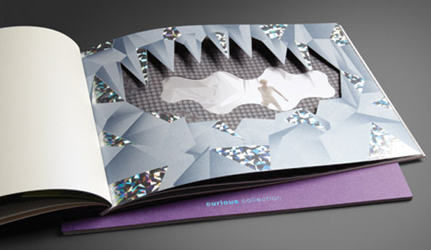
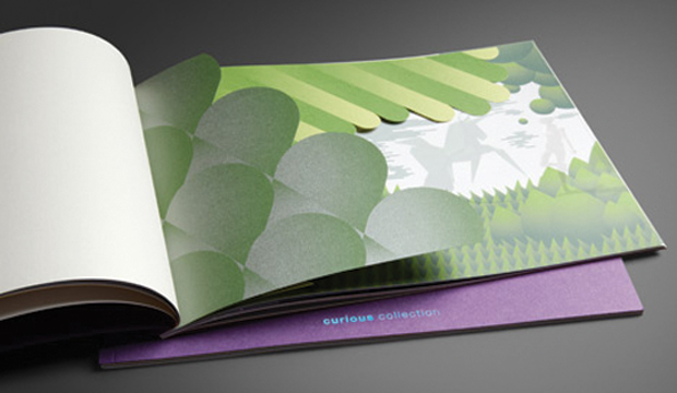
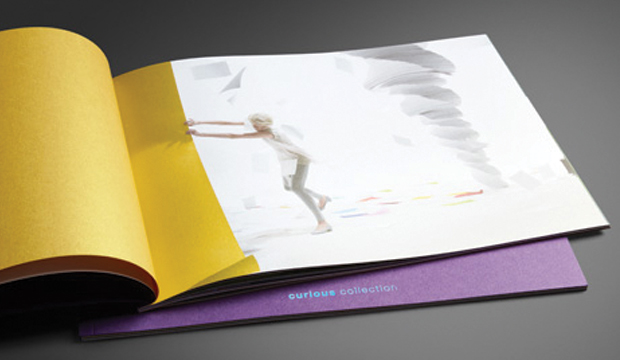
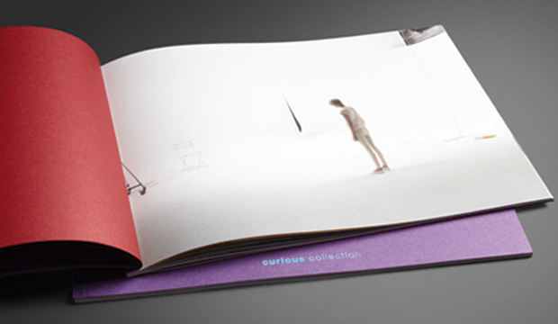
This A4 landscape booklet features amazing images and print techniques from the Arjowiggins Curious Collection. It tells a story (www.curiousstory.com) as seen through the lens of photographer Gregoire Alexandre, and exhibits a range of possibilities through print, die-cutting and embellishments on the range.

Now available exclusively from K.W.Doggett Fine Paper, the Curious range includes a variety of colours and finishes, including 5 new metallic hues. To see the new range of Curious Metallics please contact your K.W.Doggett Fine Paper representative or your nearest samples department.

A-Curious-Story_1

A-Curious-Story_2

A-Curious-Story_3

A-Curious-Story_4

A-Curious-Story_5

A-Curious-Story_6

Meet the Sovereigns

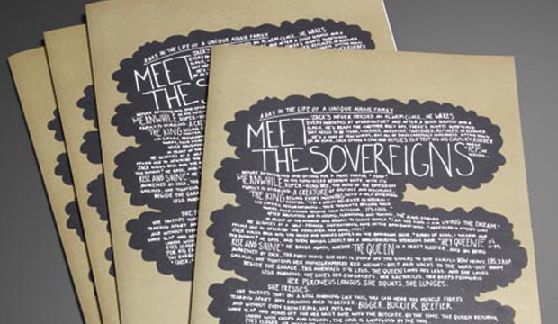
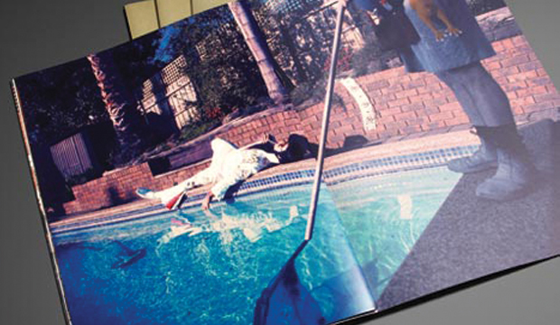
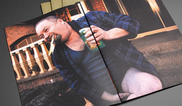
Title: Meet the Sovereigns Agency: Three60 Client: K.W.Doggett Fine Paper Stocks: Sovereign A2 – Gloss / Sovereign A2 – Silk / Sovereign Hi-Bulk Art Board / Sovereign Offset Printed by: Southern Colour A day in the life of a unique Aussie family… Jack is an early riser and he wastes no time getting stuck into the day’s work. The Queen’s day begins with a trip to the local butcher. The King’s daily ritual is grooming himself until it’s show time. He wakes up, has a shower and works on his tan for a few hours. The Queen returns, Jack cooks up a BBQ and the royal family sit down to lunch. Meet-the-Sovereigns_6 This humorous new promotion plays up the characters of the Sovereign family, with each member corresponding to one of our best loved papers: Sovereign Offset is shown as the Jack of all trades, no job is too big or too small, he gets the job done every time. Sovereign A2 is The King, the real performer. He’s been selling strong for 32 years and is well loved by printers and designers alike. And the Queen represents the heavy weight strength and durability of our Sovereign Hi-Bulk Art Board… guaranteed to outmuscle any competitor. The Sovereign Family represents our best brands for performance, price and reliability. To see the Sovereigns in action for yourself, simply contact our sample department for your copy of the book. Meet-the-Sovereigns_1 Meet-the-Sovereigns_2 Meet-the-Sovereigns_3 Meet-the-Sovereigns_4 Meet-the-Sovereigns_5

Rives sketchbook

Title: Rives Notebook
Agency: Channel Zero NSW
Client: K.W.Doggett Fine Paper
Stocks: Rives Design / Rives Tradition
Printed by: Print: Macdonald Masterson NSW Embellishment: Goldcraft Embossing NSW

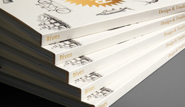
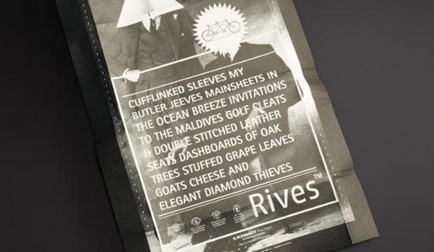
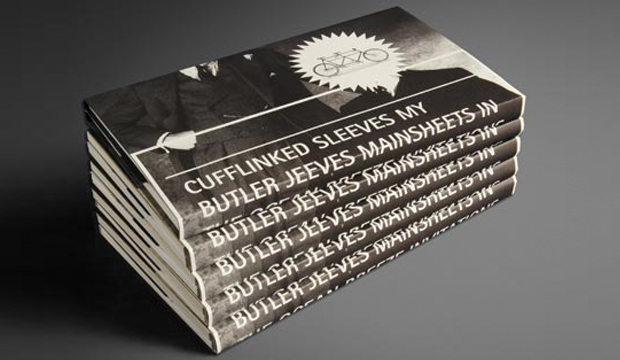
Check out our new Rives Sketchbook with the brilliant little diddy thought up by the wonderful Alex Lloyd of Channel Zero. Elegant diamond thieves, our butler Jeeves and sailing in the Maldives? Yes please!

It all sounds dreamy doesn’t it? And it’s the perfect way to describe our Rives collection of papers, designed and made in the United Kingdom by Arjowiggins.

Rives-Sketchbook_1

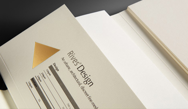
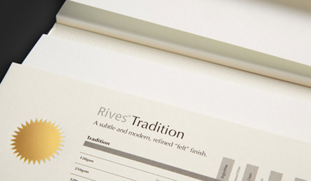
Rives comes in two whimsical textures, one a woven elegant fine mesh and the other a quirky and distinctive felt. Offered in various shades of ivory, cream and pastels this speciality paper is the perfect partner for beautiful invitations, elegant stationery and printed material that deserves a little luxury.

We’d love to send you one of our Rives sketchbooks, so drop us a line and we’ll pop one in the post.

Enjoy and happy sketching.

Catherine

Rives-Sketchbook_2

Rives-Sketchbook_3

Rives-Sketchbook_4

Rives-Sketchbook_5

Barry Bleach Board

Meet Barry Bleach Board. With a perfect set of guns and lightweight body, he can take on any full strength job that needs to pack a punch, carry a load or bend into shape. He is the smoothest guy that yields all the right moves to keep his admirers wanting more.

Specially treated to keep his edges neat and tidy, Barry is designed for quality packaging and what’s more, the consistent reliability of Barry Bleach Board makes printing, converting and packing processes efficient and trouble free.

To order your bleach board samples contact our samples department.