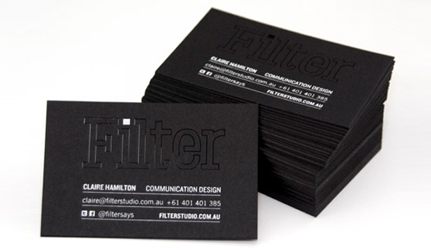
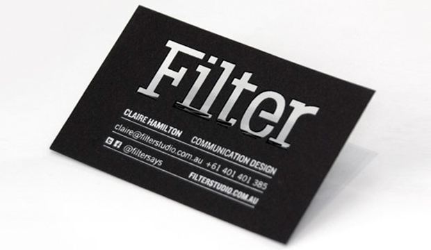
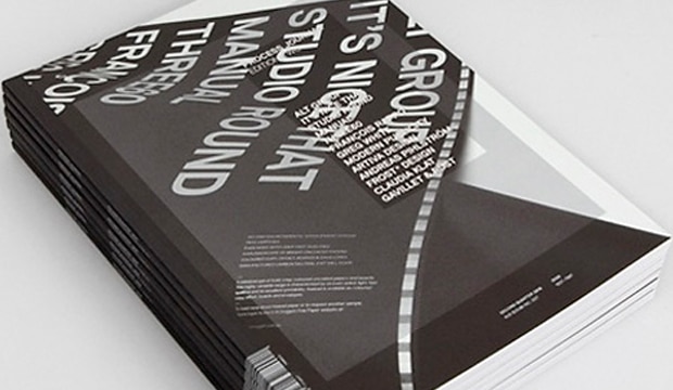
Today, first impressions count more than ever and these striking cards from Filter were designed not to be forgotten. Filter, a recently reinvented communication design studio that replaces Hamilton Creative, went through a relaunch which meant that Filter needed their business cards to tell a story. By showcasing a specific idea with an interesting print technique, it allowed the opportunity to open conversations about Filter’s values and creative experience.
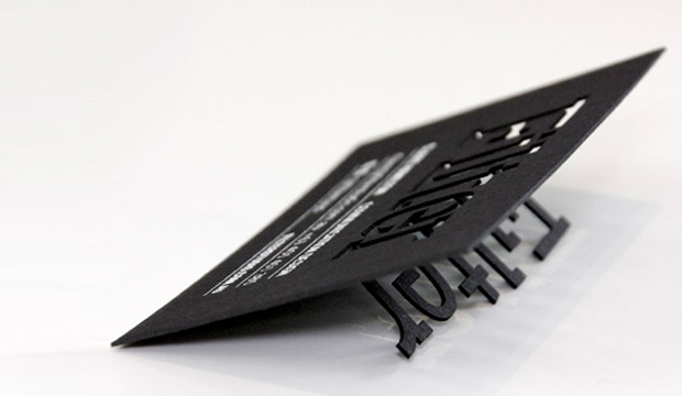
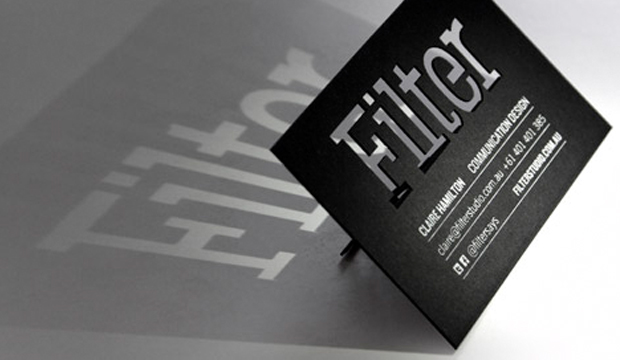
Claire Hamilton, Director and Communication Designer from Filter ultimately wanted the recipient of the card to become part of the design outcome. Claire explains: “The client can interpret and choose how the card will look. Some tear the perforated logotype completely off and create a stencil, some make the prop stand and others allow the logotype to sit alone standing upwards.” Claire continues: “This is also true for the client/designer relationship – it’s a collaborative process and to make it work involves interpretation and creativity.”
Paper is a key part of Filter’s offering, so this love of paper needed to be obvious on the initial touch point. Keaykolour Original Jet Black 450gsm was chosen for its bulky properties and ability to hold the bended logotype. Claire says: “The texture of Keaykolour Original is extremely even without being too smooth. When cut, it is sharp and precise. Plus, Jet Black is just plain sexy.” We agree 100%! The cards are white foil stamped with the logotype laser cut and laser perforated at the base of each letter. Through testing, Claire found that laser perforation was far more successful on the heavier weights.
For Claire, an integral part of achieving the best result was taking advice and collaborating with our very own paper specialist, Corinne Lloyd from the QLD team, as well as Potato Press and Michael McAteer from Printcraft (QLD) as well as Mike Fritz, Art Director/boyfriend. Claire adds: “I wish more designers would use the expertise available, because it makes great jobs even better with that kind of support. Absolutely appreciate the effort made by all for such a pedantic project. Thank you.”
This project has been entered into BADC Awards and was listed as a finalist (which is the highest level of achievement for the Branding/Stationery Range category), additionally the project will be printed in the Design and Design International Book of the Year Vol 5, to be released in December 2012.
Awareness: a·ware·ness / [uh-wair-nis].
Noun: the state or condition of being aware; having knowledge; consciousness: The object of the information drive is to raise awareness of the facts.
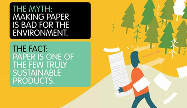
Awareness, is fundamental to helping our customers better understand the benefits of printed communications. Most of the population believe print is ‘bad’ for the environment and that printed communication isn’t effective. Widespread confusion and misconceptions on what is/isn’t the ‘right’ thing to do is rife.
Recently, I attended a meeting with a major corporate. I handed over my business card only to be told: “Sorry I’m business card free” by the person I was meeting with. “Why?” I ask. “I’m doing my bit,” she replied. I was taken aback to say the least. Is it really this bad? Another corporate contact I have who works in sustainability said they may cut a third of their print work and swap their marketing collateral to interactive PDFs. Excited to join the sustainability path and believing this would be better for their ‘footprint’ wasn’t a decision made based on cost. This means we could lose approximately $2M worth of print material out of the Australian market every year, all based on a misconception.
One business card is actually the equivalent to 0.12grams of CO2 v one Google search which is 0.36grams. One e-mail, with a 400k PDF attachment, sent to 20 people, is equivalent to burning a 100w light bulb for 30 minutes and growing every time that file is distributed. A printed brochure’s footprint is static, measurable, recyclable and renewable.
Two Sides Global Consumer Survey of 2011 findings (consistent with the Nielsen ‘The Future of Mailing’ and BPost Business surveys completed over the past 12 months) found that 80% of people prefer reading from paper with 83% in the 18-24 year old age group. Other stats: 16-24 year olds prefer and place a higher value on paper based communication than digital and 50% of respondents believe that addressed and unaddressed communication is more credible, useful and trustworthy than digital communications.
Awareness is critical. Challenging the misleading environmental claims through communication vehicles such as the ‘Myths and Facts’ booklet is one small step. Two Sides Australia is committed to continuing this journey. Hop onto the twosides.org.au website and get the facts, the extended version of this article, or even better, join Two Sides Australia and we’ll help you communicate with your customers.
A big thanks to Kellie Northwood, National Manager of Two Sides Australia for her guest blog entry. We are big supporters of the amazing work Two Sides is doing for the print communications industry in Australia.
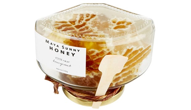
Bees produce honey but have you ever seen it done like this?? The Maya Sunny Honey (you can also visit their Facebook page) product range literally involves bees crafting the honey INSIDE the jar! Zé Studio in Sydney designed the identity and branding and used Envirocare 100% Recycled labels for the jars.
The unique and innovative 100% raw honey range is brought to you by Andrew Wyszynski. It’s such a great concept with a stylish and beautiful design to match. The upside down jars are awesome, reflecting the process taken to make the sweet nectar. For the most part, the process is a well-kept secret. But we can give you a sneak peek at how it all happens because you take the time to read our blog and we love you.
Enclosed within each individual jar is a mini beehive, with about 450-500 bees crafting an exceptional and unique honeycomb. The making of this honeycomb is an incredible system, where a set of 30 empty jars are placed upside down on top of a beehive. The bees travel from the hive into each jar creating the honeycomb from scratch with no foundation (amazing right?). Around one month later a whole jar is complete.
Joe Tarzia from Zé Studio mentions: “A sustainable and handcrafted approach was reflected in the design execution – matching the natural process of production from beehive to jar as well as the pure nature of the honey itself. Understanding Andrew’s delicate and precise process was the most honest approach in handling all aspects of packaging, from material selection through to hand application methods.”
A locally sourced vine wire was selected to hand seal the neck of each jar as well as the Envirocare 100% Recycled labels, printed using an HP Indigo press and pre-cut for hand application. Andrew believes that: “Honey should be enjoyed in its most pure form, allowing full benefit of its nutritional properties.” This innovative design does the trick by complementing the process of production from beehive to jar and looking great at the same time. Yum on both counts!
Well done to Thomas and Nic for their awesome win in the 2012 Mohawk Show. Their entry of Process Journal issue #3, printed on Expression Super Smooth was voted Best in Show. We were tickled pink to take the boys to lunch (France-soir, no less) and hand over the $5000 cheque. Yes, that’s right $5000!
But it’s very well deserved not only is the magazine beautifully designed but the content is highly curated to show only the best work. Making each issue something to really look forward to and keep on the shelf. Well done to Process Journal. We love reading your Mag and encourage those of you who haven’t read it to start now. http://www.publishedbyprocess.com
P.S. Please bring back the printing of the magazine to Australia!
P.P.S. The Mohawk show will be traveling to Australia in 2013. Look out for it. They will bring all the international winners work including a beautiful digital piece designed by Paul Garbett at Naughty Fish (NSW). Well done to Paul for being a Mohawk winner.
The Biennale awards night is almost here – in less than two weeks the design community will descend upon Melbourne’s iconic Forum Theatre to dance the night away and celebrate all that is good about Australian Graphic Design. We’ll be there and hope you can make it too.
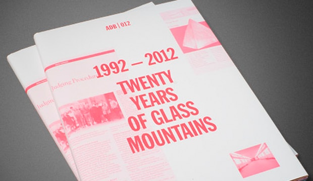
As part of the celebrations AGDA has released ‘Twenty Years of Glass Mountains’. An Exhibition of AGDA Pinnacle Award Winning work. For those of you that are seasoned AGDA members it would have been obvious what a glass mountain was but it did take me a few minutes to compute that it was the award, the winner’s trophy. I have held one, just once, at the awards after party, they are quite beautiful, very heavy and definitely not that easy to swing around the dance floor.
Trophies aside, the exhibition features all the winning work. It’s amazing to look back at the pieces from the early 90s (when the awards began). Most of it is still beautiful today, we especially love the packaging design (1992) by David Lancashire (although we’ve always been partial to Mr Lancashire talents!) and the winning illustrations from 3 Deep (2002).
Accompanying the show is great little paper program, designed and curated by Dom Forde from Famous Visual Services. It showcases all the work plus photos of the original AGDA awards team and judging panel. Rita Siow, what’s your secret? Twenty years on and you still look the same! We might point out the program was printed on some pretty nice paper. But then we’re biased. We supplied the stock and Gunn & Taylor supplied the print.
Hope to see you at the awards ceremony next Saturday!
Catherine Doggett
National Marketing Manager
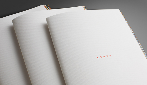
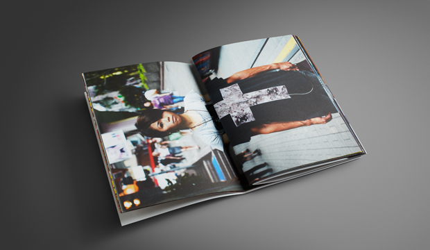
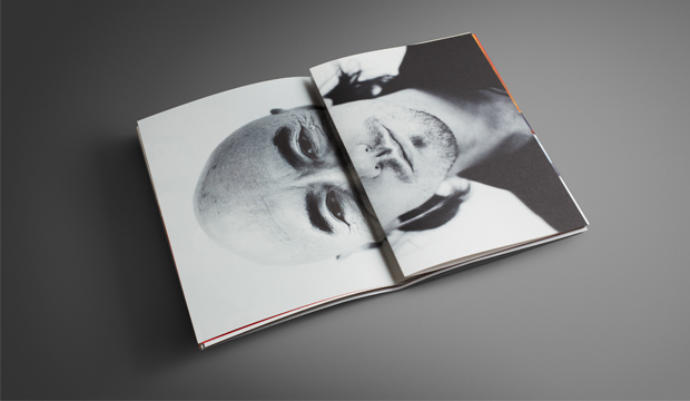
For seven days, James Braund explored the streets of Hong Kong, looking down the lane ways, discovering characters on the street and finding vantage points to absorb the metropolis. These are his observations from the trip, capturing the energy of Hong Kong and the ideas of Ted X.
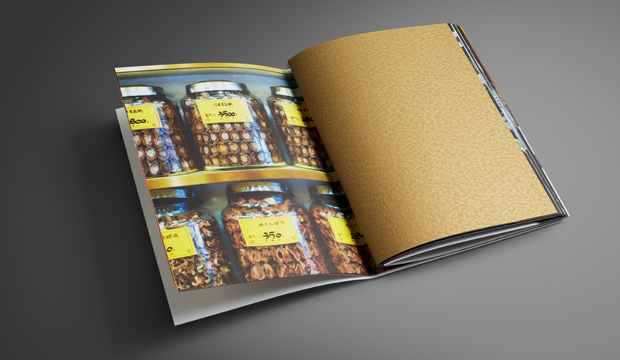
His collection of images have been beautifully reproduced on Conqueror CX22, a super smooth specialty paper made by Arjowiggins Creative Papers. Presented as a collection of loose A4 sheets means there is no binding to interrupt your view and favourite images can be easily pulled out for display. The A5 booklet features pages of solid colour, including a solid flood of gold ink on the Conqueror Contour – giving you the unusual effect of beaten metal.
A collaboration between the photographer, the designers and us has resulted in what we think is a beautiful little show piece. Something we’re really excited to be taking to market. CX22 is a paper often forgotten in the Conqueror paper suite but we think this book shows just how good the paper really is. It knocks the full colour off the page and the solids look dense and even. Definitely a paper to consider when looking for a premium print result.
Thank you to James for allowing us to print his beautiful images and a big thank you to Russell and Matthew from Clear. You guys always deliver the goods!
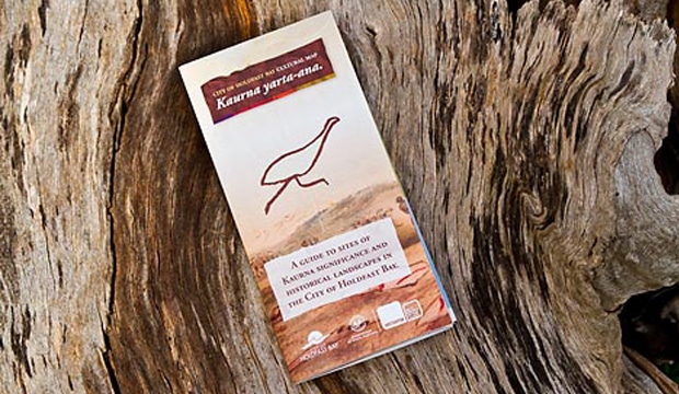
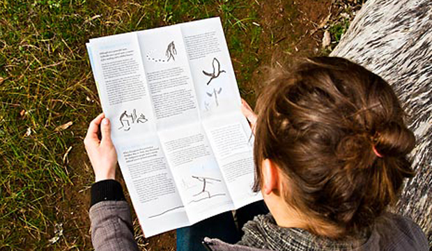
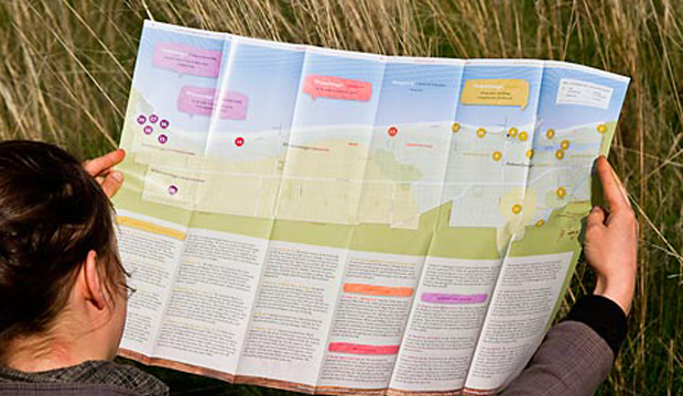
Title: Indigenous Cultural Map and Guide Agency:Ecocreative (SA) Creative direction: Matthew Wright-Simon. Designer: Clare Andrew. Stocks:Maine Recycled – Silk Printed by:Finsbury Green (SA)
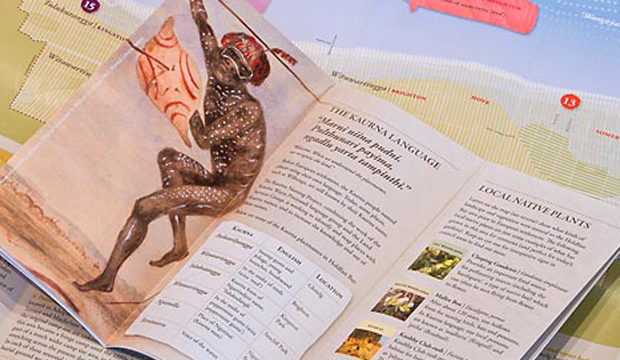
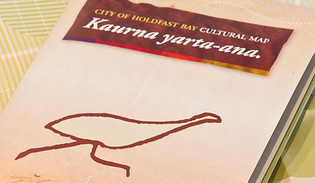
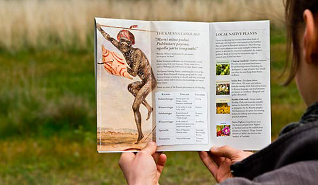
‘Marni naa putni Kaurna yarta-ana’. Beautiful isn’t it? This is how the locals from the City of Holdfast Bay in South Australia would have greeted you around 200 years ago. By the way, the translation is: ‘Welcome to Kaurna country’. The cultural map you see is by Ecocreative in Adelaide. It’s a beautifully designed guide created in consultation with the Kaurna Indigenous people of the Adelaide Plains, historians and academics. It explores language, history, biodiversity and storytelling and is printed on Maine Recycled – Silk 115gsm.
As the first council guide of its kind in South Australia, a strong visual identity was needed so Ecocreative set to work with this key piece of information in mind. The map highlights locations where native plants should be planted, forming a connection to Kaurna language and signage in the area. It also visually recreates the past, complemented with engaging stories. A Kaurna warrior painting is featured on the first page (suggested by one of the Kaurna participants), simplified figurines and an earthy colour scheme have also been used.
Printed four-colour process with vegetable-based inks by Finsbury Green (SA), the paper stock, Maine Recycled, was recommended to Ecocreative as the best environmental choice with a high resistance to cracking. “A very important aspect when producing a walking guide that will be opened and refolded repeatedly throughout its life,” Sarah van Maarseveen, Sustainability & Operations Manager from Ecocreative explains, “We chose Maine Recycled – Silk 115gsm because its hardy coated nature would stand up to coastal outdoor use.” Other sustainability credentials were also important, particularly the 60% recycled content, relevant especially in a project that emphasises past and future care of country and culture.
Many months and a lot of hard work later, Ecocreative have created a map that is being really well received by locals. They hope that this will set a precedent and help to share why ancient Aboriginal culture and language is so special. If it helps communicate to a broader audience in seeing their surroundings a little differently, even better. We think this is a case of ‘mission accomplished’.
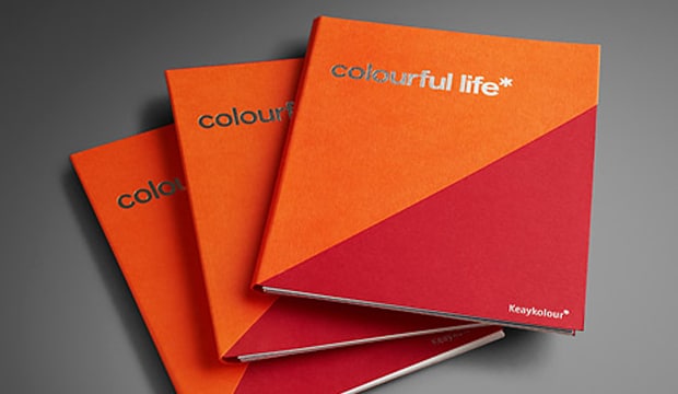
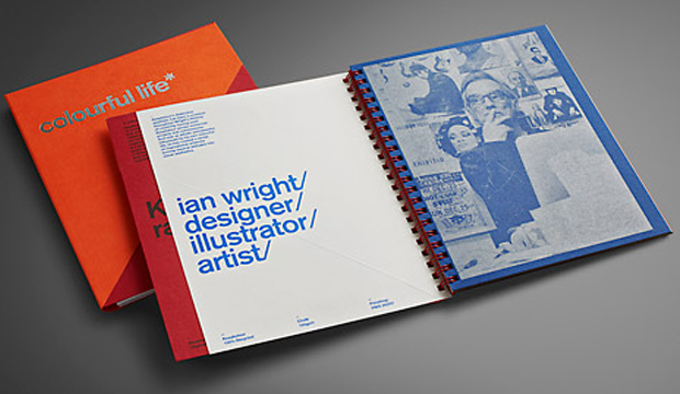
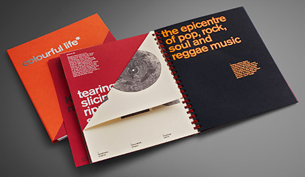
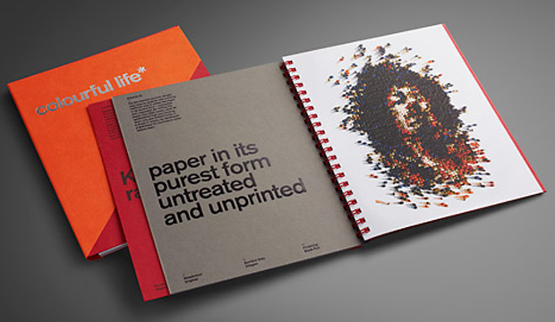
Keaykolour collaborated with Ian Wright, a contemporary artist, illustrator and designer based in the UK to come up with this musically inspired promotion. Ian has had a truly ‘colourful life’ at the forefront of contemporary design and illustration, creating iconic images for culturally hip clients. He has an original approach to image making, reflected in his three works of paper art.
The pieces include the replica of a JVC Boombox, portrait of Jimi Hendrix and a 7” disk of black vinyl. All of them have been created using paper from the Keaykolour range and by cutting, slicing, folding (and in the case of Jimi, rolling 2250 cones of paper, each 20cm high, into pre-drilled holes!), some original pieces of art have been created. Thank you Ian for reminding us how much fun paper can be. It’s like he has taken the primary school days of cutting and gluing and experimenting with paper to new heights!
Not too many tricks with this little beauty designed in collaboration with There Design (NSW) and the wonderful company behind Keaykolour – Arjowiggins Creative Papers. There is a duplex cover showcasing the new Tangerine 300gsm and favourite – Guardsman Red. The promo also features the new deeper coloured Jet Black and new grammages. We’ve used some screen printing, PMS 877U, silver and black foil action. The book comes flat, with some pages scored so that people can interact with them. We had a recent range update so we’ve included the revised stock table in the promotion.
If YouTube floats your boat, please visit our channel showing where you’ll find some behind-the-scenes footage and interviews with Ian Wright and the creative process he followed to create the homage to music that is the ‘colourful life’ promotion.
“The time I burned my guitar it was like a sacrifice. You sacrifice the things you love. I love my guitar,” Jimi Hendrix. Ok, so does that mean we need to burn paper to prove we love it? We figured a bonfire in the back of the warehouse would most likely breach an OH&S rule. A paper promotion seemed a much safer option!
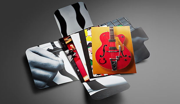
In our latest HannoArt promo, we pay homage to the worlds of music and paper. We added an educational twist by including tips about grain direction, colour, printing with blacks, stochastic/conventional line screen and also ink limits. Not to forget the awesome colour and visuals. We really wanted to showcase how well HannoArt handles solid colour and sharp detail. We pondered, we collaborated (with David Lancashire Design in Melbourne), we held production meetings (with Southern Colour in Melbourne) and fleshed out ideas over and over to come up with a promotion that uses achievable print techniques and includes technical information.
This post is going to provide you with some tips and insights into a few of the cards we printed. If you’re not keen on reading any of this, thanks for being here or call your rep and ask them for an in person demonstration. Soak up their technical knowledge!
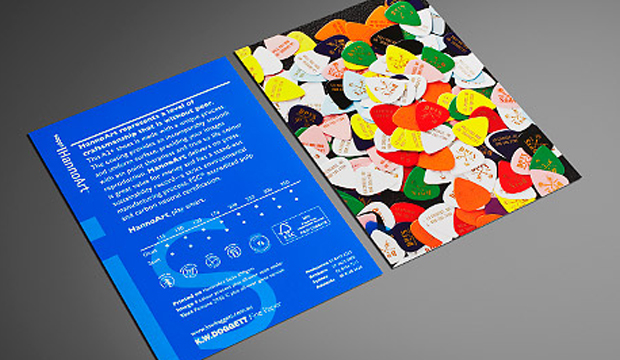
The spot matt etch, which appears on the front cover is probably the only technique that isn’t offered by a majority of printers. We firstly printed the cover with the fluoro pink, then had it laminated. The spot matt etch was done in a second pass. It’s a matt varnish technique has been applied to the black leather grain area only, leaving the glossy laminate to shine on the plectrums and the ‘IS’.
We purposefully designed some of the cards to be a comparator. The 4pp ’56 Gretsch Atkins card, is one of these. The left image is printed 4 colour process with all over gloss varnish. For the right image, we added a Pantone 877 Silver and spot OP matt and spot OP gloss varnish. We then perforated the card so our customers had the option to take one with them to a meeting and potentially leave one with their client. Now, there’s nothing wrong with the 4 colour image – it looks really good actually. But you can tell the difference with the contrasting card. The silver brightens up the bridge of the guitar, and the varnishes make the guitar pop off the page.
We used Pantone 2935 C for one card because it’s the HannoArt blue. This is such a tricky colour to print with and can be really challenging. The result shows how there is no mottling on the paper which is a really good result. No extra pressure was used for this card but we did use a stochastic screen to produce crisp, clean edges in the small logos and tiny type. Gloss varnish was used to seal in the colour better.
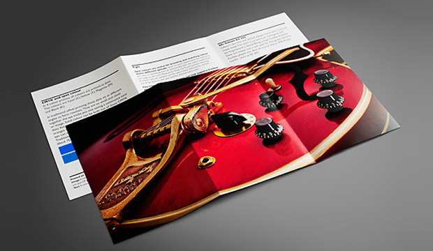
We’ve got an unofficial favourite – the 6pp red guitar. We tricked this one up on purpose. It was good for us to see what difference the Pantone Rubine Red C bump plate could make with this type of image. The body of the guitar just looks so much brighter and richer with it. And the Pantone Silver underlay boosts up the hardware. On the back, there are tips on colour, so we replicated a small square of the Pantone Blue with a CMYK blue to show the difference. It’s pretty obvious, the difference, and handy to know the compromise you’ll make if budget doesn’t allow for a PMS.
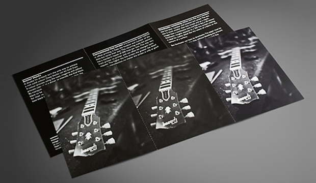
The final card in the pack shows three images – a 4 colour b&w stochastic, monotone stochastic and monotone conventional. On the reverse we have printed three blacks. The 4 colour b&w printed stochastic is a stand-out in this set, a much warmer black. On the reverse, we’ve show just how different stock looks with a varnish, we printed each card with a strip of satin sealer, gloss varnish and then no varnish. We perforated this card as well so you can compare the blacks next to each other.
You may recognise the images we’ve used are from the 2010 promotion Sappi released called ‘Dave’s Guitar Shop’. In Wisconsin USA, Dave’s famed guitar shop houses a rare collection of guitars by legends like Gibson, Fender and Gretsch and other music legends. This place is apparently a mecca for guitar lovers from all over. As an extra bonus, we have a Dave’s Guitar Shop plectrum in the promos! Just like the iconic instruments at Dave’s, HannoArt bears the hallmarks of quality and craftsmanship.
Printing specs:
Folder (outside): Satin 250gsm, 4 colour + Pantone 806 C (plectrums). Spot matt etch. All over gloss laminate.
Folder (inside): 4 colour black and white image, matt laminate.
Card 1: 2pp, Satin 350gsm.
Text: 4 colour process plus all-over satin sealer.
Image (close-up of the Dave’s 25th anniversary guitar) : 4 colour process + all over gloss varnish.
Card 2: 2pp, Satin 350gsm.
Text: 4 colour process plus all over gloss machine varnish, Pantone 2935 C.
Image (branded plectrums from the front cover): 4 colour process. All-over satin sealer.
Card 3: ’56 Gretsch Atkins. 4pp, Gloss 300gsm.
Left image: 4 colour process. All-over gloss varnish. Perforation at 6 TPI (teeth per inch).
Right image: 4 colour process. Spot Pantone Silver (first pass). (Second pass) Spot OP gloss varnish over the guitar and spot OP matt varnish over background to create a contrast. Black plus all over gloss varnish.
Tip: Ink limits.
Card 4: Three Fender Telecasters from the 50s. Gloss 170gsm.
Image: 4 colour process. All-over gloss aqueous varnish. Scored and folded.
Text: Black plus 2 hits Pantone Silver 877 C. All-over gloss aqueous varnish.
Tip: Grain direction.
Card 5: 60s Gibson ES 355. Gloss 250gsm.
Image: Pantone Silver (separation). First pass. 4 colour process. Second pass. Pantone Rubine Red C (separation). Bump plate in second pass. Spot OP gloss varnish on timber areas.
Text: Black plus all-over gloss varnish. Left card has two squares: PMS 2935 (same as the blue on card 2) – CMYK (which shows the nearest match you can get using a CMYK breakdown).
Tip: CMYK and spot colour.
Card 6: Satin 250gsm. 6pp.
Image (left): Black monotone printed stochastic. FM screen, 20 microns. Satin sealer.
Image (middle): Black monotone printed conventional. AM screen, 200 lines per inch. Satin sealer.
Image (right):4 colour black and white, printed stochastic. FM screen, 20 microns. Satin sealer.
Text (left. Tip – Better blacks: 4 colour black. K100 with underprint of C40, M20, Y20.
Text (middle). Tip – Conventional line screen: Dense black.
Text (right). Tip – Stochastic screening: Standard process black.
Varnishes Each text card has three varnishes applied to it in columns. First column is gloss varnish, then satin sealer then no varnish.
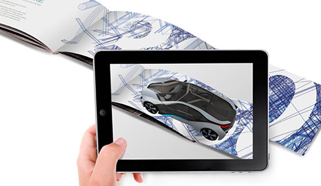
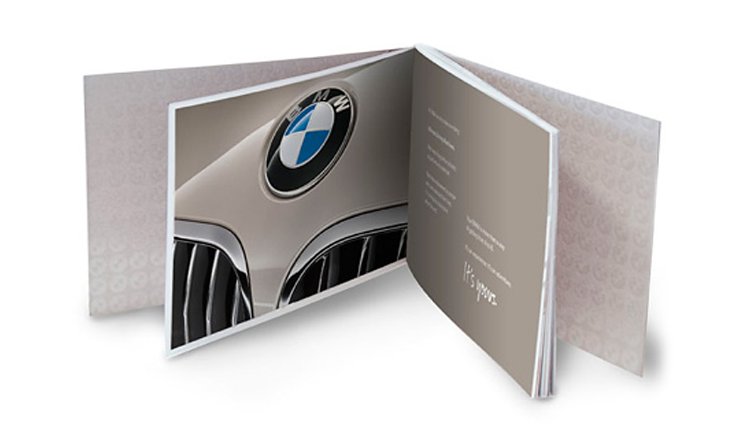
This is a story about a small yet very exciting printed piece indeed. Why is this so you may be thinking/asking/pondering? It’s because it merges offset and digital print, paper, AR (augmented reality) and IR (image recognition) technology all in one tasty package. Safe to say, we like it a lot.
Ogilvy in Melbourne were asked to design a piece for new BMW drivers. Something that would connect them to the BMW experience, even when they’re not behind the wheel of the new car they’ve just purchased. The piece also needed to generate a relationship between the buyer and their dealer.
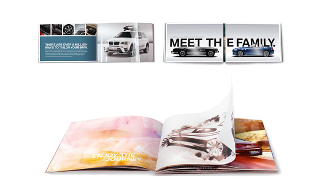
Two of our stocks feature in the booklet. The cover was printed on 340gsm Knight Vellum, text 170gsm HannoArt Silk, 140gsm Knight Vellum and 200gsm Knight Vellum (a 112gsm clear translucent trace paper and 96 micron clear acetate were also used). On some pages, a high build UV varnish appears on a matt stock, which feels good to touch. In other cases, it’s a heavier textured stock followed by a silk page.
The variety of grammages, papers and print techniques have transformed this brochure into ‘an experience and an adventure’. The additional use of IR and AR technology enhances the interactive nature of the booklet. Watching some of the pages come to life, revealing behind-the-scenes video footage, is pretty damn cool. Especially the page that starts with an engine rumble which makes your phone/iPad vibrate! Seriously, you’ve gotta love technology. Stick it together with paper and you may have created Paperland heaven right there.
As Dave Scott from Ogilvy explains: “Although some of the techniques are there to wow, elements like the acetate page also serve a purpose, demonstrating options you can buy for your BMW. We wanted it to be subtle, to feel designed, something that every second page would surprise or delight without shouting.” Mission accomplished.
This job is a great example of offset working seamlessly with digital print and using outside embellishments to gain the best possible results. Increasingly, we’re seeing great examples of print and digital technologies working really well together as a complete package. The possibilities are becoming more and more exciting and a bonus for brands wanting to create a unique experience. We might be biased but can you blame us? Exciting times people. Get on board!

 Footy Tips