High Fangs band collateral

Title: High Fangs band collateral
Agency: Grosz Co.Lab (VIC)
Client: High Fangs
Stocks: JAC Fluorescent / Kaskad / Sovereign Offset
Printed by: Grosz Co.Lab (VIC)

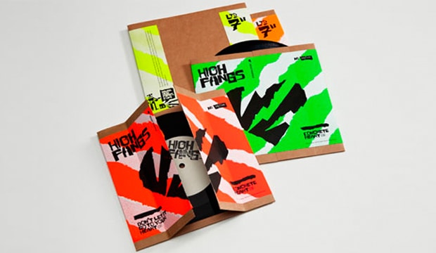
The marketing team has voted. If any of us leave Doggett’s, we’re joining a rock n roll band. In the meantime, we’ll take the use of our stock, uncoated JAC Fluorescent, as the closest link we have to a future in the music industry. Grosz Co.Lab, a Melbourne based design studio, have crafted a graphic language for High Fangs, a Melbourne three piece. A truly original visual aesthetic that encapsulates the band’s DIY rough and ready sound and live performance reputation has been created.
High-fangs_6

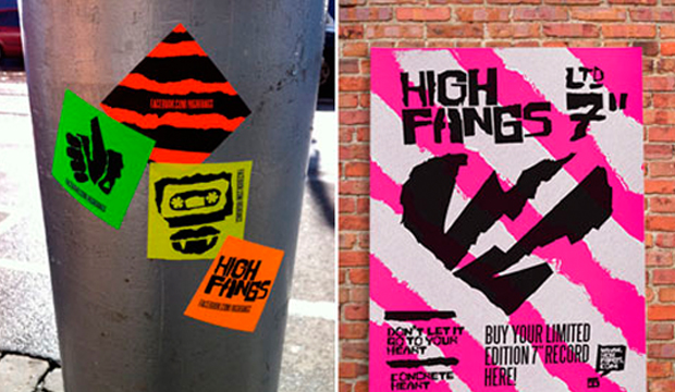
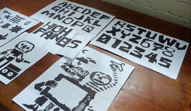
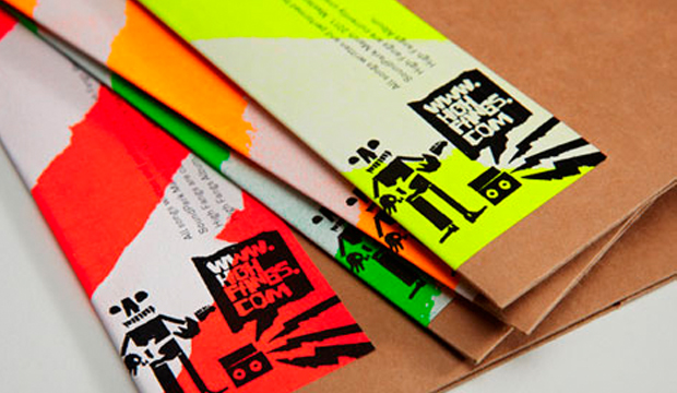
Just to put the band into context, they’re described as: ‘A fusion of 60s Garage, 70s Power Pop, Stiff Records New Wave, 00s Swedish Punk energy minus an Ikea™ Allen Key’ on their site. Somehow, this explains why JAC Fluoro is such a good choice! The visual language includes a typeface (High Fang irregular), gig posters, packaging and 3D props, logo, icons, illustrations, symbols and graphic patterns. The torn paper approach seen throughout the work provided a communication style totally reflective of the band’s music and work.

As Ben Grosz (designer by day, band member by night) mentioned to us: “We purposefully decided to do the printing ourselves in the Grosz Co.Lab studio. It’s been so enjoyable to get our hands dirty and create every piece of collateral from print to props by hand.” JAC meant Grosz Co.Lab could achieve maximum visual and economic impact, also deciding to use the stickers for guerrilla marketing, merchandise packaging or to giveaway at gigs.

Ben mentioned they had to do lots of tests before choosing to stencil white acrylic paint (using strips created by tearing, scanning, vectorising and printing a stencil to cut-out) directly onto the JAC adhesive. When the sheets were dry enough they manually fed them hrough a very cheap A4 black and white laser printer for overprinting. The fluoro colour ways of green, orange, red and yellow were rolled-out across 300 hand made, tear open record sleeves for the band’s 7″ double A side single ‘heart tearing’ themed release.

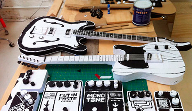
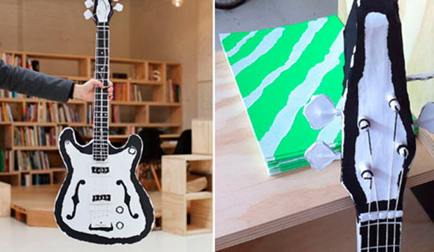
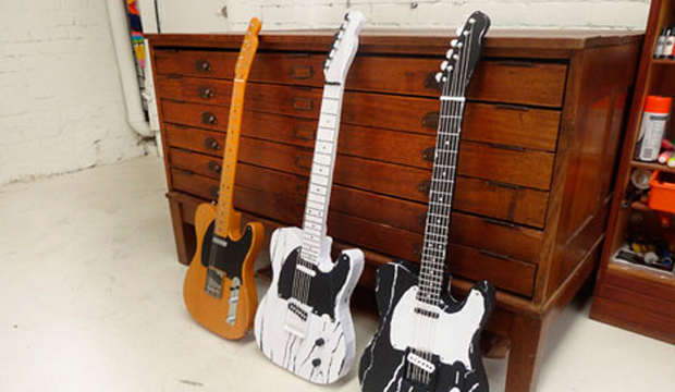
Not up for stopping there, Grosz Co.Lab recycled previously purchased and unused poster sized stock, tearing and transforming the Sovereign Offset 120gsm and Kaskad Raven Black 160gsm into electric guitars for the band’s video clip. The paper was stuck on cardboard and foam core frames.

It seems some lateral thinking, a cost effective, individual approach and a glue stick = maximum impact. Our JAC Fluoro never looked so cool. Long live rock n roll!
High-fangs_1

High-fangs_2

High-fangs_3

High-fangs_4

High-fangs_5

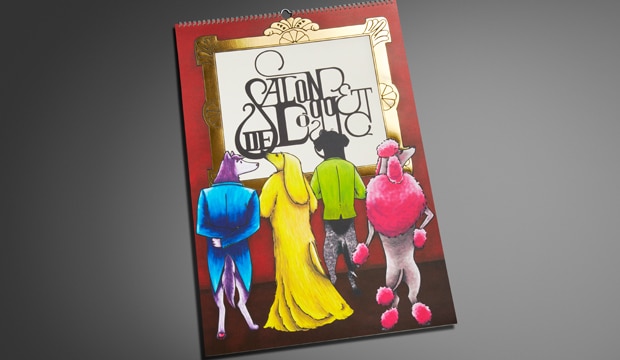
The 2013 calendar ‘Salon de Doggett’ is unveiled!

Title: 2013 calendar – Salon de Doggett
Agency: University of Technology Sydney (UTS), Bachelor of Design (Visual Communication) students
Client: K.W.Doggett Fine Paper
Stocks: Envirocare 100% Recycled / HannoArt – Satin / Knight – Textures / Knight – Vellum
Printed by: Offset Alpine Printing (NSW). Embellishments: Gold Craft Embossing (NSW)

The calendar pays homage to art movements and famous artists with canine adaptations. Imagine the Mona Lisa from the Renaissance period looking much furrier than usual! Or Picasso’s abstract Weeping Woman as a pouting pooch. These classics sit alongside dogified originals from the Graffiti Art, Bahaus and Art Deco movements, just to name a few. We’ve been producing the calendar for 26 years, as a gift for our customers. We are still, after all this time, blown away by the creativity and professionalism the students show.

Printed stochastically with 4 colour process and UV inks, the cover is printed on Knight Vellum  200gsm and features a striking gold foil. HannoArt Satin 200gsm, Envirocare 100% Recycled, Knight Linen 280gsm and Knight Vellum 200gsm are all mixed within the 12 months, with a few surprise embellishments too.

A special thank you to Amy Commons, Creative Director of Sai Designs and Tutor at UTS, as well all the students for their hard work and effort in producing an amazing calendar. The students we had the pleasure of working with (in no particular order) are: Carina Lee, Eleanor Cliffe, Jamie Lo, Nikki Lo, Ash Myburgh, Susanne Peng, Lucy Turnbull, Vanson Han, Thiwanka Somaratna, Lucinda Dryden and Yewon Chung.

Your fine paper specialist will be around shortly to drop in your 2013 calendar – where you can see these 12 beautiful (slightly familiar) loveable pooches for yourself.

Cover – Nikki Lo.
January (Futurism) – Jamie Lo.
February (Renaissance) – Susanne Peng.
March (German Expressionism) – Lucy Turnbull.
April (Graffiti Art) – Vanson Han.
May (Bahaus) – Thiwanka Somaratna.
June (Cubism) – Jamie Lo.
July (Art Deco) – Lucinda Dryden.
August (Post Impressionism) – Vanson Han.
September (Ukiyo-E) – Vanson Han.
October (Day of the Dead) – Carina Lee.
November (Surrealism) – Yewon Chung.
December (Pop Art) – Ash Myburgh.
Typography and layout – Eleanor Cliffe
Project management team – Carina Lee, Eleanor Cliffe, Jamie Lo.

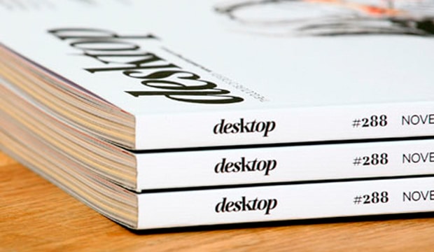
desktop’s love affair with print and paper – the November issue

desktop has long been the main go-to magazine for Australian graphic designrs. Rejuvenated early last year with a new look, it’s gone from strength-to-strength with even better visuals and content. And the best has got to be the November issue – a love affair with all things print and paper. Could the day get any better?

It starts with Matt Huynh’s beautiful illustration on the front cover (see above) and carries through to the gorgeous designs showcased across varying print techniques. It’s great to see print and paper celebrated in such style. Everyone that took part in making this edition happen approached it with pride and comittment and of course, a love of print.

All the paper merchants have come to the paper party too. We’re there flashing our wares in the ‘Special Inks’ section with Strathmore Premium Super Smooth Ultimate White 176gsm (formerly Expression) and the ‘Embossed’ section with Rives Design Natural White 120gsm. We’re kind of partial to our sections but they’re all pretty snazzy, so do pick up a copy and take a good look for yourself. It is definitely a keeper and worth every penny of the $9.25. Well done desktop!

Here’s the hit list of techniques and design studios included:
Special Inks: Toben, Deuce Design
Foiling: Babekuhl, Luke Brown
Special Papers: Alter, Work Art Life
Die Cutting: Parallax Design, Leuver Design
Embossing: A Friend of Mine, Pidgeon
Digital Printing: Photo Essay, Retrospect
Stocks: Expression Super Smooth / Rives Design

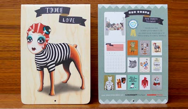
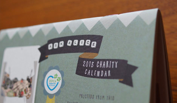
‘Tough Love’ the 2013 Ask Alice charity calendar

Title: Tough Love 2013 charity calendar
Agency: Ask Alice (coordinated by)
Stocks: Knight Digital – Indigo / Rives Design
Printed by: Bambra Press (VIC)

Ask Alice is a website worthy of being checked out and purchased from. And now with the edition of the 2013 charity calendar titled ‘Tough Love‘, there are more reasons to do some online shopping! This A5 beauty is printed on Rives Design 250gsm (cover) and Knight Digital – Indigo 270gsm (text) and for a lazy $20, you can spend all day admiring one for yourself.

The illustrations, a mix of quirky pooches and cats, are all originals from a range of talented artists like Agata Dudek, Angelique Houtkamp, Anna Martinez Harris, Cat Rabbit,Dieter VDO, Gemma Correll, Liam Barrett, Liam Sparkes, Matte Stephens,Rik Lee and Rona Green. All brought together by Sass Cocker, the woman behind Ask Alice.

And better still, 100% of the proceeds are being donated to the ‘Dog rehabilitation program’ run by the RSPCA of NSW and CSNSW Australia. It brings together dogs from shelters deemed unsuitable for re-homing, with inmates from one of Australia’s prisons located in NSW. The inmates provide behavioural rehabilitaion for the pooches so they can eventually be adopted out to caring families. This in turn provides training for the inmates which assists with employment opportunities when they’re released. Such a positive environment for everyone involved and even more amazing that it’s all about the greater good for the pooches. We heart this project.

Ask-Alice-Tough-Love_2

dmzine: Design Management Online

If you haven’t checked out the dmzine website lately (or ever), take some time and explore it. It’s full of great content for a design studio employee or owner, brought to you by Carol Mackay and Greg Branson, principals of Mackay Branson, an independent design studio based in Melbourne. We love this site, particularly for its excellent print production articles, which include such things as greenwashing, why do a press check, what paper costs, and this particular article is all about stochastic screening.

Carol and Greg set up Mackay Branson design in 1984. This innovative and business-savvy duo have often faced a common problem, which was getting their clients to take design seriously. They believe that in part, this is because not all designers are as good at business as they are at design. That designers work in their business but not on the business. To overcome this, dmzine has now published a range of eTutorials through the Design Business Council. Design is part of our community and dmzine is a chance for Carol and Greg to give a little back.

Together, Carol and Greg have gained a great deal of knowledge during the past 25 years about running a design practice. dmzine is about sharing this knowledge. Outside of Mackay Branson design, Greg is also an influential member of the Australian design community with involvement at VCE, TAFE and university levels. He is currently the CEO of the Design Business Council – an organisation that promotes the use of design in business.

Impact paper promotion – Wild Will 2012

Title: Impact booklet
Agency: Thursday Design (NSW)
Client: K.W.Doggett Fine Paper
Stocks: Impact
Printed by: Southern Colour (NSW)

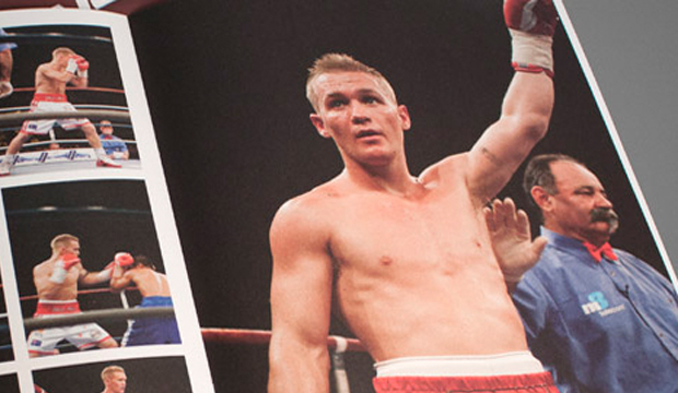
In 2009 we profiled young, up-and-coming boxer ‘Wild Will’. Back then he was preparing for his fight against Samson Percy. The fight was the undercard to the match between Anthony Mundine and Shannan Taylor. Wild Will went on to win that fight and many more since. He now holds numerous belts including the IBO World Super Featherweight title. You might say he has made quite the ‘Impact’ on the boxing scene.

Recently, we tracked Will down. Shown above is a photo of what he currently looks like. The word ‘ripped’ springs to mind plus he looks a little older and definitely has a flatter nose – no doubt the result of the few times he failed to duck!

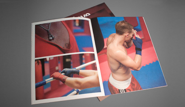
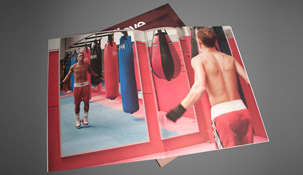
We have re-printed a shorter version of the original promotion as many of you didn’t get the chance to see it the first time. Next year, we shall give you a new Impact promotion but for the time being ‘take the shot, don’t drop your guard. Make an Impact’. Impact paper is a bright white uncoated paper made from 100% recycled pulp. It is carbon neutral from raw materials through to K.W.Doggett Fine Paper warehouses and is available from light text weights to heavy card weight.

Wild-will_1

Wild-will_2

Wild-will_4

Wild-will_5

‘In the groove: scoring and folding creatively’ video

This awesome video is from Sappi Fine Papers, the manufacturers of our HannoArt Gloss and Satin papers. Who knew scoring and folding could create such interesting results! Guest speakers Kit Hinrichs, founder of Studio Hinrichs, and Trish Witkowski, chief folding fanatic at the online community foldfactory.com, open our eyes to the scoring and folding possibilities.

HP ElectroInk white – viva la (technology) revolution!

A couple of months back we had a burst of inspiration after seeing some digital projects featuring white ink. We decided the only thing that could scratch our itch was some experimenting, so we trotted off to Bambra Press in Melbourne and spoke to Carbon8 in Sydney. As a result, here’s 12 short tips and observations on working with the white ink.

Electro_3

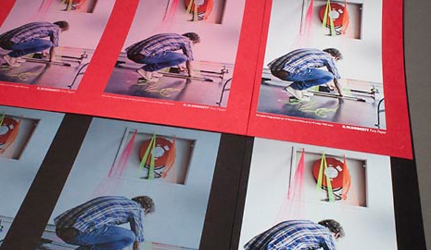
The fairly new ElectroInk white process, is currently only available for Indigo presses. It allows you to print opaque white ink on coloured or darker papers, providing a result that was traditionally only achieved through screen printing, matt pigment foiling, or through many passes on an offset press. And as the ink is opaque, it means you can print 4 colours straight over the top without it soaking back into the sheet.

  1. How many hits? When requesting print samples of your work, ask your printer whether they think one, three or five hits of white ink is better. Generally, Bambra feel that between three and five hits is enough for a foundation. Seven is the most they’ve ever needed to do, dependant on the stock and the nature of the job (each extra hit will add to the cost).
  2. The best result. Around three to four hits of white looked really good when we tested it. The first hit wasn’t strong enough – it made the type and images look washed out. The more we pushed the hits of white, the greater the result, but it often resulted in ink picking. Mis-registration also started to creep into the mix (the paper will inevitably move around the machine a little).
  3. Picking. The slight picking occurs because there’s too much wet ink. The Indigo uses a lot of pressure so with fine layers, each layer can pull the ink away slightly, increasing the chance of picking. Bambra note that thicker boards may have a tendency to do this (FYI a 300gsm sheet may mic up differently from one to another – gsm is a measure of weight not thickness so be aware of this when choosing paper).
  4. Type. The type held up really well. Even the 7pt type only started to pick slightly when we did seven continuous hits of white ink (see pic 4 above).
  5. Coloured paper. In days gone by, digital printing pretty much meant coloured ink/toner on white or light coloured papers. HP ElectroInk has increased the capabilities of digital printing, allowing you to print on almost any coloured paper. This is perfect for short run jobs that need to make an impact, like invitations. You can use the white ink as a base on which to apply 4 colour over the top (the colour won’t soak back), or use the white on its own, or apply white over the top of 4 colour, depending on the desired result.
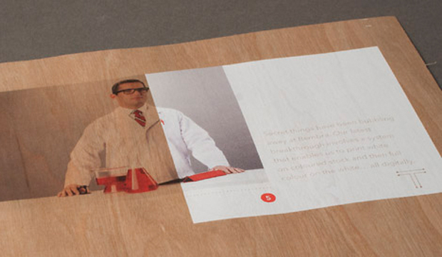
  6. Substrates.  Indigo presses work best with papers that are treated with a coating that provides maximum tac to the ElectroInk. There are many HP certified papers with this coating, but not so many coloured options. In our trials, we found that non HP certified papers can work too. Keaykolour Tangerine 300gsm, Royal Blue 250gsm, Jet Black 250gsm and Guardsmen Red 300gsm all provided great results without any additional coating. Bambra have even printed balsa wood (see pic.5 above) without it being coated. Amazing! If you are planning to use a standard sheet, best discuss a mini trial with your Indigo printer first. Some printers also offer the option to coat a standard sheet in house. We have seen some great results with this extra coating on unusual stocks like Boxboard and Chill Board. Carbon8 pre-coat stock and have so far used everything from Kaskad, Curious to Buffalo Board through their machines.
  7. Drying. A job printed with white ink needs to dry and the more hits of ink, the more time it needs but it’s not like offset printing. ElectroInk should dry in a matter of hours not days, retaining the benefits of a fast turnaround for digital print.
  8. Short grain. Paper was cut short grain (450×320) because the press feeds on the short edge and we used stock over 200gsm. Cut the sheet long grain when using stock that is 200gsm and under.
  9. Roller marks. We noticed a roller mark on one side of the sheet when we did our print trials. It might be best to set-up your artwork accordingly, or at least ask your printer what to do.
  10. Choose a good printer. Partnering with the right printer (who has the capabilities to print with white) is essential. The machine can’t operate itself! So find someone willing to push the boundaries with you. It’s also best to work with them in the beginning to set your files up properly. As Carbon8 mention: “Sometimes (as a printer) you have to stop yourself from saying ‘it’s good enough’. You need to take more time. A good printer knows how to make the white, white.” That’s the kind of standard you want to hear.
  11. Designer hot tip! A great tip from Carbon8: Remember, when setting up your files, the white ink layer needs to go down first with all the other colours on top of it. Any objects that you want to print/appear above the white, need to be set up to ‘overprint’. You can check in Acrobat if you have prepared it correctly by going to ‘output preview’ and turning off the CMYK separations. If you do not see the full white separation but instead a reversed out image of the CMYK plates, then it is being ‘knocked-out’ and will not sit below at 100% as it should.
  12. Costs. This will vary according to the number of hits because there is a per click/hit charge (a ball park figure, printing may cost around 75c-$1+ per sheet). White ink is a tricky process so there is a set-up cost too, a bit like doing a traditional embellishment. But the benefit of digital print is although it is expensive per unit you can keep the units as low as you need and therefore keep costs affordable.

So there you have it paper lovers. If you do any work with white ink in the future, please share your tips with us on our Facebook page or via Twitter (@KWDoggett) using the hashtag #whiteink – we’d love to hear about your experiences and see pictures of you work.

A big thanks to Brett and the team at Bambra Press for their hospitality! We conducted the trials on their HP Indigo 7600. And thank you to Ken from Carbon8 for your advice and time!  Carbon8 run white ink on their HP Indigo 5500 and 3050 presses.

Electro_2

Electro_4

Electro_5

Regal Rogue – Australia’s first vermouth

Title: Regal Rogue corporate identity and branding
Agency: Squad Ink (NSW)
Client: Regal Rogue
Stocks: Envirocare 100% Recycled
Printed by: Clarke Murphy Print (NSW)

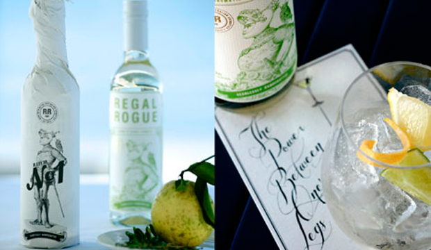
“Regal Rogue is a unique Australian aromatic vermouth. Sourced with brawn and crafted with heart for all the world to savour.” Cheers to that! We love that whimsical sentence from the Regal Rogue website. You may be thinking: ‘Since when did Australia and vermouth appear in the same sentence?’. Well, they do now. A Hunter Valley style, classic cocktail mixer, exists. For real. And the wrap of the bottle is printed on our very own Envirocare 100% Recycled 70gsm.

Regal_3

Squad Ink in Sydney, run by twin brothers Terry and Matthew Squadrito are behind the identity for this innovative brand. They were brought into the mix by marketing entrepreneur and Regal Rogue founder, Mark Ward (Bureau Six), in collaboration with winemaker Lisa McGuigan and Yakusan’s Gilles Merry providing strategic brand insights.

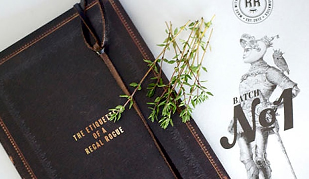
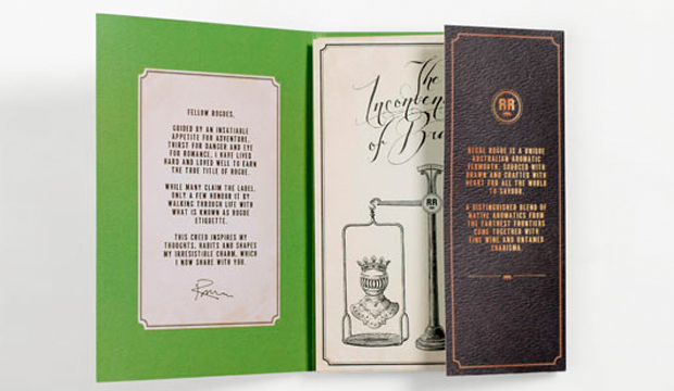
The wrap on the bottle is really beautiful, printed 1 PMS. The quirky illustration is of a Knight in armour and an owl sporting a crown, nutty but we love it. Squad Ink wanted the packaging to lend itself to fitting in with today’s commitment to sustainability ie handmade v mass produced, small v gigantic, natural v artificial. In a world full of so many choices, it is often all about the packaging and this bottle is a stand-out in that respect.

Squad Ink further developed the rogue knight’s story by highlighting his roguish ways through a series of etiquette tips and serving suggestion cards. ‘The Etiquette of a Regal Rogue’, with clever copy from the peeps at Copy&Co (see pic on the Squad Ink website). They also called it ‘Batch No.1: ‘Fearlessley handcrafted’ which sounds superbly roguish to us!

One last thing, if you love this project and would like it to win some glory, go forth and vote for it in the Sydney Design Awards.

COMPETITION DETAILS: To enter, please send an email to communication@kwdoggett.com.au with your answer to this question:

If you win, where/when will you be drinking your Regal Rogue?
A. At your local park out of a brown paper bag.
B. At a cocktail party held in your friend’s pimped-out pad.
C. By yourself next Saturday night because everyone else has gone to the AGDA Awards.

Winner will be drawn on 30 November 2012 and be notified by email.

Regal_1

MyPrintFolio – a new service by Arowiggins Creative

Hmmmm, let’s see. Your work printed on primo paper, delivered straight to your studio door. Does that sound like something that would float your boat? Arjowiggins Creative Papers, widely known as the makers of the world’s most fabulous creative papers, have produced an easy-to-use online service where you can generate a stunning printed portfolio. As the exclusive suppliers of their papers, we’re proud to bring this new service to you attention!

To use MyPrintFolio, upload your work, choose from a number of formats and bindings then select your paper from their global range. With more than 20 on offer, including bestsellers like Conqueror, Keaykolour, Pop’Set, Curious Collection and Rives, the choice is not so easy! Finished size can be A3 or A4, portrait or landscape and there are five different binding techniques on offer. The cover can be customised with your name/company/project. Pay some cash and then Arjowiggins Creative Papers’ dedicated printing partners do the rest. Your folio will arrive within approximately two weeks. We likey!

A killer portfolio makes a strong impression. Whether you need to clinch a job or commission, get an idea into the hands of a prospective client, employer or collaborator, there’s nothing like a tactile extension of your online gallery to showcase your talent and creative story. The digital print is really high quality and produces vivid, true-to-life colours on beautiful stock. You could even use this service for client presentations, photo albums and the like. Makes for a great Christmas gift too.

Check out the MyPrintFolio website for some inspiration and FAQ’s re how to get started. Put simply, the service is kind of like painting by numbers – 2012 style.