Delightful orange business cards by Poco People

Title: Tangerine business cards
Agency: Poco People
Stocks: Keaykolour Original
Printed by: Avon Graphics

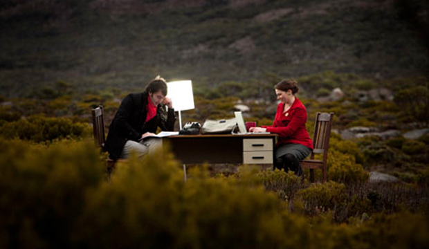
Poco People is made-up of Kelly Eijdenberg and Travis Tiddy – two passionate, creative designers from Tasmania. We love to be inspired by design and it’s a pleasant surprise to find out a customer has been inspired by us! A recent visit from Peter Hansen, our Corporate Business Development Manager with our new Keaykolour ‘colourful life’ promo in hand, sparked their excitement and sent their love of orange into overdrive.

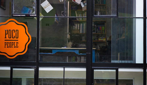
Kelly recalls Peter walking into their studio and saying: ‘I’ve got something you’re really going to love’ and boy, was he right. The duplex cover with our new, toothy, Tangerine (a delicious shade of orange) and old favourite Guardsman Red, combined with silver foil had the pair mesmerised. By the way, their love of orange extends to high vis work wear (we’re not kidding) and also to a one metre square tangerine coloured vinyl sticker on their office window.
Poco_2

Initially, they grappled with whether they should print on one side and foil on the other. They were rapt with the result and how Keaykolour held the foil on both sides as well as the thin type. The business cards are a miniature 55 x 70mm size but they sure do pack a punch. Avon Graphics in Victoria seriously impressed Kelly and Travis with their support and fast turnaround time (the cards arrived just in time for their office launch). Don’t you just love it when everything falls into place like that?

We asked Kelly what she loves most about the new Keaykolour shade: “This particular Tangerine is so strong and rich – a touch deeper and darker than your typical bright orange. We think it’s really a special colour that and we knew it would help our business cards stand out. They certainly can’t get lost on a client’s desk!” The Poco People also plan to produce letterheads and already have a paper stock in mind, Kaskad Fantail Orange, which would complement the Tangerine cards perfectly. You can find Poco People on FB, Twitter or Linked In.
Poco_1

Curious Metallics greeting cards

Title: Curious Dogs
Agency: Jacky Winter Group – Fleur Harris
Client: K.W.Doggett Fine Paper
Stocks: Curious Metallics / Curious Metallics Iridescent
Printed by: Docklands Press (VIC)

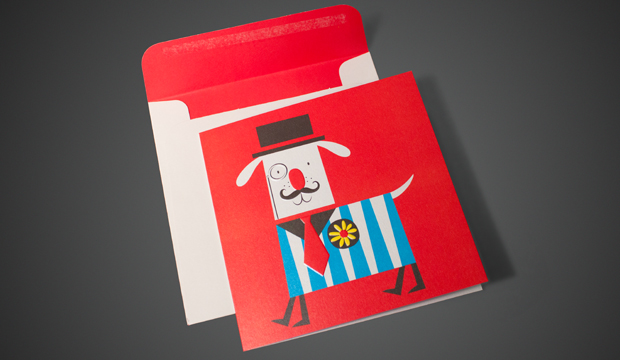
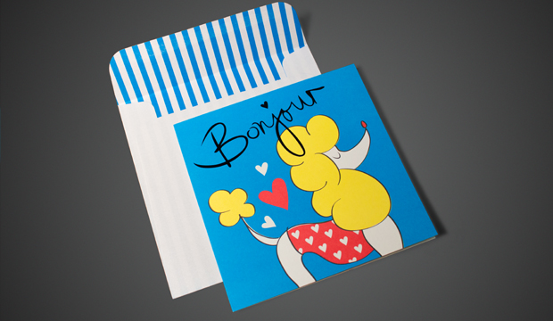
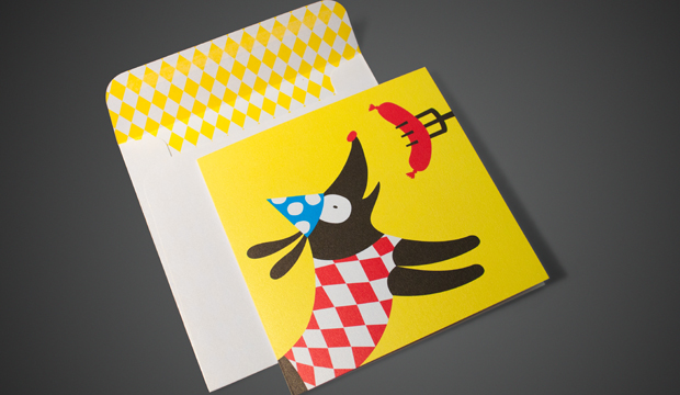
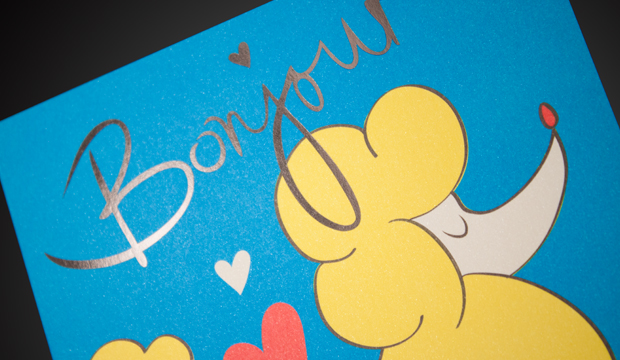
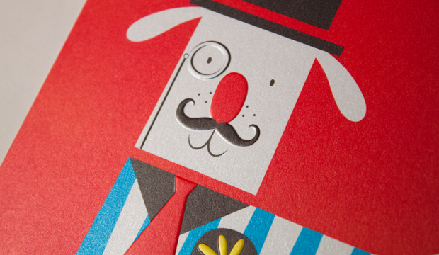
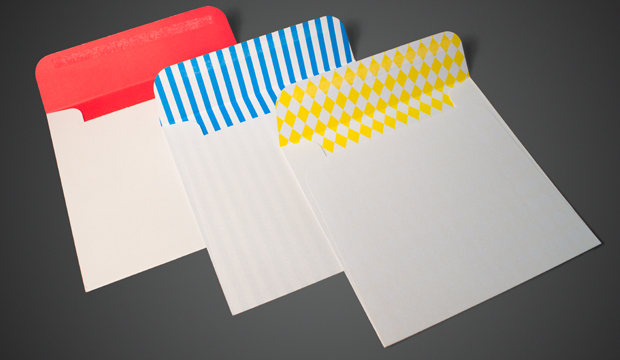
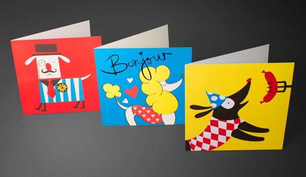
Why is it that dogs are always speaking French? We’re not sure, but these little Curious pooches are no exception. Illustrated by Fleur Harris (Jacky Winter Group), these vintage style cards feature three pups. A French poodle, a sausage dog and a bulldog. Printed on Curious Metallics paper they pop with colour and make a cute little gift set. The cards are printed offset on Ice Silver, Ice Gold and Cryogen White.
Blank on the inside, they are designed for any occasion, open to your imagination really. They are a gift from us to you to use at any time of the year. We are always searching the office for a thank you card or a last minute birthday card. So keep this little pack in your desk for just such an occasion. They are also designed to show that Curious Metallics paper looks great with full colour and can be used in a variety of ways. Metallics aren’t just for wedding invites! Coming to your studio soon. If we don’t call on you but you’d like a set anyway, drop us a line and we’ll post a pack out to you. Email Catherine Doggett cdoggett@kwdoggett.com.au

Curious-greet_2

Curious-greet_3

Curious-greet_6

Curious-greet_4

Curious-greet_5

Curious-greet_7

Sukin organic skin care

Title: Sukin organic skin care
Stocks: Buffalo Board
Printed by: Press Print Digital (VIC)

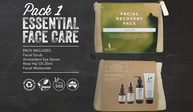
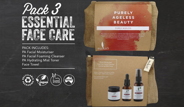
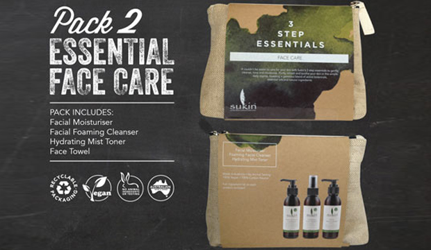
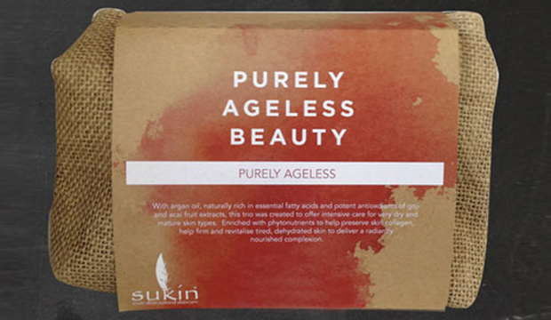
You may recall the article we featured in the last issue of Fetch about white ink (search for HP ElectroInk). Well, check out this cool print sample we’ve just seen! The packaging was created by Jayden Zernich, Senior Graphic Designer at Sukin and printed digitally on Buffalo Board 272gsm.


Sukin is an organic, wholesome, Australian made skincare range. To complement this message, Jayden chose to work with Buffalo Board. He also knew that its unrefined nature would contrast perfectly with white ink. By using custom water colours, Jayden felt that this would maintain the organic look and feel on the outside of the box and also match the product within. The range includes three separate packs, so he played with colour to differentiate the various face care products. To distinguish between the curves created from the water colour treatment and still achieve a strong impact, he incorporated a structured, almost geometric typeface. The result is a unique, softened colour dynamic between ink and paper.

The packaging suite was printed on an HP Indigo press at Press Print Digital (VIC). Jayden mentioned to us that he chose to do this job digitally eliminating the need for plates which are required for offset printing or white foiling. We seriously love the result. It was such an ‘Ooooooo’ moment in the office when the sample came in. The colours are really vibrant in the flesh and we love to see Buffalo Board wrapped around such a primo product. Christmas shopping at Sukin, anyone?

Sukn_2

Sukn_3

Sukn_1

Ashleigh Abbott stationery and prints

Title: The Story, Love Birds Part 001
Agency: Ashleigh Abbott, The Creative Collective (SA)
Stocks: Envirocare 100% Recycled
Printed by: TK Print (SA)

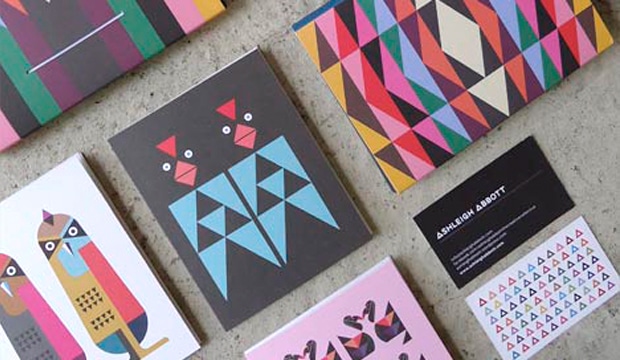
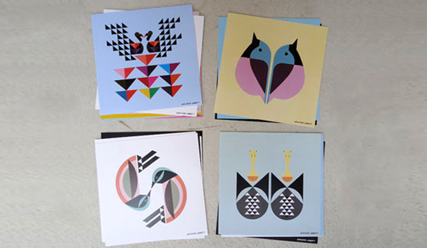
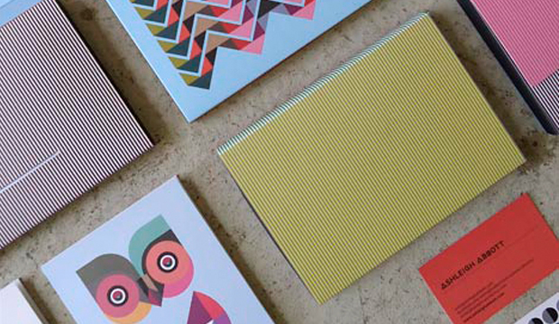
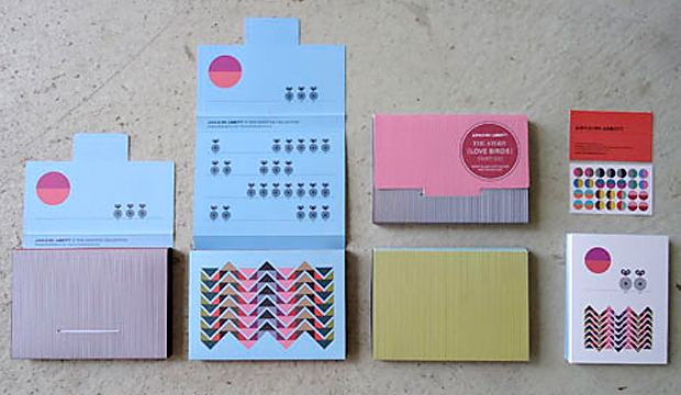
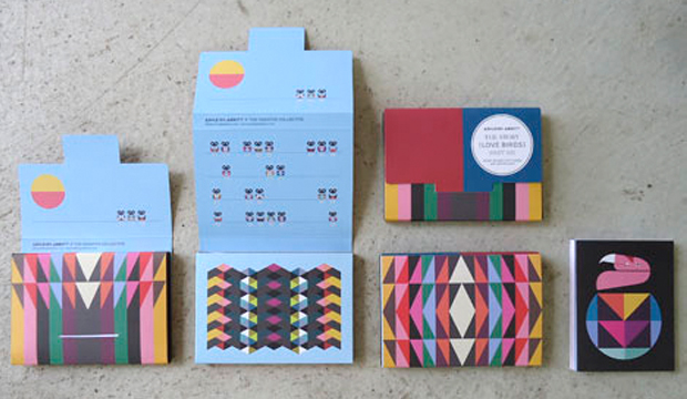
We’re completely taken aback by the enthusiasm Ashleigh Abbott from the The Creative Collective, shows for her craft. The young lass, even over email, is bursting with creativity, excitement and love – a word she uses liberally and who can blame her? Spread the love we say! Ashleigh’s latest range of gift cards and prints is a wonderfully colourful, crisp, modern and geometric interpretatiosn of birds titled: ‘The Story, Love Birds Part 001’ which are all printed on Envirocare 100% Recycled.

Ashleigh_2

To sum it up, Ashleigh’s first series takes cues from messages of L-O-V-E. Whether it’s everyday love, emotions, friendships, good old fashioned romance (she’s even picked up love poems in vintage stores that have inspired her work), past love and what she dreams love to be in her future and the promise and spark of new relationships even. Her wish?  For today’s society to express love with pride and clarity. For people to be kinder, to celebrate love and make sure their lives are full of care and sweet times every day. “Why not!” She says. “It’s amazing!”

Ashleigh was tipped off by Brenton, one of our fabulous paper specialists, to the qualities of Envirocare 100% Recycled and she’s completely in love with it – the quality, feel, texture and print result. Having used offset printing for the gift card packs/packaging and digital for the single cards and prints, she was excited by the result. Ashleigh made a smart move by considering how the paper would complement her designs. “I use a lot of solid colour, straight lines and bold geometric shapes and the warm, neutral white of Envirocare 100% Recycled softened the overall feel.”

Ashleigh describes her work as embodying the quintessence of joy and elation. And with her unabashed love of all things colour, nature, life and love, it’s no surprise her first series is a distinct reflection of this. An insight into Ashleigh’s actual world better explains the use of so much colour in her work: “I look at the world as if through a kaleidoscope and reassemble the colourful pieces I see and feel into creations that celebrate happiness, connection and new possibilities.” Not bad hey?!

Ashleigh uses other styles that involve using pencils, paints, found objects and other mediums, which means one thing – we can’t wait to see your second series! Check out Ashleigh’s official Facebook page for all the latest goss and to get your mitts on this delightful series.

Ashleigh_1

Ashleigh_3

Ashleigh_4

Cavalier Courage – a beer with a cause

Title: Cavalier Courage print collateral
Agency: Bird Design (VIC)
Client: Cavalier Courage (VIC)
Stocks: Knight Digital – Indigo
Printed by: Bambra Press (VIC)

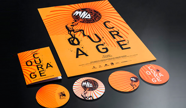
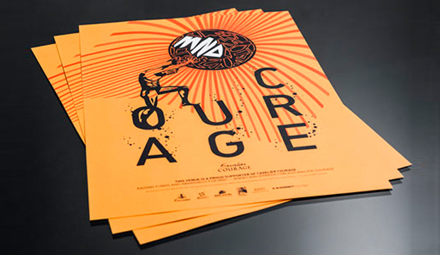
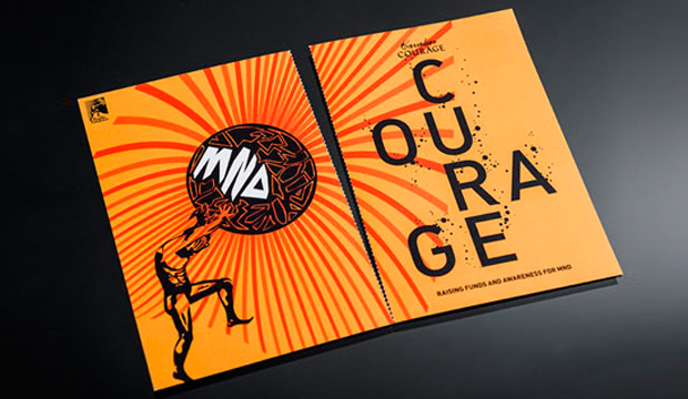
Bird Design from Melbourne have created a campaign for Cavalier Courage, a boutique beer developed to raise awareness and funds for Motor Neurone Disease (MND). Their job was to bring the myth of Sisyphus to life. They used Knight Digital – Indigo for the campaign and we have to say, the collateral sure is striking and inspiring and the story behind its creation even more so.

Cavalier_5

During an epiphany, Ian Davis, a doctor who suffers from MND, was inspired to make a difference. He contacted the team at Cavalier Brewing for their expertise and chose the name Cavalier Courage. It was Albert Camus’ essay on the king that touched Ian. He felt the story reflects the struggle MND patients go through. Sisyphus is about a king condemed to the underworld. His punishment was to push a boulder up a hill, only to have it roll down again when he reached the top.

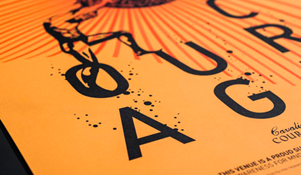
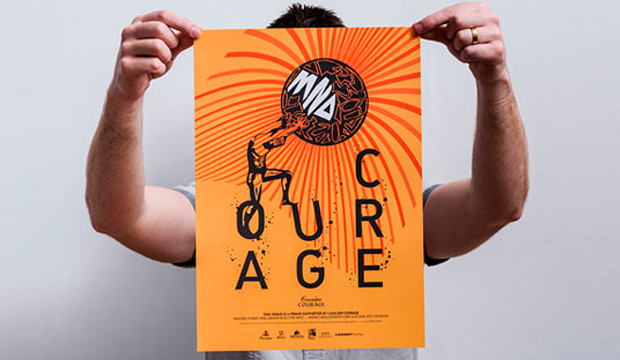
Bird Design built on this powerful message, creating a bright and hopeful design printed digitally across a perforated brochure (270gsm) so the message can be shared as a postcard, A3 poster (160gsm) and beer coasters (325gsm). If you take a closer look at the design, there’s a play on the words ‘courage’ and ‘cure’.  Bubbles represent the beer and you can see the stress and weight of the boulder Sisyphus is holding through the slanted ‘U’. The dramatic rays of sunshine that don’t quite cover the entire page show us there’s much more to do in finding a cure.

Tight production and budget deadlines and the aim to produce quality work led the boys to use Knight Digital – Indigo. Luke Carson from Bird Design: “The quality of finish achieved was fantastic. The paper is a nice sharp white, feels good, but most importantly the print result is sharp and the colours bright. Matching PMS colours with the Indigo press on Knight Digital – Indigo was very accurate too.”

What started out as an exciting and rewarding project for for Bird Design turned into a passion which they hope will contribute to the beer’s success. To find out how you can help make the beer a success too, visit the website for the low down.

Cavalier_1

Cavalier_2

Cavalier_3

Cavalier_6

Lovebird candles

Title: Lovebird Candle boxes
Agency: The Design Den (VIC)
Client: Lovebird Candles
Stocks: Buffalo Board / Knight – Smooth
Printed by: Taylor’d Press (VIC)

The Design Den have a strong background in fashion and luxury packaging design as well as brand development. The brief was a tall order – Lovebird Candles wanted their packaging to stand out in small designer homeware stores but equally shine when shelved in larger, boutique stores. The box needed to appeal to gift buyers and be a reasonable unit price. The Design Den definitely had their work cut out for them!

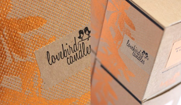
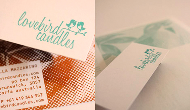
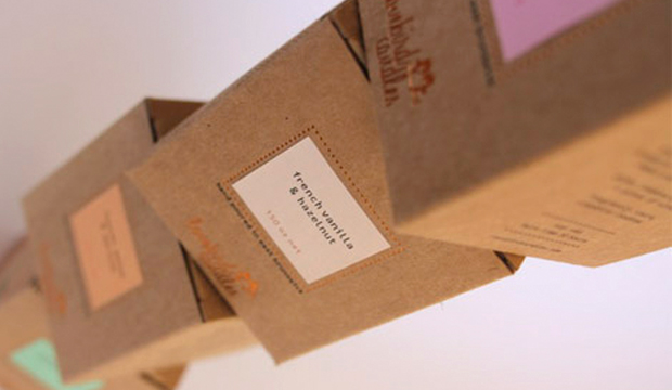
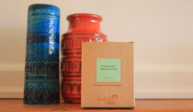
Each candle is made from 100% soy wax so in order to convey the luxury, handmade natural product, the design needed to allow this natural aspect to shine through. Buffalo Board was chosen for the boxes because of  the contrast between the warm stock and the copper metallic foil. The business cards are printed on Knight Smooth – White 400gsm, 4 colour on one side and copper foiled on the other also. The Design Den had their concerns about how the foiled dot screen would hold up and which side to print on (Buffalo Board does have slightly different textures from one side to the other). Diana Taranto from The Design Den explained how it all went: “Despite these initial concerns, the boxes came up a treat and both us and Lovebird Candles were really happy. And they already have stockists interstate now. Happy client means The Design Den is happy!”

Lovebird_1

Lovebird_3

Lovebird_2

Anne Angel wedding invitation design

Title: Foni and Sally wedding invitations
Agency:Anne Angel Designs (VIC)
Stocks:Rives Design
Printed by:Personal Printing (VIC)

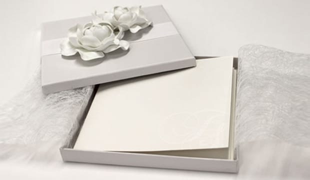
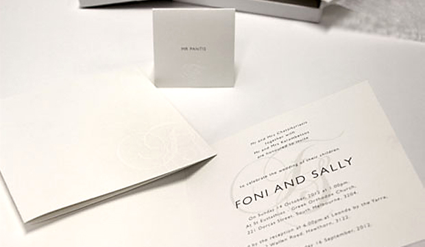
It’s often said that the humble wedding invitation sets the tone for the entire event. So we’re left wondering how amazing this wedding must have been given the beautiful invitation package created by Anne Angel Designs! Printed digitally, this stand-out wedding invite is good enough to be a feature on anyone’s mantelpiece.

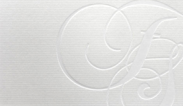
With a brief from the bride to make the invites elegant, stylish and simple, an icon was created using the couples initials. To complement this, Rives Design 350gsm was chosen as the stock. Anne Angel explains further: “We love the texture and premium look of this stock. We also wanted the contrast of the texture with the smooth foil finish in the deboss to make the initials stand out because we went with a white on white look.”

Anne_2

Anne_1

ecoChici wraps

Title: ecoChici wraps
Agency: Amy Lewis Design (VIC)
Stocks: Buffalo Board
Printed by: Madman Printing (VIC)

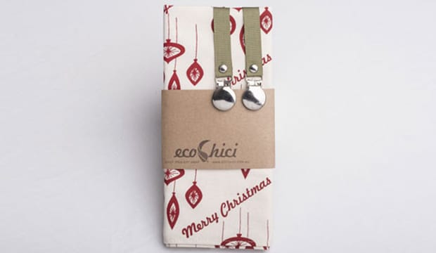
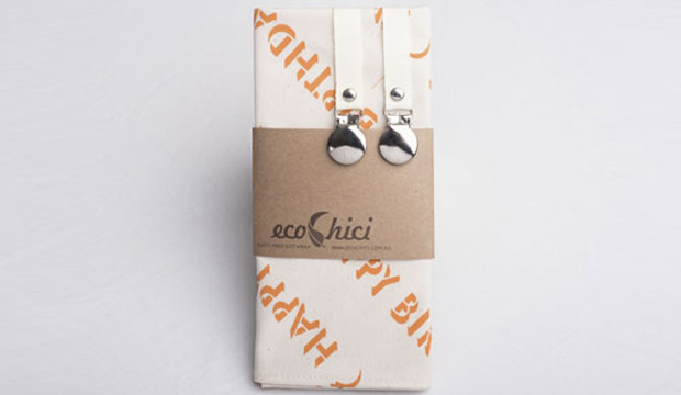
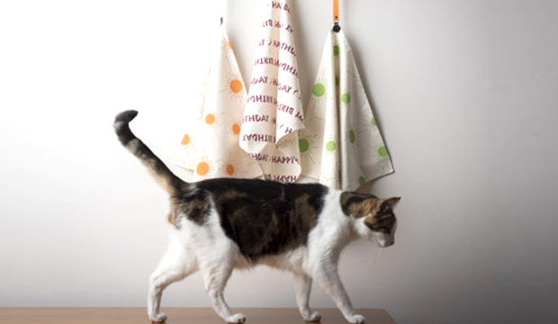
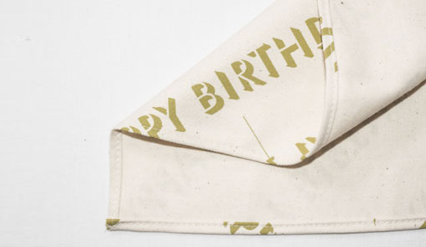
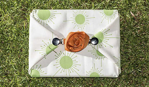
Recently launched label ecoChici is inspired by Furoshiki, the Japanese art of cloth wrapping. It’s gorgeous, easy-to-use and versatile. Amy Lewis Design is behind the packaging and product design. The team have created a suite of purposefully timeless designs that reflect a design aesthetic which influences everything from the textiles through to the branding and packaging. Check out those super cute ribbon clips in picture no.3, wrapped around our trusty Buffalo Board.

Ecochici_4

Even better, ecoChici, founded this year by Phil and Amy Lewis, is designed and made in Australia. Most of the production is carried out by a not-for-profit organisation, Radius, whose vision is to provide work opportunities for people with disabilities. Maintaining their ‘use less’ principles, Buffalo Board 280gsm was chosen to package the re-usable wraps. Printed offset with 1 spot colour, we think the contrast of the stock against the beautiful designs is right on the money. On that note, the wrap is good enough to be a gift so that’s a double bonus in our books!

Amy Lewis spoke to us about using Buffalo Board: “Taking a minimalist approach to packaging means the stock needed to have maximum visual impact. Buffalo Board looks and feels great to hold.  It’s an unbleached stock which perfectly complements our unbleached cotton products. It contains recycled content and we were also impressed with the environmental innovations implemented by the paper mill.” Buffalo Board was also used for the gift tags included in the pack and company business cards.

You can visit the official ecoChici website if you’d like one (or many) of these gorgeous wraps for yourself. We like gifts (hint hint), in case you’re wondering who you can buy an ecoChici wrap for!

Ecochici_1

Ecochici_2

Ecochici_6

Ecochici_5

ABC Television press kits

Title: ABC Television press kits
Agency: ABC TV graphic design department (NSW)
Stocks: Buffalo Board / Keaykolour Original / Maine Recycled – Silk / Newsprint / Sovereign Offset
Printed by: Advanced Press (NSW) and foiling

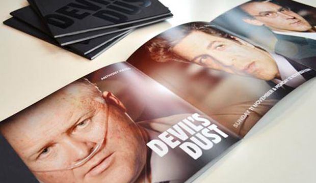
Media releases and press kits are mostly standard issue – words plus supporting imagery tends to be the status quo. Not the case for ABC Television’s graphic design department! We have to say, when we first saw these tasty morsels of paper goodness, ‘press kit’ did not cross our minds. Some hot new shows deserved kits that made the journalists sit upright in their uncomfortable office chairs. Clare Goodall, Print Designer from ABC Television, shared some insights into each of these offset printed pieces:

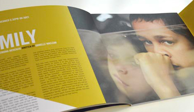
Redfern Now: The inspiration came from the keyart which saw the mustard yellow carried throught out the campaign including online, print and outdoor. Cover: 6pp wrap around on Sovereign Offset 300gsm with die cut text. Text: Sovereign Offset 170gsm.

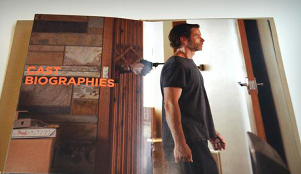
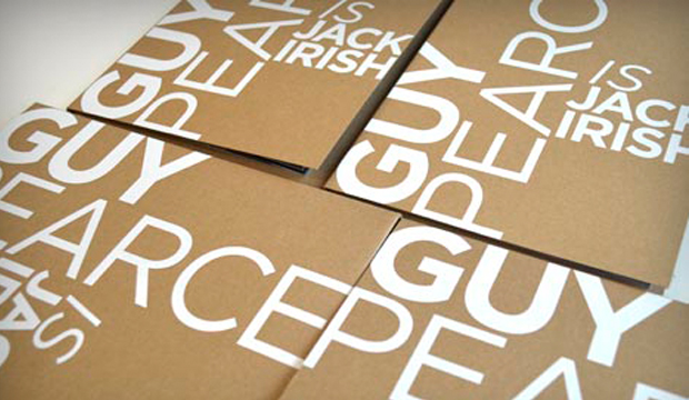
Jack Irish: The key message of this campaign was ‘Guy Pearce is back on Australian television’. This was boldly stated using a gloss white foil on a contrasting Buffalo Board. Cover: Buffalo Board 332gsm. Text: Maine Recycled Silk 170gsm with spot fluoro orange 804c.

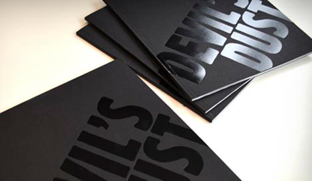
Devil’s Dust: The conflicting nature of this story was represented with the stock. The use of Newsprint 45gsm represented the story which unfolded in newspapers nationally. Maine Recycled Silk 170gsm illustrated the cinematic elements of the production. Cover: Keaykolour Jet Black 300gsm. Text: Newsprint 45gsm (printed black only) and Maine Recycled Silk 170gsm.

We rate the use of print to make an impact and a point of difference. We love the colours and carefully chosen stock selection which tells a unique story for each of these quality shows. ABC has definitely set a standard here!

Redfern_6

Redfern_1

Redfern_5

Redfern_2 Redfern_3

Redfern_4

McClelland Sculpture Gallery exhibition books

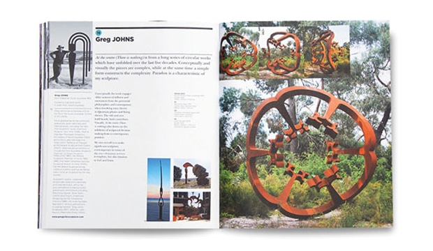
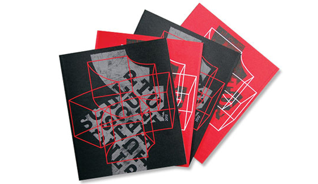
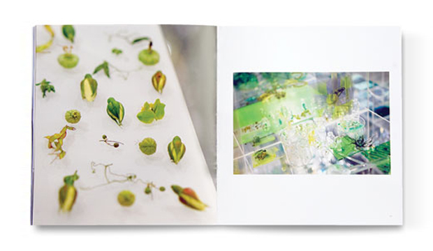
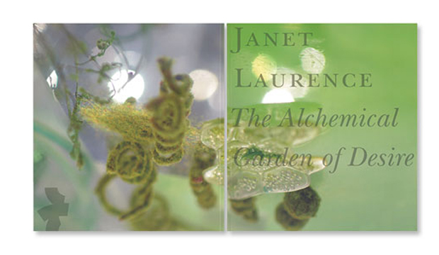
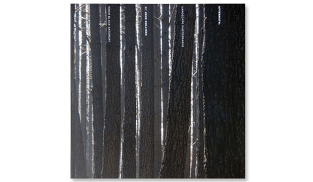
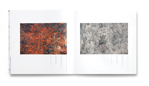
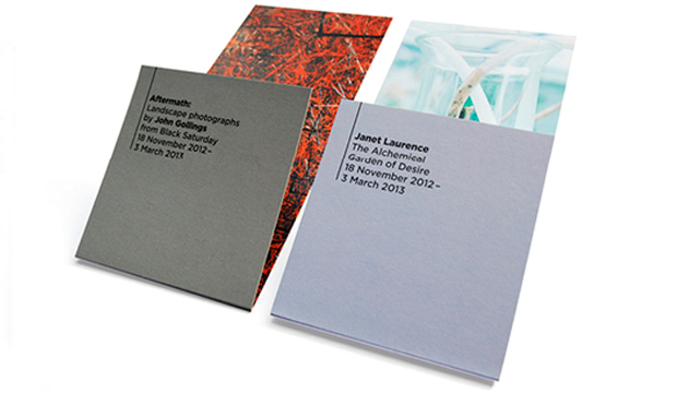
Title: McClelland Sculpture Gallery exhibition books Agency: David Lancashire Design Stocks: Barry Bleach Board / Grange Offset / HannoArt – Satin Printed by: Mercedes Waratah (VIC) Renowned for its outstanding collection of outdoor sculptures and innovative exhibition programs, McClleland Gallery and Sculpture Park is located within 16 hectares of bush and landscaped gardens on the Mornington Peninsula in Victoria. David Lancashire Design (DLD) in Melbourne have worked with the gallery since 2006 and more recently, they’ve been busy designing and art directing the exhibition catalogues and print collateral using HannoArt – Satin and Grange Offset as their chosen stocks. Sculpture_2 DLD work closely with both curators and artists when producing a full colour catalogue for each new exhibition. McClelland like to push the boundaries which allows DLD more creative freedom. They recently re-freshed the brand, creating a more dynamic, modern look across all print collateral, including brochures, event calendars and exhibition invitations. The suite of catalogues designed differ greatly, along with the subjects and styles within, but maintain an overall identity for the gallery. David Lancashire mentions: “Art direction and using a great photographer like John Gollings, as well as a good printer and choosing the right paper, all contribute to the reproduction of the artwork and a great end result.” We couldn’t agree more! DLD enjoys using HannoArt – Satin for its great printability, cost effectiveness and colour reproduction. Stephanie Mulder, Graphic Designer from DLD explains why. “We’ve found that HannoArt – Satin consistently produces great results, especially important when reproducing artwork. Another bonus is the stock’s environmental credentials, as the studio is always aware of trying to encourage the use of sustainable practice.” DLD have also introduced uncoated paper Grange Offset to contrast with the coated stock. The Sculpture Survey & Award 2012, 18 November 2012 – 14 July 2013 catalogue includes this sheet, chosen for its colour reproduction, ability to hold crisp detail, tactility and bulkiness. The identity and format for this catalogue required special treatment and stock selection to make it stand apart as the event is one of Australia’s most important outdoor sculpture exhibitions. In other words – it’s a big deal! Janet Laurence: The Alchemical Garden of Desire 18 November 2012 – 3 March 2013 and Aftermath: Landscape Photographs by John Gollings from Black Saturday 18 November 2012 – 3 March 2013 (both sewn and burst bound, with matt cello on the cover) are printed on HannoArt Satin and make up the suite of new designs. And for the exhibition invitations, the gallery now uses Barry Bleach Board 210gsm (with a gloss aqueous varnish on one side to make the colours pop and enhance the image detail) so the receiver has something more interesting to look at when the invite comes in the mail. As a whole, we really dig this new design direction. Makes for an enticing reason to drive down to Mornington. Road trip anyone? Sculpture_4 Sculpture_3  Sculpture_5 Sculpture_6 Sculpture_7