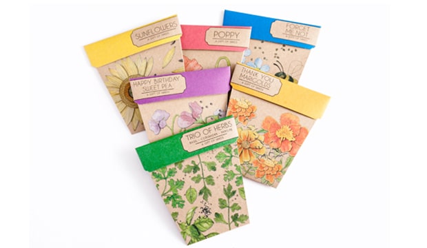
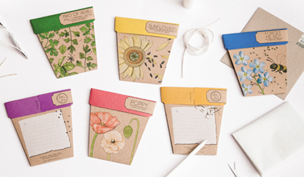
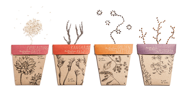
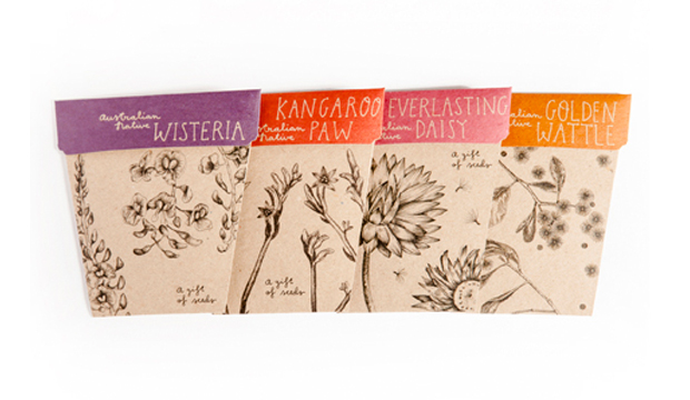
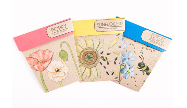
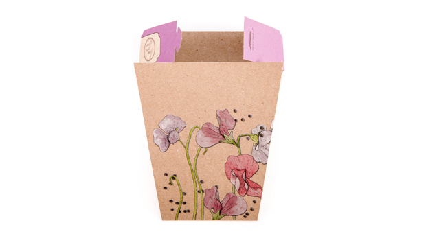
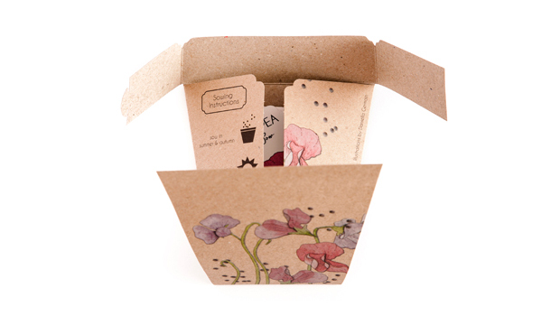
We love hearing inspiring stories and Michelle Brady is a woman with one such story to tell. Her dream to combine her penchant for gardening, be a business owner and pursue her creative passions became an everyday reality. She created Sow ‘n Sow, a Melbourne company that produces the ‘Gifts of Seeds’ card collection. The packets of seeds are beautiful enough to be given as a gift yet they’re a card too! She recently released an Australian Natives collection as well.
This innovative idea stemmed (pardon the pun) from both her new found interest in gardening and the birthday presents she would give away to friends and family that were packets of seeds. Her idea simply blossomed (ahem) from there. Michelle can tailor the seed packets to any particular project or corporate promotion. She once created mint seed packets at an event for Bacardi, to encourage people to make their own Mojito cocktail. Now, why didn’t we think of that?!
Created in collaboration with designer and illustrator Daniella Germain, the ranges feature really lovely illustrations. The ‘Gift of Seeds’ illustrations are collages which give the packets a 3D effect and for the Australian Natives collection, the inspiration came from botanical illustrations so the intention was for an earthier, more understated feel.
Michelle mentioned to us: “The focus was very much on the item being a gift, so we kept a minimal layout and let the illustrations speak for themselves. Enviro Board 230gsm was an easy choice for the packets, because of its eco-friendly credentials, 100% recycled factor as well as its earthy look and feel.” The ‘Gifts of Seeds’ cards were printed offset with a double hit of opaque white, then CMYK. The Australian Native packets were printed offset plus CMYK.
We’ve spotted these little beauties around town recently and they look even more special in person!
Part of Mohawk’s campaign ‘What will you make today?’ includes this video about designer Massimo Vignelli and his approach to book design. The short clip, created by Pentagram’sMichael Bierut and team, follows Massimo’s passion and unique method of designing books.
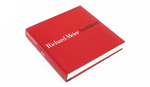
This video is an animation of one of Massimo’s classic designs showcasing architect, Richard Meier, as an example. Each page is drawn in pencil (as Massimo finds doing this by hand much faster than with a computer) and uses a grid as a guide for the initial layout stage. The grid determines the position of the photographs and “…is an integral part of book design. It’s not something that you see. It’s just like underwear: you wear it, but it’s not to be exposed. The grid is the underwear of the book.” Massimo explains while chuckling in the video.
Michael and his team at Pentagram created a corresponding journal featuring the grid, beautifully carried through to the front and back covers with a debossed effect applied. This limited edition journal is available from Mohawk’s website.
The ‘What will you make today?’ campaign launched last year together with Mohawk’s new identity. Stay tuned for more short clips planned later this year.
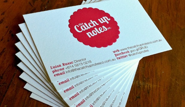
The Catch Up Notes Co. is a new company specialising in stationery and one of our fave stationery items – sticky notes, recently approached Lure Graphics (a design studio in Melbourne) and asked them to create a brand new identity for their company. It was important to The Catch Up Notes Co. to draw attention to the paper and printing process. After all, stationery is their business!
After brain storming a range of ideas, Lure Graphics decided to amplify the sticker-like aesthetic of the branding and emboss the logo. Concept Vellum – Radiance 352gsm (now called Strathmore Premium Wove) was chosen for its warm tone and subtle texture, which complimented the rubine red and black hues perfectly. The paper choice, emboss and colour palette became a match made in heaven! Everything came together, demonstrating the attention to detail that The Catch Up Notes Co. is known for. Overall, Lure Graphics wanted to embrace the confidence in the brand and give it a fresh, strong presence that communicates professionalism. An element they bring to all their stationery notes.
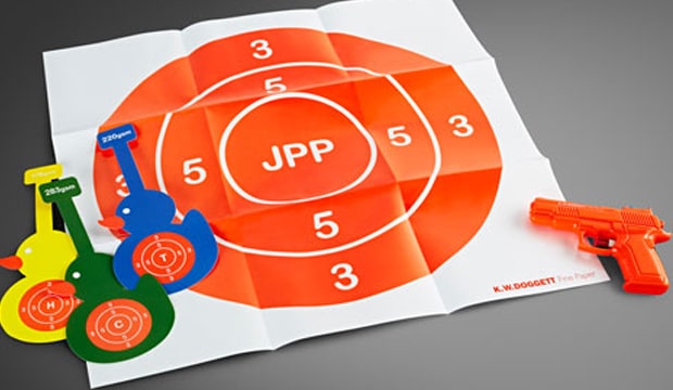
We had a lot of fun working on our latest promotion for JPP Synthetic, a range of polypropylene paper products. The big news is H Grade is back! JPP Synthetic is available in H, T and C Grades, all strong, durable and water resistant, yet each has their own unique qualities.
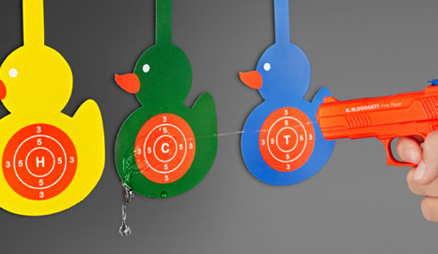
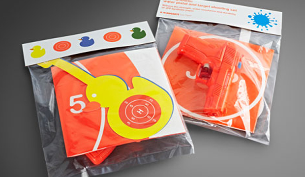
The promotion includes a target shooting set, water pistol and shelf wobblers. An A5 postcard was also printed to be included within the K.W.Doggett Fine Paper JPP Synthetic swatch. The original concept of this promotion came from Sam Barnes, the winner of a student competition in 2010. Sam’s unique design was re-worked to suit the announcement that H Grade is back and this is what he came up with!
JPP Synthetic is a high tear resistant product, with superior printing and drying capabilities. H Grade features a clay matt coating on both sides of the sheet. Print it with conventional printing processes and inks and deliver end uses like menus, maps, shelf wobblers, plant and industrial tags or labels and point of sale signage. H Grade is also suitable for folding and hole punching, as well as packaging applications.
T Grade has a semi-gloss finish and is similar to C Grade which has a matt finish, but is slightly denser. This makes T Grade whiter, more opaque, flexible and difficult to tear. C Grade is stiff with a cardboard type quality and suited for applications that require rigidity, such as book covers and food menus. The entire JPP Synthetic range is suitable for both indoor and outdoor purposes.
If you’d like to know more about our JPP Synthetic range, contact our Business Development Manager and synthetic expert, Chris Jackson on (03) 8470 2244.
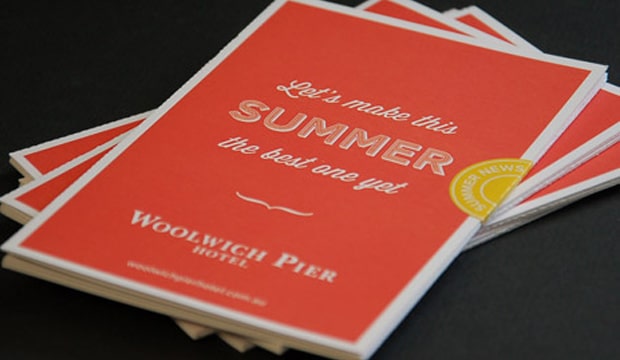
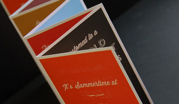
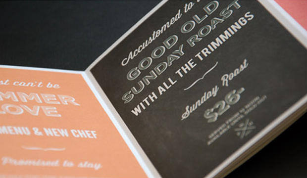
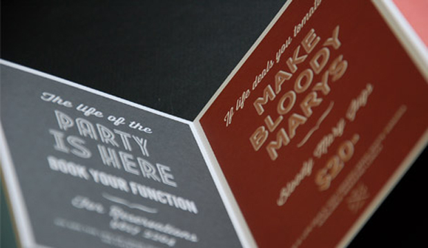
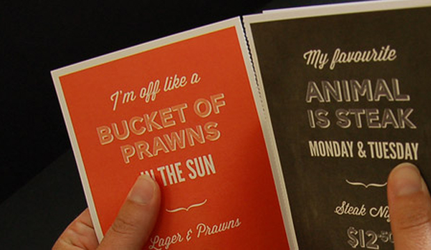
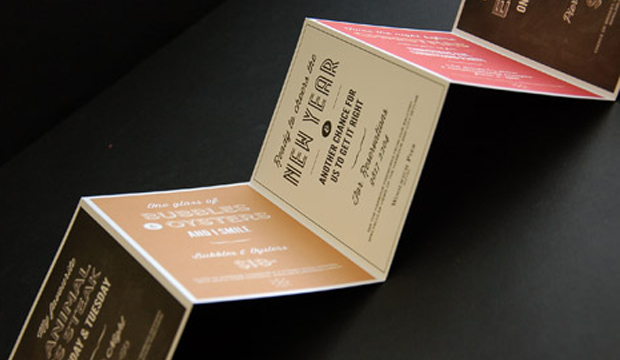
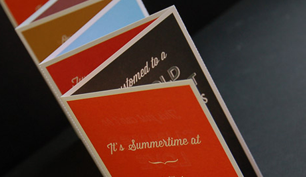
Here’s a direct mail piece that must have had thousands of people in the Lower North Shore and Ryde areas wanting a beer and hearty pub meal! Printed on Knight – Vellum 200gsm, the piece is a 7pp concertina fold with perf, created for one of Sydney’s most iconic pubs, the Woolwich Pier Hotel. The studio behind it is Matter Design (who also designed the hotel’s website and promotional posters).
Matter Design was asked to develop a new style to attract an audience over the Christmas and New Year period. The brief was to take a typographical approach and still have that traditional English feel but with a modern twist. Mission accomplished! You may recognise some of the free Conqueror typefaces that were used – Carved and Inline. Other fonts include Wisdom Script and League Gothic.
The Knight range is known for its tactility and elegant nature, factors that Matter Design took into account. They wanted people to pick up the piece and interact with it so Knight – Vellum was a good choice for them. The client provided creative freedom in all respects which made for a very happy design studio. It’s clear in the outcome – such a fun colour palette and lovely typography, quite different to regular pub branding.
Given the large print run (14,000), the job was offset printed by Lindsay Yates Group. Alyce Biggs from Matter Design explains: “The colours were practically spot on with the Pantone breakdowns on the 7 spot Heidelberg Speedmaster. The printer has great attention to detail and a great technical system so our CMYK was as close to the Pantone as it could be.”
We hope Matter Design keep producing such beautiful printed pieces. We like them a lot.
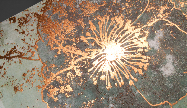
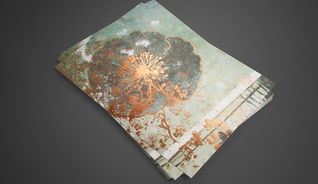
This new postcard announces the arrival of Knight Textures – Linen, now available in 300gsm and 350gsm. Some of you might recognise this gorgeous image from the Knight ‘Strength and Beauty’ large format book we released in 2010. Three60, the designers behind the creative for all the Knight promotional pieces, definitely know their way around the range. The flower on the linen texture, combined with the distressed, bronze foil, is a simple but effective design that complements the linen finish beautifully. The postcard is printed on Knight Textures – Linen 350gsm, 4 colour process. Knight Textures – Linen is part of the Knight range including Knight Textures – Hammer, Knight Vellum, Knight Smooth – White and Cream.
The uptake in the use of image recognition (IR) and augmented reality (AR) is increasing. Not to forget quick response (QR) codes and even Documobi’s Intelligent Print Recognition™ (iPR). What all of these tools are doing is bridging the gap between the paper, print and digital worlds via tablets and smart phones, providing the reader with a complete communication experience. This article is partly our thoughts, research we’ve gathered and a lengthy chat we had with Deborah Corn from Print Media Centr (PMC) in the USA – thanks Deb! We love paper but we love the digital world too and now, they can both play nice.
Tell me more…
All of these buzz words can be a bit much. In a nutshell, in the case of AR/IR, software and apps have been designed for smart phones and tablets. They can recognise images via the camera (or webcam in the case of computers), scan them and then provide an interactive digital experience. QR codes (the black and white squares used on print ads or outdoor displays) can be easily generated with free software and hundreds of different apps can read them. You can see there are various options available. The one you choose all depends on what your client wants and the end result needed because all the technologies have their own benefits and limitations, whether its cost, aesthetic etc.
We encourage you to look more into this space to understand which options best suit your project. You can research the popular AR technologies like Aurasma, Blippar™ (used by Franklin Web) and Documobi’s iPR (Digital Press uses it). This one is something quite revolutionary because you can create a digital experience with a piece that has already been printed. So it doesn’t need to be included in the design stages like with AR/IR. Here’s some real life examples from the retailers and companies that have developed/utilised these technologies:
Coles – has a Christmas edition of their free in-store magazine with QR codes throughout. They link to videos featuring Curtis Stone, their brand ambassador, doing everything from showing you how to speed up your crab picking or prepare deliciously light savoury puffs. On last visit, the savoury puffs had a whopping 7326 views!
Gram – is a popular food culture publication that uses tags (much like QR codes) to link their stories to further online content and imagery by the blogger featured in the newspaper. You’re also invited to comment on the story by scanning the code.
Tesco – the UK supermarket giant, has done a great job of delivering AR to the masses. Scanning their print ads brings the page to life. You can download daily recipes, discounts, find your nearest store, access to articles and more.
Blippar™ and ShortList magazine – This magazine is amazing (watch video above). You hold your device up to the cover in blippar mode and you can blipp to play classic computer game Chuckie Egg from the front cover, find pages where you can blipp to watch videos, buy, vote as well as many other pages where you can find extra content.
ASOS – the hugely popular online retailer, used AR with their print mag which is sent to over 450,000 readers. They know their readers love fashion, their mobiles and the mag, so they created a ‘Scan to shop’ experience like digital treasure hunts, exclusive offers and the chance to instantly buy pieces.
IKEA – their 2013 catalogue is going to be an AR experience. They’ve created their own app you can download. By scanning selected pages, you unveil films, photo galleries and interactive experiences.
BMW Australia – created a unique book for new BMW owners, using AR and IR (the thumbnail pic for the Fetch Newsletter story was taken from the book). You can scan for video content, a 3D car and one page even starts with the rumble of an engine which then makes the device tremble at the same time. Search our website for ‘BMW’ to read more about this amazing project.
GRAPH EXPO 2012 – is held in America and is one of the largest displays of ‘live’ running print equipment. Deborah Corn hosted a booth – ‘The Printerverse™’which included the first interactive message board called GRAPHitti™ using iPR technology. Participants had their photo taken in the Kodak booth, then a video was made about them. The photo was pinned up on the wall and using iPR, it linked to the video content. Deb tells us that the students who visited the booth pretty much went insane over iPR and many mentioned how they were excited about print again.
Banana Republic – a fashion label, released a QR code campaign that links the code, printed on a wine bottle, to music, style tips and food/wine recommendations.
That’s great but why would I use it?
We’ve only scratched the surface here but it’s clear these new technologies offer the best of both worlds – the tangibility of print and the possibilities the online world brings. As a printer or designer, there are plenty of reasons why you could get involved (other than the fact it’s inevitable the world is moving to a more digitised format). One of the main reasons is that it provides more value for customers like access to more content, good for times when space doesn’t allow, like on packages. Imagine being able to send the user to their travel destination with a digital experience as they’re reading a brochure! Point is, AR, IR, QR, iPR all add another level to the relevancy of the printed medium. Increasingly, the full, rich experiences and interactions a brand and/or company can deliver is going to set them apart. Just remember (it’s something we have read many times), provide credible, valuable content and not just feel good experiences (even though there is a place for that too).
If we had to rate our excitement right now, it’s about an 11 out of 10! We’ll keep adding to this discussion as time goes on so stay tuned for more content and interviews with people utilising these new technologies. We’ll also cover Near Field Communications in our next post.
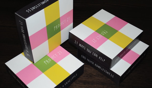
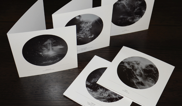
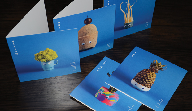
We’re proud to be a major sponsor of Project 21. A design collaboration between the Lighthouse Foundation and four generous Melbourne studios: Ortolan, Tin & Ed, 3 Deep and Paper Stone Scissors.
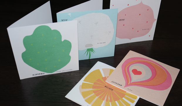
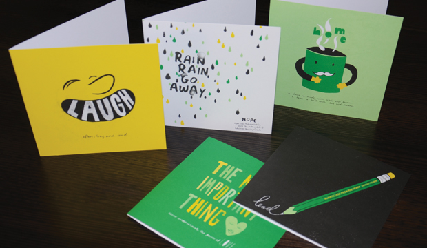
The project consists of 21 images all created around 21 positive messages such as ‘Laugh often, long and loud’ and ‘The secret to living is loving’. The images celebrate 21 years of operation for the Lighthouse Foundation, a not for profit organisation that seeks to eradicate youth homelessness. One Lighthouse statement that really resonated with us is ‘protecting young people is everyone’s business’. We like that. We’re pretty passionate about business giving back to the community. The Lighthouse Foundation says homelessness is not about a lack of a house, but rather the absence of a home. Buying one of these card packs means all of the money will go into funding one of their homes. Places where young people can develop a sense of belonging, feel connected to people and their environment. A base to start again.
But it would be remiss of us not to mention that these cards aren’t just about doing good. They look pretty awesome too. Who wouldn’t love a limited edition print of a pineapple with googly eyes? Or a beautiful water coloured sun? Plus the 21st card is a donated image from the estate of the late David Band. The cards are printed on a mix of coated and uncoated paper and feature the super duper print from the guys at Finsbury Green.
Our reps will be out showcasing the work in the new year but in the meantime, if you’d like to see a pack for yourself then jump on to the Lighthouse Foundation’s site and lock a set down. For $35 you’ll receive 21 cards (the calculator says that’s a bargain). We hope they sell the lot! Thanks in advance for your support.
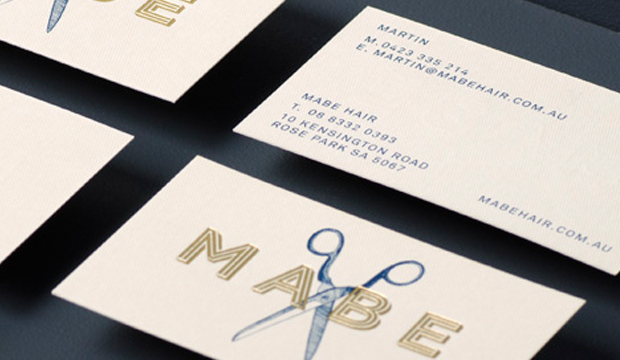
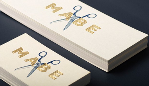
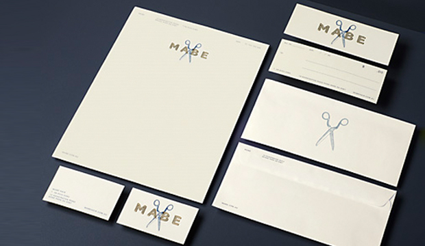
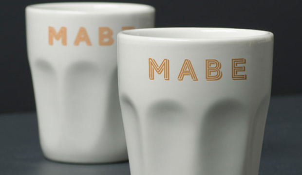
Mabe Hair is not just any hairdresser in Adelaide. With a collective 20+ years of experience, safe to say this is a very special salon. Rightly so, they deserved an identity that reflects this. Introducing Band – a brand, communication and digital agency led by George Randle and Chris Cooper. It was those gold foiled scissors that first caught our attention. Nothing like a bit of foil to make us swoon! Combined with uncoated stock Rives Design Pale Cream, it makes for very swish collateral.
Band created an identity that reflects the unique service Mabe provide as well as the history behind their craft. Hand illustrated scissors combined with bespoke typography has resulted in a clean and elegant identity. Rives Design Pale Cream 250gsm was chosen for the business cards and 120gsm for the stationery, providing an elevated feel. Printed 1 colour, the foil delivers the premium look and is a perfect balance to the creaminess of the stock.
‘No agenda, no pomp and ceremony, no clones’ states the Mabe website. Elements we think are perfectly reflected in the collateral Band has created.
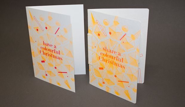
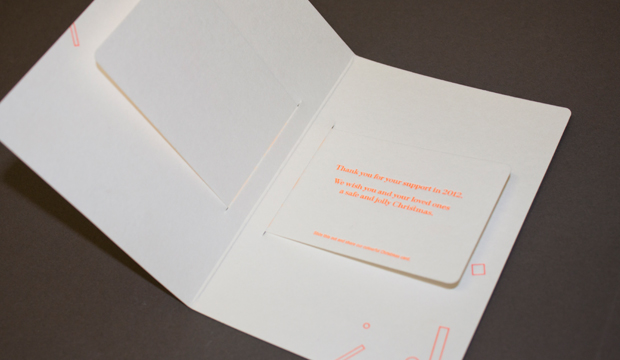
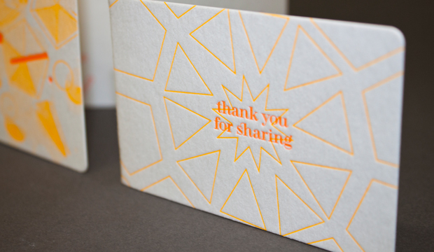
Our 2012 Christmas cards are printed on our new WILD and Strathmore Enhance papers. Why two papers? Well, we couldn’t choose between the soft cotton finish of WILD and the geometric fine texture of Enhance. So why choose when you can have both. There have to be some perks to having warehouses full of paper! We threw in some seriously bright fluoro to bring our ‘colourful Christmas’ message to life. Here’s the specification low down:
Card 1: WILD cotton paper 300gsm. Arriving mid January (weights 150, 300, 450, 850gsm)
Designed and letterpress printed by The Hungry Workshop.
Card 2: Strathmore Premium Enhance 271gsm. Sound familiar? This is not a new paper but a new name. Previously know as Beckett Enhance. This Mohawk made paper is now branded as Strathmore. In fact, all our Mohawk grades: Expression, Concept, Cambric and Enhance are all now branded as part of the Strathmore family. Swatch out in early 2013. Card designed by The Hungry Workshop. Printed offset on a Heidelberg Speedmaster press.

 Footy Tips