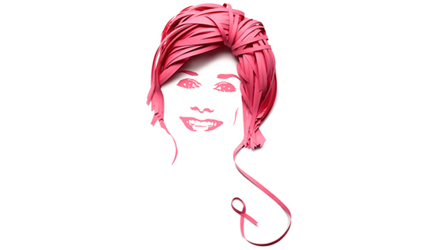
A special campaign for the National Breast Cancer Foundation

Title: Pink Ribbon Breakfast Campaign
Agency: Marlin Communications and Paperform
Client: National Breast Cancer Foundation
Stocks: Kaskad
Printed by: Emerald Press

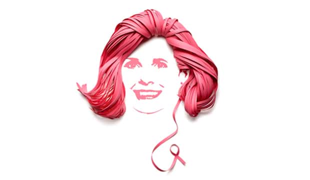
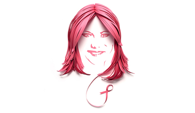
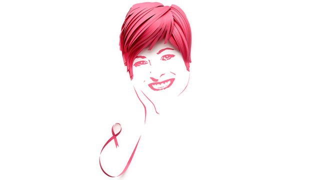
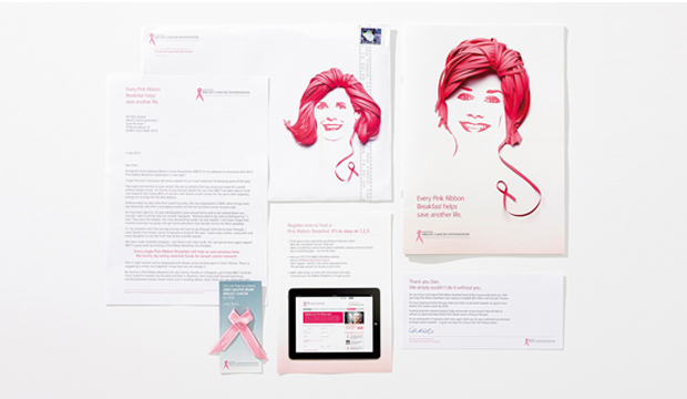
This year’s campaign for the Pink Ribbon Breakfast, created by Sydney based agency Marlin Communications, is really remarkable. The moving tribute features the portraits of  six Australian women diagnosed with breast cancer. Marlin commissioned Sydney based paper engineer Benja Harney from Paperform to craft each portrait. The hair was created using Kaskad Bullfinch Pink paper strands, placed with such precise attention to detail that Benja does with such flair.

Pink_2

The National Breast Cancer Foundation’s overall aspirational goal is to fund research that will help achieve zero deaths from breast cancer by 2030. “Our aim with this year’s campaign was to inject meaning into the event,” says Dan Geaves, Marlin’s Creative Strategy Director. “The six portraits feature five survivors, and one woman who passed – to remind supporters that not every woman survives the disease.”

National Breast Cancer Foundation are aiming to raise over $2 million dollars this year to fund Australian research. The Pink Ribbon Breakfast campaign for 2013 urges individuals across Australia to host a breakfast for friends, family or colleagues in October.

We encourage all our readers to support the cause, let’s blitz the NBCF $2 million goal!
Pink_3

Pink_4

Pink_5

Pink_6

Pink_7

BTP has a fresh new look

Title: BTP stationery suite
Agency: BTP
Client: Self promotion
Stocks: Keaykolour Original / Strathmore Premium Wove / Tablex
Printed by: Verko Press

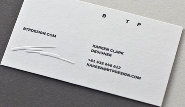
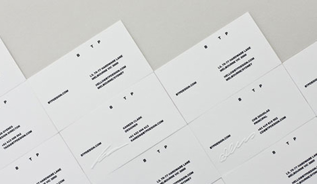
They’ve done it again. Melbourne creative practice BTP (formerly called Beyond the Pixels) has delivered yet another classic identity design only this time, they are the client! Introducing the ever so stylish re-branded BTP. Having undergone significant growth in the last few years, the team felt it was time to up the creative anti.
BTP_1

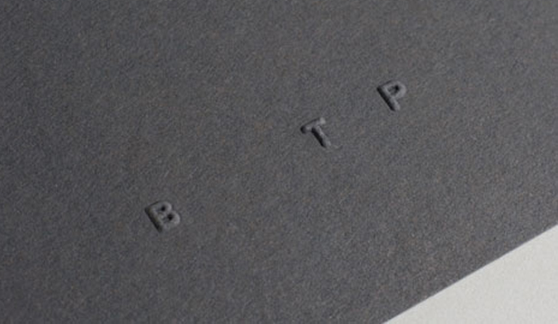
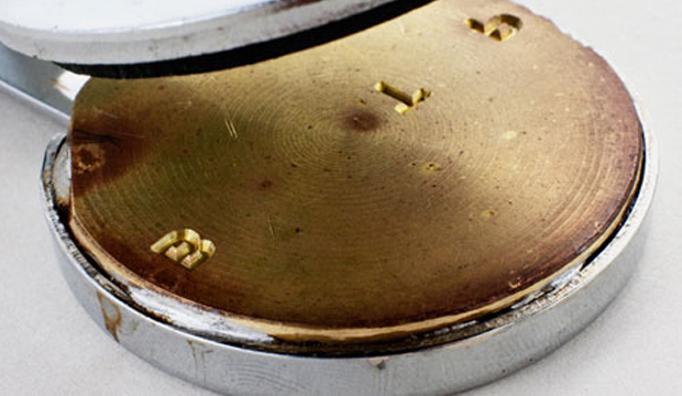
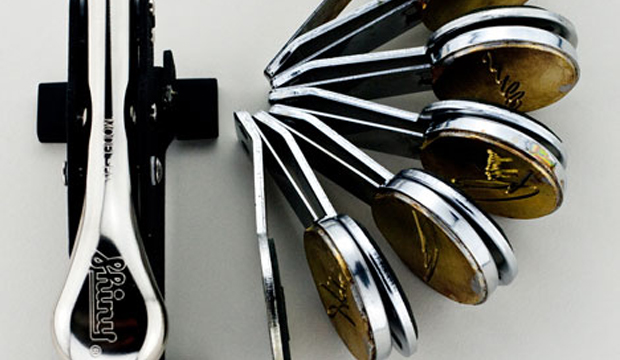
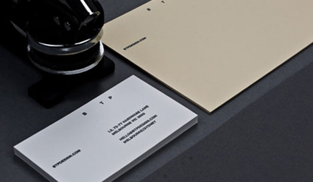
Principal, Che Douglas says the re-brand reflects BTP’s belief “in better business through design.” The result is simple, stylish and progressive. The stationery suite boasts a brilliant mix of bold Swiss style typeface softened by a reduced type size and hand embossing. BTP chose Keaykolour Original Sombre Grey 250gsm, Keaykolour Original Navy 250gsm, Tablex Buff 150gsm and Strathmore Soft White 118gsm specialty paper stocks. The plush butter, navy and warm grey tones of the paper paired with PMS Black 7 and clear verko printing delivers a stunning tactile finish across the entire stationery range. Did we mention that the signature of each staff member has a personalised emboss on their business card? Very swish indeed.

It comes as no surprise that BTP has earned a solid reputation as industry leaders in the branding and digital spaces. A culmination of over 25 years of design practice experience has led them to industry awards and recognition for projects such as Patricia cafe, the 2012 Australian Design Biennale website and Starward Whisky. It’s great to see local creative business kicking butt. We’re looking forward to seeing more big things from you BTP!

BTP_3

BTP_4

BTP_5

BTP_6

BTP_7


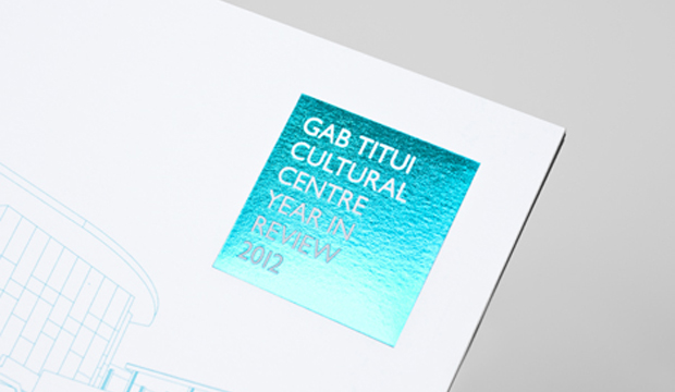
The Gab Titui Cultural Centre Year in Review 2012

Title: Year in Review 2012
Agency: R&B Creative
Client: The Gab Titui Cultural Centre
Stocks: Knight – Smooth / Knight – Vellum
Printed by: Heaneys Performers in Print (QLD)

Established in 2004, The Gab Titui Cultural Centre (the name comes from Eastern and Western dialects of the region meaning ‘Journey of the stars’), is a creative hub for local artists, cultural practitioners, crafts people and performers. You can find it in a remote yet fascinating part of the world – on Thursday Island in the Torres Strait. A beacon for creative development, the centre’s modern gallery has become a keeping place for historical artefacts and contemporary indigenous art of the region. Hmmm, might be time for a marketing department holiday. A-hem, we mean ‘work related’ excursion.

Gab-Titui_4

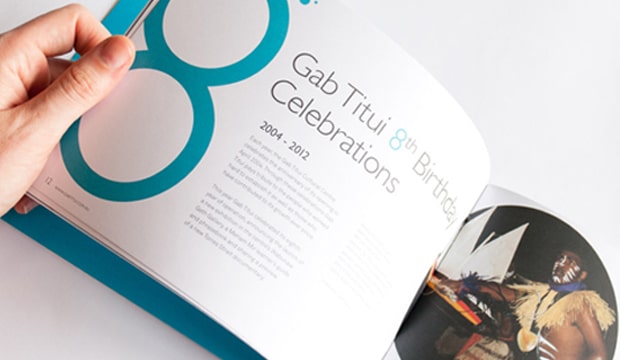
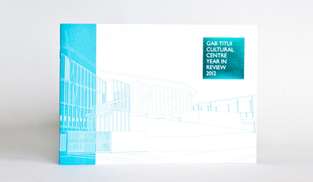
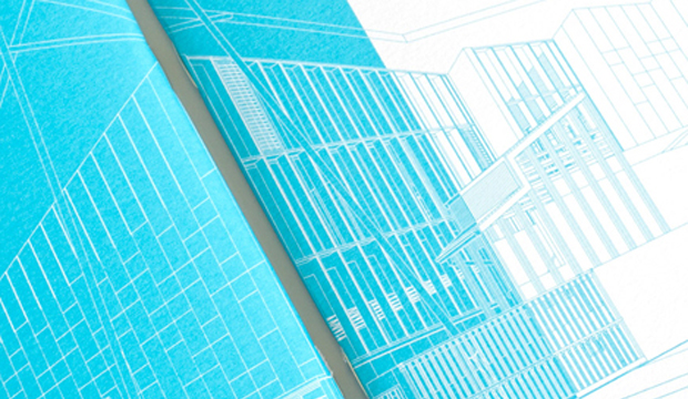
Their fresh, new look for their annual ‘Year in Review’ publication celebrates the centre’s activities, events and achievements of 2012 and it may be small in size, but it sure does pack a cultural punch. The cover features a striking blue pantone and matching hit of foil on Knight Vellum White 280gsm with Knight Smooth White 140gsm pages. Chasca Summerville, from R&B Creative, describes part of the creative process: “We were fortunate to obtain the architects schematic drawings of the new building who’s detailed lines offered both tone and form, but also intriguing abstract shapes that lead to the basis of the cover of the Year in Review‘.

By keeping the styling simple, the images and artworks stand out, providing an insight into the region’s vibrant art and culture. Did someone say Doggett’s excursion? The results really do speak for themselves, click on the link below to see more of the publication’s beautiful imagery. http://www.gabtitui.com.au/images/stories/Publications/102331_gabtitui_yearinreview_v3.pdf

The ‘Year in Review‘ has been a fantastic success in engaging communities and above all, showcasing what Gab Titui, a really dynamic organisation, has to offer. And for all those lovers of art out there, their online gallery is a must see!  To check out more about The Gab Titui Cultural Centre and their very talented artists? Go to www.gabtitui.com.au.

Gab-Titui_1

Gab-Titui_3

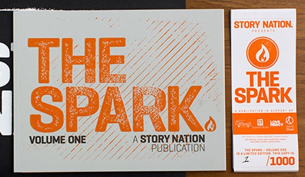
‘The Spark’ – making the most of your potential

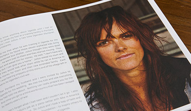
The Spark – Volume One is a publication dedicated to 12 everyday Australians, each with their own individual and inspiring story.

Matt Cowan, Director of Cowan and Partners (the founder of Story Nation), Garth Lidbetter (the creative director), Jeremy Shaw (the photographer) are all behind this beautiful book about a collective of writers, photographers and designers. Their aim – to present powerful stories with a positive social impact. Garth told us: “The idea was to present individuals who have become quite successful in their own right, (but were not yet household names) and bring out the key ‘ah-ha’ moments where they discovered their passion, what they were going to pursue and then going and doing it.”

Only 1000 copies of this limited edition publication were printed, which allowed Garth to put time into each and every book. Printed on Knight Smooth 120gsm, Tablex Salmon 300gsm and Tablex Grey 300gsm, all 1000 of them were individually numbered. Garth felt that with such personal stories in the book, the touch and feel of uncoated stocks fitted best. The Spark logo on the front cover is a big, bold emboss complemented by a pop of colour. He, himself stamped orange paint (mixed with a gloss varnish) over the top with a laser etched stamp. Brilliant result!

“A lot of time went into thinking about the presentation, with the paper band allowing us to highlight the charities and also make a point of the limited edition nature of the book. The black envelope gives the book protection against wear and tear, but also gives a strong presentation and introduction to the book from Story Nation.”

All proceeds of The Spark book sales will be donated to the following charities: Coffee Kids, Love Mercy Foundation, OzHarvest and WorldShare. The Spark series will continue with more Australians who are committed to following their passions and revealing what first led them there.

Spark_2

Spark_3

Maine Recycled – ‘A natural beauty’

Title: Maine Recycled 2013 campaign ‘A natural beauty’
Agency: Thursday Design (NSW). Christopher Nielsen (illustrator).
Stocks: Maine Recycled – Gloss / Maine Recycled – Silk / Maine Recycled Digital – Gloss / Maine Recycled Digital – Silk
Printed by: Printcraft (QLD) offset and HP Indigo. Spot Productions (QLD) Xerox 1000.

Our Maine Girl has hit the French Alps!  ‘A natural beauty’ is the new addition to our Maine Recycled story. Created by Christopher Nielsen, this beautiful vintage illustration is the latest instalment, complete with an environmental twist. We printed three cards: one offset, one on an HP Indigo 3050 and another on a Xerox 1000, all on the silk 350gsm.

A-Natural-Beauty_2

It was such a treat to collaborate with Thursday Design again, who love working on the project as much as we do. Our aim this time was to highlight the environmental components of the range that comes in gloss and silk finishes. A naturally high white sheet that reliably performs on press and is consistently super smooth, crisp and clean, it has earned itself a reputation as one of Europe’s best selling recycled coated papers.

Maine Recycled has a pretty high recycled content. The 60% recycled fibre is sourced entirely from premium office waste and it also contains 40% virgin fibre, all of which is FSC® certified. Maine Recycled comes from France, produced in a facility that operates under the ISO 14001 Environmental Management System. It’s certified carbon neutral from cradle to printer too.

The mill, along with the manufacturer Arjowiggins Graphic (France), are constantly looking at ways to reduce their environmental impact, including a commitment to reduce the mill’s carbon footprint by 3% each year. That works for us!

Maine Recycled – a genuine natural beauty, is exclusive to us, the paper people.  Your paper specialist will be around soon with a copy of your postcard.

FEATURES

  • Bright white A2+ coated paper
  • 60% recycled fibre (FSC® certified post consumer waste)
  • 40% virgin fibre (FSC® certified)
  • Certified carbon neutral paper
  • Excellent press results
  • Very fast drying time
  • Suitable for offset and digital (HP Indigo and Dry Toner) printing

Paper postcards that play music

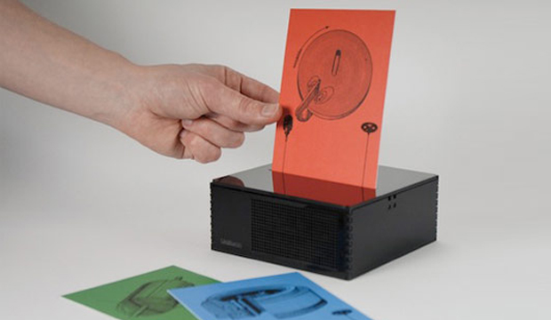
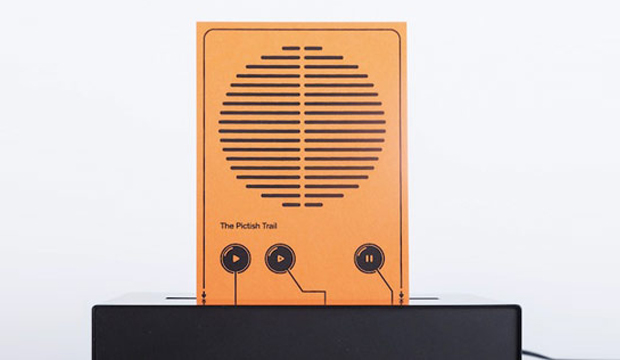
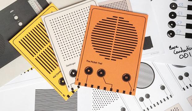
People, this is not a joke or ploy to get you as excited about paper as we are. Not sure that’s possible. We saw this post on one of our trusty client’s newsletters – AVANT Card. They featured a story on Uniform, a UK brand communications agency who have designed a device that plays music which has been printed on a postcard.

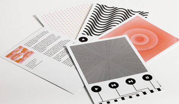
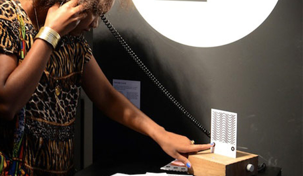
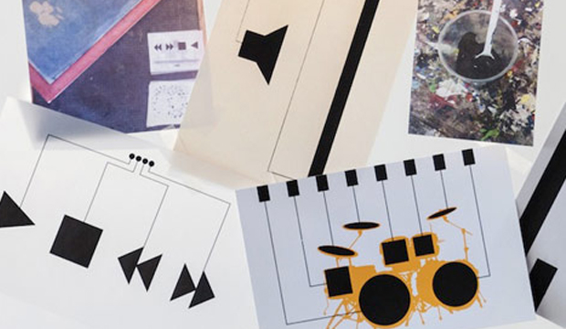
Using an emerging technology to print basic electronic circuits and components onto any surface, the paper postcard is docked in the player and you control the tunes by pressing buttons on the postcard. The interaction is very tactile, like the old days when we had vinyl record sleeves (yes, we’re old enough to remember). A little different to the feeling of sliding your finger across a screen. We do get that each has its place. And any homage to the LP is a winner with us.

Avant_2

Avant_3

Avant_4

Avant_5

Avant_6

Avant_7

Kloke’s autum/winter Collection 2013

Agency: Three60
Client: Kloke
Stocks: Strathmore Premium Super Smooth
Printed by: Bambra Press (VIC)

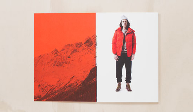
Adam and Amy Coombes share a common passion – they both love fashion and each other! In 2011, this driven and creative couple started Kloke, a Melbourne based clothing label that produces technical garments and tailored detail. Recently, Three60 produced printed piece showcasing Kloke’s Autumn/Winter collection, calling it ‘Dissimulate’.

The A5, 32pp book references the spirit of the brand as a functional and detailed piece. Printed on Strathmore Super Smooth, 352gsm the book is pad bound (also known as cheesecloth). This is where the glue is dyed and the colour is visible on the spine. It also means it can be opened flat for spreads or taken apart and used as individual cards. Printed CMYK plus PMS 172U, we think the PMS has come up a treat, really punchy and rich. Makes buying something even more enticing. Not that we need an excuse.

Kloke-autumn_2

Kloke-autumn_3


A glowing result for PointofView

Title: A lighting design PointofView
Agency: Liquorice Studio (VIC)
Client: PointofView
Stocks: HannoArt – Satin
Printed by: Bambra Press (VIC)

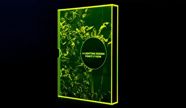
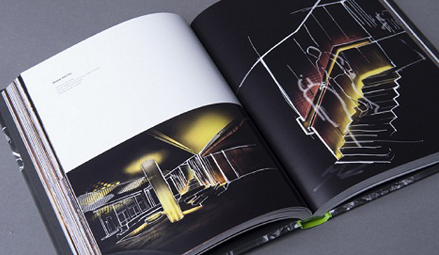
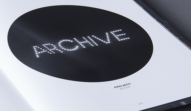
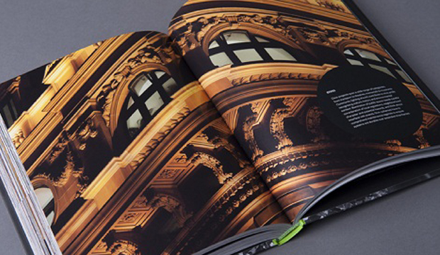
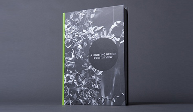
This beautiful, show stopping, magnificently crafted book was created for PointofView, a design consultancy who specialise in lighting design, audio visual and theatre systems design. Liquorice Studio in Melbourne are the creators of the book which showcases 10 years of the lighting company’s amazing catalogue of past works. The result is luminous (sorry, we couldn’t help ourselves with that one).

PointofView_6

Liquorice Studio took inspiration from PointofView’s current logo which incorporates a circle motif. They built on the concept of a viewpoint, using light and shadow to create imagery. They had some fun experimenting with angles, focus, light densities and surfaces – which all created a suite of different effects. This is also the method they used to develop a typographic image for each chapter heading.

The finished book is 324 pages and printed on HannoArt. The cover is on 150gsm over an 1800um board weight and the text pages are on 130gsm. “We were drawn to HannoArt for its smooth finish and reliable print quality. We also felt that its bright white colour was perfectly suited for a book about lighting design. We were very impressed with the crisp detail and the rich depth of colour in all the high quality images.”

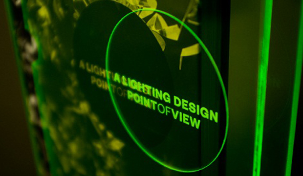
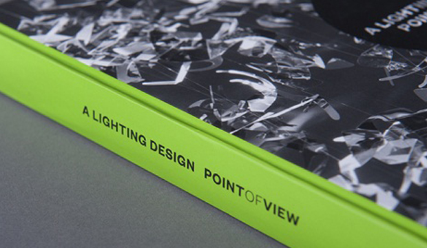
A special edition ‘glowing’ slip case was developed and the book title laser etched, to align with the printed cover. Pretty cool huh?! We certainly think so!

PointofView_1

PointofView_2

PointofView_3

PointofView_4

PointofView_5

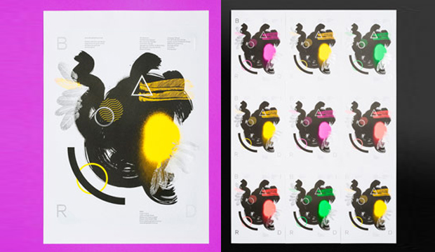
Bird self promotional posters

Title: Bird promotional posters
Agency: Bird Studios
Client: Self-promotion
Stocks: Keaykolour Original
Printed by: Taylor’d Press (VIC) and foil by Lorimier (VIC)

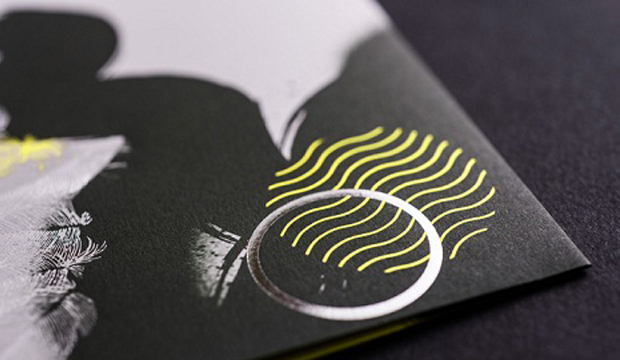
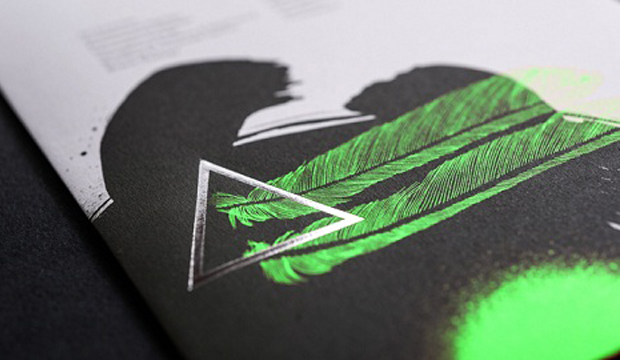
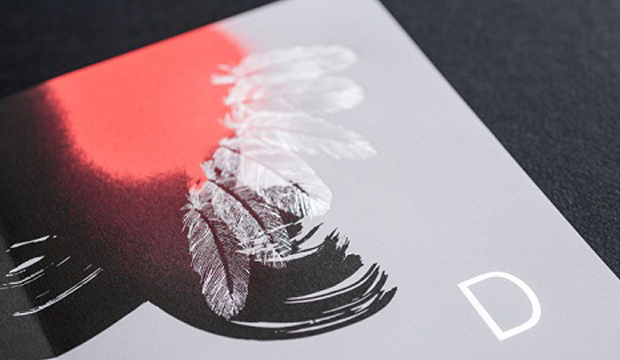
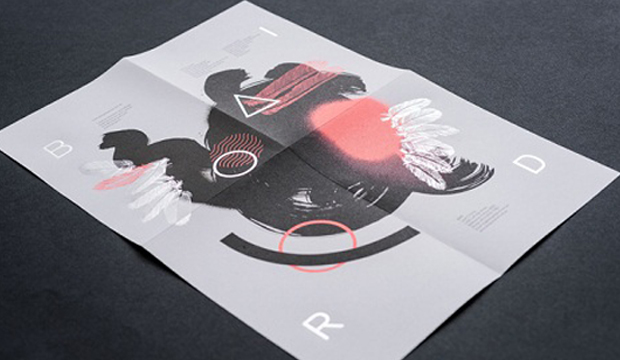
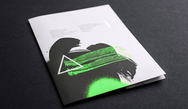
Let us share with you the excitement that filled the office when one of our much loved paper specialists came into work with the eye catching Bird A3 self-promotional posters. ‘I can choose from four colours?’ people exclaimed. ‘But I like all of them!’ was the common response. Each poster features hand drawn and vector illustrations and a unique fluorescent colour (pink, yellow, green, red) topped off with silver metallic foil. A true project of experimentation which had our paper sensibilities going c-r-a-z-y.

Bird-self-promtional-posters_2

Printed on Keaykolour Original Pure White 120gsm, which for Bird was an economical choice and great feel for a 120gsm paper. Also handy as they sent some out in the post in A5 format so the piece needed to fold down well. Each illustration varies in method and combines individual design elements such as spray paint, brush and ink, pen illustration and computer generated shapes. Experimentation is evident with things like the beautiful abstract bird illustration and typographic elements that creates a piece with energy and beauty.

Bird offset printed the posters using two colours, black and also separate fluorescents for each poster. Luke Carson from Bird mentioned: “We hit the fluorescent colours twice and the black once. The result was an even flat black and really punchy fluorescent colour that lifted off the paper. Further enhancing this was a matte spot varnish on the black and a gloss spot vanish on the fluoros.” Safe to say, we likey.

Bird-self-promtional-posters_3

Bird-self-promtional-posters_4

Bird-self-promtional-posters_5

Bird-self-promtional-posters_6

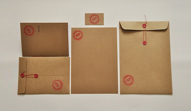
Poppy Calhoun collateral

Title: Poppy Calhoun stationery project
Stocks: Buffalo Board / Buffalo Kraft
Printed by: Print Corner (VIC) – A4 folio covers

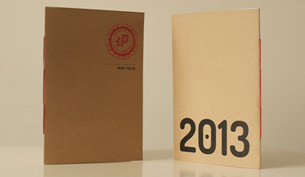
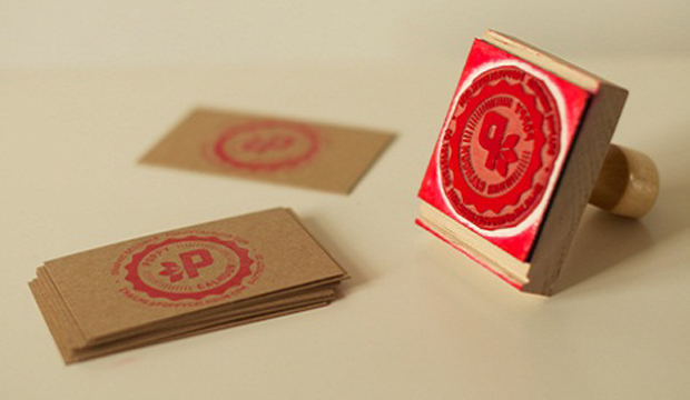
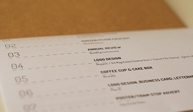
Poppy Calhoun (whose name we just love) recently completed a project as part of her diploma of graphic design at Swinburne University. The items included a mini folio, CV, business card, letter head and envelopes. See above for a winning example of creating something eye catching on a minimal budget that looks amazing and reflects individual personality. Score.

Poppy_2

Choosing Buffalo Board 332gsm was a point of difference for Poppy for both textural and environmental reasons. Combining this with a custom made stamp (from Simon Stamps in the USA) provided texture and personality and just the right amount of home made feel. She even stamped and hand cut all of her business cards and other branded pieces herself. She printed the letterhead on her home inkjet on the Buffalo Kraft 80gsm, used her local printer for the A4 folio covers which are printed in black and white, then hand stitched the binding using red thread.

A lot of work yes, but Poppy has clearly put her heart into this little suite of design goodness that we’re chuffed she’s used our stock for.

Poppy_3

Poppy_4