Title: 2013 packaging promotions
Agency: Seesaw (VIC)
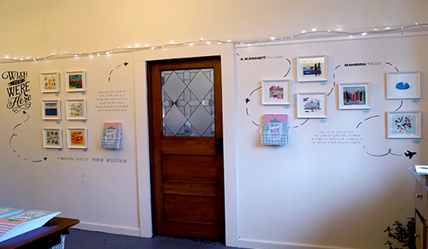
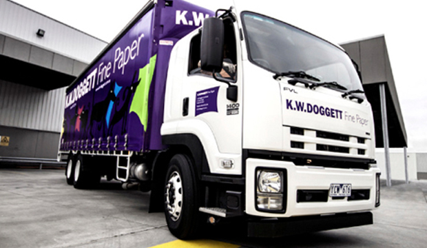
Client: K.W.Doggett Fine Paper
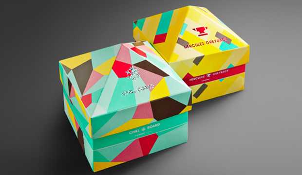
Stocks: Chill Board / Hercules Greyback
Printed by: Colna (boxes and coloured pad squares), Avon (foiling), Pala’s Print (pad squares with one colour print). All suppliers in VIC.
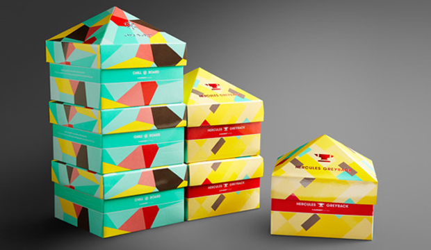
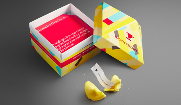
Thinking outside the box (gotta love a pun!), was the premise for the creation of these clever little stackable boxes. We thought it was about time to put some attention on our portfolio of packaging products so Chill Board and Hercules Greyback are the first to feature in this new look, developed by our friends at Seesaw.
The aim was to create promotions that were functional, fun and memorable. Something that wouldn’t be thrown into the (shock horror) bin when the rep leaves the building. It was important to create something unique yet complementary so we could add other packaging products to the suite down the track.
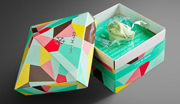
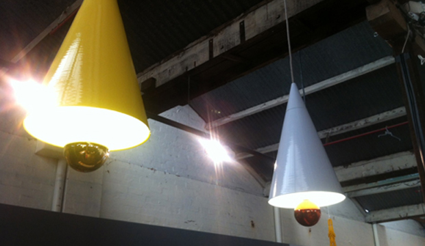
We like to have a bit of fun here at Doggett’s and Seesaw does too. The bold, colourful graphic patterns are a real stand-out. When Seesaw suggested a pad of samples to make the piece memorable and functional we thought: ‘Yeah for sure’ and they really had us at: ‘Let’s put a fortune cookie in the box’. They developed an icon for each so a snowflake for Chill Board, pointing to its freezer qualities and an anvil for Hercules Greyback, reflecting the strength of this particular product.
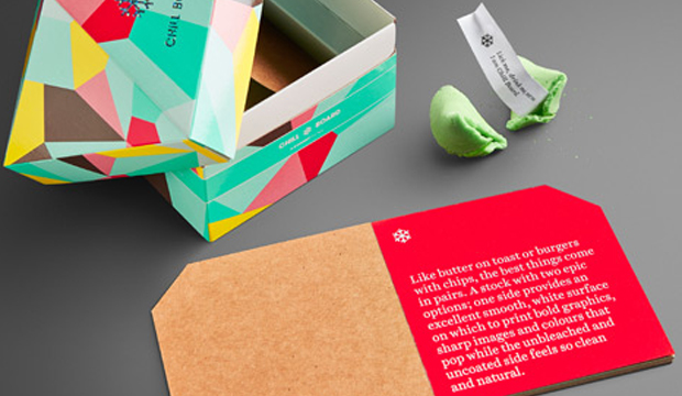
The first few pages of the pad, which acts as a mini swatch of sorts, talks about the features and benefits of the product and the remainder is a sample sheet from each grammage in the range. The idea is for our customer to be able to tear them off when visiting their client. Once again, clever.
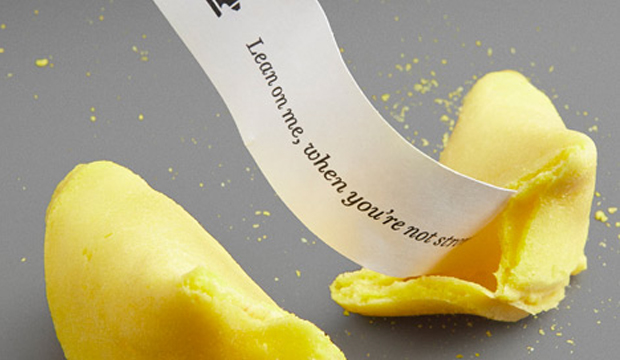
The cookies include an assortment of five fortunes that are related to the benefits of each product. Chosen to fit in with the respective colour palettes and the products, we chose mint (green) for Chill Board and a banana (yellow) for Hercules Greyback. The sayings are the best like the ‘Freeze me baby one more time’ and ‘I want to pop your colour’ for Chill Board and ‘I give good stiffness’ and ‘Lean on me when you’re not strong’ for Hercules Greyback. It may just be us and our need for a holiday but we think they’re a crack up!
Speak to your paper specialist or account manager for a copy of the promotion if you haven’t already seen it. And if you ever have any specific packaging related questions, contact our business development manager John Alipan. He’s like a guru of packaging and even wears kaftans and burns incense in the office. Ok, so maybe not the last part but it would be great to see a kaftan around the office.
Applications (Hercules Greyback): All the necessities in your life, the ones you can’t do without – biscuits, nails, toiletries, tissues, soup, cereal, washing detergent and pharmacy products. Oh and popcorn too.
Applications (Chill Board): Only the most delicious things in life like ice cream, pizza, beer, frozen berries and pies. Oh, and pretty cosmetics too.
Stock specs: Boxes and coloured pad squares – Hercules Greyback 350gsm and Chill Board 361gsm. Rest of the pads represent each grammage in the range.
Print specs: Boxes are offset printed with four PMS colours (PMS 333, PMS 102, PMS 1788, Warm Grey 11) plus some stipples. UV gloss varnish on boxes only. Grey squares warm grey 11 printed with a rubber stereo. Foils – silver confetti (Chill Board) and 098 red (Hercules Greyback).
 Footy Tips
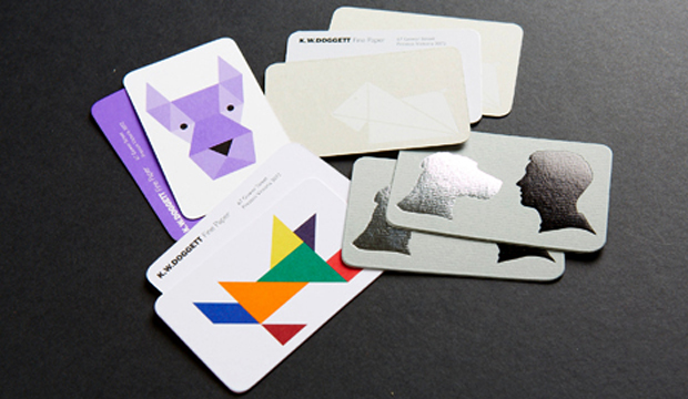
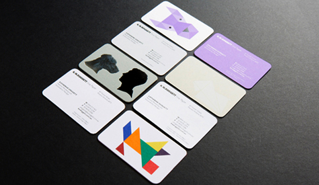 Here is a description of the four cards:
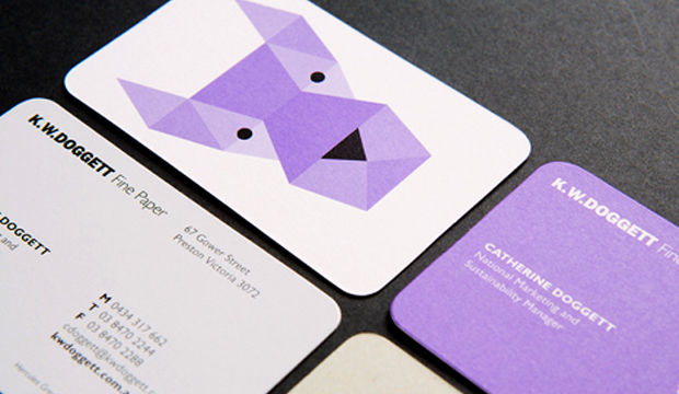
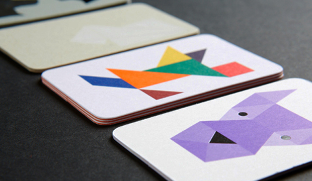
1. Purple geometric dog – printed 1 PMS 266 (Doggett purple) and black on Strathmore Premium Super Smooth Ultimate White 432gsm.
2. Origami dog – printed matt white pigment foil stamp on Hercules Greyback 450gsm.
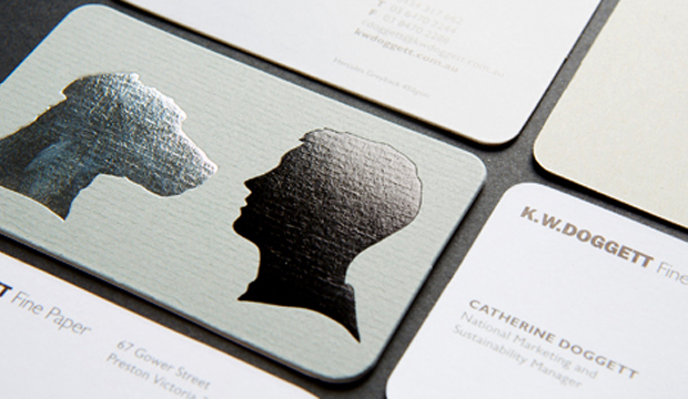
3. Silhouette dog – printed gun metal grey foil + matt black foil stamp on Conqueror Laid Concrete 300gsm duplexed to Conqueror CX22 Diamond White 320gsm.
4. Tangram dog – printed 4 colour process (high gamut*) plus 1 PMS on Knight Smooth White 200gsm and triplexed to Kaskad Fantail Orange 270gsm.
Print specs:
• All the shells were printed at Southern Colour (VIC).
• Foiling was done at Lorimier (VIC).
• All overprints done at Taylor’d Press (VIC).
• Cards designed by David Lancashire Design (VIC).
*Southern Colour have an offset process called high gamut that makes certain colours like blue, orange, green really pop. It’s a special process where two or three inks are added in addition to CMYK, to extend the colour gamut and enable the press to print a wider range of colours. This in turn makes images look more vibrant, or ‘pop’ with colour.
Ask your local paper specialist or account manager to show you the cards if you’re keen to have a look at the re-design. Enjoy!
Stocks: Conqueror CX22 / Conqueror Laid / Hercules Greyback / Kaskad / Knight – Smooth / Strathmore Premium Super Smooth.
Here is a description of the four cards:
1. Purple geometric dog – printed 1 PMS 266 (Doggett purple) and black on Strathmore Premium Super Smooth Ultimate White 432gsm.
2. Origami dog – printed matt white pigment foil stamp on Hercules Greyback 450gsm.
3. Silhouette dog – printed gun metal grey foil + matt black foil stamp on Conqueror Laid Concrete 300gsm duplexed to Conqueror CX22 Diamond White 320gsm.
4. Tangram dog – printed 4 colour process (high gamut*) plus 1 PMS on Knight Smooth White 200gsm and triplexed to Kaskad Fantail Orange 270gsm.
Print specs:
• All the shells were printed at Southern Colour (VIC).
• Foiling was done at Lorimier (VIC).
• All overprints done at Taylor’d Press (VIC).
• Cards designed by David Lancashire Design (VIC).
*Southern Colour have an offset process called high gamut that makes certain colours like blue, orange, green really pop. It’s a special process where two or three inks are added in addition to CMYK, to extend the colour gamut and enable the press to print a wider range of colours. This in turn makes images look more vibrant, or ‘pop’ with colour.
Ask your local paper specialist or account manager to show you the cards if you’re keen to have a look at the re-design. Enjoy!
Stocks: Conqueror CX22 / Conqueror Laid / Hercules Greyback / Kaskad / Knight – Smooth / Strathmore Premium Super Smooth.