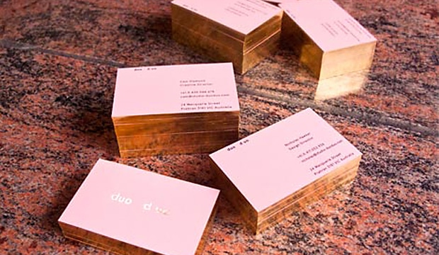
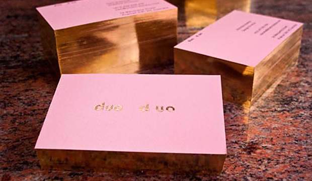
This newly formed creative studio based in Melbourne wanted their business cards to resemble their love of design and focus in the fashion industry. These alluring cards printed one colour black on Rives Design 350gsm definitely impressed us. Who can honestly say that some gold foil and gilded edges doesn’t make them just a little excited? Come on, be honest, you know it does!
Founded by designers Cam Diamond and Nicholas Hawker, duo d uo created an identity that complemented and combined their different backgrounds and design aesthetics. Cam’s motivation behind the design and choice of paper was to find a complementary solution to all of these aspects. He explains: “We chose Rives Design Bright White for its elegance, gilded edges for its subtlety and a foil for its boldness. The result is a card that resembles our image…a mix of traditional techniques and future thinking.”
Cam’s hot tip is: Don’t be afraid to foil on Rives Design.
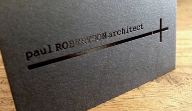
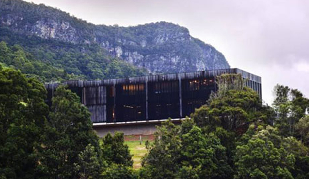
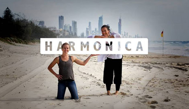
Title: Paul Robertson’s business cards Agency:Harmonica (QLD) Client:Paul RobertsonStocks:Keaykolour OriginalPrinted by: Gold Coast Foil Printers (QLD) Paul Robertson is an award winning architect from the Gold Coast. He’s also a creative, laid-back surfer (who lives on a boat) and is very modest about the beautiful structures he creates. Thanks to a local studio named Harmonica, made-up of long term friends Rachel Smith and Kate Moloney, some very classy business cards have been created using Keaykolour Jet Black. The cards appealed to Paul’s understated style and arrived just in time as he was jetting off on a whirlwind trip to Spain. Adios Amigo!
In designing Paul’s business cards, Harmonica had to walk a fine line between corporate, casual and creative without appearing too flash or in their words ‘without all the bedazzle’. To Rachel and Kate, using Keaykolour was an obvious choice having worked with the stock before. Kate tells us: “We knew the standard of finish we wanted to achieve and instantly knew that Jet Black would fit the bill for our black card dreams and desires.” Gold Coast Foil Printers in Queensland helped them out with foil selections which the Harmonica team said was invaluable. They’re big supporters of using on shore services (just quietly, so are we!) even if it means the price is higher. Harmonica’s advice: “Support local suppliers and talk to them if you don’t understand anything. Old school service is the way forward.” It also meant they could get the job done yesterday. The black gloss foil combined with the heavy 400gsm stock created the perfect balance of contrast and discretion. The result is a sophisticated and simple design and we’re guessing the Spanish like them too. Olé! We have to say, studios like Harmonica are yet another example of the amazing creative coming out of the Sunshine State. Kate commented on the fact there are heaps of rad designers, illustrators, photographers and web gurus right in their backyard. We definitely agree. Projects designed by Queensland agencies are coming across our desk in a steady stream and we’re continuously impressed with what we see. You can also check Harmonica out on their Facebook page.
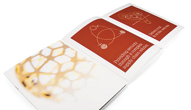
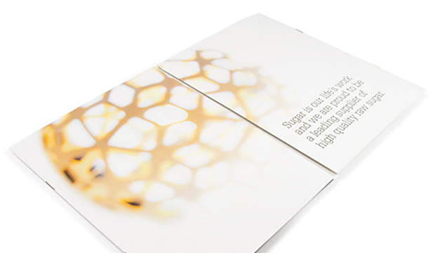
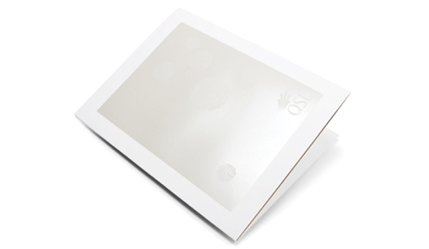
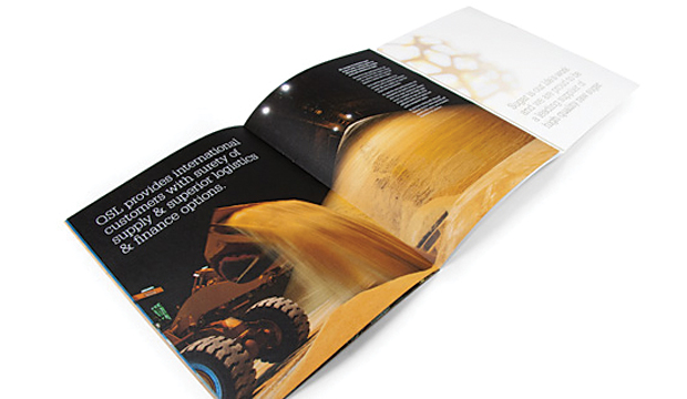
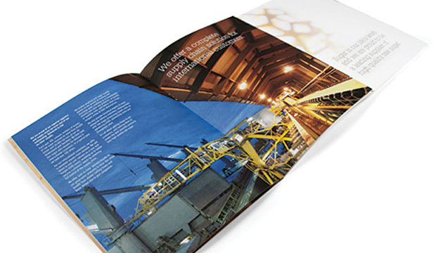
They say success is sweet. So most days at Queensland Sugar Limited (QSL) must be pretty good then! QSL is an Australian marketing and logistics company based in Brisbane, responsible for the marketing of the majority of bulk raw sugar exports produced in Queensland. Lloyd Grey Design have been working with QSL since 2009 to redesign their identity, build brand equity and the QSL brand experience. Last year, QSL approached them to come up with a high quality corporate brochure to further position them as the leading raw sugar marketer in Asia.
Ok, so sometimes we read ‘corporate brochure’ and think bo-ring. But not this time. Lloyd Grey Design went down the unconventional route with this one. The brochure needed to appeal to international customers and trade houses and showcase QSL’s expertise and innovation. The brochure has 24 pages and the eight page cover has two internal sections (each containing eight pages), which were collated and saddle stitched into the gatefold cover. They combined a memorable design with feature photography, key messages and relevant diagrams and there you have it, a corporate brochure minus the boring factor. Not surprising then that the brochure created quite the impression during face-to-face meetings.
The brochure was printed on Cambric Linen Arctic 271gsm/118gsm in 4 colour process plus PMS 7497u, featuring a white pearlised foil on the front cover. Here’s a neat story about why Lloyd Grey Design chose the stock. “We thought it was well suited to QSL as it shares strong symbolism with what forms the basis of QSL’s business – sugar cane. Like the cane, Cambric Linen is fibrous and has a natural, textured feel, without overwhelming the design. We felt the pearl foil contrasted with the paper texture for a beautiful finish.” Like we always say, there is a paper to match every occasion!
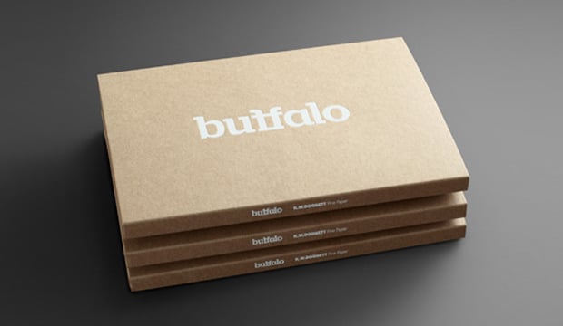
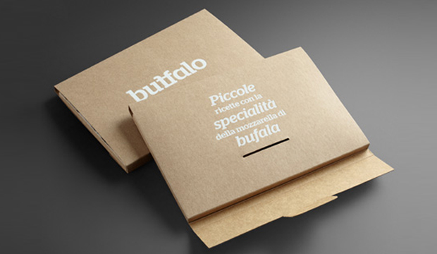
Title: Buffalo Board recipe cards Agency: Seesaw Design (Melbourne) – concept, design and photography Client: K.W.Doggett Fine Paper Stocks: Buffalo Board Printed by: Bambra Press (Melbourne), foiling by Avon (Melbourne).
As the buffalo roam the Serengeti, they dream about eating ‘Mozzarella in Carozza’. Of course we’re not being serious but wouldn’t it be a sight to see! Seriously though, did you know the Italians have been making buffalo mozzarella (bufala as they call it), since the 12th century? So what on Earth does buffalo mozzarella have to do with Buffalo Board? Well, Buffalo Board has many applications, one of which is food packaging. We collaborated with Seesaw Design in Melbourne who suggested we focus on this angle considering the stock is FDA approved for direct food contact. The concept of incorporating a food by-product led them to buffalo mozzarella (provided by La Latteria), a common ingredient on pizzas and salads. It then seemed a perfect fit to work with Ladro, a popular pizza restaurant in Melbourne. And there you have it folks, the beginning of a delicious paper promotion.
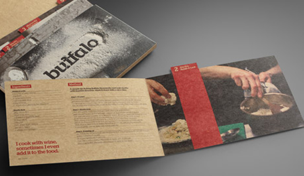
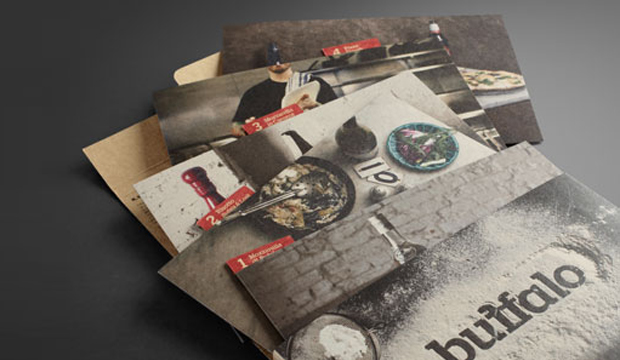
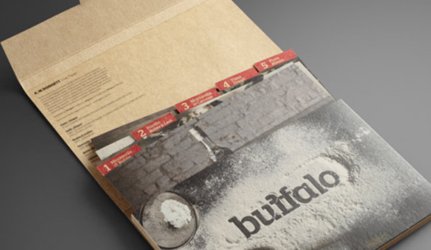
The promotion consists of an A5 folder made from 332 gsm/610ums Buffalo Board, printed with a matt white foil. Five recipe cards featuring buffalo mozzarella (ie mozzarella di bufala; risotto – bufala and leek; mozzarella in carozza; pizza dough; pizza bianco) are contained within the folder, and printed on 283gsm/508ums stock. The folder and outside of the cards are printed 4 colour process with double hit of opaque white highlights printed wet on dry. The inside of the card is printed 4 colour process.
The recipe cards are such little treasures and are so tasty they’re good enough to serve to your mama. Ladro provided a great location for the photo shoot. The photographs showcase the stock’s raw look, a bonus for people that want to convey a distinctive, clean and natural design. The rustic dishes were captured in a beautiful and elegant way, and it looked like the team had fun doing it! Here’s a video with some behind-the-scenes footage of the shoot. The food styling is thanks to Vicki Valsamis who has done such a stellar job of making the dishes look downright dreamy and scrumptious. It’s like we can hear them calling out: ‘Eat me, eat me’.
Seesaw set out to create something special with this promotion rather than a novelty piece. As Anita Ryley from Seesaw explains: “We wanted to produce a finished product that is designer orientated while showcasing the stock. We wanted the promotion to be interactive, engaging and original. Using images of stock buffalo seemed a little obvious. It needed to be a solution that was beautiful, clever, professional and a little left of centre. We wanted to create a stock sample that wasn’t just another pretty design piece. As a studio, we love the samples we can engage with. The ones that have a dual purpose.”
Buffalo Board is a low density, high yield product. It’s an uncoated, moisture-resistant folding carton board that is cost effective, has a verifiably low bacteria content compared to many other paperboard products and outstanding strength and durability. Buffalo Board is also available in 386gsm/711ums and is also used for health, beauty, fashion and beverage applications. It’s made from natural kraft fibres that are responsibly sourced and fully recyclable and it even has a low carbon footprint (measured exit mill gate).
Your K.W.Doggett Fine Paper specialist will be out to see you soon with a copy of this promo. Otherwise, please call our samples departments. If you have any specific packaging related questions, please call our dedicated packaging business development manager John Alipan on 0434 692 446 or email him jalipan@kwdoggett.com.au
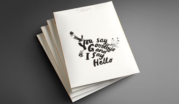
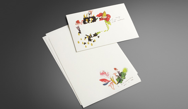
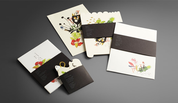
I am covetable, colourful and exciting. You want to use me, but I often get forgotten. What am I? Introducing our latest promotion for Rives – a modern day stationery set, complete with communication etiquette tips! The Rives promotion reminds us that in this day and age, we often forget the art of old fashioned communication. What? There is no hash tag involved? Impossible!
‘You say goodbye, I say hello’, is a promotion that showcases the versatility of Rives, a stock often used for letterheads, business cards and invitations. This provided the foundation for the creative development. We were fortunate enough to collaborate with two self-confessed Rives lovers – Kat Macleod and Narelle Brewer from Ortolan.
Kat and Narelle played further with the idea of tradition, took inspiration from the classic art form of botanical illustration, and included a twist. The result is a contemporary illustrative approach, featuring water colours of classic botanic specimens combined with made-up mutant flora. The word mutant conjures up a frightening image, but these illustrations are anything but that – they’re beautiful.
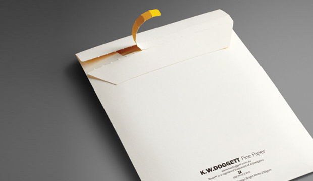
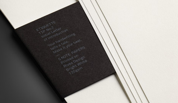
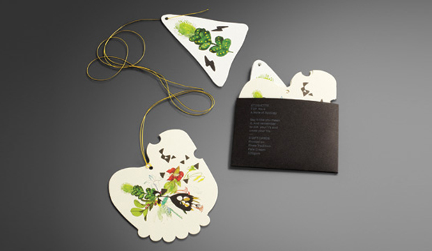
The stocks used for the 2011 Rives promotion include Rives Design and Tradition. It consists of post cards (die cut with the most gorgeous illustration and embellished with a hint of gold foil – see pics above), note paper, envelopes and gift cards (that even come with their own yellow string ready to attach to a gift!) and a paper chart.
The promo is printed four colour process, the belly bands with two spot colours (one hit of silver and one hit of white), and everything is perfectly packed into a main envelope (printed outside one colour (black) and inside one colour (yellow PMS 109). Printed on the belly bands are cheeky etiquette tips like: ‘If you want to be invited back, think ink! An email is not a thank you note’; and, ‘Your hand writing tells a tale, make it your best’.
Fusing the strength of tradition with the energy of the present, Rives is a naturally elegant collection ideal for even the most contemporary communications. Available in Design – a discreet, fine mesh texture; Tradition – a refined felt-like finish; and, Design Digital – an indigo compatible sheet. Rives is exclusive to K.W.Doggett Fine Paper and proudly made FSC certified by Arjowiggins Creative Papers (France).
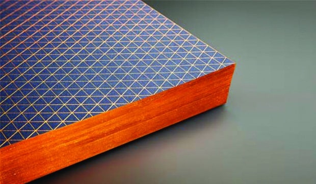
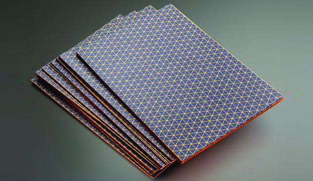
Our customers often ask what techniques they might use to help them stand out from the rest, so we’re always looking out for something new to offer them. Recently, we discovered a business card with beautifully gilded edges, a technique that we just had to try for ourselves!
We commissioned Thomas Williams from Hunt Studio to design an A5 gilded edged card on Keaykolour Antique, Navy Blue 250gsm. He came up with a mesmerising isometric pattern, wrapping around to the gilded edges and text typeset in Akkurat Mono, all in Kurz copper foil.
Originally the job was specified with a red foil, but we found that it wasn’t adhering well during testing. After experimenting with a few other similar colours, we found the copper foil adhered the best.
If you would like to use this process on your next job, our suggestion is to do some testing first, as each foil may react differently depending on the paper stock used. Also, ensure a sharp guillotine blade to avoid rough patches, or alternatively forme cut the job for greater accuracy.
Although this is a brilliant technique, there is a lot of manual labour involved, therefore we wouldn’t recommend using this process for large jobs. It’s perfect for boutique jobs and jobs with small runs, such as business cards.
To see one of these beautifully crafted cards, call our samples department or contact your KWD paper representative.
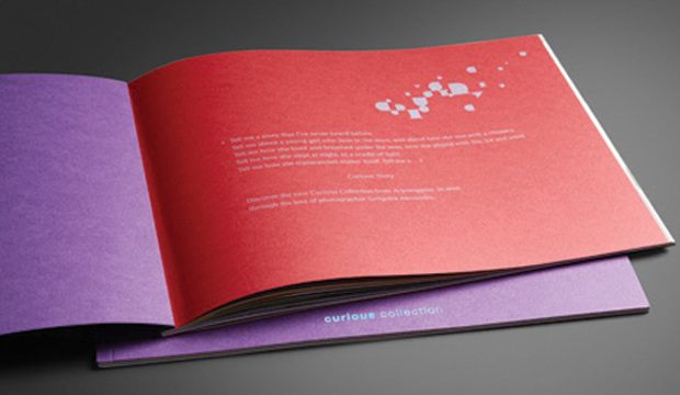
Tell me a story that I’ve never heard before.
Tell me about a young girl who lives in the stars, and about how she met with a chimera.
Tell me how she lived and breathed under the seas, how she played with fire, ice and wind.
Tell me how she slept at night, in a cradle of light.
Tell me how she transcended matter itself.
Tell me a…Curious Story.
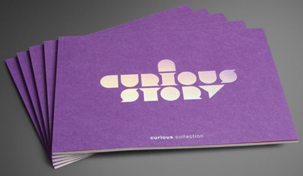
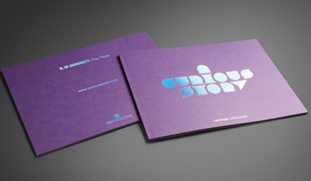
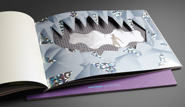
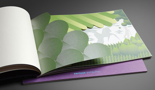
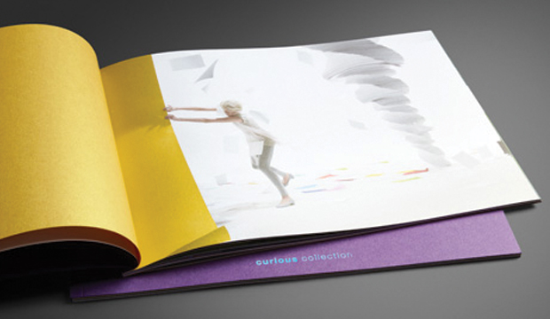
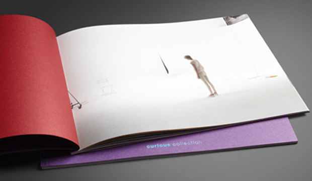
This A4 landscape booklet features amazing images and print techniques from the Arjowiggins Curious Collection. It tells a story (www.curiousstory.com) as seen through the lens of photographer Gregoire Alexandre, and exhibits a range of possibilities through print, die-cutting and embellishments on the range.
Now available exclusively from K.W.Doggett Fine Paper, the Curious range includes a variety of colours and finishes, including 5 new metallic hues. To see the new range of Curious Metallics please contact your K.W.Doggett Fine Paper representative or your nearest samples department.
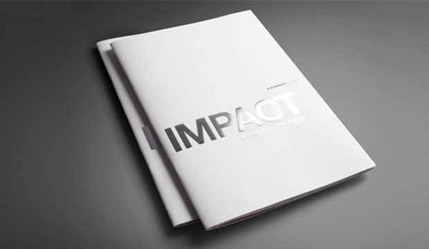
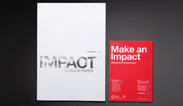
A bold promotional campaign showcasing our new environmental champion, Impact 100% recycled.
The creative team of Thursday Design in Sydney were chosen to bring this bold paper to life. The brief was to create a robust personality and not become another clichéd environmental paper promotion. The ‘Impact’ promotion needed to stand alone but still be taken as a serious contender, in the growing environmental paper market.
The solution
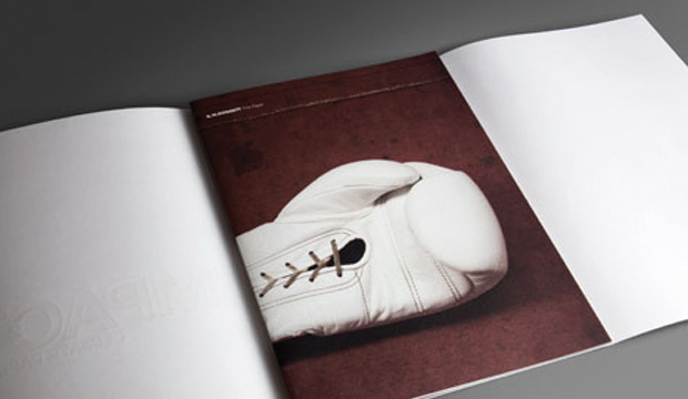
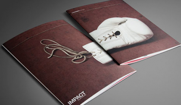
The concept for the campaign was conceived after exploring words and phases which linked ‘Impact’ (and the papers environmental attributes) to the sport of boxing, for example, fighting for what you believe in / challenges faced / raw / standing for something / guard / light-weight through to heavy-weight / protect / undisputed champion.
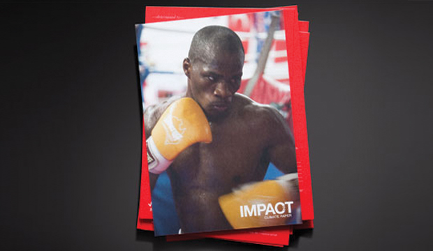
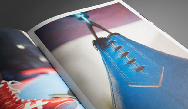
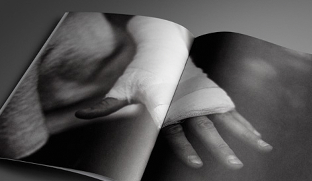
A photographer, Lee Valentine – was commissioned to document a dedicated young boxer preparing for his next professional fight. Hundreds of images were captured from the torturous training program in Western Sydney. Stunning images were taken of the boxers sparring in temperatures regularly climbing over 40°c in the gym.
The shoot climaxed after five weeks of training, when the young fighter in his sixth professional fight -successfully knocked out his opponent in under three rounds. The result provided the campaign with a visually striking conclusion.
The result
A 32 page photographic essay was offset printed, using five colours on four weights of Impact, including a large silver foiled 120gsm dust-jacket. The oversized proportion (240mm x 340mm) of the brochure enables the images to have maximum visual impact on the page, demonstrating the stocks superb ink holding qualities.
The over-riding aim of the project was to promote the use of sustainable paper options and to show that recycled and carbon neutral papers can still deliver exceptional print results.
Impact is made from 100% post consumer waste and is a carbon neutral product to K.W.Doggett Fine Paper warehouses nationally.
To receive your copy of the Impact paper sampler, please contact your nearest Sample Department.
 Footy Tips